Showing posts with label Southern Africa. Show all posts

Thursday, March 24, 2022

100. List of completed temperature analyses by country


As this is my 100th post on this blog I thought it would be a good moment to summarize the results that have emerged from the temperature data I have analysed so far. Below is a list of all the countries and regions that I have investigated to date with links to the relevant post. This amounts to about 60 countries, states and territories in total, which is roughly one third of all the countries in the world. 

The main areas that so far remain to be studied are the Arctic, Canada, Russia, UK, Scandinavia, Mediterranean, North Africa, Middle East, China and Japan. In the Southern Hemisphere only Brazil, Venezuela, Guyana, Suriname, French Guiana and the South Atlantic remain. However, most of these Southern Hemisphere regions are already included in the analysis of South America in Post 35.


Europe

Europe has the longest temperature records available with several in Germany, Sweden and the Netherlands stretching back to the early 18th century. The average of the 109 longest records yields a mean temperature anomaly (MTA) that shows a small but continuous warming of about 0.1°C per century for over 200 years until 1988. Then the temperature jumps suddenly by over 1°C. The reason for this jump is unclear. It is certainly not related directly to carbon dioxide emissions. The only countries that appear to have strong warming trends are the Benelux countries, Denmark and Switzerland. The Baltic states and most of central Europe appear to cool before 1980 and then warm suddenly.

109 longest station records (Post 44)

Austria (Post 55)

Baltic States (Post 51)

Belgium and Luxembourg (Post 40)

Central Europe average (Post 57)

Czechoslovakia (Post 53)

Denmark (Post 48)

Germany (Post 49)

Hungary (Post 54)

Netherlands (Post 41)

Poland (Post 50)

Switzerland (Post 56)


USA

The USA may not have any temperature records that are as long as the longest that Europe can boast, but its temperature data from 1850 onwards is the best there is. Virtually every state has over 100 station records with over 50 years of data and over 50 records with over 100 years of data. An average of the 400 longest temperature records appears to indicate that the climate warmed by more than 2°C from 1780 to 1920 when carbon dioxide levels barely increased, and then cooled by over 0.5°C when carbon dioxide levels took off. The early warming cannot therefore be due to CO2 and is therefore generally attributed to urbanization and deforestation in the north and east. The cooling seen after 1920 is also seen in most southern states like Louisiana, Mississippi and Texas.

400 longest station records (Post 66)

Louisiana (Post 97)

Mississippi (Post 99)

Texas (Post 52)


Central America

The temperature data for Central America can basically be split between Mexico and the rest, however, even then there are more than four times as many stations in Mexico as there are in the rest of Central America. The picture in Mexico is also complicated by the stations there falling into two distinct types from two different sources. On balance it is likely that the overall climate was stable until 1980 and then warmed over the following twenty years by about 1°C.

Mexico (Post 93)

Rest of Central America (Post 94)


South America

Of the countries in South America studied so far, only Argentina (0.6°C), Ecuador (1°C) and Uruguay (1°C) show significant warming, although the Ecuador data is far from reliable. In Paraguay and Chile the climate has cooled while in most other countries it has remained stable. The average of all medium and long stations in South America yields a warming of about 0.5°C since 1900.

All long and medium stations (Post 35)

Argentina (Post 61)

Bolivia (Post 58)

Chile (Post 62)

Colombia (Post 95)

Ecuador (Post 96)

Paraguay (Post 59)

Peru (Post 63)

Uruguay (Post 60)


Asia

My analysis so far of temperatures in Asia has focused on the countries of Indochina and the Indian subcontinent. The overall temperature trend for Indochina is one of cooling before 1980 and warming thereafter. The result is that temperatures in 2010 are barely any higher than they were in 1890. This is also reflected in the individual temperature records of Burma, Malaysia and Vietnam, while those of the Philippines and Thailand remain stable from 1920 onwards. In India and Pakistan there is little warming before 1990 and then a sudden jump in temperatures of about 0.5°C in the mid-1990s. For Sri Lanka the jump in temperature occurs in 1978 while Bangladesh sees a continuous warming of only 0.3°C per century. 

Bangladesh (Post 74)

Burma/Myanmar (Post 69)

India including Nepal (Post 71)

Indian subcontinent (Post 75)

Indochina (Post 70)

Malaysia and Singapore (Post 69)

Pakistan (Post 72)

Philippines (Post 69)

Sri Lanka (Post 73)

Thailand (Post 69)

Vietnam (Post 69)


Africa

Most of southern Africa has exhibited some significant warming of over 1°C since 1980 but the overall picture before 1980 is varied. Angola, Mozambique and South Africa show no warming before 1980 while Malawi, Zambia, Zimbabwe and Madagascar all cool significantly by as much as they later warm. The data for Namibia and Botswana is not great but may indicate a slight warming before 1980 as well as much larger warming thereafter. Of all the countries listed below, Madagascar, Mozambique, South Africa and Zimbabwe have the best quality data and none of these countries appear to exhibit any warming before 1980.

Angola (Post 82)

Botswana (Post 38)

Madagascar (Post 77)

Mozambique (Post 78)

Namibia (Post 39)

South Africa including Lesotho and Eswatini/Swaziland (Post 37)

Zambia and Malawi (Post 81)

Zimbabwe (Post 79)


Australia

Analysis of temperature data for Australia indicates that the mean temperature trend is parabolic with the climate cooling from 1875 to 1960 and then warming. Overall temperatures in 2010 are only about 0.1-0.2°C warmer than in 1875 with temperatures having increased by about 0.5°C since 1960. This pattern in seen in most states such as South Australia, New South Wales and Victoria. It is harder to be conclusive for Tasmania and Western Australia due to a lack of data before 1900 while the trend in Northern Territory is one of consistent cooling. Only Queensland shows constant warming of about 1°C since 1990.

Australia (Post 26)

New South Wales and ACT (Post 18)

Northern Territory (Post 23)

Queensland (Post 24)

South Australia (Post 21)

Tasmania (Post 20)

Victoria (Post 19)

Western Australia (Post 22)


Oceania

Most of the countries and regions of Oceania show little of no warming. In Antarctica the only warming is found around the peninsula. New Zealand cools slightly from 1860 until 1960 then warms by about 0.5°C, rather like much of Australia. Yet despite this, temperatures in 2010 are barely above those in 1860. In Indonesia only the capital city Jakarta shows any strong warming but the average temperature for the country remains stable, although data quality and quantity before 1960 is poor. This is also true for Papua New Guinea where there is some evidence of warming after 1960 by about 0.5°C. In the South Pacific there is a contrast between east and west with the eastern half cooling significantly while the west cools slightly until 1970 before warming again by about 0.5°C. In fact of all the regions listed below, only the Indian Ocean shows significant warming of about 1°C.

Antarctica (Post 30)

Indian Ocean (Post 76)

Indonesia (Post 31)

New Zealand (Post 8)

Papua New Guinea (Post 32)

South Pacific Islands - East (Post 34)

South Pacific Islands - West (Post 33)


Southern Hemisphere

An average of the temperature anomalies from the 1000 longest records in the Southern Hemisphere shows a slight cooling of about 0.1°C until 1975 followed by a modest warming of only about 0.6°C.

Southern Hemisphere station average (Post 64)


Monday, December 6, 2021

84. Southern Africa - a summary of temperature trends

Over the last fifteen months I have analysed the temperature data for nine different countries in southern Africa and calculated their temperature trends. My analysis began in September 2020 with South Africa (Post 37) before continuing on to Botswana (Post 38) and Namibia (Post 39) in October. More recently I have examined the temperature records of Madagascar (Post 77), Mozambique (Post 78), Zimbabwe (Post 79), Zambia and Malawi (Post 81), and Angola (Post 82).

The one constant for all these countries is the temperature trend since 1980. In almost all cases the climate shows evidence of warming, with the temperature rise varying between 0.5°C and 1.5°C. Before 1980 the picture is different with little or no temperature rise being seen, and in many cases (e.g. Madagascar, Zimbabwe, Zambia and Malawi) a significant cooling taking place. These results are summarized in the graphs below.

The main conclusions to be drawn here are as follows.

  • All the warming in southern Africa has occurred since 1980.
  • There is probably no warming before 1980, and possibly some cooling.
  • The net warming since 1850 is likely to be between 0.5°C and 1.0°C. This is less than the IPCC global value of 1.3°C, and much less than the land-based Berkeley Earth average of almost 2.0°C (see Fig. 80.1 in Post 80).

In the New Year I will return to the African data and analyse the data from countries in sub-Saharan and equitorial countries. In the meantime I will return to considering the physics of the Greenhouse Effect that I introduced in Post 12 (black-body radiation) and Post 13 (Earth's energy budget). In particular I will look to answer two questions: why is Venus so hot, and why is Mars so cold?


Fig. 37.2: The mean temperature anomaly (MTA) for South Africa since 1840. The best fit is applied to the interval 1857-1976 and has a gradient of +0.017 ± 0.056 °C per century. The monthly temperature changes are relative to the 1961-1990 monthly averages.


Fig. 38.3: The mean temperature anomaly (MTA) for Botswana since 1917. The best fit is applied to the interval 1917-1976 and has a positive gradient of +0.72 ± 0.26 °C per century. The monthly temperature changes are defined relative to the 1961-1990 monthly averages.


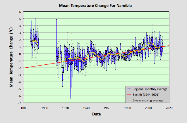
Fig. 39.8: The mean temperature anomaly (MTA) for Namibia since 1885. The best fit is applied to the interval 1944-2001 and has a positive gradient of +2.28 ± 0.17 °C per century. The monthly temperature changes are defined relative to the 1971-1990 monthly averages.


Fig. 77.6: The mean temperature anomaly (MTA) for Madagascar. The best fit is applied to the monthly mean data from 1932 to 2011 and has a negative gradient of -0.15 ± 0.07 °C per century.


Fig. 78.6: The mean temperature anomaly (MTA) relative to the 1931-1960 monthly averages for stations in Mozambique with over 300 months of data but excluding Lourenço Marques. The best fit is applied to the monthly mean data from 1921 to 1980 and has a positive gradient of +0.16 ± 0.12 °C per century.


Fig. 79.2: The mean temperature anomaly (MTA) for Zimbabwe relative to the 1971-2000 monthly averages based on an average of anomalies from stations with over 360 months of data. The best fit is applied to the monthly mean data from 1916 to 1975 and has a negative gradient of -0.96 ± 0.20 °C per century.


Fig. 81.2: The mean temperature anomaly (MTA) relative to the 1951-1980 monthly averages based on an average of anomalies from stations with over 360 months of data. The best fit is applied to the monthly mean data from 1921 to 1975 and has a negative gradient of -2.72 ± 0.17 °C per century.


Fig. 82.5: The mean temperature anomaly (MTA) for Angola relative to the 1951-1980 monthly averages based on an average of anomalies from stations with over 300 months of data. The best fit is applied to the monthly mean data from 1941 to 1980 and has a positive gradient of 0.18 ± 0.17 °C per century.


Thursday, December 31, 2020

45. Review of the year 2020

I started this blog in May, in part to occupy my time during the Covid-19 lockdown. But I was also motivated by a growing dissatisfaction with the quality of data analysis I was witnessing in climate science, and in particular the lack of any objectivity in the way much of the data was being presented and reported. My concerns were twofold. 

The first was the drip-drip of selective alarmism with an overt confirmation bias that kept appearing in the media with no comparable reporting of events that contradicted that narrative. The worry here is that extreme events that are just part of the natural variation of the climate were being portrayed as the new normal, while events of the opposite extreme were being ignored. It appeared that balance was being sacrificed for publicity.

The second was the over-reliance of much of the climate analysis on complex statistical analysis techniques of doubtful accuracy or veracity. To paraphrase Lord Rutherford: if you need to use complex statistics to see any trends in your data, then you would be better off using better data. Or to put it more simply, if you can't see a trend with simple regression analysis, then the odds are there is no trend to see.

The purpose of this blog has not been to repeat the methods of climate scientists, nor to improve on them. It has merely been to set a benchmark against which their claims can be measured and tested.

My first aim has been to go back to basics, to examine the original temperature data, look for trends in that data, and to apply some basic error analysis to determine how significant those trends really are. Then I have sought to compare what I see in the original data with what climate scientists claim is happening. In most cases I have found that the temperature trends in the real data are significantly less than those reported by climate scientists. In other words, much of the reported temperature rises, particularly in Southern Hemisphere data, result from the data manipulations performed by the climate scientists on the data. This implies that many of the reported temperature rises are an exaggeration.

In addition, I have tried to look at the physics and mathematics underpinning the data in order to test other possible hypotheses that could explain the observed temperature trends that I could detect. Below I have set out a summary of my conclusions so far.


1) The physics and mathematics

There are two alternative theories that I have considered as explanations of the temperature changes. The first is natural variation. The problem here is that in order to conclusively prove this to be the case you need temperature data that extends back in time for dozens of centuries, and we simply do not have that data. Climate scientists have tried to solve this by using proxy data from tree rings and sediments and other biological or geological sources, but in my opinion these are wholly inadequate as they are badly calibrated. The idea that you can measure the average annual temperature of an entire region to an accuracy of better than 0.1 °C simply by measuring the width of a few tree rings, when you have no idea of the degree of linearity of your proxy, or the influence of numerous external variables (e.g. rainfall, soil quality, disease, access to sunlight), is preposterous. But there is another way.

i) Fractals and self-similarity

If you can show that the fluctuations in temperature over different timescales follow a clear pattern, then you can extrapolate back in time. One such pattern is that resulting from fractal behaviour and self-similarity in the temperature record. By self-similarity I mean that every time you average the data you end up with a pattern of fluctuations that looks similar to the one you started with, but with amplitudes and periods that change according to a precise mathematical scaling function.

In Post 9 I applied this analysis to various sets of temperature data from New Zealand. I then repeated it for data from Australia and then again in Post 42 for data from De Bilt in the Netherlands. In virtually all these cases I found a consistent power law for the scaling parameter indicative of a fractal dimension of between 0.20 and 0.30, with most values clustered close to 0.25. The low magnitude of this scaling term suggests that the fluctuations in long term temperatures are much greater in amplitude than conventional statistical analysis would predict. 

For example, in the case of De Bilt it suggests that the standard deviation in the average 100-year temperature is more than 0.2 °C. This means that there is a 16% probability of the mean temperature for any century being more than 0.3°C more (or less) than the mean temperature for the previous century, and therefore a one in six possibility of a 0.6 °C temperature rise in any given century. So a 0.6 °C temperature rise over a century could occur once every 600 years purely because of natural variations in temperature. It also suggests that similar temperature variations that we have seen in temperature data in the last 50 or 100 years might have been repeated frequently in the not so distant past.

ii) Direct anthropogenic surface heating (DASH) and the urban heat island (UHI)

Another possible explanation for any observed rise in temperature is the heating of the environment that occurs due to human industrial activity. All energy use produces waste heat. Not only that, but all energy must end up as heat and entropy in the end. The Second Law of Thermodynamics tells us that. It is therefore inevitable that human activity must heat the local environment. The only question is by how much.

Most discussions in this area focus on what is known as the urban heat island (UHI). This is a phenomenon whereby urban areas either absorb extra solar radiation because of changes made to the surface albedo by urban development (e.g. concrete, tarmac, etc), or tall buildings trap the absorbed heat and reduce the circulation of warm air, thereby concentrating the heat. But there is another contribution that continually gets overlooked - direct anthropogenic surface heating (DASH). 

When humans generate and consume energy they liberate heat or thermal energy. This energy heats up the ground, and the air just above it, in much the same way that radiation from the Sun does. In so doing DASH adds to the heat that is re-emitted from the Earth's surface, and therefore increases the Earth's surface temperature at that location.

In Post 14 I showed that this heating can be significant - up to 1 °C in countries such as Belgium and the Netherlands with high levels of economic output and high population densities. In Post 29 I extended this idea to look at suburban energy usage and found a similar result. 

What this shows is that you don't need to invoke the Greenhouse Effect to find a plausible mechanism via which humans are heating the planet. Simple thermodynamics will suffice. Of course climate scientists dismiss this because they assume that this heat is dissipated uniformly across the Earth's surface - but it isn't. And just as significant is the fact that the majority of weather stations are in places where most people live, and therefore they also tend to be in regions where the direct anthropogenic surface heating (DASH) is most pronounced. So this direct heating effect is magnified in the temperature data.

iii) The data reliability

It is taken as read that the temperature data used to determine the magnitude of the observed global warming is accurate. But is it? Every measurement has an error. In the case of temperature data it appears that these errors are comparable in magnitude to many of the effects climate scientists are trying to measure.

In Post 43 I looked at pairs of stations in the Netherlands that were less than 1.6 km apart. One might expect that most such pairs would exhibit identical datasets for the two stations in the pair, but they don't. In virtually every case the fluctuations in the difference in their monthly average temperatures was about 0.2 °C. While this was consistent with the values one would expect based on error analysis, it does highlight the limits to the accuracy of this data. It also raises questions about how valid techniques such as breakpoint adjustment are, given that these techniques depend on detecting relatively small differences in temperature for data from neighbouring stations.

iv) Temperature correlations between stations

In Post 11 I looked at the product moment correlation coefficients (PMCC) between temperature data from different stations, and compared the correlation coefficients with the station separation. What became apparent was evidence for a strong negative linear relationship between the maximum correlation coefficient for temperature anomalies between pairs of station and their separation. For station separations of less than 500 km positive correlations of better than 0.9 were possible, but this dropped to a maximum correlation of about 0.7 for separations of 1000 km and 0.3 at 2000 km.

There were also clear differences between the behaviour of the raw anomaly data and the Berkeley Earth adjusted data. The Berkeley Earth adjustments appear to reduce the scatter in the correlations for the 12-month averaged data, but do so at the expense of the quality of the monthly data. This suggests that these adjustments may be making the data less reliable not more so. The improvement in the scatter of the Berkeley Earth 12-month averaged data is also curious. Is it because it is this data that is used to determine the adjustments and not the monthly data, or is this not the case and instead there is some other reason? And what of the scatter in the data? Can we use this to measure the quality and reliability of the original data? This clearly warrants further study.


Fig. 45.1: Correlations (PMCC) for the period 1971-2010 between temperature anomalies for all stations in New Zealand with a minimum overlap of 200 months. Three datasets were studied: a) the monthly anomalies; b) the 12-month average of the monthly anomalies; c) the 5-year average of the monthly anomalies. Also studied were the equivalent for the Berkeley Earth adjusted data.


2) The data

Over the last eight months I have analysed most of the temperature data in the Southern Hemisphere as well as all the data in Europe that predates 1850. The results are summarized below.

i) Antarctica

In Post 4 I showed that the temperature at the South Pole has been stable since the 1950s. There is no instrumental temperature data before 1956 and there are only two stations of note near the South Pole (Amundsen-Scott and Vostok). Both show stable or negative trends.

Then in Post 30 I looked at the temperature data from the periphery of the continent. This I divided into three geographical regions: the Atlantic coast, the Pacific coast and the Peninsula. The first two only have data from about 1950 onwards. In both cases the temperature data is also stable with no statistically significant trend either upwards or downwards. Only the Peninsula exhibited a strong and statistically significant upward trend of about 2 °C since 1945.


ii) New Zealand

Fig. 45.2: Average warming trend of for long and medium stations in New Zealand. The best fit to the data has a gradient of +0.27 ± 0.04 °C per century.

In Posts 6-9 I looked at the temperature data from New Zealand. Although the country only has about 27 long or medium length temperature records, with only ten having data before 1880, there is sufficient data before 1930 to suggest temperatures in this period were almost comparable to those of today. The difference is less than 0.3 °C.


iii) Australia

Fig. 45.3: The temperature trend for Australia since 1853. The best fit is applied to the interval 1871-2010 and has a gradient of 0.24 ± 0.04 °C per century.

The temperature trend for Australia (see Post 26) is very similar to that of New Zealand. Most states and territories exhibited high temperatures in the latter part of the 19th century that then declined before increasing in the latter quarter of the 20th century. The exceptions were Queensland (see Post 24) and Western Australia (see Post 22), but this was largely due to an absence of data before 1900. While there is much less temperature data for Australia before 1900 compared to the latter part of the 20th century, there is sufficient to indicate that, as in New Zealand, temperatures in the late 19th century were similar to those of the present day.


iv) Indonesia

Fig. 45.4: The temperature trend for Indonesia since 1840. The best fit is applied to the interval 1908-2002 and has a negative gradient of -0.03 ± 0.04 °C per century.

The temperature data for Indonesia is complicated by the lack of quality data before 1960 (see Post 31). The temperature trend after 1960 is the average of between 33 and 53 different datasets, but between 1910 and 1960 it generally comprises less than ten. Nevertheless, this is sufficient data to suggest that temperatures in the first half of the 20th century were greater than those in the latter half. This is despite the data from Jakarta Observatorium which exhibits an overall warming trend of nearly 3 °C from 1870 to 2010 (see Fig. 31.1 in Post 31).

It is also worth noting that the temperature data from Papua New Guinea (see Post 32) is similar to that for Indonesia for the period from 1940 onwards. Unfortunately Papua New Guinea only has one significant dataset that predates 1940, so conclusions regarding the temperature trend in this earlier time period are difficult to ascertain.


v) South Pacific

Most of the temperature data from the South Pacific comes from the various islands in the western half of the ocean. This data exhibits little if any warming, but does exhibit large fluctuations in temperature over the course of the 20th century (see Post 33). The eastern half of the South Pacific, on the other hand, exhibits a small but discernible negative temperature trend of between -0.1 and -0.2 °C per century (see Post 34).


vi) South America

Fig. 45.5: The temperature trend for South America since 1832. The best fit is applied to the interval 1900-1999 and has a gradient of +0.54 ± 0.05 °C per century.

In Post 35 I analysed over 300 of the longest temperature records from South America, including over 20 with more than 100 years of data. The overall trend suggests that temperatures fluctuated significantly before 1900 and have risen by about 0.5 °C since. The high temperatures seen before 1850 are exclusively due to the data from Rio de Janeiro and so may not be representative of the region as a whole.


vii) Southern Africa

Fig. 45.6: The temperature trend for South Africa since 1840. The best fit is applied to the interval 1857-1976 and has a gradient of +0.017 ± 0.056 °C per century.

In Posts 37-39 I looked at the temperature trends for South Africa, Botswana and Namibia. Botswana and Namibia were both found to have less than four usable sets of station data before 1960 and only about 10-12 afterwards. South Africa had much more data, but the general trends were the same. Before 1980 the temperature trends were stable or perhaps slightly negative, but after 1980 there was a sudden rise of between 0.5 °C and 2 °C in all three trends, with the largest being found in Botswana. This does not correlate with accepted theories on global warming (the rises in temperature are too large and too sudden, and do not correlate with rises in atmospheric carbon dioxide), and so the exact origin of these rises appears to be unexplained.


viii) Europe

Fig. 45.7: The temperature trend for Europe since 1700. The best fit is applied to the interval 1731-1980 and has a positive gradient of +0.10 ± 0.04 °C per century.

In Post 44 I used the 109 longest temperature records to determine the temperature trend in Europe since 1700. The resulting data suggests that temperatures were stable from 1700 to 1980 (they rose by less than 0.25 °C), and then rose suddenly by about 0.8 °C after 1986. The reason for this change is unclear, but one possibility is that it has occurred due to a significant improvement in air quality that reduced the amount of particulates in the atmosphere. These particulates, that may have been present in earlier years, could have induced a cooling that compensated for the underlying warming trend. Once removed, the temperature then rebounded. Even if this is true, it suggests a maximum warming of about 1 °C since 1700, much of which could be the result of direct anthropogenic surface heating (DASH) as discussed in Post 14. In countries such as Belgium and the Netherlands the temperature rise is even less than that expected from such surface heating. It is also much less than that expected from an enhanced Greenhouse Effect due to increasing carbon dioxide levels in the atmosphere (i.e. about 1.5 °C in the Northern Hemisphere since 1910). In fact the total temperature rise should exceed 2.5 °C. So here is the BIG question? Where has all that missing temperature rise gone?


Friday, October 30, 2020

39. Namibia - temperature trends

When it comes to temperature data Namibia is not much better than Botswana. In total, there have only ever been 34 weather stations in Namibia (compared to 20 in Botswana). Of these only five are medium stations with more than 480 months of data, although nine have more than 450 months of data. This includes only two with more than 900 months of data and only four with any data before 1960. There is only one long station with over 1200 months of data (Windhoek), and only Walfisch Bay has any data before 1900. Unfortunately, both of these stations have portions of data that are clearly erroneous. The most likely explanation is that these data segments have either been incorrectly converted from Fahrenheit to Celsius when they were already in Celsius, or were not converted when they should have been.


Fig. 39.1: The temperature trend for Windhoek since 1911 according to Berkeley Earth (BE).


For the case of the Windhoek data, it is the data for the period 1911-1920 that is in question, as illustrated in Fig. 39.1 above. There is clearly an offset of more than 25 °C between the data before 1920 and the data after that date. What appears to have happened here is that some data that was correctly already in Celsius was assumed incorrectly to be in Fahrenheit. So when an unwanted correction of (x - 32)÷1.8 was applied to the data, the data was offset in a negative direction. Reversing this correction appears to remove the offset, as illustrated in Fig. 39.2 below.


Fig. 39.2: The temperature trend for Windhoek since 1911. The best fit is applied to the interval 1944-2001 and has a gradient of +2.21 ± 0.26 °C per century. The monthly temperature changes are defined relative to the 1971-1990 monthly averages.


The resulting temperature trend for Windhoek is strongly positive. However, the opposite is true for the only other significant temperature record that pre-dates 1920. This is the temperature record from Walfisch Bay, which is located at sea level on the coast about 200 km to the west of Windhoek (which is at altitude).


Fig. 39.3: The temperature trend for Walfisch Bay since 1885 according to Berkeley Earth (BE).


Like the Windhoek temperature record, the one for Walfisch Bay contains a significant amount of erroneous data (see Fig. 39.3 above). In this case, most of the questionable data have values that are forty degrees too large. This is almost certainly because these data values are recorded in Fahrenheit not Celsius. If we apply the appropriate correction, then the resulting data exhibits a strong negative trend as shown in Fig. 39.4 below. There are, however, ten data readings in Fig. 39.3 (from October 1941 to July 1942) where the offset is only about twenty degrees Celsius. The reason for this error is harder to ascertain and so these data points have been excluded from Fig. 39.4.


Fig. 39.4: The temperature trend for Walfisch Bay since 1885. The best fit is applied to all the data and has a negative gradient of -2.23 ± 0.16 °C per century. The monthly temperature changes are defined relative to the 1971-1990 monthly averages.


These are not the only station records with a significant amount of data before 1970, though. The graph below (Fig. 39.5) indicates that there are at least three other stations with such data. One is at J. G. H. Van Der Wath Airport (Berkeley Earth ID: 156958) which is at altitude near Keetmanshoop, while the other two are at Lüderitz (Berkeley Earth ID: 139074 and 156957) on the coast and about 200 km to the west of Keetmanshoop.


Fig. 39.5: The number of sets of station data included each month in the temperature trend for Namibia when the MRT interval is 1971-1990.


If we look at the data for J. G. H. Van Der Wath Airport (Berkeley Earth ID: 156958) we see that it exhibits a weak negative trend before 1980 of -0.43 ± 0.41 °C per century, but then shows a strong positive trend after 1980 of 3.3 ± 0.7 °C per century (see Fig. 39.6 below). Given the proximity of this station to both South Africa and Botswana, it is perhaps not surprising that the temperature trend resembles each of the trends seen in both those countries (see Fig. 37.2 and Fig. 38.1).


Fig. 39.6: The temperature trend for J. G. H. Van Der Wath Airport since 1933. The best fit is applied to the interval 1934-1978 and has a negative gradient of -0.43 ± 0.41 °C per century. The monthly temperature changes are defined relative to the 1971-1990 monthly averages.


The only other temperature data in Namibia from before 1970 comes from two stations at Lüderitz, a small coastal town (population: 12,500) in the south of the country on a similar latitude to Keetmanshoop. The two stations have different time frames that overlap between 1973 and 1986. The earliest data comes from Lüderitz Bay (Berkeley Earth ID: 156957) and extends from 1941 to 1986. The later data is for Lüderitz Diaz Point (Berkeley Earth ID: 139074) and extends from 1973 to 2013.


Fig. 39.7: The temperature trend for two stations in Lüderitz since 1941. The anomalies up to and including 1980 are for Lüderitz Bay (Berkeley Earth ID: 156957) while those from 1981 onwards are for Lüderitz Diaz Point (Berkeley Earth ID: 139074). The best fit is applied to the interval 1941-1995 and has a positive gradient of 0.27 ± 0.20 °C per century. The monthly temperature changes are defined relative to the 1971-1990 monthly averages.


If we combine the anomalies from the two Lüderitz stations we get the temperature trend shown above in Fig. 39.7. This has a very weak upward trend before 1990 which is followed by a sudden jump in temperature just before the year 2000. This temperature jump is similar in size to those seen after 1980 in data from Botswana (see Fig. 38.3), but it occurs about ten years later.  On the one hand this suggests that the temperature jump is a real phenomenon as it is seen in multiple station records, not just in Namibia, but also in Botswana, and to a lesser extent in South Africa. However, the variation in its timing across the different countries is a concern and means that we cannot completely trust its authenticity. What we cannot do is just ignore it.


Fig. 39.8: The temperature trend for Namibia since 1885. The best fit is applied to the interval 1944-2001 and has a positive gradient of +2.28 ± 0.17 °C per century. The monthly temperature changes are defined relative to the 1971-1990 monthly averages.


In addition to the five stations mentioned so far, there are another four stations with more than 450 months of data, as indicated in Fig. 39.5 above. Combining and averaging the anomalies from these nine stations yields the overall temperature trend shown in Fig. 39.8 above. This trend shares many features with those seen for Botswana (see Fig. 38.3) and South Africa (see Fig. 37.2). However, it also hints at the possibility of higher temperatures in the 19th century that would contradict the accepted conventional view of global warming in the 20th century. What is clear, though, is that once again there are significant differences between the actual raw data presented here and the temperature trend constructed by Berkeley Earth (see Fig. 39.9 below). The two most obvious differences are the temperature rises after 1980 and before 1920, both of which have been adjusted down by Berkeley Earth.


Fig. 39.9: The temperature trend for Namibia since 1860 according to Berkeley Earth.


Conclusions

The lack of high quality data makes definitive conclusions for the temperature trend in Namibia difficult. However, by comparing the Namibia data with that from neighbouring countries we can detect commonalities that allow some conclusions to be drawn.

  1. For the majority of the 20th century little or no warming has occurred in Namibia, just as the same can be said for Botswana and South Africa.
  2. There appears to have been a significant warming period after 1990. However, it is unclear what the cause of this is, and how long term it might be. It appears to be too abrupt and too large to be solely due to carbon dioxide.
  3. There is weak evidence that 19th century temperatures in Namibia may have been much higher than those in the 20th century, just as we have seen previously in South America, Australia, New Zealand and the South Pacific. While the data before 1900 in each of these regions is scarce, the fact that there appears to be a consistent pattern across these regions for the temperature data that does exist would imply that the data is probably sound.


Sunday, October 25, 2020

38. Botswana - temperature trends STABLE to 1980

Botswana illustrates some of the challenges in analysing temperature data in Africa. Simply, there just isn't enough data. In fact there is more temperature data for California than there is for the whole of Africa.

In total, there have only ever been twenty weather stations in Botswana. Of these only six are medium stations with more than 480 months of data. This includes only two with more than 900 months of data and only three with any data before 1960. There are no long stations with over 1200 months of data and there is no data before 1900. Moreover, as the map in Fig. 37.1 illustrates, those medium stations that do exist are not evenly distributed, but are instead concentrated along the South African border.


Fig. 38.1: The temperature trend for Botswana since 1917 based on an average of twelve stations records overall and only two before 1960. The best fit is applied to the interval 1917-1976 and has a negative gradient of -0.60 ± 0.29 °C per century. The monthly temperature changes are defined relative to the 1991-2010 monthly averages.


The lack of data also means that the overall temperature trend is very sensitive to the individual contributions from one or two atypical station records. This is highlighted in the difference between the trends shown in Fig. 38.1 above and Fig 38.3 below. 

The trend in Fig. 38.1 was constructed by the usual method of averaging the temperature anomalies from the various stations for each month from the earliest temperature observation (which for Botswana is January 1917) until the latest (October 2013). As I have explained before, the monthly anomaly is the change in the monthly temperature from a pre-defined reference temperature for that month and they are used so that temperature changes over time for different stations and different regions may be more easily compared. The mathematics of their calculation is explained here. However, there are a number of problems that arise when trying to calculate these monthly reference temperatures (MRTs).

The first thing to note is that the MRTs are different for each station record, and are also different for each of the twelve calendar months within each record in order to eliminate, or at least minimize, seasonal variations. The MRTs are usually determined by averaging a set of temperature readings from the same calendar month within that particular temperature record (although some climate science groups appear to corrupt this process by using a process of homogenization to combine data from adjacent stations). Ideally this averaging is done by choosing a time interval that is both reasonably long, and also one over which there is very little overall change in temperature. For these reasons a thirty year time interval of 1951 to 1980 would probably be best. It is long enough for the MRT values to be close to the true mean, and it appears that many temperature records around the world exhibit much less variation in temperature over this time period in comparison to both earlier and later time intervals. It is also the time interval that most of the climate science groups initially chose when highlighting climate change in the 1980s and 1990s.

Unfortunately, in many countries in the Southern Hemisphere there is much less temperature data before 1960 compared to that which was recorded post-1980. For that reason it is often better to choose a later time interval such as 1961-1990, or a shorter one of perhaps only twenty years, say 1981-2000.

The next problem, though, is that the temperature records in a particular region or country will not all be of the same length. More importantly, they usually have different amounts of data within the the MRT interval. The question here is, how many months of data do you need to average in order for the MRT to be sufficiently accurate? The higher the proportion needed, the more station records that will be excluded. Ideally we would want all stations to have 100% data coverage within the MRT time interval for all twelve months of the year. But equally, we would, ideally, also want all the station records to be included in the overall trend. In practice very few stations would meet the criterion of 100% data coverage so a lower threshold needs to be set. I generally choose between 40% and 60% with a higher threshold for a shorter MRT interval.

Ultimately the only way to determine the optimum method of determining the MRTs is to test different approaches. In the case of countries with a large amount of data, the different choices for the MRT time interval and the data coverage threshold have little overall impact. However, for countries like Botswana with small numbers of stations, these choices matter because the exclusion of one or two sets of station data can have a major impact on the final temperature trend. This is illustrated in the difference between the trend in Fig. 38.1 above and the one in Fig. 38.3 below. 

The temperature trend in Fig. 38.1 was constructed by first calculating the monthly reference temperatures (MRTs) for each station for the period 1991-2010. For this analysis only the fourteen stations with more than 180 months of data in total were included in the process (for a list see here). In addition, in order to optimize the accuracy in determining the MRT for each month for each station, only stations with data in more than 60% of months (i.e. 12 months) in the MRT period of 1991-2010 were included in the calculation. This resulted in twelve station records being included and two being excluded. The resulting number of station records incorporated in the trend for each month is shown below in Fig. 38.2.


Fig. 38.2: The number of sets of station data included each month in the temperature trend for Botswana when the MRT interval is 1991-2010.


Unfortunately, one of the stations that was excluded was Gaborone (Berkeley Earth ID: 152785), which is one of only three stations with any data before 1959. The other station excluded was Mahalapye (Berkeley Earth ID: 5699) which only has data from 1961 to 1990. The effect of including both these stations can be seen in Fig. 38.3 below. The effect is to change the temperature trend before 1976 from a negative trend of -0.60 °C per century to a positive one with a trend of +0.71 °C per century. This was achieved simply by changing the MRT interval to 1961-1990. While this resulted in the inclusion of the two stations at Gaborone and Mahalapye, it also meant that six stations with virtually no data before 1990 were excluded. This in turn has had a slight impact on the trend from 1990 onward, and in particular the magnitude of the cooling from 2002 onward.


Fig. 38.3: The temperature trend for Botswana since 1917 based on an average of three station records before 1960 but only eight in total. The best fit is applied to the interval 1917-1976 and has a positive gradient of +0.72 ± 0.26 °C per century. The monthly temperature changes are defined relative to the 1961-1990 monthly averages.


Conclusions

What the Botswana temperature data illustrates is the difficulty of deriving conclusive conclusions about climate change when there is insufficient data. The temperature trend before 1976 could be strongly positive (as shown in Fig. 38.3) or strongly negative (as shown in Fig. 38.1), depending on how representative the Gaborone data is of the country as a whole. Given previous evidence from Australia, Indonesia and South America regarding the disparity in temperature trends between large cities and the rest of the country, I would suggest that the Gaborone data is more likely to be an outlier even though Gaborone is hardly a megacity (its population is about 230,000). In which case it is more likely that the temperature trend in Botswana before 1976 would be very similar to that for South Africa (i.e. stable and flat) rather than the more or less continuous warming trend that has been claimed by groups such as Berkeley Earth (see Fig. 38.4 below).


Fig. 38.4: The temperature trend for Botswana since 1860 according to Berkeley Earth.


The other feature of note in both Fig. 38.1 and Fig. 38.3 is the large temperature rise from 1980 until 2002, followed by a smaller but significant decline. This temperature rise coincides with a much smaller one seen in the South Africa temperature data (see Fig. 37.2), but the warming in Botswana is about four times larger. It may be tempting to discount this warming as spurious or just bad data (as many climate scientists do when the data is not to their liking), but it features in too many different station temperature records to be ignored that easily. Instead it hints at the possibility of a more worrying phenomenon for climate scientists: namely that natural fluctuations in the regional temperature could be much larger and more persistent than they currently accept is possible.