Showing posts with label Berkeley Earth. Show all posts

Tuesday, March 28, 2023

152: Belarus - temperature trends STABLE before 1980

When it comes to analysing the temperature data of Belarus the biggest problem is the low quantity of data. There is no data before 1880 and only three stations have data before 1950, two of which are long stations with over 1200 months of data (for a full list of stations see here). On a more positive note, there are seventeen medium stations with over 480 months of data and these are quite evenly distributed across the country. That means it should be possible to construct a reliable measure of the overall mean temperature change for Belarus, at least for the last sixty years. What this data then shows is that the climate of Belarus appears to have been fairly stable over the hundred years prior to 1980, but then in 1988, like much of Europe, the temperature suddenly increased by about 1.1°C (see Fig. 152.1 below).


Fig. 152.1: The mean temperature change for Belarus since 1880 relative to the 1981-2010 monthly averages. The best fit is applied to the monthly mean data from 1881 to 1980 and has a statistically insignificant positive gradient of +0.23 ± 0.23 °C per century. After 1980 there is an abrupt warming of 1.1°C.


In order to quantify the changes to the climate of Belarus the temperature anomalies for all stations with over 480 months of data before 2014 were determined and averaged. This was done using the usual method as outlined in Post 47 and involved first calculating the temperature anomaly each month for each of the nineteen valid stations relative to its own monthly reference temperature (MRT). Then those anomalies were averaged to determine the mean temperature anomaly (MTA) for the whole country for each month. The MRTs for each station in Belarus were calculated using the same 30-year period, namely from 1981 to 2010. The resulting MTA for Belarus is shown as a time series in Fig. 152.1 above and clearly shows that temperatures were rising slowly (at about 0.23°C per century) for about 100 years up until 1980 but that this rise was only comparable to the uncertainty in the trend and so is not significant. After 1980, however, the MTA suddenly increases by about 1.1°C. Such behaviour is seen in the MTA for many other European countries and for Europe as a whole (see Post 44).

The total number of stations included in the MTA in Fig. 152.1 each month is shown in Fig. 152.2 below. The peak in the frequency after 1970 indicates why the 1981-2010 interval was determined to be the most appropriate to use for calculating the MRTs in this case.


Fig. 152.2: The number of station records included each month in the mean temperature anomaly (MTA) trend for Belarus in Fig. 152.1.


The locations of the nineteen stations used to calculate the MTA in Fig. 152.1 are indicated on the map in Fig. 152.3 below. These stations appear to be distributed very evenly across the country with no significant clusters. This means that a simple average of their temperature anomalies should be just as accurate as any of the gridding or homogenization processes that are used by the main climate science groups in their analyses.


Fig. 152.3: The (approximate) locations of the 19 longest weather station records in Belarus. Those stations denoted with squares are long stations with over 1200 months of data, while diamonds denote medium stations with more than 480 months of data.


If we next consider the change in temperature based on Berkeley Earth (BE) adjusted data we get the MTA data in Fig. 152.4 below. This again was determined by averaging the anomalies each month from the nineteen longest stations and also suggests that the climate was warming very slightly before 1980 and then more rapidly thereafter. In this case, however, the post-1980 warming is more continuous and gradual in nature than that seen in the raw data in Fig. 152.1.


Fig. 152.4: Temperature trends for Belarus based on Berkeley Earth adjusted data. The best fit linear trend line (in red) is for the 12-month moving average data over the period 1881-1980 and has a positive gradient of +0.25 ± 0.08°C/century.


If we compare the curves in Fig. 152.4 with those from the published Berkeley Earth (BE) version for Belarus shown in Fig. 152.5 below, we see that there is excellent agreement between the two sets of data at least as far back as 1880. This indicates that the simple averaging of adjusted anomalies used to generate the BE MTA in Fig. 152.4 is as effective and accurate as the more complex gridding method used by Berkeley Earth in Fig. 152.5. In which case simple averaging should be just as effective and accurate in generating the MTA using raw unadjusted data in Fig. 152.1. What is more difficult to explain is how Berkeley Earth was able to determine the mean temperature of Belarus as far back as 1750 when there appears to be no reliable data before 1880.
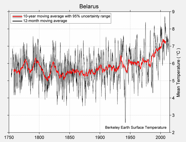

Fig. 152.5: The temperature trend for Belarus since 1750 according to Berkeley Earth.


But if we next compare the adjusted data in Fig. 152.4 with the raw data shown in Fig. 152.1 we see that there is excellent agreement between these two sets of data as well (see Fig. 152.6 below).


Fig. 152.6: A comparison of the 5-year mean temperature change for Belarus since 1880 between the original raw data from Fig. 152.1 (in blue) and the Berkeley Earth adjusted data from Fig. 152.4 (in red).


The small differences between the MTA from the raw data in Fig. 152.1 and that from the BE adjusted data in Fig. 152.4  are mainly due to the data processing procedures used by Berkeley Earth. These include homogenization, gridding, Kriging and most significantly breakpoint adjustments. These lead to changes to the original temperature data, the magnitude of these adjustments being the difference in the MTA values seen in Fig. 152.1 and Fig. 152.4. The magnitudes of these adjustments are shown graphically in Fig. 152.7 below.


Fig. 152.7: The contribution of Berkeley Earth (BE) adjustments to the anomaly data in Fig. 152.4 after smoothing with a 12-month moving average. The blue curve represents the total BE adjustments including those from homogenization. The linear best fit (red line) to these adjustments for the period 1911-2010 has a negative gradient of -0.242 ± 0.016 °C per century. The orange curve shows the contribution just from breakpoint adjustments.


The blue curve in Fig. 152.7 is the difference in MTA values between adjusted (Fig. 152.4) and unadjusted data (Fig. 152.1), while the orange curve is the contribution to those adjustments arising solely from breakpoint adjustments. Both are relatively small with the former adding a slight cooling to the data since 1911 of about 0.24°C. The large offset between the blue curve and the orange curve in Fig. 152.7 is due to the different MRT intervals used for calculating the anomalies in Fig. 152.1 (1981-2010) and in Fig. 152.4 (1961-1990).


Fig. 152.8: A comparison of the 5-year mean temperature change for Belarus (blue curve) with that of the Baltic States in Post 51 (red curve).


As mentioned at the start of this post, the main weakness of the data for Belarus is the lack of good data before 1950 which obviously raises questions over its accuracy and reliabilty. One way to test the accuracy is to compare the Belarus data with that from neighbouring states to see what the level of similarity is. This has been done in Fig. 152.8 above where the comparator set is data from the Baltic States in Post 51. As can clearly be seen, the level of agreement between the two datasets is very good, particularly after 1950. However, even before 1950 there is good agreement even though the Belarus temperature trend is based on data from three stations at most. This suggests that the MTA for Belarus in Fig. 152.1 is reliable and likely to reflect the true climate of Belarus as far back as 1880.


Summary

The raw temperature data for Belarus clearly shows that the climate was stable up until 1980. Any warming in the trend over this period was significantly less than the natural variation in the mean temperature anomaly (MTA) that was seen for all timescales up to ten years in duration (see Fig. 152.1 and Fig. 152.4).

After 1980 the climate has warmed sharply by about 1.1°C. This behaviour is similar to patterns seen across Europe. The reason for this abrupt temperature increase is still unknown as it does not correlate with increases in carbon dioxide levels in the atmosphere.

There appears to be a very good level of correlation between the MTA trend for Belarus and that for the Baltic States reported in Post 51. This allows each to in effect corroborate the other and therefore strengthen the validity of each.


Acronyms

BE = Berkeley Earth.

MRT = monthly reference temperature (see Post 47).

MTA = mean temperature anomaly.

Long station = a station with over 1200 months (100 years) of data before 2014.

Medium station = a station with over 480 months (40 years) of data before 2014.

List of all stations in Belarus with links to their raw data files.


Tuesday, September 27, 2022

139: Alaska - temperature trends WARMING (probably)

The US state most often linked to climate change is Alaska. This is probably because it is seen as having an Arctic climate even though only about a third of the state actually lies within the Arctic Circle. In fact Alaska is no more northerly than Norway and its Aleutian Island chain stretches further south than London and Berlin. It has an area three times that of France but its population is less than that of Marseille, yet it has an extensive network of weather stations that is greater in data quality than that seen in many industrialized countries. Ordinarily this should be sufficient to determine the temperature change for Alaska to a high level of precision but it isn't. In fact the data is so inconclusive it is difficult to determine whether Alaska has warmed at all over the last one hundred years let alone quantify that warming and discern when exactly it occurred. This is because the natural variation in the long term temperature averages is far greater than the likely warming.

There are one hundred stations in Alaska with over 480 months of data before 2014 including seven long stations with over 1200 months of data. Of the 93 medium stations with over 480 months of data twenty have over 1000 months of data (for a full list of stations see here). The locations of these stations are shown in Fig. 139.1 below.


Fig. 139.1: The (approximate) locations of the 100 longest weather station records in Alaska. Those stations with a high warming trend between 1911 and 2010 are marked in red while those with a cooling or stable trend are marked in blue. Those denoted with squares are long stations with over 1200 months of data, while diamonds denote medium stations with more than 480 months of data.


The map in Fig. 139.1 shows that most of the temperature data for Alaska come from stations that are outside the Arctic Circle. In fact of the one hundred longest stations in Alaska only eight are actually inside the Arctic Circle. And while the remainder are fairly evenly distributed geographically, there are significant clusters of stations around Anchorage, Fairbanks and the panhandle along the coast in the southeast between the the border of Canada and the Alexander Archipelago. As usual for simplicity I will disregard this clustering and assume it makes very little difference to the measured temperature change as it only affects the contribution or weighting of about 15% of stations.

In order to quantify the changes to the climate of Alaska the temperature anomalies for all stations with over 480 months of data before 2014 were determined and averaged. This was done using the usual method as outlined in Post 47 and involved first calculating the temperature anomaly each month for each station relative to its monthly reference temperatures (MRT), and then averaging those anomalies to determine the mean temperature anomaly (MTA) for the country. This MTA is shown as a time series in Fig. 139.2 below with the MRTs for each station calculated using data between 1961 and 1990,  (again using the methodology outlined in Post 47).


Fig. 139.2: The mean temperature change for Alaska since 1900 relative to the 1961-1990 monthly averages. The best fit is applied to the monthly mean data from 1921 to 2000 and has a positive gradient of +0.31 ± 0.31 °C per century.


The data in Fig. 139.2 above illustrates the difficulty of determining a definitive temperature trend when the data is subject to significant variability over time. In this case choosing to fit to the data from 1921 to 2000 leads to a small positive gradient of 0.31°C per century, but this is no bigger than the uncertainty and so is not statistically significant. If other fitting intervals are chosen then the gradient can be significantly different. For example, an interval of 1921-1995 results in a gradient of 0.18°C per century while 1926-2005 produces 0.96°C per century. All of which poses the awkward question, which result is correct?

In my opinion there is no obvious answer, but there are two factors that we could consider that may shed some additional light on the problem. The first of these is to choose an appropriate fitting interval based on the cycle of the natural variations (i.e. fitting from peak to peak), while the second is to concentrate on data that is the result of averaging the greatest number of station records. 

In Post 4 I explained how the best fit line to a single period of a sine wave gives a non-zero gradient (see Fig. 4.7) whereas fitting to a cosine wave does not. This is because a cosine wave is symmetric about the y-axis while the sine wave is anti-symmetric. As most temperature data tends to oscillate over time due to natural variations it therefore follows that the gradient of any fit to that data will depend on the interval chosen relative to the peaks of those natural oscillations. 

In order to avoid biasing the gradient due to asymmetry in the fitting range, the range should be symmetric relative to the natural oscillations. These natural oscillations are seen most clearly in the 5-year moving average (see the yellow curve in Fig. 139.2). So the fitting range should be chosen so that it starts and ends on a peak in the 5-year average, or alternatively starts and ends on a trough. The best fit in Fig. 139.2 does not do this. It starts near a trough at 1921 and ends on a plateau in 2000. But if we change the fitting interval from 1914 to 2003 then the interval starts and ends on a peak in the 5-year average. The result is the best fit shown in Fig. 139.3 below.


Fig. 139.3: The mean temperature change for Alaska since 1900 relative to the 1961-1990 monthly averages. The best fit is applied to the monthly mean data from 1914 to 2003 and has a positive gradient of +0.71 ± 0.26 °C per century.


The gradient of the best fit in Fig. 139.3 is more than twice that in Fig. 139.2 even though the data hasn't changed. This is simply a result of changing the fitting interval. Of course the underlying reason why a change of fitting interval makes such a big difference in this case is that the natural fluctuations in the 5-year average are so large. These changes in temperature can exceed 2°C in less than five years. So we could ask, is the temperature rise of about 0.7°C indicated by the best fit in Fig. 139.3 really that significant in comparison?


Fig. 139.4: The number of station records included each month in the mean temperature anomaly (MTA) trend for Alaska in Fig. 139.2 and Fig. 139.3.


The second factor in determining any choice of fitting range is the quantity of data available. The graph in Fig. 139.4 above shows the number of stations included in the MTA in Fig. 139.2 and Fig. 139.3. From 1920 onwards there are over twenty stations each month. In the previous post and in Post 57 I argued that at least ten, and possibly over twenty-five stations are needed in order for the MTA to be reliable, so this condition is satisfied for all months after January 1920. The data before 1920 will therefore be much less reliable, but there is still enough data to allow us to calculate an approximate MTA as far back as the 1820s. This is shown in Fig. 139.5 below.


Fig. 139.5: The mean temperature change for Alaska since 1820 relative to the 1961-1990 monthly averages. The best fit is applied to the monthly mean data from 1911 to 2010 and has a positive gradient of +0.73 ± 0.22 °C per century.


The data in Fig. 139.5 indicates that it is possible to calculate and MTA as far back as 1829, but before 1900 there are gaps in the data and most of the MTA data for this period is based on an average of anomaly data from less than three different stations. So that raises questions over its reliability.

So how should we interpret this data? The station frequency data in Fig. 139.4 suggests only data after 1900 or even 1920 is sufficiently reliable. As for the data after 1900, there are many ways to interpret it. For example, if we just look at data from 1901 to 1975 the best fit (as determined from trough to trough) is strongly negative (see Fig. 139.6 below). But after 1975 the temperature appears to increase abruptly by about 1°C. So is this interpretation of the temperature trend any more believable than those shown in Fig. 139.2 or Fig. 139.3? It is hard to tell, again because of the high level of natural variability in the data which could be varying on multiple timescales. Such multi-frequency variability is potentially indicative of chaotic or fractal behaviour as I discussed in Post 9, Post 17 and Post 42.


Fig. 139.6: The mean temperature change for Alaska since 1900 relative to the 1961-1990 monthly averages. The best fit is applied to the monthly mean data from 1901 to 1975 and has a negative gradient of -0.52 ± 0.33 °C per century.


If we next consider the change in temperature based on Berkeley Earth (BE) adjusted data we get the MTA data in Fig. 139.7 below. This again was determined by averaging the anomalies for each month from the one hundred longest stations in Alaska and suggests that the climate of Alaska has warmed by over 1°C since 1870, but with large natural variations of up to 1.5°C in the 10-year average.


Fig. 139.7: Temperature trends for Alaska based on Berkeley Earth adjusted data. The best fit linear trend line (in red) is for the period 1876-2010 and has a positive gradient of +1.00 ± 0.06°C/century.


Comparing the curves in Fig. 139.7 with the published Berkeley Earth (BE) version for Alaska in Fig. 139.8 below we see that there is good agreement between the two sets of data as far back as 1880. This indicates that the simple averaging of anomalies used to generate the BE MTA in Fig. 139.7 using adjusted data is as effective and accurate as the more complex gridding method used by Berkeley Earth in Fig. 139.8. In which case simple averaging should be just as effective and accurate in generating the MTA using raw unadjusted data in Fig. 139.2 and Fig. 139.5. In other words, any discrepancy between the adjusted data in Fig. 139.7 and the unadjusted data in Fig. 139.5 cannot be due to the averaging process. Any form of weighted averaging would also not affect the results.


Fig. 139.8: The temperature trend for Alaska since 1820 according to Berkeley Earth.


Most of the differences between the MTA in Fig. 139.6 and the BE versions using adjusted data in Fig. 139.7 are instead mainly due to the data processing procedures used by Berkeley Earth. These include homogenization, gridding, Kriging and most significantly breakpoint adjustments. These lead to changes to the original temperature data, the magnitude of these adjustments being the difference in the MTA values seen in Fig. 139.5 and Fig. 139.7.


Fig. 139.9: The contribution of Berkeley Earth (BE) adjustments to the anomaly data in Fig. 139.7 after smoothing with a 12-month moving average. The blue curve represents the total BE adjustments including those from homogenization. The linear best fit (red line) to these adjustments for the period 1921-2000 has a positive gradient of +0.262 ± 0.009 °C per century. The orange curve shows the contribution just from breakpoint adjustments.


The magnitudes of these adjustments are shown graphically in Fig. 139.9 above. The blue curve is the difference in MTA values between adjusted (Fig. 139.7) and unadjusted data (Fig. 139.5), while the orange curve is the contribution to those adjustments arising solely from breakpoint adjustments. The overall adjustment from 1920 to 2000 is small, about +0.2°C. Nevertheless, it can be seen in the difference in the 5-year means (see Fig. 139.10 below) for the unadjusted data (blue curve) and the adjusted data (red curve). The difference, though, is about ten times less than the variability in the two MTAs over time. The data in Fig. 139.10 also highlights the difficulty in interpreting the data. If the data between 1940 and 1980 were missing or ignored, then one could postulate that Alaska has seen fairly consistent warming since 1900 amounting to about 1°C in total. But if the 1940-1980 data is included the data all looks very random.


Fig. 139.10: The 5-year mean temperature change for Alaska since 1900 based on the original raw data (in blue) and the Berkeley Earth adjusted data (in red).


Summary

The temperature data for Alaska demonstrates the difficulty in determining an accurate temperature trend for a region when the climate is subject to a high degree of variability.

It is possible that the climate has warmed by almost 1°C since 1900 (see Fig. 139.3), or it might not have warmed at all (see Fig. 139.2).

If the climate has warmed, this warming may have been fairly continuous (see Fig. 139.3), or it could have been fairly recent, occurring mainly after 1980 (see Fig. 139.6).

The one thing we can say is that the difference between the temperature rise based on Berkeley Earth adjusted data (see Fig. 139.7) and that based on the raw unadjusted data (see Fig. 139.5) is small (less than 0.3°C) and much less that the 5-year natural variability of the data (about 2°C).


Acronyms

BE = Berkeley Earth.

MRT = monthly reference temperature (see Post 47).

MTA = mean temperature anomaly.

List of all stations in Alaska with links to their raw data files.


Saturday, September 24, 2022

138: Evidence against temperature adjustments #3 (Scandinavia)

One of the main aims of this blog has been to investigate the extent to which the various datasets in the global temperature record have been adjusted and to ascertain both the impact of these adjustments and their validity. Most of the blog posts for individual countries or territories have sought to quantify the magnitude of these adjustments by calculating two versions of the mean temperature anomaly (MTA) for each region; one based on its raw unadjusted data and a second using Berkeley Earth adjusted data. Then the two are compared and the difference calculated. This difference is often considerable and often shows that the adjustments have increased the amount of reported warming. But I have also investigated the second issue, that of validity. One way to do this is to compare the MTA for neighbouring regions or different data samples from the same region. 

The rationale is as follows. If there are errors in the data that are sufficient to affect the MTA, then comparing MTAs from different samples from the same region, or samples from adjacent regions that would be expected to be almost identical, could highlight the errors. Of course any difference between MTAs from different regions does not prove that the data is wrong; it may be that the regions aren't as similar as one supposed. But if the data is virtually identical then that does suggest both that the temperature trends for the two samples or regions are behaving the same, and that any data errors in the temperature datasets (which are likely to be numerous) are not significant and so are not in need of correction or adjustment.

In Post 57 I used this approach to compare the temperature trends of neighbouring countries in central Europe (Germany, Czechoslovakia, Austria and Hungary). The results showed that if the MTA for a country was determined using data from more than about fifteen different station records then there was little difference between MTAs for different countries, and thus very little error in the MTA of each country. This is because of a property of statistics called regression towards the mean. This basically states that if any dataset contains errors in its measurements (which most data does), and those errors are random in their size and distribution (which they often are), then the errors will tend to cancel each other when you average the data. Moreover, the more data you average, the greater the cancellation of errors and so the more accurate will be the result. If errors don't cancel, then that is because the errors are systematic not random, so the process also helps to identify these as well.

In Post 67 I repeated this process for temperature data from the USA. In this case instead of comparing data from adjacent regions I compared different samples of one hundred stations from the same region: the entire contiguous United States. The result was the same as in Post 57 with each sample exhibiting an identical temperature trend over time with identical fluctuations in the 5-year moving average of the trend.

In this post I will repeat the country comparison of Post 57 but using the 5-year moving average of the temperature trend data from the four neighbouring Scandinavian countries of Norway, Sweden, Finland and Denmark. These trends were determined in Post 135, Post 136, Post 137 and Post 48 respectively. The results are shown in Fig. 139.1 below.


Fig. 138.1: A comparison of the 5-year average temperature trends since 1700 for Norway, Finland and Denmark compared to that of Sweden. The trends for Finland and Norway are offset by ±3°C for clarity.


In Fig. 139.1 I have compared the trends of Norway, Finland and Denmark with that of Sweden. The reasons for choosing Sweden as the comparator were both geographic and practical. It sits between the other three countries and so is a near neighbour for each (Finland and Denmark are not near neighbours so would not be good comparators). But it also has the most stations of the four countries and so should have the most reliable trend.

The data in Fig. 139.1 clearly shows that the trends for all four countries are very similar after 1900 but diverge as one looks further back in time towards 1800. The reason for this is the reduction in station numbers seen in each country as one moves back in time from 1950 (see Fig. 138.2 below). Given that it seems that somewhere between ten and thirty stations are needed in the MTA average in order for the errors to be minimized, we can see from Fig. 138.2 that this condition is satisfied for all four countries after 1890. That is why the MTAs diverge before 1890 but are very similar after that date.


Fig. 138.2: The number of station records included each month in the averaging for the mean temperature trends in Fig. 138.1.


If we just consider the data after 1850 we see that the agreement between trends for the different countries is remarkably good after 1890 (see Fig. 138.3 below). The agreement between Norway and Sweden, and Finland and Sweden are both particularly good to the point of their three trends being almost identical. There is also excellent agreement between Denmark's trend and that of Sweden after 1980 but less so before. This is probably the result of Denmark not only having much fewer stations than the other three countries, but also having fewer than ten stations before 1975.


Fig. 138.3: A comparison of the 5-year average temperature trends since 1850 for Norway, Finland and Denmark compared to that of Sweden. The trends for Finland and Norway are offset by ±3°C for clarity.


Summary

The data in Fig. 138.3 once again demonstrates the futility of temperature adjustments. The fact that the mean temperature anomalies (MTAs) of Norway, Sweden and Finland agree so well for over 120 years from 1890 onwards without data adjustments indicates that the averaging process alone can eliminate most errors.

The Denmark data also adds weight to the conjecture that between ten and thirty stations are needed in the average in order to eliminate most of the data errors. As the error size decreases with the square root of the sample size, an average of 25 datasets should decrease the error size by 80% (reducing each error to a fifth of its nominal value). 

Comparing the data of these four countries in this way also gives us more confidence in the determining the true nature of the regional temperature trend. All the data after 1900 pretty much agree so we can conclude that temperatures from 1900 to 1980 rose marginally by less than 0.3°C and then jumped by about 1°C in the 1980s. But this jump is still only comparable to the size of the fluctuations in the 5-year average.

From 1850 to 1900 both Denmark and Norway diverge from Sweden slightly but in different directions. But this is based on a comparison of only one or two stations in each case and so is not unexpected.


Friday, August 26, 2022

133: UHI #6 - Buenos Aires (Argentina)

The second largest city in South America by population is Buenos Aires in Argentina with a population of over thirteen million people. The largest is Sao Paulo in Brazil. Both could be categorized as urban heat islands (UHIs); Sao Paulo in particular has warmed by about 3°C since 1887 and Buenos Aires by up to 2°C. However, as I have yet to fully analyse temperature data from Brazil it is not possible for me to compare the Sao Paulo data to the temperature change for the wider region, although this is unlikely to be more than about 1°C. So instead I will concentrate on Buenos Aires. Sao Paulo will come later.

A comparison of the temperature trends for Buenos Aires and Argentina shows that temperatures have risen far more in Buenos Aires than they have in Argentina as a whole. In fact as Fig. 133.1 below shows, they have risen almost three times faster in Buenos Aires since 1900 than they have in Argentina. Before 1900 temperatures were stable in both Buenos Aires and Argentina.


Fig. 132.1: The change to the 5-year average temperatures of Buenos Aires (red curve) and Argentina (blue curve) since 1900.


In Post 61 I examined the temperature trends for Argentina. The mean temperature change since 1900 is shown in Fig. 132.2 below and it indicates that Argentina has exhibited only modest warming over the last one hundred years. The best fit for 1901-2000 indicates a temperature rise of about 0.64°C while the 5-year average suggests a rise of about 0.52°C.


Fig. 132.2: The mean temperature change for Argentina since 1900 relative to the 1961-1990 monthly averages. The best fit is applied to the monthly mean data from 1901 to 2000 and has a positive gradient of +0.64 ± 0.11 °C per century.


The oldest major weather station in Argentina is Buenos Aires Observatorio (Berkeley Earth ID: 151642). It is located in the heart of Buenos Aires and has continuous data stretching back as far as 1856, although there is a break in the data between 2006 and 2011. It is one of only two major stations within 20 km of the city centre, hence its significance as a case study of the urban heat island (UHI) effect. The other is Aeroparque (Berkeley Earth ID: 151640) which only has data from 1961 onwards but also exhibits strong warming.

In contrast to the rest of Argentina, Buenos Aires Observatorio shows strong and continuous warming since 1910 (see Fig. 132.3 below). Before 1910 the temperatures were stable. The best fit for 1901-2000 indicates a temperature rise of about 2.4°C in one hundred years while the 5-year average suggests a rise of 1.77°C.


Fig. 132.3: The mean temperature change for Buenos Aires Observatorio since 1900 relative to its 1961-1990 monthly averages. The best fit is applied to the monthly mean data from 1901 to 2000 and has a positive gradient of +2.40 ± 0.18 °C per century.


Summary

The following temperature changes were observed from 1901 to 2000.

Argentina: 0.52°C (trend 0.64°C).

Buenos Aires: 1.77°C (trend 2.40°C).

So Buenos Aires has warmed by almost 1.8°C more than the surrounding state of Argentina, or more than three times faster. A classic UHI!


Wednesday, August 24, 2022

132: UHI #5 - Pretoria (South Africa)

The three largest cities in southern Africa are Kinshasa, Johannesburg and Nairobi. All have populations of more than ten million, so all three could be good contenders as examples of the urban heat island (UHI) effect. Unfortunately in all three cases making a definitive assessment is difficult because these cities do not have data of high enough quality.

The city in southern Africa with the next highest population is Luanda in Angola with a population of eight million people. Luanda does have good temperature data stretching back to 1879 that does appear to show a strong warming trend even though the data after 1980 is fragmented, probably due to the civil war. The problem is that there is very little other good temperature data for Angola (see here for a complete list of stations), so there is no reliable trend for Angola as a region as I showed in Post 82, and so no accurate regional trend with which to compare the Luanda data.

The country in southern Africa with the the best temperature data is South Africa, and while Johannesburg has no high quality weather stations near its centre, the city of Pretoria (which is part of the same conurbation) does, although the temperature record for Pretoria Eendracht (Berkeley Earth ID: 159076) only starts in 1949. Nevertheless, since then the respective temperature trends show that Pretoria has warmed significantly more than South Africa as a whole (see Fig. 132.1 below) with up to 3°C of warming in Pretoria but less than 1°C in South Africa.


Fig. 132.1: The change to the 5-year average temperatures of Pretoria Eendracht (red curve) and South Africa (blue curve) since 1952.


In Post 37 I examined the temperature trends for South Africa. The mean temperature change since 1880 is shown in Fig. 132.2 below and it indicates that South Africa exhibited no significant warming before 1980 but has since warmed by about 0.7°C. In fact the best fit for 1951-2010 indicates a temperature rise of about 1.08°C in 60 years while the 5-year average suggests a rise of about 0.96°C.


Fig. 132.2: The mean temperature change for South Africa since 1857 relative to the 1961-1990 monthly averages. The best fit is applied to the monthly mean data from 1951 to 2010 and has a positive gradient of +1.80 ± 0.14 °C per century.


In contrast to the rest of South Africa, Pretoria Eendracht (Berkeley Earth ID: 159076) shows significant and continuous warming since 1950 (see Fig. 132.3 below). The best fit for 1951-2010 indicates a temperature rise of more than 2.81°C in 60 years while the 5-year average suggests a rise of 2.99°C.


Fig. 132.3: The mean temperature change for Pretoria Eendracht since 1949 relative to its 1961-1990 monthly averages. The best fit is applied to the monthly mean data from 1951 to 2010 and has a positive gradient of +4.69 ± 0.24 °C per century.


Summary

The following temperature changes were observed from 1951 to 2010.

South Africa: 0.96°C (trend 1.08°C).

Pretoria: 2.99°C (trend 2.81°C).

So Pretoria has warmed by at about 2°C more than the surrounding state of South Africa, or up to three times faster. A classic UHI!


Monday, August 22, 2022

131: UHI #4 - Jakarta (Indonesia)

Probably the most extreme example of an urban heat island (UHI) in the Southern Hemisphere is Jakarta. I first discussed it when analysing the temperature data of Indonesia for Post 31, but it is so dramatic that it needs further examination. 

Jakarta is the largest city in the Southern Hemisphere with a population of over 33 million. Indonesia has a population of more than 270 million, but this is spread over an archipelago of islands that stretch over 5000 km. The result is that Indonesia has seen no warming over the last one hundred years while Jakarta has warmed by almost 3°C since 1880 (see Fig. 131.1 below).


Fig. 131.1: The change to the 5-year average temperatures of Jakarta (red curve) and Indonesia (blue curve) since 1920.


In Post 31 I examined the temperature trends for Indonesia. The mean temperature change since 1912 is shown in Fig. 131.2 below and it indicates that Indonesia outside of Jakarta has actually cooled slightly over the last one hundred years. The best fit for 1913-2012 indicates a temperature change of -0.08°C while the 5-year average suggests a small rise of about +0.16°C.


Fig. 131.2: The mean temperature change for Indonesia since 1912 relative to the 1961-1990 monthly averages. The best fit is applied to the monthly mean data from 1913 to 2012 and has a slight negative gradient of -0.08 ± 0.04 °C per century.


One of the oldest weather stations in Indonesia is Jakarta Observatorium (Berkeley Earth ID: 155660). It is located in the middle of Jakarta with almost continuous data stretching back as far as 1866, hence its significance as a case study of the urban heat island (UHI) effect. In contrast to the rest of Indonesia, Jakarta Observatorium shows significant and continuous warming since 1870 (see Fig. 131.3 below). The best fit for 1913-2012 indicates a temperature rise of more than 2.16°C in the one hundred years since 1913, while the 5-year average suggests a rise of over 2.35°C.


Fig. 131.3: The mean temperature change for Jakarta Observatorium since 1866 relative to its 1961-1990 monthly averages. The best fit is applied to the monthly mean data from 1913 to 2012 and has a positive gradient of +2.16 ± 0.08 °C per century.


It is important to note that while Jakarta Observatorium is the clearest example of a UHI in Indonesia, it is not the only one. Up until 1970 there was a second station in Jakarta (Berkeley Earth ID: 155660) which also exhibited over 1.8°C of warming from 1866 to 1970. But the city of Surabaya (Berkeley Earth ID: 155652) also appears to behave as a UHI. Its population is over twelve million making it the fifth largest city in the Southern Hemisphere. From 1949 to 2013 it appears to have exhibited warming of more than 1.7°C as well (or 2.75°C per century). Yet despite this the rest of Indonesia cooled.


Summary

The following temperature changes were observed from 1913 to 2012.

Indonesia: 0.16°C (trend -0.08°C).

Jakarta: 2.35°C (trend 2.16°C).

So Jakarta has warmed by at least 2°C more than the rest of Indonesia. It has also warmed while Indonesia has not. A classic UHI!


Saturday, August 20, 2022

130: UHI #3 - Perth (Western Australia)

The population of Western Australia is only about 2.67 million but two million of that total live in the state capital Perth. So 75% of the state's population live in Perth even though Perth accounts for less than 0.25% of the area of Western Australia. Perhaps this is why temperatures in Perth appear to have risen at more than twice the rate of the rest of the state. By 1990 temperatures in Perth had risen more than 1.5°C since 1900 compared to less than 0.7°C in Western Australia as a whole (see Fig. 130.1 below). That looks like classic urban heat island (UHI) behaviour. The only caveat is that the main weather station for Perth at Perth Regional Office (Berkeley Earth ID: 4321) ceased operations in 1992 just as the UHI was taking off.


Fig. 130.1: The change to the 5-year average temperatures of Perth (red curve) and Western Australia (blue curve) since 1900.


In Post 22 I examined the temperature trends for Western Australia. The mean temperature change since 1900 is shown in Fig. 130.2 below and it indicates that Western Australia has warmed by about 1°C since 1990. The best fit for 1991-1990 indicates a temperature rise of less than 0.64°C in 90 years while the 5-year average suggests a rise of about 0.67°C for the same period.


Fig. 130.2: The mean temperature change for Western Australia since 1900 relative to the 1961-1990 monthly averages. The best fit is applied to the monthly mean data from 1901 to 1990 and has a positive gradient of +0.71 ± 0.11 °C per century.


The mean temperature anomaly (MTA) for Western Australia shown in Fig. 130.2 above is the result of averaging monthly temperature anomalies from nearly hundred stations as Fig. 130.3 below demonstrates (see here for a full list of all stations). However, before 1900 there are less than ten available stations so the MTA is less reliable and more prone to error from statistical variability. For more details and analysis of the complete data for Western Australia see Post 22.


Fig. 130.3: The number of station records included each month in the mean temperature anomaly (MTA) trend for Western Australia in Fig. 130.2.


The oldest weather station in Western Australia is Perth Regional Office (Berkeley Earth ID: 4321). It has data stretching back as far as 1852, and continuous data from 1876 to 1992. In fact it is the only station within Perth with over 480 months of continuous data between 1876 to 1992, hence its significance as a case study of the urban heat island (UHI) effect.

Compared to the rest of Western Australia, Perth Regional Office shows much more significant and continuous warming since 1900 (see Fig. 130.3 below). The best fit for 1901-1990 indicates a temperature rise of more than 1.47°C in 90 years while the 5-year average suggests a rise of over 1.5°C.


Fig. 130.4: The mean temperature change for Perth Regional Office since 1900 relative to its 1961-1990 monthly averages. The best fit is applied to the monthly mean data from 1901 to 1990 and has a positive gradient of +1.63 ± 0.19 °C per century.


Summary

The following temperature changes were observed from 1901 to 1990.

Western Australia: 0.67°C (trend 0.64°C).

Perth: 1.53°C (trend 1.47°C).

So Perth warmed by almost 1°C more than the surrounding state of Western Australia in the ninety years up to 1990, or more than twice as fast. A classic UHI!


Thursday, August 18, 2022

129: UHI #2 - Melbourne (Victoria)

The Australian state of Victoria has a total population of 6.7 million, of which 5.1 million live in the city of Melbourne. That means that 76% of the population of Victoria live in its capital city even though Melbourne accounts for only 4.4% of the area of Victoria. It is not really surprising then that the temperature trends for Melbourne and Victoria over the last 100 years are markedly different. In fact while the state of Victoria has cooled slightly for most of the last 120 years, Melbourne has warmed by over 2°C (see Fig. 129.1 below). So like Sydney in the previous post, Melbourne looks like a classic urban heat island (UHI).


Fig. 129.1: The change to the 5-year average temperatures of Melbourne (red curve) and Victoria (blue curve) since 1900.


In Post 19 I examined the temperature trends for Victoria. The mean temperature change since 1880 is shown in Fig. 129.2 below and it indicates that Victoria has exhibited no significant warming. In fact the best fit for 1886-2005 indicates that temperatures actually declined very slightly, although the 5-year average over the same period suggests that they may have risen slightly by about 0.47°C with most of this rise occurring after 1990.


Fig. 129.2: The mean temperature change for Victoria since 1880 relative to the 1966-1995 monthly averages. The best fit is applied to the monthly mean data from 1886 to 2005 and has a slight negative gradient of -0.02 ± 0.08 °C per century.


The mean temperature anomaly (MTA) for Victoria shown in Fig. 129.2 above is the result of averaging monthly temperature anomalies from over fifty stations as Fig. 129.3 below demonstrates (see here for a list of all stations). However, before 1900 there are less than twenty available stations so the MTA is less reliable and more prone to error from statistical variability. For more details and analysis of the complete data for Victoria see Post 19.


Fig. 129.3: The number of station records included each month in the mean temperature anomaly (MTA) trend for Victoria in Fig. 129.2.


The oldest weather stations in Victoria is Melbourne Regional Office (Berkeley Earth ID: 151813). It is located in the heart of Melbourne and has continuous data stretching back as far as 1855. It is also the only major station within 20 km of the city centre that has continuous data extending back before 1940 (the next best is Laverton Aerodrome), hence its significance as a case study of the urban heat island (UHI) effect.

In contrast to the rest of Victoria, Melbourne Regional Office shows significant and continuous warming since 1880 (see Fig. 129.4 below). The best fit for 1886-2005 indicates a temperature rise of more than 1.4°C in 120 years while the 5-year average suggests a rise of over 2.1°C.


Fig. 129.4: The mean temperature change for Melbourne Regional Office since 1880 relative to its 1966-1995 monthly averages. The best fit is applied to the monthly mean data from 1886 to 2005 and has a positive gradient of +1.23 ± 0.10 °C per century.


Summary

The following temperature changes were observed from 1886 to 2005.

Victoria: 0.47°C (trend -0.02°C).

Melbourne: 2.1°C (trend 1.48°C).

So Melbourne has warmed by at least 1.5°C more than the surrounding state of Victoria, or up to four times faster. A classic UHI!

Given that both Sydney and Melbourne appear to be great examples of UHIs, one might expect the same of similar large cities, Adelaide and Brisbane. Yet this appears not to be the case. Neither of these cities exhibits greater warming than the rest of their respective states even though over 70% of the South Australian population of 1.8 million live in Adelaide. For Brisbane and Queensland, though, the proportion is only 44%, although Brisbane is almost twice the size of Adelaide by population. The reason both Adelaide and Brisbane do not exhibit striking UHI properties could be that they are too small. Adelaide has a population that is less than a quarter of that of Sydney. That said, the population of Perth in Western Australia is just less than two million and yet as the next post will show, it too appears to be an urban heat island (UHI).


Tuesday, August 16, 2022

128: UHI #1 - Sydney (New South Wales)

In my previous post I explained the concept of the urban heat island (UHI). Unfortunately, finding clear examples in the global temperature records is not so easy. This is not because they don't exist, but because to demonstrate their existence beyond a reasonable doubt requires good data for both the urban area and the wider region within which the UHI sits. 

In the case of the urban data, this needs to be from a station that is located in the heart of the urban area and not on its perimeter such as at the local airport. Finding datasets from such locations is a lot harder than one might think because most weather stations are deliberately sited away from the centre of urban areas. Then the dataset needs to be sufficiently long with no gaps in the record in order for it to exhibit a definite trend over time. 

In the case of the regional data, this too needs to be based on long datasets with no gaps in their records. But in addition, a large number of these datasets are needed in order to establish an accurate trend for the region.

Satisfying these criteria is particularly difficult in the Southern Hemisphere where the data for most countries other than Australia is not particularly good. Nevertheless, I have identified six examples in the Southern Hemisphere so far (excluding Brazil which I have yet to examine in detail) where the quality of the temperature data for the UHI and its host country or state is sufficient to detect unambiguous differences in their temperature trends. Over the following six posts, including this one, I will examine each of these six examples in turn. So for Exhibit #1 I give you Sydney in New South Wales (NSW), Australia.

The city of Sydney has a population of about 5.3 million. That means that 65% of the New South Wales (NSW) population of 8.2 million live in Sydney even though Sydney accounts for only 1.5% of the area of NSW. It is not really surprising then that the temperature trends for Sydney and NSW over the last 100 years are markedly different. For while NSW has barely warmed at all in the last 140 years, Sydney has warmed by almost 2°C (see Fig. 128.1 below).


Fig. 128.1: The change to the 5-year average temperatures of Sydney (red curve) and New South Wales (blue curve) since 1900.


In Post 18 I examined the temperature trends for New South Wales. The mean temperature change since 1880 is shown in Fig. 128.2 below and it indicates that NSW has exhibited no significant warming. In fact the best fit for 1886-2005 indicates a temperature rise of less than 0.12°C in 120 years while the 5-year average suggests a rise of about 0.25°C.


Fig. 128.2: The mean temperature change for New South Wales since 1880 relative to the 1965-1994 monthly averages. The best fit is applied to the monthly mean data from 1886 to 2005 and has a slight positive gradient of +0.099 ± 0.077 °C per century.


The mean temperature anomaly (MTA) for NSW shown in Fig. 128.2 above is the result of averaging monthly temperature anomalies from over one hundred stations as Fig. 128.3 below demonstrates (see here for a list). However, before 1880 there are less than twenty available stations so the MTA is less reliable and more prone to error from statistical variability. For more details and analysis of the complete data for NSW see Post 18.


Fig. 128.3: The number of station records included each month in the mean temperature anomaly (MTA) trend for New South Wales in Fig. 128.2.


One of the oldest weather stations in NSW is Sydney Observatory Hill (Berkeley Earth ID: 151986). It is located in the heart of Sydney, south of the opera house and harbour, and has continuous data stretching back as far as 1859. It is also the only major station within 20 km of the city centre, hence its significance as a case study of the urban heat island (UHI) effect. 

In contrast to the rest of NSW, Sydney Observatory Hill shows significant and continuous warming since 1880 (see Fig. 128.4 below). The best fit for 1886-2005 indicates a temperature rise of more than 1.2°C in 120 years while the 5-year average suggests a rise of over 1.5°C.


Fig. 128.4: The mean temperature change for Sydney Observatory Hill since 1880 relative to its 1965-1994 monthly averages. The best fit is applied to the monthly mean data from 1886 to 2005 and has a positive gradient of +1.01 ± 0.08 °C per century.


Summary

The following temperature changes were observed from 1886 to 2005.

NSW: 0.25°C (trend 0.12°C).

Sydney: 1.5°C (trend 1.2°C).

So Sydney has warmed by at least 1°C more than NSW, or up to ten times faster. A classic UHI!


Thursday, August 4, 2022

125: Queensland revisited - temperature trends STABLE to 1980

In Post 24 I interrogated the temperature data of Queensland. This Australian state had 28 long stations and a further 85 medium stations in its Berkeley Earth (BE) dataset as listed here. Averaging the anomalies from these 113 stations resulted in a mean temperature anomaly (MTA) that appeared to exhibit a warming of 0.7°C since 1900 as shown in Fig. 125.1 below. But is this the true picture? In this post I will show how the data can be reinterpreted, and thus deliver different results without altering the actual data.


Fig. 125.1: The mean temperature change for Queensland since 1887. The best fit is applied to the monthly mean data from 1901 to 2004 and has a positive gradient of +0.74 ± 0.08 °C per century.


The first problem with the data in Fig. 125.1 is that not all the 113 stations used are of equal length. That means that the MTA before 1905 is dependent on data from less than twenty stations rather than over one hundred as was the case in the 1980s, as the graph in Fig. 125.2 below indicates. This suggests that the data after 1920 will be more reliable than the data before.


Fig. 125.2: The number of station records included each month in the mean temperature anomaly (MTA) trend for Queensland in Fig. 125.1.


Then there is the impact of the fitting range. Applying linear regression to the entire range of data is often inappropriate because the data may have different behaviours or trends at different times. This appears to be the case for the data in Fig. 125.1 as data after 1975 is clearly behaving differently to data before that date.

So suppose we look just at data after 1920 and only fit to data before 1980. Then the picture changes from that presented in Fig. 125.1. The best fit trend line to the data now rises less steeply by only 0.2°C or so before 1980 (see Fig. 125.3 below), and while there is a larger jump after 1975 of about 0.3°C again, this appears to be temporary as the temperature returns to trend after 2010 (although that may just be a temporary reversal). So changing the interval of the linear regression fit can also change the result, or at least change our perceptions, interpretations and conclusions.


Fig. 125.3: The mean temperature change for Queensland since 1920. The best fit is applied to the monthly mean data from 1921 to 1980 and has a positive gradient of +0.29 ± 0.19 °C per century.


What is more, this temperature rise from 1921 to 1980 seen in Fig. 125.3 is more consistent with that seen for the longest temperature record for the state, Brisbane Regional Office (ID 152224), as shown in Fig. 125.4 below. Unusually, this record shows only modest warming despite coming from the middle of the largest urban area in the state. As I will show in future posts, the urban heat island (UHI) effect, where large urban areas lead to a greater warming of the local environment than is seen in more rural areas, or for the region as a whole, can be a serious issue. It usually results in greater warming for stations in large, dense, urban environments compared to the regional average, not less. But not here.


Fig. 125.4: The mean temperature change for Brisbane since 1887. The best fit is applied to the monthly mean data from 1901 to 2004 and has a positive gradient of +0.22 ± 0.08 °C per century.


All this indicates the difficulties in interpreting temperature data correctly. Not all times in history have equal quality of data, and even if they did, the natural variability in that data means that you need long time intervals to see the true trend. And even then your conclusions will be affected by your choices in how the data is analysed.

So which is the better interpretation of the data, Fig. 125.1 or Fig 125.3? My opinion is Fig. 125.3 because it focuses on the better data. The data analysis also fits to data that is less variable, and therefore more reliable. It is too early to know if the temperature rise after 1975 is part of a trend or whether it is just temporary, so the better approach is to treat it almost as a separate dataset and compare it with what went before. 

The temperature dips in Fig. 125.1 before 1910 are also of questionable veracity. Are they the latter part of an upward trend or are they just just natural variability? Without extra data before 1880 we don't know, and even if that upward trend exists, then why does it exist? Because it can't be caused by rises in CO2 because those rises were negligible before 1910. In fact CO2 levels in 1910 are estimated to be less than 300 ppm which is a rise of only 6% since 1800. That is nowhere near enough to produce temperature rises of 1°C or more. In fact it would barely result in rises of 0.1°C (see Fig. 87.3 in Post 87).

But of course not everyone sees things this way. One problem with climate science is the amount of data adjustments that are used to correct for perceived data flaws in the temperature data. But as I have shown repeatedly throughout this blog, those adjustments appear hard to justify from any statistical perspective. The raw data is far more reliable than is often assumed, and this can be evidenced by the repeated behaviours seen in temperature trends based on raw data from neighbouring regions that consistently correlate. Many (but not all) of these adjustments also appear to add warming more often than they reduce it, and so appear to exaggerate the amount of climate change that is occurring.

But perhaps one of the most concerning aspects of temperature adjustments is that they are not permanent. The same data often continues to be readjusted over time, and more often each adjustment makes the claims for the warming trend even greater. As exhibit #1 I give you the Australian Bureau of Meteorology (BoM). According to the BoM the climate of Queensland has warmed by about 1.65°C since 1910 as shown in Fig. 125.5 below. Yet the raw data in Fig. 125.1 suggests that the warming is less than half this value and Fig. 125.3 suggests it may be less than 0.3°C. The problem is that the data shown in Fig. 125.5, which is the official BoM version for July 2022, is rather different from the version published in 2010.


Fig. 125.5: The mean temperature change for Queensland since 1910 according to BoM in 2022. The best fit line has a positive gradient of 1.5 °C per century.


In 2010 the temperature trend for Queensland according to the BoM was as shown in Fig. 125.6 below (h/t Ken's Kingdom). Yes it has twelve years less data, but that is not the only difference. Many of the temperature anomalies before 2010 have rather different values compared to now, and so too does the linear trend which was only 1.0°C per century; this despite there being no change in the 30-year reference period of 1961-1990. Now some of the change in linear trend may be due to the extra data after 2010, but not all. It is quite clear that most of the annual anomalies before 1980 in Fig. 125.6 are larger or less negative than was the case for anomalies for the same year in Fig. 125.5 above, while anomalies for most years after 1980 in Fig. 125.6 have smaller values when compared to the corresponding anomaly in Fig. 125.5.


Fig. 125.6: The mean temperature change for Queensland since 1910 according to BoM in 2010. The best fit line has a positive gradient of 1.0 °C per century.


It may be difficult for some readers to spot the difference because we are talking of changes of less than 0.2°C in the height of the bars, but if we overlay the data from Fig. 125.6 on top of that from Fig. 125.5 the differences become more apparent. This is done in Fig. 125.7 below with the 2010 data from Fig. 125.6 coloured green (for positive vales) or sea-green (for negative values) and being slightly translucent so that the red and blue coloured bars from 2022 can be seen underneath.


Fig. 125.7: A comparison of BoM annual temperature anomalies for Queensland from 2022 (red and blue) and 2020 (green).


What Fig. 125.7 shows quite clearly is that the temperature anomalies before 1980 were up to 0.2°C greater back in 2010, while those after 1980 were up to 0.2°C smaller in value. In other words, the extra adjustments made to the data since 2010 have added up to 0.4°C of warming. And yet neither set of data is comparable to the unadjusted data in Fig. 125.3 where the warming is estimated at less than 0.3°C.


Summary

Re-analysis of the unadjusted Queensland temperature data from Post 24 shows that the state may have warmed by as little as 0.3°C since 1920 (see Fig. 125.3).

The most extreme analysis of the unadjusted data indicates that the warming since 1900 is less than 0.8°C (see Fig. 125.1).

According to the Australian Bureau of Meteorology (BoM) in 2010, there had been 1.0°C of warming from 1910 to 2010 (see Fig. 125.6).

In 2022 the BoM now claims that warming since 1910 has increased to 1.65°C (see 125.5).

Adjustments made to the 1910-2010 data by the BoM since 2010 appear to have added up to 0.4°C of warming (see Fig. 125.7). So up to 60% of the 0.65°C temperature rise claimed by the BoM since 2010 could be due to data readjustments for data before 2010.