Overall, Australia has the best temperature records of any country in the Southern Hemisphere. Only Rio de Janeiro has a longer record than any of those found in Australia or New Zealand. And of the eight states that comprise Australia, the one with the most comprehensive records is New South Wales (NSW). Where New Zealand has 10 long station records with more than 1200 months of data, NSW has 33. It also has another 71 stations with more than 600 months of data, and another 31 with between 480 and 600 months of data. So, as the state with the best records, it is the obvious place to start when studying climate change in Australia.

i) The long station records
As already stated, these long stations have over 1200 months (or the equivalent of 100 years) of data. They are also fairly evenly distributed across NSW as shown in the map illustrated in Fig. 18.1 above. The stations in Fig. 18.1 are also differentiated according to the size of their warming trend. A high warming trend is defined as one where the trend is greater than twice the error or uncertainty in the trend (i.e. 95% confidence). Typically, the uncertainty for long stations is about ±0.1 °C per century, so the stations with a high warming trend will generally have a warming trend of over 0.2 °C per century. Only 11 of the 33 long stations fall into this category, while 14 have a negative trend (see Fig 18.2 below).

The data in Fig. 18.2 shows that the stations with the largest warming trend are more likely to be those with the least data. This is mainly because they are also the stations that are least likely to have data that extends back before 1960. The long-term temperature trend in New South Wales is shown in Fig. 18.3 below and shows how the local climate has cooled for most of the 20th century before warming after 1960. As the shorter station records are concentrated in the post-1960 period, they tend to have warming trends, whereas the longer records that extend back to 1900 and beyond will be cooler because they also encompass the cooling period. The long station records will also be more important in determining the long-term trend of the region overall, again because they are the longest records and encompass the entire record, not just a small part of it.

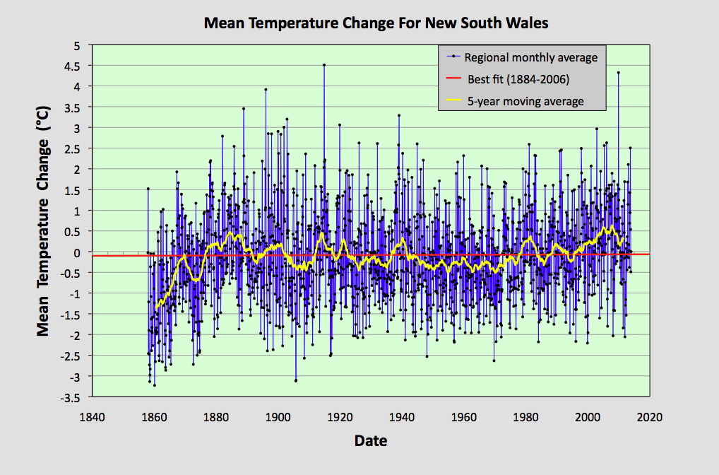
The temperature trend in Fig. 18.3 was determined by calculating the mean of the anomalies of all 33 long stations. These stations are listed on Berkeley Earth here. The procedure for determining the temperature trend in Fig. 18.3 was as follows.
For each station record the monthly reference temperature (MRT) for each month was calculated by finding the mean temperature for that month for the period 1961-1990 (as explained here). These mean values were then subtracted from the raw temperature data to yield the anomaly for each month. The mean deviation was then calculated for the anomaly and any data that was found to lie outside 6 deviations from the mean was labelled an outlier and excluded.
The factor of 6 was chosen because it relates to 6-sigma accuracy (99.9999998%), which is the standard tolerance level used in manufacturing and physics. As there could be up to 3000 data points per record potentially, an accuracy of less than 99.97% (3-sigma) would be highly likely to exclude a valid data point, even if it wasn't a genuine outlier. It would then require at least 4-sigma accuracy to differentiate an outlier and even then there would still be a 20% chance that the point was good.
Once the outliers have been excluded, the MRTs and the anomalies are recalculated. Finally, the mean of the anomalies of all 33 long stations is determined by adding the records and dividing the sum of the anomalies for each month by the number of temperature records for that month. This average trend is shown in Fig. 18.3.
The striking feature of the data in Fig. 18.3 is that there is no overall upward trend. The mean temperature in 2010 is no higher than it was in 1880, as indicated by the 5-year moving average. In between those dates the temperature trend declines by about 0.6 °C until the mid-1950s, and then rises again. The other main feature is the dip in the mean temperature before 1870. How long into the past this downward trend persists is impossible to determine though. The key question though is, what is the overall trend of the data? Are we seeing a rise or fall in temperature?
It may seem that the obvious way to answer this question is to perform a linear regression on all the available data. It is what Berkeley Earth do to their data, but this would be a mistake. The reason is that we do not have data that is randomly distributed around a straight line. There are oscillations in the data that we need to consider as well. The positions where these oscillations or peaks occur will affect the gradient of the best bit. That means our choice of time-frame for the fitting will affect our result as well.
As I pointed out in Post 4 (Fig. 4.7), the best fit to a sine wave is not a horizontal line of zero gradient, even if an integer number of periods are included in the fitting, and despite there always being equal amounts of data equally distributed above and below the x-axis. The key point is that the oscillatory component has to be symmetric about the centre of the fitting range, otherwise the asymmetry of the oscillations will bias the best fit line. For the data in Fig. 18.3 that means the fitting range needs to be from the first peak to the last peak, i.e. from 1884 to 2007. If we do this then we get a best fit trend of 0.07 ± 0.08 °C per century. In other words, there is a 19% probability that the trend is less than zero, and only a 5% probability it is more than +0.2 °C per century. Of course, if the data before 1884 is included, then the trend would be different. In fact it would be 0.23 ± 0.06 °C per century, but the data before 1884 is not a complete cycle.

Either way, the data in Fig. 18.3 bears no relation to that calculated by Berkeley Earth which is shown in Fig. 18.4 and is different is two major respects. Firstly, the Berkeley Earth trend is virtually zero from 1870 until 1960, and secondly it then exhibits a huge rise in temperature of more than 1 °C after 1960. The reason for this discrepancy will become apparent later in this post, but it is mainly to do with our dear old friend, the breakpoint adjustment.
One final point to note is the "noise level" of this averaged regional data. The anomaly data in Fig. 18.3 has a standard deviation of 1.03 °C even though it is an average of data from 33 different datasets, each of which also has a standard deviation of about 1 °C for its anomalies, as was illustrated in the last post. If those datasets were independent we would expect the "noise" or fluctuations in data values about the mean to reduce to about 0.17 °C, yet it doesn't. This shows that averaging data from different stations does not reduce the noise level significantly. This is because, as I pointed out in Post 11, the temperature data between stations is strongly correlated over distances up to at least 500 km, and therefore it is not independent in a statistical sense. It also means that even regional temperature data for entire countries or continents is still very noisy, and is likely to be subject to the same fractal behaviour I have described here and here. I will demonstrate this again in part (iii) below.
ii) The long and medium station records
The data in Fig. 18.3 only includes data from stations with more than 100 years of data. If we also include stations with over 40 years or 480 months of data (which I denote as medium length stations) the results do not change significantly from that illustrated in Fig. 18.3. In this case the MRTs were calculated for the period 1981-2000.
The mean anomaly for all long and medium stations in New South Wales (and Australian Capital Territory) is shown in Fig. 18.5 above. The trend of the best fit line is +0.02 ± 0.08 °C per century for the data between 1884 and 2006. Nevertheless, the data is still very different from that shown in Fig. 18.6 from Berkeley Earth. In fact, if we use the Berkeley Earth adjusted data to construct an equivalent trend we get a very different result.

The data shown in Fig 18.6 above was constructed in exactly the same manner as that described above for the construction of the regional trends in Fig. 18.3 and Fig. 18.5. It was formed simply by averaging the data from all the relevant station datasets. In this case, however, the data was not the raw temperature anomalies from all long and medium stations, but the Berkeley Earth adjusted anomalies from all long and medium stations.
What we find is that simply by adding the Berkeley Earth adjusted anomalies with no additional weighting, we obtain curves that are almost identical to those published by Berkeley Earth and shown in Fig. 18.4. Moreover, the Berkeley Earth adjusted data in virtually horizontal from 1861 until 1960, and then it exhibits a huge rise in temperature of more than 1 °C up to about 2010. The gradient of the trend before 1960 is -0.09 ± 0.11 °C per century (red line in Fig. 18.6), while after 1960 it is +2.2 ± 0.2 °C per century (red line in Fig. 18.7 below).

The data in Fig. 18.7 is just the regional monthly anomaly data in Fig. 18.6 that has been smoothed, either with a 12-month moving average, or a 10-year moving average. This data demonstrates two things. Firstly, because it is virtually identical to the data in Fig. 18.4, it shows that the data in Fig. 18.4 is also effectively just the sum of the adjusted anomalies. This then also demonstrates that the effect of any weighting that Berkeley Earth may have applied to those different stations, to account for differences in the density of stations across the region, is negligible in terms of the overall result, and can therefore be ignored. More importantly, it demonstrates that the differences between the averaged anomaly I have presented in Fig. 18.5 and the Berkeley Earth adjusted data in Fig. 18.6 cannot be due to a lack of appropriate weighting of the individual stations in Fig. 18.5. Therefore, the only place that the difference in the two datasets can come from is in the breakpoint adjustments (and other minor adjustments) which were introduced by Berkeley Earth. The sum total of these adjustments is shown below in Fig. 18.8 together with the best fit for the range 1881-2010.

The effect of the breakpoint adjustments in Fig. 18.8 is two-fold. On the one hand they flatten the data before 1920. On the other, they increase the warming trend after 1940. The net result is that a climate record with large temperature fluctuations but no overall warming trend becomes a "hockey-stick" with a catastrophic warming of over 1 °C since 1960.
iii) Noise and scaling
In the last post I analysed the scaling of the noise for a single temperature record in New South Wales - Newcastle Nobbys Signal Station (Berkeley Earth ID - 152044). This station showed a scaling behaviour with a power law of -0.266. If we repeat that analysis, but for the averaged New South Wales monthly anomaly data in Fig. 18.5, we get the data shown in Fig. 18.9 below.

Here the standard deviation of the averaged data for NSW obeys a power law of the form N -a relative to the size of the smoothing average, N, where a = 0.272 ± 0.005. This is very similar to the values seen for individual temperature records, such as those of New Zealand that were discussed in Post 9 and Post 10, which implies that the averaging of multiple station records does not noticeably affect the overall scaling behaviour.In this case at least 33 station records are averaged. Normally we would expect such averaging to reduce the amplitude of the noise by at least a factor of 6. Yet here there is virtually no reduction in the noise level. This implies that the noise of each temperature record is not independent.
The consistency of this scaling behaviour also allows us to extrapolate in order to predict the value of the standard deviation of temperature records with much longer timeframes or moving averages. For example, from Fig. 18.9 we can infer that a 100-year moving average of the NSW temperature record would still have a standard deviation of 0.15 °C. That means that even over very long timescales there will be fluctuations of up to 0.6 °C in the mean temperature in NSW (to a 95% confidence level).
iv) Final thoughts
I pointed out earlier in this post that the trend I constructed in Fig. 18.5 would be largely dictated by data from the 33 long stations. It is worth noting that for most of these 33 records the temperature trend is very similar to the average shown in Fig. 18.5. Only one record closely resembles the Berkeley Earth trend featured in Fig. 18.4. That station is Sydney - Observatory Hill (Berkeley Earth ID - 151986), which just happens to be bang in the middle of the biggest city in the entire country.
v) Conclusions
1) The average temperatures in New South Wales (NSW) today are no greater than they were in the 1880s, 1920s and 1940s (see Fig. 18.5). This suggests that global warming trends were negligible during the 20th century, at least in NSW.
2) The NSW long-term temperature trend exhibits fluctuations of more than 0.5 °C over timescales of more than 100 years (see Fig. 18.5). So what climate scientists think is anthropogenic is, in reality, possibly (or probably?) just noise.
3) Breakpoint adjustments can completely change the form and shape of the long-term temperature trend (see Fig. 18.7). They are not neutral and they are probably not necessary, particularly if the data from multiple stations is going to be averaged anyway.
4) Breakpoint adjustments can add at least 0.35 °C per century to the long-term temperature trend for NSW (see Fig. 18.8). When combined with the changes to the shape of the trend, their effective contribution can be even greater.
5) The noise present in the NSW regional average data is no less than that seen in data from individual station records (i.e. both have a standard deviation of at least 1 °C) despite the regional average data being the result an averaging process of more than 33 records. This also suggests that the unadjusted monthly temperature fluctuations of most stations are highly correlated, otherwise the averaging process would reduce the noise level.
6) The noise in the NSW regional temperature average scales in a similar way to that seen in data for individual temperature records except that the power law is N -0.27, where N is the size of the sliding window in the moving average (see Fig. 18.9). The index of this power law is similar to the values seen in individual station records which appear to be centred around N -0.25.
7) As the standard deviation for the 60-month smoothed data is 0.35 °C, this means that there is a 50% probability of a temperature rise of more than 0.65 °C occurring over the course of a century in New South Wales purely by random chance, as I explained here. It also implies that chaotic effects are dominant, even over long (i.e. more than 100 years) timescales.
Addendum (21/03/2021)
The trend in Fig. 18.5 above was calculated by averaging the monthly anomalies from all stations in NSW with over 480 months of data. The anomalies were calculated relative to the MRT interval of 1981-2000, and for each station to qualify for inclusion in the average it needed to have at least 12 years of data in the 1981-2000 interval for each of the 12 months of the year.

Fig. 18.10: The number of station records included each month in the mean temperature trend for NSW in Fig. 18.5 when the MRT interval is 1981-2000.
The result is that almost 100 station records are included in the trend between 1970 and 1990 (see Fig. 18.10 above). Even between 1907 and 1957 there are over 50 station records included in the mean trend, and about 20 are included between 1880 and 1907.

Fig. 18.11: Temperature trend for NSW since 1910 according to the Australian Government Bureau of Meteorology (BoM) in 2014.
In Fig. 18.4 I showed the temperature trend for NSW as reported by Berkeley Earth in 2014. It turns out this is very similar to the trend for NSW reported by the Australian Government's Bureau of Meteorology (BoM). The BoM version for 2014 is shown in Fig.18.11 above. It clearly shows that there is a temperature rise (in the 11-year moving average) of about 1.2 °C from 1950 to 2008, and a rise of about 0.7 °C from 1918 to 2008. Yet curiously the picture seven years later is a bit different, as is shown in Fig. 18.12 below.

Fig. 18.12: Temperature trend for NSW since 1910 according to the Australian Government Bureau of Meteorology (BoM) in 2021.
Note how many of the temperatures before 1970 have decreased compared to the equivalent data in Fig. 18.11, some by up to 0.2 °C, while many of those from 1980-2013 have increased, even though the reference period of 1961-1990 remains the same. This is clearly shown in the 11-year moving average where the net result is that the temperature rise from 1950 to 2008 has increased to about 1.35 °C, while the rise from 1918 to 2008 has increased to 0.9 °C. And yet the raw data for these periods haven't changed: only the interpretation and data analysis have.
An excellent and very interesting analysis.
ReplyDelete