Showing posts with label temperature trend. Show all posts

Friday, December 30, 2022

149: Portugal, Spain and France - a comparison

In Post 138 I compared the temperature trends of the Scandinavian countries to see it there were any similarities. There were. In fact there was almost perfect agreement between the 5-year average trends of Norway, Sweden and Finland as far back as 1900 (see Fig. 138.3). As both Norway and Sweden had about twenty sets of station data that went back to 1900 and Finland had about ten, this demonstrated that averaging over a large number of independent data sets eliminates most measurements errors: a consequence of regression towards the mean.

In Post 144 I repeated this procedure for trends from Ireland, Scotland and England and obtained a similar result (see Fig. 144.3), although the trend for England differed slightly from the other two due to its greater urbanization. This demonstrates that neighbouring regions should have similar climates, or at least they should experience similar changes to their climates. So is this also the case for Portugal, Spain and France? I ask this because the results from Post 146 suggest that before 1980 the climate of Spain was cooling while Post 145 suggests that that of Portugal was warming. Well, the results in Fig. 149.1 below show that in fact the temperature trends of Spain and Portugal are very well correlated as far back as 1940, then they diverge. France, on the other hand, is only very weakly correlated to both Spain and Portugal.


Fig. 149.1: A comparison of the 5-year average temperature trends since 1800 for Portugal (green), Spain (red) and France (blue). The two upper trends are offset by +2°C for clarity and the bottom two trends are offset by -2°C.


This discrepancy can be explained in part by the number of stations contributing to the mean temperature anomaly (MTA) of each country per month (see Fig. 149.2 below). Before 1940 there are only two stations contributing to the Portugal MTA, which is probably why it diverges from the Spain MTA which consistently has over ten contributing stations. However, this cannot fully explain the poor correlation of the French data to that of either Spain or Portugal, even though France also has a low number of stations before 1940. The issue here is that the France MTA has a high number of contributing stations after 1960, as do Spain and Portugal, and yet its correlation to both of their MTAs is still poor after 1960. That said, its overall trend since 1860 does follow that of Portugal quite closely.


Fig. 149.2: The number of station records included each month in the averaging for the mean temperature trends of each country in Fig. 149.1.


It should be remembered, though, that the MTAs of both Portugal and France before 1940 are strongly dependent on only two or three sets of station data, and in both cases most of these stations are located in the biggest cities: Paris, Marseille, Lisbon and Porto. These four stations also all appear to exhibit severe continuous warming since 1900 consistent with the effect of urban heat islands. In which case the similarity between the MTA trends of Portugal and France before 1940 may simply be a consequence of parallel economic development in their largest cities.

Instead these comparisons suggest that France may actually have a completely different climate to the Iberian Peninsula even though it is its closest neighbour. The reason for this may be down to geography and the influence of the Pyrenees mountain range at the border that effectively insulates one region from the other.


Tuesday, December 13, 2022

144: Evidence against temperature adjustments #4 (British Isles)

In the previous four posts I examined the temperature changes for Ireland (see Post 140), Scotland (see Post 142), England (see Post 143) and Great Britain (see Post 141). While all four sets of temperature data appeared similar from 1900 onwards, there were some differences, and these differences were most apparent in a comparison of the earlier data for Ireland and Great Britain. When the Great Britain data was separated into different trends for Scotland and England a similar degree of difference was observed with the Scotland data appearing to correlate more closely with Ireland, and England with Great Britain. In this post I will look to show this pictorially by comparing the various trends directly.

First, if we compare the data for Ireland, Scotland and England with Great Britain we see that England shows the closest agreement after 1900 but Scotland shows the better agreement before 1840 (see Fig. 144.1 below). The data depicted here are the 5-year moving averages of the mean temperature anomalies (MTAs) for each country as shown by the yellow curves in Fig. 140.2, Fig. 141.2, Fig. 142.2 and Fig. 143.2 in previous posts.


Fig. 144.1: The 5-year average temperature trends since 1760 for Ireland, Scotland and England each compared to that of Great Britain. For clarity the trends for Ireland and England are offset by +2°C and -1.5°C respectively.


What is striking about the trends in Fig. 144.1 is how similar they all are after 1860, while the greatest disparities occur before 1860. The reason for this is evident from Fig. 144.2 below which shows that the number of stations used to calculate each of the MTA for Ireland, Scotland and England drops below five before 1870. From this we can conclude two things. First, this suggests that if there are too few stations used in determining the MTA the accuracy decreases. Secondly we see that when there are sufficient stations used to determine the MTA the accuracy is so good that there is little difference between the MTA for different neighbouring countries. 

This is not the first time such conclusions have been drawn. The same effects were seen in Post 138 (Evidence against temperature adjustments #3) comparing trends in the different Scandinavian countries and Post 57 (The case against temperature data adjustments #1) comparing them in various central European countries. In all cases the conclusion is the same. If trends for neighbouring countries agree, then they are likely to all be correct, not all equally incorrect. Therefore no adjustments to the temperature data are needed or justified. A similar result is also encountered when comparing random samples of stations from the same region as was shown for the USA in Post 67 (More evidence against temperature data adjustments #2). The reason for this is that averaging a sufficiently large number of independent data sets results in a reduction in the size of the errors imported from each. This is known as regression towards the mean.


Fig. 144.2: The number of station records included each month in the averaging for the mean temperature trends in Fig. 144.1.


The second comparison I have performed is to compare data for Ireland, Scotland and England with each other. This is shown in Fig. 144.3 below. Now we see that the two countries that agree most closely are Scotland and Ireland while the data for England appears to exhibit more warming after 1980 and before 1900. This additional warming could be in excess of 0.5°C since 1840.


Fig. 144.3: Comparisons of the 5-year average temperature trends since 1760 for England and Scotland (two top curves, both offset by +2°C), Scotland and Ireland (two middle curves), and Ireland and England (two bottom curves, both offset by -2°C).


Conclusions

Once again a comparison of temperature data for neighbouring countries indicates that most adjustments to the data are unnecessary as the averaging process will correct for most errors via regression towards the mean.

The data for Scotland and Ireland are in closest agreement, probably because both have similar population densities and are more rural.

The data for England is in closest agreement with that of Great Britain, probably because England is the largest country in Great Britain and so its stations will always make the dominant contribution compared to other countries such as Scotland or Wales. 

The greater warming seen in England (of over 0.5°C) is further evidence that warming within countries is driven not just by carbon dioxide levels in the atmosphere and the greenhouse effect, but by local energy consumption as well. So net-zero will not be a panacea.


Saturday, September 24, 2022

138: Evidence against temperature adjustments #3 (Scandinavia)

One of the main aims of this blog has been to investigate the extent to which the various datasets in the global temperature record have been adjusted and to ascertain both the impact of these adjustments and their validity. Most of the blog posts for individual countries or territories have sought to quantify the magnitude of these adjustments by calculating two versions of the mean temperature anomaly (MTA) for each region; one based on its raw unadjusted data and a second using Berkeley Earth adjusted data. Then the two are compared and the difference calculated. This difference is often considerable and often shows that the adjustments have increased the amount of reported warming. But I have also investigated the second issue, that of validity. One way to do this is to compare the MTA for neighbouring regions or different data samples from the same region. 

The rationale is as follows. If there are errors in the data that are sufficient to affect the MTA, then comparing MTAs from different samples from the same region, or samples from adjacent regions that would be expected to be almost identical, could highlight the errors. Of course any difference between MTAs from different regions does not prove that the data is wrong; it may be that the regions aren't as similar as one supposed. But if the data is virtually identical then that does suggest both that the temperature trends for the two samples or regions are behaving the same, and that any data errors in the temperature datasets (which are likely to be numerous) are not significant and so are not in need of correction or adjustment.

In Post 57 I used this approach to compare the temperature trends of neighbouring countries in central Europe (Germany, Czechoslovakia, Austria and Hungary). The results showed that if the MTA for a country was determined using data from more than about fifteen different station records then there was little difference between MTAs for different countries, and thus very little error in the MTA of each country. This is because of a property of statistics called regression towards the mean. This basically states that if any dataset contains errors in its measurements (which most data does), and those errors are random in their size and distribution (which they often are), then the errors will tend to cancel each other when you average the data. Moreover, the more data you average, the greater the cancellation of errors and so the more accurate will be the result. If errors don't cancel, then that is because the errors are systematic not random, so the process also helps to identify these as well.

In Post 67 I repeated this process for temperature data from the USA. In this case instead of comparing data from adjacent regions I compared different samples of one hundred stations from the same region: the entire contiguous United States. The result was the same as in Post 57 with each sample exhibiting an identical temperature trend over time with identical fluctuations in the 5-year moving average of the trend.

In this post I will repeat the country comparison of Post 57 but using the 5-year moving average of the temperature trend data from the four neighbouring Scandinavian countries of Norway, Sweden, Finland and Denmark. These trends were determined in Post 135, Post 136, Post 137 and Post 48 respectively. The results are shown in Fig. 139.1 below.


Fig. 138.1: A comparison of the 5-year average temperature trends since 1700 for Norway, Finland and Denmark compared to that of Sweden. The trends for Finland and Norway are offset by ±3°C for clarity.


In Fig. 139.1 I have compared the trends of Norway, Finland and Denmark with that of Sweden. The reasons for choosing Sweden as the comparator were both geographic and practical. It sits between the other three countries and so is a near neighbour for each (Finland and Denmark are not near neighbours so would not be good comparators). But it also has the most stations of the four countries and so should have the most reliable trend.

The data in Fig. 139.1 clearly shows that the trends for all four countries are very similar after 1900 but diverge as one looks further back in time towards 1800. The reason for this is the reduction in station numbers seen in each country as one moves back in time from 1950 (see Fig. 138.2 below). Given that it seems that somewhere between ten and thirty stations are needed in the MTA average in order for the errors to be minimized, we can see from Fig. 138.2 that this condition is satisfied for all four countries after 1890. That is why the MTAs diverge before 1890 but are very similar after that date.


Fig. 138.2: The number of station records included each month in the averaging for the mean temperature trends in Fig. 138.1.


If we just consider the data after 1850 we see that the agreement between trends for the different countries is remarkably good after 1890 (see Fig. 138.3 below). The agreement between Norway and Sweden, and Finland and Sweden are both particularly good to the point of their three trends being almost identical. There is also excellent agreement between Denmark's trend and that of Sweden after 1980 but less so before. This is probably the result of Denmark not only having much fewer stations than the other three countries, but also having fewer than ten stations before 1975.


Fig. 138.3: A comparison of the 5-year average temperature trends since 1850 for Norway, Finland and Denmark compared to that of Sweden. The trends for Finland and Norway are offset by ±3°C for clarity.


Summary

The data in Fig. 138.3 once again demonstrates the futility of temperature adjustments. The fact that the mean temperature anomalies (MTAs) of Norway, Sweden and Finland agree so well for over 120 years from 1890 onwards without data adjustments indicates that the averaging process alone can eliminate most errors.

The Denmark data also adds weight to the conjecture that between ten and thirty stations are needed in the average in order to eliminate most of the data errors. As the error size decreases with the square root of the sample size, an average of 25 datasets should decrease the error size by 80% (reducing each error to a fifth of its nominal value). 

Comparing the data of these four countries in this way also gives us more confidence in the determining the true nature of the regional temperature trend. All the data after 1900 pretty much agree so we can conclude that temperatures from 1900 to 1980 rose marginally by less than 0.3°C and then jumped by about 1°C in the 1980s. But this jump is still only comparable to the size of the fluctuations in the 5-year average.

From 1850 to 1900 both Denmark and Norway diverge from Sweden slightly but in different directions. But this is based on a comparison of only one or two stations in each case and so is not unexpected.


Saturday, July 30, 2022

124: Arctic temperature trends - a comparison

In the previous five posts I examined the temperature changes for five different territories in the Arctic region (Greenland, Iceland, the Faroe Islands, Jan Mayen and Svalbard). All appeared to exhibit similar trends with a peak in temperatures in the 1930s followed by a dip, and then another rise after 1980. In this post I will compare and examine these five trends in more detail.

In Post 11 I demonstrated how the correlation between temperature trends from different stations depends on their separation: the further apart they are, the less well correlated they are. In fact if the distance between them exceeds 1500 km their correlation becomes very weak. On that basis we would not expect any great correlation between the the Faroes and Svalbard as they are over 2,000 km apart. In contrast, Greenland, the Faroes and Jan Mayen are all less than 600 km from Iceland, so the correlations of their temperature data with that from Iceland should be must stronger. The trends in Fig. 124.1 below attempts to do just that, compare the trends of Greenland, the Faroes and Jan Mayen with that of Iceland. For clarity the trends of Greenland and the Faroes are offset vertically by -3°C and +3°C respectively, as are their Icelandic comparator curves.


Fig. 124.1: The 5-year moving average temperature trends for Greenland, Jan Mayen and the Faroe Islands all compared against the equivalent trend for Iceland.


The data in Fig. 124.1 can be summarized as follows.

The trends of Greenland, Jan Mayen and the Faroe Islands all appear to follow the same broad pattern. Temperatures peak in the 1930s, then decline by about 2°C by the 1980s before peaking again after 2000. Only in Jan Mayen is the peak after 2000 higher (by about 0.5°C) than the one in the 1930s.

The trend from the Faroe Islands is most closely correlated with that of Iceland. Not only is the broad trend the same, but the smaller peaks and troughs also align well.

The smaller peaks for Greenland are not closely correlated with those of Iceland or the other two regions. This may be because the mean temperature anomaly (MTA) for Greenland is the result of averaging anomalies from stations over a much larger area than is the case for Iceland, Jan Mayen and the Faroe Islands. So some of the fine detail may be lost by the averaging of stations that are themselves not well correlated.

Jan Mayen shows better correlation with Iceland but its peaks and troughs are larger in size. This may be the result of it having a more extreme climate (due to being inside the Arctic Circle) where the temperature anomalies are naturally larger.


Fig. 124.2: The 5-year moving average temperature trends for Greenland, Iceland and Svalbard all compared against the equivalent trend for Jan Mayen.


If we repeat the process used for Fig. 124.1 but instead use the temperature trend of Jan Mayen as the reference comparator, then we get the trends shown in Fig. 124.2 above.

What we see from Fig. 124.2 is similar to what we saw in Fig. 124.1 with temperatures peaking in the 1930s, then declining by about 2°C by the 1980s before peaking again after 2000.

Once again the smaller peaks for the trend of Greenland are not closely correlated with those of the comparator (in this case Jan Mayen), and the reason is probably the same.

This time, though, the greatest correlation of the smaller peaks and troughs in each trend line is between those for Jan Mayen and Svalbard. This is perhaps not a surprise given that they are near(-ish) neighbours and both are well inside the Arctic Circle.


Summary and conclusions

The general long-term temperature trends of Greenland, Iceland, Jan Mayen and the Faroe Islands are well correlated over timescales of more than 20 years. This suggests that there is no need to adjust the temperature data because the data is correct.

Correlations on shorter timescales (5-10 years) are generally weaker. The two notable exceptions are firstly Jan Mayen and Svalbard, and secondly Iceland and the Faroe Islands.


Wednesday, June 29, 2022

117: Cameroon - temperature trends STABLE before 1990

Like Chad (see Post 15) and the Central African Republic (see Post 116), Cameroon has no significant temperature data before 1950. However, the change in its climate is more reminiscent of that of West Africa (see Post 114). Before 1990 the climate is stable; thereafter the mean temperature appears to increase by about 0.5°C (see Fig. 117.1 below). This is a modest temperature rise and much less than the often quoted IPCC global value.


Fig. 117.1: The mean temperature change for Cameroon since 1940 relative to the 1951-1980 monthly averages. The best fit is applied to the monthly mean data from 1956 to 1990 and has a slight negative gradient of -0.02 ± 0.20 °C per century.


In order to quantify the changes to the climate of Cameroon since 1940 the temperature anomalies for the fifteen stations with the most data (i.e. over 300 months of data) were determined and averaged. This was done using the usual method as outlined in Post 47 and involved first calculating the temperature anomaly each month for each station, and then averaging those anomalies to determine the mean temperature anomaly (MTA) for the country. This MTA is shown as a time series in Fig. 117.1 above and clearly shows that temperatures declined continuously from 1940.

The process of determining the MTA in Fig. 117.1 involved first determining the monthly reference temperatures (MRTs) for each station using a set reference period, in this case from 1951 to 1980, and then subtracting the MRTs from the raw temperature data to deliver the anomalies. If a station had at least twelve valid temperatures per month within the MRT interval then its anomalies were included in the calculation of the mean temperature anomaly (MTA). The total number of stations included in the MTA in Fig. 117.1 each month is indicated in Fig. 117.2 below. The peak in the frequency between 1950 and 1990 suggests that the 1951-1980 interval was probably the most appropriate to use for the MRTs.


Fig. 117.2: The number of station records included each month in the mean temperature anomaly (MTA) trend for Cameroon in Fig. 117.1.


The locations of the sixteen stations whose data was used to determine the MTA in Fig. 117.1 are shown in the map in Fig. 117.3 below. Eight are medium stations with over 480 months of data, but only one station has over 800 months of data before 2014, and only two have any data before 1950 (see here for a full list). In addition, there are another eight stations with over 300 months of data. According to the map below the geographical spread of stations is fairly uniform, in which case the simple average of the anomalies from all stations used to construct the MTA in Fig. 117.1 should yield a fairly accurate temperature trend for the country as a whole.


Fig. 117.3: The (approximate) locations of the sixteen longest weather station records in Cameroon. Those stations with a high warming trend between 1911 and 2010 are marked in red while those with a cooling or stable trend are marked in blue. Those denoted with squares are medium stations with over 480 months of data, while diamonds denote stations with more than 300 months of data.


The MTA in Fig. 117.1 shows the temperature change over the time period where the data is most numerous and therefore reliable. There are, however, two stations with data before 1940. These are in the two main cities of Douala and Yaoundé. The fact that in both cases the data is discontinuous with large gaps in the data between 1900 and 1940, and both stations are located in large urban areas, would suggest the data for both is not representative of the country as a whole. If we do include this earlier data we get the extended MTA shown in Fig. 117.4 below. This appears to imply an additional warming of 1.3°C occurred before 1940 when increases in carbon dioxide levels were small which also raises questions about the quality of the data. For these reasons I would tend to discount all the MTA data before 1950.


Fig. 117.4: The mean temperature change for Cameroon since 1880 relative to the 1951-1980 monthly averages. The best fit is applied to the monthly mean data from 1956 to 1990 and has a slight negative gradient of -0.02 ± 0.20 °C per century.


If we next consider the change in temperature based on Berkeley Earth (BE) adjusted data we get the MTA data in Fig. 117.5 below. This again was determined by averaging each monthly anomaly from the sixteen longest stations and suggests that the climate was fairly stable from 1940 until 1980 but then warmed by about 0.7°C thereafter.


Fig. 117.5: Temperature trends for Cameroon based on Berkeley Earth adjusted data. The best fit linear trend line (in red) is for the period 1952-2011 and has a positive gradient of +1.46 ± 0.05°C/century.


Comparing the curves in Fig. 117.5 with the published Berkeley Earth (BE) version for Cameroon in Fig. 117.6 below shows that there is good agreement between the two sets of data. This indicates that the simple averaging of anomalies used to generate the BE MTA in Fig. 117.5 is as effective and accurate as the more complex gridding method used by Berkeley Earth in Fig. 117.6. In which case simple averaging should be just as effective and accurate in generating the MTA using raw unadjusted data in Fig. 117.1. How Berkeley Earth managed to determine the temperature change in Cameroon between 1900 and 1950 in Fig. 17.6 when there is virtually no data for this period is a point of debate.


Fig. 117.6: The temperature trend for Cameroon since 1840 according to Berkeley Earth.


The differences between the MTA in Fig. 117.4 and the BE versions using adjusted data in Fig. 117.5  are instead mainly due to the data processing procedures used by Berkeley Earth. These include homogenization, gridding, Kriging and most significantly breakpoint adjustments. These lead to changes to the original temperature data, the magnitude of these adjustments being the difference in the MTA values seen in Fig. 117.4 and Fig. 117.5. The magnitudes of these adjustments are shown graphically in Fig. 117.7 below. The blue curve is the difference in MTA values between adjusted (Fig. 117.5) and unadjusted data (Fig. 117.4), while the orange curve is the contribution to those adjustments arising solely from breakpoint adjustments. Neither are larger than about 0.2°C.


Fig. 117.7: The contribution of Berkeley Earth (BE) adjustments to the anomaly data in Fig. 117.5 after smoothing with a 12-month moving average. The blue curve represents the total BE adjustments including those from homogenization. The linear best fit (red line) to these adjustments for the period 1952-2011 has a positive gradient of +0.41 ± 0.03 °C per century. The orange curve shows the contribution just from breakpoint adjustments.


Summary

According to the raw unadjusted temperature data, the climate of Cameroon was stable until 1990 and then warmed by between 0.3°C and 0.6°C (see Fig. 117.1).

Over the same period adjusted temperature data from Berkeley Earth appears to show that the climate of Cameroon has warmed by about 0.8°C (see Fig. 117.5).


Acronyms

BE = Berkeley Earth.

MRT = monthly reference temperature (see Post 47).

MTA = mean temperature anomaly.

Link to list of all stations in Cameroon and their raw data files.


Sunday, June 26, 2022

116: Central African Republic (CAR) - temperature trends COOLING

There are thirteen medium stations with over 480 months of data in the Central African Republic (CAR), but only one station has over 800 months of data before 2014, and none have any data before 1940 (see here for a full list). In addition, there are another two stations with over 300 months of data.

The neighbouring countries of Chad, Cameroon, Congo and the DRC (formerly Zaire) have virtually no data before 1940 either. Only Sudan has significant data pre-1940. This means it is not possible to know the true temperature trend of CAR before 1940. What the data that we do have tells us is that the climate of the Central African Republic cooled by over 0.5°C from 1950 onwards (see Fig. 116.1 below).


Fig. 116.1: The mean temperature change for the Central African Republic relative to the 1961-1990 monthly averages. The best fit is applied to the monthly mean data from 1941 to 2005 and has a negative gradient of -0.50 ± 0.11 °C per century.


In order to quantify the changes to the climate of the CAR since 1940 the temperature anomalies for each of the fifteen stations with the most data were determined and averaged. This was done using the usual method as outlined in Post 47 and involved first calculating the temperature anomaly each month for each station, and then averaging those anomalies to determine the mean temperature anomaly (MTA) for the country. This MTA is shown as a time series in Fig. 116.1 above and clearly shows that temperatures declined continuously from 1940.

The process of determining the MTA in Fig. 116.1 involved first determining the monthly reference temperatures (MRTs) for each station using a set reference period, in this case from 1961 to 1990, and then subtracting the MRTs from the raw temperature data to deliver the anomalies. If a station had at least twelve valid temperatures per month within the MRT interval then its anomalies were included in the calculation of the mean temperature anomaly (MTA). The total number of stations included in the MTA in Fig. 116.1 each month is indicated in Fig. 116.2 below. The peak in the frequency between 1960 and 1990 suggests that the 1961-1990 interval was indeed the most appropriate to use for the MRTs.


Fig. 116.2: The number of station records included each month in the mean temperature anomaly (MTA) trend for the Central African Republic in Fig. 116.1.


The locations of the fifteen stations with the most temperature data are shown in the map in Fig. 116.3 below. This appears to show that the geographical spread is fairly uniform, although there does appear to be more stations in the south of the country than in the north. This variation in station density is probably not sufficient to significantly distort the average in Fig. 116.1 from its true value though. In which case the simple average of the anomalies from all stations used to construct the MTA in Fig. 116.1 should still yield a fairly accurate temperature trend for the country as a whole.


Fig. 116.3: The (approximate) locations of the fifteen longest weather station records in the Central African Republic. Those stations with a high warming trend between 1911 and 2010 are marked in red while those with a cooling or stable trend are marked in blue. Those denoted with squares are medium stations with over 480 months of data, while diamonds denote stations with more than 250 months of data.


If we next consider the change in temperature based on Berkeley Earth (BE) adjusted data we get the MTA data in Fig. 116.4 below. This again was determined by averaging each monthly anomaly from the fifteen longest stations and suggests that the climate was fairly stable before 1980 but then warmed by about 0.75°C thereafter.


Fig. 116.4: Temperature trends for the Central African Republic based on Berkeley Earth adjusted data. The best fit linear trend line (in red) is for the period 1941-2010 and has a positive gradient of +0.83 ± 0.08°C/century.


If we next compare the curves in Fig. 116.4 with the published Berkeley Earth (BE) version for the CAR in Fig. 116.5 below we see that there is good agreement between the two sets of data after 1940. This indicates that the simple averaging of anomalies used to generate the BE MTA in Fig. 116.4 is as effective and accurate as the more complex gridding method used by Berkeley Earth in Fig. 116.5. In which case simple averaging should be just as effective and accurate in generating the MTA using raw unadjusted data in Fig. 116.1. What is more difficult to explain is how Berkeley Earth have determined the climate for the CAR as far back as 1880 when there is virtually no reliable temperature data for the country before 1940.


Fig. 116.5: The temperature trend for the Central African Republic since 1850 according to Berkeley Earth.


The differences between the MTA in Fig. 116.1 and the BE version using adjusted data in Fig. 116.4  are probably due to the data processing procedures used by Berkeley Earth. These include homogenization, gridding, Kriging and most significantly breakpoint adjustments. These lead to changes to the original temperature data, the magnitude of these adjustments being the difference in the MTA values seen in Fig. 116.1 and Fig. 116.4. The magnitudes of these adjustments are shown graphically in Fig. 116.6 below. The blue curve is the difference in MTA values between adjusted (Fig. 116.4) and unadjusted data (Fig. 116.1), while the orange curve is the contribution to those adjustments arising solely from breakpoint adjustments. Both are considerable with the former leading to an additional warming since 1940 of up to 1.5°C.


Fig. 116.6: The contribution of Berkeley Earth (BE) adjustments to the anomaly data in Fig. 116.4 after smoothing with a 12-month moving average. The blue curve represents the total BE adjustments including those from homogenization. The linear best fit (red line) to these adjustments for the period 1941-2010 has a positive gradient of +1.32 ± 0.03 °C per century. The orange curve shows the contribution just from breakpoint adjustments.


Summary

According to the raw unadjusted temperature data, the climate of the CAR has cooled from 1940 by about 0.5°C (see Fig. 116.1).

Over the same period adjusted temperature data from Berkeley Earth appears to show that the climate of the CAR has warmed by over 0.5°C (see Fig. 116.5).


Acronyms

BE = Berkeley Earth.

MRT = monthly reference temperature (see Post 47).

MTA = mean temperature anomaly.

Link to list of all stations in the Central African Republic and their raw data files.


Thursday, March 24, 2022

100. List of completed temperature analyses by country


As this is my 100th post on this blog I thought it would be a good moment to summarize the results that have emerged from the temperature data I have analysed so far. Below is a list of all the countries and regions that I have investigated to date with links to the relevant post. This amounts to about 60 countries, states and territories in total, which is roughly one third of all the countries in the world. 

The main areas that so far remain to be studied are the Arctic, Canada, Russia, UK, Scandinavia, Mediterranean, North Africa, Middle East, China and Japan. In the Southern Hemisphere only Brazil, Venezuela, Guyana, Suriname, French Guiana and the South Atlantic remain. However, most of these Southern Hemisphere regions are already included in the analysis of South America in Post 35.


Europe

Europe has the longest temperature records available with several in Germany, Sweden and the Netherlands stretching back to the early 18th century. The average of the 109 longest records yields a mean temperature anomaly (MTA) that shows a small but continuous warming of about 0.1°C per century for over 200 years until 1988. Then the temperature jumps suddenly by over 1°C. The reason for this jump is unclear. It is certainly not related directly to carbon dioxide emissions. The only countries that appear to have strong warming trends are the Benelux countries, Denmark and Switzerland. The Baltic states and most of central Europe appear to cool before 1980 and then warm suddenly.

109 longest station records (Post 44)

Austria (Post 55)

Baltic States (Post 51)

Belgium and Luxembourg (Post 40)

Central Europe average (Post 57)

Czechoslovakia (Post 53)

Denmark (Post 48)

Germany (Post 49)

Hungary (Post 54)

Netherlands (Post 41)

Poland (Post 50)

Switzerland (Post 56)


USA

The USA may not have any temperature records that are as long as the longest that Europe can boast, but its temperature data from 1850 onwards is the best there is. Virtually every state has over 100 station records with over 50 years of data and over 50 records with over 100 years of data. An average of the 400 longest temperature records appears to indicate that the climate warmed by more than 2°C from 1780 to 1920 when carbon dioxide levels barely increased, and then cooled by over 0.5°C when carbon dioxide levels took off. The early warming cannot therefore be due to CO2 and is therefore generally attributed to urbanization and deforestation in the north and east. The cooling seen after 1920 is also seen in most southern states like Louisiana, Mississippi and Texas.

400 longest station records (Post 66)

Louisiana (Post 97)

Mississippi (Post 99)

Texas (Post 52)


Central America

The temperature data for Central America can basically be split between Mexico and the rest, however, even then there are more than four times as many stations in Mexico as there are in the rest of Central America. The picture in Mexico is also complicated by the stations there falling into two distinct types from two different sources. On balance it is likely that the overall climate was stable until 1980 and then warmed over the following twenty years by about 1°C.

Mexico (Post 93)

Rest of Central America (Post 94)


South America

Of the countries in South America studied so far, only Argentina (0.6°C), Ecuador (1°C) and Uruguay (1°C) show significant warming, although the Ecuador data is far from reliable. In Paraguay and Chile the climate has cooled while in most other countries it has remained stable. The average of all medium and long stations in South America yields a warming of about 0.5°C since 1900.

All long and medium stations (Post 35)

Argentina (Post 61)

Bolivia (Post 58)

Chile (Post 62)

Colombia (Post 95)

Ecuador (Post 96)

Paraguay (Post 59)

Peru (Post 63)

Uruguay (Post 60)


Asia

My analysis so far of temperatures in Asia has focused on the countries of Indochina and the Indian subcontinent. The overall temperature trend for Indochina is one of cooling before 1980 and warming thereafter. The result is that temperatures in 2010 are barely any higher than they were in 1890. This is also reflected in the individual temperature records of Burma, Malaysia and Vietnam, while those of the Philippines and Thailand remain stable from 1920 onwards. In India and Pakistan there is little warming before 1990 and then a sudden jump in temperatures of about 0.5°C in the mid-1990s. For Sri Lanka the jump in temperature occurs in 1978 while Bangladesh sees a continuous warming of only 0.3°C per century. 

Bangladesh (Post 74)

Burma/Myanmar (Post 69)

India including Nepal (Post 71)

Indian subcontinent (Post 75)

Indochina (Post 70)

Malaysia and Singapore (Post 69)

Pakistan (Post 72)

Philippines (Post 69)

Sri Lanka (Post 73)

Thailand (Post 69)

Vietnam (Post 69)


Africa

Most of southern Africa has exhibited some significant warming of over 1°C since 1980 but the overall picture before 1980 is varied. Angola, Mozambique and South Africa show no warming before 1980 while Malawi, Zambia, Zimbabwe and Madagascar all cool significantly by as much as they later warm. The data for Namibia and Botswana is not great but may indicate a slight warming before 1980 as well as much larger warming thereafter. Of all the countries listed below, Madagascar, Mozambique, South Africa and Zimbabwe have the best quality data and none of these countries appear to exhibit any warming before 1980.

Angola (Post 82)

Botswana (Post 38)

Madagascar (Post 77)

Mozambique (Post 78)

Namibia (Post 39)

South Africa including Lesotho and Eswatini/Swaziland (Post 37)

Zambia and Malawi (Post 81)

Zimbabwe (Post 79)


Australia

Analysis of temperature data for Australia indicates that the mean temperature trend is parabolic with the climate cooling from 1875 to 1960 and then warming. Overall temperatures in 2010 are only about 0.1-0.2°C warmer than in 1875 with temperatures having increased by about 0.5°C since 1960. This pattern in seen in most states such as South Australia, New South Wales and Victoria. It is harder to be conclusive for Tasmania and Western Australia due to a lack of data before 1900 while the trend in Northern Territory is one of consistent cooling. Only Queensland shows constant warming of about 1°C since 1990.

Australia (Post 26)

New South Wales and ACT (Post 18)

Northern Territory (Post 23)

Queensland (Post 24)

South Australia (Post 21)

Tasmania (Post 20)

Victoria (Post 19)

Western Australia (Post 22)


Oceania

Most of the countries and regions of Oceania show little of no warming. In Antarctica the only warming is found around the peninsula. New Zealand cools slightly from 1860 until 1960 then warms by about 0.5°C, rather like much of Australia. Yet despite this, temperatures in 2010 are barely above those in 1860. In Indonesia only the capital city Jakarta shows any strong warming but the average temperature for the country remains stable, although data quality and quantity before 1960 is poor. This is also true for Papua New Guinea where there is some evidence of warming after 1960 by about 0.5°C. In the South Pacific there is a contrast between east and west with the eastern half cooling significantly while the west cools slightly until 1970 before warming again by about 0.5°C. In fact of all the regions listed below, only the Indian Ocean shows significant warming of about 1°C.

Antarctica (Post 30)

Indian Ocean (Post 76)

Indonesia (Post 31)

New Zealand (Post 8)

Papua New Guinea (Post 32)

South Pacific Islands - East (Post 34)

South Pacific Islands - West (Post 33)


Southern Hemisphere

An average of the temperature anomalies from the 1000 longest records in the Southern Hemisphere shows a slight cooling of about 0.1°C until 1975 followed by a modest warming of only about 0.6°C.

Southern Hemisphere station average (Post 64)


Monday, December 6, 2021

84. Southern Africa - a summary of temperature trends

Over the last fifteen months I have analysed the temperature data for nine different countries in southern Africa and calculated their temperature trends. My analysis began in September 2020 with South Africa (Post 37) before continuing on to Botswana (Post 38) and Namibia (Post 39) in October. More recently I have examined the temperature records of Madagascar (Post 77), Mozambique (Post 78), Zimbabwe (Post 79), Zambia and Malawi (Post 81), and Angola (Post 82).

The one constant for all these countries is the temperature trend since 1980. In almost all cases the climate shows evidence of warming, with the temperature rise varying between 0.5°C and 1.5°C. Before 1980 the picture is different with little or no temperature rise being seen, and in many cases (e.g. Madagascar, Zimbabwe, Zambia and Malawi) a significant cooling taking place. These results are summarized in the graphs below.

The main conclusions to be drawn here are as follows.

  • All the warming in southern Africa has occurred since 1980.
  • There is probably no warming before 1980, and possibly some cooling.
  • The net warming since 1850 is likely to be between 0.5°C and 1.0°C. This is less than the IPCC global value of 1.3°C, and much less than the land-based Berkeley Earth average of almost 2.0°C (see Fig. 80.1 in Post 80).

In the New Year I will return to the African data and analyse the data from countries in sub-Saharan and equitorial countries. In the meantime I will return to considering the physics of the Greenhouse Effect that I introduced in Post 12 (black-body radiation) and Post 13 (Earth's energy budget). In particular I will look to answer two questions: why is Venus so hot, and why is Mars so cold?


Fig. 37.2: The mean temperature anomaly (MTA) for South Africa since 1840. The best fit is applied to the interval 1857-1976 and has a gradient of +0.017 ± 0.056 °C per century. The monthly temperature changes are relative to the 1961-1990 monthly averages.


Fig. 38.3: The mean temperature anomaly (MTA) for Botswana since 1917. The best fit is applied to the interval 1917-1976 and has a positive gradient of +0.72 ± 0.26 °C per century. The monthly temperature changes are defined relative to the 1961-1990 monthly averages.


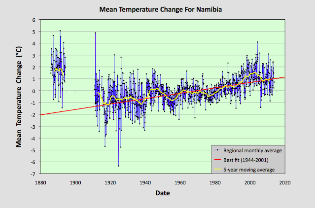
Fig. 39.8: The mean temperature anomaly (MTA) for Namibia since 1885. The best fit is applied to the interval 1944-2001 and has a positive gradient of +2.28 ± 0.17 °C per century. The monthly temperature changes are defined relative to the 1971-1990 monthly averages.


Fig. 77.6: The mean temperature anomaly (MTA) for Madagascar. The best fit is applied to the monthly mean data from 1932 to 2011 and has a negative gradient of -0.15 ± 0.07 °C per century.


Fig. 78.6: The mean temperature anomaly (MTA) relative to the 1931-1960 monthly averages for stations in Mozambique with over 300 months of data but excluding Lourenço Marques. The best fit is applied to the monthly mean data from 1921 to 1980 and has a positive gradient of +0.16 ± 0.12 °C per century.


Fig. 79.2: The mean temperature anomaly (MTA) for Zimbabwe relative to the 1971-2000 monthly averages based on an average of anomalies from stations with over 360 months of data. The best fit is applied to the monthly mean data from 1916 to 1975 and has a negative gradient of -0.96 ± 0.20 °C per century.


Fig. 81.2: The mean temperature anomaly (MTA) relative to the 1951-1980 monthly averages based on an average of anomalies from stations with over 360 months of data. The best fit is applied to the monthly mean data from 1921 to 1975 and has a negative gradient of -2.72 ± 0.17 °C per century.


Fig. 82.5: The mean temperature anomaly (MTA) for Angola relative to the 1951-1980 monthly averages based on an average of anomalies from stations with over 300 months of data. The best fit is applied to the monthly mean data from 1941 to 1980 and has a positive gradient of 0.18 ± 0.17 °C per century.


Friday, August 20, 2021

75. Southern Asia - overall temperature trend STABLE to 1975

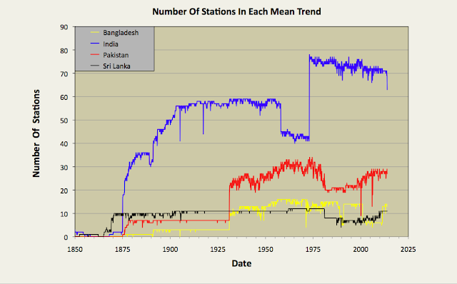
In my previous four blog posts I determined the temperature trends for India, Pakistan, Sri Lanka and Bangladesh using unadjusted temperature data. The number of stations used to calculate the mean temperature each month is shown in Fig. 75.1 below. In the first three cases no warming was detectable before 1975, and only a modest temperature increase of about 0.6°C thereafter. In the case of Bangladesh there was a continuous warming that amounted to less than 0.3°C. This is significantly different from the conventional narrative on global warming, and highlights the impact that temperature adjustments have on the warming trends published by most of the main climate groups. In almost all cases the affect of these adjustments is to increase the rate of warming in the final trend as most of the regional trends I have published on this blog have also illustrated. In this post I will combine the results for India, Pakistan, Sri Lanka and Bangladesh into a temperature trend for the region.


Fig. 75.1: The number of station records included each month in the mean temperature anomaly for each of four countries in South Asia.


In Post 70 I performed a similar task for data from the different countries in South-East Asia using two separate methods. One method just involved a simple average of temperature anomalies from all the different stations in the region, while the second used a weighting process that was used to average the mean anomalies for the different countries based on their land areas. If all the countries have similar densities of stations, then both methods should yield the same result. In the case of South-East Asia that was broadly the case for most countries other than Burma, but the differences in the two methods still led to a difference in the temperature trend gradients of almost 0.1°C per century. In the case of South Asia there are large differences in station density between countries, and these differences can also change over time, as shown in Fig. 75.2 below. For this reason, in this post I have chosen to adopt the area weighted method to determine the regional temperature trend.


Fig. 75.2: The station density each month for each of four countries in South Asia.


By comparing Fig. 75.1 and Fig. 75.2 it can be seen that India clearly has the most sets of station data, but it is Sri Lanka that has the highest density of stations. However, the temperature anomaly for Sri Lanka will also be subject to greater uncertainty as it is based on only a handful of stations (eleven at most). Then again, the contribution of the Sri Lanka stations to the final regional trend will be small due to the much smaller area of Sri Lanka compared to both India and Pakistan.


Fig. 75.3: The temperature trend for South Asia based on an average of anomalies from all long and medium stations. The best fit is applied to the monthly mean data from 1876 to 1975 and has a positive gradient of +0.19 ± 0.06 °C per century. The monthly temperature changes are defined relative to the 1951-1980 monthly averages.


Applying an area weighted approach to the calculation results in the temperature anomaly time series shown in Fig. 75.3 above. This is calculated by multiplying the mean anomaly data for each country (e.g. the monthly data in Fig. 74.2 for Bangladesh) by the area of that country, and then summing the resulting products for all four countries in the region. Then the result is divided by the total area of the four countries.

Like the equivalent anomaly time series for the individual countries, the regional anomaly exhibits very little warming before 1975 with about 0.5°C of warming occurring thereafter (see Fig. 75.3). To reiterate, this is the result that we get when we use the actual raw unadjusted temperature data for each station and not the adjusted/homogenized data that is generally favoured by climate scientists.


Fig. 75.4: Temperature trends for South Asia based on an average of Berkeley Earth adjusted data from all long and medium stations. The best fit linear trend line (in red) is for the period 1876-2005 and has a gradient of +0.66 ± 0.02°C/century.


If, however, we perform the same calculation with adjusted data (which is available in the same data file as the unadjusted data on the Berkeley Earth site) we get a quite different result as is shown in Fig. 75.4 above. There is now a strong and continuous warming trend from 1875 onwards. The total warming is claimed to be 1.25°C, with 0.5°C of this occurring before 1975 (see 10-year average in Fig. 75.4). This is still less than that claimed by Berkeley Earth and shown in Fig. 75.5 below. However, this is likely to be because Berkeley Earth included both Iran and Afghanistan in the Southern Asia region, and according to Berkeley Earth the regional temperature trends for both Iran and Afghanistan exhibit over 1.5°C of warming after 1970. That would help to explain the larger temperature rise post-1970 seen in Fig. 75.5 (almost 1°C) than is seen in Fig. 75.4 (only 0.7°C). What is harder to explain is why there is so much warming before 1900 in Fig. 75.5 when there is a) so little data with almost all being due to one or two stations in India, and b) very little increase in atmospheric carbon dioxide levels to cause such a temperature increase.


Fig. 75.5: The temperature trend for South Asia since 1790 according to Berkeley Earth.


Finally, if we compare the temperature trends for the four countries of South Asia we see that while there are broad similarities in their general trends over timescales of decades, there is only moderate correlation of more short term features and fluctuations (see fig. 75.6 below). The main reason for this is distance. The principal cities of Bangladesh (Dhaka), Sri Lanka (Colombo) and Pakistan (Karachi) are all at least 2000 km apart. As I demonstrated in Post 11, temperature anomaly time series from stations that are more than 1500 km apart are very poorly correlated as Fig. 11.2(a) in that post illustrates.


Fig. 75.6: A comparison of the temperature trends of Bangladesh, Pakistan and Sri Lanka with that of neighbour India. For clarity the trends for Pakistan and Bangladesh are offset by +1°C and -1°C respectively.


Summary

The temperature trend for Southern Asia shows no warming before 1975 and only about 0.5°C thereafter (see Fig. 75.3).

The trend based on Berkeley Earth adjusted data shows significantly more warming (about 1.1°C in total), including significant warming (about 0.5°C) before 1975 (see Fig. 75.4).