Over the last fifteen months I have analysed the temperature data for nine different countries in southern Africa and calculated their temperature trends. My analysis began in September 2020 with South Africa (Post 37) before continuing on to Botswana (Post 38) and Namibia (Post 39) in October. More recently I have examined the temperature records of Madagascar (Post 77), Mozambique (Post 78), Zimbabwe (Post 79), Zambia and Malawi (Post 81), and Angola (Post 82).
The one constant for all these countries is the temperature trend since 1980. In almost all cases the climate shows evidence of warming, with the temperature rise varying between 0.5°C and 1.5°C. Before 1980 the picture is different with little or no temperature rise being seen, and in many cases (e.g. Madagascar, Zimbabwe, Zambia and Malawi) a significant cooling taking place. These results are summarized in the graphs below.
The main conclusions to be drawn here are as follows.
- All the warming in southern Africa has occurred since 1980.
- There is probably no warming before 1980, and possibly some cooling.
- The net warming since 1850 is likely to be between 0.5°C and 1.0°C. This is less than the IPCC global value of 1.3°C, and much less than the land-based Berkeley Earth average of almost 2.0°C (see Fig. 80.1 in Post 80).
In the New Year I will return to the African data and analyse the data from countries in sub-Saharan and equitorial countries. In the meantime I will return to considering the physics of the Greenhouse Effect that I introduced in Post 12 (black-body radiation) and Post 13 (Earth's energy budget). In particular I will look to answer two questions: why is Venus so hot, and why is Mars so cold?
Fig. 37.2: The mean temperature anomaly (MTA) for South Africa since 1840. The best fit is applied to the interval 1857-1976 and has a gradient of +0.017 ± 0.056 °C per century. The monthly temperature changes are relative to the 1961-1990 monthly averages.
Fig. 38.3: The mean temperature anomaly (MTA) for Botswana since 1917. The best fit is applied to the interval 1917-1976 and has a positive gradient of +0.72 ± 0.26 °C per century. The monthly temperature changes are defined relative to the 1961-1990 monthly averages.
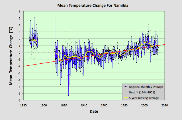
Fig. 39.8: The mean temperature anomaly (MTA) for Namibia since 1885. The best fit is applied to the interval 1944-2001 and has a positive gradient of +2.28 ± 0.17 °C per century. The monthly temperature changes are defined relative to the 1971-1990 monthly averages.
Fig. 77.6: The mean temperature anomaly (MTA) for Madagascar. The best fit is applied to the monthly mean data from 1932 to 2011 and has a negative gradient of -0.15 ± 0.07 °C per century.
Fig. 78.6: The mean temperature anomaly (MTA) relative to the 1931-1960 monthly averages for stations in Mozambique with over 300 months of data but excluding Lourenço Marques. The best fit is applied to the monthly mean data from 1921 to 1980 and has a positive gradient of +0.16 ± 0.12 °C per century.
Fig. 79.2: The mean temperature anomaly (MTA) for Zimbabwe relative to the 1971-2000 monthly averages based on an average of anomalies from stations with over 360 months of data. The best fit is applied to the monthly mean data from 1916 to 1975 and has a negative gradient of -0.96 ± 0.20 °C per century.
Fig. 81.2: The mean temperature anomaly (MTA) relative to the 1951-1980 monthly averages based on an average of anomalies from stations with over 360 months of data. The best fit is applied to the monthly mean data from 1921 to 1975 and has a negative gradient of -2.72 ± 0.17 °C per century.
Fig. 82.5: The mean temperature anomaly (MTA) for Angola relative to the 1951-1980 monthly averages based on an average of anomalies from stations with over 300 months of data. The best fit is applied to the monthly mean data from 1941 to 1980 and has a positive gradient of 0.18 ± 0.17 °C per century.


No comments:
Post a Comment