Showing posts with label Antarctica. Show all posts

Monday, January 31, 2022

92. The Greenhouse Effect for real atmospheres

In my previous post I showed how Schwarzschild's equation for the absorption and emission of radiation by a gas could result in identical results to a model based purely on elastic scattering. The only conditions on the proof I presented were that the gas is only heated at one end, and that energy conservation applies within the gas; namely that the energy each layer of the gas emits by Planck radiation balances the total energy it absorbs from the two fluxes of upwelling and downwelling radiation, Iu(x) and Id(x) respectively. I then showed that this leads to a higher transmission through thick layers of greenhouse gas than would be expected based on the Beer-Lambert law.

In this post I will consider two other situations; one where the gas is heated equally at both ends of a long column, and the second where the gas is heated at the bottom and its concentration decreases exponentially with height. The first is analogous to the situation in Antarctica, while the second is a good approximation of how the Greenhouse Effect works on both Earth and Mars.


1) Heating a column of gas at both ends

In Post 91 I showed in Fig. 91.3 how the intensity of radiation travelling in the forward and reverse directions through a greenhouse gas changes with distance into the gas when the gas is heated at one end. In both cases the radiation flow decreases linearly with distance into the gas, with the difference in the forward and reverse fluxes remaining constant. This difference in fluxes decreases with gas concentration and the thickness of the gas layer as illustrated in Fig. 91.4. But suppose the layer of gas is instead heated equally at both ends? What will happen then?

Well the resulting energy flows can be deduced from Fig. 91.3 using a combination of reflection symmetry and superposition and are shown in Fig. 92.1 below.


Fig. 92.1: The relative intensities of transmitted and reflected radiation in a 500 m long column of air with 420 ppm CO2 that is heated equally from both ends. LT is radiation transmitted from left to right when the heating is at x = 0 m, and LR is the amount reflected. RT is radiation transmitted from right to left when the heating is at x = 500 m, and RR is the amount reflected.


In Fig. 92.1 the curve TL (blue curve) represents the radiation incident from the left at x = 0 m which is then partially reflected by the greenhouse gas to create a reflected flux RL (red curve) that propagates from right to left, building in strength as it propagates. This much is identical to the situation in Fig. 91.3 in the previous post. However, in the case of Fig. 92.1 an identical radiation flux RT also enters the column of gas from the right (green curve). This is also partially reflected by the greenhouse gas to create a reflected flux RR (violet curve) that propagates from left to right. The net result is that there are now two radiation fluxes travelling from left to right (TL and RR), and two travelling in the opposite direction (LR and RT). 

It can then be seen that the total radiation flowing from left to right will be the sum of LT and RR, which will be a constant value of 1.0 at all points along the gas column. The same is true for the total radiation flowing from right to left. In other words, the radiation that is emitted at the right hand exit of the column (x = 500 m) balances exactly the energy that entered initially at x = 0 m. Similarly the radiation that is emitted at the left hand exit of the column (x = 0 m) exactly balances the energy that initially entered at the right (at x = 500 m). This result leads to three important conclusions. 

The first is that in this situation the gas must be isothermal. This follows from the Schwarzschild's equation (see Eq. 91.6 in Post 91). As the total radiation flux in both directions is constant, it follows that the differentials of both Iu(x) and Id(x) must be zero and so the following equality must hold at all points x.

Iu(x) = Id(x) = B(λ,T)

(92.1)

As Iu(x) and Id(x) are both independent of x, then it follows that B(λ,T) must be as well. In which case the temperature T must be independent of x.

The second is that the radiation emitted at each end of the column in not just the radiation that entered at the opposite end. Some of it is radiation that has been reflected by the greenhouse gases via the Greenhouse Effect. This is an important point that is lost on many. It is often falsely claimed that because the gas is isothermal and the radiation flux exiting the gas balances that entering at the opposite end, then this must mean that the Greenhouse Effect is not in operation. Actually it is. It just appears not to be.

The third conclusion is that the Beer-Lambert law cannot be valid in this situation as it cannot explain this result. If the transmitted radiation fluxes LT and RT obeyed the Beer-Lambert law then they would both decay exponentially with distance into the gas, and so too would their reflected fluxes LR and RR. This would mean that the total flux in each direction at the centre of the gas column would be less than at the ends. The laws of thermodynamics cannot allow this to happen as it would lead to a permanent temperature decrease from each end towards the centre. Energy would flow into the centre only to disappear there in violation of the law of conservation of energy. So the Beer-Lambert law is a red herring in this instance.


2) The Greenhouse Effect for Earth's atmosphere

The Earth's atmosphere deviates from the examples I have discussed so far in one major respect: its density, n(x), decreases with height, x. This density change is more or less exponential over most of the lowest 80 km and is of the form 

n(x) = no e-kx

(92.2)

where k = 0.15 km-1. As the relative concentration of carbon dioxide (CO2)in the atmosphere is remarkably constant at about 420 ppm for all altitudes up to at least 80 km, it then follows that the CO2 density will also decay with altitude, x, in accordance with Eq. 92.2 as well with no = 0.018 mol/m3. As the atmosphere is mainly heated from the bottom by the Earth's surface this decrease in density with height will significantly effect the nature of the Greenhouse Effect.

The strength of the Greenhouse Effect can be determined by substituting the expression for n(x) shown in Eq. 92.2 into Eq. 91.5 in Post 91. It is then possible to solve for Iu(x) subject to the constraint that the difference between Iu(x) and Id(x) remains constant for all values of x due to conservation of energy as I explained in Post 88. The result is that Iu(x) varies with x as
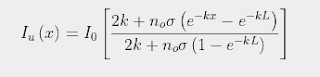
(92.3)

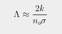
where σ is the absorption/emission cross-section of the CO2 molecules and L is the total height of the atmosphere. It then follows (by setting x = L in Eq. 92.3) that the total amount of radiation emitted at the top of the atmosphere into outer space will be ΛIo where the emitted fraction Λ is given by

 (92.4)

Subtracting ΛIo from Eq. 92.3 then gives the associated expression for the downwelling radiation

(92.5)

As the height of the atmosphere, L,  exceeds 80 km, and k is much smaller than noσ, it can then be seen that Eq. 92.4 will approximate as

(92.6)

This is virtually identical to the result shown in Eq. 91.10 in Post 91, but with L replaced by 1/k. This is not very surprising as the mathematics of integral calculus tells us that 1/k is the effective thickness of an atmosphere that gets exponentially thinner with increasing height. It also indicates that the amount of radiation that escapes at the top of the atmosphere will decrease inversely (i.e. reciprocally) with CO2 concentration and not exponentially as predicted by the Beer-Lambert law. This is shown graphically in Fig. 92.2 below where Iu(x) based on Eq. 92.3 at each altitude x is compared to the expected transmission based on the Beer-Lambert law. The difference is striking.


Fig. 92.2: A comparison of the amount of 15 µm IR radiation transmitted upwards at different heights in the atmosphere (blue curve) compared to that predicted by the Beer-Lambert law (red curve).


What Fig. 92.2 shows is that the amount of 15 µm radiation escaping at the top of the atmosphere is much greater than many people think. According to the Beer-Lambert law it should be so low as to be unmeasurable. In reality it could be as much as 1.5%. The blue curve in Fig. 92.2 does fall exponentially, but not to zero: it tends asymptotically to Λ. The value of Λ also depends on the nature of the atmosphere as Eq. 92.4 shows. However, its dependence on CO2 concentration is reciprocal not exponential. This is why more radiation escapes than many people intuitively think can do.


Summary

The examples outlined in this post show that the Greenhouse Effect is more complex than the simplistic model that is generally presented. Even thick layers of greenhouse gas will emit appreciable amounts of infra-red radiation from within their absorption bands. Relying on the Beer-Lambert law will result in at best an incomplete picture, and at worst a totally misleading one.

Yes, the amount of IR radiation transmitted by the Earth's atmosphere reduces exponentially with height, at least at lower altitudes, but this is not due to its absorbing properties associated with the Beer-Lambert law. It is due primarily to the exponential drop in CO2 concentration with height. Even then this exponential fall never tends to zero as Eq. 92.3 and Eq. 93.4 demonstrate, but instead tend to a finite transmission value Λ that could be as much as 1.5%.


Monday, August 17, 2020

30. Temperature trends in Antarctica - VARIABLE

If there is one region of the planet that is synonymous with climate change, it is probably Antarctica. Climate change, we are told, is melting the ice cap, the glaciers, the ice shelves and the sea ice. As a result penguins may become extinct in 100 years. Or not, because it turns out there are actually a lot more of them than we thought. So what is really happening in Antarctica?

Well, the honest answer is that we don't really know.  Despite being one of the most studied places on the planet, there is virtually no instrumental temperature data from before 1940. The continent has over 260 instrumental temperature records, but most are less than 40 years in length. In fact only about 56 have more than 240 months of data, of a mere 22 have more than 480 months of data. As the following analysis will show, this is insufficient to draw any accurate or definitive conclusions about the current temperature trends for the continent.


Fig. 30.1: A map of Antarctica showing the locations of all the stations with temperature records containing more than 240 months of data.


Part of the problem with analysing the temperature records of Antarctic is the sheer size of the place. It has almost twice the area of Australia, but the weather stations are not evenly distributed. And given its size, it would be inappropriate to simply aggregate trends from opposite sides of the continent, for the same reasons as for Australia; principally, that they are likely to be totally uncorrelated. When looking at the spatial distribution of stations it becomes clear that most are situated on the coast (see Fig. 30.1 above). Those that are inland are usually at altitude, and as I showed in Post 4, the temperatures in the interior of Antarctica are much lower than elsewhere, and have much higher levels of variability. This implies that they should be analysed and aggregated separately.

In addition, the coastal stations appear to exist in three distinct clusters. The most obvious two are the high densities of stations on the peninsula and around the Ross Sea. In contrast, the stations around the Atlantic coast from longitude 45° W to 90° E are more evenly spread. It therefore seems logical to subdivide the stations into four separate groupings: (i) those found on the Antarctic Peninsula; (ii) the interior stations at altitude; (iii) the stations located along the Pacific coast from the Amundsen Sea in the east, to Queen Mary Land in the west via the Ross Sea; (iv) the stations on the Atlantic Coast from 45° W to 90° E. These four groupings of stations are identified in Fig. 30.1 above. 


Fig. 30.2: Number of stations active each month that have more than 240 months of data overall.


In Post 4 I looked at the three most significant station records for the interior of Antarctica: Amundsen-Scott Base (Berkeley ID - 166900), Vostok (Berkeley ID - 151513) and Byrd Station (Berkeley ID - 166906). The data for Byrd Station was fragmented, while that for both Amundsen-Scott and Vostok indicated negative temperature trends. No other stations in the interior have more than 240 months of data.

Using 240 months as the cutoff, we find that the number of active stations in the other three regions of Antartica that contain this minimum amount of monthly temperature data never exceeds 20, and in the case of the Atlantic coast, it never exceeds 10 (see Fig. 30.2 above). In addition, most of the data is concentrated from 1980 onwards, and only the Antarctic Peninsula has any data before 1950, but even that is miniscule in terms of its total amount.


Fig. 30.3: The mean temperature for the Pacific coast of Antarctica since 1950. The best fit line is fitted to data from 1973-2010 and has an overall trend of 0.55 ± 0.80 °C per century.


If we calculate the mean temperature trend using the data that is available, the results are not great, at least not if you are a firm believer in climate change. The data for the Pacific coast displays a small amount of warming of 0.55 °C per century since 1973 as shown in Fig. 30.3 above (i.e. 0.21 °C in total). The period 1973-2010 was chosen for the best fit calculation because that time-frame is bounded by two peaks in the 5-year moving average. This means that the peaks do not distort the best fit calculation for reasons that I have outlined in the discussion of Fig. 4.7 in Post 4. 

If the best fit in Fig. 30.3 were to be made to all the data, then best fit trend becomes 1.61 °C per century. The dip around 1960 now pulls down the trend line and increases the warming trend, but is this localized dip in the temperature record permanent or just temporary? The answer is that we don't know because there is insufficient data before 1960 to judge.


Fig. 30.4: The mean temperature for the Atlantic coast of Antarctica since 1950. The best fit line is fitted to data from 1973-2010 and has an overall negative trend of -0.21 ± 0.60 °C per century.


If we now turn to the Atlantic coast the pattern is the same. The temperature trend is relatively stable from 1970 to 2010 (see Fig. 30.4). If we measure the trend for 1973-2010 in order to compare directly with that for the Pacific coast, we see that the trend is actually slightly negative and equal to -0.21 ± 0.60 °C per century. But again, extending the fitting to all the data changes the trend to a positive one of gradient +0.49 ± 0.31 °C per century. This is, once again a consequence of a dip in temperatures around 1960. This suggests that the temperature fall is real, and not due to measurement errors, but this dip is large enough to completely change the trend from -0.21 °C per century to +0.49 °C per century.

There is one other similarity with the Pacific coast data: the uncertainties in both trends are very large. This is due to the comparatively short time frame for the available data, which illustrates why long temperature records are so valuable. Even 60 years is not long enough.


Fig. 30.5: The mean temperature for the Antarctic Peninsula since 1940. The best fit line is fitted to data from 1973-2010 and has an overall trend of 2.88 ± 0.77 °C per century.


The notable point about the Antarctic Peninsula is that it is the only region of Antarctica where there is clear evidence of a significant warming trend since 1950. But this is no different from what we have seen in Australia and New Zealand, and in this case there is no data before 1940. That means we cannot say whether this warming is new and permanent, or whether, like Australia and New Zealand, it is just a recovery from a temporary cooling phase. In Australia and New Zealand the temperatures in the latter half of the 19th century were just as high as they are now. In the case of Antarctica we just do not know.


Summary

The analysis above allows us to draw the following conclusions.

  1. There has been no warming trend in the interior of Antarctica since 1957 (see Post 4).
  2. The has been no warming trend on the Atlantic coast since 1950, and probably none of any great consequence on the Pacific coast either (see Fig. 30.4 and Fig. 30.3).
  3. The only significant recent warming in Antarctic appears to be around the peninsula (as shown in Fig. 30.5). This warming is, however, no greater than that seen in Australia and New Zealand over the same time period (1950-2010), and that warming was preceded by a cooling of almost equal magnitude (see Post 26 and Post 8).
  4. We have no idea what the temperature trend anywhere in Antarctica was before 1940.


Wednesday, May 20, 2020

4. Data analysis at the South Pole

If there is one place on Earth that is synonymous with global warming, it is Antarctica. The conventional narrative is that because of climate change, the polar ice caps are melting, all the polar bears and penguins are being rendered homeless and are likely to drown, and the rest of the planet will succumb to a flood of biblical proportions that will turn most of the Pacific islands into the Lost City of Atlantis, and generally lead to global apocalypse. Needless to say, most of this is a gross exaggeration.

I have already explained that melting sea ice at the North Pole cannot raise sea levels because of Archimedes’ principle. The same is true of ice shelves around Antarctica. The only ice that can melt and raise sea levels is that which is on land. In Antarctica (and Greenland) this is virtually all at altitude (above 1000 m) where the mean temperature is below -20 °C, and the mean monthly temperature NEVER gets above zero, even in summer. Consequently, the likelihood of any of this ice melting is negligible.

The problem with analysing climate change in Antarctica is that there is very little data. If you exclude the coastal regions and only look at the interior, there are only twenty sets of temperature data with more than 120 months of data, and only four extend back beyond 1985. Of those four, one has 140 data points and only runs between 1972 and 1986 and so is nigh on useless for our purposes. The other three I shall consider here in detail.

The record that is the longest (in terms of data points), most complete and most reliable is the one that is actually at the South Pole. It is at the Amundsen-Scott Base that is run by the US government and has been permanently manned since 1957. The graph below (Fig. 4.1) illustrates the mean monthly temperatures since 1957.


Fig. 4.1: The measured monthly temperatures at Amundsen-Scott Base.


The thing that strikes you first about the data is the large range of temperatures, an almost 40 degree swing from the warmest months to the coldest. This is mainly due to the seasonal variation between summer and winter. Unfortunately, this seasonal variation makes it virtually impossible to detect a discernible trend in the underlying data. This is a problem that is true for most temperature records, but is acutely so here. However, there is a solution. If we calculate the mean temperature for each of the twelve months individually, and then subtract these monthly means from all the respective monthly temperatures in the original record, what will be left will be a signal representing time dependent changes in the local climate.


Fig. 4.2: The monthly reference temperatures (MRTs) for Amundsen-Scott Base.


The graph above (Fig. 4.2) illustrates the monthly means for the data in Fig. 4.1. We get this repeating data set by adding together all the January data in Fig. 4.1 and dividing it by the number of January readings (i.e. 57). Then we repeat the method for the remaining 11 months. Then we plot the twelve values for each year to give a repeating trend as illustrated in Fig. 4.2. If we then subtract this data from the data in Fig. 4.1 we get the data shown below (Fig. 4.3). This is the temperature anomaly for each month, namely the amount by which the average temperature for that month has deviated from the expected long-term value shown in Fig. 4.2. This is the temperature data that climate scientists are interested in and try to analyse. The monthly means in Fig. 4.2 therefore represent a series of monthly reference temperatures (MRTs) that are subtracted to the raw data in order to generate the temperature anomaly data. The temperature anomalies are therefore the amount by which the actual temperature each month changes relative to the reference or average for that month.


Fig. 4.3: The monthly temperature anomalies for Amundsen-Scott Base.


Also shown in Fig. 4.3 is the line of best fit to the temperature anomaly (red line). This is almost perfectly flat, although its slope is slightly negative (-0.003 °C/century). Even though the error in the gradient is ±0.6 °C per century, we can still venture, based on this data that there is no global warming at the South Pole.

The reasons for the error in the best fit gradient being so large (it is comparable to the global trend claimed by the IPCC and climate scientists) are the large temperature anomaly (standard deviation = ±2.4 °C) and the relatively short time baseline of 57 years (1957-2013). This is why long time series are essential, but unfortunately these are also very rare.

Then there is another problem: outliers. Occasionally the data is bad or untrustworthy. This is often manifested as a data-point that is not only not following the trend of the other data, it is not even in the same ballpark. This can be seen in the data below (Fig. 4.4) for the Vostok station that is located over 1280 km from the South Pole.


Fig. 4.4: The measured monthly temperatures at Vostok.


There is clearly an extreme value for the January 1984 reading. There are also others, including at March 1985 and March 1997, but these are obscured by the large spread of the data. They only become apparent when the anomaly is calculated, but we can remove these data points in order to make the data more robust. To do this the following process was performed.

First, find the monthly reference temperaturs (MRTs) and the anomalies as before. Then, calculate the mean anomaly. Next, calculate either the standard deviation of the anomalies, or the mean deviation (either will do). Then I set a limit for the maximum number of multiples of the deviation that an anomaly data point can lie above or below the mean value for it to be considered a good data point (I generally choose a factor of 5). Any data-points that fall outside this limit are then excluded. Then, with this modified dataset, I recalculated the MRTs and the anomalies once more. The result of this process for Vostok is shown below together with the best fit line (red line) to the resulting anomaly data (Fig. 4.5).


Fig. 4.5: The monthly temperature anomalies for Vostok.


Notice how the best fit line is now sloping up slightly, indicating a warming trend. The gradient, although looking very shallow, is still an impressive +1.00 ± 0.63 °C/century, which is more than that claimed globally by the IPCC for the entire planet. This shows how difficult these measurements are, and how statistically unreliable. Also, look at the uncertainty or error of ±0.63 °C/century. This is almost as much as the measured value. Why? Well, partly because of the short time baseline and high noise level as discussed previously, and partly because of the underlying oscillations in the data which appear to have a periodicity of about 15 years. The impact of these oscillations becomes apparent when we reduce or change the length of the base timeline.


Fig. 4.6: The monthly temperature anomalies for Vostok with reduced fitting range.


In Fig. 4.6 the same data is presented, but the best fit line has only been performed to data between 1960 and 2000. The result is that the best fit trend line (red line) changes sign and now demonstrates long-term cooling of -0.53 ± 1.00 °C/century. Not only has the trend changed sign, but the uncertainty has increased.

What this shows is the difficulty of doing a least squares best fit to an oscillatory dataset. Many people assume that the best fit line for a sine wave lies along the x-axis because there are equal numbers of points above and below the best fit line. But this is not so, as the graph below illustrates.


 Fig. 4.7: The best fit to a sine wave.


The best fit line to a single sine wave oscillation of width 2π and amplitude A is 3A2 (see Fig. 4.7). This reduces by a factor n for n complete oscillations but it never goes to zero. Only a best fit to a cosine wave will have zero gradient because it is symmetric. Yet the problem with temperature data is that most station records contain an oscillatory component that distorts the overall trend in the manner described above. This is certainly a problem for many of the fits to shorter data sets (less than 20 years). But a far bigger problem is that most temperature records are fragmented and incomplete, as the next example will illustrate.


Fig. 4.8: The measured monthly temperatures at Byrd Station.


Byrd Station is located 1110 km from the South Pole. Its local climate is slightly warmer than those at Amundsen-Scott and Vostok but the variation in seasonal temperature is just as extreme (see Fig. 4.8 above). Unfortunately, its data is far from complete. This means that its best fit line is severely compromised.


Fig. 4.9: The monthly temperature anomalies for Byrd Station.


The best fit to the Byrd Station data has a warming trend of +3.96 ± 0.83 °C/century (see the red line in Fig. 4.9 above). However, things are not quite that simple, particularly given the missing data between 1970 and 1980 which may well consist of a data peak, as well as the sparse data between 2000 and 2010 which appears to coincide with a trough. It therefore seems likely that the gradient would be very different, and much lower, if all data were present. How much lower we will never know. Nor can we know for certain why so much data is missing. Is this because the site of the weather station changed? In which case, can we really consider all the data to being part of a single record, or should we be analysing the fragments separately? This is a major and very controversial topic in climate science. As I will show later, it leads to the development of controversial numerical methods such as breakpoint alignment and homogenization.

What this post has illustrated I hope, is the difficulty of discerning an unambiguous warming (or cooling) trend in a temperature record. This is compounded by factors such as inadequate record length, high noise levels in signals, missing and fragmented data, and underlying nonlinear trends of unknown origin. However, if we can combine records, could that improve the situation? And if we do, would it yield something similar to the legendary hockey stick graph that is so iconic and controversial in climate science? Next I will use the temperature data from New Zealand to try and do just that.