The USA has compiled the most comprehensive temperature records of any country in the world over the last 130 years. It has nearly ten thousand temperature records in total, of which nearly three thousand are long stations with over 1200 months of data. In addition, over two thousand stations have data that extend back to before 1900, with over four hundred having over 1400 months of data.

Fig. 66.1: The temperature trend for the USA since 1740. The best fit is applied to the monthly mean data from 1781 to 2010 and has a positive gradient of +0.79 ± 0.04 °C per century. The monthly temperature changes are defined relative to the 1951-1980 monthly averages.
The averages of the temperature anomalies for the four hundred longest temperature records for the contiguous 48 states of the USA are shown in Fig. 66.1 above. The anomalies for each of the 400 stations are determined by first calculating the twelve monthly mean temperatures for each station. These monthly reference temperatures (MRTs) were determined for the period 1951-1980, and then subtracted from the raw temperature data to obtain the anomlies for each month, as described previously in Post 47. The monthly anomalies from each of the 400 stations were then averaged to generate the final mean temperature trend.
It is clear from the data in Fig. 66.1 that there is a strong positive trend in the temperature data. In fact the temperature appears to rise by 1.8°C from 1780 to 2010, as can clearly be seen in both the trend of the 5-year moving average (yellow curve) and the best fit line (red curve). So, there we have it: more conclusive proof of global warming.
Except it isn't, because all the temperature rise in the data in Fig. 66.1 occurs before 1930; long before atmospheric carbon dioxide levels on Earth began to increase significantly. In fact by 1930 the atmospheric concentration of carbon dioxide was only about 307 ppm, less than 10% above pre-industrial levels, so nowhere near enough to cause a temperature increase of nearly 2°C.

Fig. 66.2: The temperature trend for the USA since 1900. The best fit is applied to the monthly mean data from 1911 to 2010 and has a slight positive gradient of +0.16 ± 0.13 °C per century.
In addition, after 1900 the picture is completely different. The temperature trend for the 100 years before 2010 is virtually zero with an increase of only 0.16°C that is barely above the uncertainty value of 0.13°C (see Fig. 66.2 above). The trend is also highly dependent on the time interval chosen for the data fitting due to the considerable amount of natural variation in the time series, even after smoothing with a 5-year moving average.
Fitting to the data between the major peaks in the 5-year average at 1930 and 2000 (in order to eliminate cyclical distortions) actually gives a strong negative trend of -0.55°C per century, or a temperature fall of almost 0.4°C (see Fig. 66.3 below). So while carbon dioxide levels in the atmosphere have skyrocketed since 1930 (increasing by over 100 ppm), the climate of the continental USA has actually cooled.

Fig. 66.3: The temperature trend for the USA since 1900. The best fit is applied to the monthly mean data from 1931 to 2000 and has a strong negative gradient of -0.55 ± 0.22 °C per century.
So how reliable are these results? The graph in Fig. 66.4 below suggests that these results should be most reliable from about 1890 onwards. For this period the trends shown in Fig. 66.1-Fig. 66.3 are the result of averaging over 350 independent datasets. This reduces to less than 100 before 1870 and only one or two stations prior to 1820.
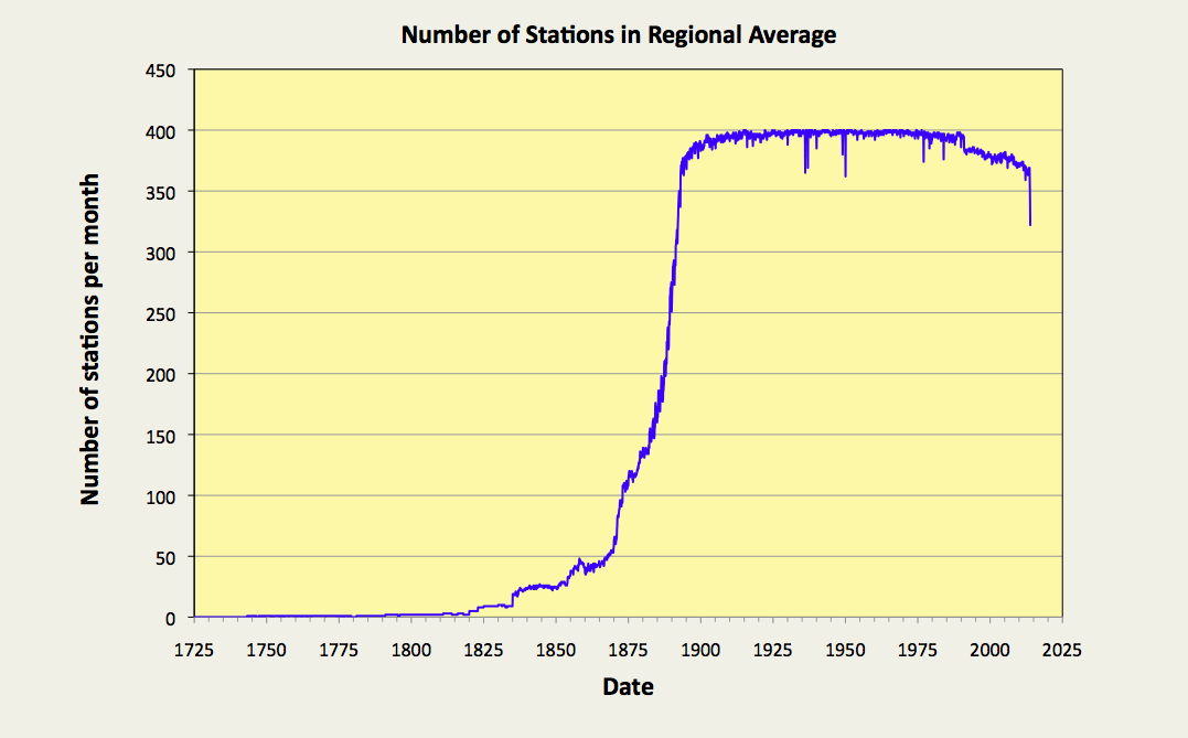
Fig. 66.4: The number of station records included each month in the mean temperature trend for USA when the MRT interval is 1951-1980.
Moreover, the stations being considered here are fairly evenly spread across the 48 contiguous states of the continental United States, although the density of stations to the west of the longitude line 96°W is only about half that of the density to the east (see Fig. 66.5 below).
The distribution of warming and cooling stations in Fig. 66.5 also provides strong evidence of a significant geographical component influencing the overall temperature trend at any given location, with stations in the west, and those in areas of high population density, more likely to exhibit a high warming trend. In this case, a station is defined to be warming strongly if its overall temperature rise exceeds 0.25°C over its entire history, and the gradient of its temperature trend exceeds twice the error in that gradient. Consequently, this dependence of the temperature trend on location appears to constitute strong evidence in support of the existence of the urban heat island effect (UHI) and its role in driving at least some global warming in highly developed regions.

Fig. 66.5: The (approximate) locations of the 400 longest temperature records in USA. Those stations with a high warming trend are marked in red and orange. Those with cooling or stable trends are marked in blue. Those denoted with squares have over 1600 months of data.
It is self-evident that the results presented in Fig. 66.1-Fig. 66.3 are at odds with the claims of most climate science groups. This is confirmed by the data in Fig. 66.6 below which is an equivalent temperature trend for the USA, but which was calculated using data that have been adjusted by Berkeley Earth. That apart, the process used to generate the curves in Fig. 66.6 is exactly the same as the process used to derive the data in Fig. 66.1. In each case a simple average was performed of the monthly anomaly data from each of the 400 longest stations. This was repeated for each month in the time series.
It can be seen that the effect of the adjustments made to the data by Berkeley Earth is to lower the peak seen in the 1930s in order to render the trend more linear. This gives the effect of implying that most of the warming has occurred after 1900, whereas the trend based on raw data presented in Fig. 66.1 suggests most warming occurred before 1900. In both cases, though, the total warming from 1820 to 2010 is about the same at just under 2°C.

Fig. 66.6: Temperature trend for the USA since 1750 derived by aggregating and averaging the Berkeley Earth adjusted data from the 400 longest temperature records. The best fit linear trend line (in red) is for the period 1791-2010 and has a gradient of +0.66 ± 0.02 °C/century.
The plot in Fig. 66.6 may differ from the one based on raw data in Fig. 66.1, but it largely agrees with the trend for the USA published by Berkeley Earth and shown in Fig. 66.7 below. This is again despite the fact the averaging process used by Berkeley Earth to generate the curves in Fig. 66.7 uses different weighting coefficients for each station based on their location and proximity to other stations. The curves in Fig. 66.6, on the other hand, are the result of a simple average with no weighting. Yet the two sets of data largely agree. This would also suggest that the variation in station density seen in Fig. 66.5 is not sufficient to significantly impact the result either. This can be tested, though, by studying the temperature trends for the USA on a state-by-state basis. The temperature trends for Texas have already been determined, however (see Post 52).
Fig. 66.7: The temperature trend for the USA since 1750 according to Berkeley Earth.
Conclusions
The data presented here appears to suggest that there has been no global warming in the USA since 1920. In fact a cyclically neutral analysis of data for the 20th century appears to exhibit a strong cooling (see Fig. 66.3).
The strong warming seen in the USA temperature trend before 1900 is incompatible with the assertion that warming is only caused by increases in carbon dioxide, for the simple reason that there were no significant increases in atmospheric carbon dioxide before 1900.
The cause of the warming before 1900 is uncertain, but could be due to natural variations in climate, or a growing urban heat island effect as the USA started to industrialize. It should be noted that most of the USA temperature records with data prior to 1880 were based in towns and cities that were growing quickly, principally around New England and Chicago.
Addendum
Here is the NOAA version of the USA data, before and after their adjustments.

Fig. 66.7: The temperature trend for the USA since 1900 according to NOAA-NCDC.
So while the raw data is fairly close to that shown Fig. 66.3, the adjusted data is not. In fact the adjustments add about 0.4°C of warming.
No comments:
Post a Comment