Showing posts with label warming. Show all posts

Thursday, September 8, 2022

136: Sweden - temperature trends WARMING mostly after 1980

The climate change seen in Sweden over the last 200 years is similar to that seen in Norway over the same period. This is perhaps not surprising given that they are nearest neighbours. The only major difference is the temperature change before 1980. In the case of Norway this was negligible (see Fig. 135.4 in Post 135) and was less than a tenth of the natural variation in the 5-year average. For Sweden there is a modest but distinct upward warming trend from 1860 to 1980 that amounts to about 0.6°C in total. That said this warming is still only comparable with the natural variation in the 5-year average of the mean temperature anomaly (MTA). Then after 1980 the MTA jumps abruptly by about 1°C, just as it did in Norway. The net result is that the temperature trend of Sweden over the last 150 years is one of the few regional trends that actually resembles the global trends published by NOAA, NASA-GISS, Hadley-CRU and Berkeley Earth, but this may not be quite what it seems.

As Sweden has a larger area and larger population than Norway it is not surprising that it has more weather stations. In total Sweden has 25 long stations with over 1200 months of data before 2014 and another 126 medium stations with over 480 months of data (for a full list of stations see here). Their approximate locations are shown on the map in Fig. 136.1 below. The stations are fairly evenly distributed across most of the country, but there does appear to be a greater concentration in the south and only twelve stations (i.e. 8%) are within the Arctic Circle. It does have two of the longest and earliest temperature records though: Uppsala and Stockholm. Both have over 3000 months of more or less continuous data that extend back to before 1760.


Fig. 136.1: The (approximate) locations of the 151 longest weather station records in Sweden. Those stations with a high warming trend between 1911 and 2010 are marked in red while those with a cooling or stable trend are marked in blue. Those denoted with squares are long stations with over 1200 months of data, while diamonds denote medium stations with more than 480 months of data.


In order to quantify the changes to the climate of Sweden the temperature anomalies for all stations with over 480 months of data before 2014 were determined and averaged. This was done using the usual method as outlined in Post 47 and involved first calculating the temperature anomaly each month for each station, and then averaging those anomalies to determine the mean temperature anomaly (MTA) for the country. This MTA is shown as a time series in Fig. 136.2 and clearly shows that temperatures were rising slowly up until 1980. Then at some point in the 1980s (probably in 1988) the mean temperature appears to increase abruptly by about 1°C.


Fig. 136.2: The mean temperature change for Sweden since 1880 relative to the 1971-2000 monthly averages. The best fit is applied to the monthly mean data from 1881 to 1980 and has a positive gradient of +0.46 ± 0.19 °C per century.


The process of determining the MTA in Fig. 136.2 involved first determining the monthly reference temperatures (MRTs) for each station using a common reference period, in this case from 1971 to 2000, and then subtracting the MRTs from the raw temperature data to deliver the anomalies. If a station had at least twelve valid temperatures per month within the MRT interval then its anomalies were included in the calculation of the mean temperature anomaly (MTA). The total number of stations included in the MTA in Fig. 136.2 each month is indicated in Fig. 136.3 below. The peak in the frequency between 1960 and 2010 suggests that the 1971-2000 interval was indeed the most appropriate to use for the MRTs.


Fig. 136.3: The number of station records included each month in the mean temperature anomaly (MTA) trend for Sweden in Fig. 136.2.


The data in Fig. 136.3 indicates that the period of greatest coverage of the country for temperature data is after 1960 with up to 150 long and medium stations in operation at any one time. This drops to about 25 between 1890 and 1960 and to four or less before 1860. This means that the MTA for Sweden before 1860 will be less reliable than its values after 1890. Note that a reliable MTA generally needs data from at least sixteen stations (see Post 57 for evidence). 

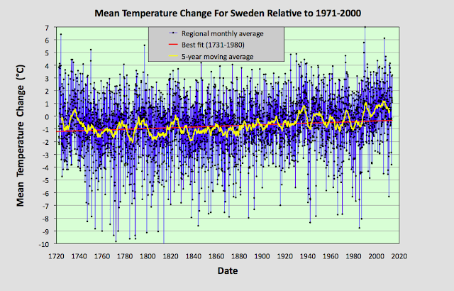
Nevertheless, we can calculate an MTA for Sweden back to 1720 and if we do so we obtain the trend shown in Fig. 136.4 below. This appears to show that the MTA exhibited a slow and gentle warming for much of the two hundred years before 1980 before the abrupt jump around 1988, but it can be interpreted differently.


Fig. 136.4: The mean temperature change for Sweden since 1720 relative to the 1971-2000 monthly averages. The best fit is applied to the monthly mean data from 1731 to 1980 and has a slight positive gradient of +0.30 ± 0.05 °C per century.


If the best fit is performed for the interval 1761-1860 then the gradient is -0.06 ± 0.22°C while the best fit to data from 1861 to 2010 yields a strong positive gradient of +0.99 ± 0.11°C (see Fig. 136.5 below). So changing the fitting interval can change the result; but remember, as Fig. 136.3 shows, the MTA data before 1860 is based on only four station records. Similarly, changing the fitting interval to 1861-2010 also changes the interpretation of the data after 1980. The abrupt jump around 1988 now looks more like a temporary plateauing of the MTA data between 1940 and 1980. So which is correct? The problem is it is difficult to know due to the large natural fluctuations in the MTA data: both could be true or neither could be true. What we do know is that the 1988 jump is seen in the MTA for other countries and for Europe as a whole (see Post 44).


Fig. 136.5: The mean temperature change for Sweden since 1820 relative to the 1971-2000 monthly averages. The best fit is applied to the monthly mean data from 1861 to 2010 and has a positive gradient of +0.99 ± 0.11 °C per century.


If we next consider the change in temperature based on Berkeley Earth (BE) adjusted data we get the MTA data in Fig. 136.6 below. This again was determined by averaging each monthly anomaly from the 151 longest stations and it suggests that the climate was fairly stable before 1870 but then warmed by over 1.5°C thereafter. In fact the 10-year average suggests a warming of almost 2°C. Moreover the data in Fig. 136.6 is in good agreement with the MTA based on unadjusted data in Fig. 136.4.


Fig. 136.6: Temperature trends for Sweden based on Berkeley Earth adjusted data. The best fit linear trend line (in red) is for the period 1876-2010 and has a positive gradient of +1.00 ± 0.06°C/century.


Comparing the curves in Fig. 136.6 with the published Berkeley Earth (BE) version for Sweden in Fig. 136.7 below we see that there is good agreement between the two sets of data. This indicates that the simple averaging of anomalies used to generate the BE MTA in Fig. 136.6 using adjusted data is as effective and accurate as the more complex gridding method used by Berkeley Earth in Fig. 136.7. In which case simple averaging should be just as effective and accurate in generating the MTA using raw unadjusted data in Fig. 136.4. In other words, any discrepancy between the adjusted data in Fig. 136.6 and the unadjusted data in Fig. 136.4 cannot be due to the averaging process.


Fig. 136.7: The temperature trend for Sweden since 1750 according to Berkeley Earth.


Most of the (slight) differences between the MTA in Fig. 136.4 and the BE versions using adjusted data in Fig. 136.7 are instead mainly due to the data processing procedures used by Berkeley Earth. These include homogenization, gridding, Kriging and most significantly breakpoint adjustments. These can lead to changes to the original temperature data, the magnitude of these adjustments being the difference in the MTA values seen in Fig. 136.4 and Fig. 136.6.

The magnitudes of these adjustments are shown graphically in Fig. 136.8 below. The blue curve is the difference in MTA values between adjusted (Fig. 136.6) and unadjusted data (Fig. 136.4), while the orange curve is the contribution to those adjustments arising solely from breakpoint adjustments. The change in the overall adjustment from 1876 to 2010 is small, less than +0.06°C while the much larger 0.4°C offset is due to the difference in MRT intervals used to determine the anomalies in Fig. 136.4 and Fig. 136.6 and can be ignored. What this shows is that the BE adjustments in this case are small which is why the data in Fig. 136.4 and Fig. 136.6 agree so well.


Fig. 136.8: The contribution of Berkeley Earth (BE) adjustments to the anomaly data in Fig. 136.6 after smoothing with a 12-month moving average. The blue curve represents the total BE adjustments including those from homogenization. The linear best fit (red line) to these adjustments for the period 1876-1980 has a positive gradient of +0.046 ± 0.002 °C per century. The orange curve shows the contribution just from breakpoint adjustments.


Summary

According to the raw unadjusted temperature data, the climate of Sweden has warmed gradually for over 150 years by about 1.5°C in total (see Fig. 136.4). There is some evidence of an abrupt jump of 1°C around 1988 but this depends on how one interprets the data and the fitting process. The temperature before 1860 appear to have been stable for over one hundred years.

In this instance the adjusted temperature data from Berkeley Earth closely follows that of the unadjusted data (see Fig. 136.6).


Acronyms

BE = Berkeley Earth.

MRT = monthly reference temperature (see Post 47).

MTA = mean temperature anomaly.

List of all stations in Sweden with links to their raw data files.


Friday, August 26, 2022

133: UHI #6 - Buenos Aires (Argentina)

The second largest city in South America by population is Buenos Aires in Argentina with a population of over thirteen million people. The largest is Sao Paulo in Brazil. Both could be categorized as urban heat islands (UHIs); Sao Paulo in particular has warmed by about 3°C since 1887 and Buenos Aires by up to 2°C. However, as I have yet to fully analyse temperature data from Brazil it is not possible for me to compare the Sao Paulo data to the temperature change for the wider region, although this is unlikely to be more than about 1°C. So instead I will concentrate on Buenos Aires. Sao Paulo will come later.

A comparison of the temperature trends for Buenos Aires and Argentina shows that temperatures have risen far more in Buenos Aires than they have in Argentina as a whole. In fact as Fig. 133.1 below shows, they have risen almost three times faster in Buenos Aires since 1900 than they have in Argentina. Before 1900 temperatures were stable in both Buenos Aires and Argentina.


Fig. 132.1: The change to the 5-year average temperatures of Buenos Aires (red curve) and Argentina (blue curve) since 1900.


In Post 61 I examined the temperature trends for Argentina. The mean temperature change since 1900 is shown in Fig. 132.2 below and it indicates that Argentina has exhibited only modest warming over the last one hundred years. The best fit for 1901-2000 indicates a temperature rise of about 0.64°C while the 5-year average suggests a rise of about 0.52°C.


Fig. 132.2: The mean temperature change for Argentina since 1900 relative to the 1961-1990 monthly averages. The best fit is applied to the monthly mean data from 1901 to 2000 and has a positive gradient of +0.64 ± 0.11 °C per century.


The oldest major weather station in Argentina is Buenos Aires Observatorio (Berkeley Earth ID: 151642). It is located in the heart of Buenos Aires and has continuous data stretching back as far as 1856, although there is a break in the data between 2006 and 2011. It is one of only two major stations within 20 km of the city centre, hence its significance as a case study of the urban heat island (UHI) effect. The other is Aeroparque (Berkeley Earth ID: 151640) which only has data from 1961 onwards but also exhibits strong warming.

In contrast to the rest of Argentina, Buenos Aires Observatorio shows strong and continuous warming since 1910 (see Fig. 132.3 below). Before 1910 the temperatures were stable. The best fit for 1901-2000 indicates a temperature rise of about 2.4°C in one hundred years while the 5-year average suggests a rise of 1.77°C.


Fig. 132.3: The mean temperature change for Buenos Aires Observatorio since 1900 relative to its 1961-1990 monthly averages. The best fit is applied to the monthly mean data from 1901 to 2000 and has a positive gradient of +2.40 ± 0.18 °C per century.


Summary

The following temperature changes were observed from 1901 to 2000.

Argentina: 0.52°C (trend 0.64°C).

Buenos Aires: 1.77°C (trend 2.40°C).

So Buenos Aires has warmed by almost 1.8°C more than the surrounding state of Argentina, or more than three times faster. A classic UHI!


Wednesday, August 24, 2022

132: UHI #5 - Pretoria (South Africa)

The three largest cities in southern Africa are Kinshasa, Johannesburg and Nairobi. All have populations of more than ten million, so all three could be good contenders as examples of the urban heat island (UHI) effect. Unfortunately in all three cases making a definitive assessment is difficult because these cities do not have data of high enough quality.

The city in southern Africa with the next highest population is Luanda in Angola with a population of eight million people. Luanda does have good temperature data stretching back to 1879 that does appear to show a strong warming trend even though the data after 1980 is fragmented, probably due to the civil war. The problem is that there is very little other good temperature data for Angola (see here for a complete list of stations), so there is no reliable trend for Angola as a region as I showed in Post 82, and so no accurate regional trend with which to compare the Luanda data.

The country in southern Africa with the the best temperature data is South Africa, and while Johannesburg has no high quality weather stations near its centre, the city of Pretoria (which is part of the same conurbation) does, although the temperature record for Pretoria Eendracht (Berkeley Earth ID: 159076) only starts in 1949. Nevertheless, since then the respective temperature trends show that Pretoria has warmed significantly more than South Africa as a whole (see Fig. 132.1 below) with up to 3°C of warming in Pretoria but less than 1°C in South Africa.


Fig. 132.1: The change to the 5-year average temperatures of Pretoria Eendracht (red curve) and South Africa (blue curve) since 1952.


In Post 37 I examined the temperature trends for South Africa. The mean temperature change since 1880 is shown in Fig. 132.2 below and it indicates that South Africa exhibited no significant warming before 1980 but has since warmed by about 0.7°C. In fact the best fit for 1951-2010 indicates a temperature rise of about 1.08°C in 60 years while the 5-year average suggests a rise of about 0.96°C.


Fig. 132.2: The mean temperature change for South Africa since 1857 relative to the 1961-1990 monthly averages. The best fit is applied to the monthly mean data from 1951 to 2010 and has a positive gradient of +1.80 ± 0.14 °C per century.


In contrast to the rest of South Africa, Pretoria Eendracht (Berkeley Earth ID: 159076) shows significant and continuous warming since 1950 (see Fig. 132.3 below). The best fit for 1951-2010 indicates a temperature rise of more than 2.81°C in 60 years while the 5-year average suggests a rise of 2.99°C.


Fig. 132.3: The mean temperature change for Pretoria Eendracht since 1949 relative to its 1961-1990 monthly averages. The best fit is applied to the monthly mean data from 1951 to 2010 and has a positive gradient of +4.69 ± 0.24 °C per century.


Summary

The following temperature changes were observed from 1951 to 2010.

South Africa: 0.96°C (trend 1.08°C).

Pretoria: 2.99°C (trend 2.81°C).

So Pretoria has warmed by at about 2°C more than the surrounding state of South Africa, or up to three times faster. A classic UHI!


Monday, August 22, 2022

131: UHI #4 - Jakarta (Indonesia)

Probably the most extreme example of an urban heat island (UHI) in the Southern Hemisphere is Jakarta. I first discussed it when analysing the temperature data of Indonesia for Post 31, but it is so dramatic that it needs further examination. 

Jakarta is the largest city in the Southern Hemisphere with a population of over 33 million. Indonesia has a population of more than 270 million, but this is spread over an archipelago of islands that stretch over 5000 km. The result is that Indonesia has seen no warming over the last one hundred years while Jakarta has warmed by almost 3°C since 1880 (see Fig. 131.1 below).


Fig. 131.1: The change to the 5-year average temperatures of Jakarta (red curve) and Indonesia (blue curve) since 1920.


In Post 31 I examined the temperature trends for Indonesia. The mean temperature change since 1912 is shown in Fig. 131.2 below and it indicates that Indonesia outside of Jakarta has actually cooled slightly over the last one hundred years. The best fit for 1913-2012 indicates a temperature change of -0.08°C while the 5-year average suggests a small rise of about +0.16°C.


Fig. 131.2: The mean temperature change for Indonesia since 1912 relative to the 1961-1990 monthly averages. The best fit is applied to the monthly mean data from 1913 to 2012 and has a slight negative gradient of -0.08 ± 0.04 °C per century.


One of the oldest weather stations in Indonesia is Jakarta Observatorium (Berkeley Earth ID: 155660). It is located in the middle of Jakarta with almost continuous data stretching back as far as 1866, hence its significance as a case study of the urban heat island (UHI) effect. In contrast to the rest of Indonesia, Jakarta Observatorium shows significant and continuous warming since 1870 (see Fig. 131.3 below). The best fit for 1913-2012 indicates a temperature rise of more than 2.16°C in the one hundred years since 1913, while the 5-year average suggests a rise of over 2.35°C.


Fig. 131.3: The mean temperature change for Jakarta Observatorium since 1866 relative to its 1961-1990 monthly averages. The best fit is applied to the monthly mean data from 1913 to 2012 and has a positive gradient of +2.16 ± 0.08 °C per century.


It is important to note that while Jakarta Observatorium is the clearest example of a UHI in Indonesia, it is not the only one. Up until 1970 there was a second station in Jakarta (Berkeley Earth ID: 155660) which also exhibited over 1.8°C of warming from 1866 to 1970. But the city of Surabaya (Berkeley Earth ID: 155652) also appears to behave as a UHI. Its population is over twelve million making it the fifth largest city in the Southern Hemisphere. From 1949 to 2013 it appears to have exhibited warming of more than 1.7°C as well (or 2.75°C per century). Yet despite this the rest of Indonesia cooled.


Summary

The following temperature changes were observed from 1913 to 2012.

Indonesia: 0.16°C (trend -0.08°C).

Jakarta: 2.35°C (trend 2.16°C).

So Jakarta has warmed by at least 2°C more than the rest of Indonesia. It has also warmed while Indonesia has not. A classic UHI!


Saturday, August 20, 2022

130: UHI #3 - Perth (Western Australia)

The population of Western Australia is only about 2.67 million but two million of that total live in the state capital Perth. So 75% of the state's population live in Perth even though Perth accounts for less than 0.25% of the area of Western Australia. Perhaps this is why temperatures in Perth appear to have risen at more than twice the rate of the rest of the state. By 1990 temperatures in Perth had risen more than 1.5°C since 1900 compared to less than 0.7°C in Western Australia as a whole (see Fig. 130.1 below). That looks like classic urban heat island (UHI) behaviour. The only caveat is that the main weather station for Perth at Perth Regional Office (Berkeley Earth ID: 4321) ceased operations in 1992 just as the UHI was taking off.


Fig. 130.1: The change to the 5-year average temperatures of Perth (red curve) and Western Australia (blue curve) since 1900.


In Post 22 I examined the temperature trends for Western Australia. The mean temperature change since 1900 is shown in Fig. 130.2 below and it indicates that Western Australia has warmed by about 1°C since 1990. The best fit for 1991-1990 indicates a temperature rise of less than 0.64°C in 90 years while the 5-year average suggests a rise of about 0.67°C for the same period.


Fig. 130.2: The mean temperature change for Western Australia since 1900 relative to the 1961-1990 monthly averages. The best fit is applied to the monthly mean data from 1901 to 1990 and has a positive gradient of +0.71 ± 0.11 °C per century.


The mean temperature anomaly (MTA) for Western Australia shown in Fig. 130.2 above is the result of averaging monthly temperature anomalies from nearly hundred stations as Fig. 130.3 below demonstrates (see here for a full list of all stations). However, before 1900 there are less than ten available stations so the MTA is less reliable and more prone to error from statistical variability. For more details and analysis of the complete data for Western Australia see Post 22.


Fig. 130.3: The number of station records included each month in the mean temperature anomaly (MTA) trend for Western Australia in Fig. 130.2.


The oldest weather station in Western Australia is Perth Regional Office (Berkeley Earth ID: 4321). It has data stretching back as far as 1852, and continuous data from 1876 to 1992. In fact it is the only station within Perth with over 480 months of continuous data between 1876 to 1992, hence its significance as a case study of the urban heat island (UHI) effect.

Compared to the rest of Western Australia, Perth Regional Office shows much more significant and continuous warming since 1900 (see Fig. 130.3 below). The best fit for 1901-1990 indicates a temperature rise of more than 1.47°C in 90 years while the 5-year average suggests a rise of over 1.5°C.


Fig. 130.4: The mean temperature change for Perth Regional Office since 1900 relative to its 1961-1990 monthly averages. The best fit is applied to the monthly mean data from 1901 to 1990 and has a positive gradient of +1.63 ± 0.19 °C per century.


Summary

The following temperature changes were observed from 1901 to 1990.

Western Australia: 0.67°C (trend 0.64°C).

Perth: 1.53°C (trend 1.47°C).

So Perth warmed by almost 1°C more than the surrounding state of Western Australia in the ninety years up to 1990, or more than twice as fast. A classic UHI!


Thursday, August 18, 2022

129: UHI #2 - Melbourne (Victoria)

The Australian state of Victoria has a total population of 6.7 million, of which 5.1 million live in the city of Melbourne. That means that 76% of the population of Victoria live in its capital city even though Melbourne accounts for only 4.4% of the area of Victoria. It is not really surprising then that the temperature trends for Melbourne and Victoria over the last 100 years are markedly different. In fact while the state of Victoria has cooled slightly for most of the last 120 years, Melbourne has warmed by over 2°C (see Fig. 129.1 below). So like Sydney in the previous post, Melbourne looks like a classic urban heat island (UHI).


Fig. 129.1: The change to the 5-year average temperatures of Melbourne (red curve) and Victoria (blue curve) since 1900.


In Post 19 I examined the temperature trends for Victoria. The mean temperature change since 1880 is shown in Fig. 129.2 below and it indicates that Victoria has exhibited no significant warming. In fact the best fit for 1886-2005 indicates that temperatures actually declined very slightly, although the 5-year average over the same period suggests that they may have risen slightly by about 0.47°C with most of this rise occurring after 1990.


Fig. 129.2: The mean temperature change for Victoria since 1880 relative to the 1966-1995 monthly averages. The best fit is applied to the monthly mean data from 1886 to 2005 and has a slight negative gradient of -0.02 ± 0.08 °C per century.


The mean temperature anomaly (MTA) for Victoria shown in Fig. 129.2 above is the result of averaging monthly temperature anomalies from over fifty stations as Fig. 129.3 below demonstrates (see here for a list of all stations). However, before 1900 there are less than twenty available stations so the MTA is less reliable and more prone to error from statistical variability. For more details and analysis of the complete data for Victoria see Post 19.


Fig. 129.3: The number of station records included each month in the mean temperature anomaly (MTA) trend for Victoria in Fig. 129.2.


The oldest weather stations in Victoria is Melbourne Regional Office (Berkeley Earth ID: 151813). It is located in the heart of Melbourne and has continuous data stretching back as far as 1855. It is also the only major station within 20 km of the city centre that has continuous data extending back before 1940 (the next best is Laverton Aerodrome), hence its significance as a case study of the urban heat island (UHI) effect.

In contrast to the rest of Victoria, Melbourne Regional Office shows significant and continuous warming since 1880 (see Fig. 129.4 below). The best fit for 1886-2005 indicates a temperature rise of more than 1.4°C in 120 years while the 5-year average suggests a rise of over 2.1°C.


Fig. 129.4: The mean temperature change for Melbourne Regional Office since 1880 relative to its 1966-1995 monthly averages. The best fit is applied to the monthly mean data from 1886 to 2005 and has a positive gradient of +1.23 ± 0.10 °C per century.


Summary

The following temperature changes were observed from 1886 to 2005.

Victoria: 0.47°C (trend -0.02°C).

Melbourne: 2.1°C (trend 1.48°C).

So Melbourne has warmed by at least 1.5°C more than the surrounding state of Victoria, or up to four times faster. A classic UHI!

Given that both Sydney and Melbourne appear to be great examples of UHIs, one might expect the same of similar large cities, Adelaide and Brisbane. Yet this appears not to be the case. Neither of these cities exhibits greater warming than the rest of their respective states even though over 70% of the South Australian population of 1.8 million live in Adelaide. For Brisbane and Queensland, though, the proportion is only 44%, although Brisbane is almost twice the size of Adelaide by population. The reason both Adelaide and Brisbane do not exhibit striking UHI properties could be that they are too small. Adelaide has a population that is less than a quarter of that of Sydney. That said, the population of Perth in Western Australia is just less than two million and yet as the next post will show, it too appears to be an urban heat island (UHI).


Tuesday, August 16, 2022

128: UHI #1 - Sydney (New South Wales)

In my previous post I explained the concept of the urban heat island (UHI). Unfortunately, finding clear examples in the global temperature records is not so easy. This is not because they don't exist, but because to demonstrate their existence beyond a reasonable doubt requires good data for both the urban area and the wider region within which the UHI sits. 

In the case of the urban data, this needs to be from a station that is located in the heart of the urban area and not on its perimeter such as at the local airport. Finding datasets from such locations is a lot harder than one might think because most weather stations are deliberately sited away from the centre of urban areas. Then the dataset needs to be sufficiently long with no gaps in the record in order for it to exhibit a definite trend over time. 

In the case of the regional data, this too needs to be based on long datasets with no gaps in their records. But in addition, a large number of these datasets are needed in order to establish an accurate trend for the region.

Satisfying these criteria is particularly difficult in the Southern Hemisphere where the data for most countries other than Australia is not particularly good. Nevertheless, I have identified six examples in the Southern Hemisphere so far (excluding Brazil which I have yet to examine in detail) where the quality of the temperature data for the UHI and its host country or state is sufficient to detect unambiguous differences in their temperature trends. Over the following six posts, including this one, I will examine each of these six examples in turn. So for Exhibit #1 I give you Sydney in New South Wales (NSW), Australia.

The city of Sydney has a population of about 5.3 million. That means that 65% of the New South Wales (NSW) population of 8.2 million live in Sydney even though Sydney accounts for only 1.5% of the area of NSW. It is not really surprising then that the temperature trends for Sydney and NSW over the last 100 years are markedly different. For while NSW has barely warmed at all in the last 140 years, Sydney has warmed by almost 2°C (see Fig. 128.1 below).


Fig. 128.1: The change to the 5-year average temperatures of Sydney (red curve) and New South Wales (blue curve) since 1900.


In Post 18 I examined the temperature trends for New South Wales. The mean temperature change since 1880 is shown in Fig. 128.2 below and it indicates that NSW has exhibited no significant warming. In fact the best fit for 1886-2005 indicates a temperature rise of less than 0.12°C in 120 years while the 5-year average suggests a rise of about 0.25°C.


Fig. 128.2: The mean temperature change for New South Wales since 1880 relative to the 1965-1994 monthly averages. The best fit is applied to the monthly mean data from 1886 to 2005 and has a slight positive gradient of +0.099 ± 0.077 °C per century.


The mean temperature anomaly (MTA) for NSW shown in Fig. 128.2 above is the result of averaging monthly temperature anomalies from over one hundred stations as Fig. 128.3 below demonstrates (see here for a list). However, before 1880 there are less than twenty available stations so the MTA is less reliable and more prone to error from statistical variability. For more details and analysis of the complete data for NSW see Post 18.


Fig. 128.3: The number of station records included each month in the mean temperature anomaly (MTA) trend for New South Wales in Fig. 128.2.


One of the oldest weather stations in NSW is Sydney Observatory Hill (Berkeley Earth ID: 151986). It is located in the heart of Sydney, south of the opera house and harbour, and has continuous data stretching back as far as 1859. It is also the only major station within 20 km of the city centre, hence its significance as a case study of the urban heat island (UHI) effect. 

In contrast to the rest of NSW, Sydney Observatory Hill shows significant and continuous warming since 1880 (see Fig. 128.4 below). The best fit for 1886-2005 indicates a temperature rise of more than 1.2°C in 120 years while the 5-year average suggests a rise of over 1.5°C.


Fig. 128.4: The mean temperature change for Sydney Observatory Hill since 1880 relative to its 1965-1994 monthly averages. The best fit is applied to the monthly mean data from 1886 to 2005 and has a positive gradient of +1.01 ± 0.08 °C per century.


Summary

The following temperature changes were observed from 1886 to 2005.

NSW: 0.25°C (trend 0.12°C).

Sydney: 1.5°C (trend 1.2°C).

So Sydney has warmed by at least 1°C more than NSW, or up to ten times faster. A classic UHI!


Sunday, April 10, 2022

105. US southern states - summary of BE temperature adjustments

In my previous post I summarized the temperature trends since 1900 of the six US states closest to the Gulf of Mexico (Texas, Louisiana, Mississippi, Alabama, Georgia and Florida). All the trends were constructed using data from the longest available temperature records in the state, all involved averaging the temperature anomalies from over 90 different station records, and none exhibited a significant positive warming trend.

Yet in every case the official Berkeley Earth (BE) trend does exhibit warming, often lots of it. The difference of course is largely down to the adjustments that Berkeley Earth make to the data via homogenization, Kriging, gridding and of course breakpoint alignment. In the post for each state (the links are here: Texas, Louisiana, Mississippi, Alabama, Georgia and Florida) I have quantified the magnitude of these adjustments, but I thought it would also be instructive to summarize them in one post just so that their full impact can be seen and compared.

The adjustments shown in the graphs below are of two types. The orange curve is the mean adjustment each month solely from breakpoint adjustments while the blue curve is the mean adjustment relative to unadjusted data from all sources of correction. This will also include homogenization, Kriging and gridding in addition to breakpoints, but it will also be affected by any difference in the chosen period for calculating the monthly reference temperatures (MRTs). The last of these will, however, only change the offset of the blue curve in the vertical direction relative to the orange one, not its slope or total change over time.

The graphs below indicate that the BE adjustments to the temperature data add between 0.5°C and 1.2°C to the final BE temperature trends. Given that we are constantly being told by climate scientists that the total global warming experienced so far is about 1.2°C, I would suggest that this is a bit of a problem.


Fig. 105.1: The Berkeley Earth (BE) temperature adjustments for Texas since 1900. The linear best fit (red line) to these adjustments for the period 1911-2010 has a positive gradient of +0.568 ± 0.003 °C per century.


Fig. 105.2: The Berkeley Earth (BE) temperature adjustments for Louisiana since 1900. The linear best fit (red line) to these adjustments for the period 1911-2010 has a positive gradient of +0.731 ± 0.004 °C per century.


Fig. 105.3: The Berkeley Earth (BE) temperature adjustments for Mississippi since 1900. The linear best fit (red line) to these adjustments for the period 1931-2010 has a positive gradient of +1.300 ± 0.007 °C per century.


Fig. 105.4: The Berkeley Earth (BE) temperature adjustments for Alabama since 1900. The linear best fit (red line) to these adjustments for the period 1931-2010 has a positive gradient of +1.231 ± 0.012 °C per century.


Fig. 105.5: The Berkeley Earth (BE) temperature adjustments for Georgia since 1900. The linear best fit (red line) to these adjustments for the period 1911-2010 has a positive gradient of +1.087 ± 0.006 °C per century.


Fig. 105.6: The Berkeley Earth (BE) temperature adjustments for Florida since 1900. The linear best fit (red line) to these adjustments for the period 1941-2010 has a positive gradient of +0.611 ± 0.010 °C per century.


Sunday, February 27, 2022

96. Ecuador - temperature trends and the curious missing data

There are two major problems when it comes to analysing the temperature data of Ecuador. The first is that there is very little good data. The second is that what data there is is subject to major natural variations; not least from El Niño

In total there are only six medium stations in Ecuador with more than 480 months of data and only one with more than 800 months of data. That station is Quito Mariscal Sucre (Berkeley Earth ID: 13263) which has almost 1200 months of data up to the end of 2013 and is located in the capital city, but even it has no data after 2000. And based on evidence from other countries and states, it is reasonable to conclude that the temperature trend for this station is not indicative of the country as a whole (because of its growing urban environment), yet it is the only station with any significant data before 1960. There is a seventh medium station in Ecuador (San Cristobal radiosonde), but that is located in the Galapagos islands over 1000 km to the west and has already been included in my analysis of the South Pacific (see Post 34). For these reasons it will be excluded from this analysis.


Fig. 96.1: The (approximate) locations of the weather stations in Ecuador. Those stations with a high warming trend between 1911 and 2010 are marked in red while those with a cooling or stable trend are marked in blue. Those denoted with squares are stations with over 480 months of data, while diamonds denote stations with more than 240 months of data.


Instead I have also included an additional ten stations with over 240 months of data, even though I generally feel that stations with less than 360 months of data generally add little to the overall trend. The locations of these and the six medium stations are shown on the map in Fig. 96.1 above (see here for a list of all stations with links to their original data). While these stations are fairly evenly distributed, it can be seen that almost all are in the western half of the country on the Pacific side of the Andes ridge. This, though does not seem to be a major issue as will be demonstrated in the analysis below. What is a major issue is the quantity and length of each dataset.

The result of averaging the monthly temperature anomalies from all the stations in Ecuador with over 240 months of data results in the set of mean temperature anomalies (MTA) shown in Fig. 96.2 below. The anomalies for each station were determined by first calculating the twelve monthly reference temperatures (MRT) for each station. The method for calculating the MRTs, and then the anomalies for each station dataset has been described previously in Post 47. In this case the time interval used to determine the MRTs was 1961-1990 as almost all the stations had at least 40% data coverage in this interval. The MRTs for each station were then subtracted from the station's raw temperature data to produce the anomalies for that station. These were then averaged to obtain the MTA for each month.


Fig. 96.2: The mean temperature change for Ecuador relative to the 1961-1990 monthly averages. The best fit is applied to the monthly mean data from 1901 to 2010 and has a positive gradient of +0.98 ± 0.08 °C per century.


The MTA data in Fig. 99.2 clearly shows a positive temperature trend over time that equates to a warming of about 1.0°C over the last century. However, within this trend are fluctuations in the 5-year moving average (yellow curve) that are even greater than the overall rise in the trend (red curve). 

One of the principal causes of these fluctuations are El Niño events. These result in large positive spikes in the regional temperature, the most dramatic of which can be seen in 1957, 1972, 1982, 1987 and 1997. The events between 1982 and 1997 in particular appear to contribute significantly to the overall warming trend for Ecuador by leading to a consistent elevated warming in this period. However, after 1997 there is a clear reversal of this with a major dip in temperatures occurring. This appears to correspond to a major La Niña event where the region undergoes a sharp cooling. 

Yet curiously something else happens to the data in this period: a lot of it (~75%) appears to go missing. This can be seen in the graph below in Fig. 96.3 which shows the number of stations used to calculate the MTA for each month. Between 2001 and 2008 up to 75% of stations used to calculate the MTA suddenly have no data, just at the point where the mean temperatures of some of the few stations that do have data show a decline in their mean monthly temperatures of up to 4°C.


Fig. 96.3: The number of station records included each month in the mean temperature anomaly (MTA) trend for Ecuador in Fig. 96.2.


The station frequency data in Fig. 96.3 illustrates another deficiency in the data: the lack of it before 1960. In fact, as I pointed out at the start of this post, there is only one station with data pre-1960. Consequently it is plausible to assume that the trend seen in the data before 1960 will differ significantly from that thereafter. The best fit line in Fig. 96.4 below confirms this.


Fig. 96.4: The mean temperature change for Ecuador relative to the 1961-1990 monthly averages. The best fit is applied to the monthly mean data from 1961 to 2010 and has a positive gradient of +0.68 ± 0.17 °C per century.


The result of this is that we cannot with any certainty proclaim what the real temperature trend is. It could be that the climate is warming at over 1°C per century as the data fit in Fig. 96.2 suggests, or it could be less than 0.7°C as indicated in Fig. 96.4 above. And given the severity and frequency of El Niño and La Niña events in the period after 1950, it could be that the real underlying climate variation is even lower. Frankly, we just can't tell. 

One way to resolve this might be to compare the temperature data for Ecuador with that of its neighbours. Yet in the previous post (Post 95) I showed that there has been no warming in Colombia since 1940 while in Post 63 I showed that the same was probably true for Peru as well (see Fig. 63.5 in Post 65).


Fig. 96.5: Temperature trends for Ecuador based on Berkeley Earth adjusted data. The average is for anomalies from all stations with over 240 months of data. The best fit linear trend line (in red) is for the period 1901-2010 and has a gradient of +1.06 ± 0.03°C/century.


So how does this tally with the data presented by Berkeley Earth (BE)? Well averaging the BE adjusted data for each station yields the time series for the mean temperature shown in Fig. 96.5 above. This has a warming trend that is significantly larger than that determined using raw data and shown in Fig. 96.2. It is, however, almost identical to the BE published version shown in Fig. 96.6 below even though the official BE trend in Fig. 96.6 is constructed using a mixture of homogenization and station weighting, and incorporates data from stations with less than 240 months of data. 

The similarity of the data in Fig. 96.5 and Fig. 96.6 suggests that statistical techniques such as homogenization and station weighting have little influence on the overall trend in this case. That also means that these statistical techniques cannot account for the differences between the trend based on adjusted data in Fig. 96.5 and Fig. 96.6 and the trend resulting from an average of anomalies based on the raw data shown in Fig. 96.2. This difference can therefore only result from the temperature adjustments.


Fig. 96.6: The temperature trend for Ecuador since 1860 according to Berkeley Earth.


So what can we conclude about the overall trend in temperature for Ecuador? The lack of data before 1960 invalidates the trend before 1960 from the discussion, while the lack of data for the period 2001-2008 probably does likewise. The remaining data in Fig. 96.4 after 1960 also fluctuates too greatly for an accurate trend to be discerned, but suggests that the real trend could be anything between zero and 1.0°C per century. Another way to estimate the likely temperature trend might be to compare it with the trend in neighbouring countries.  As Colombia (Post 95) and Peru (Post 63) appear to show no evidence of warming after 1940 it would be reasonable to assume that the same is true for Ecuador.


Acronyms

BE = Berkeley Earth.

MRT = monthly reference temperature (see Post 47).

MTA = mean temperature anomaly.

Link to list of all stations.


Friday, February 18, 2022

93. Mexico - temperature trends 0.6°C WARMING

Of all the countries in Central America only Mexico has a significant number of weather stations with over 40 years of data. In total it has 138 medium stations with over 480 months of data, and another four long stations with over 1200 months of data (see here for a list of all stations and links to all the original raw data). In total, at least fifteen stations have over 1000 months of data. In contrast, the other seven countries in the region have only 31 medium stations in total, none of which have more than 900 months of data. On the face of it this should mean that the temperature trend for Mexico should be easy to determine, but as with most things in climate science, it turns out it is not that simple.


Fig. 93.1: The mean temperature change for Mexico relative to the 1961-1990 monthly averages. The best fit is applied to the monthly mean data from 1898 to 1997 and has a positive gradient of +0.58 ± 0.06 °C per century.


The result of averaging the monthly temperature anomalies from all the 142 long and medium stations in Mexico results in the set of mean temperature anomalies (MTA) shown in Fig. 93.1 above. The anomalies for each station were determined by first calculating the twelve monthly reference temperatures (MRT) for each station. The method for calculating the MRTs, and then the anomalies for each station dataset has been described previously in Post 47. In this case the time interval used to determine the MRTs was 1961-1990 as almost all the 142 stations had at least 40% data coverage in this interval. The MRTs for each station were then subtracted from the station's raw temperature data to produce the anomalies for that station.

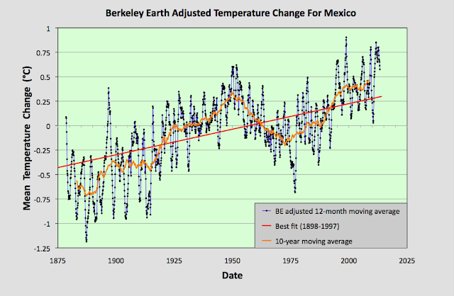
The MTA data in Fig. 93.1 clearly shows a positive temperature trend over time that equates to a warming of about 0.6°C over the last century. However, within this trend are fluctuations in the 5-year moving average (yellow curve) that are even greater than the overall rise in the trend (red curve). This behaviour is also seen in the Berkeley Earth adjusted data shown in Fig. 93.2 below.


Fig. 93.2: Temperature trends for Mexico based on Berkeley Earth adjusted data. The average is for anomalies from all stations with over 480 months of data. The best fit linear trend line (in red) is for the period 1898-1997 and has a gradient of +0.52 ± 0.03°C/century.


The Berkeley Earth (BE) data presented in Fig. 93.2 was generated using the same averaging process as that used for the data in Fig. 93.1 but using BE adjusted anomaly data. Usually this leads to a large difference in the temperature rise calculated using the unadjusted raw data (Fig. 93.1) from that using the BE adjusted data (Fig. 93.2). I have shown numerous examples in this blog over the last two years for many different countries, states and regions where this is the case, and it is one of my main reasons for doing this blog: to highlight the extent to which much of the original temperature data has been adjusted. 

In this instance, however, the adjustments made by Berkeley Earth (and there are many in most station datasets) appear to make little difference to the final outcome for the overall temperature trend. And this is not because the averaging process I use is different from the Berkeley Earth method. It is. I do not use any homogenization, Kriging or weighted coefficients for the different datasets in the averaging. Yet the temperature trend I derive from the BE adjusted data and present in Fig. 93.2 is virtually identical to the one published by Berkeley Earth and shown in Fig. 93.3 below. So once again the averaging process is not the issue.


Fig. 93.3: The temperature trend for Mexico since 1830 according to Berkeley Earth.


This all seems to suggest that the overall temperature trend for Mexico is as I have calculated in Fig. 93.1, and that this is broadly consistent with the Berkeley Earth version. But if we look at the data more closely we see a complication.


Fig. 93.4: The number of station records included each month in the mean temperature anomaly (MTA) trend for Mexico in Fig. 93.1 (blue curve). These stations can be sorted into two distinct groups. Those with five digit Berkeley Earth ID codes are shown in red, those with six digit IDs are in green.


The data files on the Berkeley Earth website for the stations in Mexico broadly fall into two distinct categories: those with 5-digit IDs and those with 6-digit ones. The different numbers appear to reflect the fact that the original data in each case comes from a different source database, with the 5-digit data files more likely to originate from a single source, usually the Global Historical Climatology Network (GHCN) of NOAA, and the 6-digit data files from multiple databases. The number of each of the two file types used to determine the MTA trend in Fig. 93.1 is shown in Fig. 93.4 above. 

Now ordinarily this difference in file source is not an issue. The same differentiation in ID numbers is seen for stations from many countries. The problem here is that these two sets of data files give wildly different results for the MTA trend of Mexico. This can be seen when we examine the temperature trends for each station individually as the map in Fig. 93.5 below illustrates.


Fig. 93.5: The (approximate) locations of the weather stations in Mexico. Those stations with a high warming trend between 1901 and 2000 are marked in red while those with a cooling or stable trend are marked in blue. Those denoted with squares are stations with a 6-digit Berkeley Earth ID, while diamonds denote stations with a 5-digit ID.


In Fig. 93.5 the geographical location in Mexico of each of the 142 weather stations with the longest temperature records used to determine the mean trend in Fig. 93.1 are plotted. Those in red have significant warming trends while those in blue are generally stable (the total temperature rise is either less than 0.25°C, or the trend is less than twice the error in the trend). In addition, the stations with 5-digit IDs are denoted by a diamond while those with a 6-digit ID are represented by a square. What is noticeable is the different split between warming and stable trends in each case.

In the case of stations with 6-digit IDs 73% (32 out of 44) have a warming trend, whereas for the stations with 5-digit IDs it is only 38% (37 out of 98). This difference is even more apparent if we calculate the mean temperature anomaly (MTA) for each set of stations separately.


Fig. 93.6: The mean temperature change for Mexico relative to the 1961-1990 monthly averages calculated using stations with a 5-digit Berkeley Earth ID. The best fit is applied to the monthly mean data from 1921 to 2010 and has a positive gradient of +0.14 ± 0.07 °C per century.


The MTA data in Fig. 93.6 above shows the mean temperature change for Mexico calculated using only anomaly data from stations with a 5-digit Berkeley Earth ID. The trend in this case is almost completely flat. In contrast, if the same exercise is performed using only anomaly data from stations with a 6-digit Berkeley Earth ID the result is a strong warming trend of over 1°C per century as shown in Fig. 93.7 below.


Fig. 93.7: The mean temperature change for Mexico relative to the 1961-1990 monthly averages calculated using stations with a 6-digit Berkeley Earth ID. The best fit is applied to the monthly mean data from 1898 to 1997 and has a positive gradient of +1.13 ± 0.06 °C per century.


All this means that it is difficult to conclusively assert what the degree of climate change in Mexico has been over the last century. The most reasonable estimate is that the mean temperature has risen by about 0.6°C (see Fig. 93.1 and Fig. 93.2), but it could be anywhere between 1.2°C (see Fig. 93.7) and 0°C (see Fig. 93.6).


Acronyms

BE = Berkeley Earth.

MRT = monthly reference temperature (see Post 47).

MTA = mean temperature anomaly.

List of all stations and links to all the original raw temperature data