Thursday, May 20, 2021

69. South-East Asia - temperature trends STABLE

Over the next few weeks I will examine some of the temperature records from Asia. This post will consider those from South-East Asia, and the countries of Burma (Myanmar), Thailand, Malaysia, The Philippines and Vietnam. Laos and Cambodia have been excluded because they have very little temperature data. Data for Singapore is incorporated into the analysis of data for Malaysia.


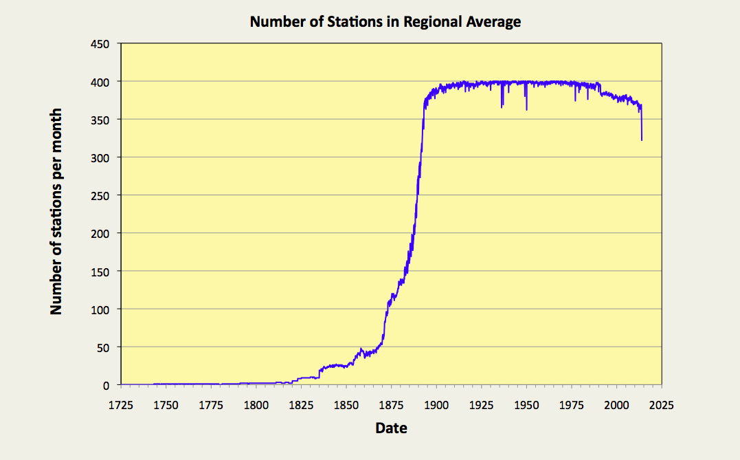
Fig. 69.1: The number of station records included each month in the mean temperature trend for five countries in South-East Asia.


In each case the temperature trend for the country was constructed by averaging the temperature anomalies from multiple station time-series. Different time periods were chosen for calculating the monthly reference temperatures (MRTs) for each country due to differences in the distribution of data in each case. These are indicated on the graphs below. For an explanation of how anomalies and MRTs are calculated, see Post 47.

The number of available series for each country are shown in Fig. 69.1 above. In all five cases there is much more data after 1950 and very little before 1900, and Thailand and The Philippines clearly have more data than the other three countries. However, Burma does have three long stations with over 1200 months of data, whereas Thailand only has one. Vietnam and Malaysia also have three long stations, although in the case of Malaysia that includes a station in Singapore, while The Philippines has two long stations. The analysis here used data only from long stations (with over 1200 months of data) and medium stations with over 480 months. In total Burma has 13 medium stations, Thailand has 55, Malaysia has 17, The Philippines has 35, and Vietnam has 10.


Fig. 69.2: The temperature trend for Burma. The best fit is applied to the monthly mean data from 1875 to 1992 and has a negative gradient of -0.13 ± 0.05 °C per century. The monthly temperature changes are defined relative to the 1961-1990 monthly averages.


Fig. 69.3: The temperature trend for Thailand. The best fit is applied to the monthly mean data from 1934 to 2008 and has a positive gradient of +0.14 ± 0.09 °C per century. The monthly temperature changes are defined relative to the 1961-1990 monthly averages.


Fig. 69.4: The temperature trend for Malaysia. The best fit is applied to the monthly mean data from 1881 to 2000 and has a negative gradient of -0.06 ± 0.03 °C per century. The monthly temperature changes are defined relative to the 1951-1980 monthly averages.


Fig. 69.5: The temperature trend for The Philippines. The best fit is applied to the monthly mean data from 1914 to 2007 and has a positive gradient of +0.24 ± 0.04 °C per century. The monthly temperature changes are defined relative to the 1951-1980 monthly averages.


Fig. 69.6: The temperature trend for Vietnam. The best fit is applied to the monthly mean data from 1901 to 2010 and has a positive gradient of +0.09 ± 0.05 °C per century. The monthly temperature changes are defined relative to the 1981-2010 monthly averages.


The graphs above indicate that there has been little, if any, climate change in the region in the last 100 years. The only country to show any significant warming has been The Philippines, and here it is less than 0.25°C. Burma may have seen a temperature rise of almost 1 °C since 1970, but beforehand the climate cooled by about 0.5°C. In all other cases the temperature appears to be stable. This is consistent with my previous analysis of temperature data for Indonesia (see Post 31), but it is not what is claimed by Berkeley Earth, though.


Fig. 69.7: The temperature trend for Thailand since 1800 according to Berkeley Earth.


According to Berkeley Earth there has been over 1.5°C of warming in Thailand since 1840 (see Fig. 69.7 above), with 0.5°C coming before 1900 despite there being no significant increase in carbon dioxide levels before 1900 (they were at 296 ppm compared to 283 ppm in 1800), and despite there being virtually no temperature data (Thailand has only one significant station with data before 1930).

The differences between the trend in Fig. 69.7 and that presented in Fig. 69.3 are due to the adjustments made to the data by Berkeley Earth. Averaging the Berkeley Earth adjusted data for the same stations used to derive the trend in Fig. 69.3 yields the curves in Fig. 69.8 below. These are almost identical to the curves shown in Fig. 69.7, thereby indicating that the adjustments are the source of the difference. This difference due to the Berkeley Earth adjustments amounts to an additional warming of 0.85°C since 1900. Without those adjustments there is virtually no warming.


Fig. 69.8: Temperature trends for Thailand since 1900 based on an average of Berkeley Earth adjusted data. The best fit linear trend line (in red) is for the period 1906-2005 and has a gradient of +0.72 ± 0.03 °C/century.


Another feature of note in the trends shown here are the standard deviations of the data. These are much less than those seen for countries in Europe, or states in the USA. In fact they are typically less than half. This suggests that temperatures near the Equator are much more stable than those nearer the poles. This in turn, suggests that as the local temperature increases, there are stronger negative feedbacks available that help to regulate that temperature. One such feedback is likely to be water vapour and associated cloud coverage. If so, then this would imply that water vapour is not the strong amplifier of climate change as is often suggested by climate scientists, at least not within the Tropics.


Conclusion

There has been no global warming or climate change in South-East Asia over the last 100 years.


Saturday, May 15, 2021

68. Happy Birthday - one year on

It is exactly one year since I started this blog, so I thought it would be a good time to pause and reflect on the developments so far.

The aim of this blog has been to test the claims of climate scientists, to test the physics, and to test the data.

Over the last year I have published 67 blog posts, the majority of which have analysed the temperature records of various countries, states and regions. But I have also considered other aspects of climate change, such as the underlying physics and thermodynamics, as well as looking at the the data analysis and its reliability. 


Fig. 68.1: The temperature trend for the Southern Hemisphere since 1820. The best fit is applied to the monthly mean data between 1876 and 1975 and has a negative gradient of -0.12 ± 0.09 °C per century.


Temperature records

So far I have analysed most of the temperature records from the Southern Hemisphere, together with the longest records from the USA and Europe. In few if any cases have the actual trends derived from the raw data agreed with the widely disseminated trends supported by the main climate science groups (NOAA, NASA, Berkeley Earth) and the IPCC.

Temperature trends for Australia and New Zealand showed little additional heating compared to the mid-18th century.

Temperature trends for many South American countries and the South Pacific showed strong cooling. Overall the trend for the whole of South America showed a modest rise of about 0.5°C since 1900 but the picture before 1900 was unclear due to poor data. If it behaved like Australia then the climate would have been just as warm as it is now.

The overall trend for the Southern Hemisphere showed cooling before 1970 and a slight warming of about 0.5°C thereafter.

In Europe there was very little temperature rise for 200 years before 1980 but then a sudden jump of over 1°C in 1988. This is totally at odds with what is conventionally reported.

In the USA temperatures have been either stable or decreasing for over 100 years. Yet trends published by NOAA and Berkeley Earth suggest otherwise.


Fig. 68.2: The temperature trend for the USA since 1900. The best fit is applied to the monthly mean data from 1931 to 2000 and has a strong negative gradient of -0.55 ± 0.22 °C per century.


Data analysis

Over the course of this blog's history I have applied a number of data analysis techniques to the temperature data.

In Post 9 I applied fractal geometry to the noise spectrum in order to ascertain the degree of self-similarity in the temperature data. This was pursued further in other posts such as Post 17, Post 27 and Post 42. The results indicate that fluctuations in the temperature record due to natural variations are likely to be significant, even when temperatures are averaged over entire centuries.

In Post 43 I showed that even temperature records from adjacent stations less than one mile apart are likely to disagree by up to 0.25°C purely because of random measurement uncertainties.

In Post 57 and Post 67 I analysed multiple data sets from the EU and the USA respectively and showed that a true regional trend could be obtained simply by averaging multiple station records, and that temperature adjustments applied to the data by climate scientists are both unnecessary and erroneous.

In Post 11 I considered the impact of station separation on the degree of correlation effects between temperature records. This indicated that neighbouring stations were likely to be very strongly correlated. In which case averaging temperature records from multiple stations for a regional trend would lead to a much smaller reduction in the temperature fluctuations than would normally be expected.


Physics

In some of my early blog posts (Posts 12, 13 and 14) I outlined the physics underpinning the Earth's climate and its energy balance.

I then drew on this knowledge to investigate the impact of surface heating due to human energy use. The results are discussed in Post 14 and Post 29, and suggest waste heat from human activities could be responsible for temperature rises of up to 1°C in some countries (e.g. Belgium and The Netherlands) and even more in large cities like London.


Future work

While most of the temperature data from the Southern Hemisphere has now been analysed here in some detail, the same is not true of the Northern Hemisphere. So far only a few European countries have been studied as well as data from Texas. There have also been analyses of the longest records from Europe and the USA in order to generate regional trends.

Future blog posts will look at analysing temperature data from Asia, Africa and the Arctic region. I will also complete analyses of the remaining European countries, some states of the USA (particularly those in the west), Canada and The Caribbean.

The other topic I will address is the issue of the Greenhouse Effect and the role of carbon dioxide in climate change.


Friday, May 14, 2021

67. More evidence against temperature data adjustments (USA)

In Post 57 (The case against temperature data adjustments) I presented evidence that seemed to cast doubt on the need to adjust temperature data. The main argument from climate scientists in favour of these adjustments is their belief that the raw data cannot always be trusted. Over time, changes to the data collection process may occur. These changes may be due to changes in the location of the weather station, changes to the environment around the original site, or changes to the instrumentation or data collection methods. 

It is certainly true that these issues affect many, if not most temperature records, and the longer the temperature record, the more likely such issues will probably occur. The important questions, though, are: how large are these data errors, and what is the best way to eliminate them from historical data?


Fig. 67.1: The temperature anomalies for Baker City Municipal Airport as calculated by Berkeley Earth.


The approach most climate groups use is to adjust data within each individual temperature record, an example of which can be seen by comparing the data in Fig. 67.1 above and Fig. 67.2 below. Both graphs show temperature data from Baker City Municipal Airport (Berkeley Earth ID: 164703) in the state of Oregon in the USA, which has then been adjusted by Berkeley Earth. The original data in Fig. 67.1 has no discernible temperature trend (green line), but after the data has been chopped into multiple autonomous segments, and those segments each subjected to its own separate corrective bias, the overall trend becomes strongly positive with a gradient of +0.67°C per century. Thus warming appears where before there was none.


Fig. 67.2: The adjustments made by Berkeley Earth to the temperature anomalies for Baker City Municipal Airport.


The justification for using these adjustments is that climate scientists believe they can identify points in the data where errors have been introduced, and also that they can determine what the correction factor needs to be in order to eradicate the error. The size of the adjustments is usually determined by comparing the station temperature time series with that of its neighbours, but as I showed in Post 43, even identical neighbours can display temperature differences of up to ±0.25°C just due to measurement uncertainties.

Adjustments are most commonly made at positions in the time series corresponding to known or documented station moves (red diamonds in Fig. 67.2), or at points where there is a gap in the temperature record (green diamonds). But, groups such as NOAA and Berkeley Earth have also developed algorithms that they claim can identify other points in the time series where undocumented changes have occurred. These positions in the data are referred to by NOAA and Berkeley Earth as changepoints and breakpoints respectively. To many climate sceptics, however, these techniques remain controversial. But I would argue that in many cases they are also unnecessary because of a statistical phenomenon called regression towards the mean.


Fig. 67.3: The average temperature trend for the 100 longest temperature records in the USA. The best fit is applied to the monthly mean data from 1921 to 2010 and has a positive gradient of +0.25 ± 0.15 °C per century. The monthly temperature changes are defined relative to the 1951-1980 monthly averages.


Basically, if the errors are randomly distributed between different records, and also at different times in those records, and if they are of comparable size, then any averaging process will cause the errors to partially cancel. The bigger the number of records in the average, the more precisely they will cancel.

In Post 57 I demonstrated that these errors can be eradicated using a simple averaging process. I did this by averaging unadjusted temperature data from stations located in neighbouring European countries (Germany, Austria, Hungary and Czechoslovakia), and showing that the averaging process gave the same result for the 5-year average trend for each country, provided there were more than about twenty stations in the average for each country. This was despite the fact that Berkeley Earth had applied over three adjustments on average to each temperature record during its own analysis process for those same stations.


Fig. 67.4: The average temperature trend for the 101st to the 200th longest temperature records in the USA. The best fit is applied to the monthly mean data from 1921 to 2010 and has a negative gradient of -0.11 ± 0.15 °C per century. The monthly temperature changes are defined relative to the 1951-1980 monthly averages.


The key to this is having sufficient data. In the case of the USA we have more than sufficient data. In Post 66 I analysed the 400 longest temperature records for the USA and determined the temperature trend since 1750. This in turn showed no evidence of any global warming in the USA over the last 100 years. But suppose we split those 400 records into four sets of 100 records, and compare the four results for the different mean temperature trends. What would we expect to see?


Fig. 67.5: The average temperature trend for the 201st to the 300th longest temperature records in the USA. The best fit is applied to the monthly mean data from 1921 to 2010 and has a slight negative gradient of -0.003 ± 0.135 °C per century. The monthly temperature changes are defined relative to the 1951-1980 monthly averages.


Well, the answer is shown in Fig. 67.3-Fig. 67.6. The result is that the four temperature trends look very similar (it is probably easiest to compare the 5-year moving average curves). But judging by the adjustments made by Berkeley Earth to the data in Fig. 67.2, it would not be unreasonable to expect Berkeley Earth to have made over 1000 adjustments in total to the 100 station records used to generate each of these four temperature trends. So not making these 1000 adjustments should result in large discrepancies between the four different trends, assuming the adjustments are needed. But they aren't needed, and there are no large discrepancies.


Fig. 67.6: The average temperature trend for the 301st to the 400th longest temperature records in the USA. The best fit is applied to the monthly mean data from 1921 to 2010 and has a negative gradient of -0.22 ± 0.14 °C per century. The monthly temperature changes are defined relative to the 1951-1980 monthly averages.


The four trends are compared in more detail in Fig. 67.7 below. The average of the anomalies from the 100 longest records in the USA are shown in yellow and are offset by -1°C for clarity. The mean of next longest 100 records is shown in blue. The mean of the third longest set is shown in red and offset by +1°C, with the fourth longest set shown in black, but not offset. To aid the analysis process, the blue curve is plotted three times, with three different offsets so that it can be compared with the other three trends.


Fig. 67.7:  A comparison of the 5-year averaged temperature trends for four sets of 100 temperature records in the USA. The trends are offset for clarity with the trend for stations 101-200 used as a comparator for each of the other three trends.


What is clear is that for all the data from 1890 onwards the four trends are virtually identical. This implies that the averaging process has eliminated almost all the data errors. Before 1890 the number of stations in each average decreases dramatically as shown in Fig. 67.8 below, which is why the level of agreement between the curves is much lower. From 1900 onwards, however, there is almost total agreement. The only significant differences are for stations 001-100 in the 1930s, and stations 301-400 post-1995, but in both cases the discrepancy is generally less than 0.25°C. These differences also largely account for the differences in the best fit lines in Fig. 67.3-Fig. 67.6. As for their causes, well the lower temperature anomaly for stations 301-400 after 1995 could be due to these stations being newer than the rest. That would imply they are located in smaller towns with less waste heat production. For stations 001-100 the opposite is probably true as these station time series are the longest. That in turn suggests they are more likely to be located near the largest cities.


Fig. 67.8: The number of station records included each month in the mean temperature trends.


What this demonstrates unequivocally is that data adjustments are unnecessary when determining global or regional mean trends. This is because the errors in the individual station records will cancel when averaged. If they did not, then the four trends in Fig. 67.7 would not be so alike. Instead there would be significant differences. And remember, the same result was demonstrated in Post 57.

But what this also implies is that, if the errors in the individual station records cancel, then so too should the adjustments that are applied by Berkeley Earth and others to correct these errors. Except they don't.


Fig. 67.9: The average temperature trend for the 301st to the 400th longest temperature records in the USA after adjustments made by Berkeley Earth. The best fit is applied to the monthly mean data from 1921 to 2010 and has a positive gradient of +0.54 ± 0.05 °C per century.


The graph in Fig. 67.9 above shows the mean temperature trend for stations 301 to 400 with their Berkeley Earth adjustments included. If the adjustments cancelled, then the graph should resemble the data in Fig. 67.6, but it doesn't. Instead of a significant negative trend, there is a sizeable positive trend. In fact the adjustments have added a net warming of over +0.7°C to the data since 1920. The same positive trend is also seen for the means of the adjusted data for the other three sets of 100 stations, so at least they are consistent, but that does not mean they are correct. In fact all they are doing here is adding warming where none existed previously.


Summary

What I have presented here is yet more compelling evidence against the statistical validity of temperature adjustments.

I have shown that the true temperature trend can be determined simply by averaging the anomalies from the raw data. This confirms the similar result for Central European data that I presented in Post 57.

This adds further weight to my claim in Post 66 that there has been no global warming in the USA since 1900.


Wednesday, May 12, 2021

66. USA - temperature trends COOLING

The USA has compiled the most comprehensive temperature records of any country in the world over the last 130 years. It has nearly ten thousand temperature records in total, of which nearly three thousand are long stations with over 1200 months of data. In addition, over two thousand stations have data that extend back to before 1900, with over four hundred having over 1400 months of data. 


Fig. 66.1: The temperature trend for the USA since 1740. The best fit is applied to the monthly mean data from 1781 to 2010 and has a positive gradient of +0.79 ± 0.04 °C per century. The monthly temperature changes are defined relative to the 1951-1980 monthly averages.


The averages of the temperature anomalies for the four hundred longest temperature records for the contiguous 48 states of the USA are shown in Fig. 66.1 above. The anomalies for each of the 400 stations are determined by first calculating the twelve monthly mean temperatures for each station. These monthly reference temperatures (MRTs) were determined for the period 1951-1980, and then subtracted from the raw temperature data to obtain the anomlies for each month, as described previously in Post 47. The monthly anomalies from each of the 400 stations were then averaged to generate the final mean temperature trend.

It is clear from the data in Fig. 66.1 that there is a strong positive trend in the temperature data. In fact the temperature appears to rise by 1.8°C from 1780 to 2010, as can clearly be seen in both the trend of the 5-year moving average (yellow curve) and the best fit line (red curve). So, there we have it: more conclusive proof of global warming. 

Except it isn't, because all the temperature rise in the data in Fig. 66.1 occurs before 1930; long before atmospheric carbon dioxide levels on Earth began to increase significantly. In fact by 1930 the atmospheric concentration of carbon dioxide was only about 307 ppm, less than 10% above pre-industrial levels, so nowhere near enough to cause a temperature increase of nearly 2°C.


Fig. 66.2: The temperature trend for the USA since 1900. The best fit is applied to the monthly mean data from 1911 to 2010 and has a slight positive gradient of +0.16 ± 0.13 °C per century.


In addition, after 1900 the picture is completely different. The temperature trend for the 100 years before 2010 is virtually zero with an increase of only 0.16°C that is barely above the uncertainty value of 0.13°C (see Fig. 66.2 above). The trend is also highly dependent on the time interval chosen for the data fitting due to the considerable amount of natural variation in the time series, even after smoothing with a 5-year moving average. 

Fitting to the data between the major peaks in the 5-year average at 1930 and 2000 (in order to eliminate cyclical distortions) actually gives a strong negative trend of -0.55°C per century, or a temperature fall of almost 0.4°C (see Fig. 66.3 below). So while carbon dioxide levels in the atmosphere have skyrocketed since 1930 (increasing by over 100 ppm), the climate of the continental USA has actually cooled.


Fig. 66.3: The temperature trend for the USA since 1900. The best fit is applied to the monthly mean data from 1931 to 2000 and has a strong negative gradient of -0.55 ± 0.22 °C per century.


So how reliable are these results? The graph in Fig. 66.4 below suggests that these results should be most reliable from about 1890 onwards. For this period the trends shown in Fig. 66.1-Fig. 66.3 are the result of averaging over 350 independent datasets. This reduces to less than 100 before 1870 and only one or two stations prior to 1820.


Fig. 66.4: The number of station records included each month in the mean temperature trend for USA when the MRT interval is 1951-1980.


Moreover, the stations being considered here are fairly evenly spread across the 48 contiguous states of the continental United States, although the density of stations to the west of the longitude line 96°W is only about half that of the density to the east (see Fig. 66.5 below). 

The distribution of warming and cooling stations in Fig. 66.5 also provides strong evidence of a significant geographical component influencing the overall temperature trend at any given location, with stations in the west, and those in areas of high population density, more likely to exhibit a high warming trend. In this case, a station is defined to be warming strongly if its overall temperature rise exceeds 0.25°C over its entire history, and the gradient of its temperature trend exceeds twice the error in that gradient. Consequently, this dependence of the temperature trend on location appears to constitute strong evidence in support of the existence of the urban heat island effect (UHI) and its role in driving at least some global warming in highly developed regions.


Fig. 66.5: The (approximate) locations of the 400 longest temperature records in USA. Those stations with a high warming trend are marked in red and orange. Those with cooling or stable trends are marked in blue. Those denoted with squares have over 1600 months of data.


It is self-evident that the results presented in Fig. 66.1-Fig. 66.3 are at odds with the claims of most climate science groups. This is confirmed by the data in Fig. 66.6 below which is an equivalent temperature trend for the USA, but which was calculated using data that have been adjusted by Berkeley Earth. That apart, the process used to generate the curves in Fig. 66.6 is exactly the same as the process used to derive the data in Fig. 66.1. In each case a simple average was performed of the monthly anomaly data from each of the 400 longest stations. This was repeated for each month in the time series.

It can be seen that the effect of the adjustments made to the data by Berkeley Earth is to lower the peak seen in the 1930s in order to render the trend more linear. This gives the effect of implying that most of the warming has occurred after 1900, whereas the trend based on raw data presented in Fig. 66.1 suggests most warming occurred before 1900. In both cases, though, the total warming from 1820 to 2010 is about the same at just under 2°C.


Fig. 66.6: Temperature trend for the USA since 1750 derived by aggregating and averaging the Berkeley Earth adjusted data from the 400 longest temperature records. The best fit linear trend line (in red) is for the period 1791-2010 and has a gradient of +0.66 ± 0.02 °C/century.


The plot in Fig. 66.6 may differ from the one based on raw data in Fig. 66.1, but it largely agrees with the trend for the USA published by Berkeley Earth and shown in Fig. 66.7 below. This is again despite the fact the averaging process used by Berkeley Earth to generate the curves in Fig. 66.7 uses different weighting coefficients for each station based on their location and proximity to other stations. The curves in Fig. 66.6, on the other hand, are the result of a simple average with no weighting. Yet the two sets of data largely agree. This would also suggest that the variation in station density seen in Fig. 66.5 is not sufficient to significantly impact the result either. This can be tested, though, by studying the temperature trends for the USA on a state-by-state basis. The temperature trends for Texas have already been determined, however (see Post 52).


Fig. 66.7: The temperature trend for the USA since 1750 according to Berkeley Earth.


Conclusions

The data presented here appears to suggest that there has been no global warming in the USA since 1920. In fact a cyclically neutral analysis of data for the 20th century appears to exhibit a strong cooling (see Fig. 66.3).

The strong warming seen in the USA temperature trend before 1900 is incompatible with the assertion that warming is only caused by increases in carbon dioxide, for the simple reason that there were no significant increases in atmospheric carbon dioxide before 1900.

The cause of the warming before 1900 is uncertain, but could be due to natural variations in climate, or a growing urban heat island effect as the USA started to industrialize. It should be noted that most of the USA temperature records with data prior to 1880 were based in towns and cities that were growing quickly, principally around New England and Chicago.


Addendum

Here is the NOAA version of the USA data, before and after their adjustments.


Fig. 66.7: The temperature trend for the USA since 1900 according to NOAA-NCDC.


So while the raw data is fairly close to that shown Fig. 66.3, the adjusted data is not. In fact the adjustments add about 0.4°C of warming.


Tuesday, May 11, 2021

65. Lateral thought #3 - when analogies go wrong


About six years ago Professor Steven Koonin wrote a guest post for Judith Curry's blog site Climate Etc. entitled "Are human influences on the climate really small?" The post was a follow-up to an article Prof. Koonin had written for the Wall Street Journal (WSJ) about six months earlier entitled "Climate science is not settled." The general thrust of these articles was to argue that many effects of man-made climate change were too small to be significant when compared with natural variabilities and climate uncertainties.

Needless to say both articles provoked a heated response from lot of climate scientists and their supporters. One such came from Andrew Lacis. His response was posted on Judith Curry's blog, and then again on Skeptical Science, and it began as follows:

Physicists should take the time to understand their physics better.

Only 1% to 2% . . . that may sound small and insignificant . . . but it isn’t.

It is well known that the normal human body temperature is about 310 K. Furthermore, it is also well known that a seemingly small change (up or down) in absolute body temperature by only 1% (3.1 K, or 5.6 F) would make one sicker than a dog, and, that a 2% change in body temperature (up or down by 6.2 K, or 11.2 F) will virtually guarantee a dead body. From this, it should be sufficiently clear that, when viewed in absolute energy terms, the viable margin between life and death in the Earth’s biosphere is remarkably narrow – so much so that a seemingly insignificant 1% to 2% change in the total energy of the global environment will invariably result in serious disruption of the established infrastructure of life in the biosphere.


The full response from Andrew Lacis ran to over twenty paragraphs and extended to other issues such as changes to atmospheric water vapour concentrations and other climate feedbacks. I am not going to consider the rest of his arguments in detail as they are not pertinent to the main thrust of this post. What I am going to consider is the above quote, minus the rather condescending first line, and ask, is the human body a good analogy for global climate? My considered answer is, no!

The attraction of the above analogy is, I think, two-fold. Firstly, both the normal temperature of the human body (310 K) and the generally assumed mean surface temperature of the Earth (288 K) are fairly similar in magnitude (the difference is only about 7%). Secondly, both the human body and the Earth are highly complex systems regulated by multiple feedback mechanisms, but which at the same time appear to be extremely stable. So, it could be inferred that what is true for one could, or should, be true for the other. In which case, according to the analogy, if a change in body temperature of 1°C in a human is of profound importance to their health and well-being, then the same should be true for the biosphere of the Earth with regard to the interdependence of its own mean temperature and its long-term survival.

Except, that it is not.

Because the mean temperature of the human body does not change by ±10°C or more every twelve hours. Nor does the mean daily temperature of the body change by over 10°C over the course of a month, or in many cases even a week, or by over 50°C from January to July. Nor is there a permanent temperature difference of over 100°C between different points on the body such as the head and the feet. Because if it did do any of this, then a mean temperature rise of only 1°C due to a mild fever would be undetectable. And that is the key point! Yet that is what climate science is trying to measure in respect of a mean global temperature, and then claim that a) the measurement is statistically significant, and b) that the consequences will be so catastrophic that the system will be unable to cope.

You might ask, why should we care now about what a few physicists, climate scientists and commenters wrote over six years ago? The main reason is that those who oppose the Steven Koonin viewpoint, or his right to articulate it, continue to republish quotes like the one above to support their own arguments.

So, thank you to Andrew Lacis for the above analogy. It is indeed a very useful and illuminating analogy.