Showing posts with label instrumental temperature record. Show all posts

Thursday, December 10, 2020

44. Europe - temperature trends since 1700 - STABLE to 1980

The longest temperature records that we have are almost all found in Europe. In fact Europe has over 30 records that predate 1800, and three that go back beyond 1750. One of those three is the De Bilt record from the Netherlands (Berkeley Earth ID: 175554) that I discussed in both Post 41 and Post 42 and which dates back to 1706. The second is Uppsala in Sweden (Berkeley Earth ID: 175676) which dates back to 1722, and the third is Berlin-Tempelhof in Germany (Berkeley Earth ID: 155194) which has data as far back as 1701. Overall, there are nearly 120 temperature records with over 1200 months of data that also have data that predates 1860 (see here for a list). If we average the anomalies from these records, we get the temperature trend shown in Fig. 44.1 below.


Fig. 44.1: The temperature trend for Europe since 1700. The best fit is applied to the interval 1731-1980 and has a positive gradient of +0.10 ± 0.04 °C per century. The monthly temperature changes are defined relative to the 1951-1980 monthly averages.


To construct the trend in Fig. 44.1 above the raw temperature data from each of 109 records was first converted to monthly anomaly data by subtracting the monthly reference temperatures (MRTs). The MRTs were in turn calculated for the time interval 1951-1980 by averaging the data in that record over all months in that period. This is the same time frame that was used by climate scientists in the 1980s to analyse temperature data, but is significantly earlier than the time intervals normally used today which tend to be 1961-1990 or 1981-2010. The reasons for the differences in time frame I intend to discuss in a later post.

The temperature trend in Fig. 44.1 has two features of note. The first is the very slight upward trend from 1730 to 1980 of approximately 0.10 °C per century. This amounts to a total temperature increase over that time period of about 0.25 °C which is significantly less than the standard deviation of the 10-year moving average of the same data. This suggests that this trend is insignificant when compared to natural variations in temperature.

The second feature is the sudden temperature rise of almost 0.8 °C seen in 1988. This looks unnatural. So much so that, if it were to occur in just one temperature record, then it could be ascribed to a random fluctuation, or a sudden change in the local environment or undocumented location change. But this is not seen in just one record; it is seen in the average of over 100 temperature records, as the data in Fig. 44.2 below shows.


Fig. 44.2: The number of sets of station data included each month in the temperature trend for Europe.


Nor can we claim that this is just a local effect. The map below in Fig. 44.3 shows the approximate location of all 109 stations whose data was used to construct the trend in Fig. 44.1 above. While it is clear that the greatest concentration of stations is in central Europe between France and Poland, it is also evident that there are significant numbers of stations with very long records located on the edges of Europe such as in the UK, Scandinavia and eastern Europe. This suggests that the sudden rise in temperature seen in 1988 is real and widespread.


 Fig. 44.3: The locations of long stations in Europe with more than 1800 months of data, or more than 1200 months of data but with significant data from before 1860. Those stations with a high warming trend from 1700-1980 are marked in red.


For comparison, I have performed the same averaging process on the adjusted data for each station created by Berkeley Earth. This adjusted data for each station incorporates two adjustments to the data. Firstly, the monthly reference temperatures (MRTs) are constructed from homogenized data for the region rather than from the raw station data. Secondly, the trend of each temperature record is spliced into segments using breakpoints, and each segment is adjusted up or down relative to its original position. These breakpoint adjustments are supposed to remove local measurement errors (such as those due to changes in instrumentation or location) and thus make the data more reliable, but as I pointed out in my previous post, reliability in temperature data is very hard to measure due to the amount of natural variability that it contains.


Fig. 44.4: Temperature trends for all long and medium stations in Europe since 1750 derived by aggregating and averaging the Berkeley Earth adjusted data. The best fit linear trend line (in red) is for the period 1801-1980 and has a gradient of +0.33 ± 0.03 °C/century.


The results of averaging the Berkeley Earth adjusted data are shown in Fig. 44.4 above. Three things are noticeable in this data. Firstly, the trend in the data before 1980 has increased by a factor of three. There are two main reasons for this. One reason is that the adjustments made to the data have increased the trend slightly and smoothed out some of peaks before 1830 (see Fig. 44.6 below). The other is that the interval used for the fitting of the linear regression is shorter. This in turn reduces the gradient of the trend.

The second feature of the data in Fig. 44.4 above is that the jump in temperature after 1988 is still present, and is just as large as that seen in Fig. 44.1.

The third feature of the data in Fig. 44.4 is that it closely resembles that data shown for the 12-month and 10-year trends that has been published by Berkeley Earth (see Fig. 44.5 below). This suggests that the averaging process I have used is sufficiently accurate without the need to apply different weightings to the data from different stations as Berkeley Earth does. The weightings that Berkeley Earth use are supposedly to correct for any clustering of stations, but the map in Fig. 44.3 suggests these weightings are not likely to vary significantly for most stations, and so are not likely to be of primary importance. The agreement between the data in Fig. 44.4 and that in Fig. 44.5 appears to confirm that hypothesis.


Fig. 44.5: The temperature trend for Europe since 1750 according to Berkeley Earth.


It can be seen from these results that the differences between the trends I have constructed using the original data and the trends derived using Berkeley Earth's adjusted data are not as large as has been seen in previous regional analyses, such as those for South Africa (Post 37), South America (Post 35), the South Pacific (Post 33 and Post 34), Papua New Guinea (Post 32), Indonesia (Post 31), Australia (Post 26) and New Zealand (Post 8). These differences for Europe are shown in Fig. 44.6 below.


Fig. 44.6: The contribution of Berkeley Earth (BE) adjustments to the anomaly data in Fig. 44.4 after smoothing with a 12-month moving average. The linear best fit (red line) to the breakpoint adjustment data (shown in orange) is for the period 1841-2010 and has a gradient of 0.057 ± 0.001 °C per century. The blue curve represents the total BE adjustments including those from homogenization.


Overall, the adjustments made by Berkeley Earth to their data have probably only added about 0.2 °C to the warming. More significant are the adjustments made to data before 1830 which appear to be designed to flatten the curve. Such adjustments, though, assume that the mean temperature before 1830 was stable. Yet data from 1830 to 1980 suggests that the temperature trend for Europe was anything but stable, even though the trend shown in Fig. 44.1 was constructed from between 50 and 109 different datasets over that period. The full extent of that instability for the 5-year average temperature can be seen in Fig. 44.7 below.


Fig. 44.7: The 5-year moving average of the temperature trend for Europe since 1700. The best fit is applied to the monthly anomaly data for the interval 1731-1980 and has a positive gradient of +0.10 ± 0.04 °C per century.


Conclusions

In 1981 James Hansen and co-workers at NASA's Goddard Institute for Space Studies (GISS) published a paper in the pre-eminent journal Science (which incidentally, has an impact factor of 41.8, where impact factors over 1.0 are considered good) that was one of the first to warn of the impact that increased levels of carbon dioxide in the atmosphere could have on global warming and climate change. But here is the problem: the data shown here appears to indicated that there was no significant warming in Europe before 1981. As the data shown in Fig. 44.1 indicates, the total warming in Europe for the 250 years before 1981 was so small (less than 0.25 °C) that it was less than the natural variation in the mean decadal temperatures over the same period.

Then, in 1988 the mean temperatures in Europe suddenly jumped by over 0.8 °C (see Fig. 44.1), just in time for the IPCC's  first assessment report on climate change in 1990 (PDF). A similar abrupt jump was seen at about the same time in Botswana and, to a lesser extent, in South Africa. Convenient, certainly. But is this just coincidence or 20:20 foresight by the IPCC?

As I have shown throughout the course of this blog, before 1981 there does not appear to have been any exceptional warming in most of the Southern Hemisphere either. So the above analysis raises important concerns regarding the reported extent of climate change in Europe and beyond. The most important question is: is the temperature rise seen after 1988 in Fig. 44.1 real? And if so, what is causing it? 

If it is being driven by CO2, then why does it not correlate with increases in CO2 levels in the atmosphere? If it is a natural phenomenon, why are there no other jumps of a similar magnitude in the previous 250 years? Could it be another example of chaotic behaviour similar to the self-similarity I explored in Post 42? And if so, is it just random, or is it the consequence of a complex system being driven between meta-stable states by, for example, greenhouse gases? What I don't see so far is conclusive evidence either way.


Tuesday, November 24, 2020

41. Netherlands - temperature trends - VARIABLE

The Netherlands has one of the longest instrumental temperature records in the world, and probably the most complete record covering the last 300 years. The record from De Bilt (Berkeley Earth ID: 175554) had nearly 3700 months of data in 2013 that stretched back to 1706 (see Fig. 41.1 below). Only Berlin Tempelhof (Berkeley Earth ID: 155194) has earlier data that extends to 1701, but it has fewer months overall and significant gaps in its record before 1756.


Fig. 41.1: The temperature trend for De Bilt since 1706. The best fit is applied to the interval 1731-2005 and has a positive gradient of +0.29 ± 0.04 °C per century. The monthly temperature changes are defined relative to the 1976-2005 monthly averages.


As I showed in the last post, Belgium also has one long record that stretches back to the 18th century, but it has virtually no other data before 1973. The Netherlands is much better in this respect. There is one other dataset with some sporadic 19th century data, and overall there are five long station records with more than 1200 months of data. In addition, there are another 25 medium records with more than 480 months of data. Details of all these 30 stations (and other shorter records) are listed here, while their geographical locations are shown on the map in Fig. 41.2 below.


Fig. 41.2: The locations of long stations (large squares) and medium stations (small diamonds) in the Netherlands. Those stations with a high warming trend are marked in red.


It can be seen from the map above that the stations in the Netherlands are fairly randomly distributed across the country, but that their number appears to be significantly less than the 30 stations stated previously. This is because in nearly a dozen cases two or more stations are located within 10 km of each other. I intend to look at this is more detail in a later post, where I will look at what this says about data reliability. 

The other impact of this clustering is the effect it could have on the station weightings in the regional average. Normally if a cluster of records is found the weighting of each record should probably be reduced as they will tend to repeat each other's data and geographical coverage. However, as most of the station records appear in effect to be paired up, they will almost all have the same reduced weighting, so the weighting reduction should largely cancel. This is largely confirmed by the results I will show later in this post. The other point to note, is that the clustering really only impacts the medium stations, most of which have data after 1970 only. So the weighting problem will only have a slight effect on the overall trends after 1970.


Fig. 41.3: The temperature trend for the Netherlands since 1706. The best fit is applied to the interval 1731-2005 and has a positive gradient of +0.31 ± 0.04 °C per century. The monthly temperature changes are defined relative to the 1976-2005 monthly averages.


If we average the anomaly data for all the long and medium stations we get the trends shown above in Fig. 41.3. The overall trend indicates that the region has warmed by about 0.31 °C per century since 1700. This equates to an overall warming of about 0.97 °C. But as I explained in Post 14, the current human industrial and domestic energy consumption in the country suggests that the region should have warmed by at least 1.0 °C over the same period simply as a consequence of all the heat that is produced each year by human activity. So, just as for Belgium, we see little need to call on the effects of carbon dioxide emissions and the Greenhouse Effect to explain the observed temperature rise.

The other interesting feature of the data in Fig. 41.3 is the shape of the temperature trend between 1800 and 1950. There is clearly a peak around 1860 that is seen not just in the De Bilt record in Fig. 41.1, but also in the Zuid-Limburg station data. This suggests that temperatures in the mid-19th century in the Netherlands were actually higher than they are today. This is a phenomenon that I have identified and highlighted previously in other countries and regions such as New Zealand (see Post 8), Australia (see Post 26) and South America (see Post 35). In fact it appears to occur over most of the Southern Hemisphere, or at least in those parts that have sufficient data before 1900.

The anomaly data used to construct the trend in Fig. 41.3 was derived by first calculating the monthly reference temperatures (MRT) for the period 1976-2005 for each record, and then subtracting these from the raw data. These were then averaged. Temperature records were only included in the trend in Fig. 41.3 if they had at least 480 months of data, and at least 320 months of this data was within the MRT interval of 1976-2005. This was to ensure that all temperature anomaly records were measured relative to identical reference points. The result was that three medium stations were excluded because they had insufficient data after 1975. These were the stations at Den Helder, Maastricht and Groningen


Fig. 41.4: The number of sets of station data included each month in the temperature trend for the Netherlands.


The actual number of stations used to construct each monthly point in the trend in Fig. 41.3 is illustrated above in Fig. 41.4. This shows that the trend before 1900 is almost entirely due to the data from De Bilt in Fig. 41.1, while the data from 1900 to 1950 comes from the five long stations. After 1950 as many as 27 station records were used for each monthly average.


Fig. 41.5: Temperature trends for all long and medium stations in the Netherlands since 1750 derived by aggregating and averaging the Berkeley Earth adjusted data. The best fit linear trend line (in red) is for the period 1801-1980 and has a gradient of +0.29 ± 0.03 °C/century.


So the question is, how significant are these results? And also how reliable are they?

Well, one way to test this is to compare these results against those produced by climate science groups like Berkeley Earth. The first thing to remember, though, is that the Berkeley Earth anomaly data for each station record is different from that which I have calculated here because it uses homogenization and breakpoint alignment to adjust the data, techniques that I have profound misgivings about because they could introduce warming to the overall trend that is not actually there. That is why I restrict my analysis to the raw data with all its imperfections.

However, if we apply the same averaging process to the Berkeley Earth adjusted data as I have employed to the raw data, we see that the trends we get (as illustrated in Fig. 41.5 above) agree very well with those published by Berkeley Earth and shown in Fig. 41.6 below. In fact the size and positions of most of the peaks in the two figures are virtually identical. This suggests that the two processes (mine and Berkeley Earth's) are broadly consistent, even if the anomaly data for each station that is used in the averaging is different. What it also shows, though, is that the Berkeley Earth trend that incorporates homogenization and breakpoint adjustments is somewhat different from the trend I have presented in Fig. 41.3 that avoids using such controversial techniques. For example, according to Berkeley Earth, the warming in the Netherlands since 1900 is at least 1.5 °C, and there was no warm period in the mid-19th century. It is these disagreements over data and methodology, and the effects they have on the resulting temperature trends, that partly fuels the climate scepticism debate.


Fig. 41.6: The temperature trend for the Netherlands since 1750 according to Berkeley Earth.


If we try to quantify the difference between the Berkeley Earth temperature trend and the raw trend I have constructed in Fig. 41.3 we find that the adjustments made by Berkeley Earth  have two main effects. The first is to flatten the trend before 1900. The second is to exaggerate the temperature rise after 1900 by about 0.3 °C. These adjustments are illustrated in Fig. 41.7 below.


Fig. 41.7: The contribution of Berkeley Earth (BE) adjustments to the anomaly data after smoothing with a 12-month moving average. The linear best fit to the data is for the period 1901-2010 (red line) and the gradient is 0.266 ± 0.009 °C per century. The orange curve represents the contribution made to the BE adjustment curve by breakpoint adjustments only.


Conclusions

It is clear from Fig. 41.3 that there has been a large degree of warming in the Netherlands over the last 300 years, but that this is probably less than than the 1.5 °C we are being led to expect for anthropogenic global warming (AGW) in the Northern Hemisphere as claimed by the IPCC and the HadCRUT4 data

The magnitude of this warming is probably only about 1 °C. However, this temperature rise is only what one would expect from the growth of industrial energy use over this period (for the Netherlands I have previously calculated that it should be about 1.0 °C) as I explained in Post 14

However, there is also evidence of significant natural variation in the temperature record (such as the warming in the mid-19th century) that is inconsistent with current IPCC claims.

Consequently, the data presented here does not really add support to the theory that carbon dioxide is the primary driver of warming, otherwise the warming seen in the Netherlands should be much larger, and there would be no anomalous fluctuations in temperature before 1900.

Finally, there is the issue of historical perspective. If temperatures in the recent past were both higher than now and at times lower than now, why are we worried about current temperatures when they appear to be fluctuating between normal bounds?


Saturday, November 21, 2020

40. Belgium and Luxembourg - temperature trends 1°C WARMING

In the next few posts I am going to take a look at the temperature trends in a few countries in western Europe, starting with Belgium. The unique feature of these countries is that they have some of the longest instrumental temperature records in the world.


Fig. 40.1: The temperature trend for Brussels since 1794. The best fit is applied to all the data and has a positive gradient of +0.67 ± 0.05 °C per century. The monthly temperature changes are defined relative to the 1976-2005 monthly averages.


The longest temperature record in Belgium comes, not surprisingly, from Brussels, and extends back to 1794 (see Fig. 40.1 above). That is the good news. The bad news is that there are no other temperature records with significant temperature data before 1973. Four records do have a couple of years of data in the early 1940s. But this data is probably not very reliable as there is then a thirty year gap to the rest of the data, and the early data was clearly collected under conditions of wartime occupation. The only other significant dataset comes from Luxembourg to the south of Belgium (see Fig. 40.2 below) which extends back to 1878.

The blue data in Fig. 40.1 above is the monthly temperature anomaly for Brussels, i.e. the amount by which each month's mean reading deviated from a reference value for that month for that station. Those monthly reference temperatures (MRT) were calculated by averaging all equivalent months (i.e. January or February etc.) in that dataset over the period 1976-2005. This is a later period than that used for most previous blog posts (most use 1961-1990) and is solely because of the lack of data before 1973. The monthly reference temperatures (MRT) are then subtracted from the raw monthly data to generate the monthly anomaly data. For a longer explanation of this process see Post 38 and Post 4.

It can be seen from the anomaly data in Fig. 40.1 that the range of anomaly values can be up to 12 °C, with the extreme negative values being more extreme than the extreme positive ones. These extreme negative values almost always correspond to severe winters; the winter of 1942 was particularly bad with two consecutive months (January and February) recording monthly means that were over 6 °C below normal. In the middle of a Nazi occupation I suspect that was really grim. Overall, though, this suggests that extreme winter cold spells are much deeper and longer lasting than prolonged summer heatwaves.

The other main feature of the data in Fig. 40.1 is the overall upward trend. Apart from a significant dip around 1890, this is almost continuous, and is illustrated more clearly by the 5-year moving average (yellow curve). Overall the mean temperature in Brussels rises by over 1 °C, as indicated by the red best fit line, from 1794 to 2013. However, as I pointed out in Post 14, the growth in energy usage in Belgium over the same period would be expected to raise temperatures by around 0.98 °C anyway. This would appear to indicate, that while the temperature rise is probably man-made, it is in all likelihood not entirely due to the emission of carbon dioxide and the Greenhouse Effect. 

It may be tempting to also discount this temperature record for Brussels as being an aberration or anomaly from the norm. However, if we compare it to the data for Luxembourg shown in Fig. 40.2 below, we see similar trends and features. There is a similar temperature rise after 1985, similar peaks in the 5-year moving average around 1947 and 1960, and a similar trough around 1890. The gradients of the best fit lines are similar in both cases as well, although the uncertainty for the Luxembourg best fit is much greater at almost ±0.16 °C. This, though, is partly due to the shorter time span of the Luxembourg data. 


Fig. 40.2: The temperature trend for Luxembourg since 1878. The best fit is applied to the interval 1895-2004 and has a positive gradient of +0.49 ± 0.16 °C per century. The monthly temperature changes are defined relative to the 1976-2005 monthly averages.


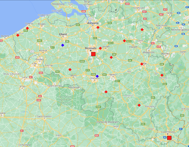
If we now look at the remaining data for Belgium and Luxembourg we see that there are an additional fourteen medium stations with temperature records that contain at least 480 months of data (see here for a list). Most of this data is for the period 1973-2013. The locations of the two long stations (Brussels and Luxembourg) and the fourteen medium stations are shown on the map in Fig. 40.3 below.


Fig. 40.3: The locations of long stations (large squares) and medium stations (small diamonds) in Belgium and Luxembourg. Those stations with a high warming trend are marked in red.


The map in Fig. 40.3 indicates that the two long stations with over 1200 months of data and the fourteen medium stations with over 480 months of data are distributed fairly evenly across Belgium and Luxembourg. This is important because it means that we probably don't need to resort to complex weighted averages when finding the overall temperature trend. A simple mean will suffice. In which case, combining the anomalies for the sixteen stations indicated in Fig. 40.3 gives the overall trend shown in Fig. 40.4 below.


Fig. 40.4: The temperature trend for Belgium and Luxembourg since 1794. The best fit is applied to the interval 1895-2004 and has a positive gradient of +0.52 ± 0.15 °C per century. The monthly temperature changes are defined relative to the 1976-2005 monthly averages.


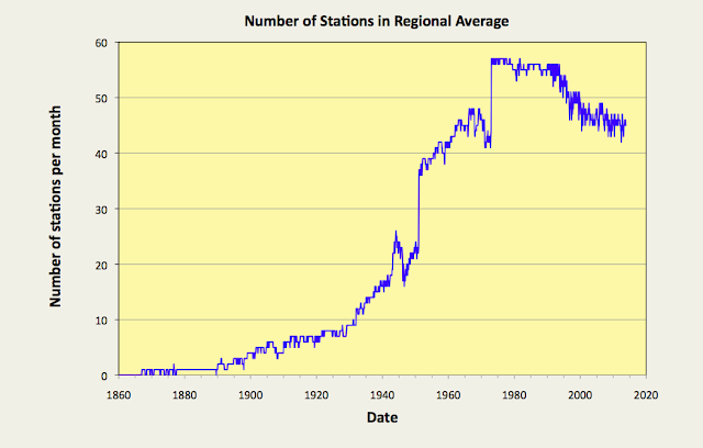
As can be clearly seen, the overall trend for the whole of Belgium is not that different from that illustrated for Brussels in Fig. 40.1, but then why would it be? Over 80% of the trend in Fig. 40.4 is entirely due to the data from two stations: Brussels and Luxembourg. This is shown graphically in Fig. 40.5 below.


Fig. 40.5: The number of sets of station data included each month in the temperature trend for Belgium and Luxembourg.


Finally, if we compare these results using the raw data with those produced by Berkeley Earth which used adjusted data, we see broad similarities but some notable differences.


Fig. 40.6: Temperature trends for all long and medium stations in Belgium and Luxembourg since 1794 derived by aggregating and averaging the Berkeley Earth adjusted data. The best fit linear trend line (in red) is for the period 1801-1980 and has a gradient of +0.28 ± 0.03 °C/century.
 

Combining the Berkeley Earth adjusted anomaly data for the same sixteen station records as in Fig. 40.4 and taking the mean value yields the two trends shown in Fig. 40.6 above: one trend for the 12-month average (in black) and a second for the 10-year average (in orange). For temperature data after 1860 the two trends are very similar to those published by Berkeley Earth and shown in Fig. 40.7 below, with the curves exhibiting similar patterns of peaks and troughs in the two figures. This does appear to validate our initial assumption that weighted averages are unnecessary when combining these temperature records due to their even geographical spacing. However, the Berkeley Earth data before 1860 looks slightly different, and quite frankly is unlikely to be very reliable, given that it is based on only one temperature record, or for the curve before 1794, on no local data at all. 


Fig. 40.7: The temperature trend for Belgium since 1760 according to Berkeley Earth.


Finally, if we look at the difference between the raw data shown in Fig. 40.4 and the Berkeley Earth adjusted data presented in Fig. 40.6 we see that while the overall net adjustments Berkeley Earth made to the data in this instance are small and result in a slightly negative contribution to the trend, there were still large corrections made to segments of the data before 1930 that in effect attempt to "flatten the curve". These do not appear to have a significant impact on the overall trend though.


Fig. 40.8: The contribution of Berkeley Earth (BE) adjustments to the anomaly data after smoothing with a 12-month moving average. The linear best fit to the data is for the period 1831-2010 (red line) and the gradient is -0.048 ± 0.009 °C per century. The orange curve represents the contribution made to the BE adjustment curve by breakpoint adjustments only.


Conclusions

It is clear from Fig. 40.4 that there has been a large degree of warming in Belgium and Luxembourg over the last 200 years. It is likely, given the agreement between the data from the two longest temperature records and their significant spatial separation, that this warming is a feature of the entire region, and is not localized to just one area (or maybe two) of the country, although given the lack of data before 1973, that is not a certainty. The magnitude of this warming is probably in excess of 1 °C. However, this temperature rise is only what one would expect from the growth of industrial energy use over this period (for Belgium it should be about 0.98 °C) as explained in Post 14. It is also less than the 1.5 °C we are told to expect for anthropogenic global warming (AGW) in the Northern Hemisphere as claimed by the IPCC and the HadCRUT4 data. Consequently, it does not really add support to the theory that carbon dioxide is the primary driver of warming, otherwise the warming should be much larger.


Thursday, August 27, 2020

33. South Pacific - temperature trends part 1 (west) STABLE

The South Pacific is too large to consider in one discussion, and its weather stations are not evenly distributed. The map below indicates the location of all the long stations (≥ 1200 months of data) and medium stations (480 - 1199 months). It can be seen that the majority of stations are in the western half of the ocean, to the west of the Pitcairn Islands (see the central cross to the right of French Polynesia in Fig. 33.1 below).


Fig. 33.1: The locations of all the long and medium stations in the South Pacific by country.


Overall there are only six long stations, four to the west of Pitcairn Island and two on Isla Juan Fernandez off the coast of Chile. In addition, there are 60 medium stations, of which only five are either on, or to the east of, the Pitcairn Islands (longitude 130.1°W). Of these 66 stations, 41 can be classified as having warming trends where the temperature trend is positive and exceeds twice the uncertainty in the trend (see Fig. 33.2 below).


Fig. 33.2: The locations of long stations (large squares) and medium stations (small diamonds) in the South Pacific. Those stations with a high warming trend are marked in red.


In this post I will look at the temperature records in the western half of the South Pacific (west of longitude 132°W). This will also include a couple of stations in Kiribati that are just north of the equator, but will exclude the Pitcairn Islands and the islands off the coast of South America. 

The total number of station temperature records in this region is more than 100, but only 59 have more than 480 months of data, and only four of those are long stations. Averaging the anomalies from these 59 records results in the temperature trend shown below in Fig. 33.3.


Fig. 33.3: The temperature trend for the western South Pacific since 1860. The best fit is applied to the interval 1912-1999 and has a gradient of 0.18 ± 0.04 °C per century. The temperature changes are relative to the 1961-1990 average.


The anomaly data in Fig. 33.3 was calculated by finding the monthly reference temperature (MRT) for the period 1961-1990 for each record, and subtracting it from the raw data to determine the temperature anomaly (see Post 4 for details). The anomalies for each month were then averaged.

Only records that had a minimum of 40% of data within this time-frame for any of the twelve months of the year January-December were included in the average for that month. Of the 59 records, one had no qualifying months and two had only nine months out of the possible twelve that satisfied this criterion. Thus one was excluded completely and two were only included for the nine months that their MRTs were valid. The resulting mean temperature trend is illustrated above.

Although the temperature data in Fig. 33.3 has an upward or warming trend from about 1900 onwards, it is very modest (0.18 °C per century for 1912-1999), and it is much less than the fluctuations in the 5-year moving average. The warming is therefore not statistically significant, particularly when compared to the variations in temperature seen before 1895. It should be noted, though, that the data before 1895 is based on only one or two records at most for that time period.


Fig. 33.4: Temperature trends for all long and medium stations in the western South Pacific since 1860 derived by aggregating and averaging the Berkeley Earth adjusted data. The best fit linear trend line (in red) is for the period 1912-1999 and has a gradient of +0.83 ± 0.02 °C/century.


The data in Fig. 33.3 is interesting, but it is meaningless unless we can test it against known control. That control is the equivalent data based on Berkeley Earth adjusted anomalies. This is shown in Fig. 33.4 above. Once again this data exhibits the standard rise in temperature since 1900 of about 1 °C that the IPCC and the climate science community insist we should see. The problem is, that once again, the majority of this warming comes not from the real data, but from the adjustments made to it (see Fig. 33.5 below). As I have noted before, these adjustments are derived from two separate sources: (i) homogenization of the data when constructing the MRTs; (ii) breakpoint adjustments made to different parts of each data set in order to improve the data fitting.


Fig. 33.5: The contribution of Berkeley Earth (BE) adjustments to the anomaly data after smoothing with a 12-month moving average. The linear best fit to the data is for the period 1912-1999 (red line) and the gradient is +0.65 ± 0.03 °C per century. The orange curve represents the contribution made to the BE adjustment curve by breakpoint adjustments only.


Conclusions

1) There is no evidence of a strong warming trend in the aggregated western South Pacific raw temperature anomaly data (see Fig. 33.3).

2) Over 78% of the warming seen in the aggregated Berkeley Earth adjusted data (see Fig. 33.4) is due to adjustments made to the data (see Fig. 33.5), and most of this comes from breakpoint adjustments.


Addendum

The maximum number of temperature records included in the trend in Fig. 33.3 is 57. Between 1900 and 1950 this increases from only 4 to about 24 (see Fig. 33.6 below). The other point to note is that the standard deviation of the temperature fluctuations for most stations in the region is only about 0.5 °C (compared to over 1 °C for most of Australia and New Zealand, for example). This means that the error in the mean temperature trend in Fig. 33.3 is less than 0.08 °C after 1950, but for the period 1900-1950 it varies from approximately 0.25 °C to 0.10 °C. All these uncertainties are, however, much less than the apparent random variations seen in the 5-year moving average for the mean temperature trend. This suggests that the fluctuations seen in the mean temperature trend from 1900-2013 are not the result of a lack of data in the first half of the 20th century or bad data. They are real and indicate the natural behaviour of the temperature record over timescales exceeding 100 years.


Fig. 33.6: The number of sets of station data included each month in the temperature trend for South Pacific (West) shown in Fig. 33.3.


Saturday, August 22, 2020

32. Papua New Guinea - temperature trends 0.4°C WARMING (moderate)

I had thought about combining the temperature data for Papua New Guinea (PNG) with that of Indonesia, just as I did with East Timor (Timor Leste) in the previous post. Like East Timor, PNG shares an island (in this case Papua) with Indonesia, so from that point of view it would be logical. However, in the end I decided there was enough data in Indonesia, and extending the analysis to PNG would not only increase the data analysis complexity, but also the geographical area of coverage, and that would be too much. 

Like Indonesia, PNG has only one long station with a temperature record longer than 1200 month (Port Moresby AP - Berkeley Earth ID: 157418). It also has seven medium stations with records of more than 480 months of temperature data, and there are approximately 30 other shorter records that are too small to be useful. One of the medium stations (Port Moresby - Berkeley Earth ID: 19383) is excluded from the following analysis even though it contains data that suggests temperatures in the late 1800s were up to 1.0 °C higher than in the early 20th century. This is because: a) it is close to another long station (Port Moresby AP - Berkeley Earth ID: 157418) which has longer and more complete data in the 20th century; and b) because it has no data after 1941, and so its monthly reference temperatures (MRTs) cannot be calculated for the same time period (1961-1990) as the other stations. For an explanation of MRTs, and how they are used to calculate the monthly temperature anomaly, see Post 4.


Fig. 32.1: Temperature trend for all long and medium stations in Papua New Guineasince 1900 derived using the Berkeley Earth adjusted data. The best fit linear trend line (in red) is for the period 1912-1999 and has a gradient of +0.83 ± 0.03 °C/century.


Averaging the Berkeley Earth adjusted anomaly data from the eight long and medium stations yields the temperature trends shown in Fig. 32.1 above. These are very similar to the versions published by Berkeley Earth and shown below in Fig. 32.2, which suggests that the weightings for each station used by Berkeley Earth in their averaging process were fairly equal.


 Fig. 32.2: Temperature trend for Papua New Guinea since 1880 according to Berkeley Earth.


The high level of agreement between the data in Fig. 32.1 and Fig. 32.2 allows us to repeat the process for the raw anomaly data without the need for different station weighting coefficients. The result is shown below in Fig. 32.3. 


Fig. 32.3: The temperature trend for Papua New Guinea since 1900. The best fit is applied to the interval 1912-1999 and has a gradient of 0.44 ± 0.07 °C per century. The temperature changes are relative to the 1961-1990 average.


It can be seen that once again, the temperature trend derived from the raw anomaly data in Fig. 32.3 is significantly different in its degree of warming compared to that derived using the Berkeley Earth adjusted data in Fig. 32.1 and Fig. 32.2. While there are qualitative similarities (the peaks at 1910 and 2000, and the local minimum around 1965), the overall temperature rise seen in the raw data is much less. At worst, the temperature rise seen in the raw data in Fig. 32.3 is less than 0.4 °C, while the 5-year average in 2010 is barely higher than the peaks in the same curve before 1940.

The 5-year average in 2010 is also only 0.3 °C higher than the 80-year average for 1903-1982. This is hardly conclusive evidence of cataclysmic global warming. In fact the 5-year mean in 2010 is less than two standard deviations above the pre-1982 mean. It is, therefore, within the expected range for natural fluctuations for the given timescale of 110 years.

The data in Fig. 32.3 is also noticeably noisier before 1950 than it is after 1950. This is because there are only two temperature records with data before 1950, and only one of those, Port Moresby AP (Berkeley Earth ID: 157418), is reasonably continuous.

A final point of interest is the qualitative similarity between the data for PNG in Fig. 32.3 above, and that for Queensland shown in Fig. 24.4 previously. The biggest difference appears to be the overall temperature rise which is significantly higher in the case of Queensland (0.74 °C per century compared to 0.44 °C per century for PNG).


Fig. 32.4: The contribution of Berkeley Earth (BE) adjustments to the anomaly data after smoothing with a 12-month moving average. The linear best fit to the data is for the period 1904-2012 (red line) and the gradient is +0.34 ± 0.03 °C per century. The orange curve represents the contribution made to the BE adjustment curve by breakpoint adjustments only.


It is clear that the Berkeley Earth adjusted data for PNG results in almost double the temperature rise since 1900 compared to that found using the raw data. The actual difference is shown in Fig. 32.4 above and amounts to about 0.34 °C per century, most of which is due to breakpoint adjustments.


Conclusions

1) Papua New Guinea has experienced a modest temperature rise since 1960 (perhaps 0.5°C), but overall, temperatures have barely risen by more than 0.3 °C since 1900 (see Fig. 32.3).

2) The temperature trend for Papua New Guinea from 1900 to 2013 is broadly similar to that seen in neighbouring countries and regions (e.g. Indonesia, Australia and New Zealand).

3) The fluctuations in temperature for Papua New Guinea appear broadly consistent with natural variability. The magnitude of these temperature changes clearly challenge the current prevailing paradigm regarding anthropogenic global warming of more than 1.0 °C.

4) The adjustments made to the temperature data by Berkeley Earth have once again had a material and significant impact on the overall temperature trend. It is only with the inclusion of these adjustments that the temperature trend for Papua New Guinea resembles that of the IPCC HadCRUT4 temperature record.

5) The lack of data means that the temperature record of Papua New Guinea before 1950 is extremely uncertain. It can only be speculated upon based on similarities with neighbouring countries.


Addendum

The maximum number of temperature records used to derive the mean temperature trend in Fig. 32.3 is seven but before 1940 this reduces to two or less (see Fig. 32.5 below). See here for a complete list of all stations in Papua New Guinea.


Fig. 32.5: The number of station records included each month in the mean temperature anomaly (MTA) trend for Papua New Guinea in Fig. 32.3.


Thursday, August 20, 2020

31. Indonesia - temperature trends STABLE

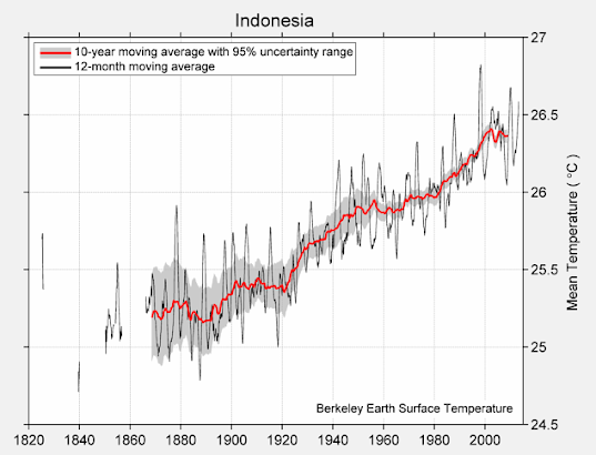
Indonesia is one of the largest countries in the world and has one of the largest populations at over 267 million. Its archipelago of islands straddles the equator and stretches from a longitude of 95°E to 141°E, a distance of over 5000 km. The country has 53 medium length temperature records with between 480 and 1200 months of data, but only one long station record with more than 1200 months of data (see here). That station is Jakarta Observatorium (Berkeley Earth ID: 155660). It is also the station with the most pronounced warming trend (see Fig. 31.1 below).


Fig. 31.1: The temperature trend for Jakarta Obervatorium since 1866. The best fit is applied to the interval 1866-2013 and has a gradient of 1.82 ± 0.08 °C per century. The temperature changes are relative to the 1961-1990 average.


Overall the temperature rise for Jakarta Obseratorium is nearly 2.7 °C from 1866 to 2013, yet this is not representative of the country as a whole. The medium stations in Indonesia exhibit both warming and stable trends as shown in Fig. 31.2 below. In this case stable trends are defined to be those with a warming that is less than twice the uncertainty. The stations are also fairly evenly dispersed, but are mainly coastal.


Fig. 31.2: The locations of long stations (large squares) and medium stations (small diamonds) in Indonesia. Those stations with a high warming trend are marked in red.


If we average all the records from the long and medium stations we get the overall trend shown in Fig. 31.3 below. Instantly we see a problem. While the overall trend since 1908 appears to be negative (-0.03 ± 0.04 °C per century in fact), there are large discontinuities around 1860, 1902 and 1941.


Fig. 31.3: The temperature trend for Indonesia since 1840. The best fit is applied to the interval 1908-2002 and has a negative gradient of -0.03 ± 0.04 °C per century. The temperature changes are relative to the 1961-1990 average.


The reason for this is the low number of station records before 1950, as illustrated in Fig. 31.4 below. For example, between 1866 and 1903 there is only one temperature record available, that of Jakarta Observatorium illustrated in Fig. 31.1 above.


Fig. 31.4: Number of stations per month included in the regional average for the Indonesia temperature anomaly. Only stations with more than 240 months of data in total and sufficient data in the period 1961-1990 are counted.


That is not the only problem, though. Low station numbers means that the average can be heavily distorted by one or two rogue datasets, and in this case there are at least three potential candidates in addition to Jakarta Obseratorium in Fig. 31.1. They are shown in the three figures below.


Fig. 31.5: The temperature trend for Christmas Island (Berkeley Earth ID: 154345) since 1900.


Fig. 31.6: The temperature trend for Padang (Berkeley Earth ID: 155706) since 1850.


Fig. 31.7: The temperature trend for Jakarta (Berkeley Earth ID: 15412) since 1866.


The last of these (Fig. 31.7) is another temperature record from Jakarta. Although this has none of the large temperature offsets seen in Fig. 31.5 and Fig. 31.6, it does appear to be as anomalous as the Jakarta Observatorium data in that it is inconsistent with the rest of the data for the country. It is also in close proximity to an existing station (Jakarta Observatorium). So, on the one hand it can corroborate the trend from Jakarta Observatorium, but on the other hand the weightings of both in the overall average trend should be halved.

The remaining question is whether the large temperature falls seen after 1950 in Fig. 31.5 and Fig. 31.6 are real. The suspicion (and it is just a suspicion) is that they are real because similar falls occur in too many other records. For example, they can also be seen in records from Dilli, Bandung and Pontianak


Fig. 31.8: The temperature trend for Indonesia since 1900 excluding the temperature records from Jakarta. The best fit is applied to the interval 1913-2012 and has a negative gradient of -0.08 ± 0.04 °C per century. The temperature changes are relative to the 1961-1990 average.


So, rather than discarding the data from Christmas Island (Fig. 31.5) and Padang (Fig. 31.6), what happens if we discard both the datasets from Jakarta (Fig. 31.1 and Fig. 31.7) instead? The result is the trend shown in Fig. 31.8 above. This has a negative trend of -0.08 ± 0.04 °C per century, a trend which is also consistent with the data around 1850. The only anomaly is the data from 1903-1913 that is solely from Christmas Island. 

The conclusion from this is that the only part of Indonesia that has exhibited any significant warming since 1850 is the capital and largest city, Jakarta. The rest of the country has seen no temperature rise at all.


Fig. 31.9: Temperature trend for all long and medium stations in Indonesiasince 1850 derived using the Berkeley Earth adjusted data. The best fit linear trend line (in red) is for the period 1871-2010 and has a gradient of +0.94 ± 0.03 °C/century.


What we need to do next is compare the results illustrated above, derived using the anomalies from the raw temperature data, with the equivalent results from Berkeley Earth. Summing and averaging the adjusted anomalies from Berkeley Earth yields the graph in Fig. 31.9 above. These are very similar to the published curves from Berkeley Earth shown in Fig. 31.10 below. Most of the differences are likely due to the inclusion of additional of smaller datasets in the Berkeley Earth plots.

The gradient of the best fit in Fig. 31.9 is +0.94 ± 0.03 °C per century. This is about half that seen in the data for Jakarta Observatorium shown in Fig. 31.1 above, but completely at odds with the data for the rest of the country shown in Fig. 31.8. It suggests that the temperature data from Jakarta has been assigned a greater level of significance (or weighting) and confidence than data from elsewhere in Indonesia. This is perhaps not surprising. The two records from Jakarta are two of the longest and most complete. They also exhibit trends that are both smooth and monotonic. But that does not mean their greater weighting is justified.


Fig. 31.10: Temperature trend for Indonesia since 1840 according to Berkeley Earth.


If we compare the Berkeley Earth adjusted data shown in Fig. 31.9 with the original raw unadjusted anomalies shown in Fig. 31.3, the difference is significant. This difference is shown in Fig. 31.11 below.


Fig. 31.11: The contribution of Berkeley Earth (BE) adjustments to the anomaly data after smoothing with a 12-month moving average. The linear best fit to the data is for the period 1904-2012 (red line) and the gradient is +0.96 ± 0.03 °C per century. The orange curve represents the contribution made to the BE adjustment curve by breakpoint adjustments only.


The data in Fig. 31.11 is shocking. If my analysis is correct, then it suggests that the adjustments made to the data by Berkeley Earth could have added about 0.95 °C to the warming trend since 1904. In other words, virtually all the warming claimed by Berkeley Earth to have occurred in Indonesia since 1904, and depicted in Fig. 31.10, may be the result of their own data adjustments, and not the original data. Moreover, most of this added warming appears to come from breakpoint adjustments.


Conclusions

1) The only warming seen in Indonesia appears to have occurred in Jakarta (see Fig. 31.1). 

2) This warming has been large (about 2.7 °C) and continuous since 1866, which is consistent with its source being population growth linked to increased energy consumption and direct anthropogenic surface heating (DASH), as discussed in Post 14 and Post 29. It may also be a consequence of the urban heat island (UHI) effect.

3) There has been no warming of the overall climate in Indonesia since 1900 (see Fig. 31.8 below).


Monday, August 17, 2020

30. Temperature trends in Antarctica - VARIABLE

If there is one region of the planet that is synonymous with climate change, it is probably Antarctica. Climate change, we are told, is melting the ice cap, the glaciers, the ice shelves and the sea ice. As a result penguins may become extinct in 100 years. Or not, because it turns out there are actually a lot more of them than we thought. So what is really happening in Antarctica?

Well, the honest answer is that we don't really know.  Despite being one of the most studied places on the planet, there is virtually no instrumental temperature data from before 1940. The continent has over 260 instrumental temperature records, but most are less than 40 years in length. In fact only about 56 have more than 240 months of data, of a mere 22 have more than 480 months of data. As the following analysis will show, this is insufficient to draw any accurate or definitive conclusions about the current temperature trends for the continent.


Fig. 30.1: A map of Antarctica showing the locations of all the stations with temperature records containing more than 240 months of data.


Part of the problem with analysing the temperature records of Antarctic is the sheer size of the place. It has almost twice the area of Australia, but the weather stations are not evenly distributed. And given its size, it would be inappropriate to simply aggregate trends from opposite sides of the continent, for the same reasons as for Australia; principally, that they are likely to be totally uncorrelated. When looking at the spatial distribution of stations it becomes clear that most are situated on the coast (see Fig. 30.1 above). Those that are inland are usually at altitude, and as I showed in Post 4, the temperatures in the interior of Antarctica are much lower than elsewhere, and have much higher levels of variability. This implies that they should be analysed and aggregated separately.

In addition, the coastal stations appear to exist in three distinct clusters. The most obvious two are the high densities of stations on the peninsula and around the Ross Sea. In contrast, the stations around the Atlantic coast from longitude 45° W to 90° E are more evenly spread. It therefore seems logical to subdivide the stations into four separate groupings: (i) those found on the Antarctic Peninsula; (ii) the interior stations at altitude; (iii) the stations located along the Pacific coast from the Amundsen Sea in the east, to Queen Mary Land in the west via the Ross Sea; (iv) the stations on the Atlantic Coast from 45° W to 90° E. These four groupings of stations are identified in Fig. 30.1 above. 


Fig. 30.2: Number of stations active each month that have more than 240 months of data overall.


In Post 4 I looked at the three most significant station records for the interior of Antarctica: Amundsen-Scott Base (Berkeley ID - 166900), Vostok (Berkeley ID - 151513) and Byrd Station (Berkeley ID - 166906). The data for Byrd Station was fragmented, while that for both Amundsen-Scott and Vostok indicated negative temperature trends. No other stations in the interior have more than 240 months of data.

Using 240 months as the cutoff, we find that the number of active stations in the other three regions of Antartica that contain this minimum amount of monthly temperature data never exceeds 20, and in the case of the Atlantic coast, it never exceeds 10 (see Fig. 30.2 above). In addition, most of the data is concentrated from 1980 onwards, and only the Antarctic Peninsula has any data before 1950, but even that is miniscule in terms of its total amount.


Fig. 30.3: The mean temperature for the Pacific coast of Antarctica since 1950. The best fit line is fitted to data from 1973-2010 and has an overall trend of 0.55 ± 0.80 °C per century.


If we calculate the mean temperature trend using the data that is available, the results are not great, at least not if you are a firm believer in climate change. The data for the Pacific coast displays a small amount of warming of 0.55 °C per century since 1973 as shown in Fig. 30.3 above (i.e. 0.21 °C in total). The period 1973-2010 was chosen for the best fit calculation because that time-frame is bounded by two peaks in the 5-year moving average. This means that the peaks do not distort the best fit calculation for reasons that I have outlined in the discussion of Fig. 4.7 in Post 4. 

If the best fit in Fig. 30.3 were to be made to all the data, then best fit trend becomes 1.61 °C per century. The dip around 1960 now pulls down the trend line and increases the warming trend, but is this localized dip in the temperature record permanent or just temporary? The answer is that we don't know because there is insufficient data before 1960 to judge.


Fig. 30.4: The mean temperature for the Atlantic coast of Antarctica since 1950. The best fit line is fitted to data from 1973-2010 and has an overall negative trend of -0.21 ± 0.60 °C per century.


If we now turn to the Atlantic coast the pattern is the same. The temperature trend is relatively stable from 1970 to 2010 (see Fig. 30.4). If we measure the trend for 1973-2010 in order to compare directly with that for the Pacific coast, we see that the trend is actually slightly negative and equal to -0.21 ± 0.60 °C per century. But again, extending the fitting to all the data changes the trend to a positive one of gradient +0.49 ± 0.31 °C per century. This is, once again a consequence of a dip in temperatures around 1960. This suggests that the temperature fall is real, and not due to measurement errors, but this dip is large enough to completely change the trend from -0.21 °C per century to +0.49 °C per century.

There is one other similarity with the Pacific coast data: the uncertainties in both trends are very large. This is due to the comparatively short time frame for the available data, which illustrates why long temperature records are so valuable. Even 60 years is not long enough.


Fig. 30.5: The mean temperature for the Antarctic Peninsula since 1940. The best fit line is fitted to data from 1973-2010 and has an overall trend of 2.88 ± 0.77 °C per century.


The notable point about the Antarctic Peninsula is that it is the only region of Antarctica where there is clear evidence of a significant warming trend since 1950. But this is no different from what we have seen in Australia and New Zealand, and in this case there is no data before 1940. That means we cannot say whether this warming is new and permanent, or whether, like Australia and New Zealand, it is just a recovery from a temporary cooling phase. In Australia and New Zealand the temperatures in the latter half of the 19th century were just as high as they are now. In the case of Antarctica we just do not know.


Summary

The analysis above allows us to draw the following conclusions.

  1. There has been no warming trend in the interior of Antarctica since 1957 (see Post 4).
  2. The has been no warming trend on the Atlantic coast since 1950, and probably none of any great consequence on the Pacific coast either (see Fig. 30.4 and Fig. 30.3).
  3. The only significant recent warming in Antarctic appears to be around the peninsula (as shown in Fig. 30.5). This warming is, however, no greater than that seen in Australia and New Zealand over the same time period (1950-2010), and that warming was preceded by a cooling of almost equal magnitude (see Post 26 and Post 8).
  4. We have no idea what the temperature trend anywhere in Antarctica was before 1940.