In Post 9 (Fooled by randomness) I looked at the possibility of fractal behaviour occurring in the temperature records of individual stations and regions. In particular, I was interested to see if those records exhibited any form of self-similarity, and whether that self-similarity could account for the magnitude of fluctuations seen in the long term temperature records.
My initial analysis was performed on data from New Zealand and it seemed to suggest that fractal behaviour may be present. This behaviour is quantified by the fractal dimension which, in the case of temperature data, defines how the amplitude of the temperature fluctuations changes with the time interval those readings represent. Most of the data I look at on this blog consists of monthly average temperatures. For these readings the data typically has a spread of up to ±5 °C, while the standard deviation of the monthly fluctuations is usually between 1 °C and 2 °C. But what would the same temperature records look like if one considered the 12-month averages? Or the 10-year averages?
Well, as I explained previously in Post 9, if the fluctuations in the temperature data conformed to a white noise spectrum, the power spectrum would be expected to be independent of frequency for all frequencies below the fundamental or cutoff frequency (see Eq. 9.1). The consequence of this is that smoothing the data with a sliding window, or moving average, of width N (where N is the number of months in the new average) should reduce the cutoff frequency by a factor of N, and thus reduce the signal power below the cutoff by a factor of N. That in turn should reduce the amplitude of the random noise fluctuations by a factor of √N. So, smoothing the monthly average data with a 24 month moving average should reduce the amplitude of the fluctuations by a factor of √24, or about a factor of five. Except that this does not happen.
As I have demonstrated in numerous previous posts, the noise amplitude in the monthly temperature data decreases much more slowly than expected as the width of the sliding window in the smoothing algorithm is increased. In fact it appears to decrease as N -p. where p tends to be in the range 0.20 < p < 0.35, but is generally concentrated around p = 0.25. This was shown in Post 9 for New Zealand data, in Post 17 for individual sites in Australia, and in Posts 18-21 for various Australian states. In most cases the same behaviour was seen. The only two exceptions I have found so far were for data from the South Pole (Amundsen-Scott), and also for the trend for South Australia (see Post 21) but only if the parabolic long term trend was removed. In both cases the data behaved like classical white noise with p = 0.5.
Why is this behaviour important? Well, for three reasons. Firstly, if there is a definite trend, it would allow us to estimate the amplitude of natural temperature fluctuations over timescales that are much longer than we have data for. Secondly, it could allow us to differentiate between natural and anthropogenic sources of climate change. And finally, it may shed light on possible natural mechanisms that may underpin long term climate change rather than assuming that everything is a consequence of carbon dioxide emissions, or that every current change in climate behaviour has a cause that is local, either spatially or temporally.
So why I am revisiting this now? Well, because in my last post I presented some data from a station at De Bilt (Berkeley Earth ID: 175554) in the Netherlands that is one of the longest continuous sets of temperature data that exists. What also set this data apart, though, was the fact that there was complex structure to the data that was much greater in amplitude than the continuous upward trend expected from global warming. Moreover, the underlying continuous upward trend could also be easily removed so that the remaining data could be studied, just as I removed the parabolic background from the South Australia data in Post 21. The question is, would I see the same result as for South Australia? Namely, that the remaining temperature fluctuations behaved like white noise. Well, the answer is no.

Fig. 42.1: The monthly temperature anomalies for De Bilt since 1706 with the linear trend of +0.29 ± 0.04 °C per century removed (blue curve). The standard deviation is 1.855 °C (for N = 1). The yellow curve is the 12-month moving average of the blue data (N = 12) and has a standard deviation of 0.810 °C.
The data in Fig. 42.1 above shows the same monthly temperature anomaly data that was presented in Fig. 41.1 of the previous post, except with the long-term upward trend of 0.23 °C per century removed. The yellow curve is the 12-month moving average of the blue data which clearly has a much lower noise amplitude, and therefore a lower standard deviation of 0.81 °C compared to 1.85 °C for the monthly data. In both cases the standard deviation was measured for data over the same 275 year period (or 3300 months) from 1731-2005.
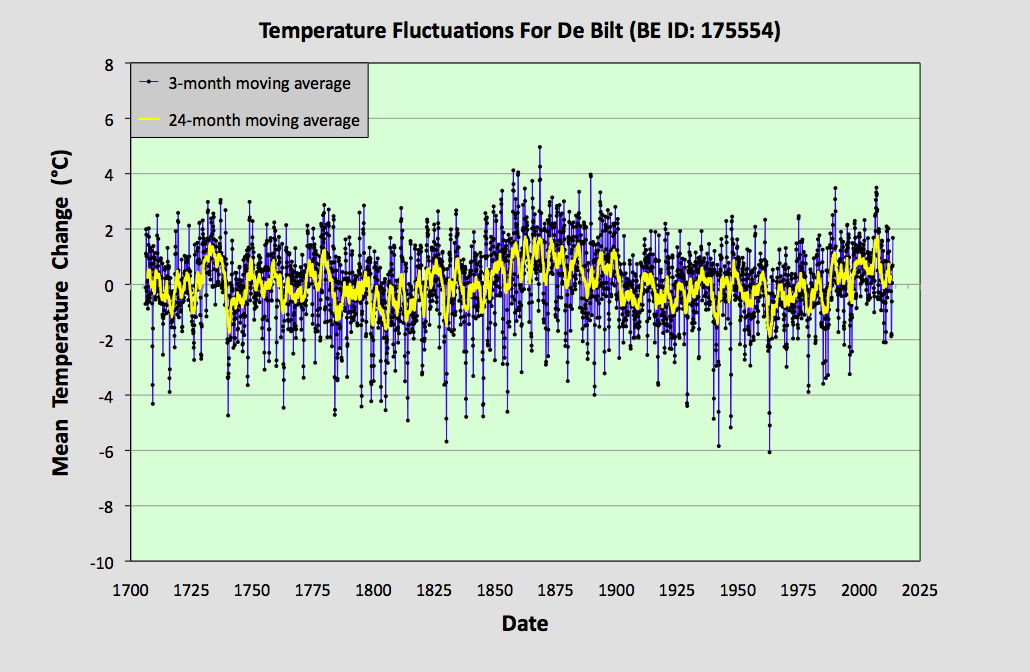
Fig. 42.2: The 3-month (N = 3) moving average (blue curve) of the monthly data in Fig. 42.1 above. The standard deviation of this data is 1.326 °C. The yellow curve is the 24-month moving average (N = 24) of the same data in Fig. 42.1 and has a standard deviation of 0.664 °C.
The data in Fig. 42.2 above shows the same monthly temperature anomaly data as shown in Fig. 42.1, but after smoothing with a 3-month moving average (blue curve) and alternatively a 24-month moving average (yellow curve). As a result of the smoothing, the standard deviation reduces to 1.326 °C for the 3-month window (N = 3) and 0.644 °C for the 24-month sliding window (N = 24).

Fig. 42.3: The 6-month (N = 6) moving average (blue curve) of the monthly data in Fig. 42.1 above. The standard deviation of this data is 1.046 °C. The yellow curve is the 5-year moving average (N = 60) of the same data in Fig. 42.1 and has a standard deviation of 0.536 °C.
Next, if we smooth the original monthly temperature anomaly data in Fig. 42.1 with 6-month and 5-year moving averages or sliding windows we get the data shown in Fig. 42.3 above. Now, after smoothing with a 6-month moving average (blue curve) the standard deviation has reduced to 1.046 °C (and N = 6), while that for the 5-year moving average (yellow curve) is now 0.536 °C (and N = 60).

Fig. 42.4: The 9-month (N = 9) moving average (blue curve) of the monthly data in Fig. 42.1 above. The standard deviation of this data is 0.894 °C. The yellow curve is the 10-year moving average (N= 120) of the same data in Fig. 42.1 and has a standard deviation of 0.462 °C.
Finally, if we smooth the original monthly temperature anomaly data in Fig. 42.1 with 9-month and 5-year moving averages or sliding window we get the data shown in Fig. 42.4 above. Now, after smoothing with a 9-month moving average (blue curve) the standard deviation has reduced to 0.894 °C (and N = 9) while that for the 10-year moving average (yellow curve) is now 0.462 °C (and N = 120).
All the standard deviations (σ) for the different sets of smoothed data are summarized in the table below.
| N | σ | ln(N) | ln(σ) |
|---|---|---|---|
| 1 |
1.855 |
0.000 |
0.618 |
| 3 |
1.326 | 1.099 | 0.282 |
| 6 | 1.046 | 1.792 | 0.045 |
| 9 | 0.894 | 2.197 | -0.112 |
| 12 | 0.810 | 2.485 | -0.211 |
| 24 | 0.664 | 3.178 | -0.409 |
| 60 | 0.536 | 4.094 | -0.624 |
| 120 | 0.462 | 4.787 | -0.772 |
If we now combine these results into a single plot we get the graph shown in Fig. 42.5 below. The gradient of this log-log plot is the exponent of N -p in the power law we expect to see for the decrease in the noise amplitude as we increase the smoothing interval N. Once again we see that the value for the exponent p is well below the 0.5 expected for white noise. In fact p = +0.31 ± 0.01, indicating that the fractal dimension is 0.31. In addition, the quality of the fit (as indicated by the R2 value) is very high.

Conclusions
- The quality and linearity of the best fit in Fig. 42.5 indicates that there is a high degree of self-similarity in the data. This in turn also suggests that all the significant features seen in the original data (such as the large broad peaks at 1725 and 1860) are natural and not the result of external or artificial biases. If such artificial biases were present, and were significant in magnitude, they would probably manifest themselves as significant deviations of the data in Fig. 42.5 from a linear trend.
- From the gradient of the trend line in Fig. 42.5 we can estimate the standard deviation of temperature data for the case N = 1200 as being 0.20 °C. In other words, the fluctuations in the 100-year average will typically be of the order of ±0.2 °C. This in turn suggests that changes in the mean temperature from century to century of more than 0.5 °C are likely to be very common.
No comments:
Post a Comment