Tuesday, November 30, 2021

82. Angola - temperature trends STABLE

The biggest problem we are confronted with when it comes to determining the extent of climate change in Angola is a lack of temperature data. There is only one long station with over 1200 months of data and another four medium stations with over 480 months of data. Only two stations have a significant quantity of data before 1939, and they are both in the capital Luanda; and none have any reliable data after 1980 due to the protracted civil war. A full list of stations for Angola can be found here.

If we include stations with over 240 months of data, then there are a total of eighteen temperature records that we can use. Their locations are indicated on the map below in Fig. 82.1. Overall they are fairly evenly distributed across the country, although the stations with the longest temperature records are generally found nearest the coast. The consequence of this deficit of data is that it is impossible to definitively determine the temperature trend for the country either before 1940, or after 1980. Between 1940 and 1980 the data suggests that no warming took place.


Fig. 82.1: The (approximate) locations of the main weather stations in Angola. Those stations with a high warming trend between 1901 and 2000 are marked in red while those with a cooling or stable trend are marked in blue.


The monthly anomalies for each station were created in the usual manner, as outlined in Post 47. First a suitable thirty year interval was chosen for calculating the monthly reference temperatures (MRTs). In this case the period 1951-1980 was chosen as that corresponded to the interval that overlapped with the maximum number of station records. The twelve MRTs for each station dataset were calculated for each of the twelve months by averaging the monthly temperatures in the reference period for that station. The MRTs were then subtracted from all the respective monthly temperature data for that station to generate the anomalies. The anomalies from all the stations were then averaged to give the mean temperature anomaly (MTA) for the region in that month. Employing a simple average of the station data rather than using Kriging, homogenization and gridding is sufficiently accurate if the stations are fair evenly distributed, which the map in Fig. 82.1 suggests to be the case. The resulting mean temperature anomaly since 1875 is shown below in Fig. 82.2.


Fig. 82.2: The mean temperature anomaly (MTA) for Angola relative to the 1951-1980 monthly averages based on an average of anomalies from stations with over 300 months of data. The best fit is applied to the monthly mean data from 1881 to 1980 and has a positive gradient of 1.39 ± 0.08 °C per century.


The MTA in Fig. 82.2 exhibits a similar warming profile to the IPCC global trends, but this is somewhat misleading. The data before 1939 is based on only two stations, and both of these are situated in the capital Luanda (Berkeley Earth ID 151475 and 2824), while the data after 1980 is highly sporadic and discontinuous for all stations with data in this period. This is illustrated in Fig. 82.3 below which shows the station frequency count in the MTA in Fig. 82.2. 


Fig. 82.3: The number of station records included each month in the mean temperature anomaly (MTA) trend in Fig. 82.2.


The station with the longest data set is Luanda (Berkeley Earth ID 151475), the monthly anomalies of which are shown in Fig. 82.4 below. The second station in Luanda (Berkeley Earth ID 2824) has no data after 1973, while its data after 1951 is virtually identical to that of station 151475. Before 1951, however, the data from the two stations disagree by an average of almost 0.5°C. This hints that the two sets of station data may not be completely independent, or may be the result of combining other datasets.


Fig. 82.4: The temperature anomaly for Luanda relative to the 1951-1980 monthly averages. The best fit is applied to all the monthly mean data and has a positive gradient of 1.63 ± 0.06 °C per century.


The main conclusion to be drawn from Fig. 82.3 is that both the data before 1939 and the data after 1980 are unreliable. The data after 1980 is unreliable because there is so little of it, and it is highly fragmented. The data before 1939 is unreliable because it is based on just two stations that are located in the most highly populated region of the country. While these two stations do corroborate each other, particularly after 1951, they are still unlikely to be representative of the climate of the country as a whole. We know this because we see it in many countries and regions: strong warming in the major cities like Jakarta (see Post 31), Sydney (BE-151986) in NSW (Post 18) and Melbourne (BE-151813) in Victoria (Post 19), but a totally different temperature trend in the surrounding region.


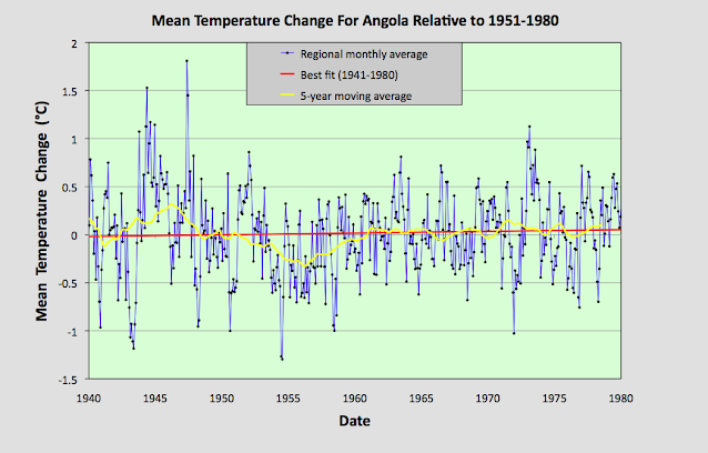
Fig. 82.5: The mean temperature anomaly (MTA) for Angola relative to the 1951-1980 monthly averages based on an average of anomalies from stations with over 300 months of data. The best fit is applied to the monthly mean data from 1941 to 1980 and has a positive gradient of 0.18 ± 0.17 °C per century.


If we therefore just look at the data from 1940 to 1980 we see that there is no significant warming (see Fig. 82.5 above). The slight rise in the best fit line is at least five times less than the standard deviation of the MTA, and is almost the same as the uncertainty in the best fit. And this is also similar to the extent of the warming claimed by Berkeley Earth for this period (see Fig. 82.6 below).


Fig. 82.6: The temperature trend for Angola since 1840 according to Berkeley Earth.


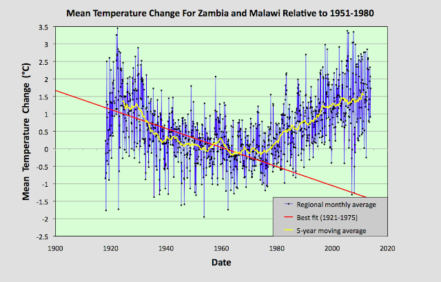
However, the temperature trend for Angola according to Berkeley Earth (BE) does exhibit strong warming both before 1939 and after 1980. While the latter is certainly a reasonable assumption based on trends elsewhere in the region, it is not a conclusion that can be confidently presented based on the available data. As for the data in Fig. 82.6 before 1939, this may be supported by the station data from Luanda, but it differs significantly from the trends I have determined for neighbouring countries such as Namibia (Post 39), Botswana (Post 38), Zambia (Post 81) and Zimbabwe (Post 79).


Summary

Temperatures in Angola between 1939 and 1980 appear to be stable.

There is insufficient data to determine the extent of climate change in Angola either before 1939, or after 1980.


Acronyms

BE = Berkeley Earth.

MRT = monthly reference temperature (see Post 47).

MTA = mean temperature anomaly.


Thursday, November 18, 2021

81. Zambia and Malawi - temperature trends PARABOLIC

In the last few posts I have investigated the temperature trends from several countries in south-eastern Africa, and while the trends from each show certain similarities and consistencies (such as significant temperature rises after 1980), they also exhibit subtle differences. For example, the trend for Zimbabwe shows a slight cooling before 1980 (see Fig. 79.2 in Post 79) while the trend for Mozambique (see Fig. 78.6 in Post 78) does not. Meanwhile, the trend for Madagascar displays strong cooling before 1980 that is even greater than the warming that succeeds it (see Fig. 77.6 in Post 77). 

These discrepancies raise question about the reliability of all the trends, particularly the trends before 1940. However, these discrepancies can be almost totally reconciled when compared to the data from Zambia and Malawi. In short, the Zambia and Malawi data largely corroborates the cooling seen before 1980 in both the Madagascar data and the Zimbabwe data. It also suggests that the cooling in the Mozambique data is under-reported. probably due to a lack of data before 1930. The Zambia and Malawi data also suggests that there has been little, or no, net overall warming in the region since 1920, and that the climate has just undergone a natural oscillation in its mean temperature, albeit a rather large one of about 1.5°C.


Fig. 81.1: The (approximate) locations of the weather stations in Zambia and Malawi. Those stations with a high warming trend between 1901 and 2000 are marked in red while those with a cooling or stable trend are marked in blue.


The map in Fig. 81.1 above shows the distribution of weather stations in Zambia and Malawi. Overall there are sixteen stations with over 400 months of data but no long stations with over 1200 months of data. The average data length is 744 months (up to the end of 2013) with all but two of the stations being medium stations with over 480 months of data. Of these sixteen stations, only five are in Malawi (for a list see here) and the other eleven are in Zambia (for a list see here). This lack of station data, particularly for Malawi, was the main reason behind the decision to combine data from the two countries into a single mean temperature trend.

The monthly anomalies for each station were created in the usual manner, as outlined in Post 47. First a suitable thirty year interval was chosen for calculating the monthly reference temperatures (MRTs). In this case the period 1951-1980 was chosen as that corresponded to the interval that overlapped with the maximum number of station records. The twelve MRTs for each station dataset were calculated for each of the twelve months by averaging the monthly temperatures in the reference period for that station. The MRTs were then subtracted from all the data for that station to generate the anomalies. The anomalies from all the stations were then averaged to give the mean temperature anomaly (MTA) for the region in that month. Employing a simple average of the station data rather than using Kriging, homogenization and gridding is sufficiently accurate if the stations are fair evenly distributed, which the map in Fig. 81.1 suggests to be the case. The resulting mean temperature anomaly since 1918 is shown below in Fig. 81.2.


Fig. 81.2: The mean temperature anomaly (MTA) relative to the 1951-1980 monthly averages based on an average of anomalies from stations with over 360 months of data. The best fit is applied to the monthly mean data from 1921 to 1975 and has a negative gradient of -2.72 ± 0.17 °C per century.


What is striking about the change in the MTA shown in Fig. 81.2 is how different it looks to the widely advertised global warning trends, particularly before 1980 (see Fig. 80.1 for an example). It suggests that temperatures in 2010 were barely 0.3°C higher than they were in 1920, and yet in the intervening period the mean temperature varied wildly, dipping by up to 1.5°C before recovering.


Fig. 81.3: The number of station records included each month in the mean temperature anomaly (MTA) trend in Fig. 81.2.


It is also clear from the number of stations included in the MTA each month (see Fig. 81.3 above) that the early 20th century data is just as reliable as the data after 1990. So a lack of station data cannot explain the difference between the trends seen in the raw data as presented in Fig. 81.2 and those claimed by climate scientists.


Fig. 81.4: Temperature trends based on Berkeley Earth adjusted data. The average is for anomalies from all stations with over 360 months of data. The best fit linear trend line (in red) is for the period 1911-2010 and has a gradient of +0.87 ± 0.03°C/century.


Much of this difference is due to adjustments made to the data by climate scientists. Berkeley Earth (BE) include both the raw data and the adjusted anomaly data in their data files, so it is fairly straightforward to compare the two. Averaging the BE adjusted anomalies gives the data curve shown in Fig. 81.4 above. What is striking about this curve is how similar it is to the conventional global warming curve, and conversely how different it is to Fig. 81.2. It is also very similar to the BE published trend for Zambia as shown in Fig. 81.5 below.


Fig. 81.5: The temperature trend for Zambia since 1840 according to Berkeley Earth.


This discrepancy between the raw data and the BE adjusted data is not unique to data from Zambia and Malawi. As I have previously shown in numerous posts on this blog, it occurs in most of the data. Yet we are not allowed to question the statistical validity of these adjustments, despite mounting evidence that they may be flawed. And the magnitude of these adjustments is not insignificant. We can easily determine their magnitude simply by subtracting the MTA based on raw data (Fig. 81.2) from the equivalent due to adjusted data (Fig. 81.4). The result is the blue curve in Fig. 81.6 below. The orange curve is the contribution to the adjustments that comes solely from the breakpoint alignment where each station dataset is chopped into fragments, and those sections of data are then subjected to different biases. In addition there are other corrections to the blue curve that result from the gridding and homogenization processes that are used to generate anomaly datasets for each station, but these are generally less significant as Fig. 81.6 shows. 


Fig. 81.6: The contribution of Berkeley Earth (BE) adjustments to the anomaly data in Fig. 80.4 after smoothing with a 12-month moving average. The blue curve represents the total BE adjustments including those from homogenization. The orange curve shows the contribution just from breakpoint adjustments.


It can be seen from Fig. 81.6 that the net effect of the Berkeley Earth (BE) adjustments is to add between 0.25°C and 0.5°C of warming to the data between 1920 and 2010, while eliminating the parabolic dip in between, and replacing the trend with something that is more linear. This then increases the warming seen in the raw data between 1920 and 2010 from less than 0.3°C in Fig. 81.2 to more than 0.7°C in Fig. 81.4. The result is an adjusted temperature trend (Fig. 81.4) that bears no relation to the original data (Fig. 81.2).


Summary

Temperature changes in Zambia and Malawi over the last 100 years appear to owe more to natural variation than global warming.

The temperature trend is parabolic with an amplitude of about 1.5°C.

The maximum detectable warming since 1920 is 0.3°C. This is much less than the natural variation, and a long way short of the 2°C average claimed by climate scientists for global warming on land.


Acronyms

BE = Berkeley Earth.

MRT = monthly reference temperature (see Post 47).

MTA = mean temperature anomaly.


Tuesday, November 16, 2021

80. Lateral thought #4 - COP26 and keeping 1.5 alive


For the last two weeks politicians from all over the world have been gathering and meeting in Glasgow in order to formulate an agreement to cut the use of fossil fuels by mankind. The target has been to keep the maximum extent of global warming below 1.5°C and so avoid a catastrophic warming of over 2.8°C by the end of this century. This may be very laudable, but in my opinion most of the measures agreed or demanded are unworkable and unnecessary.

My first critique is with regard to the current temperature rise and its projection. The received wisdom is that current warming relative to pre-industrial times (i.e. before 1750) now stands at 1.1°C. In contrast, the real temperature records, as outlined on this blog, show that this is unlikely to be true. Over the last sixteen months I have analysed the land-based temperature records of virtually the entire Southern Hemisphere, plus those of the USA, Europe and southern Asia. None show a warming of over 1°C since 1750 that correlates with increases in anthropogenic carbon dioxide emissions. The only consistent warming is seen after 1980, and this is only about 0.5°C in magnitude. Given that 70% of the Earth's surface is water and that the oceans heat up by less than half the amount compared to land, it is impossible to get to a 1.1°C average warming globally unless one postulates that land temperatures have increased by over 2°C everywhere, as Berkeley Earth does (see Fig. 80.1 below). But the reality of the raw data that I have analysed so far is that there is virtually no country or continent that I have investigated so far where this has happened. So the real temperature increase so far is likely to be less than 0.5°C. And as I showed in Post 14 and Post 29, much of this 0.5°C could be due to urban heat island effects.


Fig. 80.1: Land and ocean global average temperature anomalies since 1850 according to Berkeley Earth.


My biggest criticism, though, is reserved for the proposed countermeasures. The one consideration that has been completely omitted from discussions of carbon reduction policies has been the economics. While a lot of time has been devoted to discussing financial aid to small developing countries that are supposedly at risk from climate change, none has been directed to considering the financial impact on producers and consumers. 

One of the main aims of COP26 was to "keep 1.5 alive" - namely to enact measures that would prevent the global temperature rise from exceeding 1.5°C. This, we are told, requires a 50% reduction in fossil fuel use by 2030, and a move to net-zero by about 2060. The question, then, is how do we reduce fossil fuel use by 50% by 2030, or 5% per year? At COP26 all the emphasis appeared to be on reducing fossil fuel demand rather than supply. Yet both are problematic, and both will cause economic hardship to many.

The current political strategy appears to revolve around getting as many countries as possible to cut their usage of fossil fuels, but this policy has two flaws. Firstly, it requires over 180 countries to agree to do something that none really want to do. That means it is highly unlikely to succeed (think: herding cats). But if it does there is the second problem. It will devastate the economies of many oil producers. What is striking is the callous disregard many climate activists have for the people of these countries.

Countries like Iran, Iraq, Azerbaijan, Russia, Libya, Nigeria and Venezuela are almost entirely dependent on the revenues from oil and gas to feed their people. They are economic monocultures. Nor do they have large sovereign wealth funds to fall back on like Norway, Saudi Arabia or Kuwait. So what happens to their economies when demand for oil and gas runs out, or the sale is banned by international treaty? The impact will be cataclysmic.

The alternative strategy is hardly much better, but will create a different set of losers. Rather than trying to regulate demand, the UN could instead try to regulate supply by getting the producers to cut supply by 5% per year and thus force the consumer nations to adapt. This strategy has two advantages. Firstly it requires the agreement only of the producers who are much fewer in number, and secondly any cut in supply would result in spikes in price which would largely protect the incomes of the producers. Instead the consumers would suffer, and with them the global economy. The result would be oil and gas shortages, high prices, fuel poverty and global economic collapse. So, not a great choice!