Like many other countries and regions, Zimbabwe has experienced significant warming to its climate since 1980, possibly by as much as 1.5 °C. However, before 1980 the picture is rather different. The actual raw temperature data actually suggests that the climate of Zimbabwe cooled for at least fifty years beforehand. But like most parts of Africa, data for this period is less numerous and so is potentially less reliable.
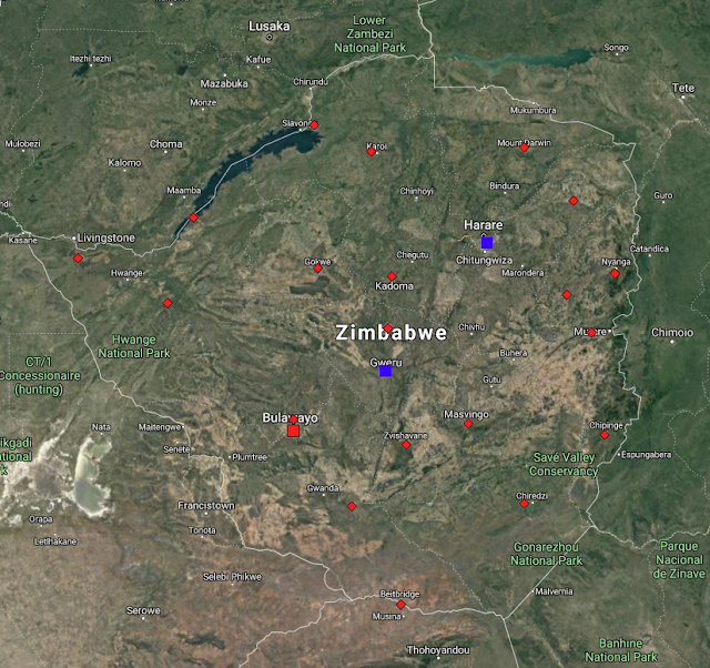
Fig. 79.1: The (approximate) locations of the weather stations in Zimbabwe. Those stations with a high warming trend between 1901 and 2000 are marked in red while those with a cooling or stable trend are marked in blue. Those denoted with squares are long stations with over 1200 months of data, while diamonds denote stations with over 360 months of data.
Overall there are only three long stations in Zimbabwe with over 1200 months of data, as well as a further sixteen medium stations with over 480 months of data, and another five with over 360 months of data (for a list of stations in Zimbabwe see here). The geographical locations of these 24 stations are indicated on the map in Fig. 79.1 above. As can be clearly seen, the stations are fairly evenly spread across the country. This means that a simple average of their temperature anomalies should yield a reasonably accurate value for the mean temperature anomaly (MTA) for the country as a whole.
The method used to determine the MTA was the same as that used in previous posts and outlined in Post 47. First, the monthly reference temperatures (MRTs) were calculated for each station time series using data from a suitable time interval; one that ensured that the maximum number of stations had a qualifying amount of good data within that time interval. In this case the thirty year period from 1971 to 2000 was selected as this ensured that all but two of the 24 station records could be used. The one station with the most significant data to be excluded was Salisbury (Berkeley ID: 44434). This station has an interesting dataset for reasons that I may explain in a later post.
As usual, a minimum of twelve years of data from within the specified thirty year time interval (1971-2000) was required to determine the MRTs for each station in order for data from that month and that station to be included in the MTA calculation. The MRTs for each set of station data were then subtracted from the raw monthly temperature readings to produce the anomaly time series for that station location. The anomaly time series from all the station records were then averaged to determine the MTA. This MTA data is shown in Fig. 79.2 below.

Fig. 79.2: The temperature trend for Zimbabwe relative to the 1971-2000 monthly averages based on an average of anomalies from stations with over 360 months of data. The best fit is applied to the monthly mean data from 1916 to 1975 and has a negative gradient of -0.96 ± 0.20 °C per century.
The MTA data in Fig. 79.2 appears to show a downward trend of about 1°C per century before 1980 followed by a temperature rise of about 1.5 °C. However, as Fig. 79.3 below indicates, the number of stations that contribute to the MTA drops significantly as you go back in time before 1960. This in turn suggests that the trend in Fig. 79.2 after 1960 is much more reliable than that before 1930.

Fig. 79.3: The number of station records included each month in the mean temperature anomaly (MTA) trend for Zimbabwe in Fig. 79.2.
As usual I have compared my results based on the raw temperature data from each station (see Fig. 79.2) with the Berkeley Earth (BE) version based on their adjusted data. The equivalent average of the BE adjusted anomalies is shown below in Fig. 79.4. From 1970 onwards its moving average (orange curve) is qualitatively very similar to the trend from the raw temperature data shown in Fig. 79.2 above (yellow curve), although the temperature rise seen in the raw data in Fig. 79.2 is about 50% greater. However, the trends before 1970 are markedly different. While the raw data in Fig. 79.2 exhibits a cooling of almost 0.6°C between 1920 and 1970, the BE data shows a slight warming.

Fig. 79.4: Temperature trends for Zimbabwe based on Berkeley Earth adjusted data. The average is for anomalies from all stations with over 360 months of data. The best fit linear trend line (in red) is for the period 1911-2010 and has a gradient of +0.85 ± 0.04°C/century.
The difference in the two temperature trends is illustrated below in Fig. 79.5. This shows how the adjustments made to the raw data by Berkeley Earth have added about 0.8°C of warming prior to 1980, and then removed a similar amount after 2000.

Fig. 79.5: The contribution of Berkeley Earth (BE) adjustments to the anomaly data in Fig. 78.4 after smoothing with a 12-month moving average. The blue curve represents the total BE adjustments including those from homogenization. The linear best fit (red line) to these adjustments for the period 1901-1980 has a positive gradient of +0.99 ± 0.02 °C per century. The orange curve shows the contribution just from breakpoint adjustments.
While the temperature trend based on BE adjusted data (Fig. 79.4) differs markedly from the one derived using raw data (Fig. 79.2), there is, however, excellent agreement between the data trends presented in Fig. 79.4 and the official BE version that is shown in Fig. 79.6 below. Both graphs are based on the same BE adjusted anomaly data, although the plot in Fig. 79.6 will likely have used a lot more data from station records with short time series (i.e. less than 360 months). However, because these time series are very short and noisy, they usually add very little new information to the temperature trend over time. That is why I (rightly) ignore them.
In addition, the averaging processes used to combine the adjusted anomalies into an MTA were probably very different. I constructed the anomaly time series shown in Fig. 79.4 by using a simple average of all the anomaly time series with over 360 months of data. In contrast, the BE version shown in Fig. 79.6 was probably constructed using techniques such as gridding, interpolation and homogenization. The data in Fig. 79.6 have also been converted to mean temperatures by adding on the mean annual temperature value for the country (which is about 21.3°C) to all the MTA data. Yet despite all these potentially significant differences, the two results are remarkably similar (other than the 21.3°C offset obviously).

Fig. 79.6: The temperature trend for Zimbabwe since 1840 according to Berkeley Earth.
This degree of similarity between the data in Fig. 79.4 and Fig. 79.6 therefore implies that the simple averaging process that I have used to construct the MTAs in both Fig. 79.2 and Fig. 79.4 is just as accurate as the more sophisticated procedures that Berkeley Earth use to construct mean temperature time series such as that presented in Fig. 79.6 above. But this is not a new result. I have shown that the same in true for BE adjusted data from most countries. The key criterion for the two averaging methods to agree is for the geographical spread of stations within the country or region to be sufficiently uniform so that all stations have equal area weightings. In the case of Zimbabwe this is clearly the case, as Fig. 79.1 above illustrates. This then validates the simple averaging process used for the raw data in Fig. 79.2 because it is the same process as was used for Fig. 79.4, and it uses data from the same stations with the same geographical distribution.
Summary
The data in Fig. 79.2 shows that there is clearly strong warming of almost 1.5°C in Zimbabwe after 1980, but before 1980 the climate appears to have cooled.
Overall this suggests that at least some of the warming seen in Zimbabwe after 1980 is probably real as it coincides with the period of greatest anthropogenic carbon dioxide production. It is also similar in timing to temperature rises seen in MTAs elsewhere around the world as I have shown previously on this blog, although its magnitude is somewhat larger than is normally seen elsewhere.
Likewise, the cooling before 1980 is similar to temperature trends seen in neighbouring countries and much of the Southern Hemisphere.
The other major question that arises is, how much of this temperature rise post-1980 is due to carbon dioxide induced climate change, and how much is just natural variation similar to the decline seen before 1980?
Acronyms
BE = Berkeley Earth.
MRT = monthly reference temperature (see Post 47).
MTA = mean temperature anomaly.