The reason is that the ideal method is either impractical or impossible.
Firstly, the ideal method assumes that all your weather stations are equally spaced. They are not. There are only about 40,000 station records in existence and while that may sound like a lot, if they were equally spaced they would still be over 100 km apart. That is because the surface area of the Earth is over 500 million square kilometres.
The second problem is that 70% of the Earth’s surface is covered in water. So, even if we ignore this and just place all 40,000 weather stations on land, they will still be over 60 km apart on average.
The third problem is that most station records are short and recent, yet less than half of the 40,000 stations are currently in operation.
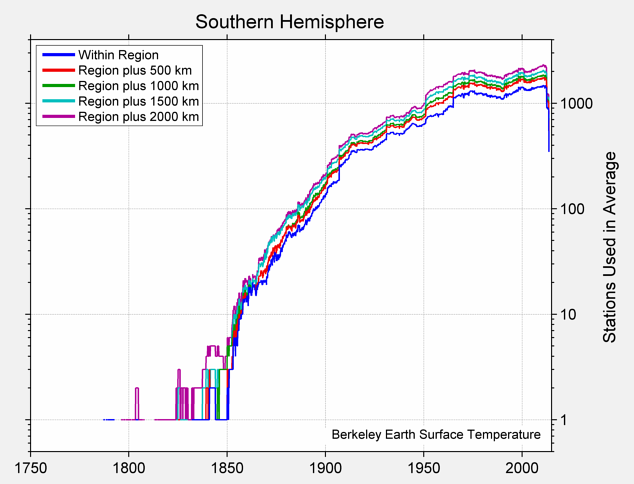
Fig. 3.1: Number of active weather stations in the Southern Hemisphere (1750-2013).
The fourth problem is that the weather stations are not evenly distributed anyway. Less than 9% are in the Southern Hemisphere, that is less that 1500 out of 17,500 at the current time. Of the 16,000 or so stations currently active in the Northern Hemisphere, over 2000 are in Europe, and over 9,000 are in the USA. Of the 1500 current stations in the Southern Hemisphere, only about 400 are in South America while nearly 700 are in Australia. As for Africa, it has just over 500. So there are about 20 times as many stations in the USA as there are in the whole of South America or Africa despite the USA being only a third the size of Africa and half the size of South America.

Fig. 3.2: Number of active weather stations in the Northern Hemisphere (1700-2013).
But the fifth and biggest problem is that most temperature records just aren’t long enough. In order to discern a definite trend you need at least 50 years, or 600 months of data. The reason is this: the data is really noisy. It also has a tendency to wobble or deviate significantly from its long-term trend. This means that the trend that you observe, and the accuracy to which you can measure the gradient of that trend, will be determined by which part of the trend has been captured by the measurement process. As an example, consider the temperature profile for Capetown in South Africa shown in Fig. 3.3 below.

Fig. 3.3: Temperature record from Capetown (1850-2013)
The data points shown in Fig. 3.3 are not the mean daily temperatures, but are actually the mean monthly temperatures. So they have already been averaged by an additional factor of about 30. Not only that, but the natural seasonal variations (i.e. summer to winter) have been removed by subtracting the long-term mean temperature for each month from the individual monthly readings. This makes the resulting data far less noisy. Yet despite this, the data set still exhibits rapid fluctuations of as much as ±2 °C on a monthly basis. Added to that, the longer term average as illustrated by the 5-year moving average (red line) indicates that the underlying trend is not linear. From 1860 to 1900 the trend is negative, as it is from 1930 to 1970, while for remainder of the time it is strongly positive.
This is why long temperature records are essential. If the Capetown record were only to consist of measurements from 1930 to 1980, the data analysis would yield a completely different result; not just because the underlying trend in this period was opposite to the overall trend in the longer time frame (1860-2010), but because the ratio of the height of the data fluctuations to the base length of the measurement period would be much larger. As a result the error in the gradient would be much greater.
The Capetown record above contains 1874 month of data. Unfortunately, in the Southern Hemisphere only 500 station records contain more than 700 months of data, while in Africa there are less than 300 stations with more than 600 months of data. It is therefore easy to see why climate scientists have resorted to a number of statistical wheezes such as homogenization, splicing and breakpoint alignment to try to maximize the data that they do have. The question is, how many of these techniques are truly valid?
On top of the problem of insufficient data, there is also the problem of the data itself. Looking for a one degree temperature rise over 100 years in a short station record with a noise level of up to ±5 °C can be like looking for a needle in a haystack. And then there is the problem of how you combine different records when their data span different time intervals. But more on that next time.
No comments:
Post a Comment