What is surprising about France is the poor quality of its temperature data. Its data is worse than for Spain, Italy, Germany, the UK, Norway, Sweden and Finland. And yet France is the de-facto home of metrology, the country that gave us SI units.
The longest temperature record in France is for Bourges in the middle of the country. It is one of only four long stations with over 1200 months of data in France. There are a further 91 medium stations in France with over 480 months of data (for a full list see here). The locations of all these 95 stations are shown on the map in Fig. 147.1 below. In this analysis I have also included two stations in the Channel Islands; a long station in Guernsey and a medium station in Jersey. The reason for this is that they are much closer to France than England and so it is more reasonable for their data to be combined with data from France than with that from the UK. It also results in another long station being included in the analysis for France thereby improving the reliability of its long-term trend.

Fig. 147.1: The (approximate) locations of the 97 longest weather station records in France and the Channel Islands. Those stations with a high warming trend are marked in red while those with a cooling or stable trend are marked in blue. Those denoted with squares are long stations with over 1200 months of data, while diamonds denote medium stations with more than 480 months of data.
In order to quantify the changes to the climate of France the temperature anomalies for all stations with over 480 months of data before 2014 were determined and averaged. This was done using the usual method as outlined in Post 47 and involved first calculating the temperature anomaly each month for each station relative to its monthly reference temperature (MRT), and then averaging those anomalies to determine the mean temperature anomaly (MTA) for the whole country for each month. The MRTs for each station in France were calculated using the same 30-year period, namely from 1961 to 1990. The resulting MTA is shown as a time series in Fig. 147.2 below and clearly shows that temperatures were fairly stable for over 120 years up until 1980. Then they appear to increase suddenly by over 0.8°C.

Fig. 147.2: The mean temperature change for France since 1820 relative to the 1961-1990 monthly averages. The best fit is applied to the monthly mean data from 1861 to 1980 and has a slight positive gradient of +0.22 ± 0.11 °C per century.
The total number of stations included in the MTA in Fig. 147.2 each month is shown in Fig. 147.3 below. The peak in the frequency around 1990 suggests that the 1961-1990 interval was an appropriate one to use for the MRTs as it enabled all but five of the 97 datasets to be included in the MTA. All five of these medium station datasets had no data after 1900 and at least four exhibited a negative temperature trend. This suggests that in the 19th century the climate of France was cooling not warming.
Fig. 147.3 also indicates that data from less than ten stations were used to calculate the MTA for almost every month before 1945. As fifteen stations appears to the threshold number needed to provide an accurate MTA, this suggests that the trend in Fig. 146.2 is reliable only as far back as 1950. In fact most of the MTA trend before 1930 is dependent on data from only six stations. Of these, two are based in large cities (Paris and Marseille) and appear to exhibit strong linear warming trends (over 1.7°C since 1900) consistent with an urban heat island effect, and three have fragmented data (Bourges, Guernsey, and Montpellier). So only one (Chateauroux) is of any real quality and it has warmed by only about 0.3°C from 1900 to 2013.

Fig. 147.3: The number of station records included each month in the mean temperature anomaly (MTA) trend for France in Fig. 147.2.
If we next consider the change in temperature based on Berkeley Earth (BE) adjusted data we get the MTA data in Fig. 147.4 below. This again was determined by averaging each month the anomalies from the 97 longest stations and suggests that the climate was slowly warming before 1980 by about 0.3°C since 1860. While this is slightly more than the 0.2°C suggested in Fig. 147.2, the difference is not that significant.

Fig. 146.4: Temperature trends for France based on Berkeley Earth adjusted data. The best fit linear trend line (in red) is for the period 1861-1980 and has a positive gradient of +0.31 ± 0.04°C/century.
Next, if we compare the curves in Fig. 147.4 with those from the published Berkeley Earth (BE) version for France shown in Fig. 147.5 below, we see that there is excellent agreement between the two sets of data at least as far back as 1825. This indicates that the simple averaging of adjusted anomalies used to generate the BE MTA in Fig. 147.4 is as effective and accurate as the more complex gridding method used by Berkeley Earth in Fig. 147.5. In which case simple averaging should be just as effective and accurate in generating the MTA using raw unadjusted data in Fig. 147.2.
-TAVG-Trend.png)
Fig. 147.5: The temperature trend for France since 1750 according to Berkeley Earth.
Any differences between the MTA in Fig. 147.2 and the BE versions using adjusted data in Fig. 147.4 are mainly due to the data processing procedures used by Berkeley Earth. These include homogenization, gridding, Kriging and most significantly breakpoint adjustments. These lead to changes to the original temperature data, the magnitude of these adjustments being the difference in the MTA values seen in Fig. 147.2 and Fig. 147.4. The magnitudes of these adjustments are shown graphically in Fig. 147.6 below. The blue curve is the difference in MTA values between adjusted (Fig. 147.4) and unadjusted data (Fig. 147.2), while the orange curve is the contribution to those adjustments arising solely from breakpoint adjustments. Both are minimal with the former leading to an additional warming since 1860 of between 0.1°C and 0.2°C.

Fig. 147.6: The contribution of Berkeley Earth (BE) adjustments to the anomaly data in Fig. 147.4 after smoothing with a 12-month moving average. The blue curve represents the total BE adjustments including those from homogenization. The linear best fit (red line) to these adjustments for the period 1861-1980 has a positive gradient of +0.079 ± 0.010 °C per century. The orange curve shows the contribution just from breakpoint adjustments.
The overall impact of the BE adjustments can be seen more clearly if we compare the 5-year averages for the raw data (from Fig. 147.2) and the BE adjusted data (from Fig. 147.4). This comparison is shown in Fig. 147.7 below. It clearly shows that the trend based on adjusted data (red curve) exhibits more warming before 1900 but very little extra afterwards.
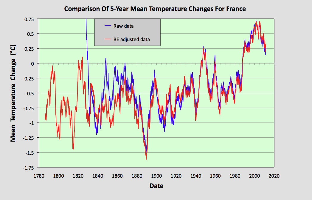
Fig. 147.7: The 5-year mean temperature change for France since 1780 based on the original raw data from Fig. 147.2 (in blue) and the Berkeley Earth adjusted data from Fig. 147.4 (in red).
Summary
The raw unadjusted temperature data for France clearly shows that the climate warmed by less than 0.2°C from 1880 to 1980 (see Fig. 147.2)
In contrast, the BE adjusted data claims that the climate warmed by 0.3°C over the same period (see Fig. 147.4).
After 1980 the climate has clearly warmed by almost 1°C (see Fig. 147.7).
The temperature data before 1980 presented here clearly disagree with that of Spain in Post 146. However, as the MTA for Spain over the 100 years before 1950 is based on data from between twelve and fifty different stations compared to only about five for France, that would suggest that the Spain data is the more accurate.
Acronyms
BE = Berkeley Earth.
MRT = monthly reference temperature (see Post 47).
MTA = mean temperature anomaly.
Long station = a station with over 1200 months (100 years) of data before 2014.
Medium station = a station with over 480 months (40 years) of data before 2014.
List of all stations in France with links to their raw data files.
No comments:
Post a Comment