Over the past year I have analysed most of the temperature data from the Southern Hemisphere as well as some data from Europe and the USA. Few if any of the resulting temperature trends that I have calculated have agreed with the global published trends of the IPCC, Hadley-CRU, NOAA, NASA-GISS, or the regional trends of Berkeley Earth. This may be because they are based on calculations for small regions rather than global averages, although this caveat does not explain the discrepancies seen when compared with the Berkeley Earth data.
In this post I will make a first attempt at analysing the data for the entire Southern Hemisphere. I will do this by simply averaging the anomalies for the 1079 longest station records in the Southern Hemisphere, but without employing any regional weighting to the data. This will produce a first estimate of the temperature trend. A more accurate analysis will be done in a future post, where trends for the various regions will be combined using area weightings similar to those I used in Post 26 to calculate the overall trend for Australia, based on the trends from its individual states. Such an approach is, however, fraught with difficulty as the area of many regions (such as island archipelagos) are difficult to define exactly.

Fig. 64.1: The temperature trend for the Southern Hemisphere since 1820 derived by averaging the 1079 longest temperature records for the region. The best fit is applied to the monthly mean data between 1876 and 1975 and has a negative gradient of -0.12 ± 0.09 °C per century.
The overall temperature trend for the Southern Hemisphere since 1820 is shown in Fig. 64.1 above. This is the result of averaging over one thousand separate station records as indicated in Fig. 64.2 below. All the stations were either long stations with over 1200 months of data before the end of 2013, or medium stations with over 480 months of data.
The temperature profile from 1970 onwards appears to exhibit a clear upward trend with the mean temperature increasing by about 0.57°C from the 1960s to 2010. This data is also the most reliable as it is the result of averaging over 900 temperature records.
In contrast, the data before 1970 exhibits a long modest cooling trend of over 0.1°C per century. The reliability of this data is also good, as it is the result of averaging over 100 temperature records from 1900 onwards. Before 1900, however, the data becomes less reliable due to its reliance on smaller numbers of stations that are also further apart and so less well correlated.

Fig. 64.2: The number of station records included each month in the mean temperature trend for the Southern Hemisphere when the MRT interval is 1981-2010.
What the data in Fig. 64.1 appears to indicate is that while there has been a significant warming of the Southern Hemisphere post-1970 of up to 0.57°C, this is partially offset by a noticeable cooling over the previous 100 years or more. So the total warming since pre-industrial times is likely to be less than 0.4°C. This is much less than the commonly quoted value of 1°C, or 1.5°C for the Northern Hemisphere. Yet this is not reflected in the Berkeley Earth adjusted data.

Fig. 64.3: Temperature trend for the Southern Hemisphere since 1840 derived by aggregating and averaging the Berkeley Earth adjusted data for over 1000 of the longest stations in the region. The best fit linear trend line (in red) is for the period 1951-2010 and has a gradient of +1.45 ± 0.10 °C/century.
An average of the Berkeley Earth adjusted time series temperature trends from the 1000 longest sets of station data in the Southern Hemisphere is presented in Fig. 64.3 above. This appears to indicate that the total temperature rise of the Southern Hemisphere since 1950 should be about 0.8°C. This is significantly more (between 0.1°C and 0.3°C depending on the time period you are considering) than is seen from the raw temperature data in Fig. 64.1, but it is in general agreement with the trend published by Berkeley Earth and shown in Fig. 64.4 below.
However, what is even more prominent is the difference in the temperature trends before 1950. Whereas the raw data in Fig. 64.1 clearly indicates a cooling trend of 0.12°C per century, a simple average of the Berkeley Earth in Fig. 64.3 indicates a modest warming of 0.24°C per century. This, though, is still much less than the official trend shown in Fig. 64.4, which appears to claim an additional 0.5°C of warming has occurred between 1880 and 1950. This is almost the same as the warming since 1950, yet the atmospheric levels of carbon dioxide in 1950 were only 310 ppm, which is only about 30 ppm above pre-industrial levels. This means that the most recent increase in carbon dioxide of 100 ppm since 1950 has produced the same warming as the first 30 ppm did before 1950. If that is true, then it suggests further increases in carbon dioxide concentrations will have ever decreasing impacts on our climate, to the point where they are inconsequential.

Fig. 64.4: The temperature trend for the Southern Hemisphere since 1860 according to Berkeley Earth.
So what are the reasons for the differences in the trends before 1950?
Well, we know that the differences between the trends in Fig. 64.1 and Fig. 64.3 are probably the result of the adjustments made to the data by Berkeley Earth. The statistical legitimacy of these adjustments I have already disputed in Post 57. This cannot explain the differences between the trends in Fig. 64.3 and Fig. 64.4, though, as these are both derived using the same adjusted data. These differences are likely to be the result of regional or station weightings, which would appear to be more important before 1950 due to the smaller number of stations and their uneven geographical distribution.
One way to examine the impact of these differences is to compare results from different samples of data. In the following five graphs I have split the stations used to construct the average in Fig. 64.1 into five separate random samples and compared their trends before and after 1975. In each case the temperature rise from the 1960s to 2010 is in the range 0.56 ±0.05°C while all but one of the samples has a negative trend before 1975. However, the range of trends for data before 1975 (or 1950) is much larger than the range for data after. This suggests that the data before 1950 is more sensitive to the impact that individual stations or regions may have on the average. The number of stations averaged each month for each sample is indicated in Fig. 64.10. This indicates that before 1940 each sample typically has significantly fewer than 70 stations in the average compared with over 150 after 1960.

Fig. 64.5: The temperature trend for the Southern Hemisphere since 1820 based on the first sample average of 224 of the 1079 longest temperature records for the region. The best fit is applied to the monthly mean data between 1876 and 1975 and has a negative gradient of -0.02 ± 0.10 °C per century.
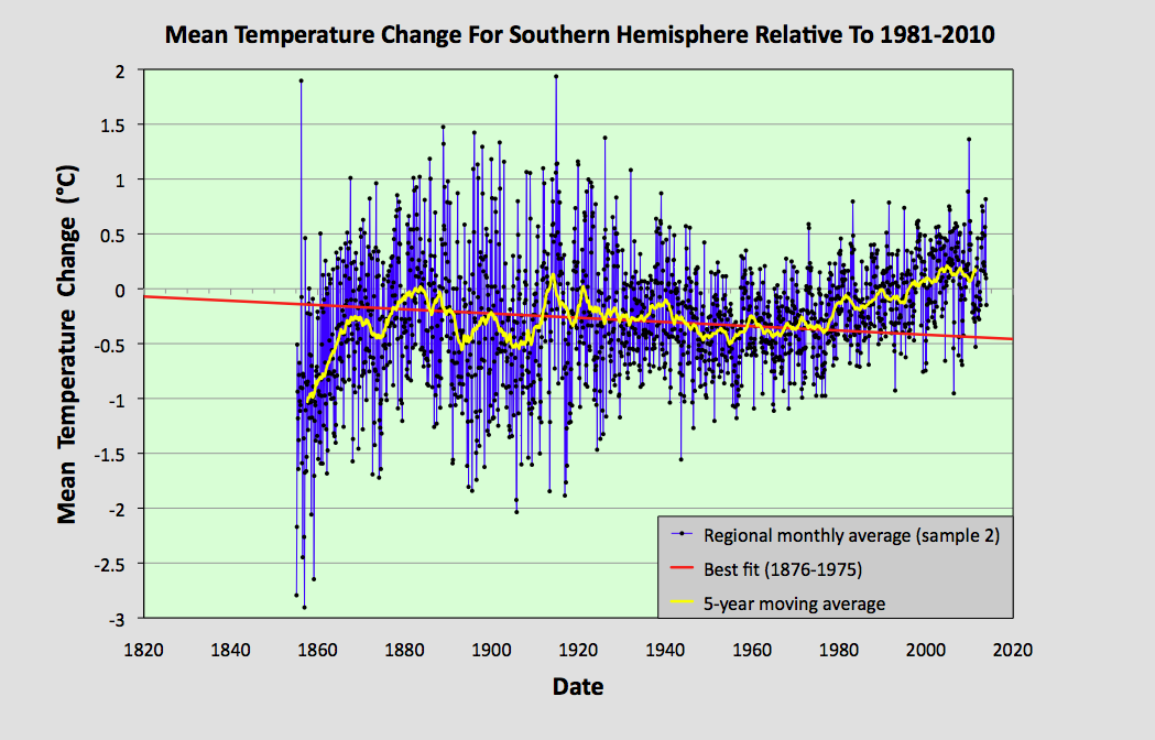
Fig. 64.6: The temperature trend for the Southern Hemisphere since 1820 based on the second sample average of 223 of the 1079 longest temperature records for the region. The best fit is applied to the monthly mean data between 1876 and 1975 and has a negative gradient of -0.19 ± 0.08 °C per century.

Fig. 64.7: The temperature trend for the Southern Hemisphere since 1820 based on the third sample average of 210 of the 1079 longest temperature records for the region. The best fit is applied to the monthly mean data between 1876 and 1975 and has a negative gradient of -0.37 ± 0.09 °C per century.

Fig. 64.8: The temperature trend for the Southern Hemisphere since 1820 based on the fourth sample average of 211 of the 1079 longest temperature records for the region. The best fit is applied to the monthly mean data between 1876 and 1975 and has a negative gradient of -0.09 ± 0.09 °C per century.

Fig. 64.9: The temperature trend for the Southern Hemisphere since 1820 based on the fifth sample average of 211 of the 1079 longest temperature records for the region. The best fit is applied to the monthly mean data between 1876 and 1975 and has a positive gradient of +0.15 ± 0.11 °C per century.

Fig. 64.10: The number of station records included each month in the mean temperature trend for each of the five samples in Fig. 64.5 - Fig. 64.9.
Summary
The temperature trend for the Southern Hemisphere, based on the raw temperature data, exhibits a warming of about 0.5°C since 1950.
Before 1950 there is strong evidence of a prolonged cooling period of over 100 years in duration that amounted to a cooling of at least 0.12°C in total.
Based on the available temperature data, the total warming seen in the Southern Hemisphere since pre-industrial times is likely to be less than 0.4°C. This is much less than the usually reported value.
Final Thoughts
The data shown in Fig. 64.1 clearly shows no warming before 1980. However, the data before 1880 is not very reliable. As Fig. 64.2 indicates, the mean anomaly prior to 1880 is based on data from less than 50 temperature records. If these records were all from the same region, then this low amount of data would be less of a problem as the different stations would be strongly correlated. The result would be reliable - but only for that region.
The data I have analysed so far for this blog suggests that, for a single region with a uniform climate, a good reliable average can be achieved from only about 15-20 sets of data. When dealing with an entire hemisphere, however, we need more data because the climate of South America will clearly be different from that of Australia. This means that the data before 1880 in Fig. 64.1 is likely to be misleading. So can we do better than the trend in Fig. 64.1? Well, yes we can.

Fig. 64.11: The temperature trend for the Southern Hemisphere since 1880 derived by averaging the 1079 longest temperature records for the region. The best fit is applied to the monthly mean data between 1881 and 1980 and has a slight positive gradient of 0.01 ± 0.09 °C per century.
If we re-scale the data in Fig. 64.1 we can create a graph that presents a truer picture of the historic temperature rise by ignoring the unreliable data before 1880. Such a graph is shown above in Fig. 64.11. The other change I have made is to the time interval of the best bit line. This fit now applies from 1881 to 1980 and its gradient is practically zero. The jump in temperature after 1980 still amounts to about 0.57°C, and this is still much less than the 1.5°C that is claimed by climate science for the rise in global land temperatures from 1900 to 2013. But what it also shows is that small changes to how data is analysed and presented can affect the results.
No comments:
Post a Comment