In the previous five posts I examined the temperature changes for five different territories in the Arctic region (Greenland, Iceland, the Faroe Islands, Jan Mayen and Svalbard). All appeared to exhibit similar trends with a peak in temperatures in the 1930s followed by a dip, and then another rise after 1980. In this post I will compare and examine these five trends in more detail.
In Post 11 I demonstrated how the correlation between temperature trends from different stations depends on their separation: the further apart they are, the less well correlated they are. In fact if the distance between them exceeds 1500 km their correlation becomes very weak. On that basis we would not expect any great correlation between the the Faroes and Svalbard as they are over 2,000 km apart. In contrast, Greenland, the Faroes and Jan Mayen are all less than 600 km from Iceland, so the correlations of their temperature data with that from Iceland should be must stronger. The trends in Fig. 124.1 below attempts to do just that, compare the trends of Greenland, the Faroes and Jan Mayen with that of Iceland. For clarity the trends of Greenland and the Faroes are offset vertically by -3°C and +3°C respectively, as are their Icelandic comparator curves.
Fig. 124.1: The 5-year moving average temperature trends for Greenland, Jan Mayen and the Faroe Islands all compared against the equivalent trend for Iceland.
The data in Fig. 124.1 can be summarized as follows.
The trends of Greenland, Jan Mayen and the Faroe Islands all appear to follow the same broad pattern. Temperatures peak in the 1930s, then decline by about 2°C by the 1980s before peaking again after 2000. Only in Jan Mayen is the peak after 2000 higher (by about 0.5°C) than the one in the 1930s.
The trend from the Faroe Islands is most closely correlated with that of Iceland. Not only is the broad trend the same, but the smaller peaks and troughs also align well.
The smaller peaks for Greenland are not closely correlated with those of Iceland or the other two regions. This may be because the mean temperature anomaly (MTA) for Greenland is the result of averaging anomalies from stations over a much larger area than is the case for Iceland, Jan Mayen and the Faroe Islands. So some of the fine detail may be lost by the averaging of stations that are themselves not well correlated.
Jan Mayen shows better correlation with Iceland but its peaks and troughs are larger in size. This may be the result of it having a more extreme climate (due to being inside the Arctic Circle) where the temperature anomalies are naturally larger.
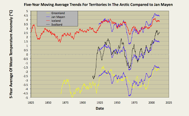
Fig. 124.2: The 5-year moving average temperature trends for Greenland, Iceland and Svalbard all compared against the equivalent trend for Jan Mayen.
If we repeat the process used for Fig. 124.1 but instead use the temperature trend of Jan Mayen as the reference comparator, then we get the trends shown in Fig. 124.2 above.
What we see from Fig. 124.2 is similar to what we saw in Fig. 124.1 with temperatures peaking in the 1930s, then declining by about 2°C by the 1980s before peaking again after 2000.
Once again the smaller peaks for the trend of Greenland are not closely correlated with those of the comparator (in this case Jan Mayen), and the reason is probably the same.
This time, though, the greatest correlation of the smaller peaks and troughs in each trend line is between those for Jan Mayen and Svalbard. This is perhaps not a surprise given that they are near(-ish) neighbours and both are well inside the Arctic Circle.
Summary and conclusions
The general long-term temperature trends of Greenland, Iceland, Jan Mayen and the Faroe Islands are well correlated over timescales of more than 20 years. This suggests that there is no need to adjust the temperature data because the data is correct.
Correlations on shorter timescales (5-10 years) are generally weaker. The two notable exceptions are firstly Jan Mayen and Svalbard, and secondly Iceland and the Faroe Islands.


No comments:
Post a Comment