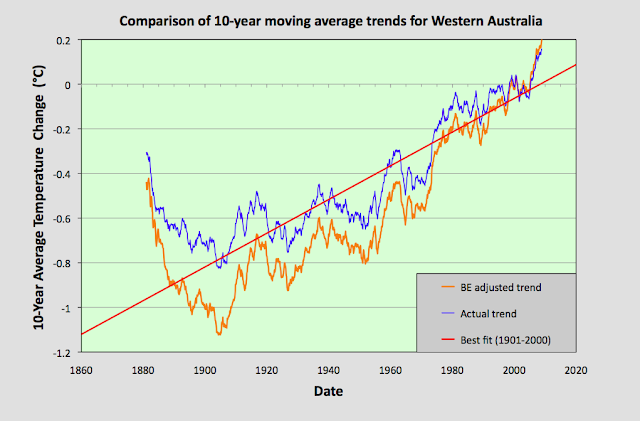
In the following graphs the blue curve is the 10-year average temperature for the state relative to the decade 1991-2000 based on the actual unadjusted raw temperature data. The red line is the best fit to that data for the 100 year interval 1901-2000. The orange curve is the trend based on Berkeley Earth adjusted data. This is also defined relative to its mean for the decade 1991-2000.
Conclusions
1) The Berkeley Earth adjusted data trends appear to closely follow the actual data trends for the period after 1970. However, before 1970 the two trends often diverge significantly.
2) Even after divergence, the Berkeley Earth adjusted data trend has almost identical features to the corresponding actual data trend. These features include the patterns of peaks, and the large changes in gradient at similar points in time. In fact the adjusted and unadjusted trend lines appear to show near identical instances of abrupt discontinuities and rapid temperature changes at various points along their respective records.
3) Linear regression fits to temperature record data cannot adequately represent the complexity of the data. For example, a 100-year best fit to the NSW data in Fig. 25.1 yields a gradient of 0.08 °C per century for the period 1901-2000, yet for the interval 1881-1980 this changes to -0.41 ± 0.11 °C per century. Likewise, changing the interval of the best fit for Northern Territory to 1886-1985 also changes the gradient to -0.41 ± 0.11 °C per century, while a best fit interval of 1871-1970 for South Australia results in a gradient of -0.60 ± 0.12 °C per century. In other words, the gradient of the best fit line depends strongly on the measurement interval chosen for the best fit.
4) The temperature trends based on actual data (not the Berkeley Earth adjusted data) suggest that for most states, except maybe Queensland, average temperatures in the latter part of the 20th century were lower than those in the latter part of the 19th century.
5) In most states the majority of any climatic warming has occurred after 1980.
Links to all posts with my original analysis are listed below or on the sidebar.


No comments:
Post a Comment