Showing posts with label Indian Ocean. Show all posts

Monday, August 22, 2022

131: UHI #4 - Jakarta (Indonesia)

Probably the most extreme example of an urban heat island (UHI) in the Southern Hemisphere is Jakarta. I first discussed it when analysing the temperature data of Indonesia for Post 31, but it is so dramatic that it needs further examination. 

Jakarta is the largest city in the Southern Hemisphere with a population of over 33 million. Indonesia has a population of more than 270 million, but this is spread over an archipelago of islands that stretch over 5000 km. The result is that Indonesia has seen no warming over the last one hundred years while Jakarta has warmed by almost 3°C since 1880 (see Fig. 131.1 below).


Fig. 131.1: The change to the 5-year average temperatures of Jakarta (red curve) and Indonesia (blue curve) since 1920.


In Post 31 I examined the temperature trends for Indonesia. The mean temperature change since 1912 is shown in Fig. 131.2 below and it indicates that Indonesia outside of Jakarta has actually cooled slightly over the last one hundred years. The best fit for 1913-2012 indicates a temperature change of -0.08°C while the 5-year average suggests a small rise of about +0.16°C.


Fig. 131.2: The mean temperature change for Indonesia since 1912 relative to the 1961-1990 monthly averages. The best fit is applied to the monthly mean data from 1913 to 2012 and has a slight negative gradient of -0.08 ± 0.04 °C per century.


One of the oldest weather stations in Indonesia is Jakarta Observatorium (Berkeley Earth ID: 155660). It is located in the middle of Jakarta with almost continuous data stretching back as far as 1866, hence its significance as a case study of the urban heat island (UHI) effect. In contrast to the rest of Indonesia, Jakarta Observatorium shows significant and continuous warming since 1870 (see Fig. 131.3 below). The best fit for 1913-2012 indicates a temperature rise of more than 2.16°C in the one hundred years since 1913, while the 5-year average suggests a rise of over 2.35°C.


Fig. 131.3: The mean temperature change for Jakarta Observatorium since 1866 relative to its 1961-1990 monthly averages. The best fit is applied to the monthly mean data from 1913 to 2012 and has a positive gradient of +2.16 ± 0.08 °C per century.


It is important to note that while Jakarta Observatorium is the clearest example of a UHI in Indonesia, it is not the only one. Up until 1970 there was a second station in Jakarta (Berkeley Earth ID: 155660) which also exhibited over 1.8°C of warming from 1866 to 1970. But the city of Surabaya (Berkeley Earth ID: 155652) also appears to behave as a UHI. Its population is over twelve million making it the fifth largest city in the Southern Hemisphere. From 1949 to 2013 it appears to have exhibited warming of more than 1.7°C as well (or 2.75°C per century). Yet despite this the rest of Indonesia cooled.


Summary

The following temperature changes were observed from 1913 to 2012.

Indonesia: 0.16°C (trend -0.08°C).

Jakarta: 2.35°C (trend 2.16°C).

So Jakarta has warmed by at least 2°C more than the rest of Indonesia. It has also warmed while Indonesia has not. A classic UHI!


Thursday, September 30, 2021

78. Mozambique - temperature trend 0.6°C WARMING after 1980

According to climate science, Mozambique has experienced a more or less continuous warming to its climate of over 1.2°C over the last 130 years. The reality as evidenced by the actual temperature data is rather different. Like many places around the world, Mozambique has certainly seen some modest warming of about 0.6°C since 1980, but before 1980 the picture is uncertain, and on balance there may have been no significant warming at all in this period.

Mozambique has eleven long and medium weather stations most of which are located on, or near, the coast, as indicated in Fig. 78.1 below. This is same number of long and medium weather stations that was seen for Madagascar (see Post 77). However Madagascar also has another nine stations with over 300 months of data; Mozambique has only four.


Fig. 78.1: The (approximate) locations of the weather stations in Mozambique. Those stations with a high warming trend between 1901 and 2000 are marked in red while those with a cooling or stable trend are marked in blue. Those denoted with squares are stations with over 1000 months of data, while diamonds denote stations with over 480 months of data.


Of the eleven long and medium stations in Mozambique, two are long stations with over 1200 months of data, another two have over 1000 months of data, and the remaining seven are medium stations with over 480 months of data. Averaging the temperature anomalies from these eleven station records results in the mean temperature anomaly (MTA) for the region shown in Fig. 78.2 below. The method used to determine the MTA was the same as that used in previous posts and has been outlined in Post 47

First the monthly reference temperatures (MRTs) were calculated for a suitable time interval, in this case the thirty year period from 1951 to 1980. This ensured that all eleven long and medium temperature records contained sufficient valid data in this interval for each month (a minimum of twelve years of data for each MRT is usually required). The MRTs for each set of station data were then subtracted from the raw monthly temperature readings to produce the anomalies for that station location. The anomalies from all eleven long and medium station records were then averaged to determine the MTA.


Fig. 78.2: The temperature trend for Mozambique relative to the 1951-1980 monthly averages based on an average of anomalies from stations with over 480 months of data. The best fit is applied to the monthly mean data from 1913 to 2012 and has a positive gradient of +1.07 ± 0.06 °C per century.


The MTA data in Fig. 78.2 appears to show an upward trend of about 1°C per century, but that is not the whole story. As Fig. 78.3 below indicates, the number of stations that contribute to the MTA drops significantly as you go back in time before 1950. This in turn suggests that the trend in Fig. 78.2 after 1960 is much more reliable than that before 1930.


Fig. 78.3: The number of station records included each month in the mean temperature anomaly (MTA) trend for Mozambique in Fig. 78.2.


As usual I have compared my results based on raw temperature data with the Berkeley Earth (BE) version based on their adjusted data. The equivalent average of the BE adjusted anomalies is shown below in Fig. 78.4. From 1940 onwards it is very similar to the trend from the raw temperature data shown in Fig. 78.2 above. In both cases the MTA plateaus between 1940 and 1980 before rising by about 0.8°C over the next twenty years. Then it drops back slightly by about 0.2°C in the following decade.


Fig. 78.4: Temperature trends for Mozambique based on Berkeley Earth adjusted data. The average is for anomalies from all stations with over 360 months of data. The best fit linear trend line (in red) is for the period 1911-2010 and has a gradient of +1.00 ± 0.03°C/century.


The MTA based on BE adjusted data also shows good agreement between 1920 and 1990 with the official Berkeley Earth trend for Mozambique shown in Fig. 78.5 below. It is only after 1995 that there is significant disagreement between the two plots. This may be because Berkeley Earth has included more data in the average after 2000 using many more stations with less than 300 months of data than I have.


Fig. 78.5: The temperature trend for Mozambique since 1840 according to Berkeley Earth.


It is clear that the temperature trend for Mozambique exhibits some warming after 1980, but the trend before 1980 is less clear. However, if we look at all the available data (see here for a list of all stations in Mozambique) we do see that there are a number of stations with data from 1930 to 1960 that are not included in the MTA trend shown in Fig. 78.2 above, due to insufficient data within the MRT period. It turns out that the temperature time series of most of these station datasets display cooling trends from 1930-1960. The one main exception is the data from Lourenço Marques (Berkeley Earth ID: 156935) which shows more or less continuous warming from 1920 onwards.

If we wish to incorporate these extra stations into the MTA then we need to change the MRT period to the interval 1931-1960 when most of this extra data was recorded. This is what I have done to generate the data in Fig. 78.6 below. The other significant change was to discard the data from Lourenço Marques (aka Maputo) from the MTA. The reason for doing this was that, while this station clearly has the longest set of temperature data in Mozambique (it has temperature data from as far back as 1892), its temperature trend is an outlier. This is probably because the station is located in the capital city Maputo and is more prone to the urban heat island (UHI) effect than most other stations in the country. I should note that this outlier behaviour of capital cities is not unusual. The same was seen for Jakarta in Indonesia (see Post 31) as well as for Sydney and Melbourne in Australia.


Fig. 78.6: The mean temperature trend relative to the 1931-1960 monthly averages for stations in Mozambique with over 300 months of data but excluding Lourenço Marques. The best fit is applied to the monthly mean data from 1921 to 1980 and has a positive gradient of +0.16 ± 0.12 °C per century.


The result of this change of MRT, together with the removal of the data from Lourenço Marques, is to completely change the temperature trend before 1940 (see Fig. 78.6 above). While the trend after 1980 still exhibits a warming of 0.6°C, the trend before 1980 is now neutral but with significant natural variability. It is also more reliable as it is based on data from more stations than previously (see Fig. 78.7 below). This would suggest that the temperature trend in Fig. 78.7 is a better representation of the true behaviour of the Mozambique climate over the last 100 years than is the trend in Fig. 78.2. It also provides more evidence to suggest that anthropogenic climate change is really only a post-1980 phenomenon and not one that began in 1850.


Fig. 78.7: The number of station records included each month in the mean temperature anomaly (MTA) trend for Mozambique in Fig. 78.6.


Summary

The data shows that there is clearly strong warming of almost 0.6°C in Mozambique after 1980 (see Fig. 78.2).

Before 1980 the climate appears to be stable (see Fig. 78.6).

Overall this suggests that the warming seen in Mozambique after 1980 is probably real as it coincides with the period of greatest anthropogenic carbon dioxide production. It is also similar in timing and magnitude to temperature rises seen elsewhere around the world as I have shown previously.


Acronyms

BE = Berkeley Earth.

MRT = monthly reference temperature (see Post 47).

MTA = mean temperature anomaly.


Tuesday, August 31, 2021

77. Madagascar - temperature trend PARABOLIC

The only weather station in Madagascar with significant temperature data before 1930 is Antananarivo (Berkeley Earth ID: 156627). The temperature anomalies for this station appear to oscillate over time with a warming phase before 1930, followed by a cooling phase until 1980, and then another warming phase (see Fig. 77.1 below). It is tempting to think that this station is just an outlier, but it might actually be representative of Madagascar as a whole.


Fig. 77.1: The temperature trend for Antananarivo relative to the 1971-2000 monthly averages. The best fit is applied to the monthly mean data from 1901 to 2010 and has a negative gradient of -0.82 ± 0.07 °C per century.


Overall there are twenty weather stations in Madagascar with over 300 months of data (for a list see here), but only one of these, Antananarivo, is a long station with over 1200 months of data. Another ten are medium stations with over 480 months of data. These stations are distributed fairly evenly across Madagascar as shown in Fig. 77.2 below.


Fig. 77.2: The (approximate) locations of the weather stations in Madagascar. Those stations with a high warming trend between 1901 and 2000 are marked in red while those with a cooling or stable trend are marked in blue. Those denoted with squares are long or medium stations with over 480 months of data, while diamonds denote stations with over 300 months of data.


When it comes to calculating the temperature trend for Madagascar the biggest problem (other than insufficient data) is in deciding the time interval for calculating the monthly reference temperatures (MRTs). The aim here is to choose an interval that allows the maximum number of stations to be included in the same average of the temperature anomalies. But there is also a balance to be struck in enabling as many months as possible, over as long a time span as possible, to have adequate data in order to generate a reasonably accurate mean trend over the longest possible time frame. You see, in order to detect global warming, because of the inherent variability in the temperature data, you need long time series (usually over 100 years) in order to detect any real trends.


Fig. 77.3: The temperature trend for Madagascar relative to the 1931-1960 monthly averages based on an average of anomalies from stations with over 300 months of data. The best fit is applied to the monthly mean data from 1901 to 2010 and has a negative gradient of -1.24 ± 0.06 °C per century.


The problem with data for Madagascar is that most of the station records have no data before 1951, while most of those that have data before 1951 have none after 1962. In fact of the six records with data before 1951, four have none after, while only two station records with data after 1962 have data before 1950.

The solution to this conundrum is to analyse the data in two parts, with a different MRT interval for each. The first MRT interval chosen was 1931-1960. This yielded the mean temperature anomaly (MTA) trend shown above in Fig. 77.3. The method for calculating the MRT, and then the anomalies for each station dataset has been described previously in Post 47. The second MRT interval chosen was 1971-2000 and the resulting MTA trend is shown below in Fig. 77.4.


Fig. 77.4: The temperature trend for Madagascar relative to the 1971-2000 monthly averages based on an average of anomalies from stations with over 300 months of data. The best fit is applied to the monthly mean data from 1956 to 1985 and has a negative gradient of -0.38 ± 0.25 °C per century.


It can be seen that the trends in Fig. 77.3 and Fig. 77.4 agree reasonably well, but close inspection suggests that the data in Fig. 77.4 is less noisy (look at the data spread) after 1960 than the equivalent data in Fig. 77.3, while the reverse is true for the period 1931-1960. The reason for this can be determined by examining the number of stations in the MTA calculation in each case as the plots in Fig. 77.5 below illustrate.


Fig. 77.5: The number of station records included each month in the mean temperature anomaly (MTA) trend for Madagascar in Fig. 77.3 (blue) and Fig. 77.4 (red).


The MRT problem outlined above can be resolved by combining data from both Fig. 77.3 and Fig. 77.4 into one single MTA trend. Because the two sets of data have different MRT intervals, there will be a vertical offset in their respective MTA values. Comparing anomalies between 1910 and 1930 for both cases indicates that the data in Fig. 77.4 is offset by 0.5083°C compared to the same data in Fig. 77.3. This offset is then subtracted from the MTA data in Fig. 77.4. Then a single MTA is constructed by combing the data in Fig. 77.3 before 1955 with the offset data from Fig. 77.4 from 1955 onwards. The result is the MTA trend shown below in Fig. 77.6 which is remarkably similar to that for Antananarivo shown in Fig. 77.1 at the start of this post.
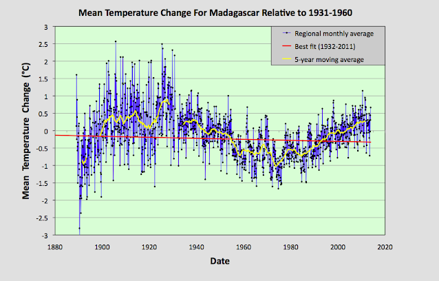

Fig. 77.6: The temperature trend for Madagascar if data before 1955 from Fig. 77.3 is combined with data after 1st January 1955 from Fig. 77.4. The best fit is applied to the monthly mean data from 1932 to 2011 and has a negative gradient of -0.15 ± 0.07 °C per century.


The MTA trend in Fig. 77.6 above differs markedly from both the official Berkeley Earth version (shown in Fig. 77.8 below) and the MTA trend for the Indian Ocean that was discussed in the previous post. A comparison of the 5-year moving averages for Madagascar and the Indian Ocean shows fairly good agreement from 1975 onwards but little before that (see Fig. 77.7 below). Even so, the level of agreement between the two data sets seen after 1975 is still not comparable to that seen for temperature trends of neighbouring countries in central Europe as demonstrated in Post 57 despite Madagascar being surrounded by most of the islands whose temperature data its data is being compared with.


Fig. 77.7: A comparison of the 5-year moving average MTA trends for Madagascar and the Indian Ocean.


A comparison of the MTA trend in Fig. 77.6 with the official Berkeley Earth (BE) regional trend shows a similar disparity between temperature data before 1975 and the data after (see Fig. 77.8 below). While the behaviour of the two trends is again similar after 1975, before this point they diverge markedly.


Fig. 77.8: The temperature trend for Madagascar since 1750 according to Berkeley Earth.


Just as I have shown in previous posts, it is possible to construct a temperature profile that is very similar to the official BE regional trend in Fig. 77.8 simply by averaging the adjusted anomaly data from each station. This data is easy to find as it is recorded alongside the raw temperature data in each BE station data file on the BE website. If we perform this average for the stations in Madagascar we obtain the temperature trend shown below in Fig. 77.9.

What is noticeable is how well the curves in Fig. 77.9 agree with those in Fig. 77.8. As I have pointed out many times before, Berkeley Earth use gridding and homogenization in their averaging, yet omitting these techniques appears to produce very similar results. The condition for this to happen, is of course the usually one, namely, the weather stations need to be fairly evenly distributed. But as Fig. 77.2 shows, in Madagascar, as in most other places, on a local level they are.


Fig. 77.9: Temperature trends for Madagascar based on Berkeley Earth adjusted data. The average is for anomalies from all stations with over 300 months of data. The best fit linear trend line (in red) is for the period 1911-2010 and has a gradient of +1.07 ± 0.03°C/century.


The difference between the Berkeley Earth (BE) trend in Fig. 77.9 and the MTA trend based on the raw unadjusted data in Fig. 77.6 is shown in Fig. 77.10 below. It shows that the adjustments made by BE to the temperature data reduced the temperature values of all the data from before 1930 by about 0.8°C, but more significantly added 1.48°C per century of warming between about 1930 and 1980, thus completely reversing the direction of the temperature trend in that time interval. The result is that the parabolic trend seen in Fig. 77.6 is turned into the almost linear trend shown in Fig. 77.9. This completely changes the nature of the trend.


Fig. 77.10: The contribution of Berkeley Earth (BE) adjustments to the anomaly data in Fig. 77.9 after smoothing with a 12-month moving average. The blue curve represents the total BE adjustments including those from homogenization. The linear best fit (red line) to these adjustments for the period 1933-1977 has a positive gradient of +1.48 ± 0.03 °C per century. The orange curve shows the contribution just from breakpoint adjustments.


Summary

There is clearly strong warming of almost 1°C in Madagascar after 1980 (see Fig. 77.6 and Fig. 77.4). This conclusion is supported by data from up to fifteen different weather stations (see Fig. 77.5).

Between 1930 and 1980 there appears to be equally strong cooling occurring (see Fig. 77.6 and Fig. 77.3). This trend is seen in all of the seven different weather stations with data in this period (see Fig. 77.5).

The overall land temperature in Madagascar before 1930 is not known with any precision due to the lack of data. Only one station (Antananarivo, Berkeley Earth ID: 156627) has significant data before 1930, but four others have fragments (see Fig. 77.5) that may partially support the trend seen for Antananarivo in Fig. 77.1.

It appears that the warming seen in Madagascar after 1980 is just a part of a natural temperature variability. It cannot be attributed to global warming without more data.


Acronyms

BE = Berkeley Earth.

MRT = monthly reference temperature (see Post 47).

MTA = mean temperature anomaly.


Monday, August 30, 2021

76. Indian Ocean - temperature trend WARMING 1°C

There are sixteen weather stations in the Indian Ocean region with over 480 months of data, most of which are situated on the islands surrounding Madagascar (see Fig. 76.1 below). The exceptions are the stations on Diego Garcia (Berkeley Earth ID: 173559) which is in the eastern half of the ocean, and Minicoy (Berkeley Earth ID: 155480) which is off the coast of India north of the Maldives (Berkeley Earth ID: 156700). The rest are located on, or near, the islands of Comoros, Mayotte, Seychelles, Agalega, Mauritius, Réunion, Ile Tromelin, Ile Juan de Nova and Ile Europa.

Of all these stations, only two have temperature records with more than 1000 months of data (Seychelles Airport and Minicoy) while thirteen have over 600 months of data. Overall, twenty-two stations have at least 300 months of data.


Fig. 76.1: The (approximate) locations of the long and medium temperature records in the Indian Ocean. Those stations with a high warming trend between 1911 and 2010 are marked in red while those with a cooling or stable trend (Comoros) are marked in blue. Those denoted with squares are long stations with over 1200 months of data, while diamonds denote medium stations with over 480 months of data.


Summing the anomalies from these stations gives the mean temperature trend shown in Fig. 76.2 below. The anomalies for each station where determined relative to the monthly reference temperature (MRT) averages for the period 1941-1970 using the method outlined in Post 47. Only stations with twelve years of data in this MRT interval are included in the final calculation of the regional mean temperature trend. This means that seventeen stations were included in the calculation, including fifteen long and medium stations. The one medium station to be excluded was that at Vacoas in Mauritius (Berkeley Earth ID: 156749) which had insufficient data in the MRT interval.


Fig. 76.2: The temperature trend for the Indian Ocean based on an average of anomalies from stations with over 300 months of data. The best fit is applied to the monthly mean data from 1916 to 1975 and has a positive gradient of +0.33 ± 0.07 °C per century. The monthly temperature changes are defined relative to the 1941-1970 monthly averages.


It can be seen that the temperature trend in Fig. 76.2 has two distinct intervals. Before 1975 there is a gentle warming of about 0.33°C per century. This gives a total warming of about 0.2°C since 1920. After 1975 the warming increases significantly and this adds a further 0.8°C to the total. This suggests that the total warming since 1900 has been about 1°C.


Fig. 76.3: The number of station records included each month in the mean temperature trend for Bangladesh in Fig. 76.2.


The reliability of this trend can be estimated by considering the number of stations included in the mean. Previous analysis for central Europe (see Post 57) suggests that between fifteen and thirty stations are needed for the mean trend to be truly representative of the actual temperature trend. This is because the individual temperature records are prone to measurement errors. However, many of these errors from different stations cancel when averaged in sufficiently large numbers (Regression Towards The Mean).

The temperature trend in Fig. 76.2 is the result of averaging up to seventeen different records, but this is only true for data from the 1950s (see Fig. 76.3 above). For data after 1960 the typical number of records in the average is only about twelve, while before 1950 its is typically less than five. This suggests that the trend after 1960 is much more reliable than that before 1950. So we can be reasonably confident in the magnitude of the warming post-1960, but much less so for the data before 1950.


Fig. 76.4: Temperature trends for the Indian Ocean based on the average of anomalies for all long and medium stations using Berkeley Earth adjusted data. The best fit linear trend line (in red) is for the period 1911-2010 and has a gradient of +1.03 ± 0.02°C/century.


Finally, if we compare the result in Fig. 76.2 with the equivalent Berkeley Earth result using their adjusted data we find only a small difference as Fig. 76.4 illustrates. In fact the only significant difference is the warming seen before 1950 which is twice as large in Fig. 76.4 as it is in Fig. 76.2. But given the scarcity and hence unreliability of this data, it is impossible to ascertain which, if any, of the two results is the more accurate.


Summary

The islands of the Indian Ocean have warmed by about 0.8°C since 1960.

There is some evidence of a slight warming before 1950, but with insufficient data available for this period, it is difficult to quantify this with any certainty.


Friday, August 20, 2021

75. Southern Asia - overall temperature trend STABLE to 1975

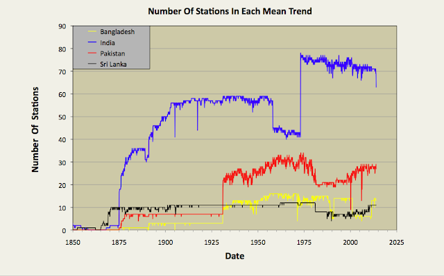
In my previous four blog posts I determined the temperature trends for India, Pakistan, Sri Lanka and Bangladesh using unadjusted temperature data. The number of stations used to calculate the mean temperature each month is shown in Fig. 75.1 below. In the first three cases no warming was detectable before 1975, and only a modest temperature increase of about 0.6°C thereafter. In the case of Bangladesh there was a continuous warming that amounted to less than 0.3°C. This is significantly different from the conventional narrative on global warming, and highlights the impact that temperature adjustments have on the warming trends published by most of the main climate groups. In almost all cases the affect of these adjustments is to increase the rate of warming in the final trend as most of the regional trends I have published on this blog have also illustrated. In this post I will combine the results for India, Pakistan, Sri Lanka and Bangladesh into a temperature trend for the region.


Fig. 75.1: The number of station records included each month in the mean temperature anomaly for each of four countries in South Asia.


In Post 70 I performed a similar task for data from the different countries in South-East Asia using two separate methods. One method just involved a simple average of temperature anomalies from all the different stations in the region, while the second used a weighting process that was used to average the mean anomalies for the different countries based on their land areas. If all the countries have similar densities of stations, then both methods should yield the same result. In the case of South-East Asia that was broadly the case for most countries other than Burma, but the differences in the two methods still led to a difference in the temperature trend gradients of almost 0.1°C per century. In the case of South Asia there are large differences in station density between countries, and these differences can also change over time, as shown in Fig. 75.2 below. For this reason, in this post I have chosen to adopt the area weighted method to determine the regional temperature trend.


Fig. 75.2: The station density each month for each of four countries in South Asia.


By comparing Fig. 75.1 and Fig. 75.2 it can be seen that India clearly has the most sets of station data, but it is Sri Lanka that has the highest density of stations. However, the temperature anomaly for Sri Lanka will also be subject to greater uncertainty as it is based on only a handful of stations (eleven at most). Then again, the contribution of the Sri Lanka stations to the final regional trend will be small due to the much smaller area of Sri Lanka compared to both India and Pakistan.


Fig. 75.3: The temperature trend for South Asia based on an average of anomalies from all long and medium stations. The best fit is applied to the monthly mean data from 1876 to 1975 and has a positive gradient of +0.19 ± 0.06 °C per century. The monthly temperature changes are defined relative to the 1951-1980 monthly averages.


Applying an area weighted approach to the calculation results in the temperature anomaly time series shown in Fig. 75.3 above. This is calculated by multiplying the mean anomaly data for each country (e.g. the monthly data in Fig. 74.2 for Bangladesh) by the area of that country, and then summing the resulting products for all four countries in the region. Then the result is divided by the total area of the four countries.

Like the equivalent anomaly time series for the individual countries, the regional anomaly exhibits very little warming before 1975 with about 0.5°C of warming occurring thereafter (see Fig. 75.3). To reiterate, this is the result that we get when we use the actual raw unadjusted temperature data for each station and not the adjusted/homogenized data that is generally favoured by climate scientists.


Fig. 75.4: Temperature trends for South Asia based on an average of Berkeley Earth adjusted data from all long and medium stations. The best fit linear trend line (in red) is for the period 1876-2005 and has a gradient of +0.66 ± 0.02°C/century.


If, however, we perform the same calculation with adjusted data (which is available in the same data file as the unadjusted data on the Berkeley Earth site) we get a quite different result as is shown in Fig. 75.4 above. There is now a strong and continuous warming trend from 1875 onwards. The total warming is claimed to be 1.25°C, with 0.5°C of this occurring before 1975 (see 10-year average in Fig. 75.4). This is still less than that claimed by Berkeley Earth and shown in Fig. 75.5 below. However, this is likely to be because Berkeley Earth included both Iran and Afghanistan in the Southern Asia region, and according to Berkeley Earth the regional temperature trends for both Iran and Afghanistan exhibit over 1.5°C of warming after 1970. That would help to explain the larger temperature rise post-1970 seen in Fig. 75.5 (almost 1°C) than is seen in Fig. 75.4 (only 0.7°C). What is harder to explain is why there is so much warming before 1900 in Fig. 75.5 when there is a) so little data with almost all being due to one or two stations in India, and b) very little increase in atmospheric carbon dioxide levels to cause such a temperature increase.


Fig. 75.5: The temperature trend for South Asia since 1790 according to Berkeley Earth.


Finally, if we compare the temperature trends for the four countries of South Asia we see that while there are broad similarities in their general trends over timescales of decades, there is only moderate correlation of more short term features and fluctuations (see fig. 75.6 below). The main reason for this is distance. The principal cities of Bangladesh (Dhaka), Sri Lanka (Colombo) and Pakistan (Karachi) are all at least 2000 km apart. As I demonstrated in Post 11, temperature anomaly time series from stations that are more than 1500 km apart are very poorly correlated as Fig. 11.2(a) in that post illustrates.


Fig. 75.6: A comparison of the temperature trends of Bangladesh, Pakistan and Sri Lanka with that of neighbour India. For clarity the trends for Pakistan and Bangladesh are offset by +1°C and -1°C respectively.


Summary

The temperature trend for Southern Asia shows no warming before 1975 and only about 0.5°C thereafter (see Fig. 75.3).

The trend based on Berkeley Earth adjusted data shows significantly more warming (about 1.1°C in total), including significant warming (about 0.5°C) before 1975 (see Fig. 75.4).


Friday, July 23, 2021

74. Bangladesh - temperature trends WARMING 0.3°C

Despite being surrounded by India on threes sides, Bangladesh has a slightly different temperature trend to its larger neighbour. This may be because of a reduction in reliable data after 1999 where, in the case of India, the temperature rises abruptly by about 0.6°C; in the case of Bangladesh it does not. Between 1930 and 1990 where Bangladesh has the majority of its temperature data, the agreement with India is actually quite good.


Fig. 74.1: The (approximate) locations of the long and medium temperature records in Bangladesh. Those stations with a high warming trend between 1921 and 2010 are marked in red while those with cooling or stable trends are marked in blue. Those denoted with squares are long stations with over 1200 months of data.


Overall there are 17 temperature records for Bangladesh that have over 480 months of data (for full list see here). Of these three are long stations with over 1200 months of data, while the remainder are medium stations. In fact all the medium stations have at least 600 months of data. The locations of these stations are shown in Fig. 74.1 above. Their geographical spread is fairly even, which suggests that any simple average of their temperature anomalies should yield a fairly accurate approximation to the true mean temperature anomaly for the region. It can also be seen that over half of the stations have stable or cooling trends for the 90 years up to the end of 2010. 

Just as for my previous regional analyses, the monthly temperature anomalies for each station were calculated by subtracting the monthly reference temperature (MRT) for the relevant month from the unadjusted mean temperature for that month. These anomalies from the various long and medium records were then averaged to determine the mean temperature trend for the region. The resulting mean monthly temperature anomaly is shown in Fig. 74.2 below.


Fig. 74.2: The temperature trend for Bangladesh based on an average of anomalies from all long and medium stations. The best fit is applied to the monthly mean data from 1921 to 2010 and has a positive gradient of +0.27 ± 0.08 °C per century. The monthly temperature changes are defined relative to the 1931-1960 monthly averages.


The MRTs are different and specific to each station, but were always calculated using data from the same time period (in this case 1931-1960) for each station using the method described previously in Post 47. This ensures that the baseline reference temperature for each station is consistent so that all temperature changes over time are measured relative to the same point in time. However, no choice of 30-year MRT interval would have enabled all 17 station records to be included in the mean temperature in Fig. 74.2. This is because one station Berhampore (Berkeley Earth ID: 5388) has no data after 1957, while two stations, Dacca Tejgaon (Berkeley Earth ID: 152645) and Sylhet (Berkeley Earth ID: 152652), have virtually no data before 1956. An MRT interval of 1931-1960 allowed Berhampore to be included, thus increasing the number of stations with data before 1930 from three to four (see Fig. 74.3 below).I decided this was more beneficial in terms of overall data quality than having an extra two sets of station data after 1957.


Fig. 74.3: The number of station records included each month in the mean temperature trend for Bangladesh in Fig. 74.2.


The mean temperature trend for Bangladesh shown in Fig. 74.2 exhibits a slight warming of about 0.25°C after 1920. Yet the official Berkeley Earth trend suggests the warming is much greater, being almost 1°C after 1920 and nearly 1.5°C since 1830 (see Fig. 74.4 below). This is despite the fact that there is no real temperature data before 1875. So which data trend is correct?


Fig. 74.4: The temperature trend for Bangladesh since 1800 according to Berkeley Earth.


Well, if we average the Berkeley Earth adjusted data from all 15 stations used in this analysis (the adjusted data is listed on the Berkeley Earth site along with the raw data) we obtain trends that are very similar to those in Fig. 74.4 as the data in Fig. 74.5 below shows. This demonstrates two points. Firstly, it provides strong evidence that the averaging method we use to combine anomalies from the different stations is sufficiently accurate to avoid the need to use gridding and homogenization techniques. If this were not true then the data in Fig. 74.4 and Fig. 74.5 would not agree so well, but the uniform geographical distribution of stations across Bangladesh clearly facilitates this. But secondly, it shows that most of the warming presented in Fig. 74.4 comes from adjustments made to the data, and not from the raw data itself, otherwise the data in Fig. 74.5 would agree with the data in Fig. 74.2.


Fig. 74.5: Temperature trends for Bangladesh based on the average of anomalies for all long and medium stations using Berkeley Earth adjusted data. The best fit linear trend line (in red) is for the period 1921-2010 and has a gradient of +0.74 ± 0.03°C/century.


Finally, comparing the adjusted data in Fig. 74.5 with the unadjusted data in Fig. 74.2 allows us to quantify the contribution made to the trends in Fig. 74.4 by the Berkeley Earth data adjustments. These net adjustments are shown below in Fig. 74.6.


Fig. 74.6: The contribution of Berkeley Earth (BE) adjustments to the anomaly data in Fig. 74.5 after smoothing with a 12-month moving average. The blue curve represents the total BE adjustments including those from homogenization. The linear best fit (red line) to these adjustments for the period 1921-2010 has a positive gradient of +0.431 ± 0.014 °C per century. The orange curve shows the contribution just from breakpoint adjustments.


The data in Fig. 74.6 indicate that the adjustments made to the data by Berkeley Earth add at least 0.4°C of warming to the overall temperature trend after 1930. This explains why Fig. 74.4 and Fig. 74.2 appear so different.


Summary

It is clear from the temperature trend calculated using the raw data (see Fig. 74.2) that there has been no significant climate change in Bangladesh over the last 80 years. The long term temperature rise of 0.24°C is much less than the observed natural variation in the mean temperature.

The small temperature rise of 0.24°C since 1920 could be due to increased greenhouse gas emissions globally. Carbon dioxide levels in the atmosphere have increased from 307 ppm in 1930 to nearly 420 ppm today. But this temperature rise is much less than what mainstream climate science claims should be the case for this magnitude of change in CO2.


Addendum

The regional average in Fig. 74.2 was calculated using 15 of the 17 possible sets of station data because of the choice of MRT interval. The stations at Dacca Tejgaon (Berkeley Earth ID: 152645) and Sylhet (Berkeley Earth ID: 152652) were excluded so that the station with much earlier data at Berhampore (Berkeley Earth ID: 5388) could be included. If the MRT interval is instead chosen to be 1951-1980 the reverse occurs with only Berhampore being excluded. The resulting mean temperature trend is shown below in Fig. 74.7. It has a slightly higher warming trend, but is otherwise very similar to Fig. 74.2.


Fig. 74.7: The temperature trend for Bangladesh based on an average of anomalies from all long and medium stations. The best fit is applied to the monthly mean data from 1921 to 2010 and has a positive gradient of +0.31 ± 0.08 °C per century. The monthly temperature changes are defined relative to the 1951-1980 monthly averages.


Monday, July 12, 2021

73. Sri Lanka - temperature trends STABLE before 1975

The striking thing about the temperature data for Sri Lanka is the lack of medium length weather station records (i.e. those with over 480 months of data). It only has two. Yet the country has ten long weather station records with over 1200 months of data, which considering its area is fifty times less than that of India, means it has over twelve times as many long stations per square kilometre as does India. Even if we combine the number of long and medium stations, Sri Lanka still has six times as many per square kilometre as India. Unfortunately, with only twelve temperature records in total (for a full list see here), any average temperature trend derived from them could potentially be less accurate than that calculated for India in the previous post, despite the higher station density. This is because, as I pointed out in a previous post, in order for regression towards the mean to be able to eradicate random data errors that are present in all temperature series, it appears that there needs to be at least twenty datasets in the average. That said, the temperature trend for Sri Lanka is still informative, not least because of its similarities to those of India and Pakistan.


Fig. 73.1: The (approximate) locations of the long and medium temperature records in Sri Lanka. Those stations with a high warming trend between 1876 and 1975 are marked in red while those with cooling or stable trends are marked in blue. Those denoted with squares are long stations with over 1200 months of data.


The locations of the long and medium stations in Sri Lanka are shown in Fig. 73.1 above. Their geographical spread is fairly even, although most are on the coast. Nevertheless, this suggests any simple average of their temperature anomalies should yield a fairly accurate approximation to the true mean temperature anomaly for the region. It can also be seen that the vast majority of stations have stable or cooling trends for the 100 years up to 1975.

Just as for previous regional analyses, the monthly temperature anomalies for each station were calculated by subtracting the monthly reference temperature (MRT) for the relevant month from the unadjusted mean temperature for that month. The MRTs are different and specific to each station, but were always calculated using data from the same time period (in this case 1951-1980) for each station using the method described previously in Post 47. This ensures that the baseline reference temperature for each station is consistent so that all temperature changes over time are measured relative to the same point in time.


Fig. 73.2: The temperature trend for Sri Lanka based on an average of anomalies from all long and medium stations. The best fit is applied to the monthly mean data from 1876 to 1975 and has a positive gradient of +0.11 ± 0.03 °C per century. The monthly temperature changes are defined relative to the 1951-1980 monthly averages.


If we calculate the monthly temperature anomalies for the twelve stations in Fig. 73.1 and then average them, the resulting times series exhibits a trend that is slightly warming, as shown in Fig. 72.2 above. However, this warming occurs in two distinct phases. Before 1975 the warming is negligible with temperatures rising barely more than 0.1°C in over a century. This is much less than the natural variation in the 5-year average temperature. Then, after 1975, the temperature appears to jump abruptly by about 0.4°C. Similar jumps have been seen in the trends for South Africa, Botswana, Europe, India and Pakistan

I have yet to determine what is causing these jumps. Are they natural or are they man-made? Are they the result of climate changes, economic changes, or changes to data collection methods? In the case of Sri Lanka, one possible cause is the civil war that raged from 1983 to 2009. This may be why there is a large dip between 1980 and 2010 in the station frequency plot in Fig. 73.3 below. And as so many of the station records are consequently discontinuous between 1983 to 2009, this may have led to bad data being generated after 1983 from station moves and equipment changes. That, though, is pure speculation.


Fig. 73.3: The number of station records included each month in the mean temperature trend for Sri Lanka in Fig. 73.2.


Of course the general temperature stability seen in Fig. 73.2 before 1975, and the temperature jump that occurs after 1975, are not what is claimed by climate scientists. Below in Fig. 73.4 is the trend for Sri Lanka according to Berkeley Earth which shows a more or less continuous warming trend since 1830 of about 1.5°C in total. Clearly this is at odds with the trend based on the raw data in Fig. 73.2, and the reasons for the differences are the same as they were for Pakistan. They are mainly due to the adjustments made to the original raw data by Berkeley Earth through the use of breakpoints and homogenization.


Fig. 73.4: The temperature trend for Sri Lanka since 1800 according to Berkeley Earth.


The temperature anomalies used to calculate the trend in Fig. 73.2 were determined using the raw data from each station, using the method that I have used throughout this blog. However, if we average the anomaly data for the same twelve long and medium stations using not the original raw data, but the adjusted data that Berkeley Earth create from the raw data (both adjusted and unadjusted data sets are listed in the data files on their website), the result is the temperature time series shown below in Fig. 73.5. These trends are very similar to the official Berkeley Earth trends shown in Fig. 73.4 above. This once again suggests that gridding and homogenization may be unnecessary steps in creating regional trends. Simple averages of all station times series appear to work just as well in most cases, particularly if the stations are fairly evenly spread.


Fig. 73.5: Temperature trends for Sri Lanka based on the average of anomalies for all long and medium stations using Berkeley Earth adjusted data. The best fit linear trend line (in red) is for the period 1876-1975 and has a gradient of +0.28 ± 0.02°C/century.


The difference between the Berkeley Earth temperature trend in Fig. 73.5 that is based on adjusted data, and the trend derived solely from raw data can be calculated by subtraction. The result is shown is shown in Fig. 73.6 below (blue curve). Also shown are the breakpoint adjustments (orange curve) that are added to the data by Berkeley Earth. It can be seen that most of the difference between the data in Fig. 73.5 and that in Fig. 73.2 is due to the breakpoint adjustments in this case. In fact they add over 0.5°C of warming between 1890 and 2010. This explains why the official Berkeley Earth trends in Fig. 73.4 are so different from the trends that result from the actual raw data in Fig. 73.2.


Fig. 73.6: The contribution of Berkeley Earth (BE) adjustments to the anomaly data in Fig. 73.5 after smoothing with a 12-month moving average. The blue curve represents the total BE adjustments including those from homogenization. The linear best fit (red line) to these adjustments for the period 1876-1975 has a positive gradient of +0.171 ± 0.007 °C per century. The orange curve shows the contribution just from breakpoint adjustments.


Finally, a word of caution. It is also clear that the data in Fig. 73.2 before 1875 is much less reliable as an indicator of the true mean temperature in the region due to insufficicient stations in the average. If we ignore that data, then the trend for Sri Lanka will be as shown in Fig. 73.7 below.


Fig. 73.7: A rescaled plot of the data in Fig. 73.2. The best fit is applied to the monthly mean data from 1876 to 1975 and has a positive gradient of +0.11 ± 0.03 °C per century. The monthly temperature changes are defined relative to the 1951-1980 monthly averages.


Summary

It is clear from the raw data that there was no climate change in Sri Lanka before 1975. Temperatures were actually stable for over 100 years prior to 1975 (see Fig. 73.7), just as in India.

Since 1975 there has been a modest temperature rise of about 0.4°C (see Fig. 73.7), but this is a long way short of the almost 1.5°C claimed by Berkeley Earth (see Fig. 73.4) or the similar value currently being touted by climate science for the mean temperature change for the entire Northern Hemisphere.

The temperature rise of 0.4°C since 1975 could be due to increased greenhouse gas emissions. Carbon dioxide levels in the atmosphere have increased from 330 ppm in 1975 to nearly 420 ppm now. But there could be other reasons, such as the impact of the civil war.


Friday, July 9, 2021

72. Pakistan - temperature trends COOLING before 1997

There are 34 temperature records for Pakistan which have more than 480 months of data (see here for a complete list), of which five are long station records with over 1200 months of data. This means that its overall station density (stations per square kilometre) is about 30% higher than that of India, but it has less than half the density of long stations.


Fig. 72.1: The (approximate) locations of the long and medium temperature records in Pakistan. Those stations with a high warming trend between 1938 and 1997 are marked in red while those with cooling or stable trends are marked in blue. Those denoted with squares are long stations with over 1200 months of data.


The locations of the 34 long and medium stations are shown in Fig. 72.1 above. Their geographical spread is fairly even which suggests any simple average of their temperature anomalies should yield a fairly accurate approximation to the true mean temperature anomaly for the region. It can also be seen that the vast majority of stations (27) have stable or cooling trends for the 60 years up to 1997. 

The monthly temperature anomalies for each station were calculated by subtracting the monthly reference temperature (MRT) for the relevant month from the unadjusted mean temperature for that month. The MRTs are different and specific to each station, but were always calculated using data from the same time period of 1951-1980 for each station using the method described previously in Post 47. This ensures that the baseline reference temperature for each station is consistent so that all temperature changes over time are measured relative to the same point in time.


Fig. 72.2: The temperature trend for Pakistan based on an average of anomalies from all long and medium stations. The best fit is applied to the monthly mean data from 1938 to 1997 and has a negative gradient of -0.12 ± 0.21 °C per century. The monthly temperature changes are defined relative to the 1951-1980 monthly averages.


If we calculate the monthly temperature anomalies for the 34 stations in Fig. 72.1 and average them, the resulting times series exhibits a trend that is slightly warming, as shown in Fig. 72.2 above. However, all this warming occurs either before 1938 or after 1997. Between 1938 and 1997 the climate actually cools, and as Fig. 72.3 below indicates, the data for this time interval is probably more reliable as it is based on good data from a larger number of stations (between 20 and 34). The trend before 1931 is based on at most data from seven stations, most of which are located near major cities. On the other hand, significant data after 1990 comes from stations with large gaps in their temperature records between 1980 and 2000. 

The overall picture from the data in Fig. 72.2 is that, for most of the 20th century, the climate in Pakistan was stable or cooling. Any warming before 1930 was probably restricted to the large cities and was not indicative of the overall climate of the region. The only significant warming to have occurred in Pakistan in the last 150 years has occurred after 1997 and amounts to 0.65°C in total at most. Even then, its reliability is questionable due to the large gaps in much of the data that precede the temperature rise. This is why there is a large dip between 1975 and 2000 in the station frequency plot in Fig. 72.3 below.


Fig. 72.3: The number of station records included each month in the mean temperature trend for Pakistan in Fig. 72.2.


Of course this general temperature stability and moderate temperature rise after 1999 is not what is claimed by climate scientists. Below in Fig. 72.4 is the trend for Pakistan according to Berkeley Earth which shows a warming of at least 1.5°C since 1930. Clearly this is at odds with the trend based on the raw data in Fig. 72.2, and the reasons for the differences are not hard to find, or are unique to Pakistan. Similar differences have been highlighted in many of my previous posts. They are mainly due to the adjustments made to the original raw data by Berkeley Earth through the use of breakpoints and homogenization.


Fig. 72.4: The temperature trend for Pakistan since 1800 according to Berkeley Earth.


The temperature anomalies used to calculate the trend in Fig. 72.2 were determined using the raw data from each station. However, if we average the anomaly data for the 34 long and medium stations using not the original raw data, but the adjusted data that Berkeley Earth create from the raw data (both adjusted and unadjusted data sets are listed in the data files on their website), the result is the temperature time series shown below in Fig. 72.5. These trends are very similar to the official Berkeley Earth trends shown in Fig. 72.4 above.


Fig. 72.5: Temperature trends for Pakistan based on the average of anomalies for all long and medium stations using Berkeley Earth adjusted data. The best fit linear trend line (in red) is for the period 1891-2010 and has a gradient of +0.91 ± 0.03°C/century.


The difference between the Berkeley Earth temperature trend in Fig. 72.5 that is based on adjusted data, and the trend derived solely from raw data shown in Fig. 72.2, is shown in Fig. 72.6 below. As Fig. 72.6 shows, the breakpoint adjustments added to the data by Berkeley Earth add over 0.5°C of warming between 1975 and 2005. This explains why the official Berkeley Earth trends in Fig. 72.4 are so different from the trends that result from the actual raw data in Fig. 72.2.


Fig. 72.6: The contribution of Berkeley Earth (BE) adjustments to the anomaly data in Fig. 72.5 after smoothing with a 12-month moving average. The blue curve represents the total BE adjustments including those from homogenization. The linear best fit (red line) to these adjustments for the period 1881-2010 has a positive gradient of +0.304 ± 0.009 °C per century. The orange curve shows the contribution just from breakpoint adjustments.


Finally, if we compare the data for Pakistan in Fig. 72.2 with the equivalent data for India (see Fig. 71.6 in Post 71) we see that there are both significant differences and similarities between the two temperature trends. The overall temperature changes from 1930 onwards are broadly the same (an increase of about 0.5°C), and many of the peaks in the two different 5-year moving averages coincide (see Fig. 72.7 below). But the overall level of agreement is much less than we have seen for trends for different countries in central Europe (see Post 57) and for different subsets of data for the USA (see Post 67). 

The reason for this is that the stations for India and Pakistan are over 1000 km apart on average. This means that India and Pakistan are much less likely to share a common climate than Austria and Germany are (where the stations are less than about 200 km apart on average). As I showed in Post 11, the spatial separation of weather stations is an important factor in determining the degree of correlation between them in their temperature signals.


Fig. 72.7: A comparison of the 5-year moving average temperature trends for India (blue) and Pakistan (red).


Summary

The mean temperature time series for Pakistan has three distinct epochs, each with a different trend (see Fig. 72.2).

Before 1938 there is some moderate warming of about 0.5°C, but this part of the mean temperature time series is based on only seven temperature records (see Fig. 72.3), most of which are located near major cities.

Between 1938 and 1997 the climate is fairly stable with a slight cooling trend. The data for this epoch is likely to be the most reliable as it is derived using data from between 19 and 34 different station records. This epoch also corresponds to a period when carbon dioxide levels in the atmosphere increased by 18% from 310 ppm to 365 ppm, yet apparently this had no impact on the local climate.

Finally, just after 1997 there appears to be an abrupt increase in temperature of about 0.65°C, which appears inexplicable. This period also coincides with a rapid increase in the number of active stations in the region (see Fig. 72.3), many of which have large gaps in their records in the 1980s and 1990s. So, the reliability of data for this epoch is questionable as well.

The adjusted data created by Berkeley Earth claims the temperature rise since 1900 to be over 1.5°C (see Fig. 72.5), of which over 0.5°C is the result of breakpoint adjustments added after 1995 (see Fig. 72.6).


Conclusions

There was no climate change due to carbon dioxide emissions in Pakistan before 1997.

The sudden temperature rise after 1997 could be the result of global warming, local climate instability, or it could be the result of other factors such as increased energy usage, or maybe even systemic changes to the data collection process. Whatever the cause, what is clear is that the temperature rise is much more modest than climate science would like us to believe.