Showing posts with label Mediterranean. Show all posts

Tuesday, January 31, 2023

150: Malta - temperature trends STABLE before 1980

The difficulty in determining the extent of climate change in Malta is the lack of data. According to Berkeley Earth (BE) there are only two stations with over 480 months of data and one of those (A. M. D.) has virtually no data after 1934. The other station is Luqa (BE ID:156721) which is situated near the main airport and actually has over 1800 months of data, so it could be a good indicator of the climate of Malta as a whole. Its monthly mean temperature anomaly (MTA) relative to the period 1981-2010 is shown in Fig. 150.1 below.


Fig. 150.1: The mean temperature change for Luqa since 1840 relative to the 1981-2010 monthly averages. The best fit is applied to the monthly mean data from 1881 to 1980 and has a slight positive gradient of +0.05 ± 0.11 °C per century.


The data in Fig. 150.1 indicates that there was virtually no climate change in Malta before 1980. Then after 1980 the local temperature appears to have risen by about 0.6°C, although this depends on how one interprets the data. If one uses the 5-year average (yellow line) as a guide the temperature appears to increase by over 1°C from 1880 to 2010. However, average temperatures in 2010 are only about 0.6°C above the 1881-1980 best fit line (in red) which is virtually horizontal. So this would indicate that temperatures in 2010 are only about 0.6°C above average.


Fig. 150.2: Temperature trends for Luqa based on Berkeley Earth adjusted data. The best fit linear trend line (in red) is for the period 1886-2010 and has a positive gradient of +0.56 ± 0.03°C/century.


A similar temperature trend for Luqa is seen in its Berkeley Earth (BE) adjusted data (see Fig. 150.2 above) which appears to have zero adjustments after 1870. However, the actual published BE trends for Malta shown in Fig. 150.3 below appear to exhibit more warming over the period from 1890 to 2000 (~1.6°C) than is seen in the Luqa data in Fig. 150.2 (~1.4°C). It is also interesting that the temperature trend in Fig. 150.3 extends back to 1750 even though there appears to be no temperature data for Malta before 1850 (for a list of stations in Malta see here).


 Fig. 150.3: The temperature trend for Malta since 1750 according to Berkeley Earth.


If we compare the raw data for Luqa with the BE adjusted version we find that there is virtually no difference between the two (see Fig. 150.4 below). It is actually very unusual for such a long dataset not to undergo at least one breakpoint adjustment so this result is quite surprising.
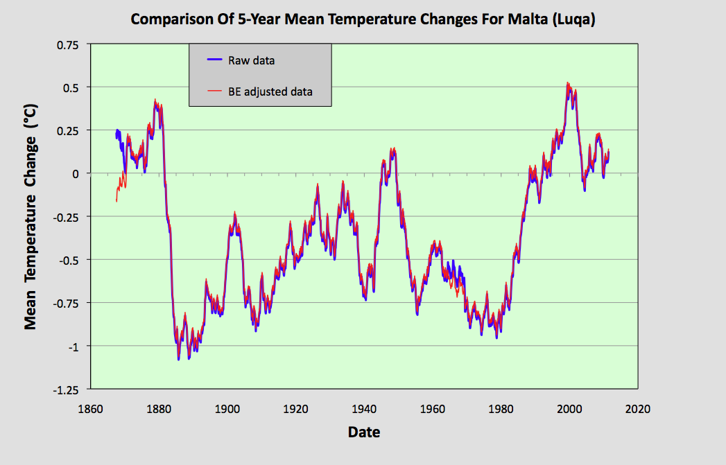
 

Fig. 150.4: The 5-year average of the monthly mean temperature change for Luqa since 1820 based on the original raw data from Fig. 150.1 (in blue) and the Berkeley Earth adjusted data from Fig. 150.2 (in red).


As there is no data from Malta to compare the Luqa data against we could instead compare it with temperature data from the nearby Italian islands of Lampedusa (BE ID: 155869) and Pantelleria (BE ID: 175525 ). The locations of these islands relative to Malta and Sicily is shown in the map in Fig. 150.5 below. Lampedusa is about 150 km from both Malta and Pantelleria.


Fig. 150.5: The (approximate) locations of the weather stations in Malta (Luqa), Lampedusa and Pantelleria. Those stations denoted with squares are long stations with over 1200 months of data, while diamonds denote medium stations with more than 480 months of data.


Unfortunately the temperature data from Lampedusa and Pantelleria only start around 1960 but both sets show temperature rises after 1980 that are similar to that seen in the Luqa data. There is also good correlation in the high frequency (less than 12 months) fluctuations, but the medium timescale fluctuations with peak widths of more than 12 months are not well correlated.


Fig. 150.6: A comparison of the 5-year average temperature change for the islands of Malta, Lampedusa and Pantelleria since 1960.


The other data that we could compare Luqa with is that of Italy. This is shown in Fig. 150.7 below and here the medium timescale fluctuations in the two datasets correlate much better.


Fig. 150.7: A comparison of the 5-year average temperature change for Malta and Italy.


Summary

The temperature data for Malta clearly shows that the climate warmed by over 0.6°C after 1980 (see Fig. 150.1).

Before 1980 there is a large amount of natural variation in the temperature data but no overall upward trend.

The temperature trend for Malta can only be determined using one set of station data: Luqa (BE ID:156721). This makes it very unreliable. Comparing it with the neighbouring islands of Lampedusa and Pantelleria only confirms the temperature trend after 1960 (see Fig. 150.6).

There does appear to be a good correlation between the temperature trend of Luqa in Malta and that of Italy in Fig. 148.2 of Post 148 extending back as far as 1890 (see Fig. 150.7). This would suggest that the temperature trends of Malta and Italy have been very similar over at least the last 150 years.


Acronyms

BE = Berkeley Earth.

MRT = monthly reference temperature (see Post 47).

MTA = mean temperature anomaly.

Long station = a station with over 1200 months (100 years) of data before 2014.

Medium station = a station with over 480 months (40 years) of data before 2014.

List of all stations in Malta with links to their raw data files.


Thursday, December 29, 2022

148: Italy - temperature trends STABLE before 1980

Whereas France only has four long stations with over 1200 months of data, Italy has at least twelve long stations, most with data stretching back over two hundred years. This means it is possible to determine  with a high degree of certainty the extent of climate change in Italy as far back as 1820. What this climate data shows is that the climate of Italy was stable for almost two hundred years up until 1980. Then over the last forty years it has warmed by about 1°C.

In addition to its twelve long stations, Italy also has 81 medium stations with over 480 months of data (for a full list see here). The locations of these 93 stations are shown on the map in Fig. 148.1 below. While the stations are generally spread evenly, there is a higher concentration of long stations in the north of the country compared to the south, and some clustering around Milan, Venice and Rome.


Fig. 148.1: The (approximate) locations of the 93 longest weather station records in Italy. Those stations with a high warming trend between 1911 and 2010 are marked in red while those with a cooling or stable trend are marked in blue. Those denoted with squares are long stations with over 1200 months of data, while diamonds denote medium stations with more than 480 months of data.


In order to quantify the changes to the climate of Italy the temperature anomalies for all stations with over 480 months of data before 2014 were determined and averaged. This was done using the usual method as outlined in Post 47 and involved first calculating the temperature anomaly each month for each station relative to its monthly reference temperature (MRT), and then averaging those anomalies to determine the mean temperature anomaly (MTA) for the whole country for each month. The MRTs for each station in Italy were calculated using the same 30-year period, namely from 1961 to 1990. 

The resulting MTA is shown as a time series in Fig. 148.2 below and clearly shows that temperatures were stable for over two hundred years up until 1980. Then they appear to increase rapidly by about 1.0°C over thirty years. That said, the change is comparable in size and speed to natural variations seen in earlier parts of the trend such as in 1940. On the other hand the MTA after 1980 is based on data from many more stations (up to ninety) and so is likely to be more accurate.


Fig. 148.2: The mean temperature change for Italy since 1740 relative to the 1961-1990 monthly averages. The best fit is applied to the monthly mean data from 1881 to 1980 and has a slight positive gradient of +0.03 ± 0.12 °C per century.


The total number of stations included in the MTA in Fig. 148.2 each month is shown in Fig. 148.3 below. The peak in the frequency around 1970 suggests that the 1961-1990 interval was indeed the most appropriate to use for the MRTs. It also indicates that data from about ten stations were used to calculate the MTA for almost every month back to 1820. As fifteen stations appears to the minimum number needed to provide an accurate MTA, this suggests that the trend in Fig. 148.2 is reliable at least as far back as 1820.


Fig. 148.3: The number of station records included each month in the mean temperature anomaly (MTA) trend for Italy in Fig. 148.2.


If we next consider the change in temperature based on Berkeley Earth (BE) adjusted data we get the MTA data in Fig. 148.4 below. This again was determined by averaging each month the anomalies from the 93 longest stations but here the picture is slightly different from that depicted in Fig. 148.2. Instead of a stable MTA we see a positive trend of over 0.5°C per century suggesting that the climate was warming before 1980. This clearly contradicts the raw data in Fig. 148.2.


Fig. 148.4: Temperature trends for Italy based on Berkeley Earth adjusted data. The best fit linear trend line (in red) is for the period 1881-1980 and has a positive gradient of +0.53 ± 0.04°C/century.


But if we next compare the curves in Fig. 148.4 with those from the published Berkeley Earth (BE) version for Italy shown in Fig. 148.5 below, we see that there is excellent agreement between the two sets of data at least as far back as 1770. This indicates that the simple averaging of adjusted anomalies used to generate the BE MTA in Fig. 148.4 is as effective and accurate as the more complex gridding method used by Berkeley Earth in Fig. 148.5. In which case simple averaging should be just as effective and accurate in generating the MTA using raw unadjusted data in Fig. 148.2.


Fig. 148.5: The temperature trend for Italy since 1750 according to Berkeley Earth.


The differences between the MTA in Fig. 148.2 and the BE versions using adjusted data in Fig. 148.4  are instead mainly due to the data processing procedures used by Berkeley Earth. These include homogenization, gridding, Kriging and most significantly breakpoint adjustments. These lead to changes to the original temperature data, the magnitude of these adjustments being the difference in the MTA values seen in Fig. 148.2 and Fig. 148.4. The magnitudes of these adjustments are shown graphically in Fig. 148.6 below. The blue curve is the difference in MTA values between adjusted (Fig. 148.4) and unadjusted data (Fig. 148.2), while the orange curve is the contribution to those adjustments arising solely from breakpoint adjustments. Between 1880 and 1980 both are considerable with the former leading to an additional warming since 1880 of over 0.5°C.


Fig. 148.6: The contribution of Berkeley Earth (BE) adjustments to the anomaly data in Fig. 148.4 after smoothing with a 12-month moving average. The blue curve represents the total BE adjustments including those from homogenization. The linear best fit (red line) to these adjustments for the period 1881-1980 has a positive gradient of +0.510 ± 0.009 °C per century. The orange curve shows the contribution just from breakpoint adjustments.


The overall impact of the BE adjustments can be seen more clearly if we compare the 5-year averages for the raw data (from Fig. 148.2) and the BE adjusted data (from Fig. 148.4). This comparison is shown in Fig. 148.7 below. It clearly shows that the trend based on adjusted data (red curve) exhibits considerably more warming since 1840 but slightly less since 1990.


Fig. 148.7: The 5-year mean temperature change for Italy since 1740 based on the original raw data from Fig. 148.2 (in blue) and the Berkeley Earth adjusted data from Fig. 148.4 (in red).


Summary

The raw unadjusted temperature data for Italy clearly shows that the climate was stable from 1780 to 1980 (see Fig. 148.2).

In contrast, the BE adjusted data claims that the climate first cooled and then warmed by 0.5°C from 1880 to 1980 (see Fig. 148.4).

After 1980 the climate has clearly warmed by about 1°C but this is still only of the same magnitude as the natural variations in the climate, so it may be too early to state definitively how much of the warming is permanent and how much more is still to come.


Acronyms

BE = Berkeley Earth.

MRT = monthly reference temperature (see Post 47).

MTA = mean temperature anomaly.

Long station = a station with over 1200 months (100 years) of data before 2014.

Medium station = a station with over 480 months (40 years) of data before 2014.

List of all stations in Italy with links to their raw data files.


Monday, December 26, 2022

147: France - temperature trends STABLE before 1980

What is surprising about France is the poor quality of its temperature data. Its data is worse than for Spain, Italy, Germany, the UK, Norway, Sweden and Finland. And yet France is the de-facto home of metrology, the country that gave us SI units.

The longest temperature record in France is for Bourges in the middle of the country. It is one of only four long stations with over 1200 months of data in France. There are a further 91 medium stations in France with over 480 months of data (for a full list see here). The locations of all these 95 stations are shown on the map in Fig. 147.1 below. In this analysis I have also included two stations in the Channel Islands; a long station in Guernsey and a medium station in Jersey. The reason for this is that they are much closer to France than England and so it is more reasonable for their data to be combined with data from France than with that from the UK. It also results in another long station being included in the analysis for France thereby improving the reliability of its long-term trend.


Fig. 147.1: The (approximate) locations of the 97 longest weather station records in France and the Channel Islands. Those stations with a high warming trend are marked in red while those with a cooling or stable trend are marked in blue. Those denoted with squares are long stations with over 1200 months of data, while diamonds denote medium stations with more than 480 months of data.


In order to quantify the changes to the climate of France the temperature anomalies for all stations with over 480 months of data before 2014 were determined and averaged. This was done using the usual method as outlined in Post 47 and involved first calculating the temperature anomaly each month for each station relative to its monthly reference temperature (MRT), and then averaging those anomalies to determine the mean temperature anomaly (MTA) for the whole country for each month. The MRTs for each station in France were calculated using the same 30-year period, namely from 1961 to 1990. The resulting MTA is shown as a time series in Fig. 147.2 below and clearly shows that temperatures were fairly stable for over 120 years up until 1980. Then they appear to increase suddenly by over 0.8°C.


Fig. 147.2: The mean temperature change for France since 1820 relative to the 1961-1990 monthly averages. The best fit is applied to the monthly mean data from 1861 to 1980 and has a slight positive gradient of +0.22 ± 0.11 °C per century.


The total number of stations included in the MTA in Fig. 147.2 each month is shown in Fig. 147.3 below. The peak in the frequency around 1990 suggests that the 1961-1990 interval was an appropriate one to use for the MRTs as it enabled all but five of the 97 datasets to be included in the MTA. All five of these medium station datasets had no data after 1900 and at least four exhibited a negative temperature trend. This suggests that in the 19th century the climate of France was cooling not warming.

Fig. 147.3 also indicates that data from less than ten stations were used to calculate the MTA for almost every month before 1945. As fifteen stations appears to the threshold number needed to provide an accurate MTA, this suggests that the trend in Fig. 146.2 is reliable only as far back as 1950. In fact most of the MTA trend before 1930 is dependent on data from only six stations. Of these, two are based in large cities (Paris and Marseille) and appear to exhibit strong linear warming trends (over 1.7°C since 1900) consistent with an urban heat island effect, and three have fragmented data (Bourges, Guernsey, and Montpellier). So only one (Chateauroux) is of any real quality and it has warmed by only about 0.3°C from 1900 to 2013.


Fig. 147.3: The number of station records included each month in the mean temperature anomaly (MTA) trend for France in Fig. 147.2.


If we next consider the change in temperature based on Berkeley Earth (BE) adjusted data we get the MTA data in Fig. 147.4 below. This again was determined by averaging each month the anomalies from the 97 longest stations and suggests that the climate was slowly warming before 1980 by about 0.3°C since 1860. While this is slightly more than the 0.2°C suggested in Fig. 147.2, the difference is not that significant.


Fig. 146.4: Temperature trends for France based on Berkeley Earth adjusted data. The best fit linear trend line (in red) is for the period 1861-1980 and has a positive gradient of +0.31 ± 0.04°C/century.


Next, if we compare the curves in Fig. 147.4 with those from the published Berkeley Earth (BE) version for France shown in Fig. 147.5 below, we see that there is excellent agreement between the two sets of data at least as far back as 1825. This indicates that the simple averaging of adjusted anomalies used to generate the BE MTA in Fig. 147.4 is as effective and accurate as the more complex gridding method used by Berkeley Earth in Fig. 147.5. In which case simple averaging should be just as effective and accurate in generating the MTA using raw unadjusted data in Fig. 147.2.


Fig. 147.5: The temperature trend for France since 1750 according to Berkeley Earth.


Any differences between the MTA in Fig. 147.2 and the BE versions using adjusted data in Fig. 147.4  are mainly due to the data processing procedures used by Berkeley Earth. These include homogenization, gridding, Kriging and most significantly breakpoint adjustments. These lead to changes to the original temperature data, the magnitude of these adjustments being the difference in the MTA values seen in Fig. 147.2 and Fig. 147.4. The magnitudes of these adjustments are shown graphically in Fig. 147.6 below. The blue curve is the difference in MTA values between adjusted (Fig. 147.4) and unadjusted data (Fig. 147.2), while the orange curve is the contribution to those adjustments arising solely from breakpoint adjustments. Both are minimal with the former leading to an additional warming since 1860 of between 0.1°C and 0.2°C.


Fig. 147.6: The contribution of Berkeley Earth (BE) adjustments to the anomaly data in Fig. 147.4 after smoothing with a 12-month moving average. The blue curve represents the total BE adjustments including those from homogenization. The linear best fit (red line) to these adjustments for the period 1861-1980 has a positive gradient of +0.079 ± 0.010 °C per century. The orange curve shows the contribution just from breakpoint adjustments.


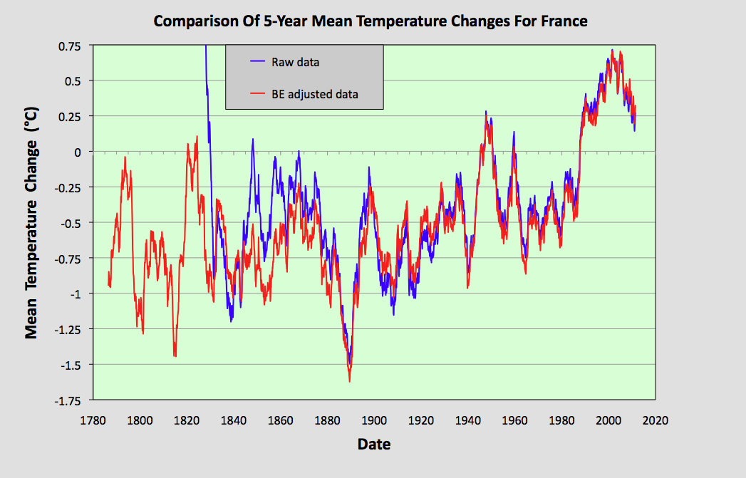
The overall impact of the BE adjustments can be seen more clearly if we compare the 5-year averages for the raw data (from Fig. 147.2) and the BE adjusted data (from Fig. 147.4). This comparison is shown in Fig. 147.7 below. It clearly shows that the trend based on adjusted data (red curve) exhibits more warming before 1900 but very little extra afterwards.


Fig. 147.7: The 5-year mean temperature change for France since 1780 based on the original raw data from Fig. 147.2 (in blue) and the Berkeley Earth adjusted data from Fig. 147.4 (in red).


Summary

The raw unadjusted temperature data for France clearly shows that the climate warmed by less than 0.2°C from 1880 to 1980 (see Fig. 147.2)

In contrast, the BE adjusted data claims that the climate warmed by 0.3°C over the same period (see Fig. 147.4).

After 1980 the climate has clearly warmed by almost 1°C (see Fig. 147.7).

The temperature data before 1980 presented here clearly disagree with that of Spain in Post 146. However, as the MTA for Spain over the 100 years before 1950 is based on data from between twelve and fifty different stations compared to only about five for France, that would suggest that the Spain data is the more accurate.


Acronyms

BE = Berkeley Earth.

MRT = monthly reference temperature (see Post 47).

MTA = mean temperature anomaly.

Long station = a station with over 1200 months (100 years) of data before 2014.

Medium station = a station with over 480 months (40 years) of data before 2014.

List of all stations in France with links to their raw data files.


Saturday, December 24, 2022

146: Spain - temperature trends COOLING before 1980

The analysis of temperature data for Portugal in the previous post appeared to indicate that the local climate had warmed continuously since 1870 by over 1°C in total. The caveat to this was the poor data quantity before 1940 with only two stations of significance contributing data to the regional trend, and one of them, Lisbon, clearly displayed characteristics in its data that were suggestive of the urban heat island effect. 

In this post I will look at the corresponding temperature data for Portugal's neighbour, Spain, to see if the temperature trends seen in Post 145 are repeated, as would be expected of neighbouring territories. The results will in fact show that they are not, and that the trends for Portugal before 1940 are probably wrong. In fact the data for Spain indicates that the climate cooled over the one hundred years before 1980 and has only recently begun to warm.

Spain has many more weather stations compared to Portugal, which given the difference in size is not surprising. Despite this, the station densities of the two countries are roughly the same. Spain has fourteen long stations with over 1200 months of data before 2014 and another 69 medium stations with over 480 months of data. The locations of these stations are indicated on the map in Fig. 146.1 below. They include two stations in Gibraltar and four in the Balearic Islands. They are distributed fairly evenly across the country but there are significant clusters around Madrid and south of Seville. 


Fig. 146.1: The (approximate) locations of the 83 longest weather station records in Spain. Those stations with a high warming trend between 1911 and 2010 are marked in red while those with a cooling or stable trend are marked in blue. Those denoted with squares are long stations with over 1200 months of data, while diamonds denote medium stations with more than 480 months of data.


In order to quantify the changes to the climate of Spain the temperature anomalies for all stations with over 480 months of data before 2014 were determined and averaged. This was done using the usual method as outlined in Post 47 and involved first calculating the temperature anomaly each month for each station relative to its monthly reference temperature (MRT), and then averaging those anomalies to determine the mean temperature anomaly (MTA) for the whole country for each month. The MRTs for each station in Spain were calculated using the same 30-year period, namely from 1961 to 1990. The resulting MTA is shown as a time series in Fig. 146.2 below and clearly shows that temperatures were decreasing for over 110 years up until 1980. After which they appear to increase suddenly by about 0.8°C.


Fig. 146.2: The mean temperature change for Spain since 1780 relative to the 1961-1990 monthly averages. The best fit is applied to the monthly mean data from 1871 to 1980 and has a slight negative gradient of -0.19 ± 0.10 °C per century.


The total number of stations included in the MTA in Fig. 146.2 each month is shown in Fig. 146.3 below. The peak in the frequency around 1970 suggests that the 1961-1990 interval was indeed the most appropriate to use for the MRTs. It also indicates that data from at least ten stations were used to calculate the MTA for almost every month back to 1865. As fifteen stations appears to the minimum number needed to provide an accurate MTA, this suggests that the trend in Fig. 146.2 is reliable at least as far back as 1865.


Fig. 146.3: The number of station records included each month in the mean temperature anomaly (MTA) trend for Spain in Fig. 146.2.


If we next consider the change in temperature based on Berkeley Earth (BE) adjusted data we get the MTA data in Fig. 146.4 below. This again was determined by averaging each month the anomalies from the 83 longest stations and suggests that the climate was warming before 1980. This clearly contradicts the raw data in Fig. 146.2.


Fig. 146.4: Temperature trends for Spain based on Berkeley Earth adjusted data. The best fit linear trend line (in red) is for the period 1871-1980 and has a positive gradient of +0.32 ± 0.04°C/century.


But if we next compare the curves in Fig. 146.4 with those from the published Berkeley Earth (BE) version for Spain shown in Fig. 146.5 below, we see that there is excellent agreement between the two sets of data at least as far back as 1865. This indicates that the simple averaging of adjusted anomalies used to generate the BE MTA in Fig. 146.4 is as effective and accurate as the more complex gridding method used by Berkeley Earth in Fig. 146.5. In which case simple averaging should be just as effective and accurate in generating the MTA using raw unadjusted data in Fig. 146.2.


Fig. 146.5: The temperature trend for Spain since 1750 according to Berkeley Earth.


The differences between the MTA in Fig. 146.2 and the BE versions using adjusted data in Fig. 146.4  are instead mainly due to the data processing procedures used by Berkeley Earth. These include homogenization, gridding, Kriging and most significantly breakpoint adjustments. These lead to changes to the original temperature data, the magnitude of these adjustments being the difference in the MTA values seen in Fig. 146.2 and Fig. 146.4. The magnitudes of these adjustments are shown graphically in Fig. 146.6 below. The blue curve is the difference in MTA values between adjusted (Fig. 146.4) and unadjusted data (Fig. 146.2), while the orange curve is the contribution to those adjustments arising solely from breakpoint adjustments. Both are considerable with the former leading to an additional warming since 1865 of over 0.5°C.


Fig. 146.6: The contribution of Berkeley Earth (BE) adjustments to the anomaly data in Fig. 146.4 after smoothing with a 12-month moving average. The blue curve represents the total BE adjustments including those from homogenization. The linear best fit (red line) to these adjustments for the period 1871-1980 has a positive gradient of +0.506 ± 0.013 °C per century. The orange curve shows the contribution just from breakpoint adjustments.


The overall impact of the BE adjustments can be seen more clearly if we compare the 5-year averages for the raw data (from Fig. 146.2) and the BE adjusted data (from Fig. 146.4). This comparison is shown in Fig. 146.7 below. It clearly shows that the trend based on adjusted data (red curve) exhibits considerably more warming since 1870.


Fig. 146.7: The 5-year mean temperature change for Spain since 1820 based on the original raw data from Fig. 146.2 (in blue) and the Berkeley Earth adjusted data from Fig. 146.4 (in red).


Summary

The raw unadjusted temperature data for Spain clearly shows that the climate cooled by about 0.2°C from 1870 to 1980 (see Fig. 146.2)

In contrast, the BE adjusted data claims that the climate warmed by 0.3°C over the same period (see Fig. 146.4).

After 1980 the climate has clearly warmed by about 0.8°C (see Fig. 146.7).

The results presented here clearly disagree with those for Portugal in Post 145. However, as the MTA for Portugal before 1960 is based on data from less than five stations compared to two or three times as many stations for Spain, that would suggest that the Spain data is the more accurate.


Acronyms

BE = Berkeley Earth.

MRT = monthly reference temperature (see Post 47).

MTA = mean temperature anomaly.

Long station = a station with over 1200 months (100 years) of data before 2014.

Medium station = a station with over 480 months (40 years) of data before 2014.

List of all stations in Spain with links to their raw data files.