Showing posts with label urban heat island. Show all posts

Sunday, August 28, 2022

134: Urban heat island (UHI) - implications for climate analysis


Fig. 134.1: UHI evidence from six cities in the Southern Hemisphere.


In my previous six posts I highlighted six examples of temperature records from major cities in the Southern Hemisphere where the temperature trend appears to be influenced by the urban heat island (UHI) effect that I discussed in Post 127. The result in each case was that the city exhibited significantly more warming than the rest of the state or country that the city was part of (see Fig. 134.1 above). However, the implications of this go beyond what is happening in a few megacities.

If large cities like Jakarta and Buenos Aires are warming because of urban heating, it then follows that smaller towns and cities must as well, only just not as much. As most weather stations are located near sites of human activity or habitation, it then also follows that most of the temperature records are likely to be corrupted to a certain degree by this UHI effect. The problem is determining to what degree that is. 

The six cities I have examined so far are obviously extreme examples and cannot on their own have a significant impact on their regional temperature trends as these regional trends are usually the result of averaging data from dozens of different stations. If they did have a large impact, then the difference between the trends for each city and its region would not be so pronounced. But that does not mean that the wider region is unaffected. 

The regional trends I compared each of the city trends with are also probably affected by the UHI effect, just not as much. That is because most of the data that goes to make up the regional trends comes from stations sited around other, smaller urban developments. So the regional warming is probably overstated as well, just not as much as that of the megacities. It is only because the megacities are so extreme that they stand out from their wider regions, but in reality both trends are likely to exhibit increased warming due to the UHI effect, just not as much as each other, hence the divergence in trends. 

And of course, if the temperature data for all the stations in the region is homogenized, then there is a risk of importing warming trends from the UHI into the surrounding area thereby raising the temperature trends of the wider region more markedly. Either way, the temperature trend for any region is likely to be corrupted to some degree by UHI effects in some of its stations.

But perhaps the biggest issue is the problem of area weighting. Ideally the contribution of each station to the overall regional average should be in proportion to area surrounding that station. So if a country has fifty stations and they are all evenly spaced, then each one should represent 2% of the area and each should make a 2% contribution to the mean temperature for the country. But suppose the station sits in a UHI and the area of the urban region is less than the nominal area that the station is supposed to represent. This is what happens with Jakarta in Indonesia (see Post 131) and for many other UHI stations.

The area of Jakarta is about 660 km2, but that is only about 0.035% of the 1,900,000 km2 area of Indonesia so the true weighting or contribution of Jakarta Observatorium (Berkeley Earth ID: 155660) to the mean temperature trend of Indonesia should be only 0.035%. But as there are less than sixty reliable temperature records for Indonesia (see Fig. 31.4 in Post 31) that means that each station on average makes a contribution of over 1.7% to the regional temperature trend. So a simple average of all station anomalies would over-represent Jakarta Observatorium (Berkeley Earth ID: 155660) by at least fifty times, and so too would an average based on a gridded method.

So how could we separate the UHI contribution to local warming from other climate drivers like carbon dioxide? One way to go about this might be to compare temperature trends for raw unadjusted temperature data from known urban and rural stations. But the problem here is that we don't know for certain where all these stations are exactly, or what the local geography around each station is. For example, according to its GPS coordinates Perth Regional Office is in the middle of the sea over 8 km off the coast of Perth. This is because the longitude and latitude coordinates for many stations are often only specified to the nearest 0.1° and sometimes the error is even greater. For Perth Regional Office the error is stated as ±0.2° for the longitude. That means its location accuracy is about ± 10 km. That is bigger than the extent of most urban areas. So finding sufficient pure rural stations against which to compare all the others is tough.

The takeaway here is that the urban heat island (UHI) effect is a big problem when interpreting temperature data, but determining how big is also a big problem.


Friday, August 26, 2022

133: UHI #6 - Buenos Aires (Argentina)

The second largest city in South America by population is Buenos Aires in Argentina with a population of over thirteen million people. The largest is Sao Paulo in Brazil. Both could be categorized as urban heat islands (UHIs); Sao Paulo in particular has warmed by about 3°C since 1887 and Buenos Aires by up to 2°C. However, as I have yet to fully analyse temperature data from Brazil it is not possible for me to compare the Sao Paulo data to the temperature change for the wider region, although this is unlikely to be more than about 1°C. So instead I will concentrate on Buenos Aires. Sao Paulo will come later.

A comparison of the temperature trends for Buenos Aires and Argentina shows that temperatures have risen far more in Buenos Aires than they have in Argentina as a whole. In fact as Fig. 133.1 below shows, they have risen almost three times faster in Buenos Aires since 1900 than they have in Argentina. Before 1900 temperatures were stable in both Buenos Aires and Argentina.


Fig. 132.1: The change to the 5-year average temperatures of Buenos Aires (red curve) and Argentina (blue curve) since 1900.


In Post 61 I examined the temperature trends for Argentina. The mean temperature change since 1900 is shown in Fig. 132.2 below and it indicates that Argentina has exhibited only modest warming over the last one hundred years. The best fit for 1901-2000 indicates a temperature rise of about 0.64°C while the 5-year average suggests a rise of about 0.52°C.


Fig. 132.2: The mean temperature change for Argentina since 1900 relative to the 1961-1990 monthly averages. The best fit is applied to the monthly mean data from 1901 to 2000 and has a positive gradient of +0.64 ± 0.11 °C per century.


The oldest major weather station in Argentina is Buenos Aires Observatorio (Berkeley Earth ID: 151642). It is located in the heart of Buenos Aires and has continuous data stretching back as far as 1856, although there is a break in the data between 2006 and 2011. It is one of only two major stations within 20 km of the city centre, hence its significance as a case study of the urban heat island (UHI) effect. The other is Aeroparque (Berkeley Earth ID: 151640) which only has data from 1961 onwards but also exhibits strong warming.

In contrast to the rest of Argentina, Buenos Aires Observatorio shows strong and continuous warming since 1910 (see Fig. 132.3 below). Before 1910 the temperatures were stable. The best fit for 1901-2000 indicates a temperature rise of about 2.4°C in one hundred years while the 5-year average suggests a rise of 1.77°C.


Fig. 132.3: The mean temperature change for Buenos Aires Observatorio since 1900 relative to its 1961-1990 monthly averages. The best fit is applied to the monthly mean data from 1901 to 2000 and has a positive gradient of +2.40 ± 0.18 °C per century.


Summary

The following temperature changes were observed from 1901 to 2000.

Argentina: 0.52°C (trend 0.64°C).

Buenos Aires: 1.77°C (trend 2.40°C).

So Buenos Aires has warmed by almost 1.8°C more than the surrounding state of Argentina, or more than three times faster. A classic UHI!


Wednesday, August 24, 2022

132: UHI #5 - Pretoria (South Africa)

The three largest cities in southern Africa are Kinshasa, Johannesburg and Nairobi. All have populations of more than ten million, so all three could be good contenders as examples of the urban heat island (UHI) effect. Unfortunately in all three cases making a definitive assessment is difficult because these cities do not have data of high enough quality.

The city in southern Africa with the next highest population is Luanda in Angola with a population of eight million people. Luanda does have good temperature data stretching back to 1879 that does appear to show a strong warming trend even though the data after 1980 is fragmented, probably due to the civil war. The problem is that there is very little other good temperature data for Angola (see here for a complete list of stations), so there is no reliable trend for Angola as a region as I showed in Post 82, and so no accurate regional trend with which to compare the Luanda data.

The country in southern Africa with the the best temperature data is South Africa, and while Johannesburg has no high quality weather stations near its centre, the city of Pretoria (which is part of the same conurbation) does, although the temperature record for Pretoria Eendracht (Berkeley Earth ID: 159076) only starts in 1949. Nevertheless, since then the respective temperature trends show that Pretoria has warmed significantly more than South Africa as a whole (see Fig. 132.1 below) with up to 3°C of warming in Pretoria but less than 1°C in South Africa.


Fig. 132.1: The change to the 5-year average temperatures of Pretoria Eendracht (red curve) and South Africa (blue curve) since 1952.


In Post 37 I examined the temperature trends for South Africa. The mean temperature change since 1880 is shown in Fig. 132.2 below and it indicates that South Africa exhibited no significant warming before 1980 but has since warmed by about 0.7°C. In fact the best fit for 1951-2010 indicates a temperature rise of about 1.08°C in 60 years while the 5-year average suggests a rise of about 0.96°C.


Fig. 132.2: The mean temperature change for South Africa since 1857 relative to the 1961-1990 monthly averages. The best fit is applied to the monthly mean data from 1951 to 2010 and has a positive gradient of +1.80 ± 0.14 °C per century.


In contrast to the rest of South Africa, Pretoria Eendracht (Berkeley Earth ID: 159076) shows significant and continuous warming since 1950 (see Fig. 132.3 below). The best fit for 1951-2010 indicates a temperature rise of more than 2.81°C in 60 years while the 5-year average suggests a rise of 2.99°C.


Fig. 132.3: The mean temperature change for Pretoria Eendracht since 1949 relative to its 1961-1990 monthly averages. The best fit is applied to the monthly mean data from 1951 to 2010 and has a positive gradient of +4.69 ± 0.24 °C per century.


Summary

The following temperature changes were observed from 1951 to 2010.

South Africa: 0.96°C (trend 1.08°C).

Pretoria: 2.99°C (trend 2.81°C).

So Pretoria has warmed by at about 2°C more than the surrounding state of South Africa, or up to three times faster. A classic UHI!


Monday, August 22, 2022

131: UHI #4 - Jakarta (Indonesia)

Probably the most extreme example of an urban heat island (UHI) in the Southern Hemisphere is Jakarta. I first discussed it when analysing the temperature data of Indonesia for Post 31, but it is so dramatic that it needs further examination. 

Jakarta is the largest city in the Southern Hemisphere with a population of over 33 million. Indonesia has a population of more than 270 million, but this is spread over an archipelago of islands that stretch over 5000 km. The result is that Indonesia has seen no warming over the last one hundred years while Jakarta has warmed by almost 3°C since 1880 (see Fig. 131.1 below).


Fig. 131.1: The change to the 5-year average temperatures of Jakarta (red curve) and Indonesia (blue curve) since 1920.


In Post 31 I examined the temperature trends for Indonesia. The mean temperature change since 1912 is shown in Fig. 131.2 below and it indicates that Indonesia outside of Jakarta has actually cooled slightly over the last one hundred years. The best fit for 1913-2012 indicates a temperature change of -0.08°C while the 5-year average suggests a small rise of about +0.16°C.


Fig. 131.2: The mean temperature change for Indonesia since 1912 relative to the 1961-1990 monthly averages. The best fit is applied to the monthly mean data from 1913 to 2012 and has a slight negative gradient of -0.08 ± 0.04 °C per century.


One of the oldest weather stations in Indonesia is Jakarta Observatorium (Berkeley Earth ID: 155660). It is located in the middle of Jakarta with almost continuous data stretching back as far as 1866, hence its significance as a case study of the urban heat island (UHI) effect. In contrast to the rest of Indonesia, Jakarta Observatorium shows significant and continuous warming since 1870 (see Fig. 131.3 below). The best fit for 1913-2012 indicates a temperature rise of more than 2.16°C in the one hundred years since 1913, while the 5-year average suggests a rise of over 2.35°C.


Fig. 131.3: The mean temperature change for Jakarta Observatorium since 1866 relative to its 1961-1990 monthly averages. The best fit is applied to the monthly mean data from 1913 to 2012 and has a positive gradient of +2.16 ± 0.08 °C per century.


It is important to note that while Jakarta Observatorium is the clearest example of a UHI in Indonesia, it is not the only one. Up until 1970 there was a second station in Jakarta (Berkeley Earth ID: 155660) which also exhibited over 1.8°C of warming from 1866 to 1970. But the city of Surabaya (Berkeley Earth ID: 155652) also appears to behave as a UHI. Its population is over twelve million making it the fifth largest city in the Southern Hemisphere. From 1949 to 2013 it appears to have exhibited warming of more than 1.7°C as well (or 2.75°C per century). Yet despite this the rest of Indonesia cooled.


Summary

The following temperature changes were observed from 1913 to 2012.

Indonesia: 0.16°C (trend -0.08°C).

Jakarta: 2.35°C (trend 2.16°C).

So Jakarta has warmed by at least 2°C more than the rest of Indonesia. It has also warmed while Indonesia has not. A classic UHI!


Saturday, August 20, 2022

130: UHI #3 - Perth (Western Australia)

The population of Western Australia is only about 2.67 million but two million of that total live in the state capital Perth. So 75% of the state's population live in Perth even though Perth accounts for less than 0.25% of the area of Western Australia. Perhaps this is why temperatures in Perth appear to have risen at more than twice the rate of the rest of the state. By 1990 temperatures in Perth had risen more than 1.5°C since 1900 compared to less than 0.7°C in Western Australia as a whole (see Fig. 130.1 below). That looks like classic urban heat island (UHI) behaviour. The only caveat is that the main weather station for Perth at Perth Regional Office (Berkeley Earth ID: 4321) ceased operations in 1992 just as the UHI was taking off.


Fig. 130.1: The change to the 5-year average temperatures of Perth (red curve) and Western Australia (blue curve) since 1900.


In Post 22 I examined the temperature trends for Western Australia. The mean temperature change since 1900 is shown in Fig. 130.2 below and it indicates that Western Australia has warmed by about 1°C since 1990. The best fit for 1991-1990 indicates a temperature rise of less than 0.64°C in 90 years while the 5-year average suggests a rise of about 0.67°C for the same period.


Fig. 130.2: The mean temperature change for Western Australia since 1900 relative to the 1961-1990 monthly averages. The best fit is applied to the monthly mean data from 1901 to 1990 and has a positive gradient of +0.71 ± 0.11 °C per century.


The mean temperature anomaly (MTA) for Western Australia shown in Fig. 130.2 above is the result of averaging monthly temperature anomalies from nearly hundred stations as Fig. 130.3 below demonstrates (see here for a full list of all stations). However, before 1900 there are less than ten available stations so the MTA is less reliable and more prone to error from statistical variability. For more details and analysis of the complete data for Western Australia see Post 22.


Fig. 130.3: The number of station records included each month in the mean temperature anomaly (MTA) trend for Western Australia in Fig. 130.2.


The oldest weather station in Western Australia is Perth Regional Office (Berkeley Earth ID: 4321). It has data stretching back as far as 1852, and continuous data from 1876 to 1992. In fact it is the only station within Perth with over 480 months of continuous data between 1876 to 1992, hence its significance as a case study of the urban heat island (UHI) effect.

Compared to the rest of Western Australia, Perth Regional Office shows much more significant and continuous warming since 1900 (see Fig. 130.3 below). The best fit for 1901-1990 indicates a temperature rise of more than 1.47°C in 90 years while the 5-year average suggests a rise of over 1.5°C.


Fig. 130.4: The mean temperature change for Perth Regional Office since 1900 relative to its 1961-1990 monthly averages. The best fit is applied to the monthly mean data from 1901 to 1990 and has a positive gradient of +1.63 ± 0.19 °C per century.


Summary

The following temperature changes were observed from 1901 to 1990.

Western Australia: 0.67°C (trend 0.64°C).

Perth: 1.53°C (trend 1.47°C).

So Perth warmed by almost 1°C more than the surrounding state of Western Australia in the ninety years up to 1990, or more than twice as fast. A classic UHI!


Thursday, August 18, 2022

129: UHI #2 - Melbourne (Victoria)

The Australian state of Victoria has a total population of 6.7 million, of which 5.1 million live in the city of Melbourne. That means that 76% of the population of Victoria live in its capital city even though Melbourne accounts for only 4.4% of the area of Victoria. It is not really surprising then that the temperature trends for Melbourne and Victoria over the last 100 years are markedly different. In fact while the state of Victoria has cooled slightly for most of the last 120 years, Melbourne has warmed by over 2°C (see Fig. 129.1 below). So like Sydney in the previous post, Melbourne looks like a classic urban heat island (UHI).


Fig. 129.1: The change to the 5-year average temperatures of Melbourne (red curve) and Victoria (blue curve) since 1900.


In Post 19 I examined the temperature trends for Victoria. The mean temperature change since 1880 is shown in Fig. 129.2 below and it indicates that Victoria has exhibited no significant warming. In fact the best fit for 1886-2005 indicates that temperatures actually declined very slightly, although the 5-year average over the same period suggests that they may have risen slightly by about 0.47°C with most of this rise occurring after 1990.


Fig. 129.2: The mean temperature change for Victoria since 1880 relative to the 1966-1995 monthly averages. The best fit is applied to the monthly mean data from 1886 to 2005 and has a slight negative gradient of -0.02 ± 0.08 °C per century.


The mean temperature anomaly (MTA) for Victoria shown in Fig. 129.2 above is the result of averaging monthly temperature anomalies from over fifty stations as Fig. 129.3 below demonstrates (see here for a list of all stations). However, before 1900 there are less than twenty available stations so the MTA is less reliable and more prone to error from statistical variability. For more details and analysis of the complete data for Victoria see Post 19.


Fig. 129.3: The number of station records included each month in the mean temperature anomaly (MTA) trend for Victoria in Fig. 129.2.


The oldest weather stations in Victoria is Melbourne Regional Office (Berkeley Earth ID: 151813). It is located in the heart of Melbourne and has continuous data stretching back as far as 1855. It is also the only major station within 20 km of the city centre that has continuous data extending back before 1940 (the next best is Laverton Aerodrome), hence its significance as a case study of the urban heat island (UHI) effect.

In contrast to the rest of Victoria, Melbourne Regional Office shows significant and continuous warming since 1880 (see Fig. 129.4 below). The best fit for 1886-2005 indicates a temperature rise of more than 1.4°C in 120 years while the 5-year average suggests a rise of over 2.1°C.


Fig. 129.4: The mean temperature change for Melbourne Regional Office since 1880 relative to its 1966-1995 monthly averages. The best fit is applied to the monthly mean data from 1886 to 2005 and has a positive gradient of +1.23 ± 0.10 °C per century.


Summary

The following temperature changes were observed from 1886 to 2005.

Victoria: 0.47°C (trend -0.02°C).

Melbourne: 2.1°C (trend 1.48°C).

So Melbourne has warmed by at least 1.5°C more than the surrounding state of Victoria, or up to four times faster. A classic UHI!

Given that both Sydney and Melbourne appear to be great examples of UHIs, one might expect the same of similar large cities, Adelaide and Brisbane. Yet this appears not to be the case. Neither of these cities exhibits greater warming than the rest of their respective states even though over 70% of the South Australian population of 1.8 million live in Adelaide. For Brisbane and Queensland, though, the proportion is only 44%, although Brisbane is almost twice the size of Adelaide by population. The reason both Adelaide and Brisbane do not exhibit striking UHI properties could be that they are too small. Adelaide has a population that is less than a quarter of that of Sydney. That said, the population of Perth in Western Australia is just less than two million and yet as the next post will show, it too appears to be an urban heat island (UHI).


Tuesday, August 16, 2022

128: UHI #1 - Sydney (New South Wales)

In my previous post I explained the concept of the urban heat island (UHI). Unfortunately, finding clear examples in the global temperature records is not so easy. This is not because they don't exist, but because to demonstrate their existence beyond a reasonable doubt requires good data for both the urban area and the wider region within which the UHI sits. 

In the case of the urban data, this needs to be from a station that is located in the heart of the urban area and not on its perimeter such as at the local airport. Finding datasets from such locations is a lot harder than one might think because most weather stations are deliberately sited away from the centre of urban areas. Then the dataset needs to be sufficiently long with no gaps in the record in order for it to exhibit a definite trend over time. 

In the case of the regional data, this too needs to be based on long datasets with no gaps in their records. But in addition, a large number of these datasets are needed in order to establish an accurate trend for the region.

Satisfying these criteria is particularly difficult in the Southern Hemisphere where the data for most countries other than Australia is not particularly good. Nevertheless, I have identified six examples in the Southern Hemisphere so far (excluding Brazil which I have yet to examine in detail) where the quality of the temperature data for the UHI and its host country or state is sufficient to detect unambiguous differences in their temperature trends. Over the following six posts, including this one, I will examine each of these six examples in turn. So for Exhibit #1 I give you Sydney in New South Wales (NSW), Australia.

The city of Sydney has a population of about 5.3 million. That means that 65% of the New South Wales (NSW) population of 8.2 million live in Sydney even though Sydney accounts for only 1.5% of the area of NSW. It is not really surprising then that the temperature trends for Sydney and NSW over the last 100 years are markedly different. For while NSW has barely warmed at all in the last 140 years, Sydney has warmed by almost 2°C (see Fig. 128.1 below).


Fig. 128.1: The change to the 5-year average temperatures of Sydney (red curve) and New South Wales (blue curve) since 1900.


In Post 18 I examined the temperature trends for New South Wales. The mean temperature change since 1880 is shown in Fig. 128.2 below and it indicates that NSW has exhibited no significant warming. In fact the best fit for 1886-2005 indicates a temperature rise of less than 0.12°C in 120 years while the 5-year average suggests a rise of about 0.25°C.


Fig. 128.2: The mean temperature change for New South Wales since 1880 relative to the 1965-1994 monthly averages. The best fit is applied to the monthly mean data from 1886 to 2005 and has a slight positive gradient of +0.099 ± 0.077 °C per century.


The mean temperature anomaly (MTA) for NSW shown in Fig. 128.2 above is the result of averaging monthly temperature anomalies from over one hundred stations as Fig. 128.3 below demonstrates (see here for a list). However, before 1880 there are less than twenty available stations so the MTA is less reliable and more prone to error from statistical variability. For more details and analysis of the complete data for NSW see Post 18.


Fig. 128.3: The number of station records included each month in the mean temperature anomaly (MTA) trend for New South Wales in Fig. 128.2.


One of the oldest weather stations in NSW is Sydney Observatory Hill (Berkeley Earth ID: 151986). It is located in the heart of Sydney, south of the opera house and harbour, and has continuous data stretching back as far as 1859. It is also the only major station within 20 km of the city centre, hence its significance as a case study of the urban heat island (UHI) effect. 

In contrast to the rest of NSW, Sydney Observatory Hill shows significant and continuous warming since 1880 (see Fig. 128.4 below). The best fit for 1886-2005 indicates a temperature rise of more than 1.2°C in 120 years while the 5-year average suggests a rise of over 1.5°C.


Fig. 128.4: The mean temperature change for Sydney Observatory Hill since 1880 relative to its 1965-1994 monthly averages. The best fit is applied to the monthly mean data from 1886 to 2005 and has a positive gradient of +1.01 ± 0.08 °C per century.


Summary

The following temperature changes were observed from 1886 to 2005.

NSW: 0.25°C (trend 0.12°C).

Sydney: 1.5°C (trend 1.2°C).

So Sydney has warmed by at least 1°C more than NSW, or up to ten times faster. A classic UHI!


Saturday, August 13, 2022

127: The urban heat island (UHI) effect - an explainer


The urban heat island (UHI) effect.


The conventional wisdom is that climate change is driven by rising carbon dioxide (CO2) levels in the atmosphere, and only by CO2; so the greater the (CO2) levels the greater the temperature increase (see Fig. 87.3 in Post 87). You may have noticed one direct consequence of this orthodoxy in the way the media these days reports on environmental disasters or extreme weather (floods, droughts, storms, hurricanes, heatwaves, forest fires etc.): they always refer to climate change.

Implicit to this climate change reference is the assumption that all climate change is due to CO2 even though CO2 is rarely explicitly mentioned and the causation is rarely demonstrated. Consequently, the solution to all extreme weather events appears to be simple and obvious: cut CO2 levels in the atmosphere (i.e. Net Zero) and everything will be fine. Except it won't. This is because much of what is happening to local climates has little or nothing to do with CO2, but it does have a lot to do with other human activities, not least urbanization and industrialization. Central to both of these is the urban heat island (UHI) effect.

The problem when discussing the impact of the UHI effect on climate, and in particular the temperature record, is that it is controversial. This is partly because much of climate science appears to be driven by an anti-fossil fuel dogma that therefore sees any talk of UHIs as at best a distraction from the supposed only true problem, CO2, and at worst a campaign of disinformation designed to undermine all of climate science and its campaign against CO2. But it is also partly because UHIs come in many flavours. 

There are those UHIs that just trap more heat by reducing airflows and those that store more solar heat than rural areas by virtue of increased heat capacities. Both of these do not add to the total amount of energy absorbed at the Earth's surface though, so there is no net global temperature increase associated with them. But then there are those UHI processes that do absorb extra heat, either via changes to the albedo of the Earth's surface, or by the emission of large amounts of additional heat through anthropogenic energy use and generation. Both of these certainly do add to global warming but are still largely ignored by climate science. In the following sections I will discuss the relative impact of each of these four types of UHI effect in turn and show that one type in particular can be very significant.


i) Heat trapping

The aspect of the UHI effect that is referred to the most is heat trapping. This is where tall buildings in a city reduce the flow of hot air away from the centre causing the city to retain its heat longer. Perhaps the most obvious example of this is Manhattan in New York City with its dense cluster of tall skyscrapers.

The result of this UHI effect is that the local area of the city stays hotter for longer compared to if the buildings were not there. This is because there is less diffusion of heat to outlying areas, so those areas are less likely to be warmed by the city and the city is less likely to be cooled by heat transfer to the rural areas that surround it. 

However, this does not lead to more global warming because while the city will be hotter for longer than otherwise expected, the surrounding area will be cooler for longer as well because less heat from the urban areas reaches the rural areas. The key point here is that no extra heat is created at the surface of the Earth, it is just prevented from diffusing to colder regions. So the net effect on local mean temperatures is zero. As an example consider the Grand Canyon. It will trap heat in the same way that tall buildings do, but does that mean that it is warming faster than the rest of Arizona? No, and nor does it make Arizona as a whole get any warmer.

This is one reason why climate scientists discount the UHI effect, and in this case they are right, provided that the weather stations used to monitor temperature changes are evenly distributed and their temperature readings are not adjusted. Those, unfortunately, are big IFs, because any bias in station numbers between urban and rural regions compared to their relative areas will affect the the relative contribution of each to the mean global temperature, and we do know that station densities are generally higher in urban areas. So potentially there are more warm urban stations contributing to the global average than there should be and fewer cold rural ones. In an ideal world, though, this should not occur, and so neither would any contribution to global temperatures.

Net effect on global warming: zero.


ii) Increased heat capacity

Probably the second most cited variation of the UHI effect is heat retention where cities heat up and store energy from the Sun during the day and then gradually release it overnight. The net effect of this is that the maximum temperature in the city during the day should be less than expected because of the time it takes the buildings to heat up. This is because the Sun is not just heating up the top layer of the Earth's surface, as would be the case in rural areas; it is also having to heat up large concrete structures with much higher heat capacities. The higher the local heat capacity of these structures, the longer it takes to warm them and the slower, and therefore lower, their temperature rise will be. This in turn means that less infra-red radiation is then radiated back into outer space during the day because the region is cooler than it would be without the buildings, and so there is less heating of the lower atmosphere and less downwelling radiation.

At night, however, the heating from the Sun stops. The rural areas cool quickly but the urban areas don't because the urban areas have the much higher heat capacity: there is more heat stored that needs to be lost before a new thermal equilibrium without the Sun can be established. So the buildings are now warmer than their rural surroundings but are slowly cooling, acting like large radiators or storage heaters. This means that the city stays warmer for longer, and temperatures within the city are higher at night than they would otherwise be. 

The net effect of this is that temperatures during the day will be lower, but those at night-time will be higher. Overall, though, the effect on the average temperature will be zero as the two changes in temperature cancel due to the fact that the changes in heat absorption will also cancel.

Net effect on global warming: zero.


iii) Increased heat absorption

One consequence of urban development is that it changes the reflectivity of the Earth's surface for incident visible, ultraviolet and near infra-red radiation. This reflectivity is known as the albedo and it is loosely related to the colour of a surface: darker colours tend to absorb more radiation while lighter ones generally reflect more. If the albedo increases, then more radiation is reflected back into space without heating the planet, so ice and snow help to cool the planet (their albedo is over 80%) while dark soil and oceans tend to warm the planet (see Table 14.1 in Post 14 for a list of typical albedos). It therefore follows that if the colour of a surface changes, then so will its albedo, and this can then change the amount of radiation absorbed at the surface. If this absorbed radiation increases, then the Earth will get warmer and the UHI effect is one way this can happen.

In Post 14 I explained that of the average incoming solar radiation of 341 W/m2 that the Earth receives, only 161 W/m2 is absorbed at its surface, and that greenhouse gases then amplify this with 333 W/m2 of additional downwelling radiation. This total absorbed heat of 494 W/m2 then dictates the mean surface temperature via the Stefan-Boltzmann law (see Post 12). It therefore follows that if any change occurs at the Earth's surface that increases the 161 W/m2 of absorbed radiation, then this will change the downwelling radiation by the same percentage and therefore change the mean surface temperature as well.

The process of urbanization inevitably involves changing the colour and texture of the Earth's surface. It generally means that areas of vegetation are replaced with tarmac and concrete. Buildings with dark roofs absorb more solar radiation than trees and grassland. However the situation is not straightforward because concrete can be very reflective and arable land tends to be very dark. Overall though, there is generally a small decrease in albedo with urbanization, and therefore a small increase in the amount of solar radiation that is absorbed. This will raise the surface temperature of the Earth slightly as well, but because it is small it is not likely to be significant.

One human innovation that can have a big impact on temperature is solar power. Because solar panels are designed to absorb 99% of solar radiation, they will add additional heating to any area where they are installed by reducing the albedo to less than 1%. So they may save on CO2 emissions but they come with their own drawbacks, particularly if you live near them. And if they are added to roofs of buildings in cities and urban areas, they will substantially warm those areas.

Net effect on global warming: small increase in local temperatures.


iv) Heat production

There is one UHI effect that does significantly affect temperatures though: waste heat. This is where human energy use ends up as waste heat that heats the local environment around where the energy is being used. As I showed first in Post 14 and later in Post 29, this direct anthropogenic surface heating (DASH) can warm suburbs, cities and even whole countries by up to 1°C. But in fact even that warming is small compared to large cities like London. 

In 2013 the total energy use in Greater London from all sources was estimated at over 150,000 GWh. That is equivalent to an average power consumption of over 15 GW throughout the year. As the area of Greater London is about 1569 km2, this amounts to a constant power density of 9.6 W/m2. In Post 14 I explained how increasing the 161 W/m2 of solar radiation absorbed by the Earth's surface by 2.25 W/m2 would be sufficient to increase the mean surface temperature by 1°C. But I also explained that any other source of heat that was absorbed or produced at the surface would have the same effect. So 2.25 W/m2 of waste heat generated at the surface would also lead to 1°C of warming.

In London the waste heat will amount to 9.6 W/m2, more or less the same as the total power usage. This is because, according to the second law of thermodynamics, all energy is destined to end up as heat or entropy eventually. So waste heat is probably responsible for over 4°C of warming in London - not a great shock to people who live there. That is the urban heat island effect (UHI).

Of course not everyone sees it this way. In climate science this warming is dismissed as trivial because it only amounts to 0.028 W/m2 of power use when averaged across the entire surface of the Earth, and so it only raises global mean temperatures by about 0.01°C. While this is technically correct, it neglects the uneven distribution of both these heat sources and the weather stations that determine the global temperature. Most weather stations are on land, almost 90% are in the Northern Hemisphere, and most of these are in the USA, Europe and China. So a high proportion are going to be distorted by the UHI effect from waste heat. That is what makes it important.

Net effect on global warming: large increase in large cities and much of Europe and the USA.


Summary

What I have shown here is that most types of urban heat island (UHI) have little or no effect on global warming with one exception: waste heat. This can add several degrees to the local temperatures.

However, even this is not the full story because the existence UHIs of themselves is not the only issue. Just because a small area of the Earth's surface retains or produces more heat than another does not mean that overall temperatures will rise and add to global warming. It is the change in heat retention and emission over time that is important, not the magnitude or difference from the rest of the environment. A UHI has no impact on global warming if its energy usage is not changing over time. Unfortunately in most cases the energy usage has changed, and by a large amount.

In the next six posts I will highlight six extreme examples of UHIs in the Southern Hemisphere. These are all examples of UHIs in large cities where the UHI temperature has increased much faster than that seen in the country or region as a whole, probably due to significant growth in the size, population and energy use in those cities.


Thursday, August 4, 2022

125: Queensland revisited - temperature trends STABLE to 1980

In Post 24 I interrogated the temperature data of Queensland. This Australian state had 28 long stations and a further 85 medium stations in its Berkeley Earth (BE) dataset as listed here. Averaging the anomalies from these 113 stations resulted in a mean temperature anomaly (MTA) that appeared to exhibit a warming of 0.7°C since 1900 as shown in Fig. 125.1 below. But is this the true picture? In this post I will show how the data can be reinterpreted, and thus deliver different results without altering the actual data.


Fig. 125.1: The mean temperature change for Queensland since 1887. The best fit is applied to the monthly mean data from 1901 to 2004 and has a positive gradient of +0.74 ± 0.08 °C per century.


The first problem with the data in Fig. 125.1 is that not all the 113 stations used are of equal length. That means that the MTA before 1905 is dependent on data from less than twenty stations rather than over one hundred as was the case in the 1980s, as the graph in Fig. 125.2 below indicates. This suggests that the data after 1920 will be more reliable than the data before.


Fig. 125.2: The number of station records included each month in the mean temperature anomaly (MTA) trend for Queensland in Fig. 125.1.


Then there is the impact of the fitting range. Applying linear regression to the entire range of data is often inappropriate because the data may have different behaviours or trends at different times. This appears to be the case for the data in Fig. 125.1 as data after 1975 is clearly behaving differently to data before that date.

So suppose we look just at data after 1920 and only fit to data before 1980. Then the picture changes from that presented in Fig. 125.1. The best fit trend line to the data now rises less steeply by only 0.2°C or so before 1980 (see Fig. 125.3 below), and while there is a larger jump after 1975 of about 0.3°C again, this appears to be temporary as the temperature returns to trend after 2010 (although that may just be a temporary reversal). So changing the interval of the linear regression fit can also change the result, or at least change our perceptions, interpretations and conclusions.


Fig. 125.3: The mean temperature change for Queensland since 1920. The best fit is applied to the monthly mean data from 1921 to 1980 and has a positive gradient of +0.29 ± 0.19 °C per century.


What is more, this temperature rise from 1921 to 1980 seen in Fig. 125.3 is more consistent with that seen for the longest temperature record for the state, Brisbane Regional Office (ID 152224), as shown in Fig. 125.4 below. Unusually, this record shows only modest warming despite coming from the middle of the largest urban area in the state. As I will show in future posts, the urban heat island (UHI) effect, where large urban areas lead to a greater warming of the local environment than is seen in more rural areas, or for the region as a whole, can be a serious issue. It usually results in greater warming for stations in large, dense, urban environments compared to the regional average, not less. But not here.


Fig. 125.4: The mean temperature change for Brisbane since 1887. The best fit is applied to the monthly mean data from 1901 to 2004 and has a positive gradient of +0.22 ± 0.08 °C per century.


All this indicates the difficulties in interpreting temperature data correctly. Not all times in history have equal quality of data, and even if they did, the natural variability in that data means that you need long time intervals to see the true trend. And even then your conclusions will be affected by your choices in how the data is analysed.

So which is the better interpretation of the data, Fig. 125.1 or Fig 125.3? My opinion is Fig. 125.3 because it focuses on the better data. The data analysis also fits to data that is less variable, and therefore more reliable. It is too early to know if the temperature rise after 1975 is part of a trend or whether it is just temporary, so the better approach is to treat it almost as a separate dataset and compare it with what went before. 

The temperature dips in Fig. 125.1 before 1910 are also of questionable veracity. Are they the latter part of an upward trend or are they just just natural variability? Without extra data before 1880 we don't know, and even if that upward trend exists, then why does it exist? Because it can't be caused by rises in CO2 because those rises were negligible before 1910. In fact CO2 levels in 1910 are estimated to be less than 300 ppm which is a rise of only 6% since 1800. That is nowhere near enough to produce temperature rises of 1°C or more. In fact it would barely result in rises of 0.1°C (see Fig. 87.3 in Post 87).

But of course not everyone sees things this way. One problem with climate science is the amount of data adjustments that are used to correct for perceived data flaws in the temperature data. But as I have shown repeatedly throughout this blog, those adjustments appear hard to justify from any statistical perspective. The raw data is far more reliable than is often assumed, and this can be evidenced by the repeated behaviours seen in temperature trends based on raw data from neighbouring regions that consistently correlate. Many (but not all) of these adjustments also appear to add warming more often than they reduce it, and so appear to exaggerate the amount of climate change that is occurring.

But perhaps one of the most concerning aspects of temperature adjustments is that they are not permanent. The same data often continues to be readjusted over time, and more often each adjustment makes the claims for the warming trend even greater. As exhibit #1 I give you the Australian Bureau of Meteorology (BoM). According to the BoM the climate of Queensland has warmed by about 1.65°C since 1910 as shown in Fig. 125.5 below. Yet the raw data in Fig. 125.1 suggests that the warming is less than half this value and Fig. 125.3 suggests it may be less than 0.3°C. The problem is that the data shown in Fig. 125.5, which is the official BoM version for July 2022, is rather different from the version published in 2010.


Fig. 125.5: The mean temperature change for Queensland since 1910 according to BoM in 2022. The best fit line has a positive gradient of 1.5 °C per century.


In 2010 the temperature trend for Queensland according to the BoM was as shown in Fig. 125.6 below (h/t Ken's Kingdom). Yes it has twelve years less data, but that is not the only difference. Many of the temperature anomalies before 2010 have rather different values compared to now, and so too does the linear trend which was only 1.0°C per century; this despite there being no change in the 30-year reference period of 1961-1990. Now some of the change in linear trend may be due to the extra data after 2010, but not all. It is quite clear that most of the annual anomalies before 1980 in Fig. 125.6 are larger or less negative than was the case for anomalies for the same year in Fig. 125.5 above, while anomalies for most years after 1980 in Fig. 125.6 have smaller values when compared to the corresponding anomaly in Fig. 125.5.


Fig. 125.6: The mean temperature change for Queensland since 1910 according to BoM in 2010. The best fit line has a positive gradient of 1.0 °C per century.


It may be difficult for some readers to spot the difference because we are talking of changes of less than 0.2°C in the height of the bars, but if we overlay the data from Fig. 125.6 on top of that from Fig. 125.5 the differences become more apparent. This is done in Fig. 125.7 below with the 2010 data from Fig. 125.6 coloured green (for positive vales) or sea-green (for negative values) and being slightly translucent so that the red and blue coloured bars from 2022 can be seen underneath.


Fig. 125.7: A comparison of BoM annual temperature anomalies for Queensland from 2022 (red and blue) and 2020 (green).


What Fig. 125.7 shows quite clearly is that the temperature anomalies before 1980 were up to 0.2°C greater back in 2010, while those after 1980 were up to 0.2°C smaller in value. In other words, the extra adjustments made to the data since 2010 have added up to 0.4°C of warming. And yet neither set of data is comparable to the unadjusted data in Fig. 125.3 where the warming is estimated at less than 0.3°C.


Summary

Re-analysis of the unadjusted Queensland temperature data from Post 24 shows that the state may have warmed by as little as 0.3°C since 1920 (see Fig. 125.3).

The most extreme analysis of the unadjusted data indicates that the warming since 1900 is less than 0.8°C (see Fig. 125.1).

According to the Australian Bureau of Meteorology (BoM) in 2010, there had been 1.0°C of warming from 1910 to 2010 (see Fig. 125.6).

In 2022 the BoM now claims that warming since 1910 has increased to 1.65°C (see 125.5).

Adjustments made to the 1910-2010 data by the BoM since 2010 appear to have added up to 0.4°C of warming (see Fig. 125.7). So up to 60% of the 0.65°C temperature rise claimed by the BoM since 2010 could be due to data readjustments for data before 2010.


Wednesday, May 12, 2021

66. USA - temperature trends COOLING

The USA has compiled the most comprehensive temperature records of any country in the world over the last 130 years. It has nearly ten thousand temperature records in total, of which nearly three thousand are long stations with over 1200 months of data. In addition, over two thousand stations have data that extend back to before 1900, with over four hundred having over 1400 months of data. 


Fig. 66.1: The temperature trend for the USA since 1740. The best fit is applied to the monthly mean data from 1781 to 2010 and has a positive gradient of +0.79 ± 0.04 °C per century. The monthly temperature changes are defined relative to the 1951-1980 monthly averages.


The averages of the temperature anomalies for the four hundred longest temperature records for the contiguous 48 states of the USA are shown in Fig. 66.1 above. The anomalies for each of the 400 stations are determined by first calculating the twelve monthly mean temperatures for each station. These monthly reference temperatures (MRTs) were determined for the period 1951-1980, and then subtracted from the raw temperature data to obtain the anomlies for each month, as described previously in Post 47. The monthly anomalies from each of the 400 stations were then averaged to generate the final mean temperature trend.

It is clear from the data in Fig. 66.1 that there is a strong positive trend in the temperature data. In fact the temperature appears to rise by 1.8°C from 1780 to 2010, as can clearly be seen in both the trend of the 5-year moving average (yellow curve) and the best fit line (red curve). So, there we have it: more conclusive proof of global warming. 

Except it isn't, because all the temperature rise in the data in Fig. 66.1 occurs before 1930; long before atmospheric carbon dioxide levels on Earth began to increase significantly. In fact by 1930 the atmospheric concentration of carbon dioxide was only about 307 ppm, less than 10% above pre-industrial levels, so nowhere near enough to cause a temperature increase of nearly 2°C.


Fig. 66.2: The temperature trend for the USA since 1900. The best fit is applied to the monthly mean data from 1911 to 2010 and has a slight positive gradient of +0.16 ± 0.13 °C per century.


In addition, after 1900 the picture is completely different. The temperature trend for the 100 years before 2010 is virtually zero with an increase of only 0.16°C that is barely above the uncertainty value of 0.13°C (see Fig. 66.2 above). The trend is also highly dependent on the time interval chosen for the data fitting due to the considerable amount of natural variation in the time series, even after smoothing with a 5-year moving average. 

Fitting to the data between the major peaks in the 5-year average at 1930 and 2000 (in order to eliminate cyclical distortions) actually gives a strong negative trend of -0.55°C per century, or a temperature fall of almost 0.4°C (see Fig. 66.3 below). So while carbon dioxide levels in the atmosphere have skyrocketed since 1930 (increasing by over 100 ppm), the climate of the continental USA has actually cooled.


Fig. 66.3: The temperature trend for the USA since 1900. The best fit is applied to the monthly mean data from 1931 to 2000 and has a strong negative gradient of -0.55 ± 0.22 °C per century.


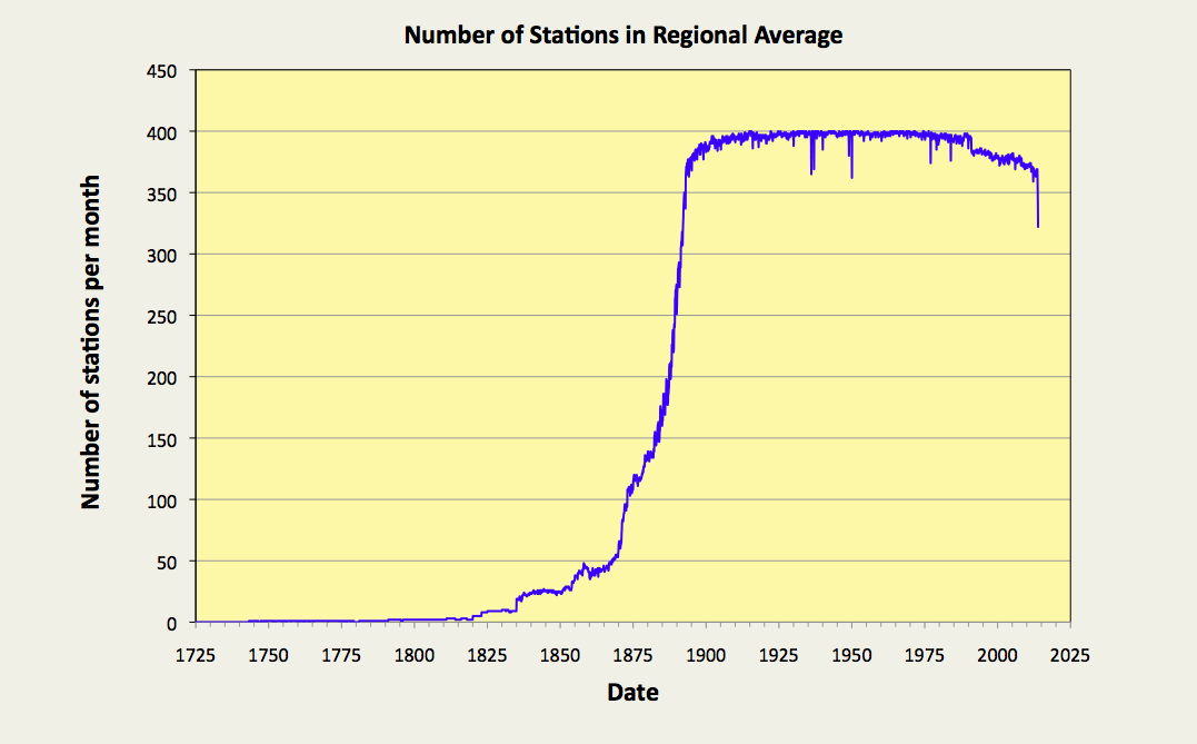
So how reliable are these results? The graph in Fig. 66.4 below suggests that these results should be most reliable from about 1890 onwards. For this period the trends shown in Fig. 66.1-Fig. 66.3 are the result of averaging over 350 independent datasets. This reduces to less than 100 before 1870 and only one or two stations prior to 1820.


Fig. 66.4: The number of station records included each month in the mean temperature trend for USA when the MRT interval is 1951-1980.


Moreover, the stations being considered here are fairly evenly spread across the 48 contiguous states of the continental United States, although the density of stations to the west of the longitude line 96°W is only about half that of the density to the east (see Fig. 66.5 below). 

The distribution of warming and cooling stations in Fig. 66.5 also provides strong evidence of a significant geographical component influencing the overall temperature trend at any given location, with stations in the west, and those in areas of high population density, more likely to exhibit a high warming trend. In this case, a station is defined to be warming strongly if its overall temperature rise exceeds 0.25°C over its entire history, and the gradient of its temperature trend exceeds twice the error in that gradient. Consequently, this dependence of the temperature trend on location appears to constitute strong evidence in support of the existence of the urban heat island effect (UHI) and its role in driving at least some global warming in highly developed regions.


Fig. 66.5: The (approximate) locations of the 400 longest temperature records in USA. Those stations with a high warming trend are marked in red and orange. Those with cooling or stable trends are marked in blue. Those denoted with squares have over 1600 months of data.


It is self-evident that the results presented in Fig. 66.1-Fig. 66.3 are at odds with the claims of most climate science groups. This is confirmed by the data in Fig. 66.6 below which is an equivalent temperature trend for the USA, but which was calculated using data that have been adjusted by Berkeley Earth. That apart, the process used to generate the curves in Fig. 66.6 is exactly the same as the process used to derive the data in Fig. 66.1. In each case a simple average was performed of the monthly anomaly data from each of the 400 longest stations. This was repeated for each month in the time series.

It can be seen that the effect of the adjustments made to the data by Berkeley Earth is to lower the peak seen in the 1930s in order to render the trend more linear. This gives the effect of implying that most of the warming has occurred after 1900, whereas the trend based on raw data presented in Fig. 66.1 suggests most warming occurred before 1900. In both cases, though, the total warming from 1820 to 2010 is about the same at just under 2°C.


Fig. 66.6: Temperature trend for the USA since 1750 derived by aggregating and averaging the Berkeley Earth adjusted data from the 400 longest temperature records. The best fit linear trend line (in red) is for the period 1791-2010 and has a gradient of +0.66 ± 0.02 °C/century.
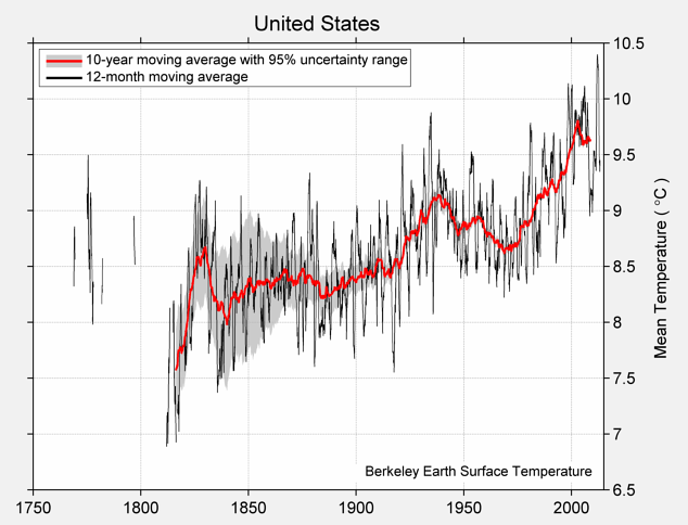

The plot in Fig. 66.6 may differ from the one based on raw data in Fig. 66.1, but it largely agrees with the trend for the USA published by Berkeley Earth and shown in Fig. 66.7 below. This is again despite the fact the averaging process used by Berkeley Earth to generate the curves in Fig. 66.7 uses different weighting coefficients for each station based on their location and proximity to other stations. The curves in Fig. 66.6, on the other hand, are the result of a simple average with no weighting. Yet the two sets of data largely agree. This would also suggest that the variation in station density seen in Fig. 66.5 is not sufficient to significantly impact the result either. This can be tested, though, by studying the temperature trends for the USA on a state-by-state basis. The temperature trends for Texas have already been determined, however (see Post 52).


Fig. 66.7: The temperature trend for the USA since 1750 according to Berkeley Earth.


Conclusions

The data presented here appears to suggest that there has been no global warming in the USA since 1920. In fact a cyclically neutral analysis of data for the 20th century appears to exhibit a strong cooling (see Fig. 66.3).

The strong warming seen in the USA temperature trend before 1900 is incompatible with the assertion that warming is only caused by increases in carbon dioxide, for the simple reason that there were no significant increases in atmospheric carbon dioxide before 1900.

The cause of the warming before 1900 is uncertain, but could be due to natural variations in climate, or a growing urban heat island effect as the USA started to industrialize. It should be noted that most of the USA temperature records with data prior to 1880 were based in towns and cities that were growing quickly, principally around New England and Chicago.


Addendum

Here is the NOAA version of the USA data, before and after their adjustments.


Fig. 66.7: The temperature trend for the USA since 1900 according to NOAA-NCDC.


So while the raw data is fairly close to that shown Fig. 66.3, the adjusted data is not. In fact the adjustments add about 0.4°C of warming.


Thursday, August 20, 2020

31. Indonesia - temperature trends STABLE

Indonesia is one of the largest countries in the world and has one of the largest populations at over 267 million. Its archipelago of islands straddles the equator and stretches from a longitude of 95°E to 141°E, a distance of over 5000 km. The country has 53 medium length temperature records with between 480 and 1200 months of data, but only one long station record with more than 1200 months of data (see here). That station is Jakarta Observatorium (Berkeley Earth ID: 155660). It is also the station with the most pronounced warming trend (see Fig. 31.1 below).


Fig. 31.1: The temperature trend for Jakarta Obervatorium since 1866. The best fit is applied to the interval 1866-2013 and has a gradient of 1.82 ± 0.08 °C per century. The temperature changes are relative to the 1961-1990 average.


Overall the temperature rise for Jakarta Obseratorium is nearly 2.7 °C from 1866 to 2013, yet this is not representative of the country as a whole. The medium stations in Indonesia exhibit both warming and stable trends as shown in Fig. 31.2 below. In this case stable trends are defined to be those with a warming that is less than twice the uncertainty. The stations are also fairly evenly dispersed, but are mainly coastal.


Fig. 31.2: The locations of long stations (large squares) and medium stations (small diamonds) in Indonesia. Those stations with a high warming trend are marked in red.


If we average all the records from the long and medium stations we get the overall trend shown in Fig. 31.3 below. Instantly we see a problem. While the overall trend since 1908 appears to be negative (-0.03 ± 0.04 °C per century in fact), there are large discontinuities around 1860, 1902 and 1941.


Fig. 31.3: The temperature trend for Indonesia since 1840. The best fit is applied to the interval 1908-2002 and has a negative gradient of -0.03 ± 0.04 °C per century. The temperature changes are relative to the 1961-1990 average.


The reason for this is the low number of station records before 1950, as illustrated in Fig. 31.4 below. For example, between 1866 and 1903 there is only one temperature record available, that of Jakarta Observatorium illustrated in Fig. 31.1 above.


Fig. 31.4: Number of stations per month included in the regional average for the Indonesia temperature anomaly. Only stations with more than 240 months of data in total and sufficient data in the period 1961-1990 are counted.


That is not the only problem, though. Low station numbers means that the average can be heavily distorted by one or two rogue datasets, and in this case there are at least three potential candidates in addition to Jakarta Obseratorium in Fig. 31.1. They are shown in the three figures below.


Fig. 31.5: The temperature trend for Christmas Island (Berkeley Earth ID: 154345) since 1900.


Fig. 31.6: The temperature trend for Padang (Berkeley Earth ID: 155706) since 1850.


Fig. 31.7: The temperature trend for Jakarta (Berkeley Earth ID: 15412) since 1866.


The last of these (Fig. 31.7) is another temperature record from Jakarta. Although this has none of the large temperature offsets seen in Fig. 31.5 and Fig. 31.6, it does appear to be as anomalous as the Jakarta Observatorium data in that it is inconsistent with the rest of the data for the country. It is also in close proximity to an existing station (Jakarta Observatorium). So, on the one hand it can corroborate the trend from Jakarta Observatorium, but on the other hand the weightings of both in the overall average trend should be halved.

The remaining question is whether the large temperature falls seen after 1950 in Fig. 31.5 and Fig. 31.6 are real. The suspicion (and it is just a suspicion) is that they are real because similar falls occur in too many other records. For example, they can also be seen in records from Dilli, Bandung and Pontianak


Fig. 31.8: The temperature trend for Indonesia since 1900 excluding the temperature records from Jakarta. The best fit is applied to the interval 1913-2012 and has a negative gradient of -0.08 ± 0.04 °C per century. The temperature changes are relative to the 1961-1990 average.


So, rather than discarding the data from Christmas Island (Fig. 31.5) and Padang (Fig. 31.6), what happens if we discard both the datasets from Jakarta (Fig. 31.1 and Fig. 31.7) instead? The result is the trend shown in Fig. 31.8 above. This has a negative trend of -0.08 ± 0.04 °C per century, a trend which is also consistent with the data around 1850. The only anomaly is the data from 1903-1913 that is solely from Christmas Island. 

The conclusion from this is that the only part of Indonesia that has exhibited any significant warming since 1850 is the capital and largest city, Jakarta. The rest of the country has seen no temperature rise at all.


Fig. 31.9: Temperature trend for all long and medium stations in Indonesiasince 1850 derived using the Berkeley Earth adjusted data. The best fit linear trend line (in red) is for the period 1871-2010 and has a gradient of +0.94 ± 0.03 °C/century.


What we need to do next is compare the results illustrated above, derived using the anomalies from the raw temperature data, with the equivalent results from Berkeley Earth. Summing and averaging the adjusted anomalies from Berkeley Earth yields the graph in Fig. 31.9 above. These are very similar to the published curves from Berkeley Earth shown in Fig. 31.10 below. Most of the differences are likely due to the inclusion of additional of smaller datasets in the Berkeley Earth plots.

The gradient of the best fit in Fig. 31.9 is +0.94 ± 0.03 °C per century. This is about half that seen in the data for Jakarta Observatorium shown in Fig. 31.1 above, but completely at odds with the data for the rest of the country shown in Fig. 31.8. It suggests that the temperature data from Jakarta has been assigned a greater level of significance (or weighting) and confidence than data from elsewhere in Indonesia. This is perhaps not surprising. The two records from Jakarta are two of the longest and most complete. They also exhibit trends that are both smooth and monotonic. But that does not mean their greater weighting is justified.


Fig. 31.10: Temperature trend for Indonesia since 1840 according to Berkeley Earth.


If we compare the Berkeley Earth adjusted data shown in Fig. 31.9 with the original raw unadjusted anomalies shown in Fig. 31.3, the difference is significant. This difference is shown in Fig. 31.11 below.


Fig. 31.11: The contribution of Berkeley Earth (BE) adjustments to the anomaly data after smoothing with a 12-month moving average. The linear best fit to the data is for the period 1904-2012 (red line) and the gradient is +0.96 ± 0.03 °C per century. The orange curve represents the contribution made to the BE adjustment curve by breakpoint adjustments only.


The data in Fig. 31.11 is shocking. If my analysis is correct, then it suggests that the adjustments made to the data by Berkeley Earth could have added about 0.95 °C to the warming trend since 1904. In other words, virtually all the warming claimed by Berkeley Earth to have occurred in Indonesia since 1904, and depicted in Fig. 31.10, may be the result of their own data adjustments, and not the original data. Moreover, most of this added warming appears to come from breakpoint adjustments.


Conclusions

1) The only warming seen in Indonesia appears to have occurred in Jakarta (see Fig. 31.1). 

2) This warming has been large (about 2.7 °C) and continuous since 1866, which is consistent with its source being population growth linked to increased energy consumption and direct anthropogenic surface heating (DASH), as discussed in Post 14 and Post 29. It may also be a consequence of the urban heat island (UHI) effect.

3) There has been no warming of the overall climate in Indonesia since 1900 (see Fig. 31.8 below).