Showing posts with label Southern Hemisphere. Show all posts

Sunday, August 28, 2022

134: Urban heat island (UHI) - implications for climate analysis


Fig. 134.1: UHI evidence from six cities in the Southern Hemisphere.


In my previous six posts I highlighted six examples of temperature records from major cities in the Southern Hemisphere where the temperature trend appears to be influenced by the urban heat island (UHI) effect that I discussed in Post 127. The result in each case was that the city exhibited significantly more warming than the rest of the state or country that the city was part of (see Fig. 134.1 above). However, the implications of this go beyond what is happening in a few megacities.

If large cities like Jakarta and Buenos Aires are warming because of urban heating, it then follows that smaller towns and cities must as well, only just not as much. As most weather stations are located near sites of human activity or habitation, it then also follows that most of the temperature records are likely to be corrupted to a certain degree by this UHI effect. The problem is determining to what degree that is. 

The six cities I have examined so far are obviously extreme examples and cannot on their own have a significant impact on their regional temperature trends as these regional trends are usually the result of averaging data from dozens of different stations. If they did have a large impact, then the difference between the trends for each city and its region would not be so pronounced. But that does not mean that the wider region is unaffected. 

The regional trends I compared each of the city trends with are also probably affected by the UHI effect, just not as much. That is because most of the data that goes to make up the regional trends comes from stations sited around other, smaller urban developments. So the regional warming is probably overstated as well, just not as much as that of the megacities. It is only because the megacities are so extreme that they stand out from their wider regions, but in reality both trends are likely to exhibit increased warming due to the UHI effect, just not as much as each other, hence the divergence in trends. 

And of course, if the temperature data for all the stations in the region is homogenized, then there is a risk of importing warming trends from the UHI into the surrounding area thereby raising the temperature trends of the wider region more markedly. Either way, the temperature trend for any region is likely to be corrupted to some degree by UHI effects in some of its stations.

But perhaps the biggest issue is the problem of area weighting. Ideally the contribution of each station to the overall regional average should be in proportion to area surrounding that station. So if a country has fifty stations and they are all evenly spaced, then each one should represent 2% of the area and each should make a 2% contribution to the mean temperature for the country. But suppose the station sits in a UHI and the area of the urban region is less than the nominal area that the station is supposed to represent. This is what happens with Jakarta in Indonesia (see Post 131) and for many other UHI stations.

The area of Jakarta is about 660 km2, but that is only about 0.035% of the 1,900,000 km2 area of Indonesia so the true weighting or contribution of Jakarta Observatorium (Berkeley Earth ID: 155660) to the mean temperature trend of Indonesia should be only 0.035%. But as there are less than sixty reliable temperature records for Indonesia (see Fig. 31.4 in Post 31) that means that each station on average makes a contribution of over 1.7% to the regional temperature trend. So a simple average of all station anomalies would over-represent Jakarta Observatorium (Berkeley Earth ID: 155660) by at least fifty times, and so too would an average based on a gridded method.

So how could we separate the UHI contribution to local warming from other climate drivers like carbon dioxide? One way to go about this might be to compare temperature trends for raw unadjusted temperature data from known urban and rural stations. But the problem here is that we don't know for certain where all these stations are exactly, or what the local geography around each station is. For example, according to its GPS coordinates Perth Regional Office is in the middle of the sea over 8 km off the coast of Perth. This is because the longitude and latitude coordinates for many stations are often only specified to the nearest 0.1° and sometimes the error is even greater. For Perth Regional Office the error is stated as ±0.2° for the longitude. That means its location accuracy is about ± 10 km. That is bigger than the extent of most urban areas. So finding sufficient pure rural stations against which to compare all the others is tough.

The takeaway here is that the urban heat island (UHI) effect is a big problem when interpreting temperature data, but determining how big is also a big problem.


Thursday, March 24, 2022

100. List of completed temperature analyses by country


As this is my 100th post on this blog I thought it would be a good moment to summarize the results that have emerged from the temperature data I have analysed so far. Below is a list of all the countries and regions that I have investigated to date with links to the relevant post. This amounts to about 60 countries, states and territories in total, which is roughly one third of all the countries in the world. 

The main areas that so far remain to be studied are the Arctic, Canada, Russia, UK, Scandinavia, Mediterranean, North Africa, Middle East, China and Japan. In the Southern Hemisphere only Brazil, Venezuela, Guyana, Suriname, French Guiana and the South Atlantic remain. However, most of these Southern Hemisphere regions are already included in the analysis of South America in Post 35.


Europe

Europe has the longest temperature records available with several in Germany, Sweden and the Netherlands stretching back to the early 18th century. The average of the 109 longest records yields a mean temperature anomaly (MTA) that shows a small but continuous warming of about 0.1°C per century for over 200 years until 1988. Then the temperature jumps suddenly by over 1°C. The reason for this jump is unclear. It is certainly not related directly to carbon dioxide emissions. The only countries that appear to have strong warming trends are the Benelux countries, Denmark and Switzerland. The Baltic states and most of central Europe appear to cool before 1980 and then warm suddenly.

109 longest station records (Post 44)

Austria (Post 55)

Baltic States (Post 51)

Belgium and Luxembourg (Post 40)

Central Europe average (Post 57)

Czechoslovakia (Post 53)

Denmark (Post 48)

Germany (Post 49)

Hungary (Post 54)

Netherlands (Post 41)

Poland (Post 50)

Switzerland (Post 56)


USA

The USA may not have any temperature records that are as long as the longest that Europe can boast, but its temperature data from 1850 onwards is the best there is. Virtually every state has over 100 station records with over 50 years of data and over 50 records with over 100 years of data. An average of the 400 longest temperature records appears to indicate that the climate warmed by more than 2°C from 1780 to 1920 when carbon dioxide levels barely increased, and then cooled by over 0.5°C when carbon dioxide levels took off. The early warming cannot therefore be due to CO2 and is therefore generally attributed to urbanization and deforestation in the north and east. The cooling seen after 1920 is also seen in most southern states like Louisiana, Mississippi and Texas.

400 longest station records (Post 66)

Louisiana (Post 97)

Mississippi (Post 99)

Texas (Post 52)


Central America

The temperature data for Central America can basically be split between Mexico and the rest, however, even then there are more than four times as many stations in Mexico as there are in the rest of Central America. The picture in Mexico is also complicated by the stations there falling into two distinct types from two different sources. On balance it is likely that the overall climate was stable until 1980 and then warmed over the following twenty years by about 1°C.

Mexico (Post 93)

Rest of Central America (Post 94)


South America

Of the countries in South America studied so far, only Argentina (0.6°C), Ecuador (1°C) and Uruguay (1°C) show significant warming, although the Ecuador data is far from reliable. In Paraguay and Chile the climate has cooled while in most other countries it has remained stable. The average of all medium and long stations in South America yields a warming of about 0.5°C since 1900.

All long and medium stations (Post 35)

Argentina (Post 61)

Bolivia (Post 58)

Chile (Post 62)

Colombia (Post 95)

Ecuador (Post 96)

Paraguay (Post 59)

Peru (Post 63)

Uruguay (Post 60)


Asia

My analysis so far of temperatures in Asia has focused on the countries of Indochina and the Indian subcontinent. The overall temperature trend for Indochina is one of cooling before 1980 and warming thereafter. The result is that temperatures in 2010 are barely any higher than they were in 1890. This is also reflected in the individual temperature records of Burma, Malaysia and Vietnam, while those of the Philippines and Thailand remain stable from 1920 onwards. In India and Pakistan there is little warming before 1990 and then a sudden jump in temperatures of about 0.5°C in the mid-1990s. For Sri Lanka the jump in temperature occurs in 1978 while Bangladesh sees a continuous warming of only 0.3°C per century. 

Bangladesh (Post 74)

Burma/Myanmar (Post 69)

India including Nepal (Post 71)

Indian subcontinent (Post 75)

Indochina (Post 70)

Malaysia and Singapore (Post 69)

Pakistan (Post 72)

Philippines (Post 69)

Sri Lanka (Post 73)

Thailand (Post 69)

Vietnam (Post 69)


Africa

Most of southern Africa has exhibited some significant warming of over 1°C since 1980 but the overall picture before 1980 is varied. Angola, Mozambique and South Africa show no warming before 1980 while Malawi, Zambia, Zimbabwe and Madagascar all cool significantly by as much as they later warm. The data for Namibia and Botswana is not great but may indicate a slight warming before 1980 as well as much larger warming thereafter. Of all the countries listed below, Madagascar, Mozambique, South Africa and Zimbabwe have the best quality data and none of these countries appear to exhibit any warming before 1980.

Angola (Post 82)

Botswana (Post 38)

Madagascar (Post 77)

Mozambique (Post 78)

Namibia (Post 39)

South Africa including Lesotho and Eswatini/Swaziland (Post 37)

Zambia and Malawi (Post 81)

Zimbabwe (Post 79)


Australia

Analysis of temperature data for Australia indicates that the mean temperature trend is parabolic with the climate cooling from 1875 to 1960 and then warming. Overall temperatures in 2010 are only about 0.1-0.2°C warmer than in 1875 with temperatures having increased by about 0.5°C since 1960. This pattern in seen in most states such as South Australia, New South Wales and Victoria. It is harder to be conclusive for Tasmania and Western Australia due to a lack of data before 1900 while the trend in Northern Territory is one of consistent cooling. Only Queensland shows constant warming of about 1°C since 1990.

Australia (Post 26)

New South Wales and ACT (Post 18)

Northern Territory (Post 23)

Queensland (Post 24)

South Australia (Post 21)

Tasmania (Post 20)

Victoria (Post 19)

Western Australia (Post 22)


Oceania

Most of the countries and regions of Oceania show little of no warming. In Antarctica the only warming is found around the peninsula. New Zealand cools slightly from 1860 until 1960 then warms by about 0.5°C, rather like much of Australia. Yet despite this, temperatures in 2010 are barely above those in 1860. In Indonesia only the capital city Jakarta shows any strong warming but the average temperature for the country remains stable, although data quality and quantity before 1960 is poor. This is also true for Papua New Guinea where there is some evidence of warming after 1960 by about 0.5°C. In the South Pacific there is a contrast between east and west with the eastern half cooling significantly while the west cools slightly until 1970 before warming again by about 0.5°C. In fact of all the regions listed below, only the Indian Ocean shows significant warming of about 1°C.

Antarctica (Post 30)

Indian Ocean (Post 76)

Indonesia (Post 31)

New Zealand (Post 8)

Papua New Guinea (Post 32)

South Pacific Islands - East (Post 34)

South Pacific Islands - West (Post 33)


Southern Hemisphere

An average of the temperature anomalies from the 1000 longest records in the Southern Hemisphere shows a slight cooling of about 0.1°C until 1975 followed by a modest warming of only about 0.6°C.

Southern Hemisphere station average (Post 64)


Friday, April 30, 2021

64. Southern Hemisphere - temperature trends COOLING to 1970

Over the past year I have analysed most of the temperature data from the Southern Hemisphere as well as some data from Europe and the USA. Few if any of the resulting temperature trends that I have calculated have agreed with the global published trends of the IPCC, Hadley-CRU, NOAA, NASA-GISS, or the regional trends of Berkeley Earth. This may be because they are based on calculations for small regions rather than global averages, although this caveat does not explain the discrepancies seen when compared with the Berkeley Earth data. 

In this post I will make a first attempt at analysing the data for the entire Southern Hemisphere. I will do this by simply averaging the anomalies for the 1079 longest station records in the Southern Hemisphere, but without employing any regional weighting to the data. This will produce a first estimate of the temperature trend. A more accurate analysis will be done in a future post, where trends for the various regions will be combined using area weightings similar to those I used in Post 26 to calculate the overall trend for Australia, based on the trends from its individual states. Such an approach is, however, fraught with difficulty as the area of many regions (such as island archipelagos) are difficult to define exactly.


Fig. 64.1: The temperature trend for the Southern Hemisphere since 1820 derived by averaging the 1079 longest temperature records for the region. The best fit is applied to the monthly mean data between 1876 and 1975 and has a negative gradient of -0.12 ± 0.09 °C per century.


The overall temperature trend for the Southern Hemisphere since 1820 is shown in Fig. 64.1 above. This is the result of averaging over one thousand separate station records as indicated in Fig. 64.2 below. All the stations were either long stations with over 1200 months of data before the end of 2013, or medium stations with over 480 months of data.

The temperature profile from 1970 onwards appears to exhibit a clear upward trend with the mean temperature increasing by about 0.57°C from the 1960s to 2010. This data is also the most reliable as it is the result of averaging over 900 temperature records. 

In contrast, the data before 1970 exhibits a long modest cooling trend of over 0.1°C per century. The reliability of this data is also good, as it is the result of averaging over 100 temperature records from 1900 onwards. Before 1900, however, the data becomes less reliable due to its reliance on smaller numbers of stations that are also further apart and so less well correlated.


Fig. 64.2: The number of station records included each month in the mean temperature trend for the Southern Hemisphere when the MRT interval is 1981-2010.


What the data in Fig. 64.1 appears to indicate is that while there has been a significant warming of the Southern Hemisphere post-1970 of up to 0.57°C, this is partially offset by a noticeable cooling over the previous 100 years or more. So the total warming since pre-industrial times is likely to be less than 0.4°C. This is much less than the commonly quoted value of 1°C, or 1.5°C for the Northern Hemisphere. Yet this is not reflected in the Berkeley Earth adjusted data.


Fig. 64.3: Temperature trend for the Southern Hemisphere since 1840 derived by aggregating and averaging the Berkeley Earth adjusted data for over 1000 of the longest stations in the region. The best fit linear trend line (in red) is for the period 1951-2010 and has a gradient of +1.45 ± 0.10 °C/century.


An average of the Berkeley Earth adjusted time series temperature trends from the 1000 longest sets of station data in the Southern Hemisphere is presented in Fig. 64.3 above. This appears to indicate that the total temperature rise of the Southern Hemisphere since 1950 should be about 0.8°C. This is significantly more (between 0.1°C and 0.3°C depending on the time period you are considering) than is seen from the raw temperature data in Fig. 64.1, but it is in general agreement with the trend published by Berkeley Earth and shown in Fig. 64.4 below. 

However, what is even more prominent is the difference in the temperature trends before 1950. Whereas the raw data in Fig. 64.1 clearly indicates a cooling trend of 0.12°C per century, a simple average of the Berkeley Earth in Fig. 64.3 indicates a modest warming of 0.24°C per century. This, though, is still much less than the official trend shown in Fig. 64.4, which appears to claim an additional 0.5°C of warming has occurred between 1880 and 1950. This is almost the same as the warming since 1950, yet the atmospheric levels of carbon dioxide in 1950 were only 310 ppm, which is only about 30 ppm above pre-industrial levels. This means that the most recent increase in carbon dioxide of 100 ppm since 1950 has produced the same warming as the first 30 ppm did before 1950. If that is true, then it suggests further increases in carbon dioxide concentrations will have ever decreasing impacts on our climate, to the point where they are inconsequential.


Fig. 64.4: The temperature trend for the Southern Hemisphere since 1860 according to Berkeley Earth.


So what are the reasons for the differences in the trends before 1950? 

Well, we know that the differences between the trends in Fig. 64.1 and Fig. 64.3 are probably the result of the adjustments made to the data by Berkeley Earth. The statistical legitimacy of these adjustments I have already disputed in Post 57. This cannot explain the differences between the trends in Fig. 64.3 and Fig. 64.4, though, as these are both derived using the same adjusted data. These differences are likely to be the result of regional or station weightings, which would appear to be more important before 1950 due to the smaller number of stations and their uneven geographical distribution.

One way to examine the impact of these differences is to compare results from different samples of data. In the following five graphs I have split the stations used to construct the average in Fig. 64.1 into five separate random samples and compared their trends before and after 1975. In each case the temperature rise from the 1960s to 2010 is in the range 0.56 ±0.05°C while all but one of the samples has a negative trend before 1975. However, the range of trends for data before 1975 (or 1950) is much larger than the range for data after. This suggests that the data before 1950 is more sensitive to the impact that individual stations or regions may have on the average. The number of stations averaged each month for each sample is indicated in Fig. 64.10. This indicates that before 1940 each sample typically has significantly fewer than 70 stations in the average compared with over 150 after 1960.


Fig. 64.5: The temperature trend for the Southern Hemisphere since 1820 based on the first sample average of 224 of the 1079 longest temperature records for the region. The best fit is applied to the monthly mean data between 1876 and 1975 and has a negative gradient of -0.02 ± 0.10 °C per century.


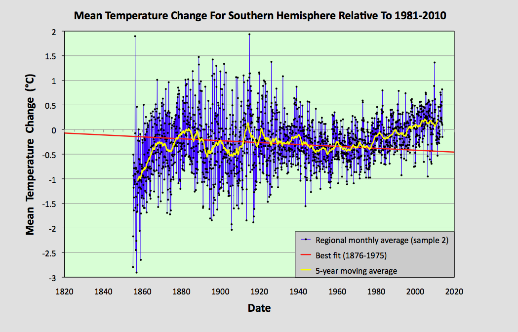
Fig. 64.6: The temperature trend for the Southern Hemisphere since 1820 based on the second sample average of 223 of the 1079 longest temperature records for the region. The best fit is applied to the monthly mean data between 1876 and 1975 and has a negative gradient of -0.19 ± 0.08 °C per century.


Fig. 64.7: The temperature trend for the Southern Hemisphere since 1820 based on the third sample average of 210 of the 1079 longest temperature records for the region. The best fit is applied to the monthly mean data between 1876 and 1975 and has a negative gradient of -0.37 ± 0.09 °C per century.


Fig. 64.8: The temperature trend for the Southern Hemisphere since 1820 based on the fourth sample average of 211 of the 1079 longest temperature records for the region. The best fit is applied to the monthly mean data between 1876 and 1975 and has a negative gradient of -0.09 ± 0.09 °C per century.


Fig. 64.9: The temperature trend for the Southern Hemisphere since 1820 based on the fifth sample average of 211 of the 1079 longest temperature records for the region. The best fit is applied to the monthly mean data between 1876 and 1975 and has a positive gradient of +0.15 ± 0.11 °C per century.


Fig. 64.10: The number of station records included each month in the mean temperature trend for each of the five samples in Fig. 64.5 - Fig. 64.9.


Summary

The temperature trend for the Southern Hemisphere, based on the raw temperature data, exhibits a warming of about 0.5°C since 1950.

Before 1950 there is strong evidence of a prolonged cooling period of over 100 years in duration that amounted to a cooling of at least 0.12°C in total.

Based on the available temperature data, the total warming seen in the Southern Hemisphere since pre-industrial times is likely to be less than 0.4°C. This is much less than the usually reported value. 


Final Thoughts

The data shown in Fig. 64.1 clearly shows no warming before 1980. However, the data before 1880 is not very reliable. As Fig. 64.2 indicates, the mean anomaly prior to 1880 is based on data from less than 50 temperature records. If these records were all from the same region, then this low amount of data would be less of a problem as the different stations would be strongly correlated. The result would be reliable - but only for that region. 

The data I have analysed so far for this blog suggests that, for a single region with a uniform climate, a good reliable average can be achieved from only about 15-20 sets of data. When dealing with an entire hemisphere, however, we need more data because the climate of South America will clearly be different from that of Australia. This means that the data before 1880 in Fig. 64.1 is likely to be misleading. So can we do better than the trend in Fig. 64.1? Well, yes we can.


Fig. 64.11: The temperature trend for the Southern Hemisphere since 1880 derived by averaging the 1079 longest temperature records for the region. The best fit is applied to the monthly mean data between 1881 and 1980 and has a slight positive gradient of 0.01 ± 0.09 °C per century.


If we re-scale the data in Fig. 64.1 we can create a graph that presents a truer picture of the historic temperature rise by ignoring the unreliable data before 1880. Such a graph is shown above in Fig. 64.11. The other change I have made is to the time interval of the best bit line. This fit now applies from 1881 to 1980 and its gradient is practically zero. The jump in temperature after 1980 still amounts to about 0.57°C, and this is still much less than the 1.5°C that is claimed by climate science for the rise in global land temperatures from 1900 to 2013. But what it also shows is that small changes to how data is analysed and presented can affect the results.