Showing posts with label NOAA. Show all posts

Friday, February 18, 2022

93. Mexico - temperature trends 0.6°C WARMING

Of all the countries in Central America only Mexico has a significant number of weather stations with over 40 years of data. In total it has 138 medium stations with over 480 months of data, and another four long stations with over 1200 months of data (see here for a list of all stations and links to all the original raw data). In total, at least fifteen stations have over 1000 months of data. In contrast, the other seven countries in the region have only 31 medium stations in total, none of which have more than 900 months of data. On the face of it this should mean that the temperature trend for Mexico should be easy to determine, but as with most things in climate science, it turns out it is not that simple.


Fig. 93.1: The mean temperature change for Mexico relative to the 1961-1990 monthly averages. The best fit is applied to the monthly mean data from 1898 to 1997 and has a positive gradient of +0.58 ± 0.06 °C per century.


The result of averaging the monthly temperature anomalies from all the 142 long and medium stations in Mexico results in the set of mean temperature anomalies (MTA) shown in Fig. 93.1 above. The anomalies for each station were determined by first calculating the twelve monthly reference temperatures (MRT) for each station. The method for calculating the MRTs, and then the anomalies for each station dataset has been described previously in Post 47. In this case the time interval used to determine the MRTs was 1961-1990 as almost all the 142 stations had at least 40% data coverage in this interval. The MRTs for each station were then subtracted from the station's raw temperature data to produce the anomalies for that station.

The MTA data in Fig. 93.1 clearly shows a positive temperature trend over time that equates to a warming of about 0.6°C over the last century. However, within this trend are fluctuations in the 5-year moving average (yellow curve) that are even greater than the overall rise in the trend (red curve). This behaviour is also seen in the Berkeley Earth adjusted data shown in Fig. 93.2 below.
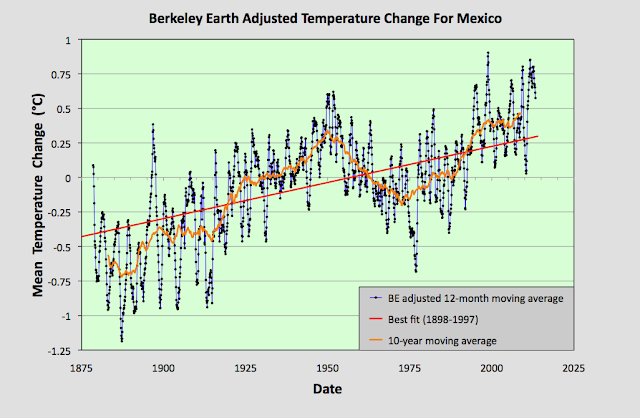

Fig. 93.2: Temperature trends for Mexico based on Berkeley Earth adjusted data. The average is for anomalies from all stations with over 480 months of data. The best fit linear trend line (in red) is for the period 1898-1997 and has a gradient of +0.52 ± 0.03°C/century.


The Berkeley Earth (BE) data presented in Fig. 93.2 was generated using the same averaging process as that used for the data in Fig. 93.1 but using BE adjusted anomaly data. Usually this leads to a large difference in the temperature rise calculated using the unadjusted raw data (Fig. 93.1) from that using the BE adjusted data (Fig. 93.2). I have shown numerous examples in this blog over the last two years for many different countries, states and regions where this is the case, and it is one of my main reasons for doing this blog: to highlight the extent to which much of the original temperature data has been adjusted. 

In this instance, however, the adjustments made by Berkeley Earth (and there are many in most station datasets) appear to make little difference to the final outcome for the overall temperature trend. And this is not because the averaging process I use is different from the Berkeley Earth method. It is. I do not use any homogenization, Kriging or weighted coefficients for the different datasets in the averaging. Yet the temperature trend I derive from the BE adjusted data and present in Fig. 93.2 is virtually identical to the one published by Berkeley Earth and shown in Fig. 93.3 below. So once again the averaging process is not the issue.


Fig. 93.3: The temperature trend for Mexico since 1830 according to Berkeley Earth.


This all seems to suggest that the overall temperature trend for Mexico is as I have calculated in Fig. 93.1, and that this is broadly consistent with the Berkeley Earth version. But if we look at the data more closely we see a complication.


Fig. 93.4: The number of station records included each month in the mean temperature anomaly (MTA) trend for Mexico in Fig. 93.1 (blue curve). These stations can be sorted into two distinct groups. Those with five digit Berkeley Earth ID codes are shown in red, those with six digit IDs are in green.


The data files on the Berkeley Earth website for the stations in Mexico broadly fall into two distinct categories: those with 5-digit IDs and those with 6-digit ones. The different numbers appear to reflect the fact that the original data in each case comes from a different source database, with the 5-digit data files more likely to originate from a single source, usually the Global Historical Climatology Network (GHCN) of NOAA, and the 6-digit data files from multiple databases. The number of each of the two file types used to determine the MTA trend in Fig. 93.1 is shown in Fig. 93.4 above. 

Now ordinarily this difference in file source is not an issue. The same differentiation in ID numbers is seen for stations from many countries. The problem here is that these two sets of data files give wildly different results for the MTA trend of Mexico. This can be seen when we examine the temperature trends for each station individually as the map in Fig. 93.5 below illustrates.


Fig. 93.5: The (approximate) locations of the weather stations in Mexico. Those stations with a high warming trend between 1901 and 2000 are marked in red while those with a cooling or stable trend are marked in blue. Those denoted with squares are stations with a 6-digit Berkeley Earth ID, while diamonds denote stations with a 5-digit ID.


In Fig. 93.5 the geographical location in Mexico of each of the 142 weather stations with the longest temperature records used to determine the mean trend in Fig. 93.1 are plotted. Those in red have significant warming trends while those in blue are generally stable (the total temperature rise is either less than 0.25°C, or the trend is less than twice the error in the trend). In addition, the stations with 5-digit IDs are denoted by a diamond while those with a 6-digit ID are represented by a square. What is noticeable is the different split between warming and stable trends in each case.

In the case of stations with 6-digit IDs 73% (32 out of 44) have a warming trend, whereas for the stations with 5-digit IDs it is only 38% (37 out of 98). This difference is even more apparent if we calculate the mean temperature anomaly (MTA) for each set of stations separately.


Fig. 93.6: The mean temperature change for Mexico relative to the 1961-1990 monthly averages calculated using stations with a 5-digit Berkeley Earth ID. The best fit is applied to the monthly mean data from 1921 to 2010 and has a positive gradient of +0.14 ± 0.07 °C per century.


The MTA data in Fig. 93.6 above shows the mean temperature change for Mexico calculated using only anomaly data from stations with a 5-digit Berkeley Earth ID. The trend in this case is almost completely flat. In contrast, if the same exercise is performed using only anomaly data from stations with a 6-digit Berkeley Earth ID the result is a strong warming trend of over 1°C per century as shown in Fig. 93.7 below.


Fig. 93.7: The mean temperature change for Mexico relative to the 1961-1990 monthly averages calculated using stations with a 6-digit Berkeley Earth ID. The best fit is applied to the monthly mean data from 1898 to 1997 and has a positive gradient of +1.13 ± 0.06 °C per century.


All this means that it is difficult to conclusively assert what the degree of climate change in Mexico has been over the last century. The most reasonable estimate is that the mean temperature has risen by about 0.6°C (see Fig. 93.1 and Fig. 93.2), but it could be anywhere between 1.2°C (see Fig. 93.7) and 0°C (see Fig. 93.6).


Acronyms

BE = Berkeley Earth.

MRT = monthly reference temperature (see Post 47).

MTA = mean temperature anomaly.

List of all stations and links to all the original raw temperature data


Friday, May 14, 2021

67. More evidence against temperature data adjustments (USA)

In Post 57 (The case against temperature data adjustments) I presented evidence that seemed to cast doubt on the need to adjust temperature data. The main argument from climate scientists in favour of these adjustments is their belief that the raw data cannot always be trusted. Over time, changes to the data collection process may occur. These changes may be due to changes in the location of the weather station, changes to the environment around the original site, or changes to the instrumentation or data collection methods. 

It is certainly true that these issues affect many, if not most temperature records, and the longer the temperature record, the more likely such issues will probably occur. The important questions, though, are: how large are these data errors, and what is the best way to eliminate them from historical data?


Fig. 67.1: The temperature anomalies for Baker City Municipal Airport as calculated by Berkeley Earth.


The approach most climate groups use is to adjust data within each individual temperature record, an example of which can be seen by comparing the data in Fig. 67.1 above and Fig. 67.2 below. Both graphs show temperature data from Baker City Municipal Airport (Berkeley Earth ID: 164703) in the state of Oregon in the USA, which has then been adjusted by Berkeley Earth. The original data in Fig. 67.1 has no discernible temperature trend (green line), but after the data has been chopped into multiple autonomous segments, and those segments each subjected to its own separate corrective bias, the overall trend becomes strongly positive with a gradient of +0.67°C per century. Thus warming appears where before there was none.


Fig. 67.2: The adjustments made by Berkeley Earth to the temperature anomalies for Baker City Municipal Airport.


The justification for using these adjustments is that climate scientists believe they can identify points in the data where errors have been introduced, and also that they can determine what the correction factor needs to be in order to eradicate the error. The size of the adjustments is usually determined by comparing the station temperature time series with that of its neighbours, but as I showed in Post 43, even identical neighbours can display temperature differences of up to ±0.25°C just due to measurement uncertainties.

Adjustments are most commonly made at positions in the time series corresponding to known or documented station moves (red diamonds in Fig. 67.2), or at points where there is a gap in the temperature record (green diamonds). But, groups such as NOAA and Berkeley Earth have also developed algorithms that they claim can identify other points in the time series where undocumented changes have occurred. These positions in the data are referred to by NOAA and Berkeley Earth as changepoints and breakpoints respectively. To many climate sceptics, however, these techniques remain controversial. But I would argue that in many cases they are also unnecessary because of a statistical phenomenon called regression towards the mean.


Fig. 67.3: The average temperature trend for the 100 longest temperature records in the USA. The best fit is applied to the monthly mean data from 1921 to 2010 and has a positive gradient of +0.25 ± 0.15 °C per century. The monthly temperature changes are defined relative to the 1951-1980 monthly averages.


Basically, if the errors are randomly distributed between different records, and also at different times in those records, and if they are of comparable size, then any averaging process will cause the errors to partially cancel. The bigger the number of records in the average, the more precisely they will cancel.

In Post 57 I demonstrated that these errors can be eradicated using a simple averaging process. I did this by averaging unadjusted temperature data from stations located in neighbouring European countries (Germany, Austria, Hungary and Czechoslovakia), and showing that the averaging process gave the same result for the 5-year average trend for each country, provided there were more than about twenty stations in the average for each country. This was despite the fact that Berkeley Earth had applied over three adjustments on average to each temperature record during its own analysis process for those same stations.


Fig. 67.4: The average temperature trend for the 101st to the 200th longest temperature records in the USA. The best fit is applied to the monthly mean data from 1921 to 2010 and has a negative gradient of -0.11 ± 0.15 °C per century. The monthly temperature changes are defined relative to the 1951-1980 monthly averages.


The key to this is having sufficient data. In the case of the USA we have more than sufficient data. In Post 66 I analysed the 400 longest temperature records for the USA and determined the temperature trend since 1750. This in turn showed no evidence of any global warming in the USA over the last 100 years. But suppose we split those 400 records into four sets of 100 records, and compare the four results for the different mean temperature trends. What would we expect to see?


Fig. 67.5: The average temperature trend for the 201st to the 300th longest temperature records in the USA. The best fit is applied to the monthly mean data from 1921 to 2010 and has a slight negative gradient of -0.003 ± 0.135 °C per century. The monthly temperature changes are defined relative to the 1951-1980 monthly averages.


Well, the answer is shown in Fig. 67.3-Fig. 67.6. The result is that the four temperature trends look very similar (it is probably easiest to compare the 5-year moving average curves). But judging by the adjustments made by Berkeley Earth to the data in Fig. 67.2, it would not be unreasonable to expect Berkeley Earth to have made over 1000 adjustments in total to the 100 station records used to generate each of these four temperature trends. So not making these 1000 adjustments should result in large discrepancies between the four different trends, assuming the adjustments are needed. But they aren't needed, and there are no large discrepancies.


Fig. 67.6: The average temperature trend for the 301st to the 400th longest temperature records in the USA. The best fit is applied to the monthly mean data from 1921 to 2010 and has a negative gradient of -0.22 ± 0.14 °C per century. The monthly temperature changes are defined relative to the 1951-1980 monthly averages.


The four trends are compared in more detail in Fig. 67.7 below. The average of the anomalies from the 100 longest records in the USA are shown in yellow and are offset by -1°C for clarity. The mean of next longest 100 records is shown in blue. The mean of the third longest set is shown in red and offset by +1°C, with the fourth longest set shown in black, but not offset. To aid the analysis process, the blue curve is plotted three times, with three different offsets so that it can be compared with the other three trends.


Fig. 67.7:  A comparison of the 5-year averaged temperature trends for four sets of 100 temperature records in the USA. The trends are offset for clarity with the trend for stations 101-200 used as a comparator for each of the other three trends.


What is clear is that for all the data from 1890 onwards the four trends are virtually identical. This implies that the averaging process has eliminated almost all the data errors. Before 1890 the number of stations in each average decreases dramatically as shown in Fig. 67.8 below, which is why the level of agreement between the curves is much lower. From 1900 onwards, however, there is almost total agreement. The only significant differences are for stations 001-100 in the 1930s, and stations 301-400 post-1995, but in both cases the discrepancy is generally less than 0.25°C. These differences also largely account for the differences in the best fit lines in Fig. 67.3-Fig. 67.6. As for their causes, well the lower temperature anomaly for stations 301-400 after 1995 could be due to these stations being newer than the rest. That would imply they are located in smaller towns with less waste heat production. For stations 001-100 the opposite is probably true as these station time series are the longest. That in turn suggests they are more likely to be located near the largest cities.


Fig. 67.8: The number of station records included each month in the mean temperature trends.


What this demonstrates unequivocally is that data adjustments are unnecessary when determining global or regional mean trends. This is because the errors in the individual station records will cancel when averaged. If they did not, then the four trends in Fig. 67.7 would not be so alike. Instead there would be significant differences. And remember, the same result was demonstrated in Post 57.

But what this also implies is that, if the errors in the individual station records cancel, then so too should the adjustments that are applied by Berkeley Earth and others to correct these errors. Except they don't.


Fig. 67.9: The average temperature trend for the 301st to the 400th longest temperature records in the USA after adjustments made by Berkeley Earth. The best fit is applied to the monthly mean data from 1921 to 2010 and has a positive gradient of +0.54 ± 0.05 °C per century.


The graph in Fig. 67.9 above shows the mean temperature trend for stations 301 to 400 with their Berkeley Earth adjustments included. If the adjustments cancelled, then the graph should resemble the data in Fig. 67.6, but it doesn't. Instead of a significant negative trend, there is a sizeable positive trend. In fact the adjustments have added a net warming of over +0.7°C to the data since 1920. The same positive trend is also seen for the means of the adjusted data for the other three sets of 100 stations, so at least they are consistent, but that does not mean they are correct. In fact all they are doing here is adding warming where none existed previously.


Summary

What I have presented here is yet more compelling evidence against the statistical validity of temperature adjustments.

I have shown that the true temperature trend can be determined simply by averaging the anomalies from the raw data. This confirms the similar result for Central European data that I presented in Post 57.

This adds further weight to my claim in Post 66 that there has been no global warming in the USA since 1900.