The only weather station in Madagascar with significant temperature data before 1930 is Antananarivo (Berkeley Earth ID: 156627). The temperature anomalies for this station appear to oscillate over time with a warming phase before 1930, followed by a cooling phase until 1980, and then another warming phase (see Fig. 77.1 below). It is tempting to think that this station is just an outlier, but it might actually be representative of Madagascar as a whole.
Fig. 77.1: The temperature trend for Antananarivo relative to the 1971-2000 monthly averages. The best fit is applied to the monthly mean data from 1901 to 2010 and has a negative gradient of -0.82 ± 0.07 °C per century.
Overall there are twenty weather stations in Madagascar with over 300 months of data (for a list see here), but only one of these, Antananarivo, is a long station with over 1200 months of data. Another ten are medium stations with over 480 months of data. These stations are distributed fairly evenly across Madagascar as shown in Fig. 77.2 below.
Fig. 77.2: The (approximate) locations of the weather stations in Madagascar. Those stations with a high warming trend between 1901 and 2000 are marked in red while those with a cooling or stable trend are marked in blue. Those denoted with squares are long or medium stations with over 480 months of data, while diamonds denote stations with over 300 months of data.
When it comes to calculating the temperature trend for Madagascar the biggest problem (other than insufficient data) is in deciding the time interval for calculating the monthly reference temperatures (MRTs). The aim here is to choose an interval that allows the maximum number of stations to be included in the same average of the temperature anomalies. But there is also a balance to be struck in enabling as many months as possible, over as long a time span as possible, to have adequate data in order to generate a reasonably accurate mean trend over the longest possible time frame. You see, in order to detect global warming, because of the inherent variability in the temperature data, you need long time series (usually over 100 years) in order to detect any real trends.

Fig. 77.3: The temperature trend for Madagascar relative to the 1931-1960 monthly averages based on an average of anomalies from stations with over 300 months of data. The best fit is applied to the monthly mean data from 1901 to 2010 and has a negative gradient of -1.24 ± 0.06 °C per century.
The problem with data for Madagascar is that most of the station records have no data before 1951, while most of those that have data before 1951 have none after 1962. In fact of the six records with data before 1951, four have none after, while only two station records with data after 1962 have data before 1950.
The solution to this conundrum is to analyse the data in two parts, with a different MRT interval for each. The first MRT interval chosen was 1931-1960. This yielded the mean temperature anomaly (MTA) trend shown above in Fig. 77.3. The method for calculating the MRT, and then the anomalies for each station dataset has been described previously in Post 47. The second MRT interval chosen was 1971-2000 and the resulting MTA trend is shown below in Fig. 77.4.
Fig. 77.4: The temperature trend for Madagascar relative to the 1971-2000 monthly averages based on an average of anomalies from stations with over 300 months of data. The best fit is applied to the monthly mean data from 1956 to 1985 and has a negative gradient of -0.38 ± 0.25 °C per century.
It can be seen that the trends in Fig. 77.3 and Fig. 77.4 agree reasonably well, but close inspection suggests that the data in Fig. 77.4 is less noisy (look at the data spread) after 1960 than the equivalent data in Fig. 77.3, while the reverse is true for the period 1931-1960. The reason for this can be determined by examining the number of stations in the MTA calculation in each case as the plots in Fig. 77.5 below illustrate.
Fig. 77.5: The number of station records included each month in the mean temperature anomaly (MTA) trend for Madagascar in Fig. 77.3 (blue) and Fig. 77.4 (red).
The MRT problem outlined above can be resolved by combining data from both Fig. 77.3 and Fig. 77.4 into one single MTA trend. Because the two sets of data have different MRT intervals, there will be a vertical offset in their respective MTA values. Comparing anomalies between 1910 and 1930 for both cases indicates that the data in Fig. 77.4 is offset by 0.5083°C compared to the same data in Fig. 77.3. This offset is then subtracted from the MTA data in Fig. 77.4. Then a single MTA is constructed by combing the data in Fig. 77.3 before 1955 with the offset data from Fig. 77.4 from 1955 onwards. The result is the MTA trend shown below in Fig. 77.6 which is remarkably similar to that for Antananarivo shown in Fig. 77.1 at the start of this post.
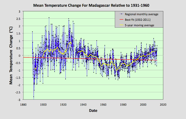
Fig. 77.6: The temperature trend for Madagascar if data before 1955 from Fig. 77.3 is combined with data after 1st January 1955 from Fig. 77.4. The best fit is applied to the monthly mean data from 1932 to 2011 and has a negative gradient of -0.15 ± 0.07 °C per century.
The MTA trend in Fig. 77.6 above differs markedly from both the official Berkeley Earth version (shown in Fig. 77.8 below) and the MTA trend for the Indian Ocean that was discussed in the previous post. A comparison of the 5-year moving averages for Madagascar and the Indian Ocean shows fairly good agreement from 1975 onwards but little before that (see Fig. 77.7 below). Even so, the level of agreement between the two data sets seen after 1975 is still not comparable to that seen for temperature trends of neighbouring countries in central Europe as demonstrated in Post 57 despite Madagascar being surrounded by most of the islands whose temperature data its data is being compared with.
Fig. 77.7: A comparison of the 5-year moving average MTA trends for Madagascar and the Indian Ocean.
A comparison of the MTA trend in Fig. 77.6 with the official Berkeley Earth (BE) regional trend shows a similar disparity between temperature data before 1975 and the data after (see Fig. 77.8 below). While the behaviour of the two trends is again similar after 1975, before this point they diverge markedly.
Fig. 77.8: The temperature trend for Madagascar since 1750 according to Berkeley Earth.
Just as I have shown in previous posts, it is possible to construct a temperature profile that is very similar to the official BE regional trend in Fig. 77.8 simply by averaging the adjusted anomaly data from each station. This data is easy to find as it is recorded alongside the raw temperature data in each BE station data file on the BE website. If we perform this average for the stations in Madagascar we obtain the temperature trend shown below in Fig. 77.9.
What is noticeable is how well the curves in Fig. 77.9 agree with those in Fig. 77.8. As I have pointed out many times before, Berkeley Earth use gridding and homogenization in their averaging, yet omitting these techniques appears to produce very similar results. The condition for this to happen, is of course the usually one, namely, the weather stations need to be fairly evenly distributed. But as Fig. 77.2 shows, in Madagascar, as in most other places, on a local level they are.
Fig. 77.9: Temperature trends for Madagascar based on Berkeley Earth adjusted data. The average is for anomalies from all stations with over 300 months of data. The best fit linear trend line (in red) is for the period 1911-2010 and has a gradient of +1.07 ± 0.03°C/century.
The difference between the Berkeley Earth (BE) trend in Fig. 77.9 and the MTA trend based on the raw unadjusted data in Fig. 77.6 is shown in Fig. 77.10 below. It shows that the adjustments made by BE to the temperature data reduced the temperature values of all the data from before 1930 by about 0.8°C, but more significantly added 1.48°C per century of warming between about 1930 and 1980, thus completely reversing the direction of the temperature trend in that time interval. The result is that the parabolic trend seen in Fig. 77.6 is turned into the almost linear trend shown in Fig. 77.9. This completely changes the nature of the trend.

Fig. 77.10: The contribution of Berkeley Earth (BE) adjustments to the anomaly data in Fig. 77.9 after smoothing with a 12-month moving average. The blue curve represents the total BE adjustments including those from homogenization. The linear best fit (red line) to these adjustments for the period 1933-1977 has a positive gradient of +1.48 ± 0.03 °C per century. The orange curve shows the contribution just from breakpoint adjustments.
Summary
There is clearly strong warming of almost 1°C in Madagascar after 1980 (see Fig. 77.6 and Fig. 77.4). This conclusion is supported by data from up to fifteen different weather stations (see Fig. 77.5).
Between 1930 and 1980 there appears to be equally strong cooling occurring (see Fig. 77.6 and Fig. 77.3). This trend is seen in all of the seven different weather stations with data in this period (see Fig. 77.5).
The overall land temperature in Madagascar before 1930 is not known with any precision due to the lack of data. Only one station (Antananarivo, Berkeley Earth ID: 156627) has significant data before 1930, but four others have fragments (see Fig. 77.5) that may partially support the trend seen for Antananarivo in Fig. 77.1.
It appears that the warming seen in Madagascar after 1980 is just a part of a natural temperature variability. It cannot be attributed to global warming without more data.
Acronyms
BE = Berkeley Earth.
MRT = monthly reference temperature (see Post 47).
MTA = mean temperature anomaly.