Showing posts with label area weighting. Show all posts

Friday, August 20, 2021

75. Southern Asia - overall temperature trend STABLE to 1975

In my previous four blog posts I determined the temperature trends for India, Pakistan, Sri Lanka and Bangladesh using unadjusted temperature data. The number of stations used to calculate the mean temperature each month is shown in Fig. 75.1 below. In the first three cases no warming was detectable before 1975, and only a modest temperature increase of about 0.6°C thereafter. In the case of Bangladesh there was a continuous warming that amounted to less than 0.3°C. This is significantly different from the conventional narrative on global warming, and highlights the impact that temperature adjustments have on the warming trends published by most of the main climate groups. In almost all cases the affect of these adjustments is to increase the rate of warming in the final trend as most of the regional trends I have published on this blog have also illustrated. In this post I will combine the results for India, Pakistan, Sri Lanka and Bangladesh into a temperature trend for the region.
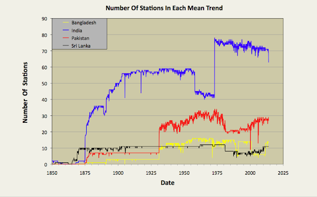

Fig. 75.1: The number of station records included each month in the mean temperature anomaly for each of four countries in South Asia.


In Post 70 I performed a similar task for data from the different countries in South-East Asia using two separate methods. One method just involved a simple average of temperature anomalies from all the different stations in the region, while the second used a weighting process that was used to average the mean anomalies for the different countries based on their land areas. If all the countries have similar densities of stations, then both methods should yield the same result. In the case of South-East Asia that was broadly the case for most countries other than Burma, but the differences in the two methods still led to a difference in the temperature trend gradients of almost 0.1°C per century. In the case of South Asia there are large differences in station density between countries, and these differences can also change over time, as shown in Fig. 75.2 below. For this reason, in this post I have chosen to adopt the area weighted method to determine the regional temperature trend.


Fig. 75.2: The station density each month for each of four countries in South Asia.


By comparing Fig. 75.1 and Fig. 75.2 it can be seen that India clearly has the most sets of station data, but it is Sri Lanka that has the highest density of stations. However, the temperature anomaly for Sri Lanka will also be subject to greater uncertainty as it is based on only a handful of stations (eleven at most). Then again, the contribution of the Sri Lanka stations to the final regional trend will be small due to the much smaller area of Sri Lanka compared to both India and Pakistan.


Fig. 75.3: The temperature trend for South Asia based on an average of anomalies from all long and medium stations. The best fit is applied to the monthly mean data from 1876 to 1975 and has a positive gradient of +0.19 ± 0.06 °C per century. The monthly temperature changes are defined relative to the 1951-1980 monthly averages.


Applying an area weighted approach to the calculation results in the temperature anomaly time series shown in Fig. 75.3 above. This is calculated by multiplying the mean anomaly data for each country (e.g. the monthly data in Fig. 74.2 for Bangladesh) by the area of that country, and then summing the resulting products for all four countries in the region. Then the result is divided by the total area of the four countries.

Like the equivalent anomaly time series for the individual countries, the regional anomaly exhibits very little warming before 1975 with about 0.5°C of warming occurring thereafter (see Fig. 75.3). To reiterate, this is the result that we get when we use the actual raw unadjusted temperature data for each station and not the adjusted/homogenized data that is generally favoured by climate scientists.


Fig. 75.4: Temperature trends for South Asia based on an average of Berkeley Earth adjusted data from all long and medium stations. The best fit linear trend line (in red) is for the period 1876-2005 and has a gradient of +0.66 ± 0.02°C/century.


If, however, we perform the same calculation with adjusted data (which is available in the same data file as the unadjusted data on the Berkeley Earth site) we get a quite different result as is shown in Fig. 75.4 above. There is now a strong and continuous warming trend from 1875 onwards. The total warming is claimed to be 1.25°C, with 0.5°C of this occurring before 1975 (see 10-year average in Fig. 75.4). This is still less than that claimed by Berkeley Earth and shown in Fig. 75.5 below. However, this is likely to be because Berkeley Earth included both Iran and Afghanistan in the Southern Asia region, and according to Berkeley Earth the regional temperature trends for both Iran and Afghanistan exhibit over 1.5°C of warming after 1970. That would help to explain the larger temperature rise post-1970 seen in Fig. 75.5 (almost 1°C) than is seen in Fig. 75.4 (only 0.7°C). What is harder to explain is why there is so much warming before 1900 in Fig. 75.5 when there is a) so little data with almost all being due to one or two stations in India, and b) very little increase in atmospheric carbon dioxide levels to cause such a temperature increase.


Fig. 75.5: The temperature trend for South Asia since 1790 according to Berkeley Earth.


Finally, if we compare the temperature trends for the four countries of South Asia we see that while there are broad similarities in their general trends over timescales of decades, there is only moderate correlation of more short term features and fluctuations (see fig. 75.6 below). The main reason for this is distance. The principal cities of Bangladesh (Dhaka), Sri Lanka (Colombo) and Pakistan (Karachi) are all at least 2000 km apart. As I demonstrated in Post 11, temperature anomaly time series from stations that are more than 1500 km apart are very poorly correlated as Fig. 11.2(a) in that post illustrates.


Fig. 75.6: A comparison of the temperature trends of Bangladesh, Pakistan and Sri Lanka with that of neighbour India. For clarity the trends for Pakistan and Bangladesh are offset by +1°C and -1°C respectively.


Summary

The temperature trend for Southern Asia shows no warming before 1975 and only about 0.5°C thereafter (see Fig. 75.3).

The trend based on Berkeley Earth adjusted data shows significantly more warming (about 1.1°C in total), including significant warming (about 0.5°C) before 1975 (see Fig. 75.4).


Wednesday, June 30, 2021

70. South-East Asia - overall temperature trend PARABOLIC

In my previous post I calculated the temperature trends for most of the countries in South-East Asia. This region comprises the countries of modern Indochina (Burma, Thailand, Malaysia, Laos, Cambodia and Vietnam) as well as Singapore and the Philippines. Unlike Berkeley Earth, I have not included Indonesia in this regional analysis, primarily because it is located mainly in the Southern Hemisphere. Instead I discussed the temperature trends of Indonesia separately in Post 31. There was no warming there except in the capital, Jakarta.

In Post 69 I showed that there has been almost no warming in Thailand, Malaysia, Vietnam or the Philippines either since 1900, with none is Burma (Myanmar) before 1980 (in fact the climate cooled by about 0.2°C) and perhaps about 1°C of warming since. Both Cambodia and Laos were excluded from the analysis in Post 69 because of their lack of data. In this post I will present calculations for the overall temperature trend of the entire region of South-East Asia. These will involve averaging all the long and medium individual temperature records from the region, but there are many ways to do this. I shall discuss the two most obvious methods.


Fig. 70.1: The (approximate) locations of the long and medium temperature records in South-East Asia. Those stations with a high warming trend are marked in red while those with cooling or stable trends are marked in blue. Those denoted with squares are long stations with over 1200 months of data.


The first method is a simple average of all the individual temperature time series from the various stations across the region. This will give a good approximation to the true regional trend if the stations are evenly distributed and if they have the same reference period for the monthly reference temperatures (MRTs). The map in Fig. 70.1 above suggests that the geographical spread of stations is fairly even, but with significantly fewer stations in Burma and Vietnam than in Malaysia, Thailand and the Philippines. It can also be seen from Fig. 70.1 that most of the stations in Malaysia and Vietnam are near the coast.


Fig. 70.2: The temperature trend for South-East Asia based on an average of anomalies from all long and medium stations. The best fit is applied to the monthly mean data from 1888 to 2007 and has a positive gradient of +0.09 ± 0.03 °C per century. The monthly temperature changes are defined relative to the 1961-1990 monthly averages.


The result of the employing the simple average method is shown in Fig. 70.2 above. The overall trend exhibits a gentle cooling of about 0.3°C for the 100 years before 1980, and a slight warming of 0.4°C since. Overall, the trend appears fairly stable with current temperatures not noticeably higher than in 1900.


Fig. 70.3: The temperature trend for South-East Asia based on an area weighted average of trends from all countries. The best fit is applied to the monthly mean data from 1888 to 2007 and has a positive gradient of +0.17 ± 0.03 °C per century. The monthly temperature changes are defined relative to the 1961-1990 monthly averages.


The second method for combining the data is to average the trends for the different countries, but to also weight each country's contribution in proportion to its area. These individual country trends are shown in the previous post. The advantage of this method is that it corrects for any bias due to differences in station density between countries. The disadvantage is that large countries with low station densities can introduce large errors due to their bigger area and less reliable national trend. 

The result obtained using this method is shown in Fig. 70.3 above. It can be seen that the main difference from Fig. 70.2 occurs after 1980 where the recent warming is larger and close to 0.6°C. This difference is primarily due to the larger contribution from the trend for Burma. The overall trend is, though, still much less than that claimed by mainstream climate science.


Fig. 70.4: Temperature trends for South-East Asia based on an average of Berkeley Earth adjusted data from all long and medium stations. The best fit linear trend line (in red) is for the period 1891-2010 and has a gradient of +0.83 ± 0.02°C/century.


If we compare these results with those derived using Berkeley Earth (BE) adjusted data, the difference is profound. A simple average of BE adjusted data yields the curve in Fig. 70.4 above. It is unrecognizable from the curve in Fig. 70.2, but perhaps not unsurprisingly, follows the official IPCC global trend very closely. The warming is over 1°C, and it is continuous except for a hiatus in the 1940s and 1950s.


Fig. 70.5: Temperature trends for South-East Asia based on an area weighted average of Berkeley Earth adjusted data. The best fit linear trend line (in red) is for the period 1891-2010 and has a gradient of +0.80 ± 0.02°C/century.


Nor does the weighted area average method fare any better for BE adjusted data, as Fig. 70.5 above shows. In fact the curves are almost indistinguishable from their equivalents in Fig. 70.4. This is probably because the station density remains fairly constant across the region as Fig. 70.1 shows. So, irrespective of the method, the BE adjusted data claims a warming of over 1°C for the region, while the raw data in Fig. 70.2 and Fig. 70.3 tells a completely different tale.


Fig. 70.6: The temperature trend for South-East Asia since 1840 according to Berkeley Earth.


Finally, we can compare these results with the trends published by Berkeley Earth. These are shown in Fig. 70.6 above. It is pretty clear that both the 12-month and 10-year moving averages shown in Fig. 70.6 are in close agreement with their counterparts in both Fig. 70.4 and Fig. 70.5. This is despite the Berkeley Earth trends in Fig. 70.6 also incorporating data from Indonesia. Overall, the Fig. 70.6 curves are probably marginally closer to those in Fig. 70.5 than those in Fig. 70.4. This is not surprising as the area weighting method employed for Fig. 70.5 is closer in methodology to the homogenization methods used by Berkeley Earth and other climate groups than is the simple average method.


Conclusions

The regional temperature trends based on the raw data show little or no warming in the region over the last 100 years.

In contrast the adjusted data adds almost 1°C of warming over the last 100 years, primarily due to those adjustments. Without the adjustment there is no significant warming.


Thursday, July 30, 2020

26. The temperature trend in Australia since 1853 - PARABOLIC

In Posts 18-24 I calculated the temperature trend for each Australian state using all the available instrumental temperature records with more than 40 years of data, and then compared the results with those claimed by Berkeley Earth. These results were summarized in my last post.

The overall picture, based on the actual raw data, was that most states had experienced significant warming since 1980 but that the current temperatures were generally the same as those seen in 1880 or earlier. In most cases, the temperature records exhibited large swings in temperature between 1890 and 2000, typically a large decline in temperature up to 1950 and then a recovery; only Queensland exhibited a temperature trend that was anything like that advanced by the IPCC in their global instrumental temperature record, but Queensland has no data before 1887. And only in the case of Queensland did the temperature construction using the raw data qualitatively agree with the equivalent Berkeley Earth version. In the case of all other states the two sets of data (i.e. the one based on raw anomalies and the Berkeley Earth adjusted anomaly version) diverged significantly the further back in time before 1950 that you look, and generally the divergence was even greater in the 19th century.

What also became abundantly clear was that due to the large fluctuations seen over time intervals of more than 50 years, only temperature records that are at least 150 years in length allow the observer to put those fluctuations into their true context and to draw any meaningful conclusions. The temperature record is not as most climate scientists and the IPCC appear to claim: namely stable and constant before 1900 and exponentially rising thereafter. What has become clear to me is that the data is largely random but on multiple timescales. There are short-term fluctuations in the monthly means of up to ±5 °C, and long-term fluctuations on timescales of many decades or centuries that are often in excess of ±0.5 °C. In previous posts (see Post 9 and Post 17 in particular) I have speculated on the nature of these fluctuations, their scaling properties and whether they are fractal in nature.

In this post I will complete the analysis for Australia by using the regional temperature trends for each state to construct an average for the whole of Australia. The method will be straightforward: to weight each state's overall trend by the area of that state relative to that of the total area of Australia. Based on this methodology the weightings for each state are as follows:

NSW
Victoria
Tasmania
South Australia
Western Australia
Northern Territory
Queensland
     
0.1004
0.0284
0.0085
0.1229
0.3306
0.1776
0.2316

In addition, the trend from each state is renormalized with a fixed temperature offset in order to ensure that the mean anomaly of each state for the period 1961-1990 is zero. After the scaling by weighting and the renormalization, the contributions from each state are added. The resulting trend in the monthly mean temperature for the whole of Australia is shown below in Fig. 26.1 together with the 5-year moving average. As a result of the offsetting process, the temperature changes in Fig. 26.1 are all defined relative to the 1961-1990 average.


Fig. 26.1: The temperature trend for Australia since 1853. The best fit is applied to the interval 1871-2010 and has a gradient of 0.24 ± 0.04 °C per century. The temperature changes are relative to the 1961-1990 average.


The data in Fig. 26.1 shows that the five year average of the regional temperature for Australia, relative to the average for 1961-1990, decreased from a peak of +0.37 °C in 1879 to a minimum of -0.46 °C in 1909. It then recovered from a low of -0.38 °C in 1948 to reach another peak of +0.47 °C in 2007. So while it is true that temperatures rose by 0.85 °C from 1948 to 2007, it is also true that there was an almost equal but opposite fall of -0.75 °C during the 70 years prior to 1948. So, when put into context, the temperature rise since 1948 does not appear that cataclysmic. Yet when you look at the Berkeley Earth adjusted data for the same period, the picture is very different.


Fig. 26.2: The temperature trend for Australia since 1853 based on Berkeley Earth adjusted temperature data. The best fit is applied to the interval 1951-2008 and has a gradient of 1.51 ± 0.06 °C per century. The temperature changes are relative to the 1961-1990 average.


Fig. 26.2 shows the result of the same averaging process for the temperature anomalies in Australia as previously outlined for the data in Fig. 26.1. The only difference is that Fig. 26.2 uses Berkeley Earth adjusted anomaly data, and Fig. 26.1 uses the original data with the correct anomalies calculated for each station. Yet the two datasets look completely different. Whereas the raw data in Fig. 26.1 combines to form a U-shaped curve or parabola, the adjusted data forms a highly asymmetric curve, with little or no change in temperature before 1950 and a steep rise afterwards. That rise has a gradient of 1.51 ± 0.06 °C per century, which equates to a total rise from 1951 to 2008 of 0.88 °C. This is similar to that seen in Fig. 26.1 for the same time period, but without the preceding decline in temperature. However, while the adjusted data in Fig. 26.2 differs significantly from the raw data in Fig. 26.1, it agrees quite well with the trend published by Berkeley Earth and shown below in Fig. 26.3.


Fig. 26.3: The temperature trend for Australia since 1840 according to the Berkeley Earth website.


I believe that the level of agreement between the 12-month and 10-year moving average curves in Fig. 26.3 with those in Fig. 26.2 validates my approach, and therefore also validates the data in Fig. 26.1. The other point to note about the data in Fig. 26.1 is the gradient of the best fit line. This is 0.24 ± 0.04 °C per century and therefore equates to a total temperature rise of about 0.34 °C from 1871 to 2010. This is far more than the actual change of about 0.10 °C and illustrates the caution that needs to be applied to linear trends that are applied to non-linear data. 


Fig. 26.4: A comparison of the actual ten year average temperature trend for Australia since 1853 and the Berkeley Earth adjusted temperature version. The best fit is applied to the actual raw data over the interval 1859-2008 and has a gradient of 0.184 ± 0.056 °C per century. The temperature changes are defined relative to the 1991-2000 average.


If we contrast the raw data in Fig. 26.1 with the adjusted data in Fig. 26.2 by comparing the 10-year moving average of each (see Fig. 26.4 above) we see that after 1980 there is relatively close agreement between the two. However, as we go back in time before 1980, we see the curves diverge. If we compare the temperature change from 1880 to 2008 in each case, we see that the raw data shows evidence of a rise of only about 0.2 °C, while for the adjusted data the rise is over 0.6 °C. This difference is principally due to adjustments made by Berkeley Earth to the data. These adjustments are shown below in Fig. 26.5.


Fig. 26.5: The contribution of Berkeley Earth adjustments to the anomaly data after smoothing with a 12-month moving average. The linear best fit to the data is for the period 1901-2010 (red line) and the gradient is +0.295 ± 0.016 °C per century. The orange curve represents the contribution made to the blue adjustment curve by breakpoint adjustments only.


The total adjustments in Fig. 26.5 (blue curve) were determined by subtracting the raw monthly data in Fig. 26.1 from the equivalent curve for the sum of the adjusted data. The data was then smoothed with a 12-month moving average which removed over 90% of the noise. The breakpoint adjustment curve in Fig. 26.5 (the orange curve) is just the weighted sum of the breakpoint adjustment curves from the different states (see Posts 18-24). The breakpoints adjustments are determined from the Berkeley Earth station data by subtracting the Berkeley Earth raw anomaly (which is different from my raw anomaly because it uses homogenization) from the Berkeley Earth adjusted anomaly.

The curves in Fig. 26.5 above indicate that summing the Berkeley Earth adjustments to the anomaly data results in a curve that has a trend of gradient +0.295 ± 0.016 °C per century for the period 1901-2010. This in turn amounts to a contribution of over 0.4 °C between 1870 and 2010 as the same trend appears to extend back until at least 1870.


Concluding points

1) According to the raw data (shown in Fig. 26.1), temperatures in Australia may have risen by up to 0.8 °C over the last 60 years, but if so, they are still, at worst, no more than about 0.2 °C above some of the peak values seen in previous centuries. In all likelihood, the temperature rise is probably even less (the data in Fig. 26.1 suggests it may be less than 0.1 °C). Unfortunately a lack of data prior to 1853 precludes any more definitive conclusions than this.

2) The large changes in mean temperature seen over time in the instrumental temperature record for Australia appear to be natural and reversible, and therefore probably occur on a regular basis.

3) The adjustments made to individual temperature records through a combination of breakpoints and homogenization by Berkeley Earth do not appear to completely cancel when multiple station records are averaged. The analysis above suggests that such adjustments could actually add more than 0.4 °C to the warming trend for Australia, which would be more than double the amount that could be attributed to the raw data, as noted in Point 1 above.