Showing posts with label Central America. Show all posts

Thursday, March 24, 2022

100. List of completed temperature analyses by country


As this is my 100th post on this blog I thought it would be a good moment to summarize the results that have emerged from the temperature data I have analysed so far. Below is a list of all the countries and regions that I have investigated to date with links to the relevant post. This amounts to about 60 countries, states and territories in total, which is roughly one third of all the countries in the world. 

The main areas that so far remain to be studied are the Arctic, Canada, Russia, UK, Scandinavia, Mediterranean, North Africa, Middle East, China and Japan. In the Southern Hemisphere only Brazil, Venezuela, Guyana, Suriname, French Guiana and the South Atlantic remain. However, most of these Southern Hemisphere regions are already included in the analysis of South America in Post 35.


Europe

Europe has the longest temperature records available with several in Germany, Sweden and the Netherlands stretching back to the early 18th century. The average of the 109 longest records yields a mean temperature anomaly (MTA) that shows a small but continuous warming of about 0.1°C per century for over 200 years until 1988. Then the temperature jumps suddenly by over 1°C. The reason for this jump is unclear. It is certainly not related directly to carbon dioxide emissions. The only countries that appear to have strong warming trends are the Benelux countries, Denmark and Switzerland. The Baltic states and most of central Europe appear to cool before 1980 and then warm suddenly.

109 longest station records (Post 44)

Austria (Post 55)

Baltic States (Post 51)

Belgium and Luxembourg (Post 40)

Central Europe average (Post 57)

Czechoslovakia (Post 53)

Denmark (Post 48)

Germany (Post 49)

Hungary (Post 54)

Netherlands (Post 41)

Poland (Post 50)

Switzerland (Post 56)


USA

The USA may not have any temperature records that are as long as the longest that Europe can boast, but its temperature data from 1850 onwards is the best there is. Virtually every state has over 100 station records with over 50 years of data and over 50 records with over 100 years of data. An average of the 400 longest temperature records appears to indicate that the climate warmed by more than 2°C from 1780 to 1920 when carbon dioxide levels barely increased, and then cooled by over 0.5°C when carbon dioxide levels took off. The early warming cannot therefore be due to CO2 and is therefore generally attributed to urbanization and deforestation in the north and east. The cooling seen after 1920 is also seen in most southern states like Louisiana, Mississippi and Texas.

400 longest station records (Post 66)

Louisiana (Post 97)

Mississippi (Post 99)

Texas (Post 52)


Central America

The temperature data for Central America can basically be split between Mexico and the rest, however, even then there are more than four times as many stations in Mexico as there are in the rest of Central America. The picture in Mexico is also complicated by the stations there falling into two distinct types from two different sources. On balance it is likely that the overall climate was stable until 1980 and then warmed over the following twenty years by about 1°C.

Mexico (Post 93)

Rest of Central America (Post 94)


South America

Of the countries in South America studied so far, only Argentina (0.6°C), Ecuador (1°C) and Uruguay (1°C) show significant warming, although the Ecuador data is far from reliable. In Paraguay and Chile the climate has cooled while in most other countries it has remained stable. The average of all medium and long stations in South America yields a warming of about 0.5°C since 1900.

All long and medium stations (Post 35)

Argentina (Post 61)

Bolivia (Post 58)

Chile (Post 62)

Colombia (Post 95)

Ecuador (Post 96)

Paraguay (Post 59)

Peru (Post 63)

Uruguay (Post 60)


Asia

My analysis so far of temperatures in Asia has focused on the countries of Indochina and the Indian subcontinent. The overall temperature trend for Indochina is one of cooling before 1980 and warming thereafter. The result is that temperatures in 2010 are barely any higher than they were in 1890. This is also reflected in the individual temperature records of Burma, Malaysia and Vietnam, while those of the Philippines and Thailand remain stable from 1920 onwards. In India and Pakistan there is little warming before 1990 and then a sudden jump in temperatures of about 0.5°C in the mid-1990s. For Sri Lanka the jump in temperature occurs in 1978 while Bangladesh sees a continuous warming of only 0.3°C per century. 

Bangladesh (Post 74)

Burma/Myanmar (Post 69)

India including Nepal (Post 71)

Indian subcontinent (Post 75)

Indochina (Post 70)

Malaysia and Singapore (Post 69)

Pakistan (Post 72)

Philippines (Post 69)

Sri Lanka (Post 73)

Thailand (Post 69)

Vietnam (Post 69)


Africa

Most of southern Africa has exhibited some significant warming of over 1°C since 1980 but the overall picture before 1980 is varied. Angola, Mozambique and South Africa show no warming before 1980 while Malawi, Zambia, Zimbabwe and Madagascar all cool significantly by as much as they later warm. The data for Namibia and Botswana is not great but may indicate a slight warming before 1980 as well as much larger warming thereafter. Of all the countries listed below, Madagascar, Mozambique, South Africa and Zimbabwe have the best quality data and none of these countries appear to exhibit any warming before 1980.

Angola (Post 82)

Botswana (Post 38)

Madagascar (Post 77)

Mozambique (Post 78)

Namibia (Post 39)

South Africa including Lesotho and Eswatini/Swaziland (Post 37)

Zambia and Malawi (Post 81)

Zimbabwe (Post 79)


Australia

Analysis of temperature data for Australia indicates that the mean temperature trend is parabolic with the climate cooling from 1875 to 1960 and then warming. Overall temperatures in 2010 are only about 0.1-0.2°C warmer than in 1875 with temperatures having increased by about 0.5°C since 1960. This pattern in seen in most states such as South Australia, New South Wales and Victoria. It is harder to be conclusive for Tasmania and Western Australia due to a lack of data before 1900 while the trend in Northern Territory is one of consistent cooling. Only Queensland shows constant warming of about 1°C since 1990.

Australia (Post 26)

New South Wales and ACT (Post 18)

Northern Territory (Post 23)

Queensland (Post 24)

South Australia (Post 21)

Tasmania (Post 20)

Victoria (Post 19)

Western Australia (Post 22)


Oceania

Most of the countries and regions of Oceania show little of no warming. In Antarctica the only warming is found around the peninsula. New Zealand cools slightly from 1860 until 1960 then warms by about 0.5°C, rather like much of Australia. Yet despite this, temperatures in 2010 are barely above those in 1860. In Indonesia only the capital city Jakarta shows any strong warming but the average temperature for the country remains stable, although data quality and quantity before 1960 is poor. This is also true for Papua New Guinea where there is some evidence of warming after 1960 by about 0.5°C. In the South Pacific there is a contrast between east and west with the eastern half cooling significantly while the west cools slightly until 1970 before warming again by about 0.5°C. In fact of all the regions listed below, only the Indian Ocean shows significant warming of about 1°C.

Antarctica (Post 30)

Indian Ocean (Post 76)

Indonesia (Post 31)

New Zealand (Post 8)

Papua New Guinea (Post 32)

South Pacific Islands - East (Post 34)

South Pacific Islands - West (Post 33)


Southern Hemisphere

An average of the temperature anomalies from the 1000 longest records in the Southern Hemisphere shows a slight cooling of about 0.1°C until 1975 followed by a modest warming of only about 0.6°C.

Southern Hemisphere station average (Post 64)


Wednesday, February 23, 2022

94. Central America - temperature trends STABLE before 1980

In this post I will study the extent of climate change in Central America. I have already discussed the trend for Mexico in the previous post where the conclusions were ambiguous. The warming that was seen in the mean temperature anomaly (MTA) could have been more than 1°C since 1900 (see Fig. 93.7), but could equally have been close to zero or even negative (see Fig. 93.6) depending on which partial dataset was used. The compromise was an estimate of about 0.6°C of warming (see Fig. 93.1).

But at least Mexico had over 130 significant temperature records on which to base these conclusions. The rest of Central America (Belize, Guatemala, El Salvador, Honduras, Nicaragua, Costa Rica and Panama) in contrast has less than forty. For this reason I have combined the analysis for these seven countries into a single post.


Fig. 94.1: The (approximate) locations of the weather stations in Central America. Those stations with a high warming trend between 1911 and 2010 are marked in red while those with a cooling or stable trend are marked in blue. Those denoted with squares are stations with over 600 months of data, while diamonds denote stations with more than 360 months of data.


In total the seven countries being considered here have only 32 medium stations with over 480 months of data before 2013 (see here for a list) and none with more than 900 months of data, although there are 19 with over 600 months of data. There are an additional ten stations with over 360 months of data. The location of these stations are shown on the map in Fig. 94.1 above. It is immediately clear that there is far from an even distribution of these stations across the region with much of Guatemala, Nicaragua and Panama having little coverage.

The other complication is that the stations in the region do not all have data for the same time period. Only about five stations have a significant amount of temperature data before 1950 and none of these have any data after 1980, whereas about eleven stations have no data before 1970. That makes it difficult to combine both into a single trend because these two sets of stations require different 30-year reference time periods against which to measure the temperature change.


Fig. 94.2: The mean temperature change for Central America relative to the 1951-1980 monthly averages. The best fit is applied to the monthly mean data from 1921 to 1975 and has a positive gradient of +0.28 ± 0.11 °C per century.


One solution is to calculate different monthly reference temperatures (MRTs) for each set. This is what I have done in Fig. 94.2 above and Fig. 94.3 below. The results are broadly the same but have significant differences.

In Fig. 94.2 the MRTs were calculated for the 30-year period from 1951 to 1980. The temperature anomalies for each station were determined by calculating the twelve monthly reference temperatures (MRTs) for each station using the method described previously in Post 47. The MRTs for each station were then subtracted from that station's raw temperature data to produce the anomalies for that station. These were then averaged to obtain the mean temperature anomaly (MTA) for each month. 

The results in Fig. 94.2 indicate that there was little or no temperature rise in the region before 1975, but a significant rise of about 1°C spread over the following twenty years. The mean temperature then seems to plateau for twenty years.


Fig. 94.3: The mean temperature change for Central America relative to the 1971-2000 monthly averages. The best fit is applied to the monthly mean data from 1917 to 1975 and has a negative gradient of -0.18 ± 0.11 °C per century.


A similar picture is seen for the data in Fig. 94.3 where the MRT period was defined to be from 1971 to 2000. The main differences are that the temperature trend before 1975 is now negative, and the temperature rise thereafter is slightly less, being about 0.8°C rather than about 1.2°C. So which of these two data interpretations are more likely to be correct? The answer depends on which graph has the better data.


Fig. 94.4: The number of station records included each month in the mean temperature anomaly (MTA) trend for Central America in Fig. 94.2 (blue curve) and Fig. 94.3 (red curve).


The graph in Fig. 94.4 above shows the number of stations used to determine the MTA each month for both Fig. 94.2 and Fig. 94.3. It indicates that Fig. 94.3 has the greater amount of data after 1975 but not before. This suggests that the temperature trend before 1975 resembled that in Fig. 94.2 and was therefore stable. After 1975 the temperature rose, but not by as much as Fig. 94.2 suggests. It probably rose by about 0.8°C in line with the data shown in Fig. 94.3.


Fig. 94.5: Temperature trends for Central America based on Berkeley Earth (BE) adjusted data. The average is for anomalies from all stations with over 240 months of data. The best fit linear trend line (in red) is for the period 1901-2010 and has a gradient of +0.83 ± 0.03°C/century.


Of course none of this corresponds to the trend produced by Berkeley Earth (BE), or even the trend that results from averaging the BE adjusted data. The latter is shown in Fig. 94.5 above. This graph is the result of averaging the anomaly data for each station after it has been adjusted using breakpoint alignment. As I have usually to be the case in previous country analyses, it differs markedly from the unadjusted data. It is also worth noting that the BE anomalies before breakpoint alignment already differ from anomalies derived solely from the raw station data because Berkeley Earth appears to use homogenization, Kriging and gridding in its process to determine the station anomalies. That is yet another reason for looking at the raw data instead.

What is apparent is that the trend shown in Fig. 94.5 above differs considerably from the official Berkeley Earth temperature trend for the region that I have reproduced in Fig. 94.6 below. That is because it the graph in Fig. 94.6 includes data from Mexico. In fact the curves in Fig. 94.6 are very similar to the equivalent graph for Mexico shown in Fig. 93.3 in Post 93. This is not surprising as the area of Mexico is four times the combined area of the seven countries being considered here.


Fig. 94.6: The temperature trend for the whole of Central America, including Mexico, since 1830 according to Berkeley Earth.


If we add the BE adjust data from Mexico (weighted 79% for its area) to the data in Fig. 94.5 the result is the graph shown in Fig. 94.7 below. As expected this agrees closely with Fig. 94.6 at least for data after 1920.


Fig. 94.7: Temperature trends for Central America including Mexico based on Berkeley Earth adjusted data. The best fit linear trend line (in red) is for the period 1911-2010 and has a gradient of +0.55 ± 0.02°C/century.


Summary and conclusions

1) There is no evidence of any meaningful rise in temperatures in Central America before 1975, even though the data is not great.

2) After 1975 the temperature appears to rise suddenly but gradually until 1995 and then plateau.

3) The maximum temperature rise after 1975 is about 1°C.


Acronyms

BE = Berkeley Earth.

MRT = monthly reference temperature (see Post 47).

MTA = mean temperature anomaly.

Link to list of all stations (including Mexico).


Friday, February 18, 2022

93. Mexico - temperature trends 0.6°C WARMING

Of all the countries in Central America only Mexico has a significant number of weather stations with over 40 years of data. In total it has 138 medium stations with over 480 months of data, and another four long stations with over 1200 months of data (see here for a list of all stations and links to all the original raw data). In total, at least fifteen stations have over 1000 months of data. In contrast, the other seven countries in the region have only 31 medium stations in total, none of which have more than 900 months of data. On the face of it this should mean that the temperature trend for Mexico should be easy to determine, but as with most things in climate science, it turns out it is not that simple.


Fig. 93.1: The mean temperature change for Mexico relative to the 1961-1990 monthly averages. The best fit is applied to the monthly mean data from 1898 to 1997 and has a positive gradient of +0.58 ± 0.06 °C per century.


The result of averaging the monthly temperature anomalies from all the 142 long and medium stations in Mexico results in the set of mean temperature anomalies (MTA) shown in Fig. 93.1 above. The anomalies for each station were determined by first calculating the twelve monthly reference temperatures (MRT) for each station. The method for calculating the MRTs, and then the anomalies for each station dataset has been described previously in Post 47. In this case the time interval used to determine the MRTs was 1961-1990 as almost all the 142 stations had at least 40% data coverage in this interval. The MRTs for each station were then subtracted from the station's raw temperature data to produce the anomalies for that station.

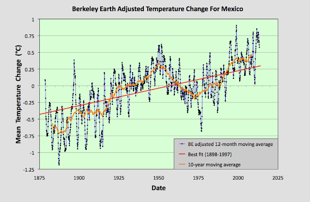
The MTA data in Fig. 93.1 clearly shows a positive temperature trend over time that equates to a warming of about 0.6°C over the last century. However, within this trend are fluctuations in the 5-year moving average (yellow curve) that are even greater than the overall rise in the trend (red curve). This behaviour is also seen in the Berkeley Earth adjusted data shown in Fig. 93.2 below.


Fig. 93.2: Temperature trends for Mexico based on Berkeley Earth adjusted data. The average is for anomalies from all stations with over 480 months of data. The best fit linear trend line (in red) is for the period 1898-1997 and has a gradient of +0.52 ± 0.03°C/century.


The Berkeley Earth (BE) data presented in Fig. 93.2 was generated using the same averaging process as that used for the data in Fig. 93.1 but using BE adjusted anomaly data. Usually this leads to a large difference in the temperature rise calculated using the unadjusted raw data (Fig. 93.1) from that using the BE adjusted data (Fig. 93.2). I have shown numerous examples in this blog over the last two years for many different countries, states and regions where this is the case, and it is one of my main reasons for doing this blog: to highlight the extent to which much of the original temperature data has been adjusted. 

In this instance, however, the adjustments made by Berkeley Earth (and there are many in most station datasets) appear to make little difference to the final outcome for the overall temperature trend. And this is not because the averaging process I use is different from the Berkeley Earth method. It is. I do not use any homogenization, Kriging or weighted coefficients for the different datasets in the averaging. Yet the temperature trend I derive from the BE adjusted data and present in Fig. 93.2 is virtually identical to the one published by Berkeley Earth and shown in Fig. 93.3 below. So once again the averaging process is not the issue.


Fig. 93.3: The temperature trend for Mexico since 1830 according to Berkeley Earth.


This all seems to suggest that the overall temperature trend for Mexico is as I have calculated in Fig. 93.1, and that this is broadly consistent with the Berkeley Earth version. But if we look at the data more closely we see a complication.


Fig. 93.4: The number of station records included each month in the mean temperature anomaly (MTA) trend for Mexico in Fig. 93.1 (blue curve). These stations can be sorted into two distinct groups. Those with five digit Berkeley Earth ID codes are shown in red, those with six digit IDs are in green.


The data files on the Berkeley Earth website for the stations in Mexico broadly fall into two distinct categories: those with 5-digit IDs and those with 6-digit ones. The different numbers appear to reflect the fact that the original data in each case comes from a different source database, with the 5-digit data files more likely to originate from a single source, usually the Global Historical Climatology Network (GHCN) of NOAA, and the 6-digit data files from multiple databases. The number of each of the two file types used to determine the MTA trend in Fig. 93.1 is shown in Fig. 93.4 above. 

Now ordinarily this difference in file source is not an issue. The same differentiation in ID numbers is seen for stations from many countries. The problem here is that these two sets of data files give wildly different results for the MTA trend of Mexico. This can be seen when we examine the temperature trends for each station individually as the map in Fig. 93.5 below illustrates.


Fig. 93.5: The (approximate) locations of the weather stations in Mexico. Those stations with a high warming trend between 1901 and 2000 are marked in red while those with a cooling or stable trend are marked in blue. Those denoted with squares are stations with a 6-digit Berkeley Earth ID, while diamonds denote stations with a 5-digit ID.


In Fig. 93.5 the geographical location in Mexico of each of the 142 weather stations with the longest temperature records used to determine the mean trend in Fig. 93.1 are plotted. Those in red have significant warming trends while those in blue are generally stable (the total temperature rise is either less than 0.25°C, or the trend is less than twice the error in the trend). In addition, the stations with 5-digit IDs are denoted by a diamond while those with a 6-digit ID are represented by a square. What is noticeable is the different split between warming and stable trends in each case.

In the case of stations with 6-digit IDs 73% (32 out of 44) have a warming trend, whereas for the stations with 5-digit IDs it is only 38% (37 out of 98). This difference is even more apparent if we calculate the mean temperature anomaly (MTA) for each set of stations separately.


Fig. 93.6: The mean temperature change for Mexico relative to the 1961-1990 monthly averages calculated using stations with a 5-digit Berkeley Earth ID. The best fit is applied to the monthly mean data from 1921 to 2010 and has a positive gradient of +0.14 ± 0.07 °C per century.


The MTA data in Fig. 93.6 above shows the mean temperature change for Mexico calculated using only anomaly data from stations with a 5-digit Berkeley Earth ID. The trend in this case is almost completely flat. In contrast, if the same exercise is performed using only anomaly data from stations with a 6-digit Berkeley Earth ID the result is a strong warming trend of over 1°C per century as shown in Fig. 93.7 below.


Fig. 93.7: The mean temperature change for Mexico relative to the 1961-1990 monthly averages calculated using stations with a 6-digit Berkeley Earth ID. The best fit is applied to the monthly mean data from 1898 to 1997 and has a positive gradient of +1.13 ± 0.06 °C per century.


All this means that it is difficult to conclusively assert what the degree of climate change in Mexico has been over the last century. The most reasonable estimate is that the mean temperature has risen by about 0.6°C (see Fig. 93.1 and Fig. 93.2), but it could be anywhere between 1.2°C (see Fig. 93.7) and 0°C (see Fig. 93.6).


Acronyms

BE = Berkeley Earth.

MRT = monthly reference temperature (see Post 47).

MTA = mean temperature anomaly.

List of all stations and links to all the original raw temperature data