Showing posts with label Malawi. Show all posts

Monday, December 6, 2021

84. Southern Africa - a summary of temperature trends

Over the last fifteen months I have analysed the temperature data for nine different countries in southern Africa and calculated their temperature trends. My analysis began in September 2020 with South Africa (Post 37) before continuing on to Botswana (Post 38) and Namibia (Post 39) in October. More recently I have examined the temperature records of Madagascar (Post 77), Mozambique (Post 78), Zimbabwe (Post 79), Zambia and Malawi (Post 81), and Angola (Post 82).

The one constant for all these countries is the temperature trend since 1980. In almost all cases the climate shows evidence of warming, with the temperature rise varying between 0.5°C and 1.5°C. Before 1980 the picture is different with little or no temperature rise being seen, and in many cases (e.g. Madagascar, Zimbabwe, Zambia and Malawi) a significant cooling taking place. These results are summarized in the graphs below.

The main conclusions to be drawn here are as follows.

  • All the warming in southern Africa has occurred since 1980.
  • There is probably no warming before 1980, and possibly some cooling.
  • The net warming since 1850 is likely to be between 0.5°C and 1.0°C. This is less than the IPCC global value of 1.3°C, and much less than the land-based Berkeley Earth average of almost 2.0°C (see Fig. 80.1 in Post 80).

In the New Year I will return to the African data and analyse the data from countries in sub-Saharan and equitorial countries. In the meantime I will return to considering the physics of the Greenhouse Effect that I introduced in Post 12 (black-body radiation) and Post 13 (Earth's energy budget). In particular I will look to answer two questions: why is Venus so hot, and why is Mars so cold?


Fig. 37.2: The mean temperature anomaly (MTA) for South Africa since 1840. The best fit is applied to the interval 1857-1976 and has a gradient of +0.017 ± 0.056 °C per century. The monthly temperature changes are relative to the 1961-1990 monthly averages.


Fig. 38.3: The mean temperature anomaly (MTA) for Botswana since 1917. The best fit is applied to the interval 1917-1976 and has a positive gradient of +0.72 ± 0.26 °C per century. The monthly temperature changes are defined relative to the 1961-1990 monthly averages.
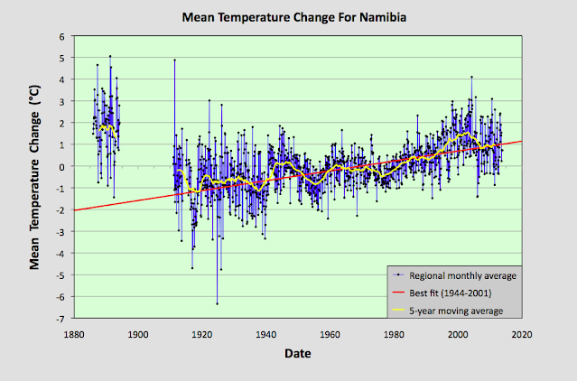


Fig. 39.8: The mean temperature anomaly (MTA) for Namibia since 1885. The best fit is applied to the interval 1944-2001 and has a positive gradient of +2.28 ± 0.17 °C per century. The monthly temperature changes are defined relative to the 1971-1990 monthly averages.


Fig. 77.6: The mean temperature anomaly (MTA) for Madagascar. The best fit is applied to the monthly mean data from 1932 to 2011 and has a negative gradient of -0.15 ± 0.07 °C per century.


Fig. 78.6: The mean temperature anomaly (MTA) relative to the 1931-1960 monthly averages for stations in Mozambique with over 300 months of data but excluding Lourenço Marques. The best fit is applied to the monthly mean data from 1921 to 1980 and has a positive gradient of +0.16 ± 0.12 °C per century.


Fig. 79.2: The mean temperature anomaly (MTA) for Zimbabwe relative to the 1971-2000 monthly averages based on an average of anomalies from stations with over 360 months of data. The best fit is applied to the monthly mean data from 1916 to 1975 and has a negative gradient of -0.96 ± 0.20 °C per century.


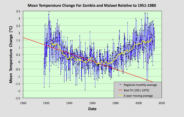
Fig. 81.2: The mean temperature anomaly (MTA) relative to the 1951-1980 monthly averages based on an average of anomalies from stations with over 360 months of data. The best fit is applied to the monthly mean data from 1921 to 1975 and has a negative gradient of -2.72 ± 0.17 °C per century.


Fig. 82.5: The mean temperature anomaly (MTA) for Angola relative to the 1951-1980 monthly averages based on an average of anomalies from stations with over 300 months of data. The best fit is applied to the monthly mean data from 1941 to 1980 and has a positive gradient of 0.18 ± 0.17 °C per century.


Thursday, November 18, 2021

81. Zambia and Malawi - temperature trends PARABOLIC

In the last few posts I have investigated the temperature trends from several countries in south-eastern Africa, and while the trends from each show certain similarities and consistencies (such as significant temperature rises after 1980), they also exhibit subtle differences. For example, the trend for Zimbabwe shows a slight cooling before 1980 (see Fig. 79.2 in Post 79) while the trend for Mozambique (see Fig. 78.6 in Post 78) does not. Meanwhile, the trend for Madagascar displays strong cooling before 1980 that is even greater than the warming that succeeds it (see Fig. 77.6 in Post 77). 

These discrepancies raise question about the reliability of all the trends, particularly the trends before 1940. However, these discrepancies can be almost totally reconciled when compared to the data from Zambia and Malawi. In short, the Zambia and Malawi data largely corroborates the cooling seen before 1980 in both the Madagascar data and the Zimbabwe data. It also suggests that the cooling in the Mozambique data is under-reported. probably due to a lack of data before 1930. The Zambia and Malawi data also suggests that there has been little, or no, net overall warming in the region since 1920, and that the climate has just undergone a natural oscillation in its mean temperature, albeit a rather large one of about 1.5°C.


Fig. 81.1: The (approximate) locations of the weather stations in Zambia and Malawi. Those stations with a high warming trend between 1901 and 2000 are marked in red while those with a cooling or stable trend are marked in blue.


The map in Fig. 81.1 above shows the distribution of weather stations in Zambia and Malawi. Overall there are sixteen stations with over 400 months of data but no long stations with over 1200 months of data. The average data length is 744 months (up to the end of 2013) with all but two of the stations being medium stations with over 480 months of data. Of these sixteen stations, only five are in Malawi (for a list see here) and the other eleven are in Zambia (for a list see here). This lack of station data, particularly for Malawi, was the main reason behind the decision to combine data from the two countries into a single mean temperature trend.

The monthly anomalies for each station were created in the usual manner, as outlined in Post 47. First a suitable thirty year interval was chosen for calculating the monthly reference temperatures (MRTs). In this case the period 1951-1980 was chosen as that corresponded to the interval that overlapped with the maximum number of station records. The twelve MRTs for each station dataset were calculated for each of the twelve months by averaging the monthly temperatures in the reference period for that station. The MRTs were then subtracted from all the data for that station to generate the anomalies. The anomalies from all the stations were then averaged to give the mean temperature anomaly (MTA) for the region in that month. Employing a simple average of the station data rather than using Kriging, homogenization and gridding is sufficiently accurate if the stations are fair evenly distributed, which the map in Fig. 81.1 suggests to be the case. The resulting mean temperature anomaly since 1918 is shown below in Fig. 81.2.


Fig. 81.2: The mean temperature anomaly (MTA) relative to the 1951-1980 monthly averages based on an average of anomalies from stations with over 360 months of data. The best fit is applied to the monthly mean data from 1921 to 1975 and has a negative gradient of -2.72 ± 0.17 °C per century.


What is striking about the change in the MTA shown in Fig. 81.2 is how different it looks to the widely advertised global warning trends, particularly before 1980 (see Fig. 80.1 for an example). It suggests that temperatures in 2010 were barely 0.3°C higher than they were in 1920, and yet in the intervening period the mean temperature varied wildly, dipping by up to 1.5°C before recovering.


Fig. 81.3: The number of station records included each month in the mean temperature anomaly (MTA) trend in Fig. 81.2.


It is also clear from the number of stations included in the MTA each month (see Fig. 81.3 above) that the early 20th century data is just as reliable as the data after 1990. So a lack of station data cannot explain the difference between the trends seen in the raw data as presented in Fig. 81.2 and those claimed by climate scientists.


Fig. 81.4: Temperature trends based on Berkeley Earth adjusted data. The average is for anomalies from all stations with over 360 months of data. The best fit linear trend line (in red) is for the period 1911-2010 and has a gradient of +0.87 ± 0.03°C/century.


Much of this difference is due to adjustments made to the data by climate scientists. Berkeley Earth (BE) include both the raw data and the adjusted anomaly data in their data files, so it is fairly straightforward to compare the two. Averaging the BE adjusted anomalies gives the data curve shown in Fig. 81.4 above. What is striking about this curve is how similar it is to the conventional global warming curve, and conversely how different it is to Fig. 81.2. It is also very similar to the BE published trend for Zambia as shown in Fig. 81.5 below.


Fig. 81.5: The temperature trend for Zambia since 1840 according to Berkeley Earth.


This discrepancy between the raw data and the BE adjusted data is not unique to data from Zambia and Malawi. As I have previously shown in numerous posts on this blog, it occurs in most of the data. Yet we are not allowed to question the statistical validity of these adjustments, despite mounting evidence that they may be flawed. And the magnitude of these adjustments is not insignificant. We can easily determine their magnitude simply by subtracting the MTA based on raw data (Fig. 81.2) from the equivalent due to adjusted data (Fig. 81.4). The result is the blue curve in Fig. 81.6 below. The orange curve is the contribution to the adjustments that comes solely from the breakpoint alignment where each station dataset is chopped into fragments, and those sections of data are then subjected to different biases. In addition there are other corrections to the blue curve that result from the gridding and homogenization processes that are used to generate anomaly datasets for each station, but these are generally less significant as Fig. 81.6 shows. 


Fig. 81.6: The contribution of Berkeley Earth (BE) adjustments to the anomaly data in Fig. 80.4 after smoothing with a 12-month moving average. The blue curve represents the total BE adjustments including those from homogenization. The orange curve shows the contribution just from breakpoint adjustments.


It can be seen from Fig. 81.6 that the net effect of the Berkeley Earth (BE) adjustments is to add between 0.25°C and 0.5°C of warming to the data between 1920 and 2010, while eliminating the parabolic dip in between, and replacing the trend with something that is more linear. This then increases the warming seen in the raw data between 1920 and 2010 from less than 0.3°C in Fig. 81.2 to more than 0.7°C in Fig. 81.4. The result is an adjusted temperature trend (Fig. 81.4) that bears no relation to the original data (Fig. 81.2).


Summary

Temperature changes in Zambia and Malawi over the last 100 years appear to owe more to natural variation than global warming.

The temperature trend is parabolic with an amplitude of about 1.5°C.

The maximum detectable warming since 1920 is 0.3°C. This is much less than the natural variation, and a long way short of the 2°C average claimed by climate scientists for global warming on land.


Acronyms

BE = Berkeley Earth.

MRT = monthly reference temperature (see Post 47).

MTA = mean temperature anomaly.