Showing posts with label natural temperature variations. Show all posts

Tuesday, December 13, 2022

144: Evidence against temperature adjustments #4 (British Isles)

In the previous four posts I examined the temperature changes for Ireland (see Post 140), Scotland (see Post 142), England (see Post 143) and Great Britain (see Post 141). While all four sets of temperature data appeared similar from 1900 onwards, there were some differences, and these differences were most apparent in a comparison of the earlier data for Ireland and Great Britain. When the Great Britain data was separated into different trends for Scotland and England a similar degree of difference was observed with the Scotland data appearing to correlate more closely with Ireland, and England with Great Britain. In this post I will look to show this pictorially by comparing the various trends directly.

First, if we compare the data for Ireland, Scotland and England with Great Britain we see that England shows the closest agreement after 1900 but Scotland shows the better agreement before 1840 (see Fig. 144.1 below). The data depicted here are the 5-year moving averages of the mean temperature anomalies (MTAs) for each country as shown by the yellow curves in Fig. 140.2, Fig. 141.2, Fig. 142.2 and Fig. 143.2 in previous posts.


Fig. 144.1: The 5-year average temperature trends since 1760 for Ireland, Scotland and England each compared to that of Great Britain. For clarity the trends for Ireland and England are offset by +2°C and -1.5°C respectively.


What is striking about the trends in Fig. 144.1 is how similar they all are after 1860, while the greatest disparities occur before 1860. The reason for this is evident from Fig. 144.2 below which shows that the number of stations used to calculate each of the MTA for Ireland, Scotland and England drops below five before 1870. From this we can conclude two things. First, this suggests that if there are too few stations used in determining the MTA the accuracy decreases. Secondly we see that when there are sufficient stations used to determine the MTA the accuracy is so good that there is little difference between the MTA for different neighbouring countries. 

This is not the first time such conclusions have been drawn. The same effects were seen in Post 138 (Evidence against temperature adjustments #3) comparing trends in the different Scandinavian countries and Post 57 (The case against temperature data adjustments #1) comparing them in various central European countries. In all cases the conclusion is the same. If trends for neighbouring countries agree, then they are likely to all be correct, not all equally incorrect. Therefore no adjustments to the temperature data are needed or justified. A similar result is also encountered when comparing random samples of stations from the same region as was shown for the USA in Post 67 (More evidence against temperature data adjustments #2). The reason for this is that averaging a sufficiently large number of independent data sets results in a reduction in the size of the errors imported from each. This is known as regression towards the mean.


Fig. 144.2: The number of station records included each month in the averaging for the mean temperature trends in Fig. 144.1.


The second comparison I have performed is to compare data for Ireland, Scotland and England with each other. This is shown in Fig. 144.3 below. Now we see that the two countries that agree most closely are Scotland and Ireland while the data for England appears to exhibit more warming after 1980 and before 1900. This additional warming could be in excess of 0.5°C since 1840.


Fig. 144.3: Comparisons of the 5-year average temperature trends since 1760 for England and Scotland (two top curves, both offset by +2°C), Scotland and Ireland (two middle curves), and Ireland and England (two bottom curves, both offset by -2°C).


Conclusions

Once again a comparison of temperature data for neighbouring countries indicates that most adjustments to the data are unnecessary as the averaging process will correct for most errors via regression towards the mean.

The data for Scotland and Ireland are in closest agreement, probably because both have similar population densities and are more rural.

The data for England is in closest agreement with that of Great Britain, probably because England is the largest country in Great Britain and so its stations will always make the dominant contribution compared to other countries such as Scotland or Wales. 

The greater warming seen in England (of over 0.5°C) is further evidence that warming within countries is driven not just by carbon dioxide levels in the atmosphere and the greenhouse effect, but by local energy consumption as well. So net-zero will not be a panacea.


Saturday, September 24, 2022

138: Evidence against temperature adjustments #3 (Scandinavia)

One of the main aims of this blog has been to investigate the extent to which the various datasets in the global temperature record have been adjusted and to ascertain both the impact of these adjustments and their validity. Most of the blog posts for individual countries or territories have sought to quantify the magnitude of these adjustments by calculating two versions of the mean temperature anomaly (MTA) for each region; one based on its raw unadjusted data and a second using Berkeley Earth adjusted data. Then the two are compared and the difference calculated. This difference is often considerable and often shows that the adjustments have increased the amount of reported warming. But I have also investigated the second issue, that of validity. One way to do this is to compare the MTA for neighbouring regions or different data samples from the same region. 

The rationale is as follows. If there are errors in the data that are sufficient to affect the MTA, then comparing MTAs from different samples from the same region, or samples from adjacent regions that would be expected to be almost identical, could highlight the errors. Of course any difference between MTAs from different regions does not prove that the data is wrong; it may be that the regions aren't as similar as one supposed. But if the data is virtually identical then that does suggest both that the temperature trends for the two samples or regions are behaving the same, and that any data errors in the temperature datasets (which are likely to be numerous) are not significant and so are not in need of correction or adjustment.

In Post 57 I used this approach to compare the temperature trends of neighbouring countries in central Europe (Germany, Czechoslovakia, Austria and Hungary). The results showed that if the MTA for a country was determined using data from more than about fifteen different station records then there was little difference between MTAs for different countries, and thus very little error in the MTA of each country. This is because of a property of statistics called regression towards the mean. This basically states that if any dataset contains errors in its measurements (which most data does), and those errors are random in their size and distribution (which they often are), then the errors will tend to cancel each other when you average the data. Moreover, the more data you average, the greater the cancellation of errors and so the more accurate will be the result. If errors don't cancel, then that is because the errors are systematic not random, so the process also helps to identify these as well.

In Post 67 I repeated this process for temperature data from the USA. In this case instead of comparing data from adjacent regions I compared different samples of one hundred stations from the same region: the entire contiguous United States. The result was the same as in Post 57 with each sample exhibiting an identical temperature trend over time with identical fluctuations in the 5-year moving average of the trend.

In this post I will repeat the country comparison of Post 57 but using the 5-year moving average of the temperature trend data from the four neighbouring Scandinavian countries of Norway, Sweden, Finland and Denmark. These trends were determined in Post 135, Post 136, Post 137 and Post 48 respectively. The results are shown in Fig. 139.1 below.


Fig. 138.1: A comparison of the 5-year average temperature trends since 1700 for Norway, Finland and Denmark compared to that of Sweden. The trends for Finland and Norway are offset by ±3°C for clarity.


In Fig. 139.1 I have compared the trends of Norway, Finland and Denmark with that of Sweden. The reasons for choosing Sweden as the comparator were both geographic and practical. It sits between the other three countries and so is a near neighbour for each (Finland and Denmark are not near neighbours so would not be good comparators). But it also has the most stations of the four countries and so should have the most reliable trend.

The data in Fig. 139.1 clearly shows that the trends for all four countries are very similar after 1900 but diverge as one looks further back in time towards 1800. The reason for this is the reduction in station numbers seen in each country as one moves back in time from 1950 (see Fig. 138.2 below). Given that it seems that somewhere between ten and thirty stations are needed in the MTA average in order for the errors to be minimized, we can see from Fig. 138.2 that this condition is satisfied for all four countries after 1890. That is why the MTAs diverge before 1890 but are very similar after that date.


Fig. 138.2: The number of station records included each month in the averaging for the mean temperature trends in Fig. 138.1.


If we just consider the data after 1850 we see that the agreement between trends for the different countries is remarkably good after 1890 (see Fig. 138.3 below). The agreement between Norway and Sweden, and Finland and Sweden are both particularly good to the point of their three trends being almost identical. There is also excellent agreement between Denmark's trend and that of Sweden after 1980 but less so before. This is probably the result of Denmark not only having much fewer stations than the other three countries, but also having fewer than ten stations before 1975.


Fig. 138.3: A comparison of the 5-year average temperature trends since 1850 for Norway, Finland and Denmark compared to that of Sweden. The trends for Finland and Norway are offset by ±3°C for clarity.


Summary

The data in Fig. 138.3 once again demonstrates the futility of temperature adjustments. The fact that the mean temperature anomalies (MTAs) of Norway, Sweden and Finland agree so well for over 120 years from 1890 onwards without data adjustments indicates that the averaging process alone can eliminate most errors.

The Denmark data also adds weight to the conjecture that between ten and thirty stations are needed in the average in order to eliminate most of the data errors. As the error size decreases with the square root of the sample size, an average of 25 datasets should decrease the error size by 80% (reducing each error to a fifth of its nominal value). 

Comparing the data of these four countries in this way also gives us more confidence in the determining the true nature of the regional temperature trend. All the data after 1900 pretty much agree so we can conclude that temperatures from 1900 to 1980 rose marginally by less than 0.3°C and then jumped by about 1°C in the 1980s. But this jump is still only comparable to the size of the fluctuations in the 5-year average.

From 1850 to 1900 both Denmark and Norway diverge from Sweden slightly but in different directions. But this is based on a comparison of only one or two stations in each case and so is not unexpected.


Tuesday, August 31, 2021

77. Madagascar - temperature trend PARABOLIC

The only weather station in Madagascar with significant temperature data before 1930 is Antananarivo (Berkeley Earth ID: 156627). The temperature anomalies for this station appear to oscillate over time with a warming phase before 1930, followed by a cooling phase until 1980, and then another warming phase (see Fig. 77.1 below). It is tempting to think that this station is just an outlier, but it might actually be representative of Madagascar as a whole.


Fig. 77.1: The temperature trend for Antananarivo relative to the 1971-2000 monthly averages. The best fit is applied to the monthly mean data from 1901 to 2010 and has a negative gradient of -0.82 ± 0.07 °C per century.


Overall there are twenty weather stations in Madagascar with over 300 months of data (for a list see here), but only one of these, Antananarivo, is a long station with over 1200 months of data. Another ten are medium stations with over 480 months of data. These stations are distributed fairly evenly across Madagascar as shown in Fig. 77.2 below.


Fig. 77.2: The (approximate) locations of the weather stations in Madagascar. Those stations with a high warming trend between 1901 and 2000 are marked in red while those with a cooling or stable trend are marked in blue. Those denoted with squares are long or medium stations with over 480 months of data, while diamonds denote stations with over 300 months of data.


When it comes to calculating the temperature trend for Madagascar the biggest problem (other than insufficient data) is in deciding the time interval for calculating the monthly reference temperatures (MRTs). The aim here is to choose an interval that allows the maximum number of stations to be included in the same average of the temperature anomalies. But there is also a balance to be struck in enabling as many months as possible, over as long a time span as possible, to have adequate data in order to generate a reasonably accurate mean trend over the longest possible time frame. You see, in order to detect global warming, because of the inherent variability in the temperature data, you need long time series (usually over 100 years) in order to detect any real trends.


Fig. 77.3: The temperature trend for Madagascar relative to the 1931-1960 monthly averages based on an average of anomalies from stations with over 300 months of data. The best fit is applied to the monthly mean data from 1901 to 2010 and has a negative gradient of -1.24 ± 0.06 °C per century.


The problem with data for Madagascar is that most of the station records have no data before 1951, while most of those that have data before 1951 have none after 1962. In fact of the six records with data before 1951, four have none after, while only two station records with data after 1962 have data before 1950.

The solution to this conundrum is to analyse the data in two parts, with a different MRT interval for each. The first MRT interval chosen was 1931-1960. This yielded the mean temperature anomaly (MTA) trend shown above in Fig. 77.3. The method for calculating the MRT, and then the anomalies for each station dataset has been described previously in Post 47. The second MRT interval chosen was 1971-2000 and the resulting MTA trend is shown below in Fig. 77.4.


Fig. 77.4: The temperature trend for Madagascar relative to the 1971-2000 monthly averages based on an average of anomalies from stations with over 300 months of data. The best fit is applied to the monthly mean data from 1956 to 1985 and has a negative gradient of -0.38 ± 0.25 °C per century.


It can be seen that the trends in Fig. 77.3 and Fig. 77.4 agree reasonably well, but close inspection suggests that the data in Fig. 77.4 is less noisy (look at the data spread) after 1960 than the equivalent data in Fig. 77.3, while the reverse is true for the period 1931-1960. The reason for this can be determined by examining the number of stations in the MTA calculation in each case as the plots in Fig. 77.5 below illustrate.


Fig. 77.5: The number of station records included each month in the mean temperature anomaly (MTA) trend for Madagascar in Fig. 77.3 (blue) and Fig. 77.4 (red).


The MRT problem outlined above can be resolved by combining data from both Fig. 77.3 and Fig. 77.4 into one single MTA trend. Because the two sets of data have different MRT intervals, there will be a vertical offset in their respective MTA values. Comparing anomalies between 1910 and 1930 for both cases indicates that the data in Fig. 77.4 is offset by 0.5083°C compared to the same data in Fig. 77.3. This offset is then subtracted from the MTA data in Fig. 77.4. Then a single MTA is constructed by combing the data in Fig. 77.3 before 1955 with the offset data from Fig. 77.4 from 1955 onwards. The result is the MTA trend shown below in Fig. 77.6 which is remarkably similar to that for Antananarivo shown in Fig. 77.1 at the start of this post.


Fig. 77.6: The temperature trend for Madagascar if data before 1955 from Fig. 77.3 is combined with data after 1st January 1955 from Fig. 77.4. The best fit is applied to the monthly mean data from 1932 to 2011 and has a negative gradient of -0.15 ± 0.07 °C per century.


The MTA trend in Fig. 77.6 above differs markedly from both the official Berkeley Earth version (shown in Fig. 77.8 below) and the MTA trend for the Indian Ocean that was discussed in the previous post. A comparison of the 5-year moving averages for Madagascar and the Indian Ocean shows fairly good agreement from 1975 onwards but little before that (see Fig. 77.7 below). Even so, the level of agreement between the two data sets seen after 1975 is still not comparable to that seen for temperature trends of neighbouring countries in central Europe as demonstrated in Post 57 despite Madagascar being surrounded by most of the islands whose temperature data its data is being compared with.


Fig. 77.7: A comparison of the 5-year moving average MTA trends for Madagascar and the Indian Ocean.


A comparison of the MTA trend in Fig. 77.6 with the official Berkeley Earth (BE) regional trend shows a similar disparity between temperature data before 1975 and the data after (see Fig. 77.8 below). While the behaviour of the two trends is again similar after 1975, before this point they diverge markedly.


Fig. 77.8: The temperature trend for Madagascar since 1750 according to Berkeley Earth.


Just as I have shown in previous posts, it is possible to construct a temperature profile that is very similar to the official BE regional trend in Fig. 77.8 simply by averaging the adjusted anomaly data from each station. This data is easy to find as it is recorded alongside the raw temperature data in each BE station data file on the BE website. If we perform this average for the stations in Madagascar we obtain the temperature trend shown below in Fig. 77.9.

What is noticeable is how well the curves in Fig. 77.9 agree with those in Fig. 77.8. As I have pointed out many times before, Berkeley Earth use gridding and homogenization in their averaging, yet omitting these techniques appears to produce very similar results. The condition for this to happen, is of course the usually one, namely, the weather stations need to be fairly evenly distributed. But as Fig. 77.2 shows, in Madagascar, as in most other places, on a local level they are.


Fig. 77.9: Temperature trends for Madagascar based on Berkeley Earth adjusted data. The average is for anomalies from all stations with over 300 months of data. The best fit linear trend line (in red) is for the period 1911-2010 and has a gradient of +1.07 ± 0.03°C/century.


The difference between the Berkeley Earth (BE) trend in Fig. 77.9 and the MTA trend based on the raw unadjusted data in Fig. 77.6 is shown in Fig. 77.10 below. It shows that the adjustments made by BE to the temperature data reduced the temperature values of all the data from before 1930 by about 0.8°C, but more significantly added 1.48°C per century of warming between about 1930 and 1980, thus completely reversing the direction of the temperature trend in that time interval. The result is that the parabolic trend seen in Fig. 77.6 is turned into the almost linear trend shown in Fig. 77.9. This completely changes the nature of the trend.


Fig. 77.10: The contribution of Berkeley Earth (BE) adjustments to the anomaly data in Fig. 77.9 after smoothing with a 12-month moving average. The blue curve represents the total BE adjustments including those from homogenization. The linear best fit (red line) to these adjustments for the period 1933-1977 has a positive gradient of +1.48 ± 0.03 °C per century. The orange curve shows the contribution just from breakpoint adjustments.


Summary

There is clearly strong warming of almost 1°C in Madagascar after 1980 (see Fig. 77.6 and Fig. 77.4). This conclusion is supported by data from up to fifteen different weather stations (see Fig. 77.5).

Between 1930 and 1980 there appears to be equally strong cooling occurring (see Fig. 77.6 and Fig. 77.3). This trend is seen in all of the seven different weather stations with data in this period (see Fig. 77.5).

The overall land temperature in Madagascar before 1930 is not known with any precision due to the lack of data. Only one station (Antananarivo, Berkeley Earth ID: 156627) has significant data before 1930, but four others have fragments (see Fig. 77.5) that may partially support the trend seen for Antananarivo in Fig. 77.1.

It appears that the warming seen in Madagascar after 1980 is just a part of a natural temperature variability. It cannot be attributed to global warming without more data.


Acronyms

BE = Berkeley Earth.

MRT = monthly reference temperature (see Post 47).

MTA = mean temperature anomaly.


Friday, May 14, 2021

67. More evidence against temperature data adjustments (USA)

In Post 57 (The case against temperature data adjustments) I presented evidence that seemed to cast doubt on the need to adjust temperature data. The main argument from climate scientists in favour of these adjustments is their belief that the raw data cannot always be trusted. Over time, changes to the data collection process may occur. These changes may be due to changes in the location of the weather station, changes to the environment around the original site, or changes to the instrumentation or data collection methods. 

It is certainly true that these issues affect many, if not most temperature records, and the longer the temperature record, the more likely such issues will probably occur. The important questions, though, are: how large are these data errors, and what is the best way to eliminate them from historical data?


Fig. 67.1: The temperature anomalies for Baker City Municipal Airport as calculated by Berkeley Earth.


The approach most climate groups use is to adjust data within each individual temperature record, an example of which can be seen by comparing the data in Fig. 67.1 above and Fig. 67.2 below. Both graphs show temperature data from Baker City Municipal Airport (Berkeley Earth ID: 164703) in the state of Oregon in the USA, which has then been adjusted by Berkeley Earth. The original data in Fig. 67.1 has no discernible temperature trend (green line), but after the data has been chopped into multiple autonomous segments, and those segments each subjected to its own separate corrective bias, the overall trend becomes strongly positive with a gradient of +0.67°C per century. Thus warming appears where before there was none.


Fig. 67.2: The adjustments made by Berkeley Earth to the temperature anomalies for Baker City Municipal Airport.


The justification for using these adjustments is that climate scientists believe they can identify points in the data where errors have been introduced, and also that they can determine what the correction factor needs to be in order to eradicate the error. The size of the adjustments is usually determined by comparing the station temperature time series with that of its neighbours, but as I showed in Post 43, even identical neighbours can display temperature differences of up to ±0.25°C just due to measurement uncertainties.

Adjustments are most commonly made at positions in the time series corresponding to known or documented station moves (red diamonds in Fig. 67.2), or at points where there is a gap in the temperature record (green diamonds). But, groups such as NOAA and Berkeley Earth have also developed algorithms that they claim can identify other points in the time series where undocumented changes have occurred. These positions in the data are referred to by NOAA and Berkeley Earth as changepoints and breakpoints respectively. To many climate sceptics, however, these techniques remain controversial. But I would argue that in many cases they are also unnecessary because of a statistical phenomenon called regression towards the mean.


Fig. 67.3: The average temperature trend for the 100 longest temperature records in the USA. The best fit is applied to the monthly mean data from 1921 to 2010 and has a positive gradient of +0.25 ± 0.15 °C per century. The monthly temperature changes are defined relative to the 1951-1980 monthly averages.


Basically, if the errors are randomly distributed between different records, and also at different times in those records, and if they are of comparable size, then any averaging process will cause the errors to partially cancel. The bigger the number of records in the average, the more precisely they will cancel.

In Post 57 I demonstrated that these errors can be eradicated using a simple averaging process. I did this by averaging unadjusted temperature data from stations located in neighbouring European countries (Germany, Austria, Hungary and Czechoslovakia), and showing that the averaging process gave the same result for the 5-year average trend for each country, provided there were more than about twenty stations in the average for each country. This was despite the fact that Berkeley Earth had applied over three adjustments on average to each temperature record during its own analysis process for those same stations.


Fig. 67.4: The average temperature trend for the 101st to the 200th longest temperature records in the USA. The best fit is applied to the monthly mean data from 1921 to 2010 and has a negative gradient of -0.11 ± 0.15 °C per century. The monthly temperature changes are defined relative to the 1951-1980 monthly averages.


The key to this is having sufficient data. In the case of the USA we have more than sufficient data. In Post 66 I analysed the 400 longest temperature records for the USA and determined the temperature trend since 1750. This in turn showed no evidence of any global warming in the USA over the last 100 years. But suppose we split those 400 records into four sets of 100 records, and compare the four results for the different mean temperature trends. What would we expect to see?


Fig. 67.5: The average temperature trend for the 201st to the 300th longest temperature records in the USA. The best fit is applied to the monthly mean data from 1921 to 2010 and has a slight negative gradient of -0.003 ± 0.135 °C per century. The monthly temperature changes are defined relative to the 1951-1980 monthly averages.


Well, the answer is shown in Fig. 67.3-Fig. 67.6. The result is that the four temperature trends look very similar (it is probably easiest to compare the 5-year moving average curves). But judging by the adjustments made by Berkeley Earth to the data in Fig. 67.2, it would not be unreasonable to expect Berkeley Earth to have made over 1000 adjustments in total to the 100 station records used to generate each of these four temperature trends. So not making these 1000 adjustments should result in large discrepancies between the four different trends, assuming the adjustments are needed. But they aren't needed, and there are no large discrepancies.


Fig. 67.6: The average temperature trend for the 301st to the 400th longest temperature records in the USA. The best fit is applied to the monthly mean data from 1921 to 2010 and has a negative gradient of -0.22 ± 0.14 °C per century. The monthly temperature changes are defined relative to the 1951-1980 monthly averages.


The four trends are compared in more detail in Fig. 67.7 below. The average of the anomalies from the 100 longest records in the USA are shown in yellow and are offset by -1°C for clarity. The mean of next longest 100 records is shown in blue. The mean of the third longest set is shown in red and offset by +1°C, with the fourth longest set shown in black, but not offset. To aid the analysis process, the blue curve is plotted three times, with three different offsets so that it can be compared with the other three trends.


Fig. 67.7:  A comparison of the 5-year averaged temperature trends for four sets of 100 temperature records in the USA. The trends are offset for clarity with the trend for stations 101-200 used as a comparator for each of the other three trends.


What is clear is that for all the data from 1890 onwards the four trends are virtually identical. This implies that the averaging process has eliminated almost all the data errors. Before 1890 the number of stations in each average decreases dramatically as shown in Fig. 67.8 below, which is why the level of agreement between the curves is much lower. From 1900 onwards, however, there is almost total agreement. The only significant differences are for stations 001-100 in the 1930s, and stations 301-400 post-1995, but in both cases the discrepancy is generally less than 0.25°C. These differences also largely account for the differences in the best fit lines in Fig. 67.3-Fig. 67.6. As for their causes, well the lower temperature anomaly for stations 301-400 after 1995 could be due to these stations being newer than the rest. That would imply they are located in smaller towns with less waste heat production. For stations 001-100 the opposite is probably true as these station time series are the longest. That in turn suggests they are more likely to be located near the largest cities.


Fig. 67.8: The number of station records included each month in the mean temperature trends.


What this demonstrates unequivocally is that data adjustments are unnecessary when determining global or regional mean trends. This is because the errors in the individual station records will cancel when averaged. If they did not, then the four trends in Fig. 67.7 would not be so alike. Instead there would be significant differences. And remember, the same result was demonstrated in Post 57.

But what this also implies is that, if the errors in the individual station records cancel, then so too should the adjustments that are applied by Berkeley Earth and others to correct these errors. Except they don't.


Fig. 67.9: The average temperature trend for the 301st to the 400th longest temperature records in the USA after adjustments made by Berkeley Earth. The best fit is applied to the monthly mean data from 1921 to 2010 and has a positive gradient of +0.54 ± 0.05 °C per century.


The graph in Fig. 67.9 above shows the mean temperature trend for stations 301 to 400 with their Berkeley Earth adjustments included. If the adjustments cancelled, then the graph should resemble the data in Fig. 67.6, but it doesn't. Instead of a significant negative trend, there is a sizeable positive trend. In fact the adjustments have added a net warming of over +0.7°C to the data since 1920. The same positive trend is also seen for the means of the adjusted data for the other three sets of 100 stations, so at least they are consistent, but that does not mean they are correct. In fact all they are doing here is adding warming where none existed previously.


Summary

What I have presented here is yet more compelling evidence against the statistical validity of temperature adjustments.

I have shown that the true temperature trend can be determined simply by averaging the anomalies from the raw data. This confirms the similar result for Central European data that I presented in Post 57.

This adds further weight to my claim in Post 66 that there has been no global warming in the USA since 1900.


Friday, April 30, 2021

64. Southern Hemisphere - temperature trends COOLING to 1970

Over the past year I have analysed most of the temperature data from the Southern Hemisphere as well as some data from Europe and the USA. Few if any of the resulting temperature trends that I have calculated have agreed with the global published trends of the IPCC, Hadley-CRU, NOAA, NASA-GISS, or the regional trends of Berkeley Earth. This may be because they are based on calculations for small regions rather than global averages, although this caveat does not explain the discrepancies seen when compared with the Berkeley Earth data. 

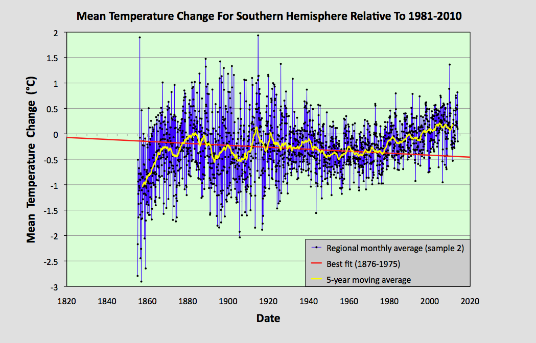
In this post I will make a first attempt at analysing the data for the entire Southern Hemisphere. I will do this by simply averaging the anomalies for the 1079 longest station records in the Southern Hemisphere, but without employing any regional weighting to the data. This will produce a first estimate of the temperature trend. A more accurate analysis will be done in a future post, where trends for the various regions will be combined using area weightings similar to those I used in Post 26 to calculate the overall trend for Australia, based on the trends from its individual states. Such an approach is, however, fraught with difficulty as the area of many regions (such as island archipelagos) are difficult to define exactly.


Fig. 64.1: The temperature trend for the Southern Hemisphere since 1820 derived by averaging the 1079 longest temperature records for the region. The best fit is applied to the monthly mean data between 1876 and 1975 and has a negative gradient of -0.12 ± 0.09 °C per century.


The overall temperature trend for the Southern Hemisphere since 1820 is shown in Fig. 64.1 above. This is the result of averaging over one thousand separate station records as indicated in Fig. 64.2 below. All the stations were either long stations with over 1200 months of data before the end of 2013, or medium stations with over 480 months of data.

The temperature profile from 1970 onwards appears to exhibit a clear upward trend with the mean temperature increasing by about 0.57°C from the 1960s to 2010. This data is also the most reliable as it is the result of averaging over 900 temperature records. 

In contrast, the data before 1970 exhibits a long modest cooling trend of over 0.1°C per century. The reliability of this data is also good, as it is the result of averaging over 100 temperature records from 1900 onwards. Before 1900, however, the data becomes less reliable due to its reliance on smaller numbers of stations that are also further apart and so less well correlated.


Fig. 64.2: The number of station records included each month in the mean temperature trend for the Southern Hemisphere when the MRT interval is 1981-2010.


What the data in Fig. 64.1 appears to indicate is that while there has been a significant warming of the Southern Hemisphere post-1970 of up to 0.57°C, this is partially offset by a noticeable cooling over the previous 100 years or more. So the total warming since pre-industrial times is likely to be less than 0.4°C. This is much less than the commonly quoted value of 1°C, or 1.5°C for the Northern Hemisphere. Yet this is not reflected in the Berkeley Earth adjusted data.


Fig. 64.3: Temperature trend for the Southern Hemisphere since 1840 derived by aggregating and averaging the Berkeley Earth adjusted data for over 1000 of the longest stations in the region. The best fit linear trend line (in red) is for the period 1951-2010 and has a gradient of +1.45 ± 0.10 °C/century.


An average of the Berkeley Earth adjusted time series temperature trends from the 1000 longest sets of station data in the Southern Hemisphere is presented in Fig. 64.3 above. This appears to indicate that the total temperature rise of the Southern Hemisphere since 1950 should be about 0.8°C. This is significantly more (between 0.1°C and 0.3°C depending on the time period you are considering) than is seen from the raw temperature data in Fig. 64.1, but it is in general agreement with the trend published by Berkeley Earth and shown in Fig. 64.4 below. 

However, what is even more prominent is the difference in the temperature trends before 1950. Whereas the raw data in Fig. 64.1 clearly indicates a cooling trend of 0.12°C per century, a simple average of the Berkeley Earth in Fig. 64.3 indicates a modest warming of 0.24°C per century. This, though, is still much less than the official trend shown in Fig. 64.4, which appears to claim an additional 0.5°C of warming has occurred between 1880 and 1950. This is almost the same as the warming since 1950, yet the atmospheric levels of carbon dioxide in 1950 were only 310 ppm, which is only about 30 ppm above pre-industrial levels. This means that the most recent increase in carbon dioxide of 100 ppm since 1950 has produced the same warming as the first 30 ppm did before 1950. If that is true, then it suggests further increases in carbon dioxide concentrations will have ever decreasing impacts on our climate, to the point where they are inconsequential.


Fig. 64.4: The temperature trend for the Southern Hemisphere since 1860 according to Berkeley Earth.


So what are the reasons for the differences in the trends before 1950? 

Well, we know that the differences between the trends in Fig. 64.1 and Fig. 64.3 are probably the result of the adjustments made to the data by Berkeley Earth. The statistical legitimacy of these adjustments I have already disputed in Post 57. This cannot explain the differences between the trends in Fig. 64.3 and Fig. 64.4, though, as these are both derived using the same adjusted data. These differences are likely to be the result of regional or station weightings, which would appear to be more important before 1950 due to the smaller number of stations and their uneven geographical distribution.

One way to examine the impact of these differences is to compare results from different samples of data. In the following five graphs I have split the stations used to construct the average in Fig. 64.1 into five separate random samples and compared their trends before and after 1975. In each case the temperature rise from the 1960s to 2010 is in the range 0.56 ±0.05°C while all but one of the samples has a negative trend before 1975. However, the range of trends for data before 1975 (or 1950) is much larger than the range for data after. This suggests that the data before 1950 is more sensitive to the impact that individual stations or regions may have on the average. The number of stations averaged each month for each sample is indicated in Fig. 64.10. This indicates that before 1940 each sample typically has significantly fewer than 70 stations in the average compared with over 150 after 1960.


Fig. 64.5: The temperature trend for the Southern Hemisphere since 1820 based on the first sample average of 224 of the 1079 longest temperature records for the region. The best fit is applied to the monthly mean data between 1876 and 1975 and has a negative gradient of -0.02 ± 0.10 °C per century.


Fig. 64.6: The temperature trend for the Southern Hemisphere since 1820 based on the second sample average of 223 of the 1079 longest temperature records for the region. The best fit is applied to the monthly mean data between 1876 and 1975 and has a negative gradient of -0.19 ± 0.08 °C per century.


Fig. 64.7: The temperature trend for the Southern Hemisphere since 1820 based on the third sample average of 210 of the 1079 longest temperature records for the region. The best fit is applied to the monthly mean data between 1876 and 1975 and has a negative gradient of -0.37 ± 0.09 °C per century.


Fig. 64.8: The temperature trend for the Southern Hemisphere since 1820 based on the fourth sample average of 211 of the 1079 longest temperature records for the region. The best fit is applied to the monthly mean data between 1876 and 1975 and has a negative gradient of -0.09 ± 0.09 °C per century.


Fig. 64.9: The temperature trend for the Southern Hemisphere since 1820 based on the fifth sample average of 211 of the 1079 longest temperature records for the region. The best fit is applied to the monthly mean data between 1876 and 1975 and has a positive gradient of +0.15 ± 0.11 °C per century.


Fig. 64.10: The number of station records included each month in the mean temperature trend for each of the five samples in Fig. 64.5 - Fig. 64.9.


Summary

The temperature trend for the Southern Hemisphere, based on the raw temperature data, exhibits a warming of about 0.5°C since 1950.

Before 1950 there is strong evidence of a prolonged cooling period of over 100 years in duration that amounted to a cooling of at least 0.12°C in total.

Based on the available temperature data, the total warming seen in the Southern Hemisphere since pre-industrial times is likely to be less than 0.4°C. This is much less than the usually reported value. 


Final Thoughts

The data shown in Fig. 64.1 clearly shows no warming before 1980. However, the data before 1880 is not very reliable. As Fig. 64.2 indicates, the mean anomaly prior to 1880 is based on data from less than 50 temperature records. If these records were all from the same region, then this low amount of data would be less of a problem as the different stations would be strongly correlated. The result would be reliable - but only for that region. 

The data I have analysed so far for this blog suggests that, for a single region with a uniform climate, a good reliable average can be achieved from only about 15-20 sets of data. When dealing with an entire hemisphere, however, we need more data because the climate of South America will clearly be different from that of Australia. This means that the data before 1880 in Fig. 64.1 is likely to be misleading. So can we do better than the trend in Fig. 64.1? Well, yes we can.


Fig. 64.11: The temperature trend for the Southern Hemisphere since 1880 derived by averaging the 1079 longest temperature records for the region. The best fit is applied to the monthly mean data between 1881 and 1980 and has a slight positive gradient of 0.01 ± 0.09 °C per century.


If we re-scale the data in Fig. 64.1 we can create a graph that presents a truer picture of the historic temperature rise by ignoring the unreliable data before 1880. Such a graph is shown above in Fig. 64.11. The other change I have made is to the time interval of the best bit line. This fit now applies from 1881 to 1980 and its gradient is practically zero. The jump in temperature after 1980 still amounts to about 0.57°C, and this is still much less than the 1.5°C that is claimed by climate science for the rise in global land temperatures from 1900 to 2013. But what it also shows is that small changes to how data is analysed and presented can affect the results.


Sunday, April 25, 2021

63. Peru - temperature trends PARABOLIC

What is striking about the temperature data for Peru is its variability. Not only is there a diverse mix of warming and cooling trends between stations, there are also a lot of extreme fluctuations within individual temperature records as illustrated by the time series for Arequipa Airport (Berkeley Earth ID:157461) in Fig. 63.1 below. This makes it very hard to assess what the true temperature trend for Peru really is.


Fig. 63.1: The temperature trend for Arequipa Airport since 1900. The best fit line has a positive gradient of +0.16 ± 0.14 °C per century. The monthly temperature changes are defined relative to the 1951-1980 monthly averages.


In all there are 42 stations in Peru with more than 300 months of data. Their locations are shown in Fig. 63.2 below. It can be seen that they are spread throughout most of Peru, but there is significant clustering in some regions and sparse coverage in others, particularly within the Amazon region to the north and east. Of these 42 stations, 24 are medium stations with over 480 months of data, the longest of which is Arequipa Airport (Berkeley Earth ID:157461) with 1163 months of data. There are no long stations with more than 1200 months of data. 


Fig. 63.2: The (approximate) locations of all stations in Chile with over 300 months of data. Those stations with a high warming trend are marked in red. Those with cooling or stable trends are marked in blue.


The station location map in Fig. 63.2 indicates that there is a fairly even mix of warming and cooling stations in Peru. However, stations with data before 1960 are more likely to exhibit cooling trends, while those with data after 1960 are more likely to be warming. The result is that the overall temperature trend from 1930 onwards comprises a sharp cooling period followed by a slow warming as shown in Fig. 63.3 below.


Fig. 63.3: The temperature trend for Peru since 1900. The best fit is applied to all the monthly mean data and has a positive gradient of +1.11 ± 0.06 °C per century. The monthly temperature changes are defined relative to the 1951-1980 monthly averages.


The temperature trend in Fig. 63.3 above was derived by averaging the temperature anomalies from all the stations with more than 300 months of data which also had at least ten years of data within the interval of 1951-1980. This amounted to 39 stations in total (for a list see here). The interval of 1951-1980 was used to determine the monthly reference temperatures (MRTs) against which the temperature anomalies were determined, as explained in Post 47. This period was chosen so as to maximize the number of stations included in the final mean trend.

If we perform a fit to all the data in Fig. 63.3, the result is a strong warming trend of 1.11°C per century as indicated in Fig. 63.3 above. Not only does this appear to closely follow the data from 1960 onwards, it also appears to fit with the data before 1925 as well.

However, the data before 1925 comes from at most two stations, as indicated in Fig. 63.4 below, while the data from 1930 to 1960 in Fig. 63.3 is the result of averaging at least fifteen different temperature records from different stations, and potentially as many as thirty. This suggests that the mean temperature trend after 1930 in Fig. 63.3 is far more reliable than the trend before 1925, a hypothesis that is confirmed by a study of the two datasets in question.


Fig. 63.4: The number of station records included each month in the mean temperature trend for Peru when the MRT interval is 1951-1980.


The two stations with data before 1925 have data that is discontinuous and that fluctuates enormously. One of the two stations is Arequipa Airport (Berkeley Earth ID:157461) shown in Fig. 63.1 above. The other is Lima-Callao Airport (Berkeley Earth ID:157469). For the former the temperatures before 1920 are comparable to those between 1970 and 2000. For the latter they are comparable with temperatures in the 1960-1980 period. Yet the result in both cases when this data is combined with the averaged data for 1929 onwards, is to produce a mean trend for 1900-1920 that is over 1°C lower than the temperatures seen in the rest of the trend between 1960 and 2000 (see Fig. 63.3). This indicates that the data for these two stations is clearly inconsistent with the overall trend for the region (compare the data from 1940-2000 in Fig. 63.1 with that in Fig. 63.3), and so the data before 1925 is highly unreliable.

If we therefore restrict our best fit to data that is from after 1929 and which is the result of averaging at least ten sets of station data, then the interpretation changes dramatically. The best fit line in Fig. 63.5 below now has a much smaller positive gradient of only 0.16°C per century. This is barely more than the uncertainty of ±0.11°C per century, and significantly less than the standard deviation of the data from 1931-2010 which is 0.63°C.


Fig. 63.5: The temperature trend for Peru since 1900. The best fit is applied to the monthly mean data from 1931-2010 and has a positive gradient of +0.16 ± 0.11 °C per century. The monthly temperature changes are defined relative to the 1951-1980 monthly averages.


Now if we compare these result with the results published by Berkeley Earth we once again see a number of major differences. The mean temperature trend becomes less variable and more linear as illustrated in Fig. 63.6 below. The trend in Fig. 63.6 was generated by performing a simple average on the Berkeley Earth adjusted data from the same 42 stations used to generate the temperature trend in Fig. 63.3.


Fig. 63.6: Temperature trend in Peru since 1900 derived by aggregating and averaging the Berkeley Earth adjusted data for all medium stations. The best fit linear trend line (in red) is for the period 1901-2012 and has a gradient of +0.84 ± 0.03 °C/century.


What is clear is that the trends in Fig. 63.6 above are very close to the trends published by Berkeley Earth and shown in Fig. 63.7 below. This comparison clearly shows that a simple average of the adjusted data from the Berkeley Earth data files (Fig. 63.6) gives almost the same result for the regional trend in Peru as the Berkeley Earth version does (Fig. 62.7), even though Berkeley Earth appears to use weighted averages for its regional averaging. This in turn also suggests that weighted averaging is probably not necessary in Peru, and simple averaging of stations is sufficient to generate a reliable trend even though the spread of stations across the county is far from ideal as Fig. 63.2 illustrates.


Fig. 63.7: The temperature trend for Peru since 1860 according to Berkeley Earth.


Clearly there are some significant differences between the temperature trend for Peru based on the original raw temperature data in Fig. 63.3 and that due to the adjusted data used by Berkeley Earth in Fig. 63.5. The exact magnitude of those differences are shown in Fig. 63.8 below.

The effect of the Berkeley Earth adjustments is to reduce the warming after 1990 and to flatten the curve between 1930 and 1950. The rationale for these adjustments is probably to correct for perceived bad data. However, the station frequency plot in Fig. 63.4 suggests that both these adjustments are being applied to data in Fig. 63.3 that should be highly robust, given that it is derived from averaging a large number (over fifteen) of independent datasets. As I have shown previously, averages of more than fifteen stations from the same local region will tend to cancel the errors from each dataset, and so produce a robust and accurate regional trend.


Fig. 63.8: The contribution of Berkeley Earth (BE) adjustments to the BE anomaly data shown in Fig. 63.6 after smoothing with a 12-month moving average. The blue curve represents the total BE adjustments including those from homogenization. The linear best fit (red line) to these adjustments for the period 1931-2010 has a positive gradient of +0.55 ± 0.06 °C per century. The orange curve shows the contribution just from breakpoint adjustments.


Conclusions

The data in Fig. 63.3 indicates that there has been a sustained but gentle warming of the climate in Peru of about 0.6°C since 1960. As this is the result of averaging between twenty and thirty different temperature records, this warming would appear to be a real effect and not one based on spurious data.

However, the evidence of Fig. 63.3 also stronly suggests that this warming is no greater than the cooling seen before 1960. So overall, temperatures today are no warmer than those of 100 years ago.

The lack of good data before 1930 makes it difficult to assess the significance of the current temperature rise. It could be due to global warming, or it could be due to natural variations.


Wednesday, March 31, 2021

57. The case against temperature data adjustments (EU)

Fig. 57.1: The number of weather stations with temperature data in the Northern Hemisphere since 1700 according to Berkeley Earth.


There are four major problems with global temperature data.

1) It is not spread evenly

Only about 10% of all available data covers the Southern Hemisphere (compare Fig. 57.2 below with Fig. 57.1 above), while in the Northern Hemisphere over half the data is from the USA alone (as shown in Fig. 57.3). In addition, there is no reliable temperature data covering the oceans from before 1998 when the Argo programme for a global array of 3000 autonomous profiling floats was proposed. The Argo programme has since been used to measure ocean temperatures and salinity on a continuous basis down to depths of 1000m across most of the oceans between the polar regions, but that means we only have reliable data for the last 20 years. 

The result is that only land-based data is available before 1998, and this tends to cluster around urban areas. The solution to this clustering employed by climate scientists is to resort to techniques such as gridding, weighting and homogenization. 

Gridding involves creating a virtual grid of points across the Earth's surface, usually 1° of longitude or latitude apart. This is limited by two factors: computing power and data coverage. As there are unlikely to be any weather stations at these grid points, unless by coincidence, virtual station records are created at these points by averaging the temperatures from the nearest real stations. This averaging of stations is not equal. Instead the average usually weights the different stations according to their closeness in distance (although even stations 1000 km away can be included) and their correlation to the mean of all those datasets. This process of weighting based on correlation is often called homogenization. 


Fig. 57.2: The number of weather stations with temperature data in the Southern Hemisphere since 1750 according to Berkeley Earth.


2) It does not go back far enough in time

As I have shown previously, the earliest temperature records are from Germany (see Post 49) and the Netherlands (see Post 41) and go back to the early 18th century. However, there is no Southern Hemisphere temperature data before 1830, and only two datasets in the USA from before 1810. The principal reason is that the amount of available data is positively correlated with economic development. As more countries have industrialized, the number of weather stations has increased. Unfortunately, climate change involves measuring the change in temperature since a previous epoch or reference period (over say 100 or 200 years), and in those times the availability of data is much, much, worse. So increasing the quality of current data cannot increase the quality of the measured temperature change. This will always be constrained by how much data we had in the distant past.


Fig. 57.3: The number of weather stations with temperature data in the United States since 1700 according to Berkeley Earth.


3) The data is often subject to measurement errors

Over time weather stations are often moved, instruments are ungraded, and the local environment changes as well. The conventional wisdom is that all these changes have profound impacts on the temperature records that need to be compensated for. This is the rationale behind data adjustments. The problem is, none of it is really justified, as I will demonstrate in this post.

If there are problems with the temperature data at different times and locations, these issues should be randomly distributed. That means any adjustments to correct these errors should be randomly distributed as well. This in turn means that averaging a sufficiently large number of stations for a regional or global trend should result in the cancellation of both the errors and the adjustments. As I have shown in many previous posts here, this does not happen. In fact in many cases the adjustments can add (or subtract) as much, or even more, warming (or cooling) to the mean trend than is present in the original data, particularly in the Southern Hemisphere. For examples see my posts for Texas, Indonesia, PNG, the South Pacific (East and West), NSW, Victoria, South Australia, Northern Territory and New Zealand among others.

One contentious issue is the problem of station moves or changes to the local environment. The conventional wisdom is that these will both strongly affect the temperature record. Frankly, I disagree. In my view those who say they will are failing to understand what is being measured. One example is, what would happen if the weather station was to be moved from open ground to an area under a large tree? Does the increased shade reduce the temperature? The answer is no because the thermometer is already in the shade inside its Stevenson screen. Moreover, the thermometer is measuring air temperature, not the temperature on the ground, and the air is continuously circulating. So the air under the tree is at virtually the same temperature as the air above open ground. The one adjustment that does affect temperature is altitude. Air (almost) always gets colder as you ascend in height.

4) There just isn't enough data

There are currently about 40,000 weather stations across the globe. This sounds like a lot, but it is only about one for every 13,000 square kilometres of area. That means that on average, these stations are over 110 km apart, or more than 1° of longitude or latitude. Even today, that is probably the bare minimum of what is required to measure a global temperature. Unfortunately, in previous times, the availability of data was much, much, worse.

Of course, now there are alternatives. One is to use satellites, but again this only provides data back to about 1980. The other problem with satellites is that their orbits generally no not cover the polar regions. And finally, they can only see what is emitted at the top of the atmosphere (TOA). So they can measure temperatures at the TOA, but measuring surface temperatures can be problematic as the infra-red radiation emitted by the surface is largely absorbed by carbon dioxide and water vapour in the lower atmosphere.

Over the course of the last eleven months I have posted 56 articles to this blog. Over half of these have analysed the surface temperature trends in various countries, states and regions. In virtually every case, the trend I have determined by averaging station anomalies has differed from the conventional widely publicized versions. These differences are largely due to homogenization and data adjustments. 

Homogenization

There are two potential issues with homogenization. Firstly, there are more urban stations than rural ones. This is because stations tend to be located near to where people live. Secondly, urban stations tend to be closer together. So they are more likely to be strongly correlated. As homogenization uses correlation for weighting the influence of each station's data in the mean temperature for the local region, this means that the influence of urban stations will be stronger. 

So both potential issues are likely to favour urban stations over rural ones. Yet it is the urban ones that are more likely to be biased due to the urban heat island (UHI) effect. The result is that that bias is often transmitted to the less contaminated rural stations, thereby biasing the whole regional trend upwards. This is why I do not use homogenization in my analysis. The other problematic intervention is data adjustment.

Data adjustments

The rationale for data adjustments is that they are needed to compensate for measurement errors that may occur from changes of station site, instrument or method. The justification for using them is that climate scientists believe they can identify weak points in the data. Some might call that hubris. The alternative viewpoint is that these adjustments are unnecessary and that averaging a sufficiently large sample will erase the errors automatically via regression to the mean. I will now demonstrate that with real data.


Fig. 57.4: The 5-year average temperature trends for Austria, Hungary and Czechoslovakia together with best fit lines for the interval 1791-1980 (m is the gradient in °C per century). The Austria and Czechoslovakia data are offset by +2°C and -2°C respectively to aid clarity.


In three recent posts I calculated and examined the temperature trends for Czechoslovakia (Post 53), Hungary (Post 54) and Austria (Post 55). The five-year moving averages of the temperature trends in these three countries are shown in Fig. 57.1 above. What is immediately apparent is the high degree of similarity that these trends display, particularly after 1940. This is indicated by the red and black arrows which mark the positions of coincident peaks and troughs respectively in the three datasets.

It turns out that all three datasets are also very similar to that of Germany (see Post 49). This is shown in Fig. 57.5 below. This is not surprising as the four countries are all close neighbours. What is surprising is that there are not greater differences between the four datasets, particularly given the number of adjustments that Berkeley Earth felt needed to be made to the individual station records for these countries when undertaking their analysis.


Fig. 57.5: The 5-year average temperature trends for Austria, Hungary and Czechoslovakia compared to that of Germany.


To understand the potential impact of these adjustments, consider this. The temperature trend for Austria in Fig. 55.1 of Post 55 was determined by averaging up to 26 individual temperature records. Yet the total number of adjustments made to those records by Berkeley Earth in the time interval 1940-2013 was more than 90. That is more than three adjustments per temperature record, or at least one for every 21 years of data. Yet if the adjustments are ignored, and the data for each country is just averaged normally, the results for each country, Austria, Czechoslovakia, Germany and Hungary, are virtually identical. This leads to the following conclusions and implications.


Conclusions

1) The data in Fig. 57.5 indicates that the temperature trends for Austria, Czechoslovakia, Germany and Hungary are virtually identical after 1940. The probability that this is due to random chance is minimal. It therefore implies that the temperature trends for these countries from 1940 onwards are indeed virtually identical. This is not a total surprise as they are all close neighbours.

2) As all the individual temperature anomaly time series used to generate these trends are not identical, and all are likely to have data irregularities from time to time, this also means that those data irregularities are highly likely to be random in both their size and distribution across the various time series. This means that when averaged to create the regional trend, their irregularities will partially cancel. If the number of sites is large enough, the cancellation will be almost total. This is what is seen in Fig. 57.5, and it is why all the trends shown are virtually identical post-1940.


Implications

1) If the temperature trends for Austria, Czechoslovakia, Germany and Hungary are virtually identical after 1940, as conclusion #1 suggests, then it is reasonable to suppose that they should be virtually identical before 1940 as well. But they aren't, as the data in Fig. 57.5 illustrates. This is because the trends in each case are based on the average of too few individual anomaly time-series for the irregularities from each station time-series to be fully cancelled by the irregularities from the remainder. Before 1940 there are only sixteen valid temperature records in Austria, three in Hungary and three in Czechoslovakia. Germany, on the other hand has about thirty.

2) However, if it is true that all the temperature trends for Austria, Czechoslovakia, Germany and Hungary before 1940 should be the same, then there is no reason why we cannot combine them all into a single trend. This would dramatically increase the number of individual time-series being averaged, and so reduce the discrepancy between the calculated value for the trend and the true value. This has been done in Fig. 57.6 below.


Fig. 57.6: The temperature trend for Central Europe since 1700. The best fit is applied to the interval 1791-1980 and has a negative gradient of -0.05 ± 0.07 °C per century. The monthly temperature changes are defined relative to the 1981-2010 monthly averages.


The data in Fig. 57.6 represents the temperature trend for the combined region of Austria, Czechoslovakia, Germany and Hungary. The trend after 1940 is the same as that seen in those individual countries and the gradient of the best fit line for 1791-1980 more closely resembles the equivalent lines for Germany and Hungary than it does those of Austria and Czechoslovakia. But now we also have a more accurate trend before 1940. The question is, how much more accurate?


Fig. 57.7: The number of station time-series included in the average each month for the temperature trend in Fig. 57.6


The data from Austria, Czechoslovakia, Germany and Hungary suggest that approximately 20 different time-series are required in the average for the irregularities in the different station time-series to almost fully cancel. The graph in Fig. 57.7 suggests that this threshold is surpassed for almost every month of every year after 1830.


Fig. 57.8: The temperature trend for Central Europe since 1700. The best fit is applied to the interval 1831-2010 and has a positive gradient of 0.62 ± 0.07 °C per century. The monthly temperature changes are defined relative to the 1981-2010 monthly averages.


If we now calculate the best fit to the data in Fig. 57.8, but only use data after 1830, we get a gradient for the trend line of 0.62 °C per century. This equates to a temperature rise since 1830 of over 1.1 °C.


Fig. 57.9: The temperature trend for Central Europe since 1700. The best fit is applied to the interval 1781-2010 and has a positive gradient of 0.21 ± 0.05 °C per century. The monthly temperature changes are defined relative to the 1981-2010 monthly averages.


However, you could argue that the regional monthly average data in Fig. 57.6 is still reasonably accurate all the way back to 1780 as it continues to have over a dozen temperature records incorporated into the average every month of every year after this time. In which case the temperature rise since 1780, as indicated by the best fit line in Fig. 57.9, is actually less than 0.5 °C. This suggests that we can be reasonably confident that temperatures in central Europe between 1750 and 1830 were fairly similar to those of today.


Summary

What I have demonstrated here is that adjustments to the raw temperature data are unnecessary and can be avoided simply by averaging sufficient datasets (i.e. more than about 20).

I have also shown that it is highly likely that the mean temperature in central Europe is not much higher now than it was at the start of the Industrial Revolution (1750-1830). 


Disclaimer: No data were harmed or mistreated during the writing of this post. This blog believes that all data deserve to be respected and to have their values protected.