Showing posts with label temperature rise. Show all posts

Sunday, June 5, 2022

112: Venezuela - temperature trends WARMING

The climate of Venezuela is interesting because the country sits between Colombia to the west and the Lesser Antilles to the north. In this blog I have already examined the climate for both these regions and the results are not entirely consistent. The mean temperature of Colombia has remained fairly stable since 1940, increasing only slightly by about 0.1°C (see Fig. 95.2 in Post 95). The caveat to this is that there is no temperature data for the country before 1920 and only two stations of note with data before 1940. The Lesser Antilles, on the other hand, have more data but spread over a larger area, and this data shows much more warming, up to 2°C since 1890 (see Fig. 111.3 in Post 111). It turns out that the climate of Venezuela more closely resembles that of the Lesser Antilles than it does its neighbour Colombia as can be seen in Fig. 112.1 below.


Fig. 112.1: The mean temperature change for Venezuela relative to the 1976-2005 monthly averages. The best fit is applied to the monthly mean data from 1941 to 1980 and has a slight positive gradient of +0.28 ± 0.31 °C per century.


The main features of the data in Fig. 112.1 are very similar to those seen in Fig. 111.3 of Post 111. Between 1940 and 1980 the climate is stable, with the mean temperature rising by at most 0.1°C, but after 1980 there is a rapid temperature increase of over 0.5°C. This is consistent with other trends seen in the region such as for Puerto Rico (see Fig. 110.1 in Post 110) and the Dominican Republic (see Fig. 109.3 in Post 109). Yet the mean temperature anomaly (MTA) dataset in Fig. 112.1 also displays a large jump in temperatures of over 1.5°C before 1940. This is not seen in the Puerto Rico or the Dominican Republic data, nor is it seen in the data for Colombia (see Fig. 95.2 in Post 95), but it is seen in the data for the Lesser Antilles (see Fig. 111.3 in Post 111). In both cases the MTA before 1940 is based on data from only about five stations or less (see Fig. 112.2 below and Fig. 111.4 of Post 111), yet the fact that they corroborate each other suggests that the data may be more reliable than than I first thought and may be indicative of real climate change. The problem is that, if this is true, it poses a lot of difficult questions about the real nature of climate change.


Fig. 112.2: The number of station records included each month in the mean temperature anomaly (MTA) trend for Venezuela in Fig. 112.1.


If we assume that the temperature rises of 1.5°C from 1900 to 1940 that are seen in Venezuela (see Fig. 112.1 above) and the Lesser Antilles are real, then we need to ask the question, why?

Historical measurements of carbon dioxide (CO2) levels suggest that atmospheric CO2 levels increased from about 290 ppm in 1880 to about 310 ppm in 1940. But even with the best will in the world it is difficult to believe that a 7% rise in CO2 would result in a 1.5°C temperature rise. In Fig. 87.3 of Post 87 I showed that the most it could lead to was a rise of 0.08°C, and even then three quarters of that rise is likely to be negated by the pre-existing presence of water vapour in the atmosphere, the absorption spectrum of which overlaps both edges of the 15 µm CO2 absorption band. So the temperature rise seen before 1940 in Venezuela is actually nearly one hundred times greater than would be expected from CO2 alone. So if CO2 cannot explain the temperature rise, what does that say about our faith in climate stability? For if the climate can fluctuate by 1.5°C from time to time off its own bat, why should we care about CO2?

Then there is the more practical issue: why did no-one even notice this temperature rise? We are constantly being told by climate scientists that a 1.5°C rise in global temperatures would be disastrous for the planet. Yet just such an increase appears to have occurred in Venezuela and the Caribbean over a century ago and nothing untoward happened. 


Fig. 112.3: The (approximate) locations of the 21 medium weather station records in Venezuela. Those stations with a high warming trend between 1911 and 2010 are marked in red while those with a cooling or stable trend are marked in blue. Those denoted with squares are stations with over 800 months of data, while diamonds denote stations with more than 480 months of data.


The mean temperature anomalies (MTA) in Fig. 112.1 were calculated by averaging the temperature anomalies from the 38 longest temperature records for the state. The anomalies for each station were determined using the usual method as outlined in Post 47. All the records used in calculating the MTA had over 240 months of temperature data before the end of 2013 and 21 were medium stations with over 480 months of data. Of these three had over 1000 months of data and a further ten had over 800 months of data. For a full list of stations see here

The locations of the medium stations are illustrated in Fig. 112.3 above. This map appears to show that the geographical spread of these stations is fairly uniform but confined to the northern half of the country. The variation in station density is probably not sufficient to significantly distort the average in Fig. 112.1 from its true value though. In which case the simple average of the anomalies from all stations used to construct the MTA in Fig. 112.1 should still yield a fairly accurate temperature trend for the country as a whole. This can be verified by calculating the equivalent MTA, but using Berkeley Earth (BE) adjusted data, and comparing the results with the official BE version. If they are the same then the averaging process should be sufficiently accurate.


Fig. 112.4: Temperature trends for Venezuela based on Berkeley Earth adjusted data. The best fit linear trend line (in red) is for the period 1941-2010 and has a gradient of +1.06 ± 0.07°C/century.


The corresponding MTA result based on data that has been adjusted by Berkeley Earth (BE) is shown in Fig. 112.4 above and, unlike the raw data in Fig. 112.1, it exhibits a strong warming trend that is more uniform in its gradient. The overall temperature rise from 1900 to 2010 is about 1.5°C and so is significantly less than the 2.2°C that is seen with the raw data in Fig. 112.1.

If we then compare the curves in Fig. 112.4 with the published Berkeley Earth (BE) version in Fig. 112.5 below we see that there is remarkably good agreement between the two sets of data at least as far back as 1920. This indicates that the simple averaging of anomalies used to generate the BE MTA in Fig. 112.4 is as effective and accurate as the more complex gridding method used by Berkeley Earth in Fig. 112.5. In which case simple averaging should be just as effective and accurate in generating the MTA using raw unadjusted data in Fig. 112.1.


Fig. 112.5: The temperature trend for Venezuela since 1820 according to Berkeley Earth.


The differences between the MTA in Fig. 112.1 and the BE versions using adjusted data in Fig. 112.4 and Fig. 112.5 are therefore mainly due to the data processing procedures used by Berkeley Earth. These include homogenization, gridding, Kriging and most significantly breakpoint adjustments. These lead to changes to the original temperature data, the magnitude of these adjustments being the difference in the MTA values seen in Fig. 112.1 and Fig. 112.4. 

The magnitudes of these adjustments are shown graphically in Fig. 112.6 below. The blue curve is the difference in MTA values between adjusted (Fig. 112.4) and unadjusted data (Fig. 112.1), while the orange curve is the contribution to those adjustments arising solely from breakpoint adjustments. The vertical offset between the two curves is due to the difference in MRT intervals used by Berkeley Earth (1961-1990) and for Fig. 112.1 in this blog (1976-2005). What is clear is that after 1960 any adjustments made by Berkeley Earth to the data have little effect on the overall trend. However, before 1940 these adjustments appear to reduce the magnitude of the temperature rise by about 0.5°C. Overall the adjustments tend to make the MTA curve more linear.


Fig. 107.6: The contribution of Berkeley Earth (BE) adjustments to the anomaly data in Fig. 112.4 after smoothing with a 12-month moving average. The blue curve represents the total BE adjustments including those from homogenization. The linear best fit (red line) to these adjustments for the period 1891-2010 has a positive gradient of +0.19 ± 0.10 °C per century. The orange curve shows the contribution just from breakpoint adjustments.


Summary

According to the raw unadjusted temperature data, over the past century the climate of Venezuela has warmed by over 2°C (see Fig. 112.1).

The climate change seen for Venezuela appears to be very similar to that of the Lesser Antilles (see Fig. 111.3 of Post 111) with 75% of the warming occurring before 1940 and very little warming between 1940 and 1980. This does not correlate with changes to atmospheric carbon dioxide concentrations over the same period. 

The origin of the 1.5°C warming before 1940 remains unexplained but its similarity to data from the Lesser Antilles suggests that the temperature change is real and not the result of measurement biases or errors.

The adjusted temperature data from Berkeley Earth appears to show that the climate of Venezuela has warmed more continuously (or linearly) and by about 1.4°C (see Fig. 112.4 and Fig. 112.5) since 1880.


Acronyms

BE = Berkeley Earth.

MRT = monthly reference temperature (see Post 47).

MTA = mean temperature anomaly.

List of all stations in Venezuela and their raw data files.


Monday, May 30, 2022

111. Lesser Antilles - temperature trends WARMING 0.5°C

Over the previous five posts I have examined the temperature records of the larger islands in the Caribbean that are found in the archipelago known as the Greater Antilles. In this post I will concentrate on the remaining islands of the Caribbean in the Lesser Antilles. 

The Lesser Antilles comprises all the islands of the Caribbean between the coast of Venezuela to the south and Puerto Rico to the north. These in turn are subdivided into three distinct smaller archipelagos: the Leeward Islands, the Windward Islands, and the Leeward Antilles (see Fig. 111.1 below).


Fig. 111.1: A map of the Caribbean Sea showing the location of the Lesser Antilles.


Most of the main islands of the Lesser Antilles have at least one weather station as illustrated in Fig. 111.2 below. However none are long stations with over 1200 months of data before 2014, although seven stations (Le Raizet, Lamentin, Codrington, Richmond Hill, Pearls Airport, St. Clair Experimental Station and St. Clair Ex) do have data from before 1900 (for a list of Caribbean stations see here). Unfortunately most of the data for these seven stations is significantly fragmented, and as a result the temperature anomalies fluctuate massively over time, particularly before 1940. The most prominent stations are shown in Fig. 111.2 and all have over 400 months of data before 2014.


Fig. 111.2: The (approximate) locations of the weather stations in the Lesser Antilles with over 400 months of data. Those stations with a high warming trend between 1911 and 2010 are marked in red while those with a cooling or stable trend are marked in blue.


As the stations shown in Fig. 111.2 appear well separated geographically we can as a first approximation average their individual temperature anomalies to determine the mean temperature anomaly (MTA) for each month for the region as a whole. These monthly MTAs are shown in Fig. 111.3 below. 


Fig. 111.3: The mean temperature change for the Lesser Antilles relative to the 1931-1990 monthly averages. The best fit is applied to the monthly mean data from 1941 to 1980 and has a slight positive gradient of +0.29 ± 0.14 °C per century.


The anomalies for each station were determined using the usual method as outlined in Post 47. This involved first calculating the monthly reference temperatures (MRTs) for each station using a set reference period, in this case from 1931 to 1990, and then subtracting the MRTs from the raw temperature data to deliver the anomalies. If a station had at least twelve valid temperatures per month within the MRT interval then its anomalies were included in the MTA calculation. 

The MRT interval used here is twice as long as normal due to the wide distribution of data between different stations. As mentioned above, seven stations have data before 1900 but most of these have no data after 1960. In contrast most stations with data after 1970 have none before 1960. So the only way to include both sets is to widen the MRT interval. This will introduce some degree of error but that error will be limited to at most to a value equivalent to the rise in temperature across the MRT period. The data in Fig. 111.3 suggests that this is relatively small. The result is that a total of 25 stations were then included in the MTA calculation with the number each month indicated in Fig. 111.4 below. The station at St. Clair Ex was excluded due to a lack of data within the MRT interval.

The MTA in Fig. 111.3 has three distinct parts. Between 1940 and 1980 the trend is neutral as indicated by the best fit line in red. After 1980 there is significant warming of about 0.5°C. Before 1940 the picture is difficult to discern as there are fewer stations with data contributing to the MTA (see Fig. 111.4 below) and most of these stations have data that is discontinuous and highly erratic. In contrast, the MTA trend after 1940 is likely to be much more reliable as it is constructed using up to twenty different sets of station data most of which are continuous.


Fig. 111.4: The number of station records included each month in the mean temperature anomaly (MTA) trend for the Lesser Antilles in Fig. 111.3.


Next I calculate the corresponding MTA result based on data that has been adjusted by Berkeley Earth (BE). The result is shown in Fig. 111.5 below and, unlike the raw data in Fig. 111.3, it exhibits a strong continuous warming trend with temperatures rising by over 1.4°C since 1910 (see orange curve). This is about the same as is seen in the raw data. However if we just look at the period since 1930 where the data is more plentiful due to there being more active stations we see that the rise is temperature is about 1.0°C. This is 0.5°C more than is seen in the raw data in Fig. 111.3.


Fig. 111.5: Temperature trends for the Lesser Antilles based on Berkeley Earth adjusted data. The best fit linear trend line (in red) is for the period 1911-2010 and has a gradient of +1.19 ± 0.02°C/century.


The differences between the MTA in Fig. 111.3 and the BE version using adjusted data in Fig. 111.5 are mainly due to the data processing procedures used by Berkeley Earth. These include homogenization, gridding, Kriging and most significantly breakpoint adjustments. These lead to changes to the original temperature data, the magnitude of these adjustments being the difference in the MTA values seen in Fig. 111.3 and Fig. 111.5. The magnitudes of these adjustments are shown graphically in Fig. 111.6 below. The blue curve is the difference in MTA values between adjusted (Fig. 111.5) and unadjusted data (Fig. 111.3), while the orange curve is the contribution to those adjustments arising solely from breakpoint adjustments. From 1920 onwards both are similar in magnitude and lead to an additional warming since 1940 of about 0.5°C.


Fig. 111.6: The contribution of Berkeley Earth (BE) adjustments to the anomaly data in Fig. 111.5 after smoothing with a 12-month moving average. The blue curve represents the total BE adjustments including those from homogenization. The linear best fit (red line) to these adjustments for the period 1921-1980 has a positive gradient of +0.289 ± 0.019 °C per century. The orange curve shows the contribution just from breakpoint adjustments.


Summary

According to the raw unadjusted temperature data, over the forty year period up to 1980 the climate of the Lesser Antilles remained fairly stable before experiencing a rapid increase in temperature of about 0.5°C (see Fig. 111.3).

The data before 1940 is too fragmented and erratic to divulge a definitive trend.

Over the period 1901-2010 the adjusted temperature data from Berkeley Earth claims to show that the climate of the Lesser Antilles has warmed by as much as 1.5°C (see Fig. 111.5).

These adjustments appear to have added around 0.5°C of warming since 1940 (see Fig. 111.6).


Acronyms

BE = Berkeley Earth.

MRT = monthly reference temperature (see Post 47).

MTA = mean temperature anomaly.


List of all stations with data before 1900

Le Raizet (Guadeloupe)
Lamentin (Martinique)
Codrington (Barbados)
Richmond Hill (Grenada)
Pearls Airport (Grenada)
St. Clair Experimental Station (Trinidad and Tobago)
St. Clair Ex (Trinidad and Tobago)


Friday, May 27, 2022

110. Puerto Rico - temperature trends WARMING 0.8°C

The island of Puerto Rico is located just over 100 km due east of the island of Hispaniola and about 800 km north of the Venezuelan coast. It is one of the larger islands in the Caribbean but it is slightly smaller than Jamaica and much smaller than both Cuba and Hispaniola. And yet it has by far the best temperature data in the region with eight long stations and over thirty medium stations (for a full list of stations see here) and data that extends back to 1898. This is probably because it has been a US territory since 1898.

The temperature trend for Puerto Rico was determined by averaging the individual temperature anomalies from each station to generate the mean temperature anomaly (MTA) each month. These are shown in Fig. 110.1 below. Overall the temperature trend is positive with a modest warming of about 0.3°C in the 80 years before 1990 followed by a larger temperature rise of 0.5°C over the next 15 years. This fits with the pattern we have seen in many other countries of temperature stability before 1980 and a sudden rise of 0.5°C thereafter. While this is concerning and demanding of explanation, it is a long way short of the values claimed globally by climate scientists and the IPCC for land-based temperature rises.


Fig. 110.1: The mean temperature change for Puerto Rico relative to the 1951-1980 monthly averages. The best fit is applied to the monthly mean data from 1911 to 1980 and has a positive gradient of +0.39 ± 0.09 °C per century.


The temperature anomalies for each station were determined using the usual method as outlined in Post 47. This involved first calculating the monthly reference temperatures (MRTs) for each station using a set reference period, in this case from 1951 to 1980, and then subtracting the MRTs from the raw temperature data to deliver the anomalies. If a station had at least twelve valid temperatures per month within the MRT interval then its anomalies were included in the calculation of the regional mean temperature anomaly (MTA). The total number of stations included in the MTA in Fig. 110.1 each month is indicated in Fig. 110.2 below. The peak in the frequency around 1965 suggests that the 1951-1980 interval was indeed the most appropriate.


Fig. 110.2: The number of station records included each month in the mean temperature anomaly (MTA) trend for Puerto Rico in Fig. 110.1.


The map in Fig. 110.3 below illustrates the geographical distribution of the stations in Puerto Rico. There are clearly more stations in the eastern half of the island than in the west, but in both halves the distribution is fairly even except for a greater clustering around San Juan. This means that a simple average of station anomalies should be reasonably accurate as previous posts have demonstrated.


Fig. 110.3: The (approximate) locations of the 41 longest weather station records in Puerto Rico. Those stations with a high warming trend between 1911 and 2010 are marked in red while those with a cooling or stable trend are marked in blue. Those denoted with squares are long stations with over 1200 months of data, while diamonds denote medium stations with more than 480 months of data.


Next I calculate the corresponding MTA result based on data that has been adjusted by Berkeley Earth (BE). The result is shown in Fig. 110.4 below and, unlike the raw data in Fig. 110.1, it exhibits a continuous strong warming trend with temperatures rising by over 1.2°C since 1910 (see orange 10-year moving average curve). This is about 50% more than is seen in the raw data.


Fig. 110.4: Temperature trends for Puerto Rico based on Berkeley Earth adjusted data. The best fit linear trend line (in red) is for the period 1911-2010 and has a gradient of +1.13 ± 0.03°C/century.


Comparing the curves in Fig. 110.4 with the published Berkeley Earth (BE) version in Fig. 110.5 below indicates remarkably good agreement at least as far back as 1910. This indicates that the simple averaging of anomalies to generate the MTA in Fig. 110.1 is as effective and accurate as the more complex gridding method used by Berkeley Earth. It also means that the averaging process cannot be responsible for the large difference in trends between that using unadjusted data in Fig. 110.1 and that using adjusted data in Fig. 101.4.


Fig. 110.5: The temperature trend for Puerto Rico since 1820 according to Berkeley Earth.


The differences between the MTA in Fig. 110.1 and the BE versions using adjusted data in Fig. 110.4 and Fig. 110.5 are instead mainly due to the data processing procedures used by Berkeley Earth. These include homogenization, gridding, Kriging and most significantly breakpoint adjustments. These lead to changes to the original temperature data, the magnitude of these adjustments being the difference in the MTA values seen in Fig. 110.1 and Fig. 110.4. The magnitudes of these adjustments are shown graphically in Fig. 110.6 below. The blue curve is the difference in MTA values between adjusted (Fig. 110.4) and unadjusted data (Fig. 110.1), while the orange curve is the contribution to those adjustments arising solely from breakpoint adjustments. Both are considerable with the former leading to an additional warming since 1900 of up to 0.7°C.


Fig. 110.6: The contribution of Berkeley Earth (BE) adjustments to the anomaly data in Fig. 110.4 after smoothing with a 12-month moving average. The blue curve represents the total BE adjustments including those from homogenization. The linear best fit (red line) to these adjustments for the period 1911-2010 has a positive gradient of +0.471 ± 0.008 °C per century. The orange curve shows the contribution just from breakpoint adjustments.


Summary

According to the raw unadjusted temperature data, over the past century the climate of Puerto Rico has warmed slowly before 1990 and then more rapidly thereafter (see Fig. 110.1). The total warming is likely to be about 0.8°C

Over the same period adjusted temperature data from Berkeley Earth claims to show that the climate of Puerto Rico has warmed by over 1.2°C (see Fig. 110.4 and Fig. 110.5).


Acronyms

BE = Berkeley Earth.

MRT = monthly reference temperature (see Post 47).

MTA = mean temperature anomaly.

List of all stations and their raw data files.


Friday, April 29, 2022

109. Hispaniola - temperature trends WARMING after 1990

To the east of Jamaica and Cuba is the island of Hispaniola. It is the second largest island in the Caribbean, and the largest by population. It is also divided between two separate countries: Haiti and the Dominican Republic. And just as the island is divided geographically and politically, so it is also divided by its temperature data.

To the west in Haiti there is only one station of note in the capital at Port-au-Prince airport, but this is also the only long station on the entire island that has over 1200 months of data before 2014 (all stations in Haiti are listed here). To the east in the Dominican Republic there are six medium stations with over 480 months of data and a further five stations with over 400 months of data (for a full list see here). The locations of all these twelve stations are indicated on the map below in Fig. 109.1. It can be seen that most have warming trends, where a warming trend is defined as one where the temperature gradient for 1911-2010 is positive and exceeds twice the error in that trend, but five have stable or cooling trends. And nine of the twelve stations are located close to the coast. The interior of the island is therefore very under-represented.


Fig. 109.1: The (approximate) locations of the twelve longest weather station records in Haiti and the Dominican Republic. Those stations with a high warming trend between 1911 and 2010 are marked in red while those with a cooling or stable trend are marked in blue. Those denoted with squares are long stations with over 1200 months of data, while diamonds denote stations with more than 400 months of data.


The other distinction between Haiti and The Dominican Republic is in the amount of observed warming seen in each country. The trend for Port-au-Prince airport is shown in Fig. 108.2 below and it clearly exhibits strong warming of over 3°C since 1900 with most of the warming having occurred since 1940. However the data is discontinuous and is not corroborated by any other station, mainly because there are no other stations with enough data locally. In fact it is the only temperature record of any significant length (i.e. over 400 months of data) in the whole of Haiti. It is also from a single station based in the capital city where over 10% of the Haitian population live, so that may also have a strong impact on the trend (e.g. note the difference in trends between Jakarta and the rest of Indonesia shown in Post 31).


Fig. 109.2: The mean temperature change for Port-au-Prince relative to the 1961-1990 monthly averages. The best fit is applied to the monthly mean data from 1916 to 1995 and has a strong positive gradient of +4.18 ± 0.09 °C per century.


In contrast, the Dominican Republic has eleven stations with data extending back to the 1960s or beyond, but none with data before 1940. Its mean temperature anomaly (MTA) over time is shown in Fig. 109.3 below, and while it also exhibits some warming since 1950, it is much more modest at about 1°C. However, this is not the whole story as there are issues regarding data coverage, both geographically and temporally.


Fig. 109.3: The mean temperature change for the Dominican Republic relative to the 1961-1990 monthly averages. The best fit is applied to the monthly mean data from 1951 to 2010 and has a positive gradient of +1.91 ± 0.13 °C per century.


The MTA in Fig. 109.3 was calculated by averaging the temperature anomalies from the eleven longest temperature records for the country. All these records had over 400 months of temperature data before the end of 2013. The anomalies for each station were determined using the usual method as outlined in Post 47. This involved first calculating the monthly reference temperatures (MRTs) for each station using a set reference period, in this case from 1961 to 1990, and then subtracting the MRTs from the raw temperature data to generate the anomalies. If a station had at least twelve valid temperatures per month within the MRT interval then its anomalies were included in the MTA calculation. The total number of stations included in the MTA in Fig. 109.3 each month is indicated in Fig. 109.4 below.


Fig. 109.4: The number of station records included each month in the mean temperature anomaly (MTA) trend for the Dominican Republic in Fig. 109.3.


The data in Fig. 109.4 suggests that the most reliable data in Fig. 109.3 is between 1950 and 1990 as this is where the MTA is calculated using the largest number of stations. Yet the data in Fig. 109.3 suggests that the warming over this interval is negligible (i.e less than 0.2°C) with far more warming occurring in the 1990s where there is much less data. The lack of data for the interior of the Dominican Republic may also play an important factor in affecting the reliability of the warming trend.

Next I calculate the corresponding MTA result based on data that has been adjusted by Berkeley Earth (BE). The result is shown in Fig. 109.5 below and like the raw data in Fig. 109.3 it exhibits a strong warming trend. However in this case, the warming seen for adjusted data is actually less than that seen for the raw data with temperatures rising by only 0.7°C since 1950 compared to about 1°C in Fig. 109.3. This is reflected in the gradients of the best fits in each case with the best bit gradient in Fig. 109.3 being almost 50% greater than the equivalent in Fig. 109.5.


Fig. 109.5: Temperature trends for the Dominican Republic based on Berkeley Earth adjusted data. The best fit linear trend line (in red) is for the period 1951-2010 and has a gradient of +1.28 ± 0.06°C/century.


Comparing the curves in Fig. 109.5 with the published Berkeley Earth (BE) version in Fig. 109.6 below indicates remarkably good agreement at least as far back as 1950. This indicates that the simple averaging of anomalies to generate the MTA in Fig. 109.3 is as effective and accurate as the more complex gridding method used by Berkeley Earth. It also means that the averaging process cannot be responsible for the difference in trends between that using unadjusted data in Fig. 109.3 and that using adjusted data in Fig. 109.5.


Fig. 109.6: The temperature trend for the Dominican Republic since 1820 according to Berkeley Earth.


The differences between the MTA in Fig. 109.3 and the BE versions using adjusted data in Fig. 109.5 and Fig. 109.6 are instead mainly due to the data processing procedures used by Berkeley Earth. These include homogenization, gridding, Kriging and most significantly breakpoint adjustments. These lead to changes to the original temperature data, the magnitude of these adjustments being the difference in the MTA values seen in Fig. 109.3 and Fig. 109.5. The magnitudes of these adjustments are shown graphically in Fig. 109.7 below. The blue curve is the difference in MTA values between adjusted (Fig. 109.5) and unadjusted data (Fig. 109.3), while the orange curve is the contribution to those adjustments arising solely from breakpoint adjustments. Both show significant fluctuations, but there is a distinct negative trend overall.


Fig. 109.7: The contribution of Berkeley Earth (BE) adjustments to the anomaly data in Fig. 109.5 after smoothing with a 12-month moving average. The blue curve represents the total BE adjustments including those from homogenization. The linear best fit (red line) to these adjustments for the period 1951-2010 has a negative gradient of -0.62 ± 0.06 °C per century. The orange curve shows the contribution just from breakpoint adjustments.


Summary

According to the raw unadjusted temperature data, the climate of the Dominican Republic may have warmed by as much as 1°C over the past sixty years (see Fig. 109.3). But most of this warming appear to have occurred in the 1990s when there were fewer active stations (see Fig. 109.4). In contrast, there appears to be very little warming before 1990.

Over the same period adjusted temperature data from Berkeley Earth claims to show that the climate of the Dominican Republic has warmed more steadily, but by only 0.7°C since 1950 (see Fig. 109.5).

The lack of data for the Dominican Republic before 1950 and from its interior is a concern.

The data for Haiti comes from only a single station (Port-au-Prince airport) and exhibits much more warming than is seen for the Dominican Republic. It is also discontinuous at multiple times in its history and is uncorroborated by any other data.


Acronyms

BE = Berkeley Earth.

MRT = monthly reference temperature (see Post 47).

MTA = mean temperature anomaly.

List of all stations in Haiti.

List of all stations in the Dominican Republic.


Monday, April 18, 2022

108. Jamaica and Grand Cayman - temperature trends WARMING

To the south of Cuba lie the Cayman Islands and Jamaica. These islands have only five significant stations between them, one on Grand Cayman and the other four in Jamaica. Their locations are shown on the map in Fig. 108.1 below.


Fig. 108.1: The (approximate) locations of the five medium weather station records in Jamaica and Grand Cayman. Those stations with a high warming trend between 1911 and 2010 are marked in red.


All are medium stations with over 480 months of data, but only one has more than 900 months of data (Kingston-Norman Manley). Two stations have virtually no data before 1960 (Grand Cayman and Montego Bay) and two have virtually none after (Kingston and Negril Point Lighthouse). All five stations exhibit warming tends, where a warming trend is defined as one where the temperature gradient for 1911-2010 is positive and exceeds twice the error in that trend. The average of the temperature anomalies from these five stations is shown in Fig. 108.2 below. The mean temperature anomaly (MTA) for the region exhibits two distinct warming trends, a moderate warming of 0.68°C per century before 1980 and a much larger jump after.


Fig. 108.2: The mean temperature change for Jamaica and Grand Cayman relative to the 1941-1980 monthly averages. The best fit is applied to the monthly mean data from 1901 to 1980 and has a positive gradient of +0.68 ± 0.07 °C per century.


The anomalies for each station were determined using the usual method as outlined in Post 47. This involved first calculating the monthly reference temperatures (MRTs) for each station using a set reference period, in this case from 1941 to 1980, and then subtracting the MRTs from the raw temperature data to deliver the anomalies. If a station had at least twelve valid temperatures per month within the MRT interval then its anomalies were included in the MTA calculation. The total number of stations included in the MTA in Fig. 108.2 each month is indicated in Fig. 108.3 below.


Fig. 108.3: The number of station records included each month in the mean temperature anomaly (MTA) trend for Jamaica and Grand Cayman in Fig. 108.2.


Next I calculate the corresponding MTA result based on data that has been adjusted by Berkeley Earth (BE). The result is shown in Fig. 108.4 below and, unlike the raw data in Fig. 108.2, it exhibits a more linear warming trend with temperatures rising by about 1°C since 1910.


Fig. 108.4: Temperature trends for Jamaica and Grand Cayman based on Berkeley Earth adjusted data. The best fit linear trend line (in red) is for the period 1911-2010 and has a gradient of +0.87 ± 0.03°C/century.


Comparing the curves in Fig. 108.4 with the published Berkeley Earth (BE) version for Jamaica only in Fig. 108.5 below indicates remarkably good agreement at least as far back as 1920. This is despite the MTA in Fig. 108.4 including data from Grand Cayman. This would suggest that the simple averaging of anomalies to generate the MTA in Fig. 108.2 is as effective and accurate as the more complex gridding method used by Berkeley Earth. It also means that the averaging process cannot be responsible for the difference in trends between that using unadjusted data in Fig. 108.2 and that using adjusted data in Fig. 108.4.


Fig. 108.5: The temperature trend for Jamaica since 1820 according to Berkeley Earth.


The differences between the MTA in Fig. 108.2 and the BE versions using adjusted data in Fig. 108.4 and Fig. 108.5 are instead mainly due to the data processing procedures used by Berkeley Earth. These include homogenization, gridding, Kriging and most significantly breakpoint adjustments. These lead to changes to the original temperature data, the magnitude of these adjustments being the difference in the MTA values seen in Fig. 108.2 and Fig. 108.4. The magnitudes of these adjustments are shown graphically in Fig. 108.6 below. The blue curve is the difference in MTA values between adjusted (Fig. 108.4) and unadjusted data (Fig. 108.2), while the orange curve is the contribution to those adjustments arising solely from breakpoint adjustments. In this case, unlike most instances in previous posts for the region, the adjustments actually reduce the amount of warming.


Fig. 108.6: The contribution of Berkeley Earth (BE) adjustments to the anomaly data in Fig. 108.4 after smoothing with a 12-month moving average. The blue curve represents the total BE adjustments including those from homogenization. The linear best fit (red line) to these adjustments for the period 1911-1980 has a negative gradient of -0.252 ± 0.015 °C per century. The orange curve shows the contribution just from breakpoint adjustments.


Summary

According to the raw unadjusted temperature data, the climate of Jamaica and Grand Cayman has probably warmed by between 1°C and 2°C over the past century with only 0.5°C of warming occurring before 1980 (see Fig. 108.2). However, given that this is based on only five sets of data, and only three at most at any given time, this result contains a high degree of error.

Over the same period adjusted temperature data from Berkeley Earth claims to show that the climate of Jamaica has warmed by almost 1.0°C since 1900 (see Fig. 108.4) and 1.5°C since 1840 (see Fig. 108.5).


Acronyms

BE = Berkeley Earth.

MRT = monthly reference temperature (see Post 47).

MTA = mean temperature anomaly.

List of all stations in Jamaica.

List of all stations in the Cayman Islands.


Friday, February 18, 2022

93. Mexico - temperature trends 0.6°C WARMING

Of all the countries in Central America only Mexico has a significant number of weather stations with over 40 years of data. In total it has 138 medium stations with over 480 months of data, and another four long stations with over 1200 months of data (see here for a list of all stations and links to all the original raw data). In total, at least fifteen stations have over 1000 months of data. In contrast, the other seven countries in the region have only 31 medium stations in total, none of which have more than 900 months of data. On the face of it this should mean that the temperature trend for Mexico should be easy to determine, but as with most things in climate science, it turns out it is not that simple.


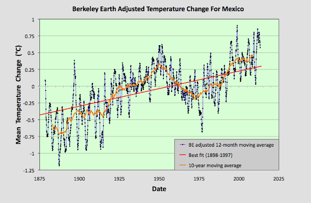
Fig. 93.1: The mean temperature change for Mexico relative to the 1961-1990 monthly averages. The best fit is applied to the monthly mean data from 1898 to 1997 and has a positive gradient of +0.58 ± 0.06 °C per century.


The result of averaging the monthly temperature anomalies from all the 142 long and medium stations in Mexico results in the set of mean temperature anomalies (MTA) shown in Fig. 93.1 above. The anomalies for each station were determined by first calculating the twelve monthly reference temperatures (MRT) for each station. The method for calculating the MRTs, and then the anomalies for each station dataset has been described previously in Post 47. In this case the time interval used to determine the MRTs was 1961-1990 as almost all the 142 stations had at least 40% data coverage in this interval. The MRTs for each station were then subtracted from the station's raw temperature data to produce the anomalies for that station.

The MTA data in Fig. 93.1 clearly shows a positive temperature trend over time that equates to a warming of about 0.6°C over the last century. However, within this trend are fluctuations in the 5-year moving average (yellow curve) that are even greater than the overall rise in the trend (red curve). This behaviour is also seen in the Berkeley Earth adjusted data shown in Fig. 93.2 below.


Fig. 93.2: Temperature trends for Mexico based on Berkeley Earth adjusted data. The average is for anomalies from all stations with over 480 months of data. The best fit linear trend line (in red) is for the period 1898-1997 and has a gradient of +0.52 ± 0.03°C/century.


The Berkeley Earth (BE) data presented in Fig. 93.2 was generated using the same averaging process as that used for the data in Fig. 93.1 but using BE adjusted anomaly data. Usually this leads to a large difference in the temperature rise calculated using the unadjusted raw data (Fig. 93.1) from that using the BE adjusted data (Fig. 93.2). I have shown numerous examples in this blog over the last two years for many different countries, states and regions where this is the case, and it is one of my main reasons for doing this blog: to highlight the extent to which much of the original temperature data has been adjusted. 

In this instance, however, the adjustments made by Berkeley Earth (and there are many in most station datasets) appear to make little difference to the final outcome for the overall temperature trend. And this is not because the averaging process I use is different from the Berkeley Earth method. It is. I do not use any homogenization, Kriging or weighted coefficients for the different datasets in the averaging. Yet the temperature trend I derive from the BE adjusted data and present in Fig. 93.2 is virtually identical to the one published by Berkeley Earth and shown in Fig. 93.3 below. So once again the averaging process is not the issue.


Fig. 93.3: The temperature trend for Mexico since 1830 according to Berkeley Earth.


This all seems to suggest that the overall temperature trend for Mexico is as I have calculated in Fig. 93.1, and that this is broadly consistent with the Berkeley Earth version. But if we look at the data more closely we see a complication.


Fig. 93.4: The number of station records included each month in the mean temperature anomaly (MTA) trend for Mexico in Fig. 93.1 (blue curve). These stations can be sorted into two distinct groups. Those with five digit Berkeley Earth ID codes are shown in red, those with six digit IDs are in green.


The data files on the Berkeley Earth website for the stations in Mexico broadly fall into two distinct categories: those with 5-digit IDs and those with 6-digit ones. The different numbers appear to reflect the fact that the original data in each case comes from a different source database, with the 5-digit data files more likely to originate from a single source, usually the Global Historical Climatology Network (GHCN) of NOAA, and the 6-digit data files from multiple databases. The number of each of the two file types used to determine the MTA trend in Fig. 93.1 is shown in Fig. 93.4 above. 

Now ordinarily this difference in file source is not an issue. The same differentiation in ID numbers is seen for stations from many countries. The problem here is that these two sets of data files give wildly different results for the MTA trend of Mexico. This can be seen when we examine the temperature trends for each station individually as the map in Fig. 93.5 below illustrates.


Fig. 93.5: The (approximate) locations of the weather stations in Mexico. Those stations with a high warming trend between 1901 and 2000 are marked in red while those with a cooling or stable trend are marked in blue. Those denoted with squares are stations with a 6-digit Berkeley Earth ID, while diamonds denote stations with a 5-digit ID.


In Fig. 93.5 the geographical location in Mexico of each of the 142 weather stations with the longest temperature records used to determine the mean trend in Fig. 93.1 are plotted. Those in red have significant warming trends while those in blue are generally stable (the total temperature rise is either less than 0.25°C, or the trend is less than twice the error in the trend). In addition, the stations with 5-digit IDs are denoted by a diamond while those with a 6-digit ID are represented by a square. What is noticeable is the different split between warming and stable trends in each case.

In the case of stations with 6-digit IDs 73% (32 out of 44) have a warming trend, whereas for the stations with 5-digit IDs it is only 38% (37 out of 98). This difference is even more apparent if we calculate the mean temperature anomaly (MTA) for each set of stations separately.


Fig. 93.6: The mean temperature change for Mexico relative to the 1961-1990 monthly averages calculated using stations with a 5-digit Berkeley Earth ID. The best fit is applied to the monthly mean data from 1921 to 2010 and has a positive gradient of +0.14 ± 0.07 °C per century.


The MTA data in Fig. 93.6 above shows the mean temperature change for Mexico calculated using only anomaly data from stations with a 5-digit Berkeley Earth ID. The trend in this case is almost completely flat. In contrast, if the same exercise is performed using only anomaly data from stations with a 6-digit Berkeley Earth ID the result is a strong warming trend of over 1°C per century as shown in Fig. 93.7 below.


Fig. 93.7: The mean temperature change for Mexico relative to the 1961-1990 monthly averages calculated using stations with a 6-digit Berkeley Earth ID. The best fit is applied to the monthly mean data from 1898 to 1997 and has a positive gradient of +1.13 ± 0.06 °C per century.


All this means that it is difficult to conclusively assert what the degree of climate change in Mexico has been over the last century. The most reasonable estimate is that the mean temperature has risen by about 0.6°C (see Fig. 93.1 and Fig. 93.2), but it could be anywhere between 1.2°C (see Fig. 93.7) and 0°C (see Fig. 93.6).


Acronyms

BE = Berkeley Earth.

MRT = monthly reference temperature (see Post 47).

MTA = mean temperature anomaly.

List of all stations and links to all the original raw temperature data


Friday, August 20, 2021

75. Southern Asia - overall temperature trend STABLE to 1975

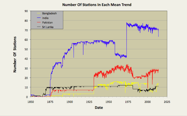
In my previous four blog posts I determined the temperature trends for India, Pakistan, Sri Lanka and Bangladesh using unadjusted temperature data. The number of stations used to calculate the mean temperature each month is shown in Fig. 75.1 below. In the first three cases no warming was detectable before 1975, and only a modest temperature increase of about 0.6°C thereafter. In the case of Bangladesh there was a continuous warming that amounted to less than 0.3°C. This is significantly different from the conventional narrative on global warming, and highlights the impact that temperature adjustments have on the warming trends published by most of the main climate groups. In almost all cases the affect of these adjustments is to increase the rate of warming in the final trend as most of the regional trends I have published on this blog have also illustrated. In this post I will combine the results for India, Pakistan, Sri Lanka and Bangladesh into a temperature trend for the region.


Fig. 75.1: The number of station records included each month in the mean temperature anomaly for each of four countries in South Asia.


In Post 70 I performed a similar task for data from the different countries in South-East Asia using two separate methods. One method just involved a simple average of temperature anomalies from all the different stations in the region, while the second used a weighting process that was used to average the mean anomalies for the different countries based on their land areas. If all the countries have similar densities of stations, then both methods should yield the same result. In the case of South-East Asia that was broadly the case for most countries other than Burma, but the differences in the two methods still led to a difference in the temperature trend gradients of almost 0.1°C per century. In the case of South Asia there are large differences in station density between countries, and these differences can also change over time, as shown in Fig. 75.2 below. For this reason, in this post I have chosen to adopt the area weighted method to determine the regional temperature trend.


Fig. 75.2: The station density each month for each of four countries in South Asia.


By comparing Fig. 75.1 and Fig. 75.2 it can be seen that India clearly has the most sets of station data, but it is Sri Lanka that has the highest density of stations. However, the temperature anomaly for Sri Lanka will also be subject to greater uncertainty as it is based on only a handful of stations (eleven at most). Then again, the contribution of the Sri Lanka stations to the final regional trend will be small due to the much smaller area of Sri Lanka compared to both India and Pakistan.


Fig. 75.3: The temperature trend for South Asia based on an average of anomalies from all long and medium stations. The best fit is applied to the monthly mean data from 1876 to 1975 and has a positive gradient of +0.19 ± 0.06 °C per century. The monthly temperature changes are defined relative to the 1951-1980 monthly averages.


Applying an area weighted approach to the calculation results in the temperature anomaly time series shown in Fig. 75.3 above. This is calculated by multiplying the mean anomaly data for each country (e.g. the monthly data in Fig. 74.2 for Bangladesh) by the area of that country, and then summing the resulting products for all four countries in the region. Then the result is divided by the total area of the four countries.

Like the equivalent anomaly time series for the individual countries, the regional anomaly exhibits very little warming before 1975 with about 0.5°C of warming occurring thereafter (see Fig. 75.3). To reiterate, this is the result that we get when we use the actual raw unadjusted temperature data for each station and not the adjusted/homogenized data that is generally favoured by climate scientists.


Fig. 75.4: Temperature trends for South Asia based on an average of Berkeley Earth adjusted data from all long and medium stations. The best fit linear trend line (in red) is for the period 1876-2005 and has a gradient of +0.66 ± 0.02°C/century.


If, however, we perform the same calculation with adjusted data (which is available in the same data file as the unadjusted data on the Berkeley Earth site) we get a quite different result as is shown in Fig. 75.4 above. There is now a strong and continuous warming trend from 1875 onwards. The total warming is claimed to be 1.25°C, with 0.5°C of this occurring before 1975 (see 10-year average in Fig. 75.4). This is still less than that claimed by Berkeley Earth and shown in Fig. 75.5 below. However, this is likely to be because Berkeley Earth included both Iran and Afghanistan in the Southern Asia region, and according to Berkeley Earth the regional temperature trends for both Iran and Afghanistan exhibit over 1.5°C of warming after 1970. That would help to explain the larger temperature rise post-1970 seen in Fig. 75.5 (almost 1°C) than is seen in Fig. 75.4 (only 0.7°C). What is harder to explain is why there is so much warming before 1900 in Fig. 75.5 when there is a) so little data with almost all being due to one or two stations in India, and b) very little increase in atmospheric carbon dioxide levels to cause such a temperature increase.


Fig. 75.5: The temperature trend for South Asia since 1790 according to Berkeley Earth.


Finally, if we compare the temperature trends for the four countries of South Asia we see that while there are broad similarities in their general trends over timescales of decades, there is only moderate correlation of more short term features and fluctuations (see fig. 75.6 below). The main reason for this is distance. The principal cities of Bangladesh (Dhaka), Sri Lanka (Colombo) and Pakistan (Karachi) are all at least 2000 km apart. As I demonstrated in Post 11, temperature anomaly time series from stations that are more than 1500 km apart are very poorly correlated as Fig. 11.2(a) in that post illustrates.


Fig. 75.6: A comparison of the temperature trends of Bangladesh, Pakistan and Sri Lanka with that of neighbour India. For clarity the trends for Pakistan and Bangladesh are offset by +1°C and -1°C respectively.


Summary

The temperature trend for Southern Asia shows no warming before 1975 and only about 0.5°C thereafter (see Fig. 75.3).

The trend based on Berkeley Earth adjusted data shows significantly more warming (about 1.1°C in total), including significant warming (about 0.5°C) before 1975 (see Fig. 75.4).


Saturday, November 21, 2020

40. Belgium and Luxembourg - temperature trends 1°C WARMING

In the next few posts I am going to take a look at the temperature trends in a few countries in western Europe, starting with Belgium. The unique feature of these countries is that they have some of the longest instrumental temperature records in the world.


Fig. 40.1: The temperature trend for Brussels since 1794. The best fit is applied to all the data and has a positive gradient of +0.67 ± 0.05 °C per century. The monthly temperature changes are defined relative to the 1976-2005 monthly averages.


The longest temperature record in Belgium comes, not surprisingly, from Brussels, and extends back to 1794 (see Fig. 40.1 above). That is the good news. The bad news is that there are no other temperature records with significant temperature data before 1973. Four records do have a couple of years of data in the early 1940s. But this data is probably not very reliable as there is then a thirty year gap to the rest of the data, and the early data was clearly collected under conditions of wartime occupation. The only other significant dataset comes from Luxembourg to the south of Belgium (see Fig. 40.2 below) which extends back to 1878.

The blue data in Fig. 40.1 above is the monthly temperature anomaly for Brussels, i.e. the amount by which each month's mean reading deviated from a reference value for that month for that station. Those monthly reference temperatures (MRT) were calculated by averaging all equivalent months (i.e. January or February etc.) in that dataset over the period 1976-2005. This is a later period than that used for most previous blog posts (most use 1961-1990) and is solely because of the lack of data before 1973. The monthly reference temperatures (MRT) are then subtracted from the raw monthly data to generate the monthly anomaly data. For a longer explanation of this process see Post 38 and Post 4.

It can be seen from the anomaly data in Fig. 40.1 that the range of anomaly values can be up to 12 °C, with the extreme negative values being more extreme than the extreme positive ones. These extreme negative values almost always correspond to severe winters; the winter of 1942 was particularly bad with two consecutive months (January and February) recording monthly means that were over 6 °C below normal. In the middle of a Nazi occupation I suspect that was really grim. Overall, though, this suggests that extreme winter cold spells are much deeper and longer lasting than prolonged summer heatwaves.

The other main feature of the data in Fig. 40.1 is the overall upward trend. Apart from a significant dip around 1890, this is almost continuous, and is illustrated more clearly by the 5-year moving average (yellow curve). Overall the mean temperature in Brussels rises by over 1 °C, as indicated by the red best fit line, from 1794 to 2013. However, as I pointed out in Post 14, the growth in energy usage in Belgium over the same period would be expected to raise temperatures by around 0.98 °C anyway. This would appear to indicate, that while the temperature rise is probably man-made, it is in all likelihood not entirely due to the emission of carbon dioxide and the Greenhouse Effect. 

It may be tempting to also discount this temperature record for Brussels as being an aberration or anomaly from the norm. However, if we compare it to the data for Luxembourg shown in Fig. 40.2 below, we see similar trends and features. There is a similar temperature rise after 1985, similar peaks in the 5-year moving average around 1947 and 1960, and a similar trough around 1890. The gradients of the best fit lines are similar in both cases as well, although the uncertainty for the Luxembourg best fit is much greater at almost ±0.16 °C. This, though, is partly due to the shorter time span of the Luxembourg data. 


Fig. 40.2: The temperature trend for Luxembourg since 1878. The best fit is applied to the interval 1895-2004 and has a positive gradient of +0.49 ± 0.16 °C per century. The monthly temperature changes are defined relative to the 1976-2005 monthly averages.


If we now look at the remaining data for Belgium and Luxembourg we see that there are an additional fourteen medium stations with temperature records that contain at least 480 months of data (see here for a list). Most of this data is for the period 1973-2013. The locations of the two long stations (Brussels and Luxembourg) and the fourteen medium stations are shown on the map in Fig. 40.3 below.


Fig. 40.3: The locations of long stations (large squares) and medium stations (small diamonds) in Belgium and Luxembourg. Those stations with a high warming trend are marked in red.


The map in Fig. 40.3 indicates that the two long stations with over 1200 months of data and the fourteen medium stations with over 480 months of data are distributed fairly evenly across Belgium and Luxembourg. This is important because it means that we probably don't need to resort to complex weighted averages when finding the overall temperature trend. A simple mean will suffice. In which case, combining the anomalies for the sixteen stations indicated in Fig. 40.3 gives the overall trend shown in Fig. 40.4 below.


Fig. 40.4: The temperature trend for Belgium and Luxembourg since 1794. The best fit is applied to the interval 1895-2004 and has a positive gradient of +0.52 ± 0.15 °C per century. The monthly temperature changes are defined relative to the 1976-2005 monthly averages.


As can be clearly seen, the overall trend for the whole of Belgium is not that different from that illustrated for Brussels in Fig. 40.1, but then why would it be? Over 80% of the trend in Fig. 40.4 is entirely due to the data from two stations: Brussels and Luxembourg. This is shown graphically in Fig. 40.5 below.


Fig. 40.5: The number of sets of station data included each month in the temperature trend for Belgium and Luxembourg.


Finally, if we compare these results using the raw data with those produced by Berkeley Earth which used adjusted data, we see broad similarities but some notable differences.


Fig. 40.6: Temperature trends for all long and medium stations in Belgium and Luxembourg since 1794 derived by aggregating and averaging the Berkeley Earth adjusted data. The best fit linear trend line (in red) is for the period 1801-1980 and has a gradient of +0.28 ± 0.03 °C/century.
 

Combining the Berkeley Earth adjusted anomaly data for the same sixteen station records as in Fig. 40.4 and taking the mean value yields the two trends shown in Fig. 40.6 above: one trend for the 12-month average (in black) and a second for the 10-year average (in orange). For temperature data after 1860 the two trends are very similar to those published by Berkeley Earth and shown in Fig. 40.7 below, with the curves exhibiting similar patterns of peaks and troughs in the two figures. This does appear to validate our initial assumption that weighted averages are unnecessary when combining these temperature records due to their even geographical spacing. However, the Berkeley Earth data before 1860 looks slightly different, and quite frankly is unlikely to be very reliable, given that it is based on only one temperature record, or for the curve before 1794, on no local data at all. 


Fig. 40.7: The temperature trend for Belgium since 1760 according to Berkeley Earth.


Finally, if we look at the difference between the raw data shown in Fig. 40.4 and the Berkeley Earth adjusted data presented in Fig. 40.6 we see that while the overall net adjustments Berkeley Earth made to the data in this instance are small and result in a slightly negative contribution to the trend, there were still large corrections made to segments of the data before 1930 that in effect attempt to "flatten the curve". These do not appear to have a significant impact on the overall trend though.


Fig. 40.8: The contribution of Berkeley Earth (BE) adjustments to the anomaly data after smoothing with a 12-month moving average. The linear best fit to the data is for the period 1831-2010 (red line) and the gradient is -0.048 ± 0.009 °C per century. The orange curve represents the contribution made to the BE adjustment curve by breakpoint adjustments only.


Conclusions

It is clear from Fig. 40.4 that there has been a large degree of warming in Belgium and Luxembourg over the last 200 years. It is likely, given the agreement between the data from the two longest temperature records and their significant spatial separation, that this warming is a feature of the entire region, and is not localized to just one area (or maybe two) of the country, although given the lack of data before 1973, that is not a certainty. The magnitude of this warming is probably in excess of 1 °C. However, this temperature rise is only what one would expect from the growth of industrial energy use over this period (for Belgium it should be about 0.98 °C) as explained in Post 14. It is also less than the 1.5 °C we are told to expect for anthropogenic global warming (AGW) in the Northern Hemisphere as claimed by the IPCC and the HadCRUT4 data. Consequently, it does not really add support to the theory that carbon dioxide is the primary driver of warming, otherwise the warming should be much larger.