Showing posts with label global warming. Show all posts

Saturday, August 13, 2022

127: The urban heat island (UHI) effect - an explainer


The urban heat island (UHI) effect.


The conventional wisdom is that climate change is driven by rising carbon dioxide (CO2) levels in the atmosphere, and only by CO2; so the greater the (CO2) levels the greater the temperature increase (see Fig. 87.3 in Post 87). You may have noticed one direct consequence of this orthodoxy in the way the media these days reports on environmental disasters or extreme weather (floods, droughts, storms, hurricanes, heatwaves, forest fires etc.): they always refer to climate change.

Implicit to this climate change reference is the assumption that all climate change is due to CO2 even though CO2 is rarely explicitly mentioned and the causation is rarely demonstrated. Consequently, the solution to all extreme weather events appears to be simple and obvious: cut CO2 levels in the atmosphere (i.e. Net Zero) and everything will be fine. Except it won't. This is because much of what is happening to local climates has little or nothing to do with CO2, but it does have a lot to do with other human activities, not least urbanization and industrialization. Central to both of these is the urban heat island (UHI) effect.

The problem when discussing the impact of the UHI effect on climate, and in particular the temperature record, is that it is controversial. This is partly because much of climate science appears to be driven by an anti-fossil fuel dogma that therefore sees any talk of UHIs as at best a distraction from the supposed only true problem, CO2, and at worst a campaign of disinformation designed to undermine all of climate science and its campaign against CO2. But it is also partly because UHIs come in many flavours. 

There are those UHIs that just trap more heat by reducing airflows and those that store more solar heat than rural areas by virtue of increased heat capacities. Both of these do not add to the total amount of energy absorbed at the Earth's surface though, so there is no net global temperature increase associated with them. But then there are those UHI processes that do absorb extra heat, either via changes to the albedo of the Earth's surface, or by the emission of large amounts of additional heat through anthropogenic energy use and generation. Both of these certainly do add to global warming but are still largely ignored by climate science. In the following sections I will discuss the relative impact of each of these four types of UHI effect in turn and show that one type in particular can be very significant.


i) Heat trapping

The aspect of the UHI effect that is referred to the most is heat trapping. This is where tall buildings in a city reduce the flow of hot air away from the centre causing the city to retain its heat longer. Perhaps the most obvious example of this is Manhattan in New York City with its dense cluster of tall skyscrapers.

The result of this UHI effect is that the local area of the city stays hotter for longer compared to if the buildings were not there. This is because there is less diffusion of heat to outlying areas, so those areas are less likely to be warmed by the city and the city is less likely to be cooled by heat transfer to the rural areas that surround it. 

However, this does not lead to more global warming because while the city will be hotter for longer than otherwise expected, the surrounding area will be cooler for longer as well because less heat from the urban areas reaches the rural areas. The key point here is that no extra heat is created at the surface of the Earth, it is just prevented from diffusing to colder regions. So the net effect on local mean temperatures is zero. As an example consider the Grand Canyon. It will trap heat in the same way that tall buildings do, but does that mean that it is warming faster than the rest of Arizona? No, and nor does it make Arizona as a whole get any warmer.

This is one reason why climate scientists discount the UHI effect, and in this case they are right, provided that the weather stations used to monitor temperature changes are evenly distributed and their temperature readings are not adjusted. Those, unfortunately, are big IFs, because any bias in station numbers between urban and rural regions compared to their relative areas will affect the the relative contribution of each to the mean global temperature, and we do know that station densities are generally higher in urban areas. So potentially there are more warm urban stations contributing to the global average than there should be and fewer cold rural ones. In an ideal world, though, this should not occur, and so neither would any contribution to global temperatures.

Net effect on global warming: zero.


ii) Increased heat capacity

Probably the second most cited variation of the UHI effect is heat retention where cities heat up and store energy from the Sun during the day and then gradually release it overnight. The net effect of this is that the maximum temperature in the city during the day should be less than expected because of the time it takes the buildings to heat up. This is because the Sun is not just heating up the top layer of the Earth's surface, as would be the case in rural areas; it is also having to heat up large concrete structures with much higher heat capacities. The higher the local heat capacity of these structures, the longer it takes to warm them and the slower, and therefore lower, their temperature rise will be. This in turn means that less infra-red radiation is then radiated back into outer space during the day because the region is cooler than it would be without the buildings, and so there is less heating of the lower atmosphere and less downwelling radiation.

At night, however, the heating from the Sun stops. The rural areas cool quickly but the urban areas don't because the urban areas have the much higher heat capacity: there is more heat stored that needs to be lost before a new thermal equilibrium without the Sun can be established. So the buildings are now warmer than their rural surroundings but are slowly cooling, acting like large radiators or storage heaters. This means that the city stays warmer for longer, and temperatures within the city are higher at night than they would otherwise be. 

The net effect of this is that temperatures during the day will be lower, but those at night-time will be higher. Overall, though, the effect on the average temperature will be zero as the two changes in temperature cancel due to the fact that the changes in heat absorption will also cancel.

Net effect on global warming: zero.


iii) Increased heat absorption

One consequence of urban development is that it changes the reflectivity of the Earth's surface for incident visible, ultraviolet and near infra-red radiation. This reflectivity is known as the albedo and it is loosely related to the colour of a surface: darker colours tend to absorb more radiation while lighter ones generally reflect more. If the albedo increases, then more radiation is reflected back into space without heating the planet, so ice and snow help to cool the planet (their albedo is over 80%) while dark soil and oceans tend to warm the planet (see Table 14.1 in Post 14 for a list of typical albedos). It therefore follows that if the colour of a surface changes, then so will its albedo, and this can then change the amount of radiation absorbed at the surface. If this absorbed radiation increases, then the Earth will get warmer and the UHI effect is one way this can happen.

In Post 14 I explained that of the average incoming solar radiation of 341 W/m2 that the Earth receives, only 161 W/m2 is absorbed at its surface, and that greenhouse gases then amplify this with 333 W/m2 of additional downwelling radiation. This total absorbed heat of 494 W/m2 then dictates the mean surface temperature via the Stefan-Boltzmann law (see Post 12). It therefore follows that if any change occurs at the Earth's surface that increases the 161 W/m2 of absorbed radiation, then this will change the downwelling radiation by the same percentage and therefore change the mean surface temperature as well.

The process of urbanization inevitably involves changing the colour and texture of the Earth's surface. It generally means that areas of vegetation are replaced with tarmac and concrete. Buildings with dark roofs absorb more solar radiation than trees and grassland. However the situation is not straightforward because concrete can be very reflective and arable land tends to be very dark. Overall though, there is generally a small decrease in albedo with urbanization, and therefore a small increase in the amount of solar radiation that is absorbed. This will raise the surface temperature of the Earth slightly as well, but because it is small it is not likely to be significant.

One human innovation that can have a big impact on temperature is solar power. Because solar panels are designed to absorb 99% of solar radiation, they will add additional heating to any area where they are installed by reducing the albedo to less than 1%. So they may save on CO2 emissions but they come with their own drawbacks, particularly if you live near them. And if they are added to roofs of buildings in cities and urban areas, they will substantially warm those areas.

Net effect on global warming: small increase in local temperatures.


iv) Heat production

There is one UHI effect that does significantly affect temperatures though: waste heat. This is where human energy use ends up as waste heat that heats the local environment around where the energy is being used. As I showed first in Post 14 and later in Post 29, this direct anthropogenic surface heating (DASH) can warm suburbs, cities and even whole countries by up to 1°C. But in fact even that warming is small compared to large cities like London. 

In 2013 the total energy use in Greater London from all sources was estimated at over 150,000 GWh. That is equivalent to an average power consumption of over 15 GW throughout the year. As the area of Greater London is about 1569 km2, this amounts to a constant power density of 9.6 W/m2. In Post 14 I explained how increasing the 161 W/m2 of solar radiation absorbed by the Earth's surface by 2.25 W/m2 would be sufficient to increase the mean surface temperature by 1°C. But I also explained that any other source of heat that was absorbed or produced at the surface would have the same effect. So 2.25 W/m2 of waste heat generated at the surface would also lead to 1°C of warming.

In London the waste heat will amount to 9.6 W/m2, more or less the same as the total power usage. This is because, according to the second law of thermodynamics, all energy is destined to end up as heat or entropy eventually. So waste heat is probably responsible for over 4°C of warming in London - not a great shock to people who live there. That is the urban heat island effect (UHI).

Of course not everyone sees it this way. In climate science this warming is dismissed as trivial because it only amounts to 0.028 W/m2 of power use when averaged across the entire surface of the Earth, and so it only raises global mean temperatures by about 0.01°C. While this is technically correct, it neglects the uneven distribution of both these heat sources and the weather stations that determine the global temperature. Most weather stations are on land, almost 90% are in the Northern Hemisphere, and most of these are in the USA, Europe and China. So a high proportion are going to be distorted by the UHI effect from waste heat. That is what makes it important.

Net effect on global warming: large increase in large cities and much of Europe and the USA.


Summary

What I have shown here is that most types of urban heat island (UHI) have little or no effect on global warming with one exception: waste heat. This can add several degrees to the local temperatures.

However, even this is not the full story because the existence UHIs of themselves is not the only issue. Just because a small area of the Earth's surface retains or produces more heat than another does not mean that overall temperatures will rise and add to global warming. It is the change in heat retention and emission over time that is important, not the magnitude or difference from the rest of the environment. A UHI has no impact on global warming if its energy usage is not changing over time. Unfortunately in most cases the energy usage has changed, and by a large amount.

In the next six posts I will highlight six extreme examples of UHIs in the Southern Hemisphere. These are all examples of UHIs in large cities where the UHI temperature has increased much faster than that seen in the country or region as a whole, probably due to significant growth in the size, population and energy use in those cities.


Wednesday, December 22, 2021

87. How the Greenhouse Effect on Earth changes with increasing carbon dioxide concentration

In my previous post (Post 86) I explained how infra-red photons emitted by the Earth's surface interact with carbon dioxide (CO2) in the atmosphere to create the Greenhouse Effect. I also showed that increasing the temperature of the planet and increasing the concentration of carbon dioxide in the atmosphere will both lead to an increase in the width of the 15 µm absorption band of CO2. This in turn will increase the amount of radiation that is backscattered by the CO2, and therefore increase the amount of radiation heating the surface of the planet. 

In this post I will attempt to quantify the temperature increase for different increases in the CO2 content of the atmosphere using the results presented in Post 86 and Post 85. What I will show is that the increase in atmospheric levels of CO2 from 280 ppm in 1750 to almost 420 ppm today can only be responsible for at most a 0.5°C increase in average temperatures. This is only about 40% of the 1.2°C claimed by the IPCC and climate scientists. In fact the actual temperature rise due to CO2 is likely to be less than half the calculated value of 0.5°C due to the masking effects of water vapour, and could be as little as 0.1°C. To put this into context, this is less than the values I have calculated for urban heating effects from waste heat (see Post 14 and Post 29) which would persist even without the use of fossil fuels.


The maths and physics

The starting point for this analysis is the quantum structure of the absorption band. This is shown in Fig. 87.1 below and was discussed in detail in Post 86. The key issue is the height of the various absorption lines in the P and R branches. These are identified by their angular momentum quantum number, J, which is numbered for each branch from the centre of the band, Q. 


Fig. 87.1: The detailed structure of the 15 µm absorption band for CO2 showing the absorption peaks associated with rotational transitions.


In Post 86 I also showed that the width of the 15 µm band is determined by the value of J that satisfies the following equation (see also Eq.86.9), this value being denoted as Jth.

(87.1)

In this equation T is the thermodynamic temperature in kelvins, k is the Boltzmann constant, h is Planck's constant and B is the frequency of the rotational angular momentum states. For the rotational transitions shown for CO2 in Fig. 87.1, hB = 0.1 meV and is equal to half the energy separation of the lines in the spectrum in Fig. 87.1. The other terms will be explained below.


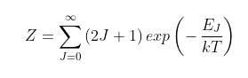
The Z term

The term Z is a normalization term equal to the total number of possible rotational states per molecule in the R (or P) branch as follows. 

(87.2)
 
In the case of Earth where the mean surface temperature T = 289 K, the term Z = 249.3. The energy term EJ = J(J+1)hB. As the degeneracy term (2J + 1) is the differential of the J component of the energy term J(J+1), it follows that for large T the summation in Eq. 87.2 reduces to an integral over all J states, in which case ZkT/hB.
 
 
The No term
 
The term No in Eq. 87.1 is equal to the total number of CO2 molecules per unit surface area found in the R branch. This can be estimated as being equal to approximately half the molecules, with the other half being in the P branch which is assumed to be the mirror image of the R branch (but is not really as was explained in Post 86). This also neglects the significant number of CO2 molecules (particularly at low temperatures) found in the Q peak. Nevertheless, this approach does at least set an upper limit to the width of the R branch, and thus the width of the 15 µm band as a whole. And as will be shown below, it does give results that are remarkably accurate. As the number of CO2 molecules per unit surface area found on Earth is 150 moles per square metre, it therefore follows that No is equal to 75 mol/m2.


Calculating Nth and Jth.

The final remaining parameter to calculate is Nth. Ideally, if the absorption band edge had vertical edges, it would be the threshold number of CO2 molecules per unit area that are just sufficient to completely block the radiation and would be equal to the reciprocal of the scattering cross-section, σs. As σs for CO2 molecules is estimated to be between 10-24 m2 and 10-23 m2 in the 15 µm band, that would imply a value for Nth of about 1 mol/m2. In practice, however, the band edge is curved so the usual definition of the edge is to take the position of the half maximum. This means using a value of Nth = 0.5 mol/m2 is more appropriate.

With all the parameters now set we can calculate Jth using Eq. 87.1 above. The result we get is 29.4, which when multiplied by the line spacing, 2hB, gives the width of the R branch as 47.4 cm-1 in wavenumbers. Assuming the P branch is identical means that the 15 µm band will extend from 619.6 cm-1 to 714.4 cm-1, or from 14.00 µm to 16.14 µm. This is remarkably close to the 14.2 µm to 16.2 µm that is generally observed for the peak in the absorption.

Having calculated the width of the 15 µm band with an atmospheric CO2 concentration of 420 ppm, we can also repeat the procedure for any other CO2 concentration of our choosing. For example, an atmospheric CO2 concentration of 280 ppm that is characteristic of global conditions in 1750 leads to a value for Jth of 27.3, which means that the width of the R branch would be 44.0 cm-1.


The temperature rise

In Post 85 I showed how the reflection of a fraction f of outgoing infra-red radiation would reheat the Earth's surface and cause the radiation it absorbed to increase from Io to a higher value IT as follows

(87.3)

Then in Post 86 I showed how the width of the 15 µm absorption band could be used to determine the value of f by calculating the relative area of this band under the absorption spectrum (see Fig. 86.1). This can then be used to infer a temperature rise due to the absorption by utilizing the Stefan-Boltzmann law,

 I = σT4

(87.4)

If IT is the intensity of radiation emitted by the Earth's surface normally (i.e. 396 W/m2), and f is the fraction of radiation reflected back by the CO2, then the intensity of radiation emitted by the Earth's surface without the CO2 greenhouse effect will, according to Eq. 87.3, be Io = (1-f)IT. We can then use Eq. 87.4 to calculate the respective surface temperatures Tf and To for each radiation emission intensity, IT and Io. The difference in the two temperatures will be the warming due to the CO2.

I showed above that an atmospheric CO2 concentration of 420 ppm leads to an absorption band that extends from 14.00 µm to 16.14 µm. Combining this with the black body spectrum of the Earth at Tf = 289 K (see Fig. 87.2 below) allows us to determine f to be f = 10.0%. This in turn implies that Io = 356.1 W/m2 (where Io is the radiation intensity without CO2 feedback), and thus To = 281.52 K. So the temperature rise due to CO2 is 7.48 K.


Fig. 87.2: The electromagnetic emission spectrum for the Earth's surface at a mean temperature of 289K (blue curve) together with the absorption profile due to CO2 between 14.00 µm and 16.14 µm (red curve).


Now if we reverse this calculation but use an atmospheric CO2 concentration of 280 ppm, we find that the absorption band now extends from 14.06 µm to 16.05 µm, so f = 9.28%. The value of Io = 356.1 W/m2 will be the same as before but the addition of a different amount of CO2 will change IT and Tf because f is different. The new values will be IT = 392.6 W/m2 and Tf = 288.46 K. So the temperature rise from CO2 is now only 6.94 K. This implies that the temperature rise since 1750 due to the atmospheric CO2 concentration increasing from 280 ppm to 420 ppm is only 0.54°C (i.e. 7.48°C - 6.94°C). 

If we repeat this process for other past or future (potentially) CO2 concentrations we can calculate a theoretical temperature rise for each. This is shown in the graph in Fig. 87.3 below with the temperature changes all measured relative to the 1750 value when the atmospheric CO2 concentration was 280 ppm.


Fig. 87.3: The theoretical effect of an increasing atmospheric CO2 concentration on the contribution of CO2 to global warming.


What Fig. 87.3 demonstrates is that the expected temperature increase from an increase in atmospheric CO2 has a logarithmic dependence on the CO2 concentration. However, the trend for concentrations between 280 ppm and 420 ppm is fairly linear and leads to a 0.5°C increase. Overall it appears that doubling the CO2 concentration leads to about 1°C (or 1 K) of warming.


The interpretation of the data

While the logarithmic trend shown in Fig. 87.3 is in general agreement with climate models, the magnitude of the temperature changes are not. Whereas Fig. 87.3 suggests that 420 ppm of CO2 leads to about 0.52°C of warming, the IPCC and climate science are claiming the rise is much greater at about 1.2°C. The difference, I suspect, is probably down to the impact of water vapour. Unfortunately, there are many ways that water vapour can impact the temperature trend.

The conventional view from climate scientists is that water vapour is a positive amplifier; the theory being that a warmer climate causes the amount of water vapour in the troposphere to increase, thus creating even more warming. As I pointed out in Post 86, the total feedback factor for infra-red radiation, f, is about 59%, while CO2 alone can only account for about 18%, assuming that the 15 µm CO2 absorption band width is measured at its half-maximum points from 13.35 µm to 17.35 µm. So the assumption is that water vapour is responsible for the rest, and that as its atmospheric concentration is dependent on the temperature, its concentration will increase as the level of CO2 increases. So this will make the feedback, f, increase about three times faster than from CO2 alone and so massively increase the temperature change to 1.2°C. The problem with this theory is that it ignores two major snags. 

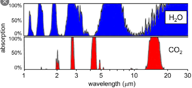
First, the 15 µm CO2 absorption band overlaps with the H2O absorption band, as shown in Fig. 87.4 below. At the high wavelength edge of the 15 µm CO2 band (17 µm) the water vapour will absorb almost 100% of the outgoing radiation while at the low wavelength edge (13 µm) it will absorb about 50%. This means that about 75% of any increase in the width of the 15 µm CO2 absorption band will be masked from the outgoing radiation by the water vapour. In which case the temperature rise will only be 25% of the predicted value, or about 0.13°C.


Fig. 87.4: The absorption bands of carbon dioxide and water vapour at sea level.


Secondly, the window in the H2O absorption band extends from 8 µm to about 15 µm (using the half maxima points). This window allows only 41% of the Earth's outgoing infra-red radiation to escape. As we know that the feedback factor f = 59%, this means that water vapour could be responsible for absorbing and reflecting almost all the outgoing infra-red radiation that is absorbed and reflected. In other words, the 15 µm CO2 band is not needed, and in fact is probably, largely redundant because it is hiding behind the water vapour. So again, a small change to the width of the CO2 band is unlikely to cause any major temperature changes. This is why so many eminent physicists have so many serious reservations regarding the global warming predictions coming out of climate science.


The conclusions

1) Increasing the atmospheric CO2 concentration will increase the width of its 15 µm absorption band.

2) In the absence of water vapour this could raise global temperatures, with an increase in CO2 concentration from 280 ppm to 420 ppm resulting in a 0.5°C increase in global temperatures. 

3) The projected temperature increase has a logarithmic dependence on CO2 concentration (see Fig. 87.3).

4) Water vapour masks most of the CO2 15 µm absorption band and so dominates the infra-red absorption. It can also account for almost all of the radiation feedback on its own.

5) The impact of water vapour means that an atmospheric CO2 concentration rising from 280 ppm to 420 ppm could result in as little as a 0.13°C increase in global temperatures. This is ten times less than is currently claimed by climate science.


The caveats and discrepancies

In this analysis there are major uncertainties over the value of the CO2 scattering cross-section, σs, and the widths of the CO2 and H2O absorption bands. This is also due to the difficulty in estimating the parameters No, Nth and Jth. However, the overall level of agreement between this analysis and real data and existing theory is encouraging.

The major discrepancy is between the measured width of the CO2 15 µm absorption band at its half maximum, where it extends from 13.35 µm to 17.35 µm, with the predicted width based on Jth where it extends from 14.00 µm to 16.14 µm. This difference could be due to line broadening from pressure broadening and temperature.


Friday, December 10, 2021

85. The Greenhouse Effect

In the overall debate over global warming probably the most contentious area for many is the scientific validity of The Greenhouse Effect. Whether on Twitter or on climate sceptic sites like WUWT, there are many commenters who simply refuse to accept it, or fail to understand it. In fact many climate scientists (particularly non-physicists) also do not fully understand it, or misrepresent it. In this post I will outline some of the common misconceptions about it, and then explain how the greenhouse effect actually arises. 


Myth 1: Carbon dioxide causes an increased heating of the atmosphere

As the atmosphere can absorb heat that is radiated from the surface of the planet, the claim here is that the presence of greenhouse gases like carbon dioxide (CO2) increases the amount of heat that the atmosphere can store. This is true(ish), but the amount of additional heat or thermal energy stored by CO2 is so small relative to the total that it is irrelevant.

The key property here is the molar heat capacity of the gas. Every gas in the atmosphere has a different heat capacity, this being the additional amount of thermal energy stored in that gas per unit increase in temperature. However, they are generally very similar in magnitude (see here), although the molar heat capacity of CO2 is about 25% greater those of nitrogen (N2) and oxygen (O2) due to its additional degrees of freedom in accordance with the equipartition theorem. But carbon dioxide only comprises about 0.042% of all the molecules in the atmosphere, so it can only increase the total heat capacity of the atmosphere by an insignificant 0.01%. But more importantly, even this small increase is irrelevant because it is the temperature of the atmosphere that determines its rate of thermal emission, not the quantity of heat that it stores. 

The amount of heat stored merely determines the rate at which the atmosphere will cool at night. This is why planets with thick atmospheres, like the Earth and Venus, cool less at night than planets with thin atmospheres like Mars. Their thick atmospheres mean that they store a lot more energy at a given temperature, but it is the temperature that determines the rate of energy loss. So two planets at the same temperature will cool at different rates if they have different densities of atmosphere, even though the initial rate of energy loss (as set by the temperature and the Stefan-Boltzmann law) will be the same for each. This is because the planet with the thinner atmosphere will run out of stored energy first.


Myth 2: The greenhouse effect is the result of a hot atmosphere heating the Earth's surface

This myth is related to, and dependent on, Myth 1. If the atmosphere is getting hotter because the CO2 is trapping and storing heat emitted by the Earth's surface, then the temperature of the atmosphere will increase. Eventually the atmosphere will become hotter than the surface and so it will begin reheating the surface. So the surface temperature will also increase. Except this is not how greenhouse gases work. 

They don't trap heat for long periods, but instead just reflect it back to the surface. In essence they behave like a thermal mirror. The result is that the surface gets reheated by the atmosphere, but not because the atmosphere is hotter than the surface. The lower atmosphere, or troposphere, is never hotter than the surface. It is just that the photons of infra-red radiation emitted by the surface bounce off the CO2 molecules, and some then get reflected back to the surface and reheat it.


Myth 3: Thermal radiation cannot move from a cold object to a hotter one

One reason many climate sceptics appear to reject the concept of the greenhouse effect is that they feel it violates basic principles of physics, not least the second law of thermodynamics. One of the many versions of this law states that net heat flow is always from a hot object to a cooler one, and not in the reverse direction. Many thus misinterpret this law because they fail to appreciate the importance of the term "net". It is not that heat or thermal energy cannot flow from a cold object to a hotter one: it does. In fact all objects emit (and absorb) thermal radiation irrespective of their temperature; the Stefan-Boltzmann law tells us that (see Post 12). The key point is that hotter objects emit more. In fact the Stefan-Boltzmann law dictates that the amount of radiation emitted is proportional to the fourth power of the thermodynamic temperature T measured in kelvins (see Eq. 12.6 in Post 12).

What the greenhouse effect does is increase the amount of energy that moves in the opposite direction by enabling the atmosphere to reflect back energy emitted by the surface. But the amount reflected back is always less than 100% of that emitted by the surface, so this still means that more energy is moving from the surface up into the atmosphere than is moving in the opposite direction. Thus, the net heat flow is still upwards into the atmosphere, moving from hot to cold. Consequently the second law of thermodynamics still holds.


Myth 4: There is too little carbon dioxide in the atmosphere to make a difference

Currently the concentration of carbon dioxide in the atmosphere is about 420 ppm, or 0.042% of all the gas molecules. This looks like a small number, but there are a lot of molecules in the atmosphere. In fact there are are 0.357 million moles of gas for every square metre of the Earth's surface (1 mole = 6.02 x 10²³ atoms or molecules). So 0.042% of that equates to 150 moles of carbon dioxide per square metre, or 9.04 x 1025 molecules of carbon dioxide per square metre. 

As these molecules are typically 0.33 nm in diameter, this still means that every infra-red photon emitted from the surface of the Earth will expect to collide with at least ten million CO2 molecules before it can escape into outer space. Sooner or later one of these molecules with absorb it and then re-emit it, and half of these re-emissions will be in a reverse direction towards the Earth's surface. That is why so few infra-red photons can escape. 

The exact number of collisions depends on the scattering cross-section of the molecule at the relevant wavelength of radiation. This cross-section represents the effective area of the molecule that the photon of radiation sees, or alternatively the actual area of the molecule multiplied by the probability of being absorbed at each potential collision. So while the actual cross-sectional area of the carbon dioxide molecule is about 10-19 m2, the effective area as measured by spectroscopy is much less, around 4x10-24 m2. This means that the number of collisions each photon can expect to make with a CO2 molecule before it can escape into outer space is only about 360 (i.e. 9.04 x 1025 x 4 x 10-24). 

This, though, is still more than enough to block the emission path of virtually every photon with the necessary wavelength. In fact most will be blocked within 30 m of the surface (the result of dividing the effective thickness of the atmosphere of 10 km by 360). But as Fig. 85.1 below shows, only photons with wavelengths close to the CO2 absoption bands at 2 µm, 2.7 µm, 4 µm and 15 µm can be absorbed by the carbon dioxide. For the rest the CO2 molecules will be completely transparent.


Fig. 85.1: The absorption spectrum of different greenhouse gases in the visible and infra-red.


How the greenhouse effect really works

The starting point is electromagnetic radiation from the Sun which heats up the surface of the planet. As the surface warms it also gives off radiation, but because the temperature of the Earth's surface (288 K) is much less than that of the Sun (5778 K), the energy, or frequency, of the radiation emitted is much less than that of the incoming radiation. That means that its wavelength is longer - typically about twenty times greater. So while the incoming radiation from the Sun is mainly in the visible part of the electromagnetic spectrum (see the red curve in Fig. 85.1), the radiation emitted by the Earth's surface is generally in the infra-red (see the blue curve in Fig. 85.1).

The effect of greenhouse gases like carbon dioxide is to reflect back some of the outgoing infra-red radiation. This then gets re-absorbed by the surface and heats it further. This is the greenhouse effect. The key point is that the outgoing radiation is merely being reflected back by collisions with carbon dioxide (or water) molecules in the atmosphere. So these greenhouse gas molecules act like a mirror. In the next post I will outline the mechanism and mathematics of this in more detail. Any additional heating of the atmosphere only comes later as a result of the additional heating of the surface.

The result of this reflection of outgoing radiation is that the amount of radiation hitting the Earth's surface and being absorbed increases. For example, suppose the amount of radiation from the Sun that is being absorbed by the Earth's surface is Io. As I showed in Post 13 (The Earth's energy budget) this equates to about 161 W/m2. With no greenhouse effect in place the outgoing radiation will balance the incoming radiation, and so according to the Stefan-Boltzmann law (see Eq. 12.6 in Post 12) the surface temperature will be 231 K (or -42°C). 

However, if a fraction p of the initial outgoing radiation is reflected back (i.e. pIo), then the total incoming radiation will be (1 + p)Io . This will heat up the surface even more and result in a higher emission temperature, which in turn will increase the total intensity of the outgoing radiation IT. If we then assume that the greenhouse gases reflect back a fraction f of the outgoing radiation, then the following equation must hold. 

(85.1)

This basically states that the total outgoing radiation must balance the incoming radiation plus the fraction of the outgoing radiation that is reflected back Ir = f IT. Rearranging Eq. 85.1 gives the result

(85.2)

We know that the current mean surface temperature of the Earth is approximately 289 K (or 16°C), so this allows us to calculate IT using the Stefan-Boltzmann law

I = σT4

(85.3)

where T is the temperature in kelvins and σ is the Stefan-Boltzmann constant. The result we obtain is that IT = 396 W/m2, and as Io = 161W/m2, this then implies that f = 0.59. In other words, the greenhouse gases reflect back about 59% of all outgoing infra-red radiation. 

Knowing the values of IT and Io also allows us to use Eq. 85.3 to determine the temperature of the Earth's surface both with and without the reflected radiation. These values will be 289 K and 231 K respectively. So the reflected radiation due to the Greenhouse Effect has increased the Earth's temperature by 58 K.


Thursday, November 18, 2021

81. Zambia and Malawi - temperature trends PARABOLIC

In the last few posts I have investigated the temperature trends from several countries in south-eastern Africa, and while the trends from each show certain similarities and consistencies (such as significant temperature rises after 1980), they also exhibit subtle differences. For example, the trend for Zimbabwe shows a slight cooling before 1980 (see Fig. 79.2 in Post 79) while the trend for Mozambique (see Fig. 78.6 in Post 78) does not. Meanwhile, the trend for Madagascar displays strong cooling before 1980 that is even greater than the warming that succeeds it (see Fig. 77.6 in Post 77). 

These discrepancies raise question about the reliability of all the trends, particularly the trends before 1940. However, these discrepancies can be almost totally reconciled when compared to the data from Zambia and Malawi. In short, the Zambia and Malawi data largely corroborates the cooling seen before 1980 in both the Madagascar data and the Zimbabwe data. It also suggests that the cooling in the Mozambique data is under-reported. probably due to a lack of data before 1930. The Zambia and Malawi data also suggests that there has been little, or no, net overall warming in the region since 1920, and that the climate has just undergone a natural oscillation in its mean temperature, albeit a rather large one of about 1.5°C.


Fig. 81.1: The (approximate) locations of the weather stations in Zambia and Malawi. Those stations with a high warming trend between 1901 and 2000 are marked in red while those with a cooling or stable trend are marked in blue.


The map in Fig. 81.1 above shows the distribution of weather stations in Zambia and Malawi. Overall there are sixteen stations with over 400 months of data but no long stations with over 1200 months of data. The average data length is 744 months (up to the end of 2013) with all but two of the stations being medium stations with over 480 months of data. Of these sixteen stations, only five are in Malawi (for a list see here) and the other eleven are in Zambia (for a list see here). This lack of station data, particularly for Malawi, was the main reason behind the decision to combine data from the two countries into a single mean temperature trend.

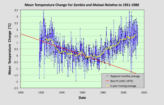
The monthly anomalies for each station were created in the usual manner, as outlined in Post 47. First a suitable thirty year interval was chosen for calculating the monthly reference temperatures (MRTs). In this case the period 1951-1980 was chosen as that corresponded to the interval that overlapped with the maximum number of station records. The twelve MRTs for each station dataset were calculated for each of the twelve months by averaging the monthly temperatures in the reference period for that station. The MRTs were then subtracted from all the data for that station to generate the anomalies. The anomalies from all the stations were then averaged to give the mean temperature anomaly (MTA) for the region in that month. Employing a simple average of the station data rather than using Kriging, homogenization and gridding is sufficiently accurate if the stations are fair evenly distributed, which the map in Fig. 81.1 suggests to be the case. The resulting mean temperature anomaly since 1918 is shown below in Fig. 81.2.


Fig. 81.2: The mean temperature anomaly (MTA) relative to the 1951-1980 monthly averages based on an average of anomalies from stations with over 360 months of data. The best fit is applied to the monthly mean data from 1921 to 1975 and has a negative gradient of -2.72 ± 0.17 °C per century.


What is striking about the change in the MTA shown in Fig. 81.2 is how different it looks to the widely advertised global warning trends, particularly before 1980 (see Fig. 80.1 for an example). It suggests that temperatures in 2010 were barely 0.3°C higher than they were in 1920, and yet in the intervening period the mean temperature varied wildly, dipping by up to 1.5°C before recovering.


Fig. 81.3: The number of station records included each month in the mean temperature anomaly (MTA) trend in Fig. 81.2.


It is also clear from the number of stations included in the MTA each month (see Fig. 81.3 above) that the early 20th century data is just as reliable as the data after 1990. So a lack of station data cannot explain the difference between the trends seen in the raw data as presented in Fig. 81.2 and those claimed by climate scientists.


Fig. 81.4: Temperature trends based on Berkeley Earth adjusted data. The average is for anomalies from all stations with over 360 months of data. The best fit linear trend line (in red) is for the period 1911-2010 and has a gradient of +0.87 ± 0.03°C/century.


Much of this difference is due to adjustments made to the data by climate scientists. Berkeley Earth (BE) include both the raw data and the adjusted anomaly data in their data files, so it is fairly straightforward to compare the two. Averaging the BE adjusted anomalies gives the data curve shown in Fig. 81.4 above. What is striking about this curve is how similar it is to the conventional global warming curve, and conversely how different it is to Fig. 81.2. It is also very similar to the BE published trend for Zambia as shown in Fig. 81.5 below.


Fig. 81.5: The temperature trend for Zambia since 1840 according to Berkeley Earth.


This discrepancy between the raw data and the BE adjusted data is not unique to data from Zambia and Malawi. As I have previously shown in numerous posts on this blog, it occurs in most of the data. Yet we are not allowed to question the statistical validity of these adjustments, despite mounting evidence that they may be flawed. And the magnitude of these adjustments is not insignificant. We can easily determine their magnitude simply by subtracting the MTA based on raw data (Fig. 81.2) from the equivalent due to adjusted data (Fig. 81.4). The result is the blue curve in Fig. 81.6 below. The orange curve is the contribution to the adjustments that comes solely from the breakpoint alignment where each station dataset is chopped into fragments, and those sections of data are then subjected to different biases. In addition there are other corrections to the blue curve that result from the gridding and homogenization processes that are used to generate anomaly datasets for each station, but these are generally less significant as Fig. 81.6 shows. 


Fig. 81.6: The contribution of Berkeley Earth (BE) adjustments to the anomaly data in Fig. 80.4 after smoothing with a 12-month moving average. The blue curve represents the total BE adjustments including those from homogenization. The orange curve shows the contribution just from breakpoint adjustments.


It can be seen from Fig. 81.6 that the net effect of the Berkeley Earth (BE) adjustments is to add between 0.25°C and 0.5°C of warming to the data between 1920 and 2010, while eliminating the parabolic dip in between, and replacing the trend with something that is more linear. This then increases the warming seen in the raw data between 1920 and 2010 from less than 0.3°C in Fig. 81.2 to more than 0.7°C in Fig. 81.4. The result is an adjusted temperature trend (Fig. 81.4) that bears no relation to the original data (Fig. 81.2).


Summary

Temperature changes in Zambia and Malawi over the last 100 years appear to owe more to natural variation than global warming.

The temperature trend is parabolic with an amplitude of about 1.5°C.

The maximum detectable warming since 1920 is 0.3°C. This is much less than the natural variation, and a long way short of the 2°C average claimed by climate scientists for global warming on land.


Acronyms

BE = Berkeley Earth.

MRT = monthly reference temperature (see Post 47).

MTA = mean temperature anomaly.


Friday, April 30, 2021

64. Southern Hemisphere - temperature trends COOLING to 1970

Over the past year I have analysed most of the temperature data from the Southern Hemisphere as well as some data from Europe and the USA. Few if any of the resulting temperature trends that I have calculated have agreed with the global published trends of the IPCC, Hadley-CRU, NOAA, NASA-GISS, or the regional trends of Berkeley Earth. This may be because they are based on calculations for small regions rather than global averages, although this caveat does not explain the discrepancies seen when compared with the Berkeley Earth data. 

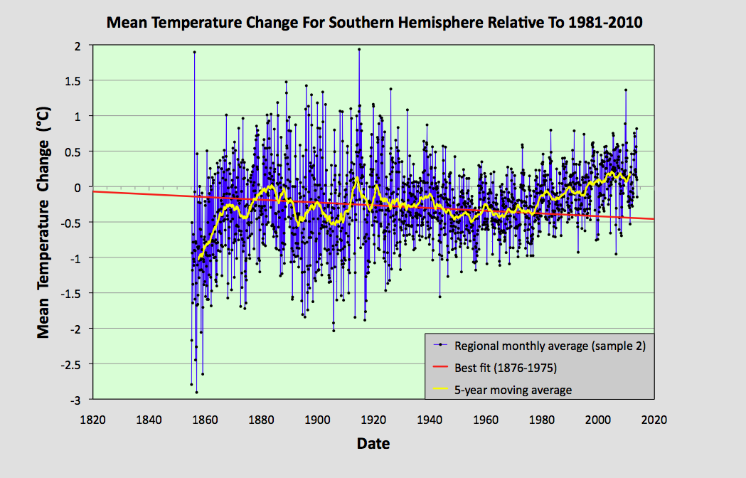
In this post I will make a first attempt at analysing the data for the entire Southern Hemisphere. I will do this by simply averaging the anomalies for the 1079 longest station records in the Southern Hemisphere, but without employing any regional weighting to the data. This will produce a first estimate of the temperature trend. A more accurate analysis will be done in a future post, where trends for the various regions will be combined using area weightings similar to those I used in Post 26 to calculate the overall trend for Australia, based on the trends from its individual states. Such an approach is, however, fraught with difficulty as the area of many regions (such as island archipelagos) are difficult to define exactly.


Fig. 64.1: The temperature trend for the Southern Hemisphere since 1820 derived by averaging the 1079 longest temperature records for the region. The best fit is applied to the monthly mean data between 1876 and 1975 and has a negative gradient of -0.12 ± 0.09 °C per century.


The overall temperature trend for the Southern Hemisphere since 1820 is shown in Fig. 64.1 above. This is the result of averaging over one thousand separate station records as indicated in Fig. 64.2 below. All the stations were either long stations with over 1200 months of data before the end of 2013, or medium stations with over 480 months of data.

The temperature profile from 1970 onwards appears to exhibit a clear upward trend with the mean temperature increasing by about 0.57°C from the 1960s to 2010. This data is also the most reliable as it is the result of averaging over 900 temperature records. 

In contrast, the data before 1970 exhibits a long modest cooling trend of over 0.1°C per century. The reliability of this data is also good, as it is the result of averaging over 100 temperature records from 1900 onwards. Before 1900, however, the data becomes less reliable due to its reliance on smaller numbers of stations that are also further apart and so less well correlated.


Fig. 64.2: The number of station records included each month in the mean temperature trend for the Southern Hemisphere when the MRT interval is 1981-2010.


What the data in Fig. 64.1 appears to indicate is that while there has been a significant warming of the Southern Hemisphere post-1970 of up to 0.57°C, this is partially offset by a noticeable cooling over the previous 100 years or more. So the total warming since pre-industrial times is likely to be less than 0.4°C. This is much less than the commonly quoted value of 1°C, or 1.5°C for the Northern Hemisphere. Yet this is not reflected in the Berkeley Earth adjusted data.


Fig. 64.3: Temperature trend for the Southern Hemisphere since 1840 derived by aggregating and averaging the Berkeley Earth adjusted data for over 1000 of the longest stations in the region. The best fit linear trend line (in red) is for the period 1951-2010 and has a gradient of +1.45 ± 0.10 °C/century.


An average of the Berkeley Earth adjusted time series temperature trends from the 1000 longest sets of station data in the Southern Hemisphere is presented in Fig. 64.3 above. This appears to indicate that the total temperature rise of the Southern Hemisphere since 1950 should be about 0.8°C. This is significantly more (between 0.1°C and 0.3°C depending on the time period you are considering) than is seen from the raw temperature data in Fig. 64.1, but it is in general agreement with the trend published by Berkeley Earth and shown in Fig. 64.4 below. 

However, what is even more prominent is the difference in the temperature trends before 1950. Whereas the raw data in Fig. 64.1 clearly indicates a cooling trend of 0.12°C per century, a simple average of the Berkeley Earth in Fig. 64.3 indicates a modest warming of 0.24°C per century. This, though, is still much less than the official trend shown in Fig. 64.4, which appears to claim an additional 0.5°C of warming has occurred between 1880 and 1950. This is almost the same as the warming since 1950, yet the atmospheric levels of carbon dioxide in 1950 were only 310 ppm, which is only about 30 ppm above pre-industrial levels. This means that the most recent increase in carbon dioxide of 100 ppm since 1950 has produced the same warming as the first 30 ppm did before 1950. If that is true, then it suggests further increases in carbon dioxide concentrations will have ever decreasing impacts on our climate, to the point where they are inconsequential.


Fig. 64.4: The temperature trend for the Southern Hemisphere since 1860 according to Berkeley Earth.


So what are the reasons for the differences in the trends before 1950? 

Well, we know that the differences between the trends in Fig. 64.1 and Fig. 64.3 are probably the result of the adjustments made to the data by Berkeley Earth. The statistical legitimacy of these adjustments I have already disputed in Post 57. This cannot explain the differences between the trends in Fig. 64.3 and Fig. 64.4, though, as these are both derived using the same adjusted data. These differences are likely to be the result of regional or station weightings, which would appear to be more important before 1950 due to the smaller number of stations and their uneven geographical distribution.

One way to examine the impact of these differences is to compare results from different samples of data. In the following five graphs I have split the stations used to construct the average in Fig. 64.1 into five separate random samples and compared their trends before and after 1975. In each case the temperature rise from the 1960s to 2010 is in the range 0.56 ±0.05°C while all but one of the samples has a negative trend before 1975. However, the range of trends for data before 1975 (or 1950) is much larger than the range for data after. This suggests that the data before 1950 is more sensitive to the impact that individual stations or regions may have on the average. The number of stations averaged each month for each sample is indicated in Fig. 64.10. This indicates that before 1940 each sample typically has significantly fewer than 70 stations in the average compared with over 150 after 1960.


Fig. 64.5: The temperature trend for the Southern Hemisphere since 1820 based on the first sample average of 224 of the 1079 longest temperature records for the region. The best fit is applied to the monthly mean data between 1876 and 1975 and has a negative gradient of -0.02 ± 0.10 °C per century.


Fig. 64.6: The temperature trend for the Southern Hemisphere since 1820 based on the second sample average of 223 of the 1079 longest temperature records for the region. The best fit is applied to the monthly mean data between 1876 and 1975 and has a negative gradient of -0.19 ± 0.08 °C per century.


Fig. 64.7: The temperature trend for the Southern Hemisphere since 1820 based on the third sample average of 210 of the 1079 longest temperature records for the region. The best fit is applied to the monthly mean data between 1876 and 1975 and has a negative gradient of -0.37 ± 0.09 °C per century.


Fig. 64.8: The temperature trend for the Southern Hemisphere since 1820 based on the fourth sample average of 211 of the 1079 longest temperature records for the region. The best fit is applied to the monthly mean data between 1876 and 1975 and has a negative gradient of -0.09 ± 0.09 °C per century.


Fig. 64.9: The temperature trend for the Southern Hemisphere since 1820 based on the fifth sample average of 211 of the 1079 longest temperature records for the region. The best fit is applied to the monthly mean data between 1876 and 1975 and has a positive gradient of +0.15 ± 0.11 °C per century.


Fig. 64.10: The number of station records included each month in the mean temperature trend for each of the five samples in Fig. 64.5 - Fig. 64.9.


Summary

The temperature trend for the Southern Hemisphere, based on the raw temperature data, exhibits a warming of about 0.5°C since 1950.

Before 1950 there is strong evidence of a prolonged cooling period of over 100 years in duration that amounted to a cooling of at least 0.12°C in total.

Based on the available temperature data, the total warming seen in the Southern Hemisphere since pre-industrial times is likely to be less than 0.4°C. This is much less than the usually reported value. 


Final Thoughts

The data shown in Fig. 64.1 clearly shows no warming before 1980. However, the data before 1880 is not very reliable. As Fig. 64.2 indicates, the mean anomaly prior to 1880 is based on data from less than 50 temperature records. If these records were all from the same region, then this low amount of data would be less of a problem as the different stations would be strongly correlated. The result would be reliable - but only for that region. 

The data I have analysed so far for this blog suggests that, for a single region with a uniform climate, a good reliable average can be achieved from only about 15-20 sets of data. When dealing with an entire hemisphere, however, we need more data because the climate of South America will clearly be different from that of Australia. This means that the data before 1880 in Fig. 64.1 is likely to be misleading. So can we do better than the trend in Fig. 64.1? Well, yes we can.


Fig. 64.11: The temperature trend for the Southern Hemisphere since 1880 derived by averaging the 1079 longest temperature records for the region. The best fit is applied to the monthly mean data between 1881 and 1980 and has a slight positive gradient of 0.01 ± 0.09 °C per century.


If we re-scale the data in Fig. 64.1 we can create a graph that presents a truer picture of the historic temperature rise by ignoring the unreliable data before 1880. Such a graph is shown above in Fig. 64.11. The other change I have made is to the time interval of the best bit line. This fit now applies from 1881 to 1980 and its gradient is practically zero. The jump in temperature after 1980 still amounts to about 0.57°C, and this is still much less than the 1.5°C that is claimed by climate science for the rise in global land temperatures from 1900 to 2013. But what it also shows is that small changes to how data is analysed and presented can affect the results.


Sunday, April 25, 2021

63. Peru - temperature trends PARABOLIC

What is striking about the temperature data for Peru is its variability. Not only is there a diverse mix of warming and cooling trends between stations, there are also a lot of extreme fluctuations within individual temperature records as illustrated by the time series for Arequipa Airport (Berkeley Earth ID:157461) in Fig. 63.1 below. This makes it very hard to assess what the true temperature trend for Peru really is.


Fig. 63.1: The temperature trend for Arequipa Airport since 1900. The best fit line has a positive gradient of +0.16 ± 0.14 °C per century. The monthly temperature changes are defined relative to the 1951-1980 monthly averages.


In all there are 42 stations in Peru with more than 300 months of data. Their locations are shown in Fig. 63.2 below. It can be seen that they are spread throughout most of Peru, but there is significant clustering in some regions and sparse coverage in others, particularly within the Amazon region to the north and east. Of these 42 stations, 24 are medium stations with over 480 months of data, the longest of which is Arequipa Airport (Berkeley Earth ID:157461) with 1163 months of data. There are no long stations with more than 1200 months of data. 


Fig. 63.2: The (approximate) locations of all stations in Chile with over 300 months of data. Those stations with a high warming trend are marked in red. Those with cooling or stable trends are marked in blue.


The station location map in Fig. 63.2 indicates that there is a fairly even mix of warming and cooling stations in Peru. However, stations with data before 1960 are more likely to exhibit cooling trends, while those with data after 1960 are more likely to be warming. The result is that the overall temperature trend from 1930 onwards comprises a sharp cooling period followed by a slow warming as shown in Fig. 63.3 below.


Fig. 63.3: The temperature trend for Peru since 1900. The best fit is applied to all the monthly mean data and has a positive gradient of +1.11 ± 0.06 °C per century. The monthly temperature changes are defined relative to the 1951-1980 monthly averages.


The temperature trend in Fig. 63.3 above was derived by averaging the temperature anomalies from all the stations with more than 300 months of data which also had at least ten years of data within the interval of 1951-1980. This amounted to 39 stations in total (for a list see here). The interval of 1951-1980 was used to determine the monthly reference temperatures (MRTs) against which the temperature anomalies were determined, as explained in Post 47. This period was chosen so as to maximize the number of stations included in the final mean trend.

If we perform a fit to all the data in Fig. 63.3, the result is a strong warming trend of 1.11°C per century as indicated in Fig. 63.3 above. Not only does this appear to closely follow the data from 1960 onwards, it also appears to fit with the data before 1925 as well.

However, the data before 1925 comes from at most two stations, as indicated in Fig. 63.4 below, while the data from 1930 to 1960 in Fig. 63.3 is the result of averaging at least fifteen different temperature records from different stations, and potentially as many as thirty. This suggests that the mean temperature trend after 1930 in Fig. 63.3 is far more reliable than the trend before 1925, a hypothesis that is confirmed by a study of the two datasets in question.


Fig. 63.4: The number of station records included each month in the mean temperature trend for Peru when the MRT interval is 1951-1980.


The two stations with data before 1925 have data that is discontinuous and that fluctuates enormously. One of the two stations is Arequipa Airport (Berkeley Earth ID:157461) shown in Fig. 63.1 above. The other is Lima-Callao Airport (Berkeley Earth ID:157469). For the former the temperatures before 1920 are comparable to those between 1970 and 2000. For the latter they are comparable with temperatures in the 1960-1980 period. Yet the result in both cases when this data is combined with the averaged data for 1929 onwards, is to produce a mean trend for 1900-1920 that is over 1°C lower than the temperatures seen in the rest of the trend between 1960 and 2000 (see Fig. 63.3). This indicates that the data for these two stations is clearly inconsistent with the overall trend for the region (compare the data from 1940-2000 in Fig. 63.1 with that in Fig. 63.3), and so the data before 1925 is highly unreliable.

If we therefore restrict our best fit to data that is from after 1929 and which is the result of averaging at least ten sets of station data, then the interpretation changes dramatically. The best fit line in Fig. 63.5 below now has a much smaller positive gradient of only 0.16°C per century. This is barely more than the uncertainty of ±0.11°C per century, and significantly less than the standard deviation of the data from 1931-2010 which is 0.63°C.


Fig. 63.5: The temperature trend for Peru since 1900. The best fit is applied to the monthly mean data from 1931-2010 and has a positive gradient of +0.16 ± 0.11 °C per century. The monthly temperature changes are defined relative to the 1951-1980 monthly averages.


Now if we compare these result with the results published by Berkeley Earth we once again see a number of major differences. The mean temperature trend becomes less variable and more linear as illustrated in Fig. 63.6 below. The trend in Fig. 63.6 was generated by performing a simple average on the Berkeley Earth adjusted data from the same 42 stations used to generate the temperature trend in Fig. 63.3.


Fig. 63.6: Temperature trend in Peru since 1900 derived by aggregating and averaging the Berkeley Earth adjusted data for all medium stations. The best fit linear trend line (in red) is for the period 1901-2012 and has a gradient of +0.84 ± 0.03 °C/century.


What is clear is that the trends in Fig. 63.6 above are very close to the trends published by Berkeley Earth and shown in Fig. 63.7 below. This comparison clearly shows that a simple average of the adjusted data from the Berkeley Earth data files (Fig. 63.6) gives almost the same result for the regional trend in Peru as the Berkeley Earth version does (Fig. 62.7), even though Berkeley Earth appears to use weighted averages for its regional averaging. This in turn also suggests that weighted averaging is probably not necessary in Peru, and simple averaging of stations is sufficient to generate a reliable trend even though the spread of stations across the county is far from ideal as Fig. 63.2 illustrates.


Fig. 63.7: The temperature trend for Peru since 1860 according to Berkeley Earth.


Clearly there are some significant differences between the temperature trend for Peru based on the original raw temperature data in Fig. 63.3 and that due to the adjusted data used by Berkeley Earth in Fig. 63.5. The exact magnitude of those differences are shown in Fig. 63.8 below.

The effect of the Berkeley Earth adjustments is to reduce the warming after 1990 and to flatten the curve between 1930 and 1950. The rationale for these adjustments is probably to correct for perceived bad data. However, the station frequency plot in Fig. 63.4 suggests that both these adjustments are being applied to data in Fig. 63.3 that should be highly robust, given that it is derived from averaging a large number (over fifteen) of independent datasets. As I have shown previously, averages of more than fifteen stations from the same local region will tend to cancel the errors from each dataset, and so produce a robust and accurate regional trend.


Fig. 63.8: The contribution of Berkeley Earth (BE) adjustments to the BE anomaly data shown in Fig. 63.6 after smoothing with a 12-month moving average. The blue curve represents the total BE adjustments including those from homogenization. The linear best fit (red line) to these adjustments for the period 1931-2010 has a positive gradient of +0.55 ± 0.06 °C per century. The orange curve shows the contribution just from breakpoint adjustments.


Conclusions

The data in Fig. 63.3 indicates that there has been a sustained but gentle warming of the climate in Peru of about 0.6°C since 1960. As this is the result of averaging between twenty and thirty different temperature records, this warming would appear to be a real effect and not one based on spurious data.

However, the evidence of Fig. 63.3 also stronly suggests that this warming is no greater than the cooling seen before 1960. So overall, temperatures today are no warmer than those of 100 years ago.

The lack of good data before 1930 makes it difficult to assess the significance of the current temperature rise. It could be due to global warming, or it could be due to natural variations.