Showing posts with label hockey stick graph. Show all posts

Friday, April 30, 2021

64. Southern Hemisphere - temperature trends COOLING to 1970

Over the past year I have analysed most of the temperature data from the Southern Hemisphere as well as some data from Europe and the USA. Few if any of the resulting temperature trends that I have calculated have agreed with the global published trends of the IPCC, Hadley-CRU, NOAA, NASA-GISS, or the regional trends of Berkeley Earth. This may be because they are based on calculations for small regions rather than global averages, although this caveat does not explain the discrepancies seen when compared with the Berkeley Earth data. 

In this post I will make a first attempt at analysing the data for the entire Southern Hemisphere. I will do this by simply averaging the anomalies for the 1079 longest station records in the Southern Hemisphere, but without employing any regional weighting to the data. This will produce a first estimate of the temperature trend. A more accurate analysis will be done in a future post, where trends for the various regions will be combined using area weightings similar to those I used in Post 26 to calculate the overall trend for Australia, based on the trends from its individual states. Such an approach is, however, fraught with difficulty as the area of many regions (such as island archipelagos) are difficult to define exactly.


Fig. 64.1: The temperature trend for the Southern Hemisphere since 1820 derived by averaging the 1079 longest temperature records for the region. The best fit is applied to the monthly mean data between 1876 and 1975 and has a negative gradient of -0.12 ± 0.09 °C per century.


The overall temperature trend for the Southern Hemisphere since 1820 is shown in Fig. 64.1 above. This is the result of averaging over one thousand separate station records as indicated in Fig. 64.2 below. All the stations were either long stations with over 1200 months of data before the end of 2013, or medium stations with over 480 months of data.

The temperature profile from 1970 onwards appears to exhibit a clear upward trend with the mean temperature increasing by about 0.57°C from the 1960s to 2010. This data is also the most reliable as it is the result of averaging over 900 temperature records. 

In contrast, the data before 1970 exhibits a long modest cooling trend of over 0.1°C per century. The reliability of this data is also good, as it is the result of averaging over 100 temperature records from 1900 onwards. Before 1900, however, the data becomes less reliable due to its reliance on smaller numbers of stations that are also further apart and so less well correlated.


Fig. 64.2: The number of station records included each month in the mean temperature trend for the Southern Hemisphere when the MRT interval is 1981-2010.


What the data in Fig. 64.1 appears to indicate is that while there has been a significant warming of the Southern Hemisphere post-1970 of up to 0.57°C, this is partially offset by a noticeable cooling over the previous 100 years or more. So the total warming since pre-industrial times is likely to be less than 0.4°C. This is much less than the commonly quoted value of 1°C, or 1.5°C for the Northern Hemisphere. Yet this is not reflected in the Berkeley Earth adjusted data.


Fig. 64.3: Temperature trend for the Southern Hemisphere since 1840 derived by aggregating and averaging the Berkeley Earth adjusted data for over 1000 of the longest stations in the region. The best fit linear trend line (in red) is for the period 1951-2010 and has a gradient of +1.45 ± 0.10 °C/century.


An average of the Berkeley Earth adjusted time series temperature trends from the 1000 longest sets of station data in the Southern Hemisphere is presented in Fig. 64.3 above. This appears to indicate that the total temperature rise of the Southern Hemisphere since 1950 should be about 0.8°C. This is significantly more (between 0.1°C and 0.3°C depending on the time period you are considering) than is seen from the raw temperature data in Fig. 64.1, but it is in general agreement with the trend published by Berkeley Earth and shown in Fig. 64.4 below. 

However, what is even more prominent is the difference in the temperature trends before 1950. Whereas the raw data in Fig. 64.1 clearly indicates a cooling trend of 0.12°C per century, a simple average of the Berkeley Earth in Fig. 64.3 indicates a modest warming of 0.24°C per century. This, though, is still much less than the official trend shown in Fig. 64.4, which appears to claim an additional 0.5°C of warming has occurred between 1880 and 1950. This is almost the same as the warming since 1950, yet the atmospheric levels of carbon dioxide in 1950 were only 310 ppm, which is only about 30 ppm above pre-industrial levels. This means that the most recent increase in carbon dioxide of 100 ppm since 1950 has produced the same warming as the first 30 ppm did before 1950. If that is true, then it suggests further increases in carbon dioxide concentrations will have ever decreasing impacts on our climate, to the point where they are inconsequential.


Fig. 64.4: The temperature trend for the Southern Hemisphere since 1860 according to Berkeley Earth.


So what are the reasons for the differences in the trends before 1950? 

Well, we know that the differences between the trends in Fig. 64.1 and Fig. 64.3 are probably the result of the adjustments made to the data by Berkeley Earth. The statistical legitimacy of these adjustments I have already disputed in Post 57. This cannot explain the differences between the trends in Fig. 64.3 and Fig. 64.4, though, as these are both derived using the same adjusted data. These differences are likely to be the result of regional or station weightings, which would appear to be more important before 1950 due to the smaller number of stations and their uneven geographical distribution.

One way to examine the impact of these differences is to compare results from different samples of data. In the following five graphs I have split the stations used to construct the average in Fig. 64.1 into five separate random samples and compared their trends before and after 1975. In each case the temperature rise from the 1960s to 2010 is in the range 0.56 ±0.05°C while all but one of the samples has a negative trend before 1975. However, the range of trends for data before 1975 (or 1950) is much larger than the range for data after. This suggests that the data before 1950 is more sensitive to the impact that individual stations or regions may have on the average. The number of stations averaged each month for each sample is indicated in Fig. 64.10. This indicates that before 1940 each sample typically has significantly fewer than 70 stations in the average compared with over 150 after 1960.


Fig. 64.5: The temperature trend for the Southern Hemisphere since 1820 based on the first sample average of 224 of the 1079 longest temperature records for the region. The best fit is applied to the monthly mean data between 1876 and 1975 and has a negative gradient of -0.02 ± 0.10 °C per century.
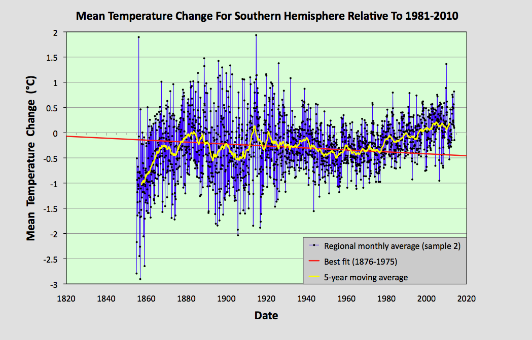


Fig. 64.6: The temperature trend for the Southern Hemisphere since 1820 based on the second sample average of 223 of the 1079 longest temperature records for the region. The best fit is applied to the monthly mean data between 1876 and 1975 and has a negative gradient of -0.19 ± 0.08 °C per century.


Fig. 64.7: The temperature trend for the Southern Hemisphere since 1820 based on the third sample average of 210 of the 1079 longest temperature records for the region. The best fit is applied to the monthly mean data between 1876 and 1975 and has a negative gradient of -0.37 ± 0.09 °C per century.


Fig. 64.8: The temperature trend for the Southern Hemisphere since 1820 based on the fourth sample average of 211 of the 1079 longest temperature records for the region. The best fit is applied to the monthly mean data between 1876 and 1975 and has a negative gradient of -0.09 ± 0.09 °C per century.


Fig. 64.9: The temperature trend for the Southern Hemisphere since 1820 based on the fifth sample average of 211 of the 1079 longest temperature records for the region. The best fit is applied to the monthly mean data between 1876 and 1975 and has a positive gradient of +0.15 ± 0.11 °C per century.


Fig. 64.10: The number of station records included each month in the mean temperature trend for each of the five samples in Fig. 64.5 - Fig. 64.9.


Summary

The temperature trend for the Southern Hemisphere, based on the raw temperature data, exhibits a warming of about 0.5°C since 1950.

Before 1950 there is strong evidence of a prolonged cooling period of over 100 years in duration that amounted to a cooling of at least 0.12°C in total.

Based on the available temperature data, the total warming seen in the Southern Hemisphere since pre-industrial times is likely to be less than 0.4°C. This is much less than the usually reported value. 


Final Thoughts

The data shown in Fig. 64.1 clearly shows no warming before 1980. However, the data before 1880 is not very reliable. As Fig. 64.2 indicates, the mean anomaly prior to 1880 is based on data from less than 50 temperature records. If these records were all from the same region, then this low amount of data would be less of a problem as the different stations would be strongly correlated. The result would be reliable - but only for that region. 

The data I have analysed so far for this blog suggests that, for a single region with a uniform climate, a good reliable average can be achieved from only about 15-20 sets of data. When dealing with an entire hemisphere, however, we need more data because the climate of South America will clearly be different from that of Australia. This means that the data before 1880 in Fig. 64.1 is likely to be misleading. So can we do better than the trend in Fig. 64.1? Well, yes we can.


Fig. 64.11: The temperature trend for the Southern Hemisphere since 1880 derived by averaging the 1079 longest temperature records for the region. The best fit is applied to the monthly mean data between 1881 and 1980 and has a slight positive gradient of 0.01 ± 0.09 °C per century.


If we re-scale the data in Fig. 64.1 we can create a graph that presents a truer picture of the historic temperature rise by ignoring the unreliable data before 1880. Such a graph is shown above in Fig. 64.11. The other change I have made is to the time interval of the best bit line. This fit now applies from 1881 to 1980 and its gradient is practically zero. The jump in temperature after 1980 still amounts to about 0.57°C, and this is still much less than the 1.5°C that is claimed by climate science for the rise in global land temperatures from 1900 to 2013. But what it also shows is that small changes to how data is analysed and presented can affect the results.


Friday, July 31, 2020

27. Scaling of temperature anomalies for Australia

In my analysis of temperature data from both New Zealand (Posts 6-10) and Australia (Posts 18-21) I have speculated about the nature of the temperature fluctuations. These fluctuations have not behaved like normal white noise. For a start, when data from multiple stations are averaged, the standard deviation of the fluctuations barely changes. If the fluctuations behaved like white noise then the standard deviation would be expected to decrease by a factor of √N, where N is the number of stations in the average. This does not happen.

Then there is the scaling behaviour. If the data is smoothed with a moving average of length N points, again you would normally expect to see the standard deviation of the smoothed data decrease by a factor of √N compared to the unsmoothed data. Again this does not happen. The standard deviation decreases, but generally only by about a factor of N 0.25. This is important because it essentially predicts how big the fluctuations will be for longer temperature records where each data points represents a longer time interval, such as yearly or decadal averages, rather than the monthly averages that form the basic station records I have been discussing here.

So what do we see for the mean temperature for Australia that I presented in Fig. 26.1 in the last post? In the following discussion I have restricted the analysis to data over a 140 year period from 1874 to 2013. This is because data earlier than this is derived by averaging over much less than 7 states, and will also be based on a much smaller number of individual stations.

Well, firstly the standard deviation of the data in Fig. 26.1 is only 0.627 °C. This is significantly less than that seen in individual temperature records, and in individual states like New South Wales where the value was 1.07 °C. The reason for this decrease is that the temperature record for Australia involves combining records from across the country, and the country is very big. It is, for example over 3600 km from Perth to Brisbane. Yet in Post 11 I showed that the correlation between monthly temperature records for stations that are spatially separated decreases almost linearly with the distance of separation (see Eq. 11.1). In fact, once you get to separations of more than 3000 km, the data in Fig. 11.2(a) suggest station records become completely uncorrelated. This is what appears to be happening here.

The monthly temperature data from Western Australia and Queensland will be almost totally uncorrelated as most of their respective stations are over 3000 km apart. So averaging the two will reduce the standard deviation by a factor of almost √2. Including the other states in the average could increase the reduction factor to √7, but this will be mitigated by the fact that the distances between those states are much less and so their correlations will be greater. The net result is a compromise with the standard deviation appearing to decrease by about 40% compared to the individual state values.

The second point to note is that the fluctuations in the mean temperature for Australia in Fig. 26.1 appear to conform to a Gaussian noise spectrum. This is confirmed below in Fig. 27.1.


Fig. 27.1: The distribution of anomaly values for the mean temperature record for Australia (blue curve), together with the predicted Gaussian distribution for a standard deviation of 0.627 °C.


However, these fluctuations are not white noise. If we smooth the data with different moving averages of size N months, and then recalculate the standard deviation, we get the data shown in Fig. 27.2 below. This is the scaling behaviour I described in the second paragraph above. For a more detailed explanation of its methodology, see Post 17.


Fig. 27.2: The change in standard deviation of the mean temperature anomaly for Australia (see Fig. 26.1) after smoothing with a moving average of size N. The gradient of the best fit line is -0.256 ± 0.003 and R2 = 0.9993


The two significant features of the data in Fig. 27.2 are the gradient of the linear regression best fit line and the magnitude of the residual for the data relative to that line. The gradient is -0.256 ± 0.003 while the rms (root mean square) residual is 2.7% of the standard deviation of the y-values, the residuals being the vertical distance from the data point to the best fit line. This gives a value for R2 of 0.9993, indicating a very good fit to the data.

The rms residual of 2.7% is incredibly low compared to previously determined values for individual states, while the gradient is incredibly close to -1/4. These two results may not be coincidental, and hint at the existence of a fundamental truth within the data, that these temperature records are fractal in nature, with the patterns of fluctuations over different timescales exhibiting strong self-similarity. If so, then this implies even 100-year mean temperatures would exhibit fluctuations with a standard deviation of over 0.1 °C and a range of over 0.4 °C. It would also suggest that changes of more than 0.5 °C in the average temperature of different centuries would be commonplace over the course of millenia. It should be noted that the data in Fig. 26.1 in the last post indicates that the average temperature in Australia over the whole of the 20th century was actually 0.063 °C less than that for the last 50 years of the 19th century.

So, are all the instrumental temperature records and their averages fractals? Do they exhibit self-similarity with a fractal dimension of 0.25 as I have suggested previously? Or is the data just white noise on an oscillating background as the data from South Australia might suggest? The answer is, it is too early to tell. We need more data and longer datasets. What we can say is that the temperature trend for Australia since 1853 in Fig. 26.1 is not a simple hockey stick.

Thursday, July 30, 2020

26. The temperature trend in Australia since 1853 - PARABOLIC

In Posts 18-24 I calculated the temperature trend for each Australian state using all the available instrumental temperature records with more than 40 years of data, and then compared the results with those claimed by Berkeley Earth. These results were summarized in my last post.

The overall picture, based on the actual raw data, was that most states had experienced significant warming since 1980 but that the current temperatures were generally the same as those seen in 1880 or earlier. In most cases, the temperature records exhibited large swings in temperature between 1890 and 2000, typically a large decline in temperature up to 1950 and then a recovery; only Queensland exhibited a temperature trend that was anything like that advanced by the IPCC in their global instrumental temperature record, but Queensland has no data before 1887. And only in the case of Queensland did the temperature construction using the raw data qualitatively agree with the equivalent Berkeley Earth version. In the case of all other states the two sets of data (i.e. the one based on raw anomalies and the Berkeley Earth adjusted anomaly version) diverged significantly the further back in time before 1950 that you look, and generally the divergence was even greater in the 19th century.

What also became abundantly clear was that due to the large fluctuations seen over time intervals of more than 50 years, only temperature records that are at least 150 years in length allow the observer to put those fluctuations into their true context and to draw any meaningful conclusions. The temperature record is not as most climate scientists and the IPCC appear to claim: namely stable and constant before 1900 and exponentially rising thereafter. What has become clear to me is that the data is largely random but on multiple timescales. There are short-term fluctuations in the monthly means of up to ±5 °C, and long-term fluctuations on timescales of many decades or centuries that are often in excess of ±0.5 °C. In previous posts (see Post 9 and Post 17 in particular) I have speculated on the nature of these fluctuations, their scaling properties and whether they are fractal in nature.

In this post I will complete the analysis for Australia by using the regional temperature trends for each state to construct an average for the whole of Australia. The method will be straightforward: to weight each state's overall trend by the area of that state relative to that of the total area of Australia. Based on this methodology the weightings for each state are as follows:

NSW
Victoria
Tasmania
South Australia
Western Australia
Northern Territory
Queensland
     
0.1004
0.0284
0.0085
0.1229
0.3306
0.1776
0.2316

In addition, the trend from each state is renormalized with a fixed temperature offset in order to ensure that the mean anomaly of each state for the period 1961-1990 is zero. After the scaling by weighting and the renormalization, the contributions from each state are added. The resulting trend in the monthly mean temperature for the whole of Australia is shown below in Fig. 26.1 together with the 5-year moving average. As a result of the offsetting process, the temperature changes in Fig. 26.1 are all defined relative to the 1961-1990 average.


Fig. 26.1: The temperature trend for Australia since 1853. The best fit is applied to the interval 1871-2010 and has a gradient of 0.24 ± 0.04 °C per century. The temperature changes are relative to the 1961-1990 average.


The data in Fig. 26.1 shows that the five year average of the regional temperature for Australia, relative to the average for 1961-1990, decreased from a peak of +0.37 °C in 1879 to a minimum of -0.46 °C in 1909. It then recovered from a low of -0.38 °C in 1948 to reach another peak of +0.47 °C in 2007. So while it is true that temperatures rose by 0.85 °C from 1948 to 2007, it is also true that there was an almost equal but opposite fall of -0.75 °C during the 70 years prior to 1948. So, when put into context, the temperature rise since 1948 does not appear that cataclysmic. Yet when you look at the Berkeley Earth adjusted data for the same period, the picture is very different.


Fig. 26.2: The temperature trend for Australia since 1853 based on Berkeley Earth adjusted temperature data. The best fit is applied to the interval 1951-2008 and has a gradient of 1.51 ± 0.06 °C per century. The temperature changes are relative to the 1961-1990 average.


Fig. 26.2 shows the result of the same averaging process for the temperature anomalies in Australia as previously outlined for the data in Fig. 26.1. The only difference is that Fig. 26.2 uses Berkeley Earth adjusted anomaly data, and Fig. 26.1 uses the original data with the correct anomalies calculated for each station. Yet the two datasets look completely different. Whereas the raw data in Fig. 26.1 combines to form a U-shaped curve or parabola, the adjusted data forms a highly asymmetric curve, with little or no change in temperature before 1950 and a steep rise afterwards. That rise has a gradient of 1.51 ± 0.06 °C per century, which equates to a total rise from 1951 to 2008 of 0.88 °C. This is similar to that seen in Fig. 26.1 for the same time period, but without the preceding decline in temperature. However, while the adjusted data in Fig. 26.2 differs significantly from the raw data in Fig. 26.1, it agrees quite well with the trend published by Berkeley Earth and shown below in Fig. 26.3.


Fig. 26.3: The temperature trend for Australia since 1840 according to the Berkeley Earth website.


I believe that the level of agreement between the 12-month and 10-year moving average curves in Fig. 26.3 with those in Fig. 26.2 validates my approach, and therefore also validates the data in Fig. 26.1. The other point to note about the data in Fig. 26.1 is the gradient of the best fit line. This is 0.24 ± 0.04 °C per century and therefore equates to a total temperature rise of about 0.34 °C from 1871 to 2010. This is far more than the actual change of about 0.10 °C and illustrates the caution that needs to be applied to linear trends that are applied to non-linear data. 


Fig. 26.4: A comparison of the actual ten year average temperature trend for Australia since 1853 and the Berkeley Earth adjusted temperature version. The best fit is applied to the actual raw data over the interval 1859-2008 and has a gradient of 0.184 ± 0.056 °C per century. The temperature changes are defined relative to the 1991-2000 average.


If we contrast the raw data in Fig. 26.1 with the adjusted data in Fig. 26.2 by comparing the 10-year moving average of each (see Fig. 26.4 above) we see that after 1980 there is relatively close agreement between the two. However, as we go back in time before 1980, we see the curves diverge. If we compare the temperature change from 1880 to 2008 in each case, we see that the raw data shows evidence of a rise of only about 0.2 °C, while for the adjusted data the rise is over 0.6 °C. This difference is principally due to adjustments made by Berkeley Earth to the data. These adjustments are shown below in Fig. 26.5.


Fig. 26.5: The contribution of Berkeley Earth adjustments to the anomaly data after smoothing with a 12-month moving average. The linear best fit to the data is for the period 1901-2010 (red line) and the gradient is +0.295 ± 0.016 °C per century. The orange curve represents the contribution made to the blue adjustment curve by breakpoint adjustments only.


The total adjustments in Fig. 26.5 (blue curve) were determined by subtracting the raw monthly data in Fig. 26.1 from the equivalent curve for the sum of the adjusted data. The data was then smoothed with a 12-month moving average which removed over 90% of the noise. The breakpoint adjustment curve in Fig. 26.5 (the orange curve) is just the weighted sum of the breakpoint adjustment curves from the different states (see Posts 18-24). The breakpoints adjustments are determined from the Berkeley Earth station data by subtracting the Berkeley Earth raw anomaly (which is different from my raw anomaly because it uses homogenization) from the Berkeley Earth adjusted anomaly.

The curves in Fig. 26.5 above indicate that summing the Berkeley Earth adjustments to the anomaly data results in a curve that has a trend of gradient +0.295 ± 0.016 °C per century for the period 1901-2010. This in turn amounts to a contribution of over 0.4 °C between 1870 and 2010 as the same trend appears to extend back until at least 1870.


Concluding points

1) According to the raw data (shown in Fig. 26.1), temperatures in Australia may have risen by up to 0.8 °C over the last 60 years, but if so, they are still, at worst, no more than about 0.2 °C above some of the peak values seen in previous centuries. In all likelihood, the temperature rise is probably even less (the data in Fig. 26.1 suggests it may be less than 0.1 °C). Unfortunately a lack of data prior to 1853 precludes any more definitive conclusions than this.

2) The large changes in mean temperature seen over time in the instrumental temperature record for Australia appear to be natural and reversible, and therefore probably occur on a regular basis.

3) The adjustments made to individual temperature records through a combination of breakpoints and homogenization by Berkeley Earth do not appear to completely cancel when multiple station records are averaged. The analysis above suggests that such adjustments could actually add more than 0.4 °C to the warming trend for Australia, which would be more than double the amount that could be attributed to the raw data, as noted in Point 1 above.


Wednesday, May 20, 2020

4. Data analysis at the South Pole

If there is one place on Earth that is synonymous with global warming, it is Antarctica. The conventional narrative is that because of climate change, the polar ice caps are melting, all the polar bears and penguins are being rendered homeless and are likely to drown, and the rest of the planet will succumb to a flood of biblical proportions that will turn most of the Pacific islands into the Lost City of Atlantis, and generally lead to global apocalypse. Needless to say, most of this is a gross exaggeration.

I have already explained that melting sea ice at the North Pole cannot raise sea levels because of Archimedes’ principle. The same is true of ice shelves around Antarctica. The only ice that can melt and raise sea levels is that which is on land. In Antarctica (and Greenland) this is virtually all at altitude (above 1000 m) where the mean temperature is below -20 °C, and the mean monthly temperature NEVER gets above zero, even in summer. Consequently, the likelihood of any of this ice melting is negligible.

The problem with analysing climate change in Antarctica is that there is very little data. If you exclude the coastal regions and only look at the interior, there are only twenty sets of temperature data with more than 120 months of data, and only four extend back beyond 1985. Of those four, one has 140 data points and only runs between 1972 and 1986 and so is nigh on useless for our purposes. The other three I shall consider here in detail.

The record that is the longest (in terms of data points), most complete and most reliable is the one that is actually at the South Pole. It is at the Amundsen-Scott Base that is run by the US government and has been permanently manned since 1957. The graph below (Fig. 4.1) illustrates the mean monthly temperatures since 1957.


Fig. 4.1: The measured monthly temperatures at Amundsen-Scott Base.


The thing that strikes you first about the data is the large range of temperatures, an almost 40 degree swing from the warmest months to the coldest. This is mainly due to the seasonal variation between summer and winter. Unfortunately, this seasonal variation makes it virtually impossible to detect a discernible trend in the underlying data. This is a problem that is true for most temperature records, but is acutely so here. However, there is a solution. If we calculate the mean temperature for each of the twelve months individually, and then subtract these monthly means from all the respective monthly temperatures in the original record, what will be left will be a signal representing time dependent changes in the local climate.


Fig. 4.2: The monthly reference temperatures (MRTs) for Amundsen-Scott Base.


The graph above (Fig. 4.2) illustrates the monthly means for the data in Fig. 4.1. We get this repeating data set by adding together all the January data in Fig. 4.1 and dividing it by the number of January readings (i.e. 57). Then we repeat the method for the remaining 11 months. Then we plot the twelve values for each year to give a repeating trend as illustrated in Fig. 4.2. If we then subtract this data from the data in Fig. 4.1 we get the data shown below (Fig. 4.3). This is the temperature anomaly for each month, namely the amount by which the average temperature for that month has deviated from the expected long-term value shown in Fig. 4.2. This is the temperature data that climate scientists are interested in and try to analyse. The monthly means in Fig. 4.2 therefore represent a series of monthly reference temperatures (MRTs) that are subtracted to the raw data in order to generate the temperature anomaly data. The temperature anomalies are therefore the amount by which the actual temperature each month changes relative to the reference or average for that month.


Fig. 4.3: The monthly temperature anomalies for Amundsen-Scott Base.


Also shown in Fig. 4.3 is the line of best fit to the temperature anomaly (red line). This is almost perfectly flat, although its slope is slightly negative (-0.003 °C/century). Even though the error in the gradient is ±0.6 °C per century, we can still venture, based on this data that there is no global warming at the South Pole.

The reasons for the error in the best fit gradient being so large (it is comparable to the global trend claimed by the IPCC and climate scientists) are the large temperature anomaly (standard deviation = ±2.4 °C) and the relatively short time baseline of 57 years (1957-2013). This is why long time series are essential, but unfortunately these are also very rare.

Then there is another problem: outliers. Occasionally the data is bad or untrustworthy. This is often manifested as a data-point that is not only not following the trend of the other data, it is not even in the same ballpark. This can be seen in the data below (Fig. 4.4) for the Vostok station that is located over 1280 km from the South Pole.


Fig. 4.4: The measured monthly temperatures at Vostok.


There is clearly an extreme value for the January 1984 reading. There are also others, including at March 1985 and March 1997, but these are obscured by the large spread of the data. They only become apparent when the anomaly is calculated, but we can remove these data points in order to make the data more robust. To do this the following process was performed.

First, find the monthly reference temperaturs (MRTs) and the anomalies as before. Then, calculate the mean anomaly. Next, calculate either the standard deviation of the anomalies, or the mean deviation (either will do). Then I set a limit for the maximum number of multiples of the deviation that an anomaly data point can lie above or below the mean value for it to be considered a good data point (I generally choose a factor of 5). Any data-points that fall outside this limit are then excluded. Then, with this modified dataset, I recalculated the MRTs and the anomalies once more. The result of this process for Vostok is shown below together with the best fit line (red line) to the resulting anomaly data (Fig. 4.5).


Fig. 4.5: The monthly temperature anomalies for Vostok.


Notice how the best fit line is now sloping up slightly, indicating a warming trend. The gradient, although looking very shallow, is still an impressive +1.00 ± 0.63 °C/century, which is more than that claimed globally by the IPCC for the entire planet. This shows how difficult these measurements are, and how statistically unreliable. Also, look at the uncertainty or error of ±0.63 °C/century. This is almost as much as the measured value. Why? Well, partly because of the short time baseline and high noise level as discussed previously, and partly because of the underlying oscillations in the data which appear to have a periodicity of about 15 years. The impact of these oscillations becomes apparent when we reduce or change the length of the base timeline.


Fig. 4.6: The monthly temperature anomalies for Vostok with reduced fitting range.


In Fig. 4.6 the same data is presented, but the best fit line has only been performed to data between 1960 and 2000. The result is that the best fit trend line (red line) changes sign and now demonstrates long-term cooling of -0.53 ± 1.00 °C/century. Not only has the trend changed sign, but the uncertainty has increased.

What this shows is the difficulty of doing a least squares best fit to an oscillatory dataset. Many people assume that the best fit line for a sine wave lies along the x-axis because there are equal numbers of points above and below the best fit line. But this is not so, as the graph below illustrates.


 Fig. 4.7: The best fit to a sine wave.


The best fit line to a single sine wave oscillation of width 2π and amplitude A is 3A2 (see Fig. 4.7). This reduces by a factor n for n complete oscillations but it never goes to zero. Only a best fit to a cosine wave will have zero gradient because it is symmetric. Yet the problem with temperature data is that most station records contain an oscillatory component that distorts the overall trend in the manner described above. This is certainly a problem for many of the fits to shorter data sets (less than 20 years). But a far bigger problem is that most temperature records are fragmented and incomplete, as the next example will illustrate.


Fig. 4.8: The measured monthly temperatures at Byrd Station.


Byrd Station is located 1110 km from the South Pole. Its local climate is slightly warmer than those at Amundsen-Scott and Vostok but the variation in seasonal temperature is just as extreme (see Fig. 4.8 above). Unfortunately, its data is far from complete. This means that its best fit line is severely compromised.


Fig. 4.9: The monthly temperature anomalies for Byrd Station.


The best fit to the Byrd Station data has a warming trend of +3.96 ± 0.83 °C/century (see the red line in Fig. 4.9 above). However, things are not quite that simple, particularly given the missing data between 1970 and 1980 which may well consist of a data peak, as well as the sparse data between 2000 and 2010 which appears to coincide with a trough. It therefore seems likely that the gradient would be very different, and much lower, if all data were present. How much lower we will never know. Nor can we know for certain why so much data is missing. Is this because the site of the weather station changed? In which case, can we really consider all the data to being part of a single record, or should we be analysing the fragments separately? This is a major and very controversial topic in climate science. As I will show later, it leads to the development of controversial numerical methods such as breakpoint alignment and homogenization.

What this post has illustrated I hope, is the difficulty of discerning an unambiguous warming (or cooling) trend in a temperature record. This is compounded by factors such as inadequate record length, high noise levels in signals, missing and fragmented data, and underlying nonlinear trends of unknown origin. However, if we can combine records, could that improve the situation? And if we do, would it yield something similar to the legendary hockey stick graph that is so iconic and controversial in climate science? Next I will use the temperature data from New Zealand to try and do just that.


Monday, May 18, 2020

2. Is climate change real?

Well, first there is the nature of the temperature rise itself. Below is the graph of the global temperature rise since 1880 (as postulated by climate scientists) which shows the generally accepted rise in temperature of about 0.9 °C. There are a number of problems with it, not least regarding how it is constructed. This I will discuss at length in later posts. But more immediately there is the question of why this temperature curve doesn’t look like most real temperature data.


Fig. 2.1: Global temperature rise since 1880.

Actual temperature records don’t look anything like the one above: they look like the one below.


Fig. 2.2: Temperature anomaly at Berlin-Templehof (1701-2013).

This is the temperature record from Berlin showing average monthly temperatures from month to month. It is probably the longest temperature record we have and extends back to 1701, which is doubly remarkable since Daniel Fahrenheit only invented the thermometer and the temperature scale that bears his name in 1714. But there you go.

The first point to note is that the data in the Berlin-Templehof record consists of fluctuations of up to ±5 °C. These are changes to the monthly mean and are not the result of seasonal variations. I suspect the size of these fluctuations is far greater than what most people would imagine them to be if asked to speculate. Was February 1929 really almost 13 °C colder on average than the previous February? Well apparently it was, and we are not talking about the odd cold day here or there, we mean all 28 of them, or most of them at least. But not only that, the average yearly temperatures fluctuated by over two degrees over the period 1701-2013, and the average temperature for each decade by more than one degree. In which case, why are climate scientists getting so worked up about a temperature rise of 0.9 °C over 125 years?

It is a rhetorical question that the Norwegian Nobel Laureate in physicist, Ivar Giaever posed when he resigned from the American Physical Society (APS) in 2011, principally over its stated position that global warming was happening and the “The evidence is incontrovertible”. He pointed out that a rise of the mean temperature on Earth from 288.0 K to 288.8 K (which is also 0.8 °C) in 150 years seems remarkably stable. This represents a change of less than 0.3% per century, which most people (including most physicists) would consider an example of extreme systemic stability.

Then there is the issue of carbon dioxide. The graph below is the plot of CO2 concentration in parts per million (ppm) in the atmosphere as measured near the top of Mauna Loa in Hawaii at an altitude of 3397 m. In climate science this data is one of the few pieces of hard evidence that is undisputed (except perhaps by a few cranks).


Fig. 2.3: The concentration of carbon dioxide in the atmosphere since 1959.

By 2005 the CO2 concentration had risen to just over 370 pp, up from 280 ppm in pre-industrial times. This coincides with a temperature rise of about 0.9 °C. Yet if you look at when these changes happened there are striking differences. Two-thirds of the rise in CO2 levels occurred before 1980, but two-thirds of the temperature rise is after 1980. That is not a strong positive correlation.

Then there is the plateau in temperatures between 1940 and 1980 in Fig 2.1 above. What caused this? We don’t know for sure, but one suggestion is that it may be due to the cooling effect of particles in the air due to industrial pollution, and that this increased as dirty heavy industry expanded after World War II, thus offsetting the temperature rise. This means, though, that up until 1980 there was virtually no noticeable increase in global temperatures. But this raises a much bigger question that rarely gets asked and is never answered, at least not by climate scientists. If temperatures before 1980 had not yet increased, why was it that in the 1980s this whole global warming hysteria suddenly took off? Are climate scientists also clairvoyants? How could their claims be based on evidence if the evidence wasn’t there (yet)?

Part of the reason why I think the global warming debate will not go away is that the whole subject is based on two facts that are undoubtedly true, but which has led many to a conclusion, via bad physics or bad logic, which may not be. The fact that CO2 levels in the atmosphere are increasing is true, as is the assertion that CO2 is a greenhouse gas. But this does not mean that increasing CO2 levels must lead to an increase in temperatures. The greenhouse effect is not linear, as I will probably discuss further at a later date.

What is particularly worrying about climate science is that the things that are controversial now were just as controversial back in the 1980s. Back in 1990, Channel 4 in the UK broadcast a documentary entitled “The Greenhouse Conspiracy” (try getting that commissioned on Channel 4 now). What is particularly striking about the programme is how many of criticisms of global warming it made at the time still remain valid today. Equally striking is how apocalyptic claims made 30 years ago still haven’t come true but are still being touted by climate scientists to justify current policy.

One such issue is extreme weather. We are led to believe that global warming will lead to more extreme weather events such as droughts, storms, floods etc., except of course when it doesn’t. Then the explanation is that warming at the poles reduces the temperature gradient, thus reducing extreme weather. Talk about having your cake and eating it. Except that there is no evidence of warming at the poles. The temperature at the South Pole has gone down since 1956 (when the first measurements were taken) not up, and there is no weather data within 1000 miles of the North Pole and never has been. As for extreme weather, well the USA has some of the longest weather records on the planet, including records of extreme weather. These show that over the last 170 years there has been no increase in the number of hurricanes hitting the USA (see Fig. 2.4), nor was there any change in their average strength.


Fig 2.4: Number of hurricanes hitting the USA by decade (1850-2019).

Over the last 70 years the number of tornadoes has also been stable (see Fig. 2.5) but might actually be going down (2018 was the first year on record where no violent EF4 or EF5 tornadoes were recorded).

 Fig. 2.5: Annual frequency of tornadoes (EF1-EF5) in the USA (1954-2014).

There has been no increase in drought, flooding or wildfires, or in the number of fatalities due to extreme events. And while most of these events are difficult to record accurately, their insurance costs can be measured and these have also remained stable as a proportion of GDP. And before anybody cries foul about the use of %GDP as a valid measure rather than real value in pounds or dollars, I will point out that insurance costs are invariably linked to the value of property, and property values are inextricably linked to increases in GDP.

Then there is the issue of melting polar ice-caps and rising sea levels. The problem here is that very little of this is true either. While glaciers in the Northern Hemisphere may be shrinking, some of those in the Southern Hemisphere have been growing. In New Zealand since 1980 many glaciers have expanded in size after large declines prior to 1960 (see below). Both of these changes are uncorrelated with either the local or the global temperature records.


Fig. 2.6: Length of selected New Zealand glaciers since 1900.

But it is really the claims regarding rising sea levels that need to be addressed. One frequent claim is that melting sea ice will raise sea levels. It won’t. Anyone who understands Archimedes’ principle should understand that. If a floating iceberg melts, then the sea level must remain the same. That is basic physics. The iceberg floats because it displaces a volume of water equal to its own mass: 10% of the iceberg is above the waterline because the density of ice is 10% less than water. When it melts it contracts and exactly fills the hole in the sea that it had previously created. There is no rise in sea level and never can be.

Nor can warming oceans be a significant factor in sea level rise either. The thermal coefficient of expansion of water is 207 ppm/°C. As the average ocean depth is 3688m, a 1 °C rise in all ocean temperatures at all depths would result in a rise of less than 77 cm. However, as it is extremely unlikely that any heating of the ocean surface could extend down beyond more than about 500 m from the surface (remember, warm water is less dense and so rises to the surface), a more likely sea level rise would be a mere 10 cm or 1 mm per year. That is unnoticeable, and un-measureable.

Finally, there is one last philosophical question to consider. If the temperature of our planet is changing, and mankind is responsible, and if it is in our power to set that temperature to one of our choosing, what temperature should we choose? In short, what is the optimum surface temperature of Planet Earth, and what should be the optimum level of CO2 to ensure that our plant is the greenest, and most beneficial for life and diversity that it can possibly be? These are the questions that no environmentalists will answer, partly because before they got hysterical about global warming, they got equally hysterical about global cooling. And at the centre of both was one man: Stephen Schneider.