Showing posts with label climate science. Show all posts

Sunday, June 14, 2020

13. The Earth's energy budget

In order to understand how the Earth is heating up, you need to understand why it is warm in the first place. That means you need to know where the energy is coming from and where it is going. That is the basis of the Earth's energy budget or energy balance.

The purpose of this post is to analyse that energy balance, and to determine which parts of it can change, and what the effects of those changes are likely to be. Specifically, this post will try to relate various possible changes in the energy balance to any consequential changes in global temperatures. In so doing, it will also be necessary to critically ascertain the degree of confidence that there is surrounding the various estimates, and measurements, regarding the energy flows in the different parts of the atmosphere.

As I pointed out in the last post, virtually all the energy that is present on Earth originated in the Sun. The amount of energy per second arriving from the Sun at the top of the Earth’s atmosphere is 1361 watts per square metre (W/m2), and as I also pointed out, because the area this energy is ultimately required to heat up (4πr2 where r is the Earth's radius) is four times the cross-sectional area that actually captures the energy (πr2), that means that the mean power density (remember: power is rate of flow of energy) that the Earth receives is only a quarter of the incoming 1361 W/m2, or about 341 W/m2. However as I also showed in Fig. 12.1, not all this energy reaches the Earth's surface. In fact only about 161 W/m2 does. The rest is either absorbed by the atmosphere (78 W/m2), reflected by the atmosphere and clouds (79 W/m2), or is reflected by the Earth's surface (23 W/m2). This is shown diagrammatically in Fig. 13.1 below.


Fig. 13.1: The Earth's energy budget as postulated by Trenberth et al. (2009).


The image in Fig. 13.1 is taken from a 2009 paper by Kevin Trenberth, John Fasullo and Jeffrey Kiehl (Bull. Amer. Meteor. Soc. 90 (3): 311–324). It is not necessarily the most definitive representation of the energy flows (as we shall see there are other models and significant disparaties and uncertainties in the numbers), but it is probably the most cited. The data it quotes specifically relates to the energy budget for the period March 2000 - May 2004.


Fig. 13.2: The Earth's energy budget as postulated by Kiehl and Trenberth (1997).


The 2009 Trenberth paper is not the first or last paper he has produced on the subject. The energy budget it describes is actually a revision of an earlier attempt from 1997 (J. T. Kiehl and K. E. Trenberth, Bull. Amer. Meteor. Soc., 78, 197–208) shown in Fig 13.2 above, and has since been revised again in 2012 (K. E. Trenberth and J. T.  Fasullo, Surv. Geophys. 33, 413–426) as shown in Fig. 13.3 below.


Fig. 13.3: The Earth's energy budget as postulated by Trenberth and Fasullo (2012).


The only real difference between the energy budget in Fig. 13.3 and that from 2009 in Fig. 13.1 is the magnitude of the atmospheric window for long wave infra-red radiation (revised down from 40 W/m2 to 22 W/m2), but I still think this highlights the level of uncertainty that there is regarding these numbers. This is further emphasised by a contemporary paper from Stephens et al. (Nature Geoscience 5, 691–696 (2012) ) shown below in Fig. 13.4.


Fig. 13.4: The Earth's energy budget as postulated by Graeme L. Stephens et al. (2012).


As the 2009 Trenberth paper appears to be the most cited it is probably best to use this as the basis for the following discussion, but to bear in mind the amount of uncertainty regarding the actual numbers.

In Fig. 13.1 the three most significant numbers are those for the direct surface absorption from the Sun (161 W/m2), the upward surface radiation (396 W/m2), and the long-wave infra-red back radiation due to the Greenhouse Effect (333 W/m2). Of these it is the upward surface radiation (396 W/m2) that determines the temperature but its value is set by the other two.

As I explained in the last post the emission of electromagnetic radiation from a hot object is governed by the Stefan-Boltzmann law as shown below

  
(13.1)

where I(T) is the power density (per unit area) of the emitted radiation, σ = 5.67 x 10⁻⁸ Wm-2K-4 is the Stefan-Boltzmann constant, and the term ε is the relative emissivity of the object. The emissivity defines the proportion of the emission from that object at that wavelength compared to a black body at the same temperature, and it varies with wavelength. It is also different for different materials. In the case of planet Earth, it is generally assumed to be very close to unity all over the surface for all emission wavelengths, but this is not always the case.

It is Eq. 13.1 that allows us to determine the surface temperature (T = 289 K) from the upward surface radiation (396 W/m2) or visa versa. It also allows us to calculate the change in upward surface radiation that would result from a given increase in the surface temperature. It turns out that an increase in surface temperature of 1 °C would necessitate the upward surface radiation increasing from 396 W/m2 to 401 W/m2, in other words a 1.39% increase. A 2 °C increase would require a 2.80% increase in the upward surface radiation.

I also explained in the last post how the total upward surface radiation (IT) was related to the direct surface absorption from the Sun (Io) via a feedback factor f which represented the fraction of upward surface radiation that was reflected back via the Greenhouse Effect.


(13.2)

This model assumed that all the energy absorbed by the greenhouse gases came from one source, though, namely surface upward radiation, and was driven by a single input, the surface absorption of solar radiation, Io. As Fig. 13.1 indicates, this is not the case. This means that Eq. 13.2 will need to be modified.

The aim here is to determine what changes to the energy flows in Fig. 13.1 would result in a particular temperature rise, specifically a rise of 1 °C in the surface temperature. Realistically, there are only three things that could bring about any significant change. The first is a change in the amount of energy coming from the Sun. The second is is a change in the direct absorption of radiation at the surface, Io. The third is a change in the strength of the Greenhouse Effect, f.


Case 1: Changes to the incoming solar radiation.

This is probably the easiest of the three propositions to analyse. If the incoming solar radiation at the top of the atmosphere were to change by 1.39%, then we would expect virtually all the projected heat flows in Fig. 13.1 to change by the same amount, including the upward surface radiation (from 396 W/m2 to 401 W/m2). This is because almost all the scattering mechanisms and absorption processes in Fig. 13.1 are linear and proportional. The two exceptions are likely to be the thermals (17 W/m2) and the evapo-transpiration (80 W/m2), the former of which will be governed more by temperature differences, and the latter by the non-linear Clausius-Clapeyron equation. While changes to these two components are likely to be linear for small changes, they are unlikely to be proportional. However, as the changes to these two components are likely to be fairly small and comparable to other errors, we can probably ignore these deficiencies. So, if the incoming solar radiation (1361 W/m2) were to increase by 1.39% we could see a global temperature rise of 1 °C.

The problem is that there is no evidence to suggest the Sun's solar output has changed by anything like 1.39% over the last 100 years, and no obvious theoretical mechanism to suggest that it could. The only evidence of change is from satellite measurements over the last 40 years or so that suggest an oscillation in solar output with an eleven year period and an amplitude of about 0.05% (see Fig. 13.5 below). This would give a maximum temperature change of about 0.1 °C.


Fig. 13.5: Changes in the Sun's output since 1979 (from NOAA).


The only other known mechanism is the Milankovitch cycle. This can produce temperature oscillations of over 10 °C in magnitude (peak to trough) but is only seen over 120,000 year cycles (see red curve in Fig. 13.6 below). 


Fig. 13.6: Changes to temperature in the southern oceans (red curve) derived from isotope analysis of the Vostok ice core in Antarctica.


These temperature oscillations are mainly due to changes in the Earth's orbit around the Sun (changes to a more elliptical ortbit), or changes in the Earth's angle of inclination or tilt, or an increased precession that then exposes the polar regions to higher levels of solar radiation. Such effects may be responsible for the cycle of ice ages, but cannot be responsible for changes thought to have happened over the last 100 years. As the data in Fig. 13.6 indicates, even the periods of fastest climate change amounted to only a 10 °C increase over 10,000 years, or 0.1 °C per century, and we do not appear to be in one of those warming periods. If anything, the planet should be slowly cooling by about 0.01 °C per century.

The conclusion, therefore, is that global temperatures may fluctuate by 0.1 °C across the decade due to changes in solar output, but there is no evidence or credible mechanism that would support a long-term warming trend.


Case 2: Changes to the direct absorption of radiation at the surface.

The second possible driver of global warming comes from changes at the surface, specifically to the thermal energy absorbed there, Io. This will then impact on the total upward surface radiation IT and thereby also on the back radiation. According to Eq. 13.2 the changes to Io and IT should be proportional. As Eq. 13.1 indicates that a 1 °C change to the surface temperature, To, should result in a 1.39% change to IT, it follows that a 1.39% change to Io should result in a 1 °C change to To. Unfortunately there are three additional complications that we need to consider: the thermals (Ith = 17 W/m2), the evapo-transpiration (IE = 80 W/m2), and the incoming solar radiation absorbed by the atmosphere (IA = 78 W/m2).

The thermals (17 W/m2) and evapo-transpiration (80 W/m2) in Fig. 13.1 transfer heat from the surface into the upper atmosphere (top of the tropopause) by mass transfer (convection) rather than radiation. This may potentially provide a route for heat to escape from the Earth via a by-passing of the greenhouse mechanism. However, I would expect this energy to eventually get dumped in the atmosphere somewhere before the top of the tropopause (at a height of 20 km). When this happens it will merely add to the long-wave infra-red radiation being emitted from the surface, and so should still be reflected by the greenhouse gases. So while these heat sources will not contribute to the surface temperature as defined in Eq. 13.1, they should be included in the feedback factor f in Eq. 13.2.

So too will some of the power absorbed by the atmosphere directly from the incoming solar radiation (78 W/m2). Here again things are complicated because if the energy is absorbed before the bottom of the stratosphere (at 20 km altitude), the Greenhouse Effect will actually reflect some of that heat back into space. To account for this we can include an additional parameter μ as a variable that specifies the proportion of the incoming solar absorbed by the atmosphere that is absorbed in the lower atmosphere where it can be reflected backwards the surface. The fraction (1-μ) absorbed in the upper atmosphere will escape and therefore will not contribute to the back radiation.

In all there are seven energy terms that we need to consider.
  1. Initial surface absorption (Io = 161 W/m2).
  2. Thermals (Ith = 17 W/m2).
  3. Evapo-transpiration (IE = 80 W/m2).
  4. Upward surface long-wavelength radiation (Iup = 396 W/m2).
  5. Long-wavelength back radiation (IRF = 333 W/m2).
  6. Incoming solar absorbed by the atmosphere (IA = 78 W/m2).
  7. Net radiation permanently absorbed by the Earth's surface (Inet = 0.9 W/m2).
We must then consider energy conservation at the surface and in the atmosphere. At the surface the law of conservation of energy (1st law of thermodynamics) requires that

 (13.3)

while in the atmosphere similar considerations mean that the total energy entering the atmosphere must equal the total that is emitted. As f is the proportion that is reflected back it follows that

(13.4)

The parameter μ is a variable that specifies the proportion of the incoming solar absorbed by the atmosphere (IA) that is absorbed in the lower atmosphere where it can be reflected back towards the surface. The fraction (1-μ) absorbed in the upper atmosphere will escape and therefore will not contribute to IRF. It therefore follows that


(13.5)

Using Eq. 13.5 we can work out a value for f, but only if we know μ, which we don't. However, using Eq. 13.4 and the knowlege that μ must lie in the range 0 <  μ < 1, we can say that f will be in the range 0.583 to 0.675 and that when μ = 0.5, f = 0.626. This allows us to estimate the change required in Io to generate a 1 °C change in To, but to do that we will need to make some assumptions given the number of variables that there are.

First we can probably assume that f, μ and IA remain unchanged even when Io changes. We know that a 1 °C increase in To will result in a 1.39% increase in Iup to 401.5 W/m2 and a 2 °C increase in To will result in a 2.80% increase in Iup to 407.1 W/m2. The question is what happens to the thermals (Ith), the evapo-transpiration (IE) and the net surface absorption (Inet)? They will probably increase as well, but by how much? A good starting point is to assume that they will increase by the same percentage as the upward surface long-wavelength radiation (Iup). A benchmark control is to assume that they stay constant. This gives us the following two scenarios.

If Ith, IE and Inet scale with Iup and the scaling factor due to the increase in temperature To is g, then Eq. 13.5 can be rearranged to give

(13.6)

whereas if Ith, IE and Inet are constant then

(13.7)

We know that g = 1.0139 for a 1 °C rise in To and g = 1.0280 for a 2 °C rise in To. So combining the two options in Eq. 13.56 and Eq. 13.7 implies that Io is in the range 162.8-163.9 W/m2. That implies an excess direct heating at the surface of ∆Io = 2.33 ± 0.54 W/m2, with the error range being set by the range of possible values for f, μ, IE, Inet and Ith. A 2 °C increase in surface temperature would require a change in direct heating at the surface of ∆Io = 4.69 ± 1.09 W/m2.

The conclusion, therefore, is that a 1 °C increase in global temperatures would require an increase in the initial surface absorption of ∆Io = 2.3 ± 0.5 W/m2. How this might be achieved will be explored further in the next post.


Case 3: Changes to the feedback factor.

The most obvious and heavily reported mechanism by which global temperatures could increase is via changes to the Greenhouse Effect due to increased carbon dioxide concentrations in the atmosphere. The specific change that will ensue will be in the value of the feedback term, f, and hence the value of the back radiation, IRF. As in the previous case, some of the heat flow parameters in Fig. 13.1 would change and some would stay the same. For example, we can confidently assume that IA and Io will remain unchanged, but if f changes, so might μ. But as before, the main question is what happens to the thermals (Ith) and the evapo-transpiration (IE)?

Rearranging Eq. 13.5 once more gives

 (13.8)

while for the case that Ith, IE and Inet are constant we get

 (13.9)

It turns out there is very little difference in the results using the two methods. The biggest factor affecting f is the value of μ. When there is no warming (g = 1.0) f = 0.629. A warming of 1 °C (g = 1.0139) requires f to increase to 0.634, and a warming of 2 °C (g = 1.0280) requires f to increase to 0.638. These values all correspond to values for μ of 0.5, but the possible spread of values for μ leads to an error in f of ±0.047 in all cases.

What this shows is that the increase in feedback factor needed for a 1 °C rise in global temperatures will be about 0.005. This is a small change, but at the end of the last post (Post 12) I calculated that the fraction of the long-wave infra-red radiation that could be absorbed and reflected by the carbon dioxide in its main absorption band (the frequency range 620-720 wavenumbers or the wavelength range 13.89 - 16.13 μm). The result was at best 10.5%. This implies that only about 15% of the Greenhouse Effect is due to CO2, and the rest is due to other agents, mainly water vapour.

The conclusion, therefore, is that a 1 °C increase in global temperatures would require an increase in the width or strength of the carbon dioxide absorption band by at least 5% relative to its current size in order achieve this temperature rise.


The final point to note is the size of the potential measurement errors in the various energy flows, and the effect of rounding errors. A particular egregious anomaly occurs at the top of the atmosphere in Fig. 13.1 (and remains uncorrected in Fig. 13.3) where the rounded value of the incoming solar (341 W/m2) radiation balances the rounded outgoing values (239 W/m2 and 102 W/m2). This is inconsistent with the rest of the diagram as there should be a 0.9 W/m2 difference to account for the net absorption at the surface. In the more exact values quoted (341.3 W/m2, 238.5 W/m2 and 101.9 W/m2) this difference is specified correctly. So the problem is a rounding issue initially, but it then has a knock-on effect for the values quoted within the atmosphere.

For consistency it would therefore be better in this instance to round the 238.5 W/m2 value down (to 238 W/m2) rather than up (to 239 W/m2). That would ensure that there was a net inflow of about 1 W/m2 that balanced the net absorbed value at the surface (0.9 W/m2). It would also eliminate the false imbalance within the atmosphere itself. Here the net inflow should balance the net outflow (currently there is a 1 W/m2 deficit). There can be no 0.9 W/m2 energy gain in the atmosphere otherwise the atmosphere would heat up, and heat up by more than 2.7 °C per annum. What should remain invariant at various points from the surface to the top of the atmosphere is the following energy balance

(13.10)

where ITOA = 238.5 W/m2 is the outgoing long-wave radiation at the top of the atmosphere. A correction for this error requires the stated value for the power emitted upwards by the atmosphere (169 W/m2) in Fig. 13.1 to be reduced to 168 W/m2.

It is also important to note that some of the errors in the energy flows in Fig. 13.1-Fig.13.4 are considerable, either in magnitude, or as a percentage. A comparison of the data in Fig. 13.1 and Fig. 13.4 illustrates how variable the results can be. The back radiation values, for example, do not agree within the noted error range, and the net surface absorption is 50% higher in Trenberth's papers than it is in the Stephens paper (Fig. 13.4). I shall look at the net surface absorption in more detail later as it has important implications for sea level rise, but the fact that this value is so small, not just relative to the other energy flows, but also in comparison to their errors, is a cause for concern with respect to its own accuracy. It should also be noted that the net surface absorption should also be measurable directly at the top of the atmosphere using satellite technology to measure both the solar energy going in and the Earth's thermal energy flowing out. Yet the discrepancies seen there between incoming and outgoing energy flows currently far exceed 0.9 W/m2. The result is that most of the energy flows shown in Fig. 13.1-Fig.13.4 are at best estimates, and are often based more on climate models than on actual data.

Saturday, May 30, 2020

9. Fooled by randomness

Is global warming real? That is probably a justifiable question given what I revealed in the last post about breakpoint alignment. But what I am going to demonstrate here and over the next two or three posts should also make you question everything you think you know about climate change. The first topic I am going to explore is a concept that most physicists and mathematicians are all too familiar with, but which appears to be totally off the radar of climate scientists: chaos theory and fractal geometry.


Fig. 9.1:  Record 1.


First a test. Look at the dataset above (Fig. 9.1) and the one below (Fig. 9.2). Can you tell which one is a real set of temperature data and which one is fake?


Fig. 9.2:  Record 2.


Okay, so actually it was a trick question because they are both real sets of data. In fact they are both from the same set of station data, and they are partially from the same time period as well, but there is clearly a difference. The difference is that the data in Fig. 9.1 above is only a small part of the actual temperature record but the data from Fig. 9.2 is from the entire record. The data in Fig. 9.1 is taken from the Christchurch station (Berkeley Earth ID - 157045) and is monthly data for the period 1974 - 1987. The data in Fig. 9.2 is from the same record but for the time interval 1864 - 2013: it has also been smoothed with a 12 month moving average. Yet they look the very similar in terms of the frequency and height of their fluctuations - why? Well, what you are seeing here is an example of self-similarity or fractal behaviour. The temperature record for Christchurch is a one-dimensional fractal, and so for that matter is every other temperature record.

Self-similarity is common in nature. You see it everywhere from fern leaves and cauliflowers to clouds and snowflakes. It is observed when you magnify some objects and look at them in greater detail, only to find, to your surprise, that the detail looks just like a smaller version of the original object. This is known as self-similarity: the object looks like itself but in microcosm. It is also an example of scaling behaviour. There is usually a fixed size ratio between the original and the smaller copies from which it is made.

In order to make the smoothed data in Fig. 9.2 look similar to the original data in Fig. 9.1 two scaling adjustments were made. First the time scale on the horizontal axis in Fig. 9.2 was shrunk by a factor of twelve. This is to compensate for the smoothing process which effectively combines twelve points into one. The second was to scale up the temperature axis in Fig. 9.2 by a factor 12 0.275. The reason for the power of 0.275 will become apparent shortly, but it is important as it has profound implications for the noise level we see in temperature records over long time periods (i.e. centuries).

To demonstrate the scaling behaviour of the temperature record we shall do the following. First we smooth the data with a moving average of length say two points and then calculate the standard deviation of the smoothed data. Then we repeat this for the original data, but with a different number of data points in the moving average and again calculate the standard deviation of the new smoothed data. After doing this for six or seven different moving averages we plot a graph of the logarithm of the standard deviation versus log(N) where N is the number of points used each time for the moving average. The result is shown below in Fig. 9.3.


Fig. 9.3:  Plot of the standard deviation of the smoothed  anomaly data against the smoothing interval N for temperature data from Christchurch (1864-2013).


The important feature of the graph in Fig. 9.3 is that the data lies on an almost perfect straight line of slope -0.275 (remember that number)? I have to confess that even I was shocked by how good the fitting was when I first saw it, particularly given how imperfect temperature data is supposed to be. What this graph is illustrating is that as we smooth the data by a factor N, the noise level is reducing by a factor N-0.275. But is this reproducible for other data? Well the answer appears to be, yes.


Fig. 9.4:  Plot of the standard deviation of the smoothed  anomaly data against the smoothing interval N for temperature data from Auckland (1853-2013).


The graph above (Fig. 9.4) shows the same scaling behaviour for the station at Auckland (Berkeley Earth ID = 157062) while the one below (Fig. 9.5) illustrates it for the station at Wellington (Berkeley Earth ID = 18625). The gradients of the best fit lines (i.e. the power law index in each case) are -0.248 and -0.235 respectively. This suggests that the real value is probably about -0.25.


Fig. 9.5:  Plot of the standard deviation of the smoothed  anomaly data against the smoothing interval N for temperature data from Wellington (1863-2005).


But it is the implications of this that are profound. Because the data is such a perfect fit in all three cases, we can extrapolate to longer smoothing operations such as one hundred years. That corresponds to a scaling term of 1200 (because it is equal to 1200 months and thus is 1200 greater in period than the original data) and a noise reduction of 1200 0.25 = 5.89. In other words, the noise level on the underlying one hundred year moving average is expected to be about six times less than for the monthly data. This sounds like a lot but the monthly data for Christchurch has a noise range of up to 5 °C (see Fig. 9.6 below), so this implies that the noise range on a 100 year trend will still be almost 1 °C. Now if that doesn’t grab your attention, I have to wonder what will? Because it implies that the anthropogenic global warming (AGW) that climate scientists think they are measuring is probably all just low frequency noise resulting from the random fluctuations of a chaotic non-linear system.


Fig. 9.6:  The temperature anomaly data from Christchurch (1864-2013) plus a 5-year smoothing average.


What we are seeing here is a manifestation of the butterfly effect which, put simply, says that there is no immediate causal link between some current phenomena such as the temperature fluctuations we see today and current global events. This is because the fluctuations are actually the result of dynamic effects that played out long ago but which are only now becoming visible.


Fig. 9.7:  Typical mean station temperatures for each decade over time.


To illustrate the potential of this scaling behaviour further we can use it to make other predictions. Because the temperature record exhibits self-similarity on all timescales, it must do so for long timescales as well, such as centuries. So we can predict what the average temperature over hundreds of years might look like (qualitatively but not precisely) just by taking the monthly data in Fig. 9.6, expanding the time axis by a factor of 120 and shrinking the amplitude of the fluctuations by a factor of 120 0.25 = 3.310. The result is shown in Fig. 9.7 above. Because of the scaling by a factor of 120, each monthly data point in Fig. 9.6 becomes a decade in Fig. 9.7. The data in Fig. 9.7 thus indicates that the average temperature for each decade can typically fluctuate by about ±0.5 °C or more over the course of time.


Fig. 9.8:  Typical mean station temperatures over 100 years over time.


Then, if we smooth the data in Fig. 9.7, we can determine the typical fluctuations over even longer timescales. So, smoothing with a ten point moving average will yield the changes in mean temperature for 100 year intervals as shown in the graph above (Fig. 9.8). This again shows large fluctuations (up to 0.5 °C) over large time intervals. But what we are really interested in from a practical viewpoint is the range of possible fluctuations over 100 years as this corresponds to the timeframe most quoted by climate scientists.

To examine this we can subtract from the value at current time t the equivalent value from one hundred years previous, i.e. ∆T = T(t) - T(t-100).


Fig. 9.9:  Typical change in the 100-year mean temperature for a time difference of 100 years.


So, as an example we may wish to look at the change in mean temperature from different epochs, say from one century to the next. Well the data in Fig. 9.9 shows just that. Each data point represents difference between the mean temperature over a hundred years at that point in time with the same value for a hundred years previous. Despite the large averaging periods we still see significant temperature changes of ± 0.25 °C or more. However, if we compare decades in different centuries it is even more dramatic.

For example, Fig. 9.10 below predicts the range of changes in the average decadal temperatures from one century to the next, in other words, the difference between the 10-year mean temperature at a given time t and the equivalent decadal mean for a time one hundred years previous. What Fig. 9.10 indicates is that there is a high probability that the mean temperature in the 1990s could be 0.5 °C higher or lower that the mean temperature in the 1890s, and this is just as a consequence of low frequency noise.


Fig. 9.10:  Typical change in mean decadal temperature for a time difference of 100 years.


So why have climate scientists not realized all this? Maybe it's because their cadre comprise more geography graduates and marine biologists than people with PhDs in quantum physics. But perhaps it is also due to the unique behaviour of the noise power spectrum.

If the noise in the temperature record behaved like white noise it would have a power spectrum that is independent of frequency, ω. If we define P(ω) to be the total power in the noise below a frequency, ω, then the power spectrum is the differential of P(ω). For white noise this is expected to be constant across all frequencies up to a cutoff frequency ωo.


(9.1)

This in turn means that P(ω) has the following linear form up to the cutoff frequency ωo.

P(ω) = aω

(9.2)

where a is a constant. The cutoff frequency is the maximum frequency in the Fourier spectrum of the data and is set by the inverse of the temporal spacing of the data points. If the data points are closer together then the cutoff frequency will be higher. Graphically P(ω) looks like the plot shown below in Fig. 9.11, a continuous horizontal line up to the cutoff frequency ωo.


Fig. 9.11: The frequency dependent power function P(ω) for white noise.


The effect of smoothing with a moving average of N points is to effectively reduce the cutoff frequency by a factor of N because you are merging N points into one. And because the noise power is proportional to the noise intensity, which is proportional to the square of the noise amplitude, this means that the noise amplitude (as well as the standard deviation of the noise) will reduce by a factor equal to √N when you smooth by a factor of N.

For a 100-year smoothing the scaling factor compared to a monthly average is 1200, and so the noise will therefore reduce by a factor of 1200 0.5 = 34.64 . That means the temperature fluctuations will be typically less than 0.1 °C. This is probably why climate scientists believe that the long term noise will always be smoothed or averaged out, and therefore why any features that remain in the temperature trend must be "real". The problem is, this does not appear to be true.

Instead the standard deviation varies as N -0.25. So the intensity of the noise varies as N -0.5 and P(ω) will increase as √N. It therefore follows that the power spectrum is not independent of frequency as is the case for white noise, but instead varies with frequency as


(9.3)

and P(ω) will look like the curve shown in Fig. 9.12 below.


Fig. 9.12:  The frequency dependent power function P(ω) for temperature data.


The net result is that the random fluctuations in temperature seen over timescales of 100 years or more are up to six times greater in magnitude than most climate scientists probably think they will be. So the clear conclusions is this: most of what you see in the smoothed and averaged temperature data is noise not systemic change (i.e. warming). Except, unfortunately, most people tend to see what they want to see.


Saturday, May 23, 2020

5. Combining temperature records into local trends

To see how temperature records can be added or combined it is first necessary to identify the separate components that go to comprise each record.

If we define the temperature record at a position ri (where i just denotes a label for that location or weather station) on the Earth's surface at time t to be Ti(ri,t), then each temperature record Ti(ri,t) can be thought of as the sum of four distinct components as shown below.

 (5.1)

The first of the terms to the right of the equality is the one we are interested in: G(t). This is the global warming trend for the whole planet. It is in effect two terms in one. The first is the benchmark term G(0), which is the global temperature before the start of our measurement, Ti(ri,t). The second is the change in G(t) over time which we can denote as ∆G(t). So

 (5.2)

The other terms after G(t) in Eq. (5.1) are (in order), the local warming trend (Li), the seasonal temperature change (Si), and the local random variations (Wi). These last three terms all vary with time (t) and the location (ri). The term Li(ri,t), like G(t), is actually the sum of two terms, one that denotes the value of Li(ri,t) at the start of the temperature record, Li(ri,0), and a second that represents the change of Li(ri,t) with time, ∆Li(ri,t).

  Li(ri,t)  =  Li(ri,0)  +   ∆Li(ri,t).
(5.3)

The term Wi(ri,t) is just the local weather. It is therefore random and should average to zero, either over time via a temporal moving average on the dataset, Ti(ri,t), or over position if we combine records from different stations across the globe.

The term Si(ri,t) is related to the monthly reference temperature (MRT) that was discussed in the previous post, which we can denote as Mi(ri,t). So we know how to calculate this, by adding a sufficient amount of data from the same month but different years, in the same record and over multiple years, and finding the mean. However this value will inevitably contain the benchmark values of G(t) and Li(ri,t), namely G(0) and Li(ri,0) respectively.

(5.4)

Given that Ti(ri,t) is our data and ∆G(t) or G(t) is what we are trying to measure, the task then is to be able to identify and remove the other three terms Li , Si and Wi. We can do this as follows.

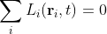
The term Li(ri,t) is the local warming trend. This is how much the local temperature data is changing with time in a manner that is different from G(t). This could be due to differences in latitude, altitude or local geography (such as whether the station is inland or close to the sea, or surrounded by mountains). However, what is also true of Li(ri,t) is that, in absence of any global warming G(t), it should average to a fixed value. But that fixed value would just in effect be a second global warming term that should by rights be part of G(t). In which case it would be logical for the sum of all the local warming terms to equate to zero.

(5.5)

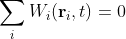
But as already mentioned, the same should be true for the weather component as well:

(5.6)

These two constraints allow us to find the global warming term G(t). To do so we first need to find the temperature anomaly for station or location i.

(5.7)

This, as explained in the last post, is just the difference between the station temperature, Ti(ri,t), and the MRT. If we substitute for Ti(ri,t) and Mi(ri,t) in Eq. 5.7 from the expressions in Eq. 5.1 and 5.4 respectively, together with Eq. 5.2 and Eq. 5.3, after cancellation of terms we get the expression

(5.8)

Now when we sum the anomalies we get

(5.9)

But we know that the summation over Wi(ri,t) will tend to zero as the number of stations increases, or if a smoothing process is utilised, as will the summation over ∆Li(ri,t). So the net result is that if we sum over all possible stations, then

(5.10)

where N is the total number of stations in the summation. Hence the global warming trend is just the mean of the temperature anomalies.

(5.11)

or

(5.12)

If we just sum over all local stations within a region R we will get a similar result, but one that includes the regional trendLR(t).

(5.13)

As the number of regions in the summation increases, theLR(t) term will tend to zero and the result will tend to that in Eq. 5.11. It is important to note, however, that when combining anomalies, those anomalies should be derived using MRTs calculated over the same time period. Typically this is chosen to be from 1961 to 1990, mainly because this period contains data from the largest number of temperature records. A second consideration, though, when choosing a suitable period is to select the one where the temperature is most stable. However, given that most temperature records are fairly recent and recent temperature anomalies tend to show the largest rate of warming, it follows that these two criteria are often mutually exclusive. 

What the above analysis demonstrates is that the global warming trend, either globally or locally, is just the sum of the temperature anomalies. None of this requires the climate scientist to determine the local climatic warming Li(ri,t). That is just an additional layer of complexity via which the data may possibly be corrupted or even cynically distorted.

The major caveat that one should apply to the above analysis is that it assumes that all stations are equally important in the summation in Eq. 5.13 or Eq. 5.11. This is generally not true as each station effectively represents the area between itself and its nearest neighbours. Hence stations that are more isolated are, therefore, responsible for a larger surface area and should command a stronger weighting.

To account for this we can give each station a weighting coefficient ai that reflects the proportion of the land area (Ai) that surrounds station i, in comparison to the total land area Atot. Thus if

(5.14)

then

(5.15)

It is also worth noting the because the areas Ai sum to Atot, it follows that the coefficients ai must sum to unity.

So are these weighting coefficients an important consideration? Well most of the major climate science groups that have derived curves for the global warming (NOAA, NASA-GISS, Berkeley Earth and UK Met. Office Hadley Centre/UEA CRU) seem to calculate the area around each station to great precision and use this in the weighting. Personally I think this is generally a waste of effort. I would argue that in most countries the weather stations appear to be fairly uniformly distributed and any variation is relatively small compared to the much larger measurement uncertainties seen in the temperature data. However, there are certainly enormous differences in station densities between countries and also regions (as noted previously), so it is mainly when combining results from different countries and regions that this becomes a major issue, in my opinion.

The main point, however, is this: To get the global warming trend, you just need to average the anomalies. If you do this for a country or a region, the trend will be unique for that country or region. But this will also show you which countries and regions have the greatest warming.

Wednesday, May 20, 2020

4. Data analysis at the South Pole

If there is one place on Earth that is synonymous with global warming, it is Antarctica. The conventional narrative is that because of climate change, the polar ice caps are melting, all the polar bears and penguins are being rendered homeless and are likely to drown, and the rest of the planet will succumb to a flood of biblical proportions that will turn most of the Pacific islands into the Lost City of Atlantis, and generally lead to global apocalypse. Needless to say, most of this is a gross exaggeration.

I have already explained that melting sea ice at the North Pole cannot raise sea levels because of Archimedes’ principle. The same is true of ice shelves around Antarctica. The only ice that can melt and raise sea levels is that which is on land. In Antarctica (and Greenland) this is virtually all at altitude (above 1000 m) where the mean temperature is below -20 °C, and the mean monthly temperature NEVER gets above zero, even in summer. Consequently, the likelihood of any of this ice melting is negligible.

The problem with analysing climate change in Antarctica is that there is very little data. If you exclude the coastal regions and only look at the interior, there are only twenty sets of temperature data with more than 120 months of data, and only four extend back beyond 1985. Of those four, one has 140 data points and only runs between 1972 and 1986 and so is nigh on useless for our purposes. The other three I shall consider here in detail.

The record that is the longest (in terms of data points), most complete and most reliable is the one that is actually at the South Pole. It is at the Amundsen-Scott Base that is run by the US government and has been permanently manned since 1957. The graph below (Fig. 4.1) illustrates the mean monthly temperatures since 1957.


Fig. 4.1: The measured monthly temperatures at Amundsen-Scott Base.


The thing that strikes you first about the data is the large range of temperatures, an almost 40 degree swing from the warmest months to the coldest. This is mainly due to the seasonal variation between summer and winter. Unfortunately, this seasonal variation makes it virtually impossible to detect a discernible trend in the underlying data. This is a problem that is true for most temperature records, but is acutely so here. However, there is a solution. If we calculate the mean temperature for each of the twelve months individually, and then subtract these monthly means from all the respective monthly temperatures in the original record, what will be left will be a signal representing time dependent changes in the local climate.


Fig. 4.2: The monthly reference temperatures (MRTs) for Amundsen-Scott Base.


The graph above (Fig. 4.2) illustrates the monthly means for the data in Fig. 4.1. We get this repeating data set by adding together all the January data in Fig. 4.1 and dividing it by the number of January readings (i.e. 57). Then we repeat the method for the remaining 11 months. Then we plot the twelve values for each year to give a repeating trend as illustrated in Fig. 4.2. If we then subtract this data from the data in Fig. 4.1 we get the data shown below (Fig. 4.3). This is the temperature anomaly for each month, namely the amount by which the average temperature for that month has deviated from the expected long-term value shown in Fig. 4.2. This is the temperature data that climate scientists are interested in and try to analyse. The monthly means in Fig. 4.2 therefore represent a series of monthly reference temperatures (MRTs) that are subtracted to the raw data in order to generate the temperature anomaly data. The temperature anomalies are therefore the amount by which the actual temperature each month changes relative to the reference or average for that month.


Fig. 4.3: The monthly temperature anomalies for Amundsen-Scott Base.


Also shown in Fig. 4.3 is the line of best fit to the temperature anomaly (red line). This is almost perfectly flat, although its slope is slightly negative (-0.003 °C/century). Even though the error in the gradient is ±0.6 °C per century, we can still venture, based on this data that there is no global warming at the South Pole.

The reasons for the error in the best fit gradient being so large (it is comparable to the global trend claimed by the IPCC and climate scientists) are the large temperature anomaly (standard deviation = ±2.4 °C) and the relatively short time baseline of 57 years (1957-2013). This is why long time series are essential, but unfortunately these are also very rare.

Then there is another problem: outliers. Occasionally the data is bad or untrustworthy. This is often manifested as a data-point that is not only not following the trend of the other data, it is not even in the same ballpark. This can be seen in the data below (Fig. 4.4) for the Vostok station that is located over 1280 km from the South Pole.


Fig. 4.4: The measured monthly temperatures at Vostok.


There is clearly an extreme value for the January 1984 reading. There are also others, including at March 1985 and March 1997, but these are obscured by the large spread of the data. They only become apparent when the anomaly is calculated, but we can remove these data points in order to make the data more robust. To do this the following process was performed.

First, find the monthly reference temperaturs (MRTs) and the anomalies as before. Then, calculate the mean anomaly. Next, calculate either the standard deviation of the anomalies, or the mean deviation (either will do). Then I set a limit for the maximum number of multiples of the deviation that an anomaly data point can lie above or below the mean value for it to be considered a good data point (I generally choose a factor of 5). Any data-points that fall outside this limit are then excluded. Then, with this modified dataset, I recalculated the MRTs and the anomalies once more. The result of this process for Vostok is shown below together with the best fit line (red line) to the resulting anomaly data (Fig. 4.5).


Fig. 4.5: The monthly temperature anomalies for Vostok.


Notice how the best fit line is now sloping up slightly, indicating a warming trend. The gradient, although looking very shallow, is still an impressive +1.00 ± 0.63 °C/century, which is more than that claimed globally by the IPCC for the entire planet. This shows how difficult these measurements are, and how statistically unreliable. Also, look at the uncertainty or error of ±0.63 °C/century. This is almost as much as the measured value. Why? Well, partly because of the short time baseline and high noise level as discussed previously, and partly because of the underlying oscillations in the data which appear to have a periodicity of about 15 years. The impact of these oscillations becomes apparent when we reduce or change the length of the base timeline.


Fig. 4.6: The monthly temperature anomalies for Vostok with reduced fitting range.


In Fig. 4.6 the same data is presented, but the best fit line has only been performed to data between 1960 and 2000. The result is that the best fit trend line (red line) changes sign and now demonstrates long-term cooling of -0.53 ± 1.00 °C/century. Not only has the trend changed sign, but the uncertainty has increased.

What this shows is the difficulty of doing a least squares best fit to an oscillatory dataset. Many people assume that the best fit line for a sine wave lies along the x-axis because there are equal numbers of points above and below the best fit line. But this is not so, as the graph below illustrates.


 Fig. 4.7: The best fit to a sine wave.


The best fit line to a single sine wave oscillation of width 2π and amplitude A is 3A2 (see Fig. 4.7). This reduces by a factor n for n complete oscillations but it never goes to zero. Only a best fit to a cosine wave will have zero gradient because it is symmetric. Yet the problem with temperature data is that most station records contain an oscillatory component that distorts the overall trend in the manner described above. This is certainly a problem for many of the fits to shorter data sets (less than 20 years). But a far bigger problem is that most temperature records are fragmented and incomplete, as the next example will illustrate.


Fig. 4.8: The measured monthly temperatures at Byrd Station.


Byrd Station is located 1110 km from the South Pole. Its local climate is slightly warmer than those at Amundsen-Scott and Vostok but the variation in seasonal temperature is just as extreme (see Fig. 4.8 above). Unfortunately, its data is far from complete. This means that its best fit line is severely compromised.


Fig. 4.9: The monthly temperature anomalies for Byrd Station.


The best fit to the Byrd Station data has a warming trend of +3.96 ± 0.83 °C/century (see the red line in Fig. 4.9 above). However, things are not quite that simple, particularly given the missing data between 1970 and 1980 which may well consist of a data peak, as well as the sparse data between 2000 and 2010 which appears to coincide with a trough. It therefore seems likely that the gradient would be very different, and much lower, if all data were present. How much lower we will never know. Nor can we know for certain why so much data is missing. Is this because the site of the weather station changed? In which case, can we really consider all the data to being part of a single record, or should we be analysing the fragments separately? This is a major and very controversial topic in climate science. As I will show later, it leads to the development of controversial numerical methods such as breakpoint alignment and homogenization.

What this post has illustrated I hope, is the difficulty of discerning an unambiguous warming (or cooling) trend in a temperature record. This is compounded by factors such as inadequate record length, high noise levels in signals, missing and fragmented data, and underlying nonlinear trends of unknown origin. However, if we can combine records, could that improve the situation? And if we do, would it yield something similar to the legendary hockey stick graph that is so iconic and controversial in climate science? Next I will use the temperature data from New Zealand to try and do just that.