Showing posts with label Netherlands. Show all posts

Tuesday, December 8, 2020

43. The reliability of individual temperature records

One of my many criticisms of climate scientists is their use of adjustments to temperature data to supposedly correct for errors in the measurements, corrections which in my opinion are probably not needed for errors that are not real. These corrections come in two main types: homogenization and breakpoint adjustments.

In the case of homogenization, records from neighbouring stations (and the definition of what constitutes a neighbouring station can be somewhat variable) are used to create an average expected temperature for that location, with differences in latitude and elevation compensated for during the process. This homogenization is used to infill missing monthly data points in each record. But it is also used to define the monthly reference temperatures (MRTs) that then define the monthly anomalies.

Breakpoint adjustments, or changepoint adjustments (see this PDF from NOAA) as they are alternatively called, are supposedly used to correct for false trends in the data. This generally means adjusting the slope of all sets of station data so that they look more or less the same, and more importantly have the same general trends as those quoted by the IPCC. So a station like Jakarta Observatorium in Indonesia (Berkeley Earth ID:155660) which actually has a very large warming trend of 1.84 °C per century, and has had since 1870 (and therefore has a total warming since 1870 of over 2.6 °C), gets adjusted down so that its trend is only 0.95 °C. This is because its warming is too high to fit with the IPCC narrative of only 1.0 °C of warming in the Southern Hemisphere since 1900. 

On the other hand, Dubbo (Darling Street) in New South Wales (Berkeley Earth ID:152082) which also has temperature data dating from about 1870, but instead has a negative warming (or cooling) trend of -0.32 °C per century, gets adjusted up so that its trend becomes +0.56 °C per century, and thus closer to accepted "real" value of 1.0 °C per century. 

If this all sounds a bit fishy, then welcome to the wonderful and wacky world of climate science, where nothing is quite as it seems. Central to all these data corrections is the assumption that most of the underlying data is reliable, but more importantly, that it is possible to detect the bad data from the good data. The questions, is any of this true? Is most of the data good? Can we really detect the small amount of bad data? And can the good data actually be so unreliable, or subject to so many unknown hidden variables, that it looks like bad data? One way to test this is by comparing data from stations that are very close neighbours.

As I pointed out in Post 41, the Netherlands has a number of stations that are located very close to a neighbouring station. In fact I have identified nine pairs of stations in the Netherlands where both stations have over 480 months of data, where there is significant temporal overlap of their data (i.e. they have a lot of months where both stations have active data), and where their spatial separation is less than 1.6 km (or about one mile for those dinosaurs from the USA who can't do metric). This allows direct comparisons of data to be made for stations that are, or should be, virtually identical. It is worth noting here that for this purpose the Netherlands has another unique advantage: it is very flat. That means that we do not need to worry about temperature differences occurring between stations due to differences in altitude.

In order to test the reliability of these temperature records I will apply three tests to their data. The first will look at the difference in the mean temperature of each set of station data in the pair. Ideally this should be zero, but there may be a systematic offset between stations due to local geography that could be significant. Such a difference would not necessarily raise question-marks over the validity of the data.

The second test will look at the difference in monthly temperatures between the two stations over time. The issue here is how much randomness is there in the temperature difference, and how significant is it. This will be measured by calculating the standard deviation of the temperature difference. Again, I would expect to see a low value here with noise levels in this data being at least at least a factor of √30 less than the accuracy of the daily mean temperature of each station (which I would estimate conservatively at 1 °C). Overall, this suggests that the standard deviation of this dataset should be less than 0.2 °C, and probably less than 0.1 °C.

Finally, I will look at the trend of the difference in temperature over time. If this is significantly large and comparable to the trends seen in the anomaly data for either station, that would indicate significant reliability problems with this type of data.

The results of these three test are summarized below for each of the nine pairs of stations.


Case 1: Soesterberg

Fig 43.1: The difference is monthly mean temperatures for two stations at Soesterberg. The mean of the monthly differences is 0.17 °C, the standard deviation of the differences is 0.27 °C, and the trend in the differences is -0.29 ± 0.10 °C per century.


The two stations at Soesterberg are BE-92835 (trend of +2.55 °C per century) and BE-139138 (trend of +2.29 °C per century). According to Berkeley Earth they are 1.06 km apart.


Case 2: Schiphol

Fig 43.2: The difference is monthly mean temperatures for two stations at Schiphol. The mean of the monthly differences is 0.09 °C, the standard deviation of the differences is 0.17 °C, and the trend in the differences is 0.017 ± 0.056 °C per century.


The two stations at Schiphol are BE-18517 (trend of +2.53 °C per century) and BE-157005 (trend of +2.12 °C per century). According to Berkeley Earth they are 1.2 km apart.


Case 3: Valkenberg

Fig 43.3: The difference is monthly mean temperatures for two stations at Valkenberg. The mean of the monthly differences is 0.18 °C, the standard deviation of the differences is 0.20 °C, and the trend in the differences is -0.07 ± 0.09 °C per century.


The two stations at Valkenberg are BE-174609 (trend of +2.29 °C per century) and BE-157004 (trend of +1.65 °C per century). According the Berkeley Earth they are 0.25 km apart.


Case 4: Eindhoven

Fig 43.4: The difference is monthly mean temperatures for two stations at Eindhoven. The mean of the monthly differences is 0.10 °C, the standard deviation of the differences is 0.20 °C, and the trend in the differences is 0.20 ± 0.06 °C per century.


The two stations at Eindhoven are BE-18478 (trend of +2.31 °C per century) and BE-156991 (trend of +2.06 °C per century). According to Berkeley Earth they are 1.42 km apart.


Case 5: Volkel

Fig 43.5: The difference is monthly mean temperatures for two stations at Volkel. The mean of the monthly differences is 0.10 °C, the standard deviation of the differences is 0.23 °C, and the trend in the differences is 0.20 ± 0.07 °C per century.


The two stations at Volkel are BE-92832 (trend of +2.31 °C per century) and BE-156995 (trend of +2.10 °C per century). According to Berkeley Earth they are 0.81 km apart.


Case 6: Gilze Rijen

Fig 43.6: The difference is monthly mean temperatures for two stations at Gilze Rijen. The mean of the monthly differences is 0.11 °C, the standard deviation of the differences is 0.30 °C, and the trend in the differences is -0.01 ± 0.09 °C per century.


The two stations at Gilze Rijen are BE-18485 (trend of +2.41 °C per century) and BE-156994 (trend of +1.93 °C per century). According to Berkeley Earth they are 0.16 km apart.


Case 7: Deelen

Fig 43.7: The difference is monthly mean temperatures for two stations at Deelen. The mean of the monthly differences is 0.11 °C, the standard deviation of the differences is 0.25 °C, and the trend in the differences is -0.13 ± 0.09 °C per century.


The two stations at Deelen are BE-18506 (trend of +2.50 °C per century) and BE-157001 (trend of +1.78 °C per century). According to Berkeley Earth they are 1.62 km apart.


Case 8: Rotterdam

Fig 43.8: The difference is monthly mean temperatures for two stations at Rotterdam. The mean of the monthly differences is 0.21 °C, the standard deviation of the differences is 0.21 °C, and the trend in the differences is -0.26 ± 0.14 °C per century.


The two stations at Rotterdam are BE-18497 (trend of +2.17 °C per century) and BE-18496 (trend of +1.80 °C per century). According to Berkeley Earth they are 0.89 km apart.


Case 9: Hoek Van Holland

Fig 43.9: The difference is monthly mean temperatures for two stations at Hoek Van Holland. The mean of the monthly differences is 0.07 °C, the standard deviation of the differences is 0.29 °C, and the trend in the differences is 0.50 ± 0.18 °C per century.


The two stations at Hoek Van Holland and BE-156999 (trend of +1.95 °C per century) and BE-18500 (trend of +1.62 °C per century). According to Berkeley Earth they are 0.87 km apart.


Summary

The three measures I have used to assess the reliability of the temperature records are the difference in the mean temperatures of various pairs of stations, the standard deviation of that difference in monthly temperatures between the two stations, and the magnitude of the trend difference in monthly temperatures. It is important to point out that the data used in the analysis shown in the figures above was the raw monthly temperature data, and not the monthly anomaly data. Overall, the results can be summarized as follows.

1) The difference in mean temperatures

The data shown above for nine pairs of stations indicates that in each case the mean temperature of the two stations can differ by up to 0.2 °C. In fact the mean difference is about 0.13 °C. The question we then need to answer is, is this difference in line with expectations based on known measurement accuracies for the actual data? Or is it determined by other factors such as random variations in the local climate or systematic differences due to differing local environments?

The expected error in the difference in mean temperatures comes from two main sources. One arises from the error in calculating the mean temperature of each station, while the second comes from the expected temperature difference due to their spatial separation.

In order to estimate the first error we start with the original measurement error in the mean daily temperature. This should be less than 1 °C. Then, as each station has over 480 months of data, and each month is itself the average of approximately 30 daily readings, the total number of daily readings being averaged for each station will be N ≥ 30x480. This implies that N ≥ 14400. Now statistical theory states that the error in measuring the mean temperature of a particular station over N readings should be a factor of √N less than the error in a single daily mean temperature measurement. So, this component of the error should be less than 1/120 of 1 °C, in other words less than about 0.008 °C. Combining the error from second station will increase this error by a factor of √2 to give 0.012 °C

The second error component can be estimated by looking at how the global mean temperature changes with latitude. At the equator mean temperatures are about 25 °C, while around the Arctic Circle they drop to near zero. this implies that mean temperatures drop by about 1 °C for every 300 km of latitude. As the two stations in each station pairs are never more than about 1.5 km apart, this implies a maximum difference in temperature due to location of about 0.005 °C. 

Combining the two errors above (by summing their squares) give a combined maximum expected error of 0.013 °C. This is an order of magnitude less than what we observe. This suggests the difference in the mean temperatures is too high to be solely due to measurement uncertainties, even if we allow for differences in local geographical location. It seems likely that local environment differences are the dominant factor here, but these will probably be in the form of fixed temperature offsets that should not impact significantly on the anomaly data over time. If they do, then there will be evidence for this in the form of excessive differences in the trends.


2) The standard deviation

The mean standard deviation of the monthly temperature differences for the nine pairs of stations shown in the figures above is 0.24 °C. While this is much less than the standard deviation of the monthly anomalies of individual stations (typically about 1 °C), it is still significant.

At the start of this post I suggested that 0.2 °C should be a more likely upper limit for the standard deviation, based on the measurement accuracy of the daily mean temperatures, and the number of daily readings that combine to form the monthly mean temperature. This will be heavily dependent on the accuracy of the mean daily temperature, though. 

If the daily mean temperature measurements have an error or uncertainty of 1 °C, then combining 30 of them into a monthly mean will decrease the error or uncertainty for the monthly mean by a factor of √30. However, then comparing the monthly means of two different stations will increase the error in the temperature difference by √2, so overall, the error in the difference in monthly temperatures should be a factor of √15 less than the error in a single mean daily temperature. This is approximately what we see.


3) The long term trend of the temperature difference

Of the three test results, this is probably the most surprising. While one might expect adjacent stations to experience a relative offset in their local temperatures, or differences due to statistical fluctuations over time, generally one would expect their temperature trends to follow each other. Yet the data shown above suggests otherwise.

Overall, the various station pairs exhibited a wide range of trends for their difference in monthly temperatures over time, as illustrated in the figures above. The mean trend seen for the first five pairs of stations (ignoring sign) is approximately 0.15 °C per century. This seems much higher than I would intuitively expect, but is it?

The difference in the trends is likely to be related to the uncertainty in the trends for the anomalies of each station dataset. These depend to the standard deviation of the residuals and inversely with the length of the dataset. For any best fit or trend line the error in the gradient can by estimated by dividing the standard deviation of the residuals by the standard deviation of the x-values multiplied by the square root of the number of x-values. 

In this case the residual is effectively the difference in monthly mean temperatures between stations, and the x-values are the time axis in the graphs above. The standard deviation of the x-values is roughly 12 years and there are roughly 400 points, while the standard deviation of the residuals is effectively 0.24 °C. This suggests that the trend seen in the temperature difference data is likely to be in the range ±0.001 °C per year, or ±0.1 °C per century. Again this is roughly what we see, although the actual trends in the graphs shown above are about double this value, so maybe there is some additional (but relatively small) influence here due to differences in the local environment for the two stations over time. 


Conclusions

The analysis above indicates that even weather stations that are located close together can yield significantly different results from each other for their temperature trends, mean temperatures and temperature distributions over time, just through the presence of known measurement errors. These differences between nearby stations are much greater than I expected to see before I performed this analysis, but are generally consistent with the measurement data and known sources of error. What it does indicate, though, is that even the best data is not that accurate, reproducible or reliable. Given the lack of long term temperature data for many parts of the world, this raises questions over the accuracy of any climate analysis that relies on this imperfect data.


Sunday, December 6, 2020

42. A study of fractal self-similarity and scaling for the De Bilt temperature data

In Post 9 (Fooled by randomness) I looked at the possibility of fractal behaviour occurring in the temperature records of individual stations and regions. In particular, I was interested to see if those records exhibited any form of self-similarity, and whether that self-similarity could account for the magnitude of fluctuations seen in the long term temperature records.

My initial analysis was performed on data from New Zealand and it seemed to suggest that fractal behaviour may be present. This behaviour is quantified by the fractal dimension which, in the case of temperature data, defines how the amplitude of the temperature fluctuations changes with the time interval those readings represent. Most of the data I look at on this blog consists of monthly average temperatures. For these readings the data typically has a spread of up to ±5 °C, while the standard deviation of the monthly fluctuations is usually between 1 °C and 2 °C. But what would the same temperature records look like if one considered the 12-month averages? Or the 10-year averages? 

Well, as I explained previously in Post 9, if the fluctuations in the temperature data conformed to a white noise spectrum, the power spectrum would be expected to be independent of frequency for all frequencies below the fundamental or cutoff frequency (see Eq. 9.1). The consequence of this is that smoothing the data with a sliding window, or moving average, of width N (where N is the number of months in the new average) should reduce the cutoff frequency by a factor of N, and thus reduce the signal power below the cutoff by a factor of N. That in turn should reduce the amplitude of the random noise fluctuations by a factor of √N. So, smoothing the monthly average data with a 24 month moving average should reduce the amplitude of the fluctuations by a factor of √24, or about a factor of five. Except that this does not happen.

As I have demonstrated in numerous previous posts, the noise amplitude in the monthly temperature data decreases much more slowly than expected as the width of the sliding window in the smoothing algorithm is increased. In fact it appears to decrease as N -p. where p tends to be in the range 0.20 < p < 0.35, but is generally concentrated around p = 0.25. This was shown in Post 9 for New Zealand data, in Post 17 for individual sites in Australia, and in Posts 18-21 for various Australian states. In most cases the same behaviour was seen. The only two exceptions I have found so far were for data from the South Pole (Amundsen-Scott), and also for the trend for South Australia (see Post 21) but only if the parabolic long term trend was removed. In both cases the data behaved like classical white noise with p = 0.5.

Why is this behaviour important? Well, for three reasons. Firstly, if there is a definite trend, it would allow us to estimate the amplitude of natural temperature fluctuations over timescales that are much longer than we have data for. Secondly, it could allow us to differentiate between natural and anthropogenic sources of climate change. And finally, it may shed light on possible natural mechanisms that may underpin long term climate change rather than assuming that everything is a consequence of carbon dioxide emissions, or that every current change in climate behaviour has a cause that is local, either spatially or temporally.

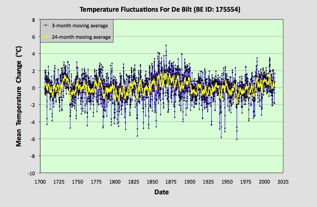
So why I am revisiting this now? Well, because in my last post I presented some data from a station at De Bilt (Berkeley Earth ID: 175554) in the Netherlands that is one of the longest continuous sets of temperature data that exists. What also set this data apart, though, was the fact that there was complex structure to the data that was much greater in amplitude than the continuous upward trend expected from global warming. Moreover, the underlying continuous upward trend could also be easily removed so that the remaining data could be studied, just as I removed the parabolic background from the South Australia data in Post 21. The question is, would I see the same result as for South Australia? Namely, that the remaining temperature fluctuations behaved like white noise. Well, the answer is no.


Fig. 42.1: The monthly temperature anomalies for De Bilt since 1706 with the linear trend of +0.29 ± 0.04 °C per century removed (blue curve). The standard deviation is 1.855 °C (for N = 1). The yellow curve is the 12-month moving average of the blue data (N = 12) and has a standard deviation of 0.810 °C.


The data in Fig. 42.1 above shows the same monthly temperature anomaly data that was presented in Fig. 41.1 of the previous post, except with the long-term upward trend of 0.23 °C per century removed. The yellow curve is the 12-month moving average of the blue data which clearly has a much lower noise amplitude, and therefore a lower standard deviation of 0.81 °C compared to 1.85 °C for the monthly data. In both cases the standard deviation was measured for data over the same 275 year period (or 3300 months) from 1731-2005.


Fig. 42.2: The 3-month (N = 3) moving average (blue curve) of the monthly data in Fig. 42.1 above. The standard deviation of this data is 1.326 °C. The yellow curve is the 24-month moving average (N = 24) of the same data in Fig. 42.1 and has a standard deviation of 0.664 °C.


The data in Fig. 42.2 above shows the same monthly temperature anomaly data as shown in Fig. 42.1, but after smoothing with a 3-month moving average (blue curve) and alternatively a 24-month moving average (yellow curve). As a result of the smoothing, the standard deviation reduces to 1.326 °C for the 3-month window (N = 3) and 0.644 °C for the 24-month sliding window (N = 24).


Fig. 42.3: The 6-month (N = 6) moving average (blue curve) of the monthly data in Fig. 42.1 above. The standard deviation of this data is 1.046 °C. The yellow curve is the 5-year moving average (N = 60) of the same data in Fig. 42.1 and has a standard deviation of 0.536 °C.


Next, if we smooth the original monthly temperature anomaly data in Fig. 42.1 with 6-month and 5-year moving averages or sliding windows we get the data shown in Fig. 42.3 above. Now, after smoothing with a 6-month moving average (blue curve) the standard deviation has reduced to 1.046 °C (and N = 6), while that for the 5-year moving average (yellow curve) is now 0.536 °C (and N = 60).


Fig. 42.4: The 9-month (N = 9) moving average (blue curve) of the monthly data in Fig. 42.1 above. The standard deviation of this data is 0.894 °C. The yellow curve is the 10-year moving average (N= 120) of the same data in Fig. 42.1 and has a standard deviation of 0.462 °C.


Finally, if we smooth the original monthly temperature anomaly data in Fig. 42.1 with 9-month and 5-year moving averages or sliding window we get the data shown in Fig. 42.4 above. Now, after smoothing with a 9-month moving average (blue curve) the standard deviation has reduced to 0.894 °C (and N = 9) while that for the 10-year moving average (yellow curve) is now 0.462 °C (and N = 120).

All the standard deviations (σ) for the different sets of smoothed data are summarized in the table below.


Table 42.1
N σ ln(N) ln(σ)
1
1.855
0.000
0.618
3
 1.326  1.099  0.282
 6  1.046  1.792  0.045
 9  0.894  2.197  -0.112
 12  0.810  2.485  -0.211
 24  0.664  3.178  -0.409
 60  0.536  4.094  -0.624
 120  0.462  4.787  -0.772


If we now combine these results into a single plot we get the graph shown in Fig. 42.5 below. The gradient of this log-log plot is the exponent of N -p in the power law we expect to see for the decrease in the noise amplitude as we increase the smoothing interval N. Once again we see that the value for the exponent p is well below the 0.5 expected for white noise. In fact p = +0.31 ± 0.01, indicating that the fractal dimension is 0.31. In addition, the quality of the fit (as indicated by the R2 value) is very high.


Fig. 42.5:  Plot of the standard deviation of the smoothed anomaly data against the smoothing interval N for temperature data from De Bilt. The best fit line is fitted to all the data except that from the 10-year moving average (as indicated by the length of the red line). The gradient of the best fit line is -0.31 ± 0.01 and R2 = 0.9943.


Conclusions

  1. The quality and linearity of the best fit in Fig. 42.5 indicates that there is a high degree of self-similarity in the data. This in turn also suggests that all the significant features seen in the original data (such as the large broad peaks at 1725 and 1860) are natural and not the result of external or artificial biases. If such artificial biases were present, and were significant in magnitude, they would probably manifest themselves as significant deviations of the data in Fig. 42.5 from a linear trend.
  2. From the gradient of the trend line in Fig. 42.5 we can estimate the standard deviation of temperature data for the case N = 1200 as being 0.20 °C. In other words, the fluctuations in the 100-year average will typically be of the order of ±0.2 °C. This in turn suggests that changes in the mean temperature from century to century of more than 0.5 °C are likely to be very common.


Tuesday, November 24, 2020

41. Netherlands - temperature trends - VARIABLE

The Netherlands has one of the longest instrumental temperature records in the world, and probably the most complete record covering the last 300 years. The record from De Bilt (Berkeley Earth ID: 175554) had nearly 3700 months of data in 2013 that stretched back to 1706 (see Fig. 41.1 below). Only Berlin Tempelhof (Berkeley Earth ID: 155194) has earlier data that extends to 1701, but it has fewer months overall and significant gaps in its record before 1756.


Fig. 41.1: The temperature trend for De Bilt since 1706. The best fit is applied to the interval 1731-2005 and has a positive gradient of +0.29 ± 0.04 °C per century. The monthly temperature changes are defined relative to the 1976-2005 monthly averages.


As I showed in the last post, Belgium also has one long record that stretches back to the 18th century, but it has virtually no other data before 1973. The Netherlands is much better in this respect. There is one other dataset with some sporadic 19th century data, and overall there are five long station records with more than 1200 months of data. In addition, there are another 25 medium records with more than 480 months of data. Details of all these 30 stations (and other shorter records) are listed here, while their geographical locations are shown on the map in Fig. 41.2 below.


Fig. 41.2: The locations of long stations (large squares) and medium stations (small diamonds) in the Netherlands. Those stations with a high warming trend are marked in red.


It can be seen from the map above that the stations in the Netherlands are fairly randomly distributed across the country, but that their number appears to be significantly less than the 30 stations stated previously. This is because in nearly a dozen cases two or more stations are located within 10 km of each other. I intend to look at this is more detail in a later post, where I will look at what this says about data reliability. 

The other impact of this clustering is the effect it could have on the station weightings in the regional average. Normally if a cluster of records is found the weighting of each record should probably be reduced as they will tend to repeat each other's data and geographical coverage. However, as most of the station records appear in effect to be paired up, they will almost all have the same reduced weighting, so the weighting reduction should largely cancel. This is largely confirmed by the results I will show later in this post. The other point to note, is that the clustering really only impacts the medium stations, most of which have data after 1970 only. So the weighting problem will only have a slight effect on the overall trends after 1970.


Fig. 41.3: The temperature trend for the Netherlands since 1706. The best fit is applied to the interval 1731-2005 and has a positive gradient of +0.31 ± 0.04 °C per century. The monthly temperature changes are defined relative to the 1976-2005 monthly averages.


If we average the anomaly data for all the long and medium stations we get the trends shown above in Fig. 41.3. The overall trend indicates that the region has warmed by about 0.31 °C per century since 1700. This equates to an overall warming of about 0.97 °C. But as I explained in Post 14, the current human industrial and domestic energy consumption in the country suggests that the region should have warmed by at least 1.0 °C over the same period simply as a consequence of all the heat that is produced each year by human activity. So, just as for Belgium, we see little need to call on the effects of carbon dioxide emissions and the Greenhouse Effect to explain the observed temperature rise.

The other interesting feature of the data in Fig. 41.3 is the shape of the temperature trend between 1800 and 1950. There is clearly a peak around 1860 that is seen not just in the De Bilt record in Fig. 41.1, but also in the Zuid-Limburg station data. This suggests that temperatures in the mid-19th century in the Netherlands were actually higher than they are today. This is a phenomenon that I have identified and highlighted previously in other countries and regions such as New Zealand (see Post 8), Australia (see Post 26) and South America (see Post 35). In fact it appears to occur over most of the Southern Hemisphere, or at least in those parts that have sufficient data before 1900.

The anomaly data used to construct the trend in Fig. 41.3 was derived by first calculating the monthly reference temperatures (MRT) for the period 1976-2005 for each record, and then subtracting these from the raw data. These were then averaged. Temperature records were only included in the trend in Fig. 41.3 if they had at least 480 months of data, and at least 320 months of this data was within the MRT interval of 1976-2005. This was to ensure that all temperature anomaly records were measured relative to identical reference points. The result was that three medium stations were excluded because they had insufficient data after 1975. These were the stations at Den Helder, Maastricht and Groningen


Fig. 41.4: The number of sets of station data included each month in the temperature trend for the Netherlands.


The actual number of stations used to construct each monthly point in the trend in Fig. 41.3 is illustrated above in Fig. 41.4. This shows that the trend before 1900 is almost entirely due to the data from De Bilt in Fig. 41.1, while the data from 1900 to 1950 comes from the five long stations. After 1950 as many as 27 station records were used for each monthly average.


Fig. 41.5: Temperature trends for all long and medium stations in the Netherlands since 1750 derived by aggregating and averaging the Berkeley Earth adjusted data. The best fit linear trend line (in red) is for the period 1801-1980 and has a gradient of +0.29 ± 0.03 °C/century.


So the question is, how significant are these results? And also how reliable are they?

Well, one way to test this is to compare these results against those produced by climate science groups like Berkeley Earth. The first thing to remember, though, is that the Berkeley Earth anomaly data for each station record is different from that which I have calculated here because it uses homogenization and breakpoint alignment to adjust the data, techniques that I have profound misgivings about because they could introduce warming to the overall trend that is not actually there. That is why I restrict my analysis to the raw data with all its imperfections.

However, if we apply the same averaging process to the Berkeley Earth adjusted data as I have employed to the raw data, we see that the trends we get (as illustrated in Fig. 41.5 above) agree very well with those published by Berkeley Earth and shown in Fig. 41.6 below. In fact the size and positions of most of the peaks in the two figures are virtually identical. This suggests that the two processes (mine and Berkeley Earth's) are broadly consistent, even if the anomaly data for each station that is used in the averaging is different. What it also shows, though, is that the Berkeley Earth trend that incorporates homogenization and breakpoint adjustments is somewhat different from the trend I have presented in Fig. 41.3 that avoids using such controversial techniques. For example, according to Berkeley Earth, the warming in the Netherlands since 1900 is at least 1.5 °C, and there was no warm period in the mid-19th century. It is these disagreements over data and methodology, and the effects they have on the resulting temperature trends, that partly fuels the climate scepticism debate.


Fig. 41.6: The temperature trend for the Netherlands since 1750 according to Berkeley Earth.


If we try to quantify the difference between the Berkeley Earth temperature trend and the raw trend I have constructed in Fig. 41.3 we find that the adjustments made by Berkeley Earth  have two main effects. The first is to flatten the trend before 1900. The second is to exaggerate the temperature rise after 1900 by about 0.3 °C. These adjustments are illustrated in Fig. 41.7 below.


Fig. 41.7: The contribution of Berkeley Earth (BE) adjustments to the anomaly data after smoothing with a 12-month moving average. The linear best fit to the data is for the period 1901-2010 (red line) and the gradient is 0.266 ± 0.009 °C per century. The orange curve represents the contribution made to the BE adjustment curve by breakpoint adjustments only.


Conclusions

It is clear from Fig. 41.3 that there has been a large degree of warming in the Netherlands over the last 300 years, but that this is probably less than than the 1.5 °C we are being led to expect for anthropogenic global warming (AGW) in the Northern Hemisphere as claimed by the IPCC and the HadCRUT4 data

The magnitude of this warming is probably only about 1 °C. However, this temperature rise is only what one would expect from the growth of industrial energy use over this period (for the Netherlands I have previously calculated that it should be about 1.0 °C) as I explained in Post 14

However, there is also evidence of significant natural variation in the temperature record (such as the warming in the mid-19th century) that is inconsistent with current IPCC claims.

Consequently, the data presented here does not really add support to the theory that carbon dioxide is the primary driver of warming, otherwise the warming seen in the Netherlands should be much larger, and there would be no anomalous fluctuations in temperature before 1900.

Finally, there is the issue of historical perspective. If temperatures in the recent past were both higher than now and at times lower than now, why are we worried about current temperatures when they appear to be fluctuating between normal bounds?


Wednesday, June 17, 2020

14. Surface heating

The principal claim made by climate scientists is that global temperatures have increased by about 1 °C over the last 100 years. In the last post I outlined three ways that this might happen. The first, which was due to changes in the amount of solar radiation reaching the Earth, I discounted due to a lack of evidence or plausible mechanism. The last, changes to the radiative forcing term I will discuss at a later date. In this post I will consider the second possibility: changes to the amount of direct heat absorption at the surface of the Earth. There are essentially only two ways this can happen: (i) through changes to the Earth’s reflectivity or albedo; (ii) by direct heating of the surface from energy sources other than the Sun.

(i) Changing the Earth’s albedo.

As I explained in the last post, one way that the Earth's surface temperature might change is if the proportion of light from the Sun that is reflected from the surface were to change. The amount reflected is called the albedo. This effect can be seen in Fig. 14.1 below which is taken from a 2009 paper by Kevin Trenberth, John Fasullo and Jeffrey Kiehl (Bull. Amer. Meteor. Soc. 90 (3): 311–324). On the left of Fig. 14.1 where the direct radiation from the Sun (in yellow) impacts the surface, the radiation is partially reflected with 23 W/m2 being reflected and 161 W/m2 is absorbed. This equates to an albedo of 0.125 ( = 23/(23+161) ).

As an aside: it seems slightly suspicious that the fractions reflected at the surface (1/8) and at the top of the atmosphere (102/341 = 30%) are so close to simple fractions. Does this indicate a high degree of uncertainty in these numbers, I wonder?


Fig. 14.1: The Earth's energy balance according to Trenberth et al. (2009). 


In order for the surface temperature of the Earth to have increased by 1 °C, one way that this could have happened would be for the amount of energy absorbed at the surface to have increased over time by 2.3 W/m2. If this were to be achieved through changes to the albedo, then the albedo would need to have decreased from 0.1375 to 0.125. That is a change of 0.0125. So how likely is this?

The albedo of the Earth's surface depends of the type of material of the surface, as shown in Table 14.1. It also depends on the angle of incidence of the light as light tends to reflect more off surfaces at glazing incidence. So ocean water at the equator has a lower albedo than it does near the poles. However, there is also much less surface area near the poles which consequently reduces the contribution of high angle reflectance. 


  Surface  % of Earth's
    Surface Area   
  Albedo   
%
    Contribution to the    
Earth's Albedo
Ocean          71.00           6                 0.0426
Forest            7.62       8-18                 0.0091
Grassland            7.93         25                 0.0198
Arable            2.37         17                 0.0040
Desert sand                    5.51         40                 0.0220
Urban            0.21         20                 0.0004
Glaciers & ice caps              2.90         80                 0.0232
Shrub & tundra            2.46         15                 0.0037

Table 14.1: Approximate albedo of different parts of the Earth's surface.


The most common claims made about land use and climate changes are in regard to deforestation, increasing agricultural use, and increased urbanization. First it is claimed that deforestation for farming, particularly livestock farming aids global warming. As far as changes to the albedo are concerned, the evidence in Table 14.1 seems to point the other way. Turning forests into grassland increases the albedo.

Urbanization is also generally believed to reduce albedo, partly through what is termed the urban heat island (UHI) effect. This is the theory that cities with large amounts of concrete soak up more heat, and tall buildings trap that heat. This may be true, but it may also be a small localized effect. Again the data in Table 14.1 does not support it as a major driver of global warming.

A third claim is often made about polar ice and glaciers. The claim is that, because ice and snow have high levels of albedo, any change in their total albedo would have a large impact on global temperatures. The two main negative effects cited tend to be reductions in area by melting, or black carbon soot particles that drop on the surface and reduce the albedo. The main problem here is that the changes required are huge; a 54% decrease in area, or a decrease in albedo from 0.80 to 0.37. The first obviously has not and will not happen, and the latter is very unlikely as it would require huge levels of soot deposits.

The conclusion is, therefore, that changes to the Earth's albedo are difficult to achieve, and any that might have occurred have probably produced very little real effect in terms of increasing global temperatures.


(ii) Direct anthropogenic surface heating due to human and industrial activity.

The proposition here is this. All energy generation by humans results in an output of heat or thermal energy. Not only does every industrial process produce waste heat, but all mechanical work that is done by that process eventually ends up as heat or entropy as well. These are the consequences of the Second Law of Thermodynamics, and as every physicist knows, nothing can defeat the Second Law of Thermodynamics. So as temperature is just a measure of heat and entropy, it follows that everything humans do, every industrial process they create, all the energy that goes in will, in the end, just heat up the environment.

In the last post I showed that an increase of 2.3 ± 0.5 W/m2 in the amount of radiation at the surface would raise global temperatures by 1 °C. So if we can work out what the rate of energy production and consumption by humans is, then we can equate that to a global temperature rise. The starting point for this is clear: we know from IPCC reports and the protestations of climate scientists that the human race currently emits 36 gigatonnes of carbon dioxide (CO2) into the atmosphere. That CO2 is created primarily by three processes.

The first is the burning of pure carbon (from coal) that produces an energy output of 394 kJ/mol for the process


(14.1)

The second is burning of methane (natural gas) that produces an energy output of 882 kJ/mol for the process


(14.2)

The third is the burning of higher alkanes (from oil) that produces an energy output of about 660 kJ per mole of CO2 for the process


(14.3)

Each of the above energy outputs is for the burning of carbon or hydrocarbons to produce one mole of CO2. To work out how energy that amounts to in total we need to know how much of each type of fossil fuel was used.

In 2018 global coal production was 7665 million tonnes, natural gas production was 3955 billion cubic metres or 2786 million tonnes (assuming 1 cubic metre = 704.5 g), and crude oil production was 4472 million tonnes. That suggests a mean energy output of about 560 kJ/mol. As 36 gigatonnes of carbon dioxide equates to 8.18 x 10m14 moles, then the total energy consumption would have been 4.58 x 10²⁰ J for the year, or 52,268 TWh.


Fig. 14.2: Global fossil fuel consumption since 1800.


However, according to the Our World In Data website, the global energy consumption from fossil fuels in 2017 amounted to 36,704 TWh from natural gas, 53,752 TWh from crude oil and 43,397 TWh from coal (see Fig. 14.2 above). The total of these values (133,853 TWh) is 2.53 times the value based on CO2 emissions and suggests only 39% of fossil fuel combustion results in CO2. This higher figure equates to an average power density at the Earth's surface of 0.030 W/m2 across the whole surface of the Earth. That is turn implies a global temperature increase (based on the 2.3 W/m2 required for a 1 °C increase that I demonstrated in the last post) of 0.013 °C compared to pre-industrial times. This, though, still omits the impact of nuclear power and renewables.


Fig. 14.3: Global energy production by energy type (2005-2018).


According to Statistica.com renewables and nuclear energy accounted for 15.3% of global energy consumption in 2018, and fossil fuel usage in 2018 exceeded that in 2017 (see Fig. 14.3 above), so that implies a global temperature increase of at least 0.015 °C compared to pre-industrial times. This temperature increase of 0.015 °C is, however, at least 60 times less than the one the IPCC is claiming for global warming since 1850. So this suggests that any resulting surface heating is such a small effect that we can safely ignore it, right? Well, not so fast.

We know that this heat is not spread evenly, its impact is greatest in the areas where most people live and work. We know that 90% of people live in the Northern Hemisphere; we know that 99.999% of people live on land. It is also true that 90% of weather stations are in the Northern Hemisphere, and at least 99.9% of them are on land. In other words there is a high degree of correlation between where people live, where industrial energy usage is, and where the weather stations are. For example, 19.7% of the Earth's surface is land in the Northern Hemisphere. So if 90% of the energy use is found there then the mean temperature rise on land in the Northern Hemisphere will be 0.069 °C. But of course, even that fails to tell the whole story. If we look at individual countries the results become even more stark.

If we start with what has been, historically, the biggest CO2 producer, the USA, we see that it accounts for about 20% of global energy use despite being home to only 4.3% of the world's population, and covering only 1.6% of the Earth's surface area. That suggests that the power density for surface heating in the USA should be about 0.38 W/m2 (an increase by a factor of 12.6 on the global average of 0.03 W/m2). This picture is confirmed by data from the US Energy Information Administration that indicates that the total power consumption of the 48 contiguous states (excluding Hawaii and Alaska) is 100.3 x 10¹⁵ BTU (see Fig. 14.4 below) over an area of 8.08 x 10⁶ km2. As 1 BTU (British thermal unit) is the equivalent of 1055 J, this gives a power density for surface heating of 0.42 W/m2. Yet this increases to 0.69 W/m2 in Texas and 1.11 W/m2 in Pennsylvania. That means that the temperature rise in Pennsylvania due to surface heating is almost 0.5 °C. But if we look at Europe the situation is even more extreme.


 Fig. 14.4: US energy consumption since 1950 by sector (in BTU).


According to the IEA, the UK's energy usage in 2018 was 177 million tonnes of oil equivalent (Mtoe), or 2059 TWh (1 Mtoe = 11.63 MWh). As the area of the UK is only 242,495 km2, that equates to a power density of 0.97 W/m2 and a temperature rise of 0.42 °C. But it is safe to assume that that energy usage will not be spread evenly across the country. At least 84% of both the UK population and UK economic activity is found in England (with an area of 130,395 km2) which implies a temperature rise for England alone of 0.66 °C. Yet that is still modest compared to Belgium and the Netherlands with their much higher population densities (see Table 14.2 below) where the projected temperature rise is close to 1.0 °C. That is more than the IPCC claims for global warming from greenhouse gas emissions.


  Country  Energy Usage
(Mtoe)   
  Power Density
(W/m2)  
 Temperature Rise
(°C) 
UK                 177                 0.97                 0.42
Italy                 151                 0.66                 0.29
France                 245                 0.50                 0.22
Belgium                   52                 2.25                 0.98
Netherlands                      72                 2.30                 1.00
Germany                 298                 1.11                 0.48
Austria                   33                 0.52                 0.23
Switzerland                   24                 0.77                 0.34

Table 14.2: Energy usage, surface heating and temperature rise in Europe.


What Table 14.2 illustrates is that surface heating is a significant factor in overall global warming, and it is occurring in every major EU country, including those that border the Alps. In fact the average temperature rise over all five of the main alpine countries is 0.30 °C. It is perhaps no wonder then that the alpine glaciers have been retreating for over a century, while those in Norway and New Zealand, where the population density (and also the economic activity) is much lower, have remained more stable. But what this warming is not due to is increased CO2 levels in the atmosphere or an enhanced Greenhouse Effect. That is a completely separate issue.

The conclusion we can draw from this is that, in most developed countries, warming of up to 1.0 °C has occurred since pre-industrial times, and this warming is solely a result of industrial activity and the heat that is generated as a result of that activity. This will occur irrespective of the energy type or source used because it is the heat that is directly warming the planet, not increases in the concentration of waste gases that then add to the Greenhouse Effect. This also means that when the energy usage goes down, the temperature should go down.

This has major implications for future energy policy because it means that nuclear power and most renewables are no better than fossil fuels. It also means that the efficiency of energy generation is as important as the quantity of energy generation in determining the amount of warming.


Fig. 14.5: Efficiencies of different power sources.


As an example of the impact of energy efficiency consider the case of solar photovoltaics. The relative efficiencies of different power sources are illustrated in Fig. 14.5 above. Of these photovoltaics are among the least efficient. They are in fact only about 15% efficient, meaning that for every 100 joules of energy they harvest from the Sun, they only create 15 joules of electricity. Yet in order to do this solar cells need to be 95% efficient in terms of absorbing incoming solar radiation. In other words their albedo needs to be less than 0.05. That means that for every 100 joules of solar radiation that falls on a solar cell, 5 joules is reflected back into space, 15 joules is turned into electricity (which will then become surface heat at the point of use), and 80 joules becomes waste surface heat in the solar cell.

Now a fashionable policy proposal at the moment is to put large numbers of photovoltaics in the Sahara Desert and then pump the electricity they produce to wherever it is needed. The problem is that not only will the electricity generated heat the location of its end user, but the solar cells will heat up the desert by decreasing the local albedo from 0.40 to 0.05. That is a double whammy. It is global warming without the need for CO2. Now you don't hear much about that from climate scientists.