Showing posts with label chaos theory. Show all posts

Sunday, December 6, 2020

42. A study of fractal self-similarity and scaling for the De Bilt temperature data

In Post 9 (Fooled by randomness) I looked at the possibility of fractal behaviour occurring in the temperature records of individual stations and regions. In particular, I was interested to see if those records exhibited any form of self-similarity, and whether that self-similarity could account for the magnitude of fluctuations seen in the long term temperature records.

My initial analysis was performed on data from New Zealand and it seemed to suggest that fractal behaviour may be present. This behaviour is quantified by the fractal dimension which, in the case of temperature data, defines how the amplitude of the temperature fluctuations changes with the time interval those readings represent. Most of the data I look at on this blog consists of monthly average temperatures. For these readings the data typically has a spread of up to ±5 °C, while the standard deviation of the monthly fluctuations is usually between 1 °C and 2 °C. But what would the same temperature records look like if one considered the 12-month averages? Or the 10-year averages? 

Well, as I explained previously in Post 9, if the fluctuations in the temperature data conformed to a white noise spectrum, the power spectrum would be expected to be independent of frequency for all frequencies below the fundamental or cutoff frequency (see Eq. 9.1). The consequence of this is that smoothing the data with a sliding window, or moving average, of width N (where N is the number of months in the new average) should reduce the cutoff frequency by a factor of N, and thus reduce the signal power below the cutoff by a factor of N. That in turn should reduce the amplitude of the random noise fluctuations by a factor of √N. So, smoothing the monthly average data with a 24 month moving average should reduce the amplitude of the fluctuations by a factor of √24, or about a factor of five. Except that this does not happen.

As I have demonstrated in numerous previous posts, the noise amplitude in the monthly temperature data decreases much more slowly than expected as the width of the sliding window in the smoothing algorithm is increased. In fact it appears to decrease as N -p. where p tends to be in the range 0.20 < p < 0.35, but is generally concentrated around p = 0.25. This was shown in Post 9 for New Zealand data, in Post 17 for individual sites in Australia, and in Posts 18-21 for various Australian states. In most cases the same behaviour was seen. The only two exceptions I have found so far were for data from the South Pole (Amundsen-Scott), and also for the trend for South Australia (see Post 21) but only if the parabolic long term trend was removed. In both cases the data behaved like classical white noise with p = 0.5.

Why is this behaviour important? Well, for three reasons. Firstly, if there is a definite trend, it would allow us to estimate the amplitude of natural temperature fluctuations over timescales that are much longer than we have data for. Secondly, it could allow us to differentiate between natural and anthropogenic sources of climate change. And finally, it may shed light on possible natural mechanisms that may underpin long term climate change rather than assuming that everything is a consequence of carbon dioxide emissions, or that every current change in climate behaviour has a cause that is local, either spatially or temporally.

So why I am revisiting this now? Well, because in my last post I presented some data from a station at De Bilt (Berkeley Earth ID: 175554) in the Netherlands that is one of the longest continuous sets of temperature data that exists. What also set this data apart, though, was the fact that there was complex structure to the data that was much greater in amplitude than the continuous upward trend expected from global warming. Moreover, the underlying continuous upward trend could also be easily removed so that the remaining data could be studied, just as I removed the parabolic background from the South Australia data in Post 21. The question is, would I see the same result as for South Australia? Namely, that the remaining temperature fluctuations behaved like white noise. Well, the answer is no.


Fig. 42.1: The monthly temperature anomalies for De Bilt since 1706 with the linear trend of +0.29 ± 0.04 °C per century removed (blue curve). The standard deviation is 1.855 °C (for N = 1). The yellow curve is the 12-month moving average of the blue data (N = 12) and has a standard deviation of 0.810 °C.


The data in Fig. 42.1 above shows the same monthly temperature anomaly data that was presented in Fig. 41.1 of the previous post, except with the long-term upward trend of 0.23 °C per century removed. The yellow curve is the 12-month moving average of the blue data which clearly has a much lower noise amplitude, and therefore a lower standard deviation of 0.81 °C compared to 1.85 °C for the monthly data. In both cases the standard deviation was measured for data over the same 275 year period (or 3300 months) from 1731-2005.


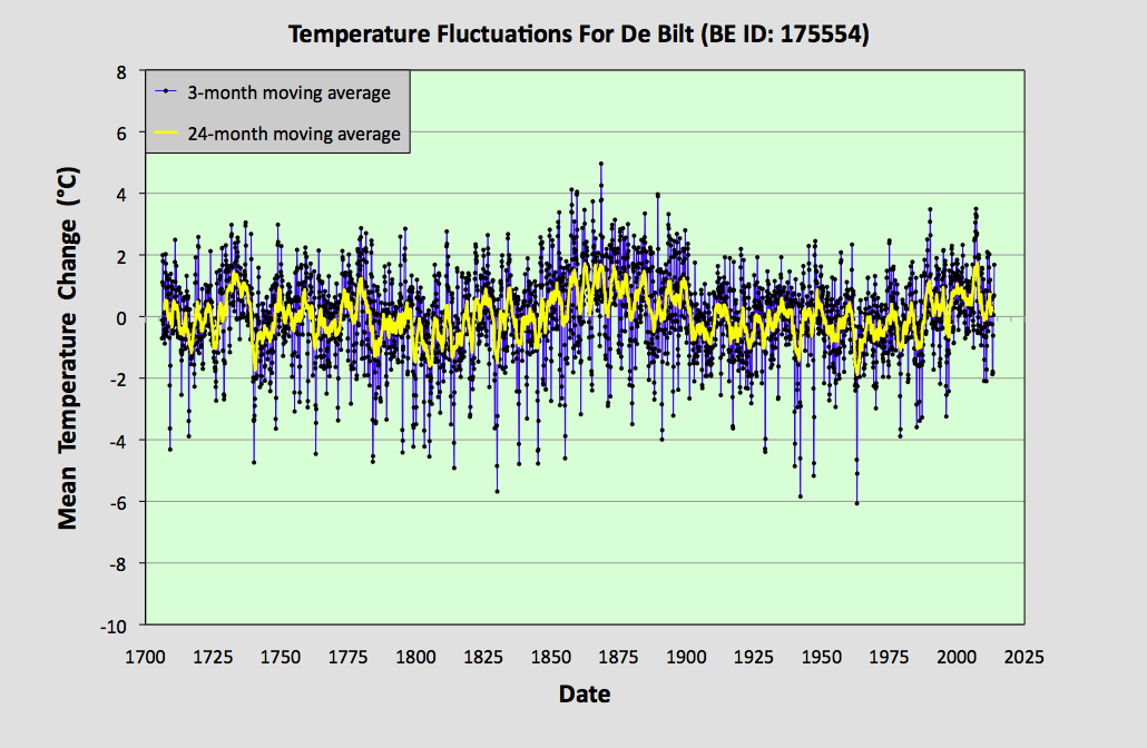
Fig. 42.2: The 3-month (N = 3) moving average (blue curve) of the monthly data in Fig. 42.1 above. The standard deviation of this data is 1.326 °C. The yellow curve is the 24-month moving average (N = 24) of the same data in Fig. 42.1 and has a standard deviation of 0.664 °C.


The data in Fig. 42.2 above shows the same monthly temperature anomaly data as shown in Fig. 42.1, but after smoothing with a 3-month moving average (blue curve) and alternatively a 24-month moving average (yellow curve). As a result of the smoothing, the standard deviation reduces to 1.326 °C for the 3-month window (N = 3) and 0.644 °C for the 24-month sliding window (N = 24).


Fig. 42.3: The 6-month (N = 6) moving average (blue curve) of the monthly data in Fig. 42.1 above. The standard deviation of this data is 1.046 °C. The yellow curve is the 5-year moving average (N = 60) of the same data in Fig. 42.1 and has a standard deviation of 0.536 °C.


Next, if we smooth the original monthly temperature anomaly data in Fig. 42.1 with 6-month and 5-year moving averages or sliding windows we get the data shown in Fig. 42.3 above. Now, after smoothing with a 6-month moving average (blue curve) the standard deviation has reduced to 1.046 °C (and N = 6), while that for the 5-year moving average (yellow curve) is now 0.536 °C (and N = 60).


Fig. 42.4: The 9-month (N = 9) moving average (blue curve) of the monthly data in Fig. 42.1 above. The standard deviation of this data is 0.894 °C. The yellow curve is the 10-year moving average (N= 120) of the same data in Fig. 42.1 and has a standard deviation of 0.462 °C.


Finally, if we smooth the original monthly temperature anomaly data in Fig. 42.1 with 9-month and 5-year moving averages or sliding window we get the data shown in Fig. 42.4 above. Now, after smoothing with a 9-month moving average (blue curve) the standard deviation has reduced to 0.894 °C (and N = 9) while that for the 10-year moving average (yellow curve) is now 0.462 °C (and N = 120).

All the standard deviations (σ) for the different sets of smoothed data are summarized in the table below.


Table 42.1
N σ ln(N) ln(σ)
1
1.855
0.000
0.618
3
 1.326  1.099  0.282
 6  1.046  1.792  0.045
 9  0.894  2.197  -0.112
 12  0.810  2.485  -0.211
 24  0.664  3.178  -0.409
 60  0.536  4.094  -0.624
 120  0.462  4.787  -0.772


If we now combine these results into a single plot we get the graph shown in Fig. 42.5 below. The gradient of this log-log plot is the exponent of N -p in the power law we expect to see for the decrease in the noise amplitude as we increase the smoothing interval N. Once again we see that the value for the exponent p is well below the 0.5 expected for white noise. In fact p = +0.31 ± 0.01, indicating that the fractal dimension is 0.31. In addition, the quality of the fit (as indicated by the R2 value) is very high.


Fig. 42.5:  Plot of the standard deviation of the smoothed anomaly data against the smoothing interval N for temperature data from De Bilt. The best fit line is fitted to all the data except that from the 10-year moving average (as indicated by the length of the red line). The gradient of the best fit line is -0.31 ± 0.01 and R2 = 0.9943.


Conclusions

  1. The quality and linearity of the best fit in Fig. 42.5 indicates that there is a high degree of self-similarity in the data. This in turn also suggests that all the significant features seen in the original data (such as the large broad peaks at 1725 and 1860) are natural and not the result of external or artificial biases. If such artificial biases were present, and were significant in magnitude, they would probably manifest themselves as significant deviations of the data in Fig. 42.5 from a linear trend.
  2. From the gradient of the trend line in Fig. 42.5 we can estimate the standard deviation of temperature data for the case N = 1200 as being 0.20 °C. In other words, the fluctuations in the 100-year average will typically be of the order of ±0.2 °C. This in turn suggests that changes in the mean temperature from century to century of more than 0.5 °C are likely to be very common.


Sunday, August 2, 2020

28. No AGW in Australia? A summary of trends.


Fig. 28: 10-year average temperature trends for Australia based on actual raw data (blue curve) and Berkeley Earth adjusted data (orange curve). The gradient of the best fit to the actual raw data (red line) is +0.18 ± 0.02 °C per century. The temperature change is relative to the 1961-1990 average.


My previous ten posts have examined the temperature records of Australia, state by state, and then also examined the combined result. The final results, based on my analytical methods, are summarized as follows.

1) The mean temperatures in Australia since 2000 are at most 0.2 °C higher, and probably less than 0.1 °C higher than those seen in the latter part of the 19th century (see Fig. 26.1).

2) The average temperature in Australia over the course of the entire 20th century was 0.063 °C lower than the equivalent value for the last 50 years of the 19th century.

3) The average temperature in Australia from 1950-1999 was only 0.1 °C higher than the average for the last 50 years of the 19th century.

4) The fluctuations in the temperature of Australia show a scaling behaviour with a fractal dimension of 0.26 (see Fig. 27.2). This suggests that most of the features in the smoothed data, or data averaged over long timescales, are just low frequency noise. Similar effects are seen in the data for most states, and also in the data for New Zealand (see Post 9).

5) The scaling behaviour of the anomalies implies that the 100-year average temperature for Australia would still have fluctuations with a standard deviation of more than 0.10 °C. This is more than the temperature difference observed between the values for the mean temperature of the latter half of the 19th century and that of the latter half of the 20th century. Thus, the temperature rise seen in the latter half of the 20th century is within the range that would be expected based on random chaotic fluctuations.

6) Only Western Australia and Queensland appear to have had noticeably higher temperatures after the year 2000 compared to the late 19th century. This is partly explained by the fact that both states have little or poor data before 1890.

7) The various adjustments made to the individual temperature records by climate groups like Berkeley Earth appear to have had a significant impact on the overall warming trend for Australia when compared with my more simplified (but in my view more justifiable) statistical methodology. This means that the statistical methods used to analyse the data, and their rationale, are of critical importance and need to be thoroughly tested, evaluated, and justified. The first step in doing this should always be to compare the results based on the adjustments with those obtained without the adjustments. That has always been the primary raison d'être of this blog.

8) The overall effect of adjustments made to the individual temperature records of Australia by Berkeley Earth, when compared to my results, has been to partially flatten the curve in Fig. 26.1 before 1900 and to increase the warming trend by up to 0.3 °C after 1900 (see Fig. 26.5). These adjustments are not neutral and completely change the shape of the curve.

9) The overall temperature trend for Australia looks more like a parabola or low frequency oscillation when the raw data is averaged according to my statistical procedure. The effect of the adjustments made to the data by Berkeley Earth is to make the temperature trend look more like a hockey stick (see Fig. 26.4).

Given the shape of the overall instrumental temperature record illustrated in Fig. 26.1, it is difficult to see how this could constitute unambiguous evidence for anthropogenic global warming (AGW). The best (or worst) that can be said about the data is that it is ambiguous. However, it also represents an alternative self-consistent narrative that raises profound questions about the current climate warming zeitgeist.

If my averaging methods for the anomaly data were simplistic to the point of being erroneous, the result would be a mean temperature trend in Fig. 26.1 that was totally uncorrelated with the majority of the individual records from which it was formed. Yet there is no evidence that this is the case. In fact the majority of long temperature records for Australia look very similar to the mean trend shown in Fig. 26.1.

But it is the scaling behaviour that is the killer application. If this phenomenon is real and ubiquitous, then it implies that (almost) everything that is seen in the temperature record is just chaotic noise. The only exception might be the urban heating I described here, and which is clearly important in those parts of the world that have high levels of industry and high population densities. But that is unlikely to be important in most of the Southern Hemisphere.

Friday, July 31, 2020

27. Scaling of temperature anomalies for Australia

In my analysis of temperature data from both New Zealand (Posts 6-10) and Australia (Posts 18-21) I have speculated about the nature of the temperature fluctuations. These fluctuations have not behaved like normal white noise. For a start, when data from multiple stations are averaged, the standard deviation of the fluctuations barely changes. If the fluctuations behaved like white noise then the standard deviation would be expected to decrease by a factor of √N, where N is the number of stations in the average. This does not happen.

Then there is the scaling behaviour. If the data is smoothed with a moving average of length N points, again you would normally expect to see the standard deviation of the smoothed data decrease by a factor of √N compared to the unsmoothed data. Again this does not happen. The standard deviation decreases, but generally only by about a factor of N 0.25. This is important because it essentially predicts how big the fluctuations will be for longer temperature records where each data points represents a longer time interval, such as yearly or decadal averages, rather than the monthly averages that form the basic station records I have been discussing here.

So what do we see for the mean temperature for Australia that I presented in Fig. 26.1 in the last post? In the following discussion I have restricted the analysis to data over a 140 year period from 1874 to 2013. This is because data earlier than this is derived by averaging over much less than 7 states, and will also be based on a much smaller number of individual stations.

Well, firstly the standard deviation of the data in Fig. 26.1 is only 0.627 °C. This is significantly less than that seen in individual temperature records, and in individual states like New South Wales where the value was 1.07 °C. The reason for this decrease is that the temperature record for Australia involves combining records from across the country, and the country is very big. It is, for example over 3600 km from Perth to Brisbane. Yet in Post 11 I showed that the correlation between monthly temperature records for stations that are spatially separated decreases almost linearly with the distance of separation (see Eq. 11.1). In fact, once you get to separations of more than 3000 km, the data in Fig. 11.2(a) suggest station records become completely uncorrelated. This is what appears to be happening here.

The monthly temperature data from Western Australia and Queensland will be almost totally uncorrelated as most of their respective stations are over 3000 km apart. So averaging the two will reduce the standard deviation by a factor of almost √2. Including the other states in the average could increase the reduction factor to √7, but this will be mitigated by the fact that the distances between those states are much less and so their correlations will be greater. The net result is a compromise with the standard deviation appearing to decrease by about 40% compared to the individual state values.

The second point to note is that the fluctuations in the mean temperature for Australia in Fig. 26.1 appear to conform to a Gaussian noise spectrum. This is confirmed below in Fig. 27.1.


Fig. 27.1: The distribution of anomaly values for the mean temperature record for Australia (blue curve), together with the predicted Gaussian distribution for a standard deviation of 0.627 °C.


However, these fluctuations are not white noise. If we smooth the data with different moving averages of size N months, and then recalculate the standard deviation, we get the data shown in Fig. 27.2 below. This is the scaling behaviour I described in the second paragraph above. For a more detailed explanation of its methodology, see Post 17.


Fig. 27.2: The change in standard deviation of the mean temperature anomaly for Australia (see Fig. 26.1) after smoothing with a moving average of size N. The gradient of the best fit line is -0.256 ± 0.003 and R2 = 0.9993


The two significant features of the data in Fig. 27.2 are the gradient of the linear regression best fit line and the magnitude of the residual for the data relative to that line. The gradient is -0.256 ± 0.003 while the rms (root mean square) residual is 2.7% of the standard deviation of the y-values, the residuals being the vertical distance from the data point to the best fit line. This gives a value for R2 of 0.9993, indicating a very good fit to the data.

The rms residual of 2.7% is incredibly low compared to previously determined values for individual states, while the gradient is incredibly close to -1/4. These two results may not be coincidental, and hint at the existence of a fundamental truth within the data, that these temperature records are fractal in nature, with the patterns of fluctuations over different timescales exhibiting strong self-similarity. If so, then this implies even 100-year mean temperatures would exhibit fluctuations with a standard deviation of over 0.1 °C and a range of over 0.4 °C. It would also suggest that changes of more than 0.5 °C in the average temperature of different centuries would be commonplace over the course of millenia. It should be noted that the data in Fig. 26.1 in the last post indicates that the average temperature in Australia over the whole of the 20th century was actually 0.063 °C less than that for the last 50 years of the 19th century.

So, are all the instrumental temperature records and their averages fractals? Do they exhibit self-similarity with a fractal dimension of 0.25 as I have suggested previously? Or is the data just white noise on an oscillating background as the data from South Australia might suggest? The answer is, it is too early to tell. We need more data and longer datasets. What we can say is that the temperature trend for Australia since 1853 in Fig. 26.1 is not a simple hockey stick.

Friday, July 3, 2020

17. Noise, fractals and scaling revisited

In Post 9 (Fooled by randomness) I presented evidence suggesting that the temperature records used to construct the global temperature trends might exhibit behaviour that could be fractal or quasi-fractal in nature. As a prelude to discussing the temperature trends in Australia, I thought I would first look at this quasi-fractal behaviour in more detail. To illustrate this phenomenon I am going to examine the data from the Newcastle Nobbys Signal Station in New South Wales (Berkeley Earth ID - 152044). I have chosen this station data because it is a fairly long temperature record (almost 150 years), and it is typical of the data seen in New South Wales.


Fig. 17.1: Temperature anomaly for Newcastle Nobbys Signal Station since 1860. Also shown are the standard deviation of the data (σ) and the predicted 95% (±2σ) and 99.7% (±3σ) confidence levels.


i) The noise spectrum

The temperature anomaly for the Newcastle station is shown in Fig. 17.1 above. The monthly reference temperature (MRT) for each month was calculated for the period 1961-1990, and these 12 values were subtracted from the raw data for the respective month to yield the anomalies shown in Fig. 17.1. The dataset has a standard deviation (σ) of 0.907 °C, which is indicated by the red lines on the graph. Also shown are the ±2σ (in green) and ±3σ boundaries (in orange).

Fig. 17.2: The predicted 68.27% σ), 95% (±2σ) and 99.7% (±3σ) confidence levels for data with a Gaussian probability density function and a standard deviation of σ.


If the data in Fig. 17.1 has a Gaussian frequency spectrum, you would expect to see a distribution of the data similar to that illustrated in Fig. 17.2 above, with 68.27% of data located within ±σ of the mean, 95.45% within ±2σ, and 99.73% within ±3σ. The data in Fig. 17.1 appears to be distributed roughly along these lines. In Fig. 17.3 below I have converted the anomaly data in Fig. 17.1 to a frequency distribution (with a certain amount of smoothing added in order to reduce the discrete data to a continuum) and then compared this distribution (in blue) to the expected Gaussian distribution with the same standard deviation (σ) of 0.907 °C (red curve). As can be readily seen, the degree of agreement is good. This suggests that this anomaly data, and probably most other anomaly data, does indeed have a probability distribution that is Gaussian.


Fig. 17.3: The calculated probability distribution of temperature 68.27% σ), 95% (±2σ) and 99.7% (±3σ) confidence levels for data with a Gaussian probability density function and a standard deviation of σ.


The real benefit of knowing the nature of the probability density function is that it allows us to calculate the likelihood that an extreme temperature change is the the result of a random process, or if not, then whether it may then be anthropogenic in origin. However, the data in Fig. 17.1 is not the temperature change. It represents the difference of each month's temperate from the mean, not the difference from a previous time. We can however, use the data for the former to simulate the latter. This is demonstrated in Fig. 17.4 below.


Fig. 17.4: Year on year change in the monthly temperature anomaly for Newcastle Nobbys Signal Station since 1860. Also shown are the ±σ, ±2σ and ±3σ confidence levels for the monthly anomalies in Fig. 17.1 for comparison.


The data in Fig. 17.4 was derived by calculating the temperature change between identical months one year apart using the anomaly data in Fig. 17.1. What is noticeable is that the spread of the data is greater in Fig. 17.4 than in Fig. 17.1 as indicated by the ±σ, ±2σ and ±3σ lines that refer back to the Fig. 17.1 data. In fact the standard deviation of the data in Fig. 17.4 should be a factor of √2 greater than that from which it is derived. This is because the error (or standard deviation) in the difference of two independent data readings, σ12, depends on the squares of the errors of the original two readings.

(17.1)

As the two readings being subtracted are from the same dataset, they will have the same standard deviation. Therefore, it follows that if σ1 = σ2 = σ, then σ12 = σ.√2 (so the standard deviation of the temperature difference is 41% larger than that of the original data). This means that extreme changes in temperature are more frequent than the data in Fig. 17.1 might suggest if one were to look only at the proportion of data that lies outside the ±σ, ±2σ or ±3σ boundaries.


ii) The scaling of the noise with data averaging or smoothing

A key point of note in Post 9 was the scaling behaviour of the noise. It has become apparent that some readers of this blog do not fully understand the methodology I used in Post 9, so I thought it might be useful to explain it again in a bit more detail here.

The central issue is how the data behaves as you smooth it. The smoothing process involves a moving average with a sliding window of data centred on the point that is being averaged. The aim is usually to reduce or eliminate the high frequency noise so that only the underlying trend remains. This is important in analysing climate data because the data in often very noisy, as is illustrated in Fig. 17.1. There is clearly an upward trend in that data between 1960 and 2010, but it is difficult to discern precisely what is happening before 1960. Smoothing can help identify this. However, smoothing also has some negative consequences. It inevitably removes any genuine structure in the data that has a similar frequency to the noise. It will also reduce the heights of maxima and raise the levels of minima in the data. The degree to which this happens will depend upon the sharpness of the turning points relative to the width of the sliding window.

The smoothing process is as follows. First you choose the number, N, of adjacent data points that you wish to average. The general rule is that the bigger the number N, the smaller in value the noise will become, and so the clearer the underlying trend will be.

Suppose you choose N = 5. That means for a given data value for the temperature in Fig. 17.1 (say for March 1966), you add the five temperature anomaly values centred on March 1966 and find the average or mean. That means adding the values for January, February, March, April and May anomalies together and dividing the result by five. Then you repeat this for every data point in Fig. 17.1 by moving along the dataset point by point. As you do so the set of five points to be averaged moves, hence the term "moving average". The width of the data being averaged (in this case N = 5) is the width of your "sliding window". The end result is a completely new dataset that follows the original data but has less noise. This is shown in Fig. 17.5 below where the 4 month smoothed data (N = 4) in green clearly has less noise than the original data in Fig. 17.1. However, smoothing the data by using 16 points (black curve in Fig. 17.5) reduces the noise level even further. What is interesting is why?


Fig. 17.5: The 4-month and 16-month smoothed monthly temperature anomalies for Newcastle Nobbys Signal Station.


The noise reduces because it is random, and if you add enough random numbers together eventually they will average to zero as the approximately equal number of negative and positive values you are adding will gradually cancel. If the noise is white noise, you would expect the mean amplitude of the noise, as represented by the standard deviation, σ, to decrease by a factor of √N. So, smoothing with a 4-month moving average (N = 4) should halve the noise amplitude or standard deviation, while smoothing with a 16-month moving average (N = 16) should reduce the standard deviation of the noise by a factor of 4. Except that does not happen with most temperature data.

Instead what we find is that a 4-month moving average (N = 4) only reduces the standard deviation of the noise by a factor of approximately √2, while a 16-month moving average (N = 16) only reduces it by a factor of about 2. In fact while the standard deviation, σ, for the anomaly data in Fig. 17.1 is 0.907 °C, we find that σ = 0.635 °C for N = 4, and σ = 0.429 °C for N = 16. So, rather than the noise decreasing by a factor of √N, the smoothing appears to reduce it much more slowly. How much more slowly is illustrated in Fig. 17.6 below. 


Fig. 17.6: The scaling behaviour of the smoothed temperature anomaly data for Newcastle Nobbys Signal Station. The graph shows the standard deviations (S.D.) for data smoothed with different moving averages (N). The gradient of the best fit line is -0.266 ± 0.006 and R2 = 0.9978.


The data in Fig. 17.6 shows the results for the standard deviation of the original data in Fig. 17.1 (N = 1), together with the standard deviation of same data after it has been smoothed with six different values for N (3, 6, 9, 12, 24, 60). The linear regression or best fit to the log-log plot of the data indicates that the smoothing reduces the standard deviation each time by a factor close to N 0.266 rather than the expected √N.

Because the trend line in Fig. 17.6 fits the data so well, it means we can use it to extrapolate with a high degree of confidence. That allows us to predict the standard deviation of the smoothed data for any level of smoothing, N, we might choose. For example, if N = 120, then each data point in the smoothed dataset would represent the mean temperature over a decade. Likewise, if N = 1200, each data point would represent the mean temperature for the century of data that was centred on that point in time.

Thus, the best fit line in Fig. 17.6 allows us to predict that σ = 0.252 °C for N = 120, and σ = 0.137 °C for N = 1200 for the smoothed temperature anomaly at this location. Given the rate of change in global temperatures that is claimed for global warming (i.e. 0.7-1.0 °C), these numbers are not insignificant and suggest that low frequency noise may be a significant component of any temperature rise climate scientists claim they are detecting.


iii) The implications for 100-year temperature trends

To illustrate the potential implications of noise in the temperature record, consider the following example. The data in Fig. 17.1 has a standard deviation of 0.907 °C. When smoothed with a 5-year moving average this reduces to 0.31 °C. That implies that 95.45% of the data will be within ±0.62 °C of the mean and 2.275 % will have values that are more than 0.62 °C above the mean. The final 2.275% will have values that are more than 0.62 °C below the mean.

But as we saw in Fig. 17.4, when we look at changes in temperature between years, the standard deviation increases by about a factor of √2. For the data in Fig. 17.4 that means a value of 0.43 °C, and now the fraction of data that sees a rise of 0.86 °C will be p = 2.275%.

But what we really want to know is how likely any temperature rise of this magnitude will be over a 100 year period if it occurs purely by chance. The answer to that will (approximately) be that the overall probability P100 will be determined by

P100 = 1 - (1 - p)20 
(17.2)

As p = 0.02275, then P100 = 0.37. The power of 20 in Eq. 17.2 reflects the fact that in a 100 year interval there will be an average of 20 possible attempts for the 5-year average to jump by the desired amount or more. In other words, there is a 37% probability of a 0.86°C temperature rise occurring purely by random chance. That is not insignificant. To find the probability of other temperature rises occurring, the maths is more difficult, but not impossible. We just need to find p.

We now know that the anomaly fluctuations obey a Gaussian probability distribution of the form

(17.3)

where σ is the standard deviation and ∆T is the change in temperature from the mean. The probability p that ∆T exceeds some critical value ∆T0 will be given by

(17.4)

where x = ∆T0/σ√2 and erfc(x) is the complementary error function. Using these equations we can now find the probability of other temperature rises occurring naturally via random processes.

As I have already demonstrated, there is a 37% probability of a 0.86°C temperature rise in 100 years due to random chance. In other words, if ∆T0 = 2σ, and σ = 0.43 °C, then p = 0.02275 and P100 = 0.37. Similarly, the above analysis means that this probability (P100) will increase to 89% for a ∆T0 = 0.7 °C temperature rise and fall to 18% for a 1.0 °C rise for the same value of σ. In addition, the data implies that there will be a 50% probability of a random temperature rise of more than 0.78 °C at some time over the century. It should also be remembered that all these probabilities are based on the initial standard deviation of 0.907 °C. If the standard deviation increases (as is seen, for example, in other datasets), then so too will the probabilities.


iv) The scaling of the noise frequency

So far I have only considered the scaling behaviour of the anomaly amplitude. But it is clear from the data in Fig. 17.1 and Fig. 17.5 that smoothing the data changes the underlying frequency of the fluctuations as well. One might expect this frequency to decrease linearly with the smoothing factor N, but it does not.

The easiest way to quantify the frequency of the fluctuations is to count the number of times the data crosses the mean value of the anomaly in a given time interval. For example, in Fig. 17.1 the data crosses the mean value 317 times over the course of 140 years. This decreases to 155 for a 3-month moving average, and 54 for a 12-month moving average.


Fig. 17.7: The scaling behaviour of the mean period of the smoothed temperature anomalies for Newcastle Nobbys Signal Station for different moving averages (N). The gradient of the best fit line is 0.756 ± 0.031 and R2 = 0.9917.


Plotting this data on a log-log plot again yields a linear trend indicating that the period of the fluctuations increases as N a. In this case, though, a = 0.756 ± 0.031 with a residual that is 9% of the standard deviation of y-values(see Fig. 17.7 above).

In Post 9 I showed theoretical plots (see Figs. 9.7 - 9.10) to highlight how the scaling could be used to predict the qualitative behaviour of longer time series. However, these plots did not include the appropriate scaling of the time axis. It assumed the scaling of the time base was proportional to N. If the correct scaling is now included, the results will be similar, but the time axis will expand slightly.


Fig. 17.8: Simulated 2000 year temperature anomalies with 50-year mean for Newcastle Nobbys Signal Station.


As an example of the power of predictive scaling, consider the scaled data shown in Fig. 17.8 above. This data aims to simulate the behaviour of the Newcastle Nobbys Signal Station (Berkeley Earth ID - 152044) time series over an arbitrary 2000 year time period where the data will typically have been smoothed to a resolution of 50 years. That means N = 600 and the standard deviation of the fluctuations will be 0.183 °C. The time base and the mean period of the fluctuations, however, will increase by a factor of about 120. Finally the data is filtered so that only every 6th point is plotted. This corresponds to one point per decade. What Fig. 17.8 shows is that large swings in the mean decadal temperature of more up to 0.5 °C within a century are expected to be fairly common. The big question is, is it realistic? And can we find any corroboration for it?


Fig. 17.9: A 2000 year proxy temperature record for China.


Of course we do not have temperature records that are 2000 years long, but we do have some proxy records, including this one from China (see Fig. 17.9 above). Intriguingly, the China data in Fig. 17.9 shows many features that are not that dissimilar to the simulated data in Fig. 17.8. The standard deviations of the fluctuations in both appear to be around to 0.2 °C and the period of the fluctuations appear similar as well. So, is the China data evidence of the validity of our approach? Quite possibly, but then I might be biased.


v) Conclusions

Wherever I look in climate science data, all I can see is noise. It appears that much of this noise is more persistent than that seen with typical white noise, and this becomes significant in temperature trends that are several decades or centuries in length. It leads to long timescale (low frequency) fluctuations that are comparable in amplitude to those currently being attributed to global warming. This represents a serious challenge to current climate science orthodoxy, because I cannot see how you can definitively distinguish one effect from the other, based on the available data.

In physics we normally aim for a 3-sigma level of confidence before we even begin to make claims of proof regarding any theory or hypothesis. Normally it requires 5-sigma levels of confidence. The Higgs boson was confirmed with a 5-sigma level of confidence that has now risen to nearly 7-sigma. Yet most climate data seems incapable of exhibiting even a 1-sigma level of confidence when compared to any available theory or model. But the claims made by many climate scientists about said data would seem to imply otherwise. None of their pronouncements ever seem to be qualified. It is this lack of doubt and critical thinking among climate scientists that I find most troubling.


Fig. 17.10: A 10,000 year proxy temperature record for Greenland based on the GISP2 ice core isotope data.


Take the data in Fig. 17.10  above, for example. This is a plot of the inland temperature of the Greenland ice sheet over the last 10,000 years based on ice core data. It shows large fluctuations in temperature that are comparable to those seen in modern temperature records, but the mean period of the fluctuations is much larger. That is probably because the timescale is much larger. But the question is: are these fluctuations real in the sense that there is an immediate identifiable cause for them? Or are they just noise? The fact is we don't know. Climate scientists have proposed countless theories to account for the fluctuations, but none are watertight. Yet the possibility that it might all be just noise resulting from the afterglow of a much bigger physical event (such as Milankovitch oscillations in this case), in the same way that the cosmic microwave background is the afterglow of the Big Bang, still doesn't appear to register with most of them.

Wednesday, June 24, 2020

16. The story so far


The main purpose of this blog has been to analyse the physics behind climate change, and then to compare what the basic physics and raw data are indicating with what the climate scientists are saying. These are the results so far.

Post 7 looked at the temperature trend in New Zealand and found that the overall mean temperature actually declined until 1940 before increasing slightly up to the present day. The overall temperature change was a slight rise, but only amounting to about 0.25 °C since the mid 19th century. This is much less than the 1 °C rise climate scientists claim.

Post 8 examined the temperature trend in New Zealand in more detail and found that the breakpoint adjustments made to the data by Berkeley Earth, that were intended to correct for data flaws, actually added more warming to the trend than was in the original data.

Post 9 looked at the noise spectrum of the New Zealand data and found evidence of self-similarity and scaling behaviour with a fractal dimension of about 0.25. This implies that long-term temperature records over several thousands of years should still see fluctuations between the average temperature each century of over 0.5 °C, even without human intervention. In other words, a temperature rise (or fall) of at least up to 1 °C over a century is likely to be fairly common over time, and perfectly natural.

Post 10 looked at the impact of Berkeley Earth's breakpoint adjustments on the scaling behaviour of the temperature records and found that they had a negative impact. In other words the integrity of the data appeared to decline rather than improve after the adjustments were made.

Post 11 looked at the degree of correlation between pairs of temperature records in New Zealand as a function of their distance apart. For the original data a strong linear negative trend was observed for the maximum possible correlation between station pairs over distances up to 3000 km. But again the effect of Berkeley Earth's breakpoint adjustments to the data was a negative one. This trend became less detectable after the adjustments had been made. The one-year and five-year moving average smoothed data did become more highly correlated though.

After analysing the physics that dictate how the Sun and the Earth's atmosphere interact to set the Earth's surface temperature in Post 13, I then explored the implications of direct heating or energy liberation by humans at the Earth's surface in Post 14. Calculations of this direct anthropogenic surface heating (DASH) showed that while human energy use only contributed an average increase of 0.013 °C to the current overall global temperature, this energy use was highly concentrated. It is practically zero over the oceans and the poles, but in the USA it leads to an average increase of almost 0.2 °C. This rises to 0.3 °C in Texas and 0.5 °C in Pennsylvania. Yet in Europe the increases are typically even greater. In England the increase is almost 0.7 °C, and in the Benelux countries almost 1.0 °C. Perhaps more significantly for our understanding of retreating glaciers, the mean temperature rise from this effect for all the alpine countries is at least 0.3 °C.

Finally in Post 15 I looked at the energy requirements for sea level rise (SLR). Recent papers have claimed that sea levels are rising by up to 3.5 mm per year while NOAA/NASA satellite data puts the rise at 3.1 mm per year. These values are non-trivial but are still a long way short of the rate needed to cause serious environmental problems over the next 100 years.

In upcoming posts I will examine more of the global temperature data. But given what I have discovered so far, it would be a surprise if the results were found to be as clear cut as climate scientists claim. Contrary to what many claim, the science is not settled, and the data is open to many interpretations. That is not to say that everything is hunky dory though. Far from it.


Saturday, May 30, 2020

9. Fooled by randomness

Is global warming real? That is probably a justifiable question given what I revealed in the last post about breakpoint alignment. But what I am going to demonstrate here and over the next two or three posts should also make you question everything you think you know about climate change. The first topic I am going to explore is a concept that most physicists and mathematicians are all too familiar with, but which appears to be totally off the radar of climate scientists: chaos theory and fractal geometry.


Fig. 9.1:  Record 1.


First a test. Look at the dataset above (Fig. 9.1) and the one below (Fig. 9.2). Can you tell which one is a real set of temperature data and which one is fake?


Fig. 9.2:  Record 2.


Okay, so actually it was a trick question because they are both real sets of data. In fact they are both from the same set of station data, and they are partially from the same time period as well, but there is clearly a difference. The difference is that the data in Fig. 9.1 above is only a small part of the actual temperature record but the data from Fig. 9.2 is from the entire record. The data in Fig. 9.1 is taken from the Christchurch station (Berkeley Earth ID - 157045) and is monthly data for the period 1974 - 1987. The data in Fig. 9.2 is from the same record but for the time interval 1864 - 2013: it has also been smoothed with a 12 month moving average. Yet they look the very similar in terms of the frequency and height of their fluctuations - why? Well, what you are seeing here is an example of self-similarity or fractal behaviour. The temperature record for Christchurch is a one-dimensional fractal, and so for that matter is every other temperature record.

Self-similarity is common in nature. You see it everywhere from fern leaves and cauliflowers to clouds and snowflakes. It is observed when you magnify some objects and look at them in greater detail, only to find, to your surprise, that the detail looks just like a smaller version of the original object. This is known as self-similarity: the object looks like itself but in microcosm. It is also an example of scaling behaviour. There is usually a fixed size ratio between the original and the smaller copies from which it is made.

In order to make the smoothed data in Fig. 9.2 look similar to the original data in Fig. 9.1 two scaling adjustments were made. First the time scale on the horizontal axis in Fig. 9.2 was shrunk by a factor of twelve. This is to compensate for the smoothing process which effectively combines twelve points into one. The second was to scale up the temperature axis in Fig. 9.2 by a factor 12 0.275. The reason for the power of 0.275 will become apparent shortly, but it is important as it has profound implications for the noise level we see in temperature records over long time periods (i.e. centuries).

To demonstrate the scaling behaviour of the temperature record we shall do the following. First we smooth the data with a moving average of length say two points and then calculate the standard deviation of the smoothed data. Then we repeat this for the original data, but with a different number of data points in the moving average and again calculate the standard deviation of the new smoothed data. After doing this for six or seven different moving averages we plot a graph of the logarithm of the standard deviation versus log(N) where N is the number of points used each time for the moving average. The result is shown below in Fig. 9.3.


Fig. 9.3:  Plot of the standard deviation of the smoothed  anomaly data against the smoothing interval N for temperature data from Christchurch (1864-2013).


The important feature of the graph in Fig. 9.3 is that the data lies on an almost perfect straight line of slope -0.275 (remember that number)? I have to confess that even I was shocked by how good the fitting was when I first saw it, particularly given how imperfect temperature data is supposed to be. What this graph is illustrating is that as we smooth the data by a factor N, the noise level is reducing by a factor N-0.275. But is this reproducible for other data? Well the answer appears to be, yes.


Fig. 9.4:  Plot of the standard deviation of the smoothed  anomaly data against the smoothing interval N for temperature data from Auckland (1853-2013).


The graph above (Fig. 9.4) shows the same scaling behaviour for the station at Auckland (Berkeley Earth ID = 157062) while the one below (Fig. 9.5) illustrates it for the station at Wellington (Berkeley Earth ID = 18625). The gradients of the best fit lines (i.e. the power law index in each case) are -0.248 and -0.235 respectively. This suggests that the real value is probably about -0.25.


Fig. 9.5:  Plot of the standard deviation of the smoothed  anomaly data against the smoothing interval N for temperature data from Wellington (1863-2005).


But it is the implications of this that are profound. Because the data is such a perfect fit in all three cases, we can extrapolate to longer smoothing operations such as one hundred years. That corresponds to a scaling term of 1200 (because it is equal to 1200 months and thus is 1200 greater in period than the original data) and a noise reduction of 1200 0.25 = 5.89. In other words, the noise level on the underlying one hundred year moving average is expected to be about six times less than for the monthly data. This sounds like a lot but the monthly data for Christchurch has a noise range of up to 5 °C (see Fig. 9.6 below), so this implies that the noise range on a 100 year trend will still be almost 1 °C. Now if that doesn’t grab your attention, I have to wonder what will? Because it implies that the anthropogenic global warming (AGW) that climate scientists think they are measuring is probably all just low frequency noise resulting from the random fluctuations of a chaotic non-linear system.


Fig. 9.6:  The temperature anomaly data from Christchurch (1864-2013) plus a 5-year smoothing average.


What we are seeing here is a manifestation of the butterfly effect which, put simply, says that there is no immediate causal link between some current phenomena such as the temperature fluctuations we see today and current global events. This is because the fluctuations are actually the result of dynamic effects that played out long ago but which are only now becoming visible.


Fig. 9.7:  Typical mean station temperatures for each decade over time.


To illustrate the potential of this scaling behaviour further we can use it to make other predictions. Because the temperature record exhibits self-similarity on all timescales, it must do so for long timescales as well, such as centuries. So we can predict what the average temperature over hundreds of years might look like (qualitatively but not precisely) just by taking the monthly data in Fig. 9.6, expanding the time axis by a factor of 120 and shrinking the amplitude of the fluctuations by a factor of 120 0.25 = 3.310. The result is shown in Fig. 9.7 above. Because of the scaling by a factor of 120, each monthly data point in Fig. 9.6 becomes a decade in Fig. 9.7. The data in Fig. 9.7 thus indicates that the average temperature for each decade can typically fluctuate by about ±0.5 °C or more over the course of time.


Fig. 9.8:  Typical mean station temperatures over 100 years over time.


Then, if we smooth the data in Fig. 9.7, we can determine the typical fluctuations over even longer timescales. So, smoothing with a ten point moving average will yield the changes in mean temperature for 100 year intervals as shown in the graph above (Fig. 9.8). This again shows large fluctuations (up to 0.5 °C) over large time intervals. But what we are really interested in from a practical viewpoint is the range of possible fluctuations over 100 years as this corresponds to the timeframe most quoted by climate scientists.

To examine this we can subtract from the value at current time t the equivalent value from one hundred years previous, i.e. ∆T = T(t) - T(t-100).


Fig. 9.9:  Typical change in the 100-year mean temperature for a time difference of 100 years.


So, as an example we may wish to look at the change in mean temperature from different epochs, say from one century to the next. Well the data in Fig. 9.9 shows just that. Each data point represents difference between the mean temperature over a hundred years at that point in time with the same value for a hundred years previous. Despite the large averaging periods we still see significant temperature changes of ± 0.25 °C or more. However, if we compare decades in different centuries it is even more dramatic.

For example, Fig. 9.10 below predicts the range of changes in the average decadal temperatures from one century to the next, in other words, the difference between the 10-year mean temperature at a given time t and the equivalent decadal mean for a time one hundred years previous. What Fig. 9.10 indicates is that there is a high probability that the mean temperature in the 1990s could be 0.5 °C higher or lower that the mean temperature in the 1890s, and this is just as a consequence of low frequency noise.


Fig. 9.10:  Typical change in mean decadal temperature for a time difference of 100 years.


So why have climate scientists not realized all this? Maybe it's because their cadre comprise more geography graduates and marine biologists than people with PhDs in quantum physics. But perhaps it is also due to the unique behaviour of the noise power spectrum.

If the noise in the temperature record behaved like white noise it would have a power spectrum that is independent of frequency, ω. If we define P(ω) to be the total power in the noise below a frequency, ω, then the power spectrum is the differential of P(ω). For white noise this is expected to be constant across all frequencies up to a cutoff frequency ωo.


(9.1)

This in turn means that P(ω) has the following linear form up to the cutoff frequency ωo.

P(ω) = aω

(9.2)

where a is a constant. The cutoff frequency is the maximum frequency in the Fourier spectrum of the data and is set by the inverse of the temporal spacing of the data points. If the data points are closer together then the cutoff frequency will be higher. Graphically P(ω) looks like the plot shown below in Fig. 9.11, a continuous horizontal line up to the cutoff frequency ωo.


Fig. 9.11: The frequency dependent power function P(ω) for white noise.


The effect of smoothing with a moving average of N points is to effectively reduce the cutoff frequency by a factor of N because you are merging N points into one. And because the noise power is proportional to the noise intensity, which is proportional to the square of the noise amplitude, this means that the noise amplitude (as well as the standard deviation of the noise) will reduce by a factor equal to √N when you smooth by a factor of N.

For a 100-year smoothing the scaling factor compared to a monthly average is 1200, and so the noise will therefore reduce by a factor of 1200 0.5 = 34.64 . That means the temperature fluctuations will be typically less than 0.1 °C. This is probably why climate scientists believe that the long term noise will always be smoothed or averaged out, and therefore why any features that remain in the temperature trend must be "real". The problem is, this does not appear to be true.

Instead the standard deviation varies as N -0.25. So the intensity of the noise varies as N -0.5 and P(ω) will increase as √N. It therefore follows that the power spectrum is not independent of frequency as is the case for white noise, but instead varies with frequency as


(9.3)

and P(ω) will look like the curve shown in Fig. 9.12 below.


Fig. 9.12:  The frequency dependent power function P(ω) for temperature data.


The net result is that the random fluctuations in temperature seen over timescales of 100 years or more are up to six times greater in magnitude than most climate scientists probably think they will be. So the clear conclusions is this: most of what you see in the smoothed and averaged temperature data is noise not systemic change (i.e. warming). Except, unfortunately, most people tend to see what they want to see.