Showing posts with label parabolic trend. Show all posts

Friday, August 26, 2022

133: UHI #6 - Buenos Aires (Argentina)

The second largest city in South America by population is Buenos Aires in Argentina with a population of over thirteen million people. The largest is Sao Paulo in Brazil. Both could be categorized as urban heat islands (UHIs); Sao Paulo in particular has warmed by about 3°C since 1887 and Buenos Aires by up to 2°C. However, as I have yet to fully analyse temperature data from Brazil it is not possible for me to compare the Sao Paulo data to the temperature change for the wider region, although this is unlikely to be more than about 1°C. So instead I will concentrate on Buenos Aires. Sao Paulo will come later.

A comparison of the temperature trends for Buenos Aires and Argentina shows that temperatures have risen far more in Buenos Aires than they have in Argentina as a whole. In fact as Fig. 133.1 below shows, they have risen almost three times faster in Buenos Aires since 1900 than they have in Argentina. Before 1900 temperatures were stable in both Buenos Aires and Argentina.


Fig. 132.1: The change to the 5-year average temperatures of Buenos Aires (red curve) and Argentina (blue curve) since 1900.


In Post 61 I examined the temperature trends for Argentina. The mean temperature change since 1900 is shown in Fig. 132.2 below and it indicates that Argentina has exhibited only modest warming over the last one hundred years. The best fit for 1901-2000 indicates a temperature rise of about 0.64°C while the 5-year average suggests a rise of about 0.52°C.


Fig. 132.2: The mean temperature change for Argentina since 1900 relative to the 1961-1990 monthly averages. The best fit is applied to the monthly mean data from 1901 to 2000 and has a positive gradient of +0.64 ± 0.11 °C per century.


The oldest major weather station in Argentina is Buenos Aires Observatorio (Berkeley Earth ID: 151642). It is located in the heart of Buenos Aires and has continuous data stretching back as far as 1856, although there is a break in the data between 2006 and 2011. It is one of only two major stations within 20 km of the city centre, hence its significance as a case study of the urban heat island (UHI) effect. The other is Aeroparque (Berkeley Earth ID: 151640) which only has data from 1961 onwards but also exhibits strong warming.

In contrast to the rest of Argentina, Buenos Aires Observatorio shows strong and continuous warming since 1910 (see Fig. 132.3 below). Before 1910 the temperatures were stable. The best fit for 1901-2000 indicates a temperature rise of about 2.4°C in one hundred years while the 5-year average suggests a rise of 1.77°C.


Fig. 132.3: The mean temperature change for Buenos Aires Observatorio since 1900 relative to its 1961-1990 monthly averages. The best fit is applied to the monthly mean data from 1901 to 2000 and has a positive gradient of +2.40 ± 0.18 °C per century.


Summary

The following temperature changes were observed from 1901 to 2000.

Argentina: 0.52°C (trend 0.64°C).

Buenos Aires: 1.77°C (trend 2.40°C).

So Buenos Aires has warmed by almost 1.8°C more than the surrounding state of Argentina, or more than three times faster. A classic UHI!


Thursday, August 18, 2022

129: UHI #2 - Melbourne (Victoria)

The Australian state of Victoria has a total population of 6.7 million, of which 5.1 million live in the city of Melbourne. That means that 76% of the population of Victoria live in its capital city even though Melbourne accounts for only 4.4% of the area of Victoria. It is not really surprising then that the temperature trends for Melbourne and Victoria over the last 100 years are markedly different. In fact while the state of Victoria has cooled slightly for most of the last 120 years, Melbourne has warmed by over 2°C (see Fig. 129.1 below). So like Sydney in the previous post, Melbourne looks like a classic urban heat island (UHI).


Fig. 129.1: The change to the 5-year average temperatures of Melbourne (red curve) and Victoria (blue curve) since 1900.


In Post 19 I examined the temperature trends for Victoria. The mean temperature change since 1880 is shown in Fig. 129.2 below and it indicates that Victoria has exhibited no significant warming. In fact the best fit for 1886-2005 indicates that temperatures actually declined very slightly, although the 5-year average over the same period suggests that they may have risen slightly by about 0.47°C with most of this rise occurring after 1990.


Fig. 129.2: The mean temperature change for Victoria since 1880 relative to the 1966-1995 monthly averages. The best fit is applied to the monthly mean data from 1886 to 2005 and has a slight negative gradient of -0.02 ± 0.08 °C per century.


The mean temperature anomaly (MTA) for Victoria shown in Fig. 129.2 above is the result of averaging monthly temperature anomalies from over fifty stations as Fig. 129.3 below demonstrates (see here for a list of all stations). However, before 1900 there are less than twenty available stations so the MTA is less reliable and more prone to error from statistical variability. For more details and analysis of the complete data for Victoria see Post 19.


Fig. 129.3: The number of station records included each month in the mean temperature anomaly (MTA) trend for Victoria in Fig. 129.2.


The oldest weather stations in Victoria is Melbourne Regional Office (Berkeley Earth ID: 151813). It is located in the heart of Melbourne and has continuous data stretching back as far as 1855. It is also the only major station within 20 km of the city centre that has continuous data extending back before 1940 (the next best is Laverton Aerodrome), hence its significance as a case study of the urban heat island (UHI) effect.

In contrast to the rest of Victoria, Melbourne Regional Office shows significant and continuous warming since 1880 (see Fig. 129.4 below). The best fit for 1886-2005 indicates a temperature rise of more than 1.4°C in 120 years while the 5-year average suggests a rise of over 2.1°C.


Fig. 129.4: The mean temperature change for Melbourne Regional Office since 1880 relative to its 1966-1995 monthly averages. The best fit is applied to the monthly mean data from 1886 to 2005 and has a positive gradient of +1.23 ± 0.10 °C per century.


Summary

The following temperature changes were observed from 1886 to 2005.

Victoria: 0.47°C (trend -0.02°C).

Melbourne: 2.1°C (trend 1.48°C).

So Melbourne has warmed by at least 1.5°C more than the surrounding state of Victoria, or up to four times faster. A classic UHI!

Given that both Sydney and Melbourne appear to be great examples of UHIs, one might expect the same of similar large cities, Adelaide and Brisbane. Yet this appears not to be the case. Neither of these cities exhibits greater warming than the rest of their respective states even though over 70% of the South Australian population of 1.8 million live in Adelaide. For Brisbane and Queensland, though, the proportion is only 44%, although Brisbane is almost twice the size of Adelaide by population. The reason both Adelaide and Brisbane do not exhibit striking UHI properties could be that they are too small. Adelaide has a population that is less than a quarter of that of Sydney. That said, the population of Perth in Western Australia is just less than two million and yet as the next post will show, it too appears to be an urban heat island (UHI).


Tuesday, August 16, 2022

128: UHI #1 - Sydney (New South Wales)

In my previous post I explained the concept of the urban heat island (UHI). Unfortunately, finding clear examples in the global temperature records is not so easy. This is not because they don't exist, but because to demonstrate their existence beyond a reasonable doubt requires good data for both the urban area and the wider region within which the UHI sits. 

In the case of the urban data, this needs to be from a station that is located in the heart of the urban area and not on its perimeter such as at the local airport. Finding datasets from such locations is a lot harder than one might think because most weather stations are deliberately sited away from the centre of urban areas. Then the dataset needs to be sufficiently long with no gaps in the record in order for it to exhibit a definite trend over time. 

In the case of the regional data, this too needs to be based on long datasets with no gaps in their records. But in addition, a large number of these datasets are needed in order to establish an accurate trend for the region.

Satisfying these criteria is particularly difficult in the Southern Hemisphere where the data for most countries other than Australia is not particularly good. Nevertheless, I have identified six examples in the Southern Hemisphere so far (excluding Brazil which I have yet to examine in detail) where the quality of the temperature data for the UHI and its host country or state is sufficient to detect unambiguous differences in their temperature trends. Over the following six posts, including this one, I will examine each of these six examples in turn. So for Exhibit #1 I give you Sydney in New South Wales (NSW), Australia.

The city of Sydney has a population of about 5.3 million. That means that 65% of the New South Wales (NSW) population of 8.2 million live in Sydney even though Sydney accounts for only 1.5% of the area of NSW. It is not really surprising then that the temperature trends for Sydney and NSW over the last 100 years are markedly different. For while NSW has barely warmed at all in the last 140 years, Sydney has warmed by almost 2°C (see Fig. 128.1 below).


Fig. 128.1: The change to the 5-year average temperatures of Sydney (red curve) and New South Wales (blue curve) since 1900.


In Post 18 I examined the temperature trends for New South Wales. The mean temperature change since 1880 is shown in Fig. 128.2 below and it indicates that NSW has exhibited no significant warming. In fact the best fit for 1886-2005 indicates a temperature rise of less than 0.12°C in 120 years while the 5-year average suggests a rise of about 0.25°C.


Fig. 128.2: The mean temperature change for New South Wales since 1880 relative to the 1965-1994 monthly averages. The best fit is applied to the monthly mean data from 1886 to 2005 and has a slight positive gradient of +0.099 ± 0.077 °C per century.


The mean temperature anomaly (MTA) for NSW shown in Fig. 128.2 above is the result of averaging monthly temperature anomalies from over one hundred stations as Fig. 128.3 below demonstrates (see here for a list). However, before 1880 there are less than twenty available stations so the MTA is less reliable and more prone to error from statistical variability. For more details and analysis of the complete data for NSW see Post 18.


Fig. 128.3: The number of station records included each month in the mean temperature anomaly (MTA) trend for New South Wales in Fig. 128.2.


One of the oldest weather stations in NSW is Sydney Observatory Hill (Berkeley Earth ID: 151986). It is located in the heart of Sydney, south of the opera house and harbour, and has continuous data stretching back as far as 1859. It is also the only major station within 20 km of the city centre, hence its significance as a case study of the urban heat island (UHI) effect. 

In contrast to the rest of NSW, Sydney Observatory Hill shows significant and continuous warming since 1880 (see Fig. 128.4 below). The best fit for 1886-2005 indicates a temperature rise of more than 1.2°C in 120 years while the 5-year average suggests a rise of over 1.5°C.


Fig. 128.4: The mean temperature change for Sydney Observatory Hill since 1880 relative to its 1965-1994 monthly averages. The best fit is applied to the monthly mean data from 1886 to 2005 and has a positive gradient of +1.01 ± 0.08 °C per century.


Summary

The following temperature changes were observed from 1886 to 2005.

NSW: 0.25°C (trend 0.12°C).

Sydney: 1.5°C (trend 1.2°C).

So Sydney has warmed by at least 1°C more than NSW, or up to ten times faster. A classic UHI!


Thursday, November 18, 2021

81. Zambia and Malawi - temperature trends PARABOLIC

In the last few posts I have investigated the temperature trends from several countries in south-eastern Africa, and while the trends from each show certain similarities and consistencies (such as significant temperature rises after 1980), they also exhibit subtle differences. For example, the trend for Zimbabwe shows a slight cooling before 1980 (see Fig. 79.2 in Post 79) while the trend for Mozambique (see Fig. 78.6 in Post 78) does not. Meanwhile, the trend for Madagascar displays strong cooling before 1980 that is even greater than the warming that succeeds it (see Fig. 77.6 in Post 77). 

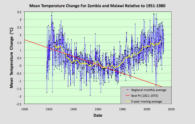
These discrepancies raise question about the reliability of all the trends, particularly the trends before 1940. However, these discrepancies can be almost totally reconciled when compared to the data from Zambia and Malawi. In short, the Zambia and Malawi data largely corroborates the cooling seen before 1980 in both the Madagascar data and the Zimbabwe data. It also suggests that the cooling in the Mozambique data is under-reported. probably due to a lack of data before 1930. The Zambia and Malawi data also suggests that there has been little, or no, net overall warming in the region since 1920, and that the climate has just undergone a natural oscillation in its mean temperature, albeit a rather large one of about 1.5°C.


Fig. 81.1: The (approximate) locations of the weather stations in Zambia and Malawi. Those stations with a high warming trend between 1901 and 2000 are marked in red while those with a cooling or stable trend are marked in blue.


The map in Fig. 81.1 above shows the distribution of weather stations in Zambia and Malawi. Overall there are sixteen stations with over 400 months of data but no long stations with over 1200 months of data. The average data length is 744 months (up to the end of 2013) with all but two of the stations being medium stations with over 480 months of data. Of these sixteen stations, only five are in Malawi (for a list see here) and the other eleven are in Zambia (for a list see here). This lack of station data, particularly for Malawi, was the main reason behind the decision to combine data from the two countries into a single mean temperature trend.

The monthly anomalies for each station were created in the usual manner, as outlined in Post 47. First a suitable thirty year interval was chosen for calculating the monthly reference temperatures (MRTs). In this case the period 1951-1980 was chosen as that corresponded to the interval that overlapped with the maximum number of station records. The twelve MRTs for each station dataset were calculated for each of the twelve months by averaging the monthly temperatures in the reference period for that station. The MRTs were then subtracted from all the data for that station to generate the anomalies. The anomalies from all the stations were then averaged to give the mean temperature anomaly (MTA) for the region in that month. Employing a simple average of the station data rather than using Kriging, homogenization and gridding is sufficiently accurate if the stations are fair evenly distributed, which the map in Fig. 81.1 suggests to be the case. The resulting mean temperature anomaly since 1918 is shown below in Fig. 81.2.


Fig. 81.2: The mean temperature anomaly (MTA) relative to the 1951-1980 monthly averages based on an average of anomalies from stations with over 360 months of data. The best fit is applied to the monthly mean data from 1921 to 1975 and has a negative gradient of -2.72 ± 0.17 °C per century.


What is striking about the change in the MTA shown in Fig. 81.2 is how different it looks to the widely advertised global warning trends, particularly before 1980 (see Fig. 80.1 for an example). It suggests that temperatures in 2010 were barely 0.3°C higher than they were in 1920, and yet in the intervening period the mean temperature varied wildly, dipping by up to 1.5°C before recovering.


Fig. 81.3: The number of station records included each month in the mean temperature anomaly (MTA) trend in Fig. 81.2.


It is also clear from the number of stations included in the MTA each month (see Fig. 81.3 above) that the early 20th century data is just as reliable as the data after 1990. So a lack of station data cannot explain the difference between the trends seen in the raw data as presented in Fig. 81.2 and those claimed by climate scientists.


Fig. 81.4: Temperature trends based on Berkeley Earth adjusted data. The average is for anomalies from all stations with over 360 months of data. The best fit linear trend line (in red) is for the period 1911-2010 and has a gradient of +0.87 ± 0.03°C/century.


Much of this difference is due to adjustments made to the data by climate scientists. Berkeley Earth (BE) include both the raw data and the adjusted anomaly data in their data files, so it is fairly straightforward to compare the two. Averaging the BE adjusted anomalies gives the data curve shown in Fig. 81.4 above. What is striking about this curve is how similar it is to the conventional global warming curve, and conversely how different it is to Fig. 81.2. It is also very similar to the BE published trend for Zambia as shown in Fig. 81.5 below.


Fig. 81.5: The temperature trend for Zambia since 1840 according to Berkeley Earth.


This discrepancy between the raw data and the BE adjusted data is not unique to data from Zambia and Malawi. As I have previously shown in numerous posts on this blog, it occurs in most of the data. Yet we are not allowed to question the statistical validity of these adjustments, despite mounting evidence that they may be flawed. And the magnitude of these adjustments is not insignificant. We can easily determine their magnitude simply by subtracting the MTA based on raw data (Fig. 81.2) from the equivalent due to adjusted data (Fig. 81.4). The result is the blue curve in Fig. 81.6 below. The orange curve is the contribution to the adjustments that comes solely from the breakpoint alignment where each station dataset is chopped into fragments, and those sections of data are then subjected to different biases. In addition there are other corrections to the blue curve that result from the gridding and homogenization processes that are used to generate anomaly datasets for each station, but these are generally less significant as Fig. 81.6 shows. 


Fig. 81.6: The contribution of Berkeley Earth (BE) adjustments to the anomaly data in Fig. 80.4 after smoothing with a 12-month moving average. The blue curve represents the total BE adjustments including those from homogenization. The orange curve shows the contribution just from breakpoint adjustments.


It can be seen from Fig. 81.6 that the net effect of the Berkeley Earth (BE) adjustments is to add between 0.25°C and 0.5°C of warming to the data between 1920 and 2010, while eliminating the parabolic dip in between, and replacing the trend with something that is more linear. This then increases the warming seen in the raw data between 1920 and 2010 from less than 0.3°C in Fig. 81.2 to more than 0.7°C in Fig. 81.4. The result is an adjusted temperature trend (Fig. 81.4) that bears no relation to the original data (Fig. 81.2).


Summary

Temperature changes in Zambia and Malawi over the last 100 years appear to owe more to natural variation than global warming.

The temperature trend is parabolic with an amplitude of about 1.5°C.

The maximum detectable warming since 1920 is 0.3°C. This is much less than the natural variation, and a long way short of the 2°C average claimed by climate scientists for global warming on land.


Acronyms

BE = Berkeley Earth.

MRT = monthly reference temperature (see Post 47).

MTA = mean temperature anomaly.


Tuesday, August 31, 2021

77. Madagascar - temperature trend PARABOLIC

The only weather station in Madagascar with significant temperature data before 1930 is Antananarivo (Berkeley Earth ID: 156627). The temperature anomalies for this station appear to oscillate over time with a warming phase before 1930, followed by a cooling phase until 1980, and then another warming phase (see Fig. 77.1 below). It is tempting to think that this station is just an outlier, but it might actually be representative of Madagascar as a whole.


Fig. 77.1: The temperature trend for Antananarivo relative to the 1971-2000 monthly averages. The best fit is applied to the monthly mean data from 1901 to 2010 and has a negative gradient of -0.82 ± 0.07 °C per century.


Overall there are twenty weather stations in Madagascar with over 300 months of data (for a list see here), but only one of these, Antananarivo, is a long station with over 1200 months of data. Another ten are medium stations with over 480 months of data. These stations are distributed fairly evenly across Madagascar as shown in Fig. 77.2 below.


Fig. 77.2: The (approximate) locations of the weather stations in Madagascar. Those stations with a high warming trend between 1901 and 2000 are marked in red while those with a cooling or stable trend are marked in blue. Those denoted with squares are long or medium stations with over 480 months of data, while diamonds denote stations with over 300 months of data.


When it comes to calculating the temperature trend for Madagascar the biggest problem (other than insufficient data) is in deciding the time interval for calculating the monthly reference temperatures (MRTs). The aim here is to choose an interval that allows the maximum number of stations to be included in the same average of the temperature anomalies. But there is also a balance to be struck in enabling as many months as possible, over as long a time span as possible, to have adequate data in order to generate a reasonably accurate mean trend over the longest possible time frame. You see, in order to detect global warming, because of the inherent variability in the temperature data, you need long time series (usually over 100 years) in order to detect any real trends.


Fig. 77.3: The temperature trend for Madagascar relative to the 1931-1960 monthly averages based on an average of anomalies from stations with over 300 months of data. The best fit is applied to the monthly mean data from 1901 to 2010 and has a negative gradient of -1.24 ± 0.06 °C per century.


The problem with data for Madagascar is that most of the station records have no data before 1951, while most of those that have data before 1951 have none after 1962. In fact of the six records with data before 1951, four have none after, while only two station records with data after 1962 have data before 1950.

The solution to this conundrum is to analyse the data in two parts, with a different MRT interval for each. The first MRT interval chosen was 1931-1960. This yielded the mean temperature anomaly (MTA) trend shown above in Fig. 77.3. The method for calculating the MRT, and then the anomalies for each station dataset has been described previously in Post 47. The second MRT interval chosen was 1971-2000 and the resulting MTA trend is shown below in Fig. 77.4.


Fig. 77.4: The temperature trend for Madagascar relative to the 1971-2000 monthly averages based on an average of anomalies from stations with over 300 months of data. The best fit is applied to the monthly mean data from 1956 to 1985 and has a negative gradient of -0.38 ± 0.25 °C per century.


It can be seen that the trends in Fig. 77.3 and Fig. 77.4 agree reasonably well, but close inspection suggests that the data in Fig. 77.4 is less noisy (look at the data spread) after 1960 than the equivalent data in Fig. 77.3, while the reverse is true for the period 1931-1960. The reason for this can be determined by examining the number of stations in the MTA calculation in each case as the plots in Fig. 77.5 below illustrate.


Fig. 77.5: The number of station records included each month in the mean temperature anomaly (MTA) trend for Madagascar in Fig. 77.3 (blue) and Fig. 77.4 (red).


The MRT problem outlined above can be resolved by combining data from both Fig. 77.3 and Fig. 77.4 into one single MTA trend. Because the two sets of data have different MRT intervals, there will be a vertical offset in their respective MTA values. Comparing anomalies between 1910 and 1930 for both cases indicates that the data in Fig. 77.4 is offset by 0.5083°C compared to the same data in Fig. 77.3. This offset is then subtracted from the MTA data in Fig. 77.4. Then a single MTA is constructed by combing the data in Fig. 77.3 before 1955 with the offset data from Fig. 77.4 from 1955 onwards. The result is the MTA trend shown below in Fig. 77.6 which is remarkably similar to that for Antananarivo shown in Fig. 77.1 at the start of this post.


Fig. 77.6: The temperature trend for Madagascar if data before 1955 from Fig. 77.3 is combined with data after 1st January 1955 from Fig. 77.4. The best fit is applied to the monthly mean data from 1932 to 2011 and has a negative gradient of -0.15 ± 0.07 °C per century.


The MTA trend in Fig. 77.6 above differs markedly from both the official Berkeley Earth version (shown in Fig. 77.8 below) and the MTA trend for the Indian Ocean that was discussed in the previous post. A comparison of the 5-year moving averages for Madagascar and the Indian Ocean shows fairly good agreement from 1975 onwards but little before that (see Fig. 77.7 below). Even so, the level of agreement between the two data sets seen after 1975 is still not comparable to that seen for temperature trends of neighbouring countries in central Europe as demonstrated in Post 57 despite Madagascar being surrounded by most of the islands whose temperature data its data is being compared with.


Fig. 77.7: A comparison of the 5-year moving average MTA trends for Madagascar and the Indian Ocean.


A comparison of the MTA trend in Fig. 77.6 with the official Berkeley Earth (BE) regional trend shows a similar disparity between temperature data before 1975 and the data after (see Fig. 77.8 below). While the behaviour of the two trends is again similar after 1975, before this point they diverge markedly.


Fig. 77.8: The temperature trend for Madagascar since 1750 according to Berkeley Earth.


Just as I have shown in previous posts, it is possible to construct a temperature profile that is very similar to the official BE regional trend in Fig. 77.8 simply by averaging the adjusted anomaly data from each station. This data is easy to find as it is recorded alongside the raw temperature data in each BE station data file on the BE website. If we perform this average for the stations in Madagascar we obtain the temperature trend shown below in Fig. 77.9.

What is noticeable is how well the curves in Fig. 77.9 agree with those in Fig. 77.8. As I have pointed out many times before, Berkeley Earth use gridding and homogenization in their averaging, yet omitting these techniques appears to produce very similar results. The condition for this to happen, is of course the usually one, namely, the weather stations need to be fairly evenly distributed. But as Fig. 77.2 shows, in Madagascar, as in most other places, on a local level they are.


Fig. 77.9: Temperature trends for Madagascar based on Berkeley Earth adjusted data. The average is for anomalies from all stations with over 300 months of data. The best fit linear trend line (in red) is for the period 1911-2010 and has a gradient of +1.07 ± 0.03°C/century.


The difference between the Berkeley Earth (BE) trend in Fig. 77.9 and the MTA trend based on the raw unadjusted data in Fig. 77.6 is shown in Fig. 77.10 below. It shows that the adjustments made by BE to the temperature data reduced the temperature values of all the data from before 1930 by about 0.8°C, but more significantly added 1.48°C per century of warming between about 1930 and 1980, thus completely reversing the direction of the temperature trend in that time interval. The result is that the parabolic trend seen in Fig. 77.6 is turned into the almost linear trend shown in Fig. 77.9. This completely changes the nature of the trend.


Fig. 77.10: The contribution of Berkeley Earth (BE) adjustments to the anomaly data in Fig. 77.9 after smoothing with a 12-month moving average. The blue curve represents the total BE adjustments including those from homogenization. The linear best fit (red line) to these adjustments for the period 1933-1977 has a positive gradient of +1.48 ± 0.03 °C per century. The orange curve shows the contribution just from breakpoint adjustments.


Summary

There is clearly strong warming of almost 1°C in Madagascar after 1980 (see Fig. 77.6 and Fig. 77.4). This conclusion is supported by data from up to fifteen different weather stations (see Fig. 77.5).

Between 1930 and 1980 there appears to be equally strong cooling occurring (see Fig. 77.6 and Fig. 77.3). This trend is seen in all of the seven different weather stations with data in this period (see Fig. 77.5).

The overall land temperature in Madagascar before 1930 is not known with any precision due to the lack of data. Only one station (Antananarivo, Berkeley Earth ID: 156627) has significant data before 1930, but four others have fragments (see Fig. 77.5) that may partially support the trend seen for Antananarivo in Fig. 77.1.

It appears that the warming seen in Madagascar after 1980 is just a part of a natural temperature variability. It cannot be attributed to global warming without more data.


Acronyms

BE = Berkeley Earth.

MRT = monthly reference temperature (see Post 47).

MTA = mean temperature anomaly.


Wednesday, June 30, 2021

70. South-East Asia - overall temperature trend PARABOLIC

In my previous post I calculated the temperature trends for most of the countries in South-East Asia. This region comprises the countries of modern Indochina (Burma, Thailand, Malaysia, Laos, Cambodia and Vietnam) as well as Singapore and the Philippines. Unlike Berkeley Earth, I have not included Indonesia in this regional analysis, primarily because it is located mainly in the Southern Hemisphere. Instead I discussed the temperature trends of Indonesia separately in Post 31. There was no warming there except in the capital, Jakarta.

In Post 69 I showed that there has been almost no warming in Thailand, Malaysia, Vietnam or the Philippines either since 1900, with none is Burma (Myanmar) before 1980 (in fact the climate cooled by about 0.2°C) and perhaps about 1°C of warming since. Both Cambodia and Laos were excluded from the analysis in Post 69 because of their lack of data. In this post I will present calculations for the overall temperature trend of the entire region of South-East Asia. These will involve averaging all the long and medium individual temperature records from the region, but there are many ways to do this. I shall discuss the two most obvious methods.


Fig. 70.1: The (approximate) locations of the long and medium temperature records in South-East Asia. Those stations with a high warming trend are marked in red while those with cooling or stable trends are marked in blue. Those denoted with squares are long stations with over 1200 months of data.


The first method is a simple average of all the individual temperature time series from the various stations across the region. This will give a good approximation to the true regional trend if the stations are evenly distributed and if they have the same reference period for the monthly reference temperatures (MRTs). The map in Fig. 70.1 above suggests that the geographical spread of stations is fairly even, but with significantly fewer stations in Burma and Vietnam than in Malaysia, Thailand and the Philippines. It can also be seen from Fig. 70.1 that most of the stations in Malaysia and Vietnam are near the coast.


Fig. 70.2: The temperature trend for South-East Asia based on an average of anomalies from all long and medium stations. The best fit is applied to the monthly mean data from 1888 to 2007 and has a positive gradient of +0.09 ± 0.03 °C per century. The monthly temperature changes are defined relative to the 1961-1990 monthly averages.


The result of the employing the simple average method is shown in Fig. 70.2 above. The overall trend exhibits a gentle cooling of about 0.3°C for the 100 years before 1980, and a slight warming of 0.4°C since. Overall, the trend appears fairly stable with current temperatures not noticeably higher than in 1900.


Fig. 70.3: The temperature trend for South-East Asia based on an area weighted average of trends from all countries. The best fit is applied to the monthly mean data from 1888 to 2007 and has a positive gradient of +0.17 ± 0.03 °C per century. The monthly temperature changes are defined relative to the 1961-1990 monthly averages.


The second method for combining the data is to average the trends for the different countries, but to also weight each country's contribution in proportion to its area. These individual country trends are shown in the previous post. The advantage of this method is that it corrects for any bias due to differences in station density between countries. The disadvantage is that large countries with low station densities can introduce large errors due to their bigger area and less reliable national trend. 

The result obtained using this method is shown in Fig. 70.3 above. It can be seen that the main difference from Fig. 70.2 occurs after 1980 where the recent warming is larger and close to 0.6°C. This difference is primarily due to the larger contribution from the trend for Burma. The overall trend is, though, still much less than that claimed by mainstream climate science.


Fig. 70.4: Temperature trends for South-East Asia based on an average of Berkeley Earth adjusted data from all long and medium stations. The best fit linear trend line (in red) is for the period 1891-2010 and has a gradient of +0.83 ± 0.02°C/century.


If we compare these results with those derived using Berkeley Earth (BE) adjusted data, the difference is profound. A simple average of BE adjusted data yields the curve in Fig. 70.4 above. It is unrecognizable from the curve in Fig. 70.2, but perhaps not unsurprisingly, follows the official IPCC global trend very closely. The warming is over 1°C, and it is continuous except for a hiatus in the 1940s and 1950s.


Fig. 70.5: Temperature trends for South-East Asia based on an area weighted average of Berkeley Earth adjusted data. The best fit linear trend line (in red) is for the period 1891-2010 and has a gradient of +0.80 ± 0.02°C/century.


Nor does the weighted area average method fare any better for BE adjusted data, as Fig. 70.5 above shows. In fact the curves are almost indistinguishable from their equivalents in Fig. 70.4. This is probably because the station density remains fairly constant across the region as Fig. 70.1 shows. So, irrespective of the method, the BE adjusted data claims a warming of over 1°C for the region, while the raw data in Fig. 70.2 and Fig. 70.3 tells a completely different tale.


Fig. 70.6: The temperature trend for South-East Asia since 1840 according to Berkeley Earth.


Finally, we can compare these results with the trends published by Berkeley Earth. These are shown in Fig. 70.6 above. It is pretty clear that both the 12-month and 10-year moving averages shown in Fig. 70.6 are in close agreement with their counterparts in both Fig. 70.4 and Fig. 70.5. This is despite the Berkeley Earth trends in Fig. 70.6 also incorporating data from Indonesia. Overall, the Fig. 70.6 curves are probably marginally closer to those in Fig. 70.5 than those in Fig. 70.4. This is not surprising as the area weighting method employed for Fig. 70.5 is closer in methodology to the homogenization methods used by Berkeley Earth and other climate groups than is the simple average method.


Conclusions

The regional temperature trends based on the raw data show little or no warming in the region over the last 100 years.

In contrast the adjusted data adds almost 1°C of warming over the last 100 years, primarily due to those adjustments. Without the adjustment there is no significant warming.


Thursday, May 20, 2021

69. South-East Asia - temperature trends STABLE

Over the next few weeks I will examine some of the temperature records from Asia. This post will consider those from South-East Asia, and the countries of Burma (Myanmar), Thailand, Malaysia, The Philippines and Vietnam. Laos and Cambodia have been excluded because they have very little temperature data. Data for Singapore is incorporated into the analysis of data for Malaysia.


Fig. 69.1: The number of station records included each month in the mean temperature trend for five countries in South-East Asia.


In each case the temperature trend for the country was constructed by averaging the temperature anomalies from multiple station time-series. Different time periods were chosen for calculating the monthly reference temperatures (MRTs) for each country due to differences in the distribution of data in each case. These are indicated on the graphs below. For an explanation of how anomalies and MRTs are calculated, see Post 47.

The number of available series for each country are shown in Fig. 69.1 above. In all five cases there is much more data after 1950 and very little before 1900, and Thailand and The Philippines clearly have more data than the other three countries. However, Burma does have three long stations with over 1200 months of data, whereas Thailand only has one. Vietnam and Malaysia also have three long stations, although in the case of Malaysia that includes a station in Singapore, while The Philippines has two long stations. The analysis here used data only from long stations (with over 1200 months of data) and medium stations with over 480 months. In total Burma has 13 medium stations, Thailand has 55, Malaysia has 17, The Philippines has 35, and Vietnam has 10.


Fig. 69.2: The temperature trend for Burma. The best fit is applied to the monthly mean data from 1875 to 1992 and has a negative gradient of -0.13 ± 0.05 °C per century. The monthly temperature changes are defined relative to the 1961-1990 monthly averages.


Fig. 69.3: The temperature trend for Thailand. The best fit is applied to the monthly mean data from 1934 to 2008 and has a positive gradient of +0.14 ± 0.09 °C per century. The monthly temperature changes are defined relative to the 1961-1990 monthly averages.


Fig. 69.4: The temperature trend for Malaysia. The best fit is applied to the monthly mean data from 1881 to 2000 and has a negative gradient of -0.06 ± 0.03 °C per century. The monthly temperature changes are defined relative to the 1951-1980 monthly averages.


Fig. 69.5: The temperature trend for The Philippines. The best fit is applied to the monthly mean data from 1914 to 2007 and has a positive gradient of +0.24 ± 0.04 °C per century. The monthly temperature changes are defined relative to the 1951-1980 monthly averages.


Fig. 69.6: The temperature trend for Vietnam. The best fit is applied to the monthly mean data from 1901 to 2010 and has a positive gradient of +0.09 ± 0.05 °C per century. The monthly temperature changes are defined relative to the 1981-2010 monthly averages.


The graphs above indicate that there has been little, if any, climate change in the region in the last 100 years. The only country to show any significant warming has been The Philippines, and here it is less than 0.25°C. Burma may have seen a temperature rise of almost 1 °C since 1970, but beforehand the climate cooled by about 0.5°C. In all other cases the temperature appears to be stable. This is consistent with my previous analysis of temperature data for Indonesia (see Post 31), but it is not what is claimed by Berkeley Earth, though.


Fig. 69.7: The temperature trend for Thailand since 1800 according to Berkeley Earth.


According to Berkeley Earth there has been over 1.5°C of warming in Thailand since 1840 (see Fig. 69.7 above), with 0.5°C coming before 1900 despite there being no significant increase in carbon dioxide levels before 1900 (they were at 296 ppm compared to 283 ppm in 1800), and despite there being virtually no temperature data (Thailand has only one significant station with data before 1930).

The differences between the trend in Fig. 69.7 and that presented in Fig. 69.3 are due to the adjustments made to the data by Berkeley Earth. Averaging the Berkeley Earth adjusted data for the same stations used to derive the trend in Fig. 69.3 yields the curves in Fig. 69.8 below. These are almost identical to the curves shown in Fig. 69.7, thereby indicating that the adjustments are the source of the difference. This difference due to the Berkeley Earth adjustments amounts to an additional warming of 0.85°C since 1900. Without those adjustments there is virtually no warming.


Fig. 69.8: Temperature trends for Thailand since 1900 based on an average of Berkeley Earth adjusted data. The best fit linear trend line (in red) is for the period 1906-2005 and has a gradient of +0.72 ± 0.03 °C/century.


Another feature of note in the trends shown here are the standard deviations of the data. These are much less than those seen for countries in Europe, or states in the USA. In fact they are typically less than half. This suggests that temperatures near the Equator are much more stable than those nearer the poles. This in turn, suggests that as the local temperature increases, there are stronger negative feedbacks available that help to regulate that temperature. One such feedback is likely to be water vapour and associated cloud coverage. If so, then this would imply that water vapour is not the strong amplifier of climate change as is often suggested by climate scientists, at least not within the Tropics.


Conclusion

There has been no global warming or climate change in South-East Asia over the last 100 years.


Friday, April 30, 2021

64. Southern Hemisphere - temperature trends COOLING to 1970

Over the past year I have analysed most of the temperature data from the Southern Hemisphere as well as some data from Europe and the USA. Few if any of the resulting temperature trends that I have calculated have agreed with the global published trends of the IPCC, Hadley-CRU, NOAA, NASA-GISS, or the regional trends of Berkeley Earth. This may be because they are based on calculations for small regions rather than global averages, although this caveat does not explain the discrepancies seen when compared with the Berkeley Earth data. 

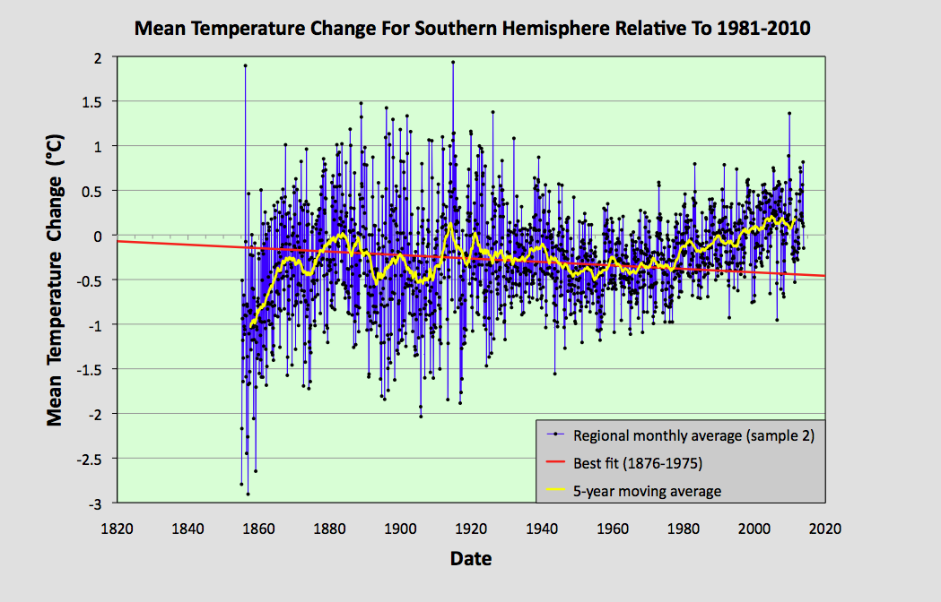
In this post I will make a first attempt at analysing the data for the entire Southern Hemisphere. I will do this by simply averaging the anomalies for the 1079 longest station records in the Southern Hemisphere, but without employing any regional weighting to the data. This will produce a first estimate of the temperature trend. A more accurate analysis will be done in a future post, where trends for the various regions will be combined using area weightings similar to those I used in Post 26 to calculate the overall trend for Australia, based on the trends from its individual states. Such an approach is, however, fraught with difficulty as the area of many regions (such as island archipelagos) are difficult to define exactly.


Fig. 64.1: The temperature trend for the Southern Hemisphere since 1820 derived by averaging the 1079 longest temperature records for the region. The best fit is applied to the monthly mean data between 1876 and 1975 and has a negative gradient of -0.12 ± 0.09 °C per century.


The overall temperature trend for the Southern Hemisphere since 1820 is shown in Fig. 64.1 above. This is the result of averaging over one thousand separate station records as indicated in Fig. 64.2 below. All the stations were either long stations with over 1200 months of data before the end of 2013, or medium stations with over 480 months of data.

The temperature profile from 1970 onwards appears to exhibit a clear upward trend with the mean temperature increasing by about 0.57°C from the 1960s to 2010. This data is also the most reliable as it is the result of averaging over 900 temperature records. 

In contrast, the data before 1970 exhibits a long modest cooling trend of over 0.1°C per century. The reliability of this data is also good, as it is the result of averaging over 100 temperature records from 1900 onwards. Before 1900, however, the data becomes less reliable due to its reliance on smaller numbers of stations that are also further apart and so less well correlated.


Fig. 64.2: The number of station records included each month in the mean temperature trend for the Southern Hemisphere when the MRT interval is 1981-2010.


What the data in Fig. 64.1 appears to indicate is that while there has been a significant warming of the Southern Hemisphere post-1970 of up to 0.57°C, this is partially offset by a noticeable cooling over the previous 100 years or more. So the total warming since pre-industrial times is likely to be less than 0.4°C. This is much less than the commonly quoted value of 1°C, or 1.5°C for the Northern Hemisphere. Yet this is not reflected in the Berkeley Earth adjusted data.


Fig. 64.3: Temperature trend for the Southern Hemisphere since 1840 derived by aggregating and averaging the Berkeley Earth adjusted data for over 1000 of the longest stations in the region. The best fit linear trend line (in red) is for the period 1951-2010 and has a gradient of +1.45 ± 0.10 °C/century.


An average of the Berkeley Earth adjusted time series temperature trends from the 1000 longest sets of station data in the Southern Hemisphere is presented in Fig. 64.3 above. This appears to indicate that the total temperature rise of the Southern Hemisphere since 1950 should be about 0.8°C. This is significantly more (between 0.1°C and 0.3°C depending on the time period you are considering) than is seen from the raw temperature data in Fig. 64.1, but it is in general agreement with the trend published by Berkeley Earth and shown in Fig. 64.4 below. 

However, what is even more prominent is the difference in the temperature trends before 1950. Whereas the raw data in Fig. 64.1 clearly indicates a cooling trend of 0.12°C per century, a simple average of the Berkeley Earth in Fig. 64.3 indicates a modest warming of 0.24°C per century. This, though, is still much less than the official trend shown in Fig. 64.4, which appears to claim an additional 0.5°C of warming has occurred between 1880 and 1950. This is almost the same as the warming since 1950, yet the atmospheric levels of carbon dioxide in 1950 were only 310 ppm, which is only about 30 ppm above pre-industrial levels. This means that the most recent increase in carbon dioxide of 100 ppm since 1950 has produced the same warming as the first 30 ppm did before 1950. If that is true, then it suggests further increases in carbon dioxide concentrations will have ever decreasing impacts on our climate, to the point where they are inconsequential.


Fig. 64.4: The temperature trend for the Southern Hemisphere since 1860 according to Berkeley Earth.


So what are the reasons for the differences in the trends before 1950? 

Well, we know that the differences between the trends in Fig. 64.1 and Fig. 64.3 are probably the result of the adjustments made to the data by Berkeley Earth. The statistical legitimacy of these adjustments I have already disputed in Post 57. This cannot explain the differences between the trends in Fig. 64.3 and Fig. 64.4, though, as these are both derived using the same adjusted data. These differences are likely to be the result of regional or station weightings, which would appear to be more important before 1950 due to the smaller number of stations and their uneven geographical distribution.

One way to examine the impact of these differences is to compare results from different samples of data. In the following five graphs I have split the stations used to construct the average in Fig. 64.1 into five separate random samples and compared their trends before and after 1975. In each case the temperature rise from the 1960s to 2010 is in the range 0.56 ±0.05°C while all but one of the samples has a negative trend before 1975. However, the range of trends for data before 1975 (or 1950) is much larger than the range for data after. This suggests that the data before 1950 is more sensitive to the impact that individual stations or regions may have on the average. The number of stations averaged each month for each sample is indicated in Fig. 64.10. This indicates that before 1940 each sample typically has significantly fewer than 70 stations in the average compared with over 150 after 1960.


Fig. 64.5: The temperature trend for the Southern Hemisphere since 1820 based on the first sample average of 224 of the 1079 longest temperature records for the region. The best fit is applied to the monthly mean data between 1876 and 1975 and has a negative gradient of -0.02 ± 0.10 °C per century.


Fig. 64.6: The temperature trend for the Southern Hemisphere since 1820 based on the second sample average of 223 of the 1079 longest temperature records for the region. The best fit is applied to the monthly mean data between 1876 and 1975 and has a negative gradient of -0.19 ± 0.08 °C per century.


Fig. 64.7: The temperature trend for the Southern Hemisphere since 1820 based on the third sample average of 210 of the 1079 longest temperature records for the region. The best fit is applied to the monthly mean data between 1876 and 1975 and has a negative gradient of -0.37 ± 0.09 °C per century.


Fig. 64.8: The temperature trend for the Southern Hemisphere since 1820 based on the fourth sample average of 211 of the 1079 longest temperature records for the region. The best fit is applied to the monthly mean data between 1876 and 1975 and has a negative gradient of -0.09 ± 0.09 °C per century.


Fig. 64.9: The temperature trend for the Southern Hemisphere since 1820 based on the fifth sample average of 211 of the 1079 longest temperature records for the region. The best fit is applied to the monthly mean data between 1876 and 1975 and has a positive gradient of +0.15 ± 0.11 °C per century.


Fig. 64.10: The number of station records included each month in the mean temperature trend for each of the five samples in Fig. 64.5 - Fig. 64.9.


Summary

The temperature trend for the Southern Hemisphere, based on the raw temperature data, exhibits a warming of about 0.5°C since 1950.

Before 1950 there is strong evidence of a prolonged cooling period of over 100 years in duration that amounted to a cooling of at least 0.12°C in total.

Based on the available temperature data, the total warming seen in the Southern Hemisphere since pre-industrial times is likely to be less than 0.4°C. This is much less than the usually reported value. 


Final Thoughts

The data shown in Fig. 64.1 clearly shows no warming before 1980. However, the data before 1880 is not very reliable. As Fig. 64.2 indicates, the mean anomaly prior to 1880 is based on data from less than 50 temperature records. If these records were all from the same region, then this low amount of data would be less of a problem as the different stations would be strongly correlated. The result would be reliable - but only for that region. 

The data I have analysed so far for this blog suggests that, for a single region with a uniform climate, a good reliable average can be achieved from only about 15-20 sets of data. When dealing with an entire hemisphere, however, we need more data because the climate of South America will clearly be different from that of Australia. This means that the data before 1880 in Fig. 64.1 is likely to be misleading. So can we do better than the trend in Fig. 64.1? Well, yes we can.


Fig. 64.11: The temperature trend for the Southern Hemisphere since 1880 derived by averaging the 1079 longest temperature records for the region. The best fit is applied to the monthly mean data between 1881 and 1980 and has a slight positive gradient of 0.01 ± 0.09 °C per century.


If we re-scale the data in Fig. 64.1 we can create a graph that presents a truer picture of the historic temperature rise by ignoring the unreliable data before 1880. Such a graph is shown above in Fig. 64.11. The other change I have made is to the time interval of the best bit line. This fit now applies from 1881 to 1980 and its gradient is practically zero. The jump in temperature after 1980 still amounts to about 0.57°C, and this is still much less than the 1.5°C that is claimed by climate science for the rise in global land temperatures from 1900 to 2013. But what it also shows is that small changes to how data is analysed and presented can affect the results.