Tuesday, September 29, 2020

37. South Africa - temperature trends STABLE to 1980

Over the next few posts I will look at the temperature data in Africa, starting with South Africa. Of all the countries in Africa south of the equator, South Africa has the most temperature data. However, the extent and quality of that data is still much less than that seen for even most individual states in Australia, let alone the entire country.

In total there are about 48 long and medium temperature records for South Africa with more than 480 months of data. Of these only five are long station records with more than 1200 months of data. The locations of these stations are shown below in Fig. 37.1 as well as the locations of similar stations in Namibia and Botswana. In South Africa the spread of the stations is fairly uniform. Sadly this is not true of Namibia and Botswana where the station densities are also much lower.


Fig. 37.1: The locations of long stations (large squares) and medium stations (small diamonds) in South Africa. Those stations with a high warming trend are marked in red.


If we average the anomaly data from the long and medium station records for South Africa we get the temperature trend shown below in Fig. 37.2. This has two main features. Before 1980 (when climate scientists first started claiming that global warming was happening) there is no warming at all. After 1980 there is a sharp rise of more than 0.7 °C. Details regarding how the anomalies in Fig. 37.2 were calculated have been outlined on previous blog posts, particularly Post 35 where the temperature trend for South America was calculated. This process involves calculating the mean reference temperatures (MRTs) for each of the twelve months of the year over a specific time interval (in this case 1961-1990) and subtracting them from the raw mean monthly temperatures to yield the anomalies.


Fig. 37.2: The temperature trend for South Africa since 1840. The best fit is applied to the interval 1857-1976 and has a gradient of +0.017 ± 0.056 °C per century. The monthly temperature changes are defined relative to the 1961-1990 monthly averages.


The number of stations in the average for each month in the temperature trend in Fig. 37.2 above is indicated in Fig. 37.3 below. As is clear from the graph, most of the station data was recorded between 1960 and 2000 with only one set of data continuing prior to 1880. Despite this, there is no evidence that the change in the number of stations over time has impacted the average temperature trend in Fig. 37.2 above in a manner that was seen for Indonesia (see Post 31). 


Fig. 37.3: The number of sets of station data included each month in the temperature trend for South Africa.


If we now compare these results with those published by Berkeley Earth we find similar patterns to those seen for data from other countries. Firstly, the average of the adjusted anomalies results in a temperature trend that is steadily increasing over time, not just after 1980, but also before (see Fig. 37.4 below).


Fig. 37.4: Temperature trends for all long and medium stations in South Africa since 1840 derived by aggregating and averaging the Berkeley Earth adjusted data. The best fit linear trend line (in red) is for the period 1884-2003 and has a gradient of +0.87 ± 0.02 °C/century.


The data in Fig. 37.4 agrees remarkably well with that published by Berkeley Earth and shown below in Fig. 37.5, even though I have only used stations with more than 480 months of data, and have not weighted any of the those stations differently when computing the average. This demonstrates that the fairly even geographical spread of the stations across South Africa eliminates the need to apply different weightings to each dataset. It therefore also justifies the use of the same simple averaging process for calculating the temperature trend in Fig. 37.2.


Fig. 37.5: The temperature trend for South Africa since 1850 according to Berkeley Earth.


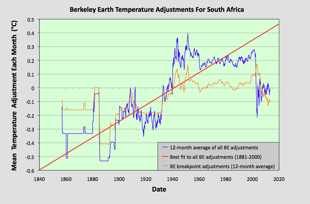
The outstanding question is why does the data published by Berkeley Earth in Fig. 37.5 differ so markedly from that for the real anomaly data in Fig. 37.2. The answer is of course once again down to the use of breakpoint adjustments and homogenization by Berkeley Earth. The sum total of these contributions have been calculated and are shown in Fig. 37.6 below. They clearly show that large upward adjustments were made to most of the temperature data around 1890-1900 and 1930-1940.


Fig. 37.6: The contribution of Berkeley Earth (BE) adjustments to the anomaly data after smoothing with a 12-month moving average. The linear best fit to the data is for the period 1881-2000 (red line) and the gradient is +0.59 ± 0.03 °C per century. The orange curve represents the contribution made to the BE adjustment curve by breakpoint adjustments only.


Conclusions

1) There is no evidence of any warming of the climate in South Africa before 1980 according to the raw temperature data.

2) There appears to be a sudden sharp rise in temperature after 1980 that is not consistent with the gradual increase in CO2 levels seen since 1850. 

3) Once again the temperature trend constructed by Berkeley Earth appears to be strongly affected by their own data adjustments via breakpoints and homogenization.


Friday, September 11, 2020

36. Lateral thought #2 - does human respiration cause carbon dioxide levels in the atmosphere to increase?

Does breathing contribute to a build-up of carbon dioxide in the atmosphere? This was the subject of an article on the Skeptical Science website that I came across recently that claimed to be debunking a climate myth. That supposed myth was that breathing contributes to a build-up of CO2 in the atmosphere.

The article is not new: it was first published ten years ago. The central point of the article was to refute claims supposedly made by climate sceptics that breathing by humans adds carbon dioxide to the atmosphere, and so contributes to global warming. But after reading the article and many of the comments I realized that not only was the entire article wrong, so too were most of the comments. 

The motivation for the article appears to be a throw-away comment by Australian academic Professor Ian Plimer, Professor of Mining Geology (University of Adelaide) and Emeritus Professor of Earth Sciences (University of Melbourne), in an ABC radio interview regarding his latest book. The comment was a response to claims made in a green paper by Australian Climate Minister and Senator Penny Wong regarding the threat of climate change where she claimed carbon was a pollutant. In reply Professor Plimer said:

"If Senator Wong was really serious about her science she would stop breathing because you inhale air that's got 385 parts per million carbon dioxide in it and you exhale air with about ten times as much, and that extra carbon comes from what you eat."

I'm still not sure why that statement riled the people at Skeptical Science so much, other than it came from a climate sceptic attacking a supporter of global warming. To me it just seems like a statement of fact and a reference to the carbon cycle. It is therefore doubly puzzling that those same people at Skeptical Science then chose to use the carbon cycle to refute a claim that was not explicitly made, namely that breathing contributes to a build-up of CO2 in the atmosphere. The argument outlined in the rebuttal by Skeptical Science basically came down to saying:

"Therefore, when we breathe out, all the carbon dioxide we exhale has already been accounted for. We are simply returning to the air the same carbon that was there to begin with."

The problem is this is not quite true. Actually, it is not true at all. In fact I will now explain why breathing by humans may have actually contributed to a build-up of CO2 in the atmosphere over the last 100 years.


 Fig. 36.1 The carbon cycle.


The first problem with invoking the carbon cycle is that there is no such thing. There is no single carbon cycle. Instead there are multiple interlocking cycles as illustrated in Fig. 36.1 above. I've listed three possibilities below.

Atmosphere  ==>  plants  ==>  soil (bacteria)  ==>  atmosphere.

Atmosphere  ==>  plants  ==>  animals  ==>  atmosphere.

Atmosphere  ==>  ocean plants (algae)  ==>  oceans (bacteria)  ==>  atmosphere.

So the CO2 doesn't just go round in a circle, as is claimed: it goes around multiple circles. 

The second problem is that the carbon cycle only describes the steady state. So you can’t use it to prove that human respiration isn’t increasing CO2 levels in the atmosphere because the human population has grown exponentially over the last 100 years. It has almost quadrupled since 1920. That is not a system operating in the steady state or at long-term equilibrium.

In essence, the carbon cycle describes five competing carbon reservoirs or sinks (vegetation, animals, soil, the ocean and the atmosphere) all of which also act as carbon pumps. Moreover, these five reservoirs are all interconnected, and the pumping capacity of each depends on their size. Generally, the bigger they are, the more carbon they will pump. That interconnection means that changing the size of one will change the size of all the others in order to a) balance the pumping rates, and b) to ensure that the law of conservation of mass, as applied to the amount of carbon in the system, is never violated. These changes will happen as the system seeks to find a new equilibrium position or steady state. 

So in principle, any change to either the pumping rate or the size of a reservoir will have knock-on effects throughout the rest of the carbon cycle. That means that any increase in the human population will affect everything else. We can, however, estimate what some of these changes might be based on what we know about the change in human population over the last 100 years.

As the average 70 kg person generates about 1 kg of CO2 per day, that means they transfer 100 kg of carbon to the atmosphere every year. This carbon comes from the food they eat. With nearly 8 billion people on the planet that equates to about 0.8 GtC per annum (GtC = gigatonne of carbon) being transferred into the atmosphere.

But that is not all. The average person probably eats their own bodyweight in meat every year. So the growth in the human population since 1920 must be reflected in a similar percentage growth in the number of farm livestock. If we assume there is about 2 kg of livestock per 1 kg of human (i.e. a 2 year supply of meat in production), then the overall CO2 production from both will be about 2.4 GtC per annum. This is about a quarter of our fossil fuel CO2 output so it is not insignificant. But is this directly increasing atmospheric CO2 levels as some climate change deniers might claim (although I'm not entirely sure which)?

Some people have suggested that the increases in human and livestock CO2 emissions are offset by increased crop production. Their argument is that, as all the carbon we breathe out comes from crops, any increase in the CO2 produced by the human population will be offset by a commensurate increase in crop production required to feed the extra humans and their livestock. That in essence is the core of the original rebuttal from Skeptical Science outlined above. The problem is that this is not true either.

Increased crop production comes at the expense of other types of vegetation (e.g. forests). The total area under human cultivation may increase, but the total amount of land and vegetation won’t. All available fertile land is already fully occupied with vegetation, so any increase in farmland will be at the expense of wild countryside. Changing usage from one to the other does not increase CO2 uptake because both types of land are already doing this. For example, deforestation in the Amazon region driven by the desire to grow crops and farm cattle does not increase the rate of CO2 capture in the region. If anything, it decreases it. Forests, so we are told, are the best carbon dioxide scrubbers.

Also, increasing the number of animals does not increase the amount of vegetation or its growth rate. Instead it decreases the amount of carbon going into the soil. Animals eat plants before those plant can die and before they can decay in the soil. This means that animals replace the CO2 producing capacity of the soil. That is where the substitution occurs. And if the pumping efficiencies of both animals and the soil were the same then nothing much would change as the animal population increases. But they aren’t the same. 

The carbon pumping efficiency of the soil is only 4%. As Fig. 36.1 indicates, the soil contains 1580 GtC globally but emits 60 GtC per annum. Humans store only 0.1 GtC but emit 0.8 GtC per annum. That is an efficiency of 800%. If we include livestock, the efficiency will be broadly the same (800%) but the size of the carbon reservoir and CO2 emissions will both be about three times greater, for the reasons outlined above. This also means that the increase in CO2 production from humans and livestock is the same as that produced by about 4% of the Earth’s soil. The consequence of this is that the volume of the soil must reduce by 4% over time as its pumping capacity is replaced by human and their animals, and the amount of carbon entering it from dead plants declines. 

So 63.2 GtC will be lost from the soil while only 0.3 GtC will be transferred to storage in humans and animals, and none to plants. There is only one other place that most of the 62.9 GtC can go: the atmosphere. This 62.9 GtC will increase the atmospheric CO2 concentration by about 25-30 ppm. So the human population increase could have increased atmospheric CO2 levels by up to 30 ppm over time, and about 20 ppm since 1920.

Fig. 36.2: A schematic illustration of the carbon cycle on land.


To understand this more fully consider the schematic diagram in Fig. 36.2 above. This represents the part of the carbon cycle involving exchange of carbon between the air and land in the case where initially there are no animals in existence. The terms T1-T4 are the flow rates of carbon between the three reservoirs, with the size of each reservoir indicated in parentheses. The four flow rates represent carbon capture in plants by photosynthesis (T1), respiration from plants and animals (T2), the transfer of dead plant and animal matter to the soil (T3), and the decay of organic matter in the soil to release CO2 back into the atmosphere (T4).

In equilibrium the flow rates into and out of each reservoir must balance. So 

T1 = T2 + T4
(36.1)


T1 = T2 + T3
(36.2)

and

T3 = T4
(36.3)

Only two of these equations are independent. In addition, the total amount of carbon in the system must remain constant at 2940 GtC (=1580+610+750).

Now suppose the ecosystem outlined in Fig. 36.2 initially contains only plants and bacteria in the soil. Then we introduce some animals. The effect of animals is to eat some of the plants and emit CO2. This means respiration (T2) must increase by an amount x and the amount of plant matter entering the soil (T3) must decrease by the same amount in order for Eq. 36.2 to balance. For the case of the addition of humans and livestock we have already estimated that x = 2.4 GtC per annum. 

The problem is that both Eq. 36.1 and Eq. 36.3 now no longer balance. Only Eq. 36.2 remains balanced. So the soil will lose 2.4 GtC per annum and the atmosphere will gain 2.4 GtC per annum. There is a mass transfer of carbon from the soil to the atmosphere. This will only stop when the emission of CO2 from the soil (T4) decreases, as it will do gradually due to the slow and gradual reduction in its volume. When that happens both Eq. 36.1 and Eq. 36.3 will once more balance and the mass transfer will stop. That will happen when T4 has also decreased by x. As T4 was initially about 60 GtC per annum, this requires a 4% reduction in T4, and therefore a 4% reduction in the volume of the soil, i.e. 63 GtC (the rate of decay of the soil and its rate of emission of CO2 must be proportional to the soil volume). That amounts to a total mass transfer of approximately 63 GtC to the atmosphere, the same as in our preliminary calculation above.

Is this an upper estimate? Yes, probably. It assumes that the growth in the human population and farming livestock is a net gain in terms of animal numbers and that they do not merely substitute for the loss of other species. But we know this is not true. Humans and their livestock do displace other creatures to some extent. This analysis also omits any additional loss of CO2 to the oceans and changes to vegetation volumes through loss of soil (down 4%) and increasing growth rates due to increased CO2 levels in the atmosphere (up by 8%). But what it does demonstrate is that when the human population changes, everything else changes. 


Conclusion

What we have shown here is that changes to the ecological balance between plants and animals changes the concentration of CO2 in the atmosphere. So respiration by humans and other animals can contribute to a build-up of carbon dioxide in the atmosphere.


Saturday, September 5, 2020

35. South America - temperature trends 0.5°C WARMING

The land area of South America is more than twice that of Australia while its population is more than sixteen times greater. Yet it has fewer high quality temperature records than New South Wales.

Overall South America has about 1000 temperature records, but only 21 have more than 100 years, or 1200 months, of data. Of these long station records, the longest is that of Rio de Janeiro (Berkeley Earth ID: 152852). Its earliest temperature data dates from 1832 and clearly shows that temperatures in the city at that time were higher than today (see Fig. 35.1 below). The average temperature then declined throughout the 19th century before recovering over the last 100 years. This behaviour is not unique to South America. We have seen it in both Australia and New Zealand previously, and if other countries in the Southern Hemisphere had longer records, we might have seen it in many other places as well. 


Fig. 35.1: The temperature trend for Rio de Janeiro since 1832. The best fit is applied to the interval 1921-1990 and has a gradient of +2.06 ± 0.15 °C per century. The monthly temperature changes are defined relative to the 1951-2000 monthly averages.


However, the extent to which the Rio data reflects the overall temperature trend in South America is harder to determine. Of the 1000 or so sets of station data from South America, only about 318 have more than 40 years, or 480 months, of data, and as I have shown in previous posts, even this length of data is insufficient to ascertain the recent overall temperature trend, let alone its longer term context. 

The approximate locations of the long and medium stations in South America are shown on the map below. It can be seen that they are fairly evenly spread throughout the continent, but with the Amazon region, not surprisingly, being less well represented. 


Fig. 35.2: The locations of long stations (large squares) and medium stations (small diamonds) in South America. Those stations with a high warming trend are marked in red.


In order to determine the overall temperature trend for South America we need to average the temperature anomalies from all the different stations in the region, as I explained in Post 5. These temperature anomalies are not the actual average monthly temperatures for each location, but the amount by which those average monthly temperatures change relative to a defined reference value for that month. That monthly reference temperature (or MRT), is usually an average of the values for that month over a given period, say 1961-1990. However, as I have pointed out in many previous posts, the way anomaly data used by climate groups like Berkeley Earth is calculated is not quite that straightforward. 

The anomaly data used by climate groups is also subject to adjustments via processes such as homogenization and breakpoint alignment. In homogenization, neighbouring sets of station data are compared and averaged to determine the monthly reference temperature values (MRT) for the target station. Once this homogenized MRT is subtracted from the monthly temperature to yield the anomaly for that month, a number of breakpoint adjustments are then made to different segments of the anomaly data in that dataset, supposedly to correct for bad data and other behaviours seen in the data that appear to be incongruous. The problem with both these interventions is that they are not neutral. Analysis from almost all the previous data I have examined so far in this blog has shown that both these interventions tend to add significant warming to the temperature trends after 1900. The data presented here for South America is no exception.

It is relatively easy to calculate the magnitude of the adjustments made by Berkeley Earth, because conveniently Berkeley Earth list both the adjusted and unadjusted anomaly data in each data file, together with the original raw temperature data. If we average the Berkeley Earth adjusted anomaly data from all the long and medium stations identified in Fig. 35.2 above, the result is the curves shown below in Fig. 35.3.


Fig. 35.3: Temperature trends for all long and medium stations in South America since 1832 derived by aggregating and averaging the Berkeley Earth adjusted data. The best fit linear trend line (in red) is for the period 1900-1999 and has a gradient of +0.85 ± 0.02 °C/century.


The temperature trends shown in Fig. 35.3 above clearly exhibit a strong warming of more than 1.0 °C after 1890. The other notable point is how well the data in Fig. 35.3 agrees with the official Berkeley Earth version shown in Fig. 35.4 below. This can be verified by comparing the pattern of peaks in the 12-month moving average in each case. This shows that using different weightings for each set of station data when calculating the average is not needed.


Fig. 35.4: The temperature trend for South America since 1850 according to Berkeley Earth.


So, what happens if we perform the same averaging of station data, but use the raw temperature data without homogenization and breakpoint adjustments? This means first constructing the anomaly data by calculating the MRT using only the actual station data. 

Ideally when calculating the MRT values it is best to choose as long a time interval as possible for the reference average so that those values have less uncertainty associated with them. This means that ideally you want to include as many years of data as possible in the calculation of each of the twelve MRT values. But this poses a number of problems.

(i) Different station records generally have different amounts of data.

(ii) Different station records often encompass different epochs.

(iii) Most station records have periods of missing data or gaps in their record. These may be a single month of data, or they could be several years in length, and there are often multiple gaps.

(iv) Different sets of station data have different temperature trends. Moreover, the longer the temperature records, the more the trend can vary over time within that station record, or the greater the difference in the mean temperatures will be at either end of the record.

The result is that you need to compromise by choosing a time interval for the MRT average that maximizes the total number of stations that can be included in the average, reduces the uncertainty in that average, but also addresses the four issues listed above. The solutions to those four problems are as follows:

(i) Use the same length of time interval for the MRT average for all stations. This is normally 20 or 30 years.

(ii) Choose the MRT time interval so that it overlaps with the epochs of as many station records as possible. In the case of South America this was achieved by using the time interval 1971-2000.

(iii) Set a minimum threshold for the number of years of data required for the MRT for that month to be of sufficient quality. For the data analysed here that was set at 40% (i.e. 12 out of a possible 30 years).

(iv) Set the length of time interval for the MRT average to be shorter than the timescale over which most significant temperature trends are seen. This is normally 20 or 30 years.


Fig. 35.5: The temperature trend for South America since 1832. The best fit is applied to the interval 1900-1999 and has a gradient of +0.54 ± 0.05 °C per century. The monthly temperature changes are defined relative to the 1971-2000 monthly averages.


After the MRT has been calculated for each of the twelve months in each station record, these MRT values are then subtracted from the raw temperature data for that station to yield the monthly anomalies. The anomalies from all the stations are then averaged to provide the regional temperature trend. This trend for South America is shown in Fig. 35.5 above.

The data in Fig. 35.5 clearly shows an upward temperature trend since 1920 of about 0.5 °C. This is similar to trends we have seen in other regions such as Australia and New Zealand, but it is much less than the 1.0 °C or so that is expected based on the HadCRUT4 data. However the picture before 1900 is less clear. There is some evidence of higher temperatures in the late 19th century, but the data is not extensive enough to provide definite proof. There are only about a dozen stations in the whole continent with data that dates from before 1880. Nevertheless, there are definite similarities between the data shown here for South America and other Southern Hemisphere data from Australia and New Zealand. The fact that all three regions exhibit similar trends before 1900 and also after 1900 suggests that the higher temperatures seen in Fig. 35.5 before 1900 are probably real.

What is evident, though, is that the temperature rise in the trend based on the raw data shown in Fig. 35.5 is not as severe as that published by Hadley-CRU, or that published by Berkeley Earth and shown in Fig. 35.4 above. The differences between the two sets of data (from Fig. 35.5 and Fig. 35.3) are highlighted in Fig. 35.6 below.


Fig. 35.6: The contribution of Berkeley Earth (BE) adjustments to the anomaly data after smoothing with a 12-month moving average. The linear best fit to the data is for the period 1901-2010 (red line) and the gradient is +0.33 ± 0.02 °C per century. The orange curve represents the contribution made to the BE adjustment curve by breakpoint adjustments only.


What Fig. 35.6 demonstrates is that the adjustments made to the data by Berkeley Earth are (again) not neutral. In this case they add at least 0.4 °C to the warming since about 1900. But, this is not new. Similar impacts have been seen previously on the temperature trends from many other regions in the Southern Hemisphere (see my other country-based and regional blog posts 8, 18-26, 30-34).


Conclusions

1) There has been about 0.5 °C of warming in South America since 1920. This is much less than is claimed by climate groups and the IPCC.

2) There is some evidence of higher temperatures before 1900, similar to those seen in Australia and New Zealand, but it is heavily dependent on only one or two temperature records, principally Rio de Janeiro as shown in Fig. 35.1.

3) Adjustments made to the data by Berkeley Earth have added significant warming to the temperature trend since 1900.


Addendum

The temperature trend shown in Fig. 35.5 above is the result of averaging almost 300 temperature records. While all these records have over 480 months of data, very few extend back beyond 1900. In fact between 1860 and 1900 the number of temperature records involved in the average for the trend varies from 4 up to 18. This implies an uncertainty in the trend in Fig. 35.5 of between 0.25 °C and 0.5 °C, whereas after 1960 this falls to about 0.05 °C. Thus the uncertainty in the trend in 1860 is about ten times greater than in 1980. This is probably reflected in the differing amounts of natural variation in the 5-year moving average temperature trend for those different epochs. 

It should also be noted that the temperature data shown in Fig. 35.5 before 1860 is dominated by the temperature data from Rio de Janeiro shown in Fig. 35.1. Its reliability is therefore questionable.


Fig. 35.7: The number of sets of station data included each month in the temperature trend for South America shown in Fig. 35.5.


Friday, August 28, 2020

34. South Pacific - temperature trends part 2 (east) COOLING

In my previous post I used the temperature data from all the significant temperature records in the region to show that there is no evidence of anthropogenic global warming (AGW) in the western region of the South Pacific. Now I will demonstrate the same for the eastern region.

The eastern region I have defined to be the part of the southern Pacific Ocean between the Pitcairn Islands at a longitude of about 130.1°W and the Pacific coast of South America. This region of the ocean contains far fewer islands than the western portion, and therefore far fewer temperature records. In fact there are only seven station temperature records with more than 480 months of data, of which two are long station records with more than 1200 months. Those latter two are both located on the Chilean islands of Isla Juan Fernandez (Berkeley Earth ID: 11338 and 153937) along with one of the medium records with over 480 months of data (Berkeley Earth ID: 11341). Of the other four medium records, one is from the Pitcairn Islands (Berkeley Earth ID: 155860), one is from San Cristobal in the Galapagos Islands (Berkeley Earth ID: 154642), and two are from the Chilean island of Isla de Pascua, otherwise known as Easter Island (Berkeley Earth ID: 11362 and 153945).


Fig. 34.1: The temperature trend for the eastern South Pacific since 1900. The best fit is applied to the interval 1913-2012 and has a negative gradient of -0.10 ± 0.06 °C per century. The monthly temperature changes are defined relative to the 1951-1970 monthly averages.


The anomalies for each of the seven temperature records used were calculated by subtracting a monthly reference temperature (MRT) from each monthly reading, as described previously. These reference temperatures were calculated by averaging that month's data for the interval 1951-1970. The mean of the seven sets of anomalies is shown above in Fig. 34.1. It can clearly be seen to exhibit a negative temperature trend. In other words, there is no evidence of global warming.


Fig. 34.2: Temperature trends for all long and medium stations in the eastern South Pacific since 1900 derived by aggregating and averaging the Berkeley Earth adjusted data. The best fit linear trend line (in red) is for the period 1913-2012 and has a gradient of +0.71 ± 0.03 °C/century.


Yet the same calculation using Berkeley Earth adjusted data yields a completely different result. The warming since 1900 is now more than 0.8 °C. This is not a consequence of the data, but of the adjustments made to that data. The sum of those adjustments is illustrated below in Fig. 34.3, and indicates that they amount to a correction to the raw data of at least 0.8 °C since 1900, and possibly even more. The data in Fig. 34.3 also indicates that the vast majority of these adjustments are due to the breakpoint adjustment process rather than homogenization.


Fig. 34.3: The contribution of Berkeley Earth (BE) adjustments to the anomaly data after smoothing with a 12-month moving average. The linear best fit to the data is for the period 1913-2012 (red line) and the gradient is +0.81 ± 0.04 °C per century. The orange curve represents the contribution made to the BE adjustment curve by breakpoint adjustments only.


Conclusions

1) The overall temperature trend in the eastern region of the South Pacific over the last 100 years has been negative (see Fig. 34.1). There is no evidence in the raw temperature records of anthropogenic global warming (AGW) in this region.

2) In contrast, the adjusted temperature data constructed by Berkeley Earth exhibits a strong warming trend in its aggregated data of over 0.7 °C per century since 1900 (see Fig. 34.2).

3) The adjustments made to the raw temperature data by Berkeley Earth equate to a change in the overall temperature trend of more than 0.8 °C per century. Almost all of this is the result of adjustments made using the breakpoint adjustment process (see Fig 34.3).


Addendum

The data in Fig. 34.1 above was calculated by averaging the records of the seven stations listed. However, as three of those stations are in close proximity to each other on Isla Juan Fernandez, and another two are likewise in close proximity on Isla de Pascua, it could be argued that relative weightings of 1/3 and 1/2 respectively should be applied to these stations. It so, then the overall temperature trend will change to that shown below in Fig. 34.4. The principal result here is that the new temperature trend with the station weightings is now even more negative: -0.18 ± 0.07 °C per century.


Fig. 34.4: The temperature trend for the eastern South Pacific since 1900. The best fit is applied to the interval 1913-2012 and has a negative gradient of -0.18 ± 0.07 °C per century. The monthly temperature changes are defined relative to the 1951-1970 monthly averages and local weightings are applied to the different temperature anomalies.


Thursday, August 27, 2020

33. South Pacific - temperature trends part 1 (west) STABLE

The South Pacific is too large to consider in one discussion, and its weather stations are not evenly distributed. The map below indicates the location of all the long stations (≥ 1200 months of data) and medium stations (480 - 1199 months). It can be seen that the majority of stations are in the western half of the ocean, to the west of the Pitcairn Islands (see the central cross to the right of French Polynesia in Fig. 33.1 below).


Fig. 33.1: The locations of all the long and medium stations in the South Pacific by country.


Overall there are only six long stations, four to the west of Pitcairn Island and two on Isla Juan Fernandez off the coast of Chile. In addition, there are 60 medium stations, of which only five are either on, or to the east of, the Pitcairn Islands (longitude 130.1°W). Of these 66 stations, 41 can be classified as having warming trends where the temperature trend is positive and exceeds twice the uncertainty in the trend (see Fig. 33.2 below).


Fig. 33.2: The locations of long stations (large squares) and medium stations (small diamonds) in the South Pacific. Those stations with a high warming trend are marked in red.


In this post I will look at the temperature records in the western half of the South Pacific (west of longitude 132°W). This will also include a couple of stations in Kiribati that are just north of the equator, but will exclude the Pitcairn Islands and the islands off the coast of South America. 

The total number of station temperature records in this region is more than 100, but only 59 have more than 480 months of data, and only four of those are long stations. Averaging the anomalies from these 59 records results in the temperature trend shown below in Fig. 33.3.


Fig. 33.3: The temperature trend for the western South Pacific since 1860. The best fit is applied to the interval 1912-1999 and has a gradient of 0.18 ± 0.04 °C per century. The temperature changes are relative to the 1961-1990 average.


The anomaly data in Fig. 33.3 was calculated by finding the monthly reference temperature (MRT) for the period 1961-1990 for each record, and subtracting it from the raw data to determine the temperature anomaly (see Post 4 for details). The anomalies for each month were then averaged.

Only records that had a minimum of 40% of data within this time-frame for any of the twelve months of the year January-December were included in the average for that month. Of the 59 records, one had no qualifying months and two had only nine months out of the possible twelve that satisfied this criterion. Thus one was excluded completely and two were only included for the nine months that their MRTs were valid. The resulting mean temperature trend is illustrated above.

Although the temperature data in Fig. 33.3 has an upward or warming trend from about 1900 onwards, it is very modest (0.18 °C per century for 1912-1999), and it is much less than the fluctuations in the 5-year moving average. The warming is therefore not statistically significant, particularly when compared to the variations in temperature seen before 1895. It should be noted, though, that the data before 1895 is based on only one or two records at most for that time period.


Fig. 33.4: Temperature trends for all long and medium stations in the western South Pacific since 1860 derived by aggregating and averaging the Berkeley Earth adjusted data. The best fit linear trend line (in red) is for the period 1912-1999 and has a gradient of +0.83 ± 0.02 °C/century.


The data in Fig. 33.3 is interesting, but it is meaningless unless we can test it against known control. That control is the equivalent data based on Berkeley Earth adjusted anomalies. This is shown in Fig. 33.4 above. Once again this data exhibits the standard rise in temperature since 1900 of about 1 °C that the IPCC and the climate science community insist we should see. The problem is, that once again, the majority of this warming comes not from the real data, but from the adjustments made to it (see Fig. 33.5 below). As I have noted before, these adjustments are derived from two separate sources: (i) homogenization of the data when constructing the MRTs; (ii) breakpoint adjustments made to different parts of each data set in order to improve the data fitting.


Fig. 33.5: The contribution of Berkeley Earth (BE) adjustments to the anomaly data after smoothing with a 12-month moving average. The linear best fit to the data is for the period 1912-1999 (red line) and the gradient is +0.65 ± 0.03 °C per century. The orange curve represents the contribution made to the BE adjustment curve by breakpoint adjustments only.


Conclusions

1) There is no evidence of a strong warming trend in the aggregated western South Pacific raw temperature anomaly data (see Fig. 33.3).

2) Over 78% of the warming seen in the aggregated Berkeley Earth adjusted data (see Fig. 33.4) is due to adjustments made to the data (see Fig. 33.5), and most of this comes from breakpoint adjustments.


Addendum

The maximum number of temperature records included in the trend in Fig. 33.3 is 57. Between 1900 and 1950 this increases from only 4 to about 24 (see Fig. 33.6 below). The other point to note is that the standard deviation of the temperature fluctuations for most stations in the region is only about 0.5 °C (compared to over 1 °C for most of Australia and New Zealand, for example). This means that the error in the mean temperature trend in Fig. 33.3 is less than 0.08 °C after 1950, but for the period 1900-1950 it varies from approximately 0.25 °C to 0.10 °C. All these uncertainties are, however, much less than the apparent random variations seen in the 5-year moving average for the mean temperature trend. This suggests that the fluctuations seen in the mean temperature trend from 1900-2013 are not the result of a lack of data in the first half of the 20th century or bad data. They are real and indicate the natural behaviour of the temperature record over timescales exceeding 100 years.


Fig. 33.6: The number of sets of station data included each month in the temperature trend for South Pacific (West) shown in Fig. 33.3.


Saturday, August 22, 2020

32. Papua New Guinea - temperature trends 0.4°C WARMING (moderate)

I had thought about combining the temperature data for Papua New Guinea (PNG) with that of Indonesia, just as I did with East Timor (Timor Leste) in the previous post. Like East Timor, PNG shares an island (in this case Papua) with Indonesia, so from that point of view it would be logical. However, in the end I decided there was enough data in Indonesia, and extending the analysis to PNG would not only increase the data analysis complexity, but also the geographical area of coverage, and that would be too much. 

Like Indonesia, PNG has only one long station with a temperature record longer than 1200 month (Port Moresby AP - Berkeley Earth ID: 157418). It also has seven medium stations with records of more than 480 months of temperature data, and there are approximately 30 other shorter records that are too small to be useful. One of the medium stations (Port Moresby - Berkeley Earth ID: 19383) is excluded from the following analysis even though it contains data that suggests temperatures in the late 1800s were up to 1.0 °C higher than in the early 20th century. This is because: a) it is close to another long station (Port Moresby AP - Berkeley Earth ID: 157418) which has longer and more complete data in the 20th century; and b) because it has no data after 1941, and so its monthly reference temperatures (MRTs) cannot be calculated for the same time period (1961-1990) as the other stations. For an explanation of MRTs, and how they are used to calculate the monthly temperature anomaly, see Post 4.


Fig. 32.1: Temperature trend for all long and medium stations in Papua New Guineasince 1900 derived using the Berkeley Earth adjusted data. The best fit linear trend line (in red) is for the period 1912-1999 and has a gradient of +0.83 ± 0.03 °C/century.


Averaging the Berkeley Earth adjusted anomaly data from the eight long and medium stations yields the temperature trends shown in Fig. 32.1 above. These are very similar to the versions published by Berkeley Earth and shown below in Fig. 32.2, which suggests that the weightings for each station used by Berkeley Earth in their averaging process were fairly equal.


 Fig. 32.2: Temperature trend for Papua New Guinea since 1880 according to Berkeley Earth.


The high level of agreement between the data in Fig. 32.1 and Fig. 32.2 allows us to repeat the process for the raw anomaly data without the need for different station weighting coefficients. The result is shown below in Fig. 32.3. 


Fig. 32.3: The temperature trend for Papua New Guinea since 1900. The best fit is applied to the interval 1912-1999 and has a gradient of 0.44 ± 0.07 °C per century. The temperature changes are relative to the 1961-1990 average.


It can be seen that once again, the temperature trend derived from the raw anomaly data in Fig. 32.3 is significantly different in its degree of warming compared to that derived using the Berkeley Earth adjusted data in Fig. 32.1 and Fig. 32.2. While there are qualitative similarities (the peaks at 1910 and 2000, and the local minimum around 1965), the overall temperature rise seen in the raw data is much less. At worst, the temperature rise seen in the raw data in Fig. 32.3 is less than 0.4 °C, while the 5-year average in 2010 is barely higher than the peaks in the same curve before 1940.

The 5-year average in 2010 is also only 0.3 °C higher than the 80-year average for 1903-1982. This is hardly conclusive evidence of cataclysmic global warming. In fact the 5-year mean in 2010 is less than two standard deviations above the pre-1982 mean. It is, therefore, within the expected range for natural fluctuations for the given timescale of 110 years.

The data in Fig. 32.3 is also noticeably noisier before 1950 than it is after 1950. This is because there are only two temperature records with data before 1950, and only one of those, Port Moresby AP (Berkeley Earth ID: 157418), is reasonably continuous.

A final point of interest is the qualitative similarity between the data for PNG in Fig. 32.3 above, and that for Queensland shown in Fig. 24.4 previously. The biggest difference appears to be the overall temperature rise which is significantly higher in the case of Queensland (0.74 °C per century compared to 0.44 °C per century for PNG).


Fig. 32.4: The contribution of Berkeley Earth (BE) adjustments to the anomaly data after smoothing with a 12-month moving average. The linear best fit to the data is for the period 1904-2012 (red line) and the gradient is +0.34 ± 0.03 °C per century. The orange curve represents the contribution made to the BE adjustment curve by breakpoint adjustments only.


It is clear that the Berkeley Earth adjusted data for PNG results in almost double the temperature rise since 1900 compared to that found using the raw data. The actual difference is shown in Fig. 32.4 above and amounts to about 0.34 °C per century, most of which is due to breakpoint adjustments.


Conclusions

1) Papua New Guinea has experienced a modest temperature rise since 1960 (perhaps 0.5°C), but overall, temperatures have barely risen by more than 0.3 °C since 1900 (see Fig. 32.3).

2) The temperature trend for Papua New Guinea from 1900 to 2013 is broadly similar to that seen in neighbouring countries and regions (e.g. Indonesia, Australia and New Zealand).

3) The fluctuations in temperature for Papua New Guinea appear broadly consistent with natural variability. The magnitude of these temperature changes clearly challenge the current prevailing paradigm regarding anthropogenic global warming of more than 1.0 °C.

4) The adjustments made to the temperature data by Berkeley Earth have once again had a material and significant impact on the overall temperature trend. It is only with the inclusion of these adjustments that the temperature trend for Papua New Guinea resembles that of the IPCC HadCRUT4 temperature record.

5) The lack of data means that the temperature record of Papua New Guinea before 1950 is extremely uncertain. It can only be speculated upon based on similarities with neighbouring countries.


Addendum

The maximum number of temperature records used to derive the mean temperature trend in Fig. 32.3 is seven but before 1940 this reduces to two or less (see Fig. 32.5 below). See here for a complete list of all stations in Papua New Guinea.


Fig. 32.5: The number of station records included each month in the mean temperature anomaly (MTA) trend for Papua New Guinea in Fig. 32.3.


Thursday, August 20, 2020

31. Indonesia - temperature trends STABLE

Indonesia is one of the largest countries in the world and has one of the largest populations at over 267 million. Its archipelago of islands straddles the equator and stretches from a longitude of 95°E to 141°E, a distance of over 5000 km. The country has 53 medium length temperature records with between 480 and 1200 months of data, but only one long station record with more than 1200 months of data (see here). That station is Jakarta Observatorium (Berkeley Earth ID: 155660). It is also the station with the most pronounced warming trend (see Fig. 31.1 below).


Fig. 31.1: The temperature trend for Jakarta Obervatorium since 1866. The best fit is applied to the interval 1866-2013 and has a gradient of 1.82 ± 0.08 °C per century. The temperature changes are relative to the 1961-1990 average.


Overall the temperature rise for Jakarta Obseratorium is nearly 2.7 °C from 1866 to 2013, yet this is not representative of the country as a whole. The medium stations in Indonesia exhibit both warming and stable trends as shown in Fig. 31.2 below. In this case stable trends are defined to be those with a warming that is less than twice the uncertainty. The stations are also fairly evenly dispersed, but are mainly coastal.


Fig. 31.2: The locations of long stations (large squares) and medium stations (small diamonds) in Indonesia. Those stations with a high warming trend are marked in red.


If we average all the records from the long and medium stations we get the overall trend shown in Fig. 31.3 below. Instantly we see a problem. While the overall trend since 1908 appears to be negative (-0.03 ± 0.04 °C per century in fact), there are large discontinuities around 1860, 1902 and 1941.


Fig. 31.3: The temperature trend for Indonesia since 1840. The best fit is applied to the interval 1908-2002 and has a negative gradient of -0.03 ± 0.04 °C per century. The temperature changes are relative to the 1961-1990 average.


The reason for this is the low number of station records before 1950, as illustrated in Fig. 31.4 below. For example, between 1866 and 1903 there is only one temperature record available, that of Jakarta Observatorium illustrated in Fig. 31.1 above.


Fig. 31.4: Number of stations per month included in the regional average for the Indonesia temperature anomaly. Only stations with more than 240 months of data in total and sufficient data in the period 1961-1990 are counted.


That is not the only problem, though. Low station numbers means that the average can be heavily distorted by one or two rogue datasets, and in this case there are at least three potential candidates in addition to Jakarta Obseratorium in Fig. 31.1. They are shown in the three figures below.


Fig. 31.5: The temperature trend for Christmas Island (Berkeley Earth ID: 154345) since 1900.


Fig. 31.6: The temperature trend for Padang (Berkeley Earth ID: 155706) since 1850.


Fig. 31.7: The temperature trend for Jakarta (Berkeley Earth ID: 15412) since 1866.


The last of these (Fig. 31.7) is another temperature record from Jakarta. Although this has none of the large temperature offsets seen in Fig. 31.5 and Fig. 31.6, it does appear to be as anomalous as the Jakarta Observatorium data in that it is inconsistent with the rest of the data for the country. It is also in close proximity to an existing station (Jakarta Observatorium). So, on the one hand it can corroborate the trend from Jakarta Observatorium, but on the other hand the weightings of both in the overall average trend should be halved.

The remaining question is whether the large temperature falls seen after 1950 in Fig. 31.5 and Fig. 31.6 are real. The suspicion (and it is just a suspicion) is that they are real because similar falls occur in too many other records. For example, they can also be seen in records from Dilli, Bandung and Pontianak


Fig. 31.8: The temperature trend for Indonesia since 1900 excluding the temperature records from Jakarta. The best fit is applied to the interval 1913-2012 and has a negative gradient of -0.08 ± 0.04 °C per century. The temperature changes are relative to the 1961-1990 average.


So, rather than discarding the data from Christmas Island (Fig. 31.5) and Padang (Fig. 31.6), what happens if we discard both the datasets from Jakarta (Fig. 31.1 and Fig. 31.7) instead? The result is the trend shown in Fig. 31.8 above. This has a negative trend of -0.08 ± 0.04 °C per century, a trend which is also consistent with the data around 1850. The only anomaly is the data from 1903-1913 that is solely from Christmas Island. 

The conclusion from this is that the only part of Indonesia that has exhibited any significant warming since 1850 is the capital and largest city, Jakarta. The rest of the country has seen no temperature rise at all.


Fig. 31.9: Temperature trend for all long and medium stations in Indonesiasince 1850 derived using the Berkeley Earth adjusted data. The best fit linear trend line (in red) is for the period 1871-2010 and has a gradient of +0.94 ± 0.03 °C/century.


What we need to do next is compare the results illustrated above, derived using the anomalies from the raw temperature data, with the equivalent results from Berkeley Earth. Summing and averaging the adjusted anomalies from Berkeley Earth yields the graph in Fig. 31.9 above. These are very similar to the published curves from Berkeley Earth shown in Fig. 31.10 below. Most of the differences are likely due to the inclusion of additional of smaller datasets in the Berkeley Earth plots.

The gradient of the best fit in Fig. 31.9 is +0.94 ± 0.03 °C per century. This is about half that seen in the data for Jakarta Observatorium shown in Fig. 31.1 above, but completely at odds with the data for the rest of the country shown in Fig. 31.8. It suggests that the temperature data from Jakarta has been assigned a greater level of significance (or weighting) and confidence than data from elsewhere in Indonesia. This is perhaps not surprising. The two records from Jakarta are two of the longest and most complete. They also exhibit trends that are both smooth and monotonic. But that does not mean their greater weighting is justified.


Fig. 31.10: Temperature trend for Indonesia since 1840 according to Berkeley Earth.


If we compare the Berkeley Earth adjusted data shown in Fig. 31.9 with the original raw unadjusted anomalies shown in Fig. 31.3, the difference is significant. This difference is shown in Fig. 31.11 below.


Fig. 31.11: The contribution of Berkeley Earth (BE) adjustments to the anomaly data after smoothing with a 12-month moving average. The linear best fit to the data is for the period 1904-2012 (red line) and the gradient is +0.96 ± 0.03 °C per century. The orange curve represents the contribution made to the BE adjustment curve by breakpoint adjustments only.


The data in Fig. 31.11 is shocking. If my analysis is correct, then it suggests that the adjustments made to the data by Berkeley Earth could have added about 0.95 °C to the warming trend since 1904. In other words, virtually all the warming claimed by Berkeley Earth to have occurred in Indonesia since 1904, and depicted in Fig. 31.10, may be the result of their own data adjustments, and not the original data. Moreover, most of this added warming appears to come from breakpoint adjustments.


Conclusions

1) The only warming seen in Indonesia appears to have occurred in Jakarta (see Fig. 31.1). 

2) This warming has been large (about 2.7 °C) and continuous since 1866, which is consistent with its source being population growth linked to increased energy consumption and direct anthropogenic surface heating (DASH), as discussed in Post 14 and Post 29. It may also be a consequence of the urban heat island (UHI) effect.

3) There has been no warming of the overall climate in Indonesia since 1900 (see Fig. 31.8 below).