Over the next few posts I will look at the temperature data in Africa, starting with South Africa. Of all the countries in Africa south of the equator, South Africa has the most temperature data. However, the extent and quality of that data is still much less than that seen for even most individual states in Australia, let alone the entire country.
In total there are about 48 long and medium temperature records for South Africa with more than 480 months of data. Of these only five are long station records with more than 1200 months of data. The locations of these stations are shown below in Fig. 37.1 as well as the locations of similar stations in Namibia and Botswana. In South Africa the spread of the stations is fairly uniform. Sadly this is not true of Namibia and Botswana where the station densities are also much lower.

Fig. 37.1: The locations of long stations (large squares) and medium stations (small diamonds) in South Africa. Those stations with a high warming trend are marked in red.
If we average the anomaly data from the long and medium station records for South Africa we get the temperature trend shown below in Fig. 37.2. This has two main features. Before 1980 (when climate scientists first started claiming that global warming was happening) there is no warming at all. After 1980 there is a sharp rise of more than 0.7 °C. Details regarding how the anomalies in Fig. 37.2 were calculated have been outlined on previous blog posts, particularly Post 35 where the temperature trend for South America was calculated. This process involves calculating the mean reference temperatures (MRTs) for each of the twelve months of the year over a specific time interval (in this case 1961-1990) and subtracting them from the raw mean monthly temperatures to yield the anomalies.

Fig. 37.2: The temperature trend for South Africa since 1840. The best fit is applied to the interval 1857-1976 and has a gradient of +0.017 ± 0.056 °C per century. The monthly temperature changes are defined relative to the 1961-1990 monthly averages.
The number of stations in the average for each month in the temperature trend in Fig. 37.2 above is indicated in Fig. 37.3 below. As is clear from the graph, most of the station data was recorded between 1960 and 2000 with only one set of data continuing prior to 1880. Despite this, there is no evidence that the change in the number of stations over time has impacted the average temperature trend in Fig. 37.2 above in a manner that was seen for Indonesia (see Post 31).

Fig. 37.3: The number of sets of station data included each month in the temperature trend for South Africa.
If we now compare these results with those published by Berkeley Earth we find similar patterns to those seen for data from other countries. Firstly, the average of the adjusted anomalies results in a temperature trend that is steadily increasing over time, not just after 1980, but also before (see Fig. 37.4 below).

Fig. 37.4: Temperature trends for all long and medium stations in South Africa since 1840 derived by aggregating and averaging the Berkeley Earth adjusted data. The best fit linear trend line (in red) is for the period 1884-2003 and has a gradient of +0.87 ± 0.02 °C/century.
The data in Fig. 37.4 agrees remarkably well with that published by Berkeley Earth and shown below in Fig. 37.5, even though I have only used stations with more than 480 months of data, and have not weighted any of the those stations differently when computing the average. This demonstrates that the fairly even geographical spread of the stations across South Africa eliminates the need to apply different weightings to each dataset. It therefore also justifies the use of the same simple averaging process for calculating the temperature trend in Fig. 37.2.

Fig. 37.5: The temperature trend for South Africa since 1850 according to Berkeley Earth.
The outstanding question is why does the data published by Berkeley Earth in Fig. 37.5 differ so markedly from that for the real anomaly data in Fig. 37.2. The answer is of course once again down to the use of breakpoint adjustments and homogenization by Berkeley Earth. The sum total of these contributions have been calculated and are shown in Fig. 37.6 below. They clearly show that large upward adjustments were made to most of the temperature data around 1890-1900 and 1930-1940.
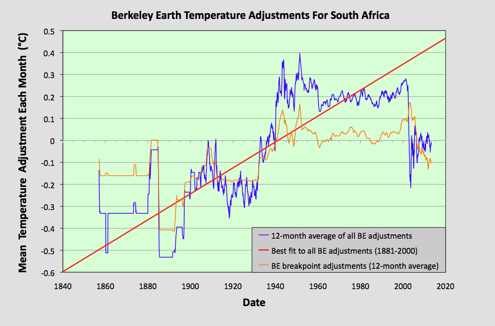
Fig. 37.6: The contribution of Berkeley Earth (BE) adjustments to the anomaly data after smoothing with a 12-month moving average. The linear best fit to the data is for the period 1881-2000 (red line) and the gradient is +0.59 ± 0.03 °C per century. The orange curve represents the contribution made to the BE adjustment curve by breakpoint adjustments only.
Conclusions
1) There is no evidence of any warming of the climate in South Africa before 1980 according to the raw temperature data.
2) There appears to be a sudden sharp rise in temperature after 1980 that is not consistent with the gradual increase in CO2 levels seen since 1850.
3) Once again the temperature trend constructed by Berkeley Earth appears to be strongly affected by their own data adjustments via breakpoints and homogenization.
No comments:
Post a Comment