Monday, March 21, 2022

99. Mississippi - temperature trends COOLING

Mississippi has even better temperature data than Louisiana which I examined in Post 97. It has 46 long stations with over 1200 months of data and another 60 medium stations with over 480 months of data. Of these, 98 stations in total have over 600 months of data. The graph in Fig. 99.1 below shows the result of averaging the monthly temperature anomalies for the 100 longest station records in Mississippi. It shows that there was no warming in the 120 years before 2010. In fact the state's climate cooled by 0.5°C.


Fig. 99.1: The mean temperature change for Mississippi relative to the 1951-1980 monthly averages. The best fit is applied to the monthly mean data from 1891 to 2010 and has a negative gradient of -0.42 ± 0.13 °C per century.


The scatter plot graph in Fig. 99.1 of mean temperature anomalies (MTA) is the result of averaging the temperature anomalies from 100 separate temperature records. These anomalies were calculated by subtracting the raw monthly mean temperature of each station from its monthly reference temperature (MRT) using the method outlined in Post 47. In this case the MRTs for each station were determined for the period 1951-1980 as this corresponded to the thirty year period with the most station data as shown in Fig. 99.2 below.


Fig. 99.2: The number of station records included each month in the mean temperature anomaly (MTA) trend for Mississippi in Fig. 99.1.


The data in Fig. 99.2 indicates that after 1900 the MTA in Fig. 99.1 is the result of averaging over more than forty separate station records, and peaks at over ninety. However, before 1890 this number drops to less than fifteen, which as I have noted before in Post 57 seems to be the minimum needed in order to obtain reliable values for the MTA.


Fig. 99.3: The (approximate) locations of the 100 longest weather station records in Mississippi. Those stations with a high warming trend between 1911 and 2010 are marked in red while those with a cooling or stable trend are marked in blue. Those denoted with squares are long stations with over 1200 months of data, while diamonds denote stations with more than 480 months of data, although all but two have over 600 months of data.


The locations of the stations with the 100 longest temperature records are shown on the map in Fig. 99.3 above. This shows them to be evenly distributed across the state. This means that advanced numerical techniques of homogenization, gridding and Kriging used by Berkeley Earth (BE) and others are probably unnecessary for determining an accurate MTA.


Fig. 99.4: Temperature trends for Mississippi based on Berkeley Earth adjusted data from the 100 longest station data records. The best fit linear trend line (in red) is for the period 1891-2010 and has a gradient of +0.54 ± 0.04°C/century.


This is confirmed by a comparison of the data in Fig. 99.4 above and Fig. 99.5 below. The MTA in Fig. 99.4 above was determined by averaging the Berkeley Earth (BE) adjusted anomalies. These values are found in the data files for each station on the Berkeley Earth website along with the raw data that I use. This allows me to do two things: (i) compare the MTA based on raw data (Fig. 99.1) with the same based on BE adjusted data (Fig. 99.4); (ii) assess the accuracy of the averaging process by comparing the average without homogenization, gridding and Kriging (Fig. 99.4) with the BE average that uses all three (Fig. 99.5).

A comparison of Fig. 99.1 and Fig. 99.4 indicates that the BE adjustments have turned a strong negative (cooling) temperature trend into a significant warming trend. Yet this cannot be due to any fault in the averaging process that I use because that yields virtually identical results for the BE adjusted MTA in Fig. 99.4 as the official published version in Fig. 99.5. So it is the BE temperature adjustments, and only those adjustments that are making the difference.


Fig. 99.5: The temperature trend for Mississippi since 1750 according to Berkeley Earth.


Finally it is possible to determine the magnitude of the BE adjustments by subtracting the unadjusted data in Fig. 99.1 from the adjusted data in Fig. 99.4. The result is shown in Fig. 99.6 below and indicates that the BE adjustments add over 1.1°C of warming from 1890 onwards, and possibly as much as 1.4°C. This is a huge amount of warming to add to a trend that is otherwise generally cooling.


Fig. 99.6: The contribution of Berkeley Earth (BE) adjustments to the anomaly data in Fig. 99.4 after smoothing with a 12-month moving average. The blue curve represents the total BE adjustments including those from homogenization. The linear best fit (red line) to these adjustments for the period 1891-2010 has a positive gradient of +0.949 ± 0.008 °C per century. The orange curve shows the contribution just from breakpoint adjustments.


Finally, we need to consider the discontinuity in the MTA data in 1957. This was discussed for Louisiana and Texas in Post 98 and it occurs again for Mississippi as shown by the arrow and red line in Fig. 99.7 below.

The size of this discontinuity can be estimated by averaging the anomalies for a thirty year period either side of it. If the periods chosen are 1921-1950 and 1961-1990, then the difference in the mean anomalies for those periods is 0.81°C. This is the magnitude of the discontinuity (red curve) in Fig. 99.7.


Fig. 99.7: The mean temperature change for Mississippi relative to the 1951-1980 monthly averages. The arrow and red line indicate the position and size of the data discontinuity.


If we then correct for this discontinuity by adjusting upwards all the anomalies after 1957 by 0.81°C we get the MTA time series shown in Fig. 99.8 below. The best fit to the data after 1891 now has an upward slope indicating a warming of about 0.7°C in total. This is now almost identical to the trend in the BE adjusted data in Fig. 99.4, but is this correct? After all, the BE adjusted data in Fig. 99.4 shows the same discontinuity in 1957 as the unadjusted data in Fig. 99.1. In other words, the BE adjustments have failed to erase the most striking irregularity in the data.


Fig. 99.8: The mean temperature change for Mississippi after breakpoint adjustment in 1957. The best fit is applied to the monthly mean data from 1891 to 2010 and has a positive gradient of +0.58 ± 0.13 °C per century.


A further complication can be found in the data in 1919. Here there is also what appears to be an abrupt discontinuity, but this one adds warming of approximately 0.43°C. It therefore partially cancels the effect of the discontinuity in 1957. The result is that the warming trend is dramatically reduced to a mere 0.19°C per century, or about 0.23 °C in total from 1891 to 2010.


Fig. 99.9: The mean temperature change for Mississippi after breakpoint adjustments to data before 1919 of 0.43°C and after 1957 of 0.81°C. The best fit is applied to the monthly mean data from 1891 to 2010 and has a positive gradient of +0.19 ± 0.12 °C per century.


What this highlights is the difficulty in using breakpoint adjustments. In the two examples shown above the data discontinuities in 1919 and 1957 can be seen in many of the original data sets of the 100 individual station records used to determine the MTA. So these different stations act as corroboration for each other, and this also explains why the discontinuities are so pronounced. But that does not explain the cause of the discontinuities, which could be natural and so should just be accepted, or could be due to a systematic and simultaneous change in the data gathering methods which then needs to be adjusted for.

The Berkeley Earth breakpoint algorithm, on the other hand, instead identifies numerous potential breakpoints in most station records in addition to the ones I have outlined. These additional breakpoints are often unique to each station record and so have no way of being corroborated. The other issue here is whether the Berkeley Earth identification algorithm actually works. But even if it does, regression towards the mean would render many of these adjustments redundant as I demonstrated in Post 57 and Post 67. Only the coincident ones would then remain after averaging such as those at 1919 and 1957.


Conclusions

Analysis of the raw temperature data suggests that the climate of Mississippi has cooled by almost 0.5°C since 1890 (see Fig. 99.1).

This is totally at odds with the result presented by Berkeley Earth (Fig. 99.4 and Fig. 99.5) which claims that the climate warmed by over 0.6°C over the same period. This is still less than the mean temperature rise for land-based stations (see Fig. 98.1 in Post 98).

Two major discontinuities in the mean temperature anomaly (MTA) data remain unexplained. Compensating for either or both would change the temperature trend of the MTA from strong cooling in Fig. 99.1 to either moderate (Fig. 99.8) or slight (Fig. 99.9) warming.


Acronyms

BE = Berkeley Earth.

MRT = monthly reference temperature (see Post 47).

MTA = mean temperature anomaly.

Link to list of all stations and their raw data files.


Friday, March 11, 2022

98. What happened to Louisiana temperatures in 1957?


Fig. 98.1: Global average land temperatures since 1850 according to Berkeley Earth.


In my previous post looking at the temperature trend for Louisiana (Post 97) I showed that the mean temperature in the region had declined by almost 0.2°C in the last century or so. This is in sharp contrast to the claim from most climate scientists that average temperatures have increased by almost 1.2°C in that time, and that this increase is even greater on land. In fact Berkeley Earth claims the increase in land temperatures since 1850 to be in excess of 2°C (see Fig. 98.1 above). But while analysing the Louisiana data one feature stood out that makes me query both the results of my last post and the analysis processes of Berkeley Earth (BE). 

In 1957 the temperature appears to drop suddenly and permanently by about 0.615°C (see black arrow on Fig. 98.2 below). What makes this feature significant is that similar temperature falls at identical times can be seen in the most of the individual temperature records for Louisiana. But they can also be seen in the temperature trends of neighbouring states like Texas. 

So is this temperature drop due to a sudden and large, natural change in the local climate? Or is it due to a change in the data measurement and analysis? If it is the latter then it needs to be corrected for and that will change drastically the true temperature trend. If it is the former then it raises serious questions about how the climate changes over time. In this post I will look at this feature in more detail and try to answer those questions.


Fig. 98.2: The mean temperature change for Louisiana relative to the 1951-1980 monthly averages. The best fit (white line) is applied to the monthly mean data from 1911 to 2010 and has a negative gradient of -0.38 ± 0.15 °C per century. The arrow and red line indicate the position and size of the data discontinuity.


The data in Fig. 98.2 above is the part of the same data that was presented previously in Fig. 97.1 of Post 97. In this case I am concentrating only on data after 1910 which, as I pointed out in Post 97, is the most reliable as it all results from an averaging of over forty distinct temperature records (see Fig. 97.2). The white line in Fig. 98.2 is the best fit to the data from 1911 to 2010 and has a strong negative gradient of -0.38°C per century. This is somewhat more negative than the trend in Fig. 97.1 because the fitting range is different. This shows how the value of the best fit gradient can be strongly influenced by the data range, particularly when the data exhibits large fluctuations.

The point of interest in the data above is in 1957 (as indicated by the large black arrow) where the mean temperature appears to drop suddenly and permanently by about 0.615°C. This can be seen clearly in the yellow line which is the 5-year moving average of the monthly anomaly data. It is also illustrated by the red line which is effectively two separate lines: the average temperature for 1921-1960 and the average for 1961-1990. In both cases the discontinuity is clear. The magnitude of the vertical discontinuity can be estimated from the discontinuity in the red line and is 0.615°C. 


Fig. 98.3: The mean temperature change for Louisiana after breakpoint adjustment. The best fit is applied to the monthly mean data from 1911 to 2010 and has a positive gradient of +0.54 ± 0.15 °C per century.


The next step is to remove the discontinuity by shifting upwards all the data after the start of 1958 in Fig. 98.2 by the size of the discontinuity, 0.615°C. The result is shown in Fig. 98.3 above. Two things are striking about the result. First, the gradient of the best fit is now strongly positive (+0.54°C per century) suggesting that the climate is warming. And secondly, the data just looks better with a more consistent trend. Of course just because data looks nicer does not prove that it is more reliable or more accurate.


Fig. 98.4: The total contribution of Berkeley Earth (BE) adjustments to the Louisiana temperature data. The orange curve shows the contribution just from breakpoint adjustments. The blue curve represents the total BE adjustments including those from homogenization. The linear best fit (red line) to the total BE adjustments for the period 1911-2010 has a positive gradient of +0.731 ± 0.004 °C per century.


The process I have employed here is virtually identical in concept to the breakpoint adjustments used by Berkeley Earth (BE). The main difference is that I have only applied one adjustment to the final mean temperature data whereas Berkeley Earth apply multiple adjustments of differing magnitudes and times to almost every station dataset. The sum total of those BE adjustments for the Louisiana data is shown in Fig. 98.4 above and the result is a huge warming trend of +0.73°C per century. This is warming that is added to the original data as I showed in Post 97. Yet the 0.6°C discontinuity in the middle of 1957 still remains in the adjusted BE data even after their adjustments have been made as the arrow in Fig. 98.5 below indicates. So the BE adjustments have not corrected the most glaring issue with the original data, which does rather raise a lot of questions regarding the accuracy and validity of the BE adjustments that are made.


Fig. 98.5: Temperature trends for Louisiana based on Berkeley Earth adjusted data from the 90 longest station data records. The best fit linear trend line (in red) is for the period 1911-2010 and has a gradient of +0.37 ± 0.05°C/century.


This is not the first time I have encountered these sudden jumps in temperature data. A similar upward jump in temperature of over 1°C can be seen in the temperature trend for Europe in 1988 (see Fig. 44.1 in Post 44). So what is the cause? At the moment I can only think of two explanations: a natural phenomenon that suddenly changes the local climate, or a sudden change in measurement equipment or methodology that is applied across all stations in a region simultaneously. But so far I can find no evidence for either. Of course the natural phenomenon may not have occurred in 1957 or at any other recent time before that. The complex dynamics of the Earth's climate could mean we are seeing the ripples now of forcing events many centuries ago. In Post 9 and Post 17 I have investigated chaotic effects in the temperature record and found evidence of fractal behaviour that can persist for centuries.


Fig. 98.6: The mean temperature change for Texas relative to the 1961-1990 monthly averages. The best fit (white line) is applied to the monthly mean data from 1911 to 2010 and has a negative gradient of -0.15 ± 0.15 °C per century. The arrow and red line indicate the position and size of the data discontinuity.


What is clear is that this temperature discontinuity is not restricted to Louisiana. The same data anomaly can be seen in the temperature trend for Texas that I analysed in Post 52. This is shown in Fig. 98.6 above with the breakpoint adjusted temperatures shown in Fig. 98.7 below.


 Fig. 98.7: The mean temperature change for Texas after breakpoint adjustment. The best fit is applied to the monthly mean data from 1911 to 2010 and has a positive gradient of +0.56 ± 0.15 °C per century.


After the breakpoint adjustment the temperature trend for Texas is now positive and virtually identical to that of Louisiana in Fig. 98.3. There also appears to be a strong correlation between the 5-year moving average (yellow curves) of each. This suggests that the region could have warmed by about 0.5°C over the last one hundred years. However, as I pointed out in Post 52, direct anthropogenic surface heating (DASH) or waste heat equating to about 0.7 W/m2 is probably currently warming Texas by up to 0.3 °C compared to 1850. That only leaves about 0.2°C for carbon dioxide induced climate change. This in line with the temperature rise I estimated in Post 87 and a long way short of the 2°C claimed by Berkeley Earth and others. So even with this adjustment there is little evidence to support severe carbon dioxide induced climate change in Louisiana or Texas.


Wednesday, March 9, 2022

97. Louisiana - temperature trends COOLING

In Post 52 I calculated the mean temperature anomalies for Texas and showed that there had been no warming in the state since 1840. In this post I will repeat the analysis for the neighbouring state of Louisiana. The result (SPOILER ALERT) is that once again there is no evidence of the climate warming. In fact over the last 120 years it appears to have cooled by almost 0.2°C.

Louisiana has less temperature data than Texas but considerably more than most states in Europe, Africa or South America. It has 26 long stations with over 1200 months of data (before 2014) and another 62 medium stations with over 480 months of data. In Fig. 97.1 below I have plotted the mean temperature anomaly (MTA) over time for the state by combining the monthly anomalies from the ninety longest temperature records in Louisiana. As can be seen, the trend over time is clearly negative suggesting the local climate is cooling not warming.


Fig. 97.1: The mean temperature change for Louisiana relative to the 1951-1980 monthly averages. The best fit is applied to the monthly mean data from 1896 to 2010 and has a negative gradient of -0.17 ± 0.13 °C per century.


The procedure for calculating the monthly anomalies for each station was the same as that used in all my previous regional temperature trend analyses. The anomalies for each station were determined by first calculating the twelve monthly reference temperatures (MRT) for each station. The method for calculating the MRTs, and then the anomalies for each station dataset has been described previously in Post 47. In this case the time interval used to determine the MRTs was 1951-1980 as almost all the stations had at least 40% data coverage in this interval. The MRTs for each station were then subtracted from the station's raw temperature data to produce the anomalies for that station. These were then averaged to obtain the MTA for each month shown in Fig. 97.1 above.


Fig. 97.2: The number of station records included each month in the mean temperature anomaly (MTA) trend for Louisiana in Fig. 97.1.


It is important to note, however, that not all data points in Fig. 97.1 are equally reliable. This is because the accuracy of the MTA for any given month depends in large part on the number of stations included in the average for that month. As Fig. 97.2 above shows, most months after 1910 have over forty different sets of station data available to be included in the MTA, but before 1890 that number is less than ten. This means that the trend in Fig. 97.1 is likely to be very unreliable before 1895.


Fig. 97.3: The (approximate) locations of the weather stations in Louisiana. Those stations with a high warming trend between 1911 and 2010 are marked in red while those with a cooling or stable trend are marked in blue. Those denoted with squares are long stations with over 1200 months of data, while diamonds denote medium stations with more than 480 months of data.


Then there is the issue of the geographical distribution of the stations. Ideally this should be as even as possible, with all stations being equally separated. This is never the case as Fig. 97.3 above illustrates for Louisiana. But previous analyses on this blog have shown that any inhomogeneity in the station density is usually of minor importance. As a result the simple averaging process of station anomalies generally gives the correct answer (or as close as we can be reasonably sure of) as I will demonstrate below.

In contrast, climate groups like Berkeley Earth use gridding and homogenization to construct idealized networks of stations. Not only is this unnecessary in my opinion, but it can also introduce additional biases via temperature adjustments. It is also worth noting that while climate scientists try to initiate regular square grids of nodes or points in order to perform their numerical models, in real physics and engineering finite element modellers favour highly irregular lattices in order to improve the accuracy of their simulations in fields such as thermodynamic heat flow and microelectronic device operation. So regular grids are not only unnecessary, but can be less accurate, particularly in regions of the model with large gradients.


Fig. 97.4: Temperature trends for Louisiana based on Berkeley Earth adjusted data from the 90 longest station data records. The best fit linear trend line (in red) is for the period 1896-2010 and has a gradient of +0.49 ± 0.04°C/century.


To prove my point I invite you to compare the two graphs in Fig. 97.4 above and Fig. 97.5 below. Both use the same adjusted data from Berkeley Earth, but the monthly average in Fig. 97.4 is a plot I derived by simply averaging the adjusted anomalies from Berkeley Earth (BE) of the ninety longest stations, while Fig. 97.5 below is the result Berkeley Earth obtained, probably by weighting each station in the average based on local station density. Yet it is clear that the results from 1910 onwards are virtually identical, thus indicating that the weighting process (and by extension the non-uniform station density) have minimal impact on the final result.


Fig. 97.5: The temperature trend for Louisiana since 1750 according to Berkeley Earth.


It is also clear that the BE adjusted anomaly data gives completely different results for the MTA in Fig. 97.4 (and Fig. 97.5) compared to the MTA based on unadjusted raw anomaly data in Fig. 97.1. The main reason for this difference is the data adjustments made by Berkeley Earth. Subtracting the data in Fig. 97.1 from that in Fig. 97.4 yields the total adjustments in Fig. 97.6 below (blue curve). Also shown is the contribution from breakpoint adjustments alone (in orange). These breakpoint adjustments can be determined from data in Berkeley Earth's own data files. It is clear from Fig. 97.6 that the BE adjustments are huge and add at least 0.7°C of warming to the BE trend.


Fig. 97.6: The contribution of Berkeley Earth (BE) adjustments to the anomaly data in Fig. 97.4 after smoothing with a 12-month moving average. The blue curve represents the total BE adjustments including those from homogenization. The linear best fit (red line) to these adjustments for the period 1911-2010 has a positive gradient of +0.731 ± 0.004 °C per century. The orange curve shows the contribution just from breakpoint adjustments.


Summary and conclusions

Once again an analysis of raw temperature data for a state or region yields results that are less alarming from a warming perspective than the official narrative.

In this case the raw unadjusted data for Louisiana shows a significant cooling of up to 0.2°C (see Fig. 97.1).

The Berkeley Earth adjusted data (Fig. 97.4), on the other hand, shows a warming since 1896 of between 0.6°C (red trend line) and 1.2°C (orange 10-year moving average). The difference is largely down to the adjustments made to the original data by Berkeley Earth (see Fig. 97.6).

There is, however, one intriguing complication: the data discontinuity or sudden temperature decline in 1957 in Fig. 97.1. I will examine this more closely in my next post, not least because it occurs not just in the Louisiana data, but in data for most of Louisiana's neighbours as well. It is also in the BE data in Fig. 97.4. Its importance though is in its origin. If it is a systematic measurement error, then correcting for it changes everything.


Acronyms

BE = Berkeley Earth.

MRT = monthly reference temperature (see Post 47).

MTA = mean temperature anomaly.

Link to list of all stations.


Sunday, February 27, 2022

96. Ecuador - temperature trends and the curious missing data

There are two major problems when it comes to analysing the temperature data of Ecuador. The first is that there is very little good data. The second is that what data there is is subject to major natural variations; not least from El Niño

In total there are only six medium stations in Ecuador with more than 480 months of data and only one with more than 800 months of data. That station is Quito Mariscal Sucre (Berkeley Earth ID: 13263) which has almost 1200 months of data up to the end of 2013 and is located in the capital city, but even it has no data after 2000. And based on evidence from other countries and states, it is reasonable to conclude that the temperature trend for this station is not indicative of the country as a whole (because of its growing urban environment), yet it is the only station with any significant data before 1960. There is a seventh medium station in Ecuador (San Cristobal radiosonde), but that is located in the Galapagos islands over 1000 km to the west and has already been included in my analysis of the South Pacific (see Post 34). For these reasons it will be excluded from this analysis.


Fig. 96.1: The (approximate) locations of the weather stations in Ecuador. Those stations with a high warming trend between 1911 and 2010 are marked in red while those with a cooling or stable trend are marked in blue. Those denoted with squares are stations with over 480 months of data, while diamonds denote stations with more than 240 months of data.


Instead I have also included an additional ten stations with over 240 months of data, even though I generally feel that stations with less than 360 months of data generally add little to the overall trend. The locations of these and the six medium stations are shown on the map in Fig. 96.1 above (see here for a list of all stations with links to their original data). While these stations are fairly evenly distributed, it can be seen that almost all are in the western half of the country on the Pacific side of the Andes ridge. This, though does not seem to be a major issue as will be demonstrated in the analysis below. What is a major issue is the quantity and length of each dataset.

The result of averaging the monthly temperature anomalies from all the stations in Ecuador with over 240 months of data results in the set of mean temperature anomalies (MTA) shown in Fig. 96.2 below. The anomalies for each station were determined by first calculating the twelve monthly reference temperatures (MRT) for each station. The method for calculating the MRTs, and then the anomalies for each station dataset has been described previously in Post 47. In this case the time interval used to determine the MRTs was 1961-1990 as almost all the stations had at least 40% data coverage in this interval. The MRTs for each station were then subtracted from the station's raw temperature data to produce the anomalies for that station. These were then averaged to obtain the MTA for each month.


Fig. 96.2: The mean temperature change for Ecuador relative to the 1961-1990 monthly averages. The best fit is applied to the monthly mean data from 1901 to 2010 and has a positive gradient of +0.98 ± 0.08 °C per century.


The MTA data in Fig. 99.2 clearly shows a positive temperature trend over time that equates to a warming of about 1.0°C over the last century. However, within this trend are fluctuations in the 5-year moving average (yellow curve) that are even greater than the overall rise in the trend (red curve). 

One of the principal causes of these fluctuations are El Niño events. These result in large positive spikes in the regional temperature, the most dramatic of which can be seen in 1957, 1972, 1982, 1987 and 1997. The events between 1982 and 1997 in particular appear to contribute significantly to the overall warming trend for Ecuador by leading to a consistent elevated warming in this period. However, after 1997 there is a clear reversal of this with a major dip in temperatures occurring. This appears to correspond to a major La Niña event where the region undergoes a sharp cooling. 

Yet curiously something else happens to the data in this period: a lot of it (~75%) appears to go missing. This can be seen in the graph below in Fig. 96.3 which shows the number of stations used to calculate the MTA for each month. Between 2001 and 2008 up to 75% of stations used to calculate the MTA suddenly have no data, just at the point where the mean temperatures of some of the few stations that do have data show a decline in their mean monthly temperatures of up to 4°C.


Fig. 96.3: The number of station records included each month in the mean temperature anomaly (MTA) trend for Ecuador in Fig. 96.2.


The station frequency data in Fig. 96.3 illustrates another deficiency in the data: the lack of it before 1960. In fact, as I pointed out at the start of this post, there is only one station with data pre-1960. Consequently it is plausible to assume that the trend seen in the data before 1960 will differ significantly from that thereafter. The best fit line in Fig. 96.4 below confirms this.


Fig. 96.4: The mean temperature change for Ecuador relative to the 1961-1990 monthly averages. The best fit is applied to the monthly mean data from 1961 to 2010 and has a positive gradient of +0.68 ± 0.17 °C per century.


The result of this is that we cannot with any certainty proclaim what the real temperature trend is. It could be that the climate is warming at over 1°C per century as the data fit in Fig. 96.2 suggests, or it could be less than 0.7°C as indicated in Fig. 96.4 above. And given the severity and frequency of El Niño and La Niña events in the period after 1950, it could be that the real underlying climate variation is even lower. Frankly, we just can't tell. 

One way to resolve this might be to compare the temperature data for Ecuador with that of its neighbours. Yet in the previous post (Post 95) I showed that there has been no warming in Colombia since 1940 while in Post 63 I showed that the same was probably true for Peru as well (see Fig. 63.5 in Post 65).


Fig. 96.5: Temperature trends for Ecuador based on Berkeley Earth adjusted data. The average is for anomalies from all stations with over 240 months of data. The best fit linear trend line (in red) is for the period 1901-2010 and has a gradient of +1.06 ± 0.03°C/century.


So how does this tally with the data presented by Berkeley Earth (BE)? Well averaging the BE adjusted data for each station yields the time series for the mean temperature shown in Fig. 96.5 above. This has a warming trend that is significantly larger than that determined using raw data and shown in Fig. 96.2. It is, however, almost identical to the BE published version shown in Fig. 96.6 below even though the official BE trend in Fig. 96.6 is constructed using a mixture of homogenization and station weighting, and incorporates data from stations with less than 240 months of data. 

The similarity of the data in Fig. 96.5 and Fig. 96.6 suggests that statistical techniques such as homogenization and station weighting have little influence on the overall trend in this case. That also means that these statistical techniques cannot account for the differences between the trend based on adjusted data in Fig. 96.5 and Fig. 96.6 and the trend resulting from an average of anomalies based on the raw data shown in Fig. 96.2. This difference can therefore only result from the temperature adjustments.


Fig. 96.6: The temperature trend for Ecuador since 1860 according to Berkeley Earth.


So what can we conclude about the overall trend in temperature for Ecuador? The lack of data before 1960 invalidates the trend before 1960 from the discussion, while the lack of data for the period 2001-2008 probably does likewise. The remaining data in Fig. 96.4 after 1960 also fluctuates too greatly for an accurate trend to be discerned, but suggests that the real trend could be anything between zero and 1.0°C per century. Another way to estimate the likely temperature trend might be to compare it with the trend in neighbouring countries.  As Colombia (Post 95) and Peru (Post 63) appear to show no evidence of warming after 1940 it would be reasonable to assume that the same is true for Ecuador.


Acronyms

BE = Berkeley Earth.

MRT = monthly reference temperature (see Post 47).

MTA = mean temperature anomaly.

Link to list of all stations.


Friday, February 25, 2022

95. Colombia - temperature trends STABLE

Like Central America the temperature data for Colombia is far from ideal. There are too few stations with little data before 1940, and very few stations in the east of the country (see Fig. 95.1 below). Nevertheless, the data that is available does allow us to determine the temperature trend since 1940 with a fair degree of certainty. That data indicates that Colombia has experienced no global warming so far.


Fig. 95.1: The (approximate) locations of the weather stations in Colombia. Those stations with a high warming trend between 1911 and 2010 are marked in red while those with a cooling or stable trend are marked in blue. Those denoted with squares are stations with over 600 months of data, while diamonds denote medium stations with more than 480 months of data.


Overall, Colombia has only 22 medium station temperature records with over 480 months of data (before 2014) and no long stations with over 1200 months of data. Of these medium stations, ten have more than 600 months of data, with the two longest datasets containing just over 1000 months of data each. In addition there are another 13 station datasets with over 360 months of data. Most of these stations are located on the Cordillera mountain ranges in the west of the country, with a few also being found on the Caribbean coast but only three being located in the eastern half of the country (see Fig. 95.1 above). There is no temperature data before 1920.

The change in the mean monthly temperature of Colombia since 1920 is shown in Fig. 95.2 below. This was determined by first calculating the monthly temperature anomalies for each station dataset and then averaging them to produce a mean temperature anomaly (MTA) for the region. The temperature anomalies for each station were determined by calculating the twelve monthly reference temperatures (MRTs) for each station using the method described previously in Post 47 with the reference period being 1971-2000. The MRTs for each station were then subtracted from that station's raw temperature data to produce the anomalies for that station. These anomalies are therefore a measure of the change in the monthly temperature relative to the average for that month between 1971 and 2000.


Fig. 95.2: The mean temperature change for Colombia relative to the 1951-1980 monthly averages. The best fit is applied to the monthly mean data from 1946 to 2005 and has a slight positive gradient of +0.17 ± 0.10 °C per century.


The data in Fig. 95.2 above clearly shows that there has been no significant climate change in Colombia since 1940, while the frequency graph in Fig. 95.3 below shows that before 1940 there is too little data to make a reliable judgement. Generally I have found that at least fifteen active stations in a region of under 500 km in extent are needed to provide a reliable MTA. This condition is really only satisfied for Colombia after 1960, and even then only for the west of the country. This suggests that the maximum warming seen in Colombia is likely to be 0.1°C at most. This, of course, does not conform to the established narrative on climate change.


Fig. 95.3: The number of station records included each month in the mean temperature anomaly (MTA) trend for Colombia.


According to Berkeley Earth (BE) the climate in Colombia has warmed by over 1.5°C since 1890. If we average the BE adjusted anomalies for Colombia we get the temperature trend shown in Fig. 95.4 below which indicates a similar result and clearly implies a warming of over 0.8°C since 1920. This is clearly completely different from the trend shown in Fig. 95.2 at the start of this blog. So why the difference?


Fig. 95.4: Temperature trends for Colombia based on Berkeley Earth (BE) adjusted data. The average is for anomalies from all stations with over 360 months of data. The best fit linear trend line (in red) is for the period 1926-2010 and has a gradient of +0.95 ± 0.05°C/century.


Critics might claim that the difference is down to the averaging process. Berkeley Earth use gridding, Kriging and homogenization in their process in order to account for variations in local station density: I do not. But if that were the sole or principal explanation then the graph I have constructed in Fig. 95.4 using a simple average would differ significantly from the official Berkeley Earth (BE) plot shown in Fig. 95.5 below. Yet it does not. In fact the two plots are virtually identical even though I have also excluded all stations will less than 360 months of data from the MTA in Fig. 95.2. It is also interesting that the BE graph in Fig. 95.5 claims to be able to estimate the mean temperature in Colombia as far back as 1850 (admittedly with some greater uncertainty) even though the country has no temperature data that I can find before 1920.


Fig. 95.5: The temperature trend for Colombia since 1820 according to Berkeley Earth.


Instead what this shows is that the averaging process is sufficiently accurate to yield the correct result and that the processes of homogenization etc. are not needed. It also shows that stations with small amounts of data (i.e. less than 360 months) add nothing to the overall MTA trend and are therefore nigh on useless. 

We are therefore left with the only other explanation, namely that the differences between the trends in Fig. 95.2 and Fig. 95.4 (or Fig. 95.5) are mainly down to the adjustments made to the data by Berkeley Earth. In short, these adjustments have turned a temperature trend with no intrinsic warming (in Fig. 95.2) into one with almost 1°C of warming in a century (in Fig. 95.4).


Fig. 95.6: The contribution of Berkeley Earth (BE) adjustments to the anomaly data in Fig. 95.4 after smoothing with a 12-month moving average. The blue curve represents the total BE adjustments including those from homogenization. The linear best fit (red line) to these adjustments for the period 1926-2010 has a positive gradient of +0.62 ± 0.03 °C per century. The orange curve shows the contribution just from breakpoint adjustments.


We can quantify the difference between the climate change seen in the raw data and that claimed by climate science by subtracting the data in Fig. 95.2 from the data in Fig. 95.4. The result is the blue curve in Fig. 95.6 above. The warming it represents clearly amounts to at least 0.6°C over the last century. Conveniently Berkeley Earth also detail the magnitude of their breakpoint adjustments in their station data files. These can easily be averaged separately and are indicated by the orange curve in Fig. 95.6. Clearly these adjustments account for the majority of the added warming.


Summary and conclusions

1) There is no evidence of any meaningful rise in temperatures in Colombia since 1940 (see Fig. 95.2).

2) The difference between the temperature trend based on the unadulterated raw data (Fig. 95.2) and the trend based on Berkeley Earth (BE) adjusted data (Fig. 95.4) can probably only be explained by the BE adjustments (see Fig. 95.6) and not some other factors such as the irregular geographical distribution of stations or missing data. This is the most reasonable conclusion in my opinion based on the similarity of the data time series in Fig. 95.4 and Fig. 95.5. 


Acronyms

BE = Berkeley Earth.

MRT = monthly reference temperature (see Post 47).

MTA = mean temperature anomaly.

Link to list of all stations.


Wednesday, February 23, 2022

94. Central America - temperature trends STABLE before 1980

In this post I will study the extent of climate change in Central America. I have already discussed the trend for Mexico in the previous post where the conclusions were ambiguous. The warming that was seen in the mean temperature anomaly (MTA) could have been more than 1°C since 1900 (see Fig. 93.7), but could equally have been close to zero or even negative (see Fig. 93.6) depending on which partial dataset was used. The compromise was an estimate of about 0.6°C of warming (see Fig. 93.1).

But at least Mexico had over 130 significant temperature records on which to base these conclusions. The rest of Central America (Belize, Guatemala, El Salvador, Honduras, Nicaragua, Costa Rica and Panama) in contrast has less than forty. For this reason I have combined the analysis for these seven countries into a single post.


Fig. 94.1: The (approximate) locations of the weather stations in Central America. Those stations with a high warming trend between 1911 and 2010 are marked in red while those with a cooling or stable trend are marked in blue. Those denoted with squares are stations with over 600 months of data, while diamonds denote stations with more than 360 months of data.


In total the seven countries being considered here have only 32 medium stations with over 480 months of data before 2013 (see here for a list) and none with more than 900 months of data, although there are 19 with over 600 months of data. There are an additional ten stations with over 360 months of data. The location of these stations are shown on the map in Fig. 94.1 above. It is immediately clear that there is far from an even distribution of these stations across the region with much of Guatemala, Nicaragua and Panama having little coverage.

The other complication is that the stations in the region do not all have data for the same time period. Only about five stations have a significant amount of temperature data before 1950 and none of these have any data after 1980, whereas about eleven stations have no data before 1970. That makes it difficult to combine both into a single trend because these two sets of stations require different 30-year reference time periods against which to measure the temperature change.


Fig. 94.2: The mean temperature change for Central America relative to the 1951-1980 monthly averages. The best fit is applied to the monthly mean data from 1921 to 1975 and has a positive gradient of +0.28 ± 0.11 °C per century.


One solution is to calculate different monthly reference temperatures (MRTs) for each set. This is what I have done in Fig. 94.2 above and Fig. 94.3 below. The results are broadly the same but have significant differences.

In Fig. 94.2 the MRTs were calculated for the 30-year period from 1951 to 1980. The temperature anomalies for each station were determined by calculating the twelve monthly reference temperatures (MRTs) for each station using the method described previously in Post 47. The MRTs for each station were then subtracted from that station's raw temperature data to produce the anomalies for that station. These were then averaged to obtain the mean temperature anomaly (MTA) for each month. 

The results in Fig. 94.2 indicate that there was little or no temperature rise in the region before 1975, but a significant rise of about 1°C spread over the following twenty years. The mean temperature then seems to plateau for twenty years.


Fig. 94.3: The mean temperature change for Central America relative to the 1971-2000 monthly averages. The best fit is applied to the monthly mean data from 1917 to 1975 and has a negative gradient of -0.18 ± 0.11 °C per century.


A similar picture is seen for the data in Fig. 94.3 where the MRT period was defined to be from 1971 to 2000. The main differences are that the temperature trend before 1975 is now negative, and the temperature rise thereafter is slightly less, being about 0.8°C rather than about 1.2°C. So which of these two data interpretations are more likely to be correct? The answer depends on which graph has the better data.


Fig. 94.4: The number of station records included each month in the mean temperature anomaly (MTA) trend for Central America in Fig. 94.2 (blue curve) and Fig. 94.3 (red curve).


The graph in Fig. 94.4 above shows the number of stations used to determine the MTA each month for both Fig. 94.2 and Fig. 94.3. It indicates that Fig. 94.3 has the greater amount of data after 1975 but not before. This suggests that the temperature trend before 1975 resembled that in Fig. 94.2 and was therefore stable. After 1975 the temperature rose, but not by as much as Fig. 94.2 suggests. It probably rose by about 0.8°C in line with the data shown in Fig. 94.3.


Fig. 94.5: Temperature trends for Central America based on Berkeley Earth (BE) adjusted data. The average is for anomalies from all stations with over 240 months of data. The best fit linear trend line (in red) is for the period 1901-2010 and has a gradient of +0.83 ± 0.03°C/century.


Of course none of this corresponds to the trend produced by Berkeley Earth (BE), or even the trend that results from averaging the BE adjusted data. The latter is shown in Fig. 94.5 above. This graph is the result of averaging the anomaly data for each station after it has been adjusted using breakpoint alignment. As I have usually to be the case in previous country analyses, it differs markedly from the unadjusted data. It is also worth noting that the BE anomalies before breakpoint alignment already differ from anomalies derived solely from the raw station data because Berkeley Earth appears to use homogenization, Kriging and gridding in its process to determine the station anomalies. That is yet another reason for looking at the raw data instead.

What is apparent is that the trend shown in Fig. 94.5 above differs considerably from the official Berkeley Earth temperature trend for the region that I have reproduced in Fig. 94.6 below. That is because it the graph in Fig. 94.6 includes data from Mexico. In fact the curves in Fig. 94.6 are very similar to the equivalent graph for Mexico shown in Fig. 93.3 in Post 93. This is not surprising as the area of Mexico is four times the combined area of the seven countries being considered here.


Fig. 94.6: The temperature trend for the whole of Central America, including Mexico, since 1830 according to Berkeley Earth.


If we add the BE adjust data from Mexico (weighted 79% for its area) to the data in Fig. 94.5 the result is the graph shown in Fig. 94.7 below. As expected this agrees closely with Fig. 94.6 at least for data after 1920.


Fig. 94.7: Temperature trends for Central America including Mexico based on Berkeley Earth adjusted data. The best fit linear trend line (in red) is for the period 1911-2010 and has a gradient of +0.55 ± 0.02°C/century.


Summary and conclusions

1) There is no evidence of any meaningful rise in temperatures in Central America before 1975, even though the data is not great.

2) After 1975 the temperature appears to rise suddenly but gradually until 1995 and then plateau.

3) The maximum temperature rise after 1975 is about 1°C.


Acronyms

BE = Berkeley Earth.

MRT = monthly reference temperature (see Post 47).

MTA = mean temperature anomaly.

Link to list of all stations (including Mexico).


Friday, February 18, 2022

93. Mexico - temperature trends 0.6°C WARMING

Of all the countries in Central America only Mexico has a significant number of weather stations with over 40 years of data. In total it has 138 medium stations with over 480 months of data, and another four long stations with over 1200 months of data (see here for a list of all stations and links to all the original raw data). In total, at least fifteen stations have over 1000 months of data. In contrast, the other seven countries in the region have only 31 medium stations in total, none of which have more than 900 months of data. On the face of it this should mean that the temperature trend for Mexico should be easy to determine, but as with most things in climate science, it turns out it is not that simple.


Fig. 93.1: The mean temperature change for Mexico relative to the 1961-1990 monthly averages. The best fit is applied to the monthly mean data from 1898 to 1997 and has a positive gradient of +0.58 ± 0.06 °C per century.


The result of averaging the monthly temperature anomalies from all the 142 long and medium stations in Mexico results in the set of mean temperature anomalies (MTA) shown in Fig. 93.1 above. The anomalies for each station were determined by first calculating the twelve monthly reference temperatures (MRT) for each station. The method for calculating the MRTs, and then the anomalies for each station dataset has been described previously in Post 47. In this case the time interval used to determine the MRTs was 1961-1990 as almost all the 142 stations had at least 40% data coverage in this interval. The MRTs for each station were then subtracted from the station's raw temperature data to produce the anomalies for that station.

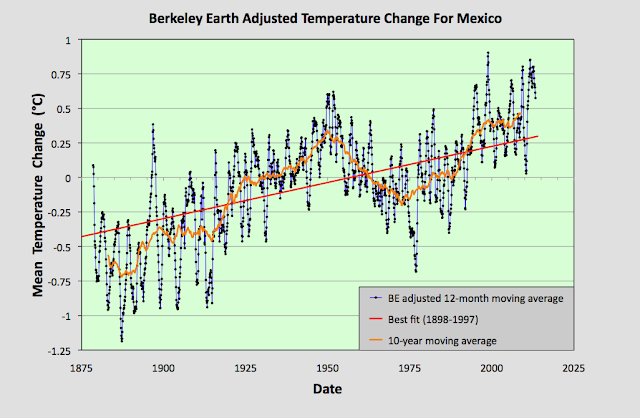
The MTA data in Fig. 93.1 clearly shows a positive temperature trend over time that equates to a warming of about 0.6°C over the last century. However, within this trend are fluctuations in the 5-year moving average (yellow curve) that are even greater than the overall rise in the trend (red curve). This behaviour is also seen in the Berkeley Earth adjusted data shown in Fig. 93.2 below.


Fig. 93.2: Temperature trends for Mexico based on Berkeley Earth adjusted data. The average is for anomalies from all stations with over 480 months of data. The best fit linear trend line (in red) is for the period 1898-1997 and has a gradient of +0.52 ± 0.03°C/century.


The Berkeley Earth (BE) data presented in Fig. 93.2 was generated using the same averaging process as that used for the data in Fig. 93.1 but using BE adjusted anomaly data. Usually this leads to a large difference in the temperature rise calculated using the unadjusted raw data (Fig. 93.1) from that using the BE adjusted data (Fig. 93.2). I have shown numerous examples in this blog over the last two years for many different countries, states and regions where this is the case, and it is one of my main reasons for doing this blog: to highlight the extent to which much of the original temperature data has been adjusted. 

In this instance, however, the adjustments made by Berkeley Earth (and there are many in most station datasets) appear to make little difference to the final outcome for the overall temperature trend. And this is not because the averaging process I use is different from the Berkeley Earth method. It is. I do not use any homogenization, Kriging or weighted coefficients for the different datasets in the averaging. Yet the temperature trend I derive from the BE adjusted data and present in Fig. 93.2 is virtually identical to the one published by Berkeley Earth and shown in Fig. 93.3 below. So once again the averaging process is not the issue.


Fig. 93.3: The temperature trend for Mexico since 1830 according to Berkeley Earth.


This all seems to suggest that the overall temperature trend for Mexico is as I have calculated in Fig. 93.1, and that this is broadly consistent with the Berkeley Earth version. But if we look at the data more closely we see a complication.


Fig. 93.4: The number of station records included each month in the mean temperature anomaly (MTA) trend for Mexico in Fig. 93.1 (blue curve). These stations can be sorted into two distinct groups. Those with five digit Berkeley Earth ID codes are shown in red, those with six digit IDs are in green.


The data files on the Berkeley Earth website for the stations in Mexico broadly fall into two distinct categories: those with 5-digit IDs and those with 6-digit ones. The different numbers appear to reflect the fact that the original data in each case comes from a different source database, with the 5-digit data files more likely to originate from a single source, usually the Global Historical Climatology Network (GHCN) of NOAA, and the 6-digit data files from multiple databases. The number of each of the two file types used to determine the MTA trend in Fig. 93.1 is shown in Fig. 93.4 above. 

Now ordinarily this difference in file source is not an issue. The same differentiation in ID numbers is seen for stations from many countries. The problem here is that these two sets of data files give wildly different results for the MTA trend of Mexico. This can be seen when we examine the temperature trends for each station individually as the map in Fig. 93.5 below illustrates.


Fig. 93.5: The (approximate) locations of the weather stations in Mexico. Those stations with a high warming trend between 1901 and 2000 are marked in red while those with a cooling or stable trend are marked in blue. Those denoted with squares are stations with a 6-digit Berkeley Earth ID, while diamonds denote stations with a 5-digit ID.


In Fig. 93.5 the geographical location in Mexico of each of the 142 weather stations with the longest temperature records used to determine the mean trend in Fig. 93.1 are plotted. Those in red have significant warming trends while those in blue are generally stable (the total temperature rise is either less than 0.25°C, or the trend is less than twice the error in the trend). In addition, the stations with 5-digit IDs are denoted by a diamond while those with a 6-digit ID are represented by a square. What is noticeable is the different split between warming and stable trends in each case.

In the case of stations with 6-digit IDs 73% (32 out of 44) have a warming trend, whereas for the stations with 5-digit IDs it is only 38% (37 out of 98). This difference is even more apparent if we calculate the mean temperature anomaly (MTA) for each set of stations separately.


Fig. 93.6: The mean temperature change for Mexico relative to the 1961-1990 monthly averages calculated using stations with a 5-digit Berkeley Earth ID. The best fit is applied to the monthly mean data from 1921 to 2010 and has a positive gradient of +0.14 ± 0.07 °C per century.


The MTA data in Fig. 93.6 above shows the mean temperature change for Mexico calculated using only anomaly data from stations with a 5-digit Berkeley Earth ID. The trend in this case is almost completely flat. In contrast, if the same exercise is performed using only anomaly data from stations with a 6-digit Berkeley Earth ID the result is a strong warming trend of over 1°C per century as shown in Fig. 93.7 below.


Fig. 93.7: The mean temperature change for Mexico relative to the 1961-1990 monthly averages calculated using stations with a 6-digit Berkeley Earth ID. The best fit is applied to the monthly mean data from 1898 to 1997 and has a positive gradient of +1.13 ± 0.06 °C per century.


All this means that it is difficult to conclusively assert what the degree of climate change in Mexico has been over the last century. The most reasonable estimate is that the mean temperature has risen by about 0.6°C (see Fig. 93.1 and Fig. 93.2), but it could be anywhere between 1.2°C (see Fig. 93.7) and 0°C (see Fig. 93.6).


Acronyms

BE = Berkeley Earth.

MRT = monthly reference temperature (see Post 47).

MTA = mean temperature anomaly.

List of all stations and links to all the original raw temperature data