Sunday, February 27, 2022

96. Ecuador - temperature trends and the curious missing data

There are two major problems when it comes to analysing the temperature data of Ecuador. The first is that there is very little good data. The second is that what data there is is subject to major natural variations; not least from El Niño. 

In total there are only six medium stations in Ecuador with more than 480 months of data and only one with more than 800 months of data. That station is Quito Mariscal Sucre (Berkeley Earth ID: 13263) which has almost 1200 months of data up to the end of 2013 and is located in the capital city, but even it has no data after 2000. And based on evidence from other countries and states, it is reasonable to conclude that the temperature trend for this station is not indicative of the country as a whole (because of its growing urban environment), yet it is the only station with any significant data before 1960. There is a seventh medium station in Ecuador (San Cristobal radiosonde), but that is located in the Galapagos islands over 1000 km to the west and has already been included in my analysis of the South Pacific (see Post 34). For these reasons it will be excluded from this analysis.


Fig. 96.1: The (approximate) locations of the weather stations in Ecuador. Those stations with a high warming trend between 1911 and 2010 are marked in red while those with a cooling or stable trend are marked in blue. Those denoted with squares are stations with over 480 months of data, while diamonds denote stations with more than 240 months of data.


Instead I have also included an additional ten stations with over 240 months of data, even though I generally feel that stations with less than 360 months of data generally add little to the overall trend. The locations of these and the six medium stations are shown on the map in Fig. 96.1 above (see here for a list of all stations with links to their original data). While these stations are fairly evenly distributed, it can be seen that almost all are in the western half of the country on the Pacific side of the Andes ridge. This, though does not seem to be a major issue as will be demonstrated in the analysis below. What is a major issue is the quantity and length of each dataset.

The result of averaging the monthly temperature anomalies from all the stations in Ecuador with over 240 months of data results in the set of mean temperature anomalies (MTA) shown in Fig. 96.2 below. The anomalies for each station were determined by first calculating the twelve monthly reference temperatures (MRT) for each station. The method for calculating the MRTs, and then the anomalies for each station dataset has been described previously in Post 47. In this case the time interval used to determine the MRTs was 1961-1990 as almost all the stations had at least 40% data coverage in this interval. The MRTs for each station were then subtracted from the station's raw temperature data to produce the anomalies for that station. These were then averaged to obtain the MTA for each month.


Fig. 96.2: The mean temperature change for Ecuador relative to the 1961-1990 monthly averages. The best fit is applied to the monthly mean data from 1901 to 2010 and has a positive gradient of +0.98 ± 0.08 °C per century.


The MTA data in Fig. 99.2 clearly shows a positive temperature trend over time that equates to a warming of about 1.0°C over the last century. However, within this trend are fluctuations in the 5-year moving average (yellow curve) that are even greater than the overall rise in the trend (red curve). 

One of the principal causes of these fluctuations are El Niño events. These result in large positive spikes in the regional temperature, the most dramatic of which can be seen in 1957, 1972, 1982, 1987 and 1997. The events between 1982 and 1997 in particular appear to contribute significantly to the overall warming trend for Ecuador by leading to a consistent elevated warming in this period. However, after 1997 there is a clear reversal of this with a major dip in temperatures occurring. This appears to correspond to a major La Niña event where the region undergoes a sharp cooling. 

Yet curiously something else happens to the data in this period: a lot of it (~75%) appears to go missing. This can be seen in the graph below in Fig. 96.3 which shows the number of stations used to calculate the MTA for each month. Between 2001 and 2008 up to 75% of stations used to calculate the MTA suddenly have no data, just at the point where the mean temperatures of some of the few stations that do have data show a decline in their mean monthly temperatures of up to 4°C.


Fig. 96.3: The number of station records included each month in the mean temperature anomaly (MTA) trend for Ecuador in Fig. 96.2.


The station frequency data in Fig. 96.3 illustrates another deficiency in the data: the lack of it before 1960. In fact, as I pointed out at the start of this post, there is only one station with data pre-1960. Consequently it is plausible to assume that the trend seen in the data before 1960 will differ significantly from that thereafter. The best fit line in Fig. 96.4 below confirms this.


Fig. 96.4: The mean temperature change for Ecuador relative to the 1961-1990 monthly averages. The best fit is applied to the monthly mean data from 1961 to 2010 and has a positive gradient of +0.68 ± 0.17 °C per century.


The result of this is that we cannot with any certainty proclaim what the real temperature trend is. It could be that the climate is warming at over 1°C per century as the data fit in Fig. 96.2 suggests, or it could be less than 0.7°C as indicated in Fig. 96.4 above. And given the severity and frequency of El Niño and La Niña events in the period after 1950, it could be that the real underlying climate variation is even lower. Frankly, we just can't tell. 

One way to resolve this might be to compare the temperature data for Ecuador with that of its neighbours. Yet in the previous post (Post 95) I showed that there has been no warming in Colombia since 1940 while in Post 63 I showed that the same was probably true for Peru as well (see Fig. 63.5 in Post 65).


Fig. 96.5: Temperature trends for Ecuador based on Berkeley Earth adjusted data. The average is for anomalies from all stations with over 240 months of data. The best fit linear trend line (in red) is for the period 1901-2010 and has a gradient of +1.06 ± 0.03°C/century.


So how does this tally with the data presented by Berkeley Earth (BE)? Well averaging the BE adjusted data for each station yields the time series for the mean temperature shown in Fig. 96.5 above. This has a warming trend that is significantly larger than that determined using raw data and shown in Fig. 96.2. It is, however, almost identical to the BE published version shown in Fig. 96.6 below even though the official BE trend in Fig. 96.6 is constructed using a mixture of homogenization and station weighting, and incorporates data from stations with less than 240 months of data. 

The similarity of the data in Fig. 96.5 and Fig. 96.6 suggests that statistical techniques such as homogenization and station weighting have little influence on the overall trend in this case. That also means that these statistical techniques cannot account for the differences between the trend based on adjusted data in Fig. 96.5 and Fig. 96.6 and the trend resulting from an average of anomalies based on the raw data shown in Fig. 96.2. This difference can therefore only result from the temperature adjustments.


Fig. 96.6: The temperature trend for Ecuador since 1860 according to Berkeley Earth.


So what can we conclude about the overall trend in temperature for Ecuador? The lack of data before 1960 invalidates the trend before 1960 from the discussion, while the lack of data for the period 2001-2008 probably does likewise. The remaining data in Fig. 96.4 after 1960 also fluctuates too greatly for an accurate trend to be discerned, but suggests that the real trend could be anything between zero and 1.0°C per century. Another way to estimate the likely temperature trend might be to compare it with the trend in neighbouring countries.  As Colombia (Post 95) and Peru (Post 63) appear to show no evidence of warming after 1940 it would be reasonable to assume that the same is true for Ecuador.


Acronyms

BE = Berkeley Earth.

MRT = monthly reference temperature (see Post 47).

MTA = mean temperature anomaly.

Link to list of all stations.


Friday, February 25, 2022

95. Colombia - temperature trends STABLE

Like Central America the temperature data for Colombia is far from ideal. There are too few stations with little data before 1940, and very few stations in the east of the country (see Fig. 95.1 below). Nevertheless, the data that is available does allow us to determine the temperature trend since 1940 with a fair degree of certainty. That data indicates that Colombia has experienced no global warming so far.


Fig. 95.1: The (approximate) locations of the weather stations in Colombia. Those stations with a high warming trend between 1911 and 2010 are marked in red while those with a cooling or stable trend are marked in blue. Those denoted with squares are stations with over 600 months of data, while diamonds denote medium stations with more than 480 months of data.


Overall, Colombia has only 22 medium station temperature records with over 480 months of data (before 2014) and no long stations with over 1200 months of data. Of these medium stations, ten have more than 600 months of data, with the two longest datasets containing just over 1000 months of data each. In addition there are another 13 station datasets with over 360 months of data. Most of these stations are located on the Cordillera mountain ranges in the west of the country, with a few also being found on the Caribbean coast but only three being located in the eastern half of the country (see Fig. 95.1 above). There is no temperature data before 1920.

The change in the mean monthly temperature of Colombia since 1920 is shown in Fig. 95.2 below. This was determined by first calculating the monthly temperature anomalies for each station dataset and then averaging them to produce a mean temperature anomaly (MTA) for the region. The temperature anomalies for each station were determined by calculating the twelve monthly reference temperatures (MRTs) for each station using the method described previously in Post 47 with the reference period being 1971-2000. The MRTs for each station were then subtracted from that station's raw temperature data to produce the anomalies for that station. These anomalies are therefore a measure of the change in the monthly temperature relative to the average for that month between 1971 and 2000.


Fig. 95.2: The mean temperature change for Colombia relative to the 1951-1980 monthly averages. The best fit is applied to the monthly mean data from 1946 to 2005 and has a slight positive gradient of +0.17 ± 0.10 °C per century.


The data in Fig. 95.2 above clearly shows that there has been no significant climate change in Colombia since 1940, while the frequency graph in Fig. 95.3 below shows that before 1940 there is too little data to make a reliable judgement. Generally I have found that at least fifteen active stations in a region of under 500 km in extent are needed to provide a reliable MTA. This condition is really only satisfied for Colombia after 1960, and even then only for the west of the country. This suggests that the maximum warming seen in Colombia is likely to be 0.1°C at most. This, of course, does not conform to the established narrative on climate change.


Fig. 95.3: The number of station records included each month in the mean temperature anomaly (MTA) trend for Colombia.


According to Berkeley Earth (BE) the climate in Colombia has warmed by over 1.5°C since 1890. If we average the BE adjusted anomalies for Colombia we get the temperature trend shown in Fig. 95.4 below which indicates a similar result and clearly implies a warming of over 0.8°C since 1920. This is clearly completely different from the trend shown in Fig. 95.2 at the start of this blog. So why the difference?


Fig. 95.4: Temperature trends for Colombia based on Berkeley Earth (BE) adjusted data. The average is for anomalies from all stations with over 360 months of data. The best fit linear trend line (in red) is for the period 1926-2010 and has a gradient of +0.95 ± 0.05°C/century.


Critics might claim that the difference is down to the averaging process. Berkeley Earth use gridding, Kriging and homogenization in their process in order to account for variations in local station density: I do not. But if that were the sole or principal explanation then the graph I have constructed in Fig. 95.4 using a simple average would differ significantly from the official Berkeley Earth (BE) plot shown in Fig. 95.5 below. Yet it does not. In fact the two plots are virtually identical even though I have also excluded all stations will less than 360 months of data from the MTA in Fig. 95.2. It is also interesting that the BE graph in Fig. 95.5 claims to be able to estimate the mean temperature in Colombia as far back as 1850 (admittedly with some greater uncertainty) even though the country has no temperature data that I can find before 1920.


Fig. 95.5: The temperature trend for Colombia since 1820 according to Berkeley Earth.


Instead what this shows is that the averaging process is sufficiently accurate to yield the correct result and that the processes of homogenization etc. are not needed. It also shows that stations with small amounts of data (i.e. less than 360 months) add nothing to the overall MTA trend and are therefore nigh on useless. 

We are therefore left with the only other explanation, namely that the differences between the trends in Fig. 95.2 and Fig. 95.4 (or Fig. 95.5) are mainly down to the adjustments made to the data by Berkeley Earth. In short, these adjustments have turned a temperature trend with no intrinsic warming (in Fig. 95.2) into one with almost 1°C of warming in a century (in Fig. 95.4).


Fig. 95.6: The contribution of Berkeley Earth (BE) adjustments to the anomaly data in Fig. 95.4 after smoothing with a 12-month moving average. The blue curve represents the total BE adjustments including those from homogenization. The linear best fit (red line) to these adjustments for the period 1926-2010 has a positive gradient of +0.62 ± 0.03 °C per century. The orange curve shows the contribution just from breakpoint adjustments.


We can quantify the difference between the climate change seen in the raw data and that claimed by climate science by subtracting the data in Fig. 95.2 from the data in Fig. 95.4. The result is the blue curve in Fig. 95.6 above. The warming it represents clearly amounts to at least 0.6°C over the last century. Conveniently Berkeley Earth also detail the magnitude of their breakpoint adjustments in their station data files. These can easily be averaged separately and are indicated by the orange curve in Fig. 95.6. Clearly these adjustments account for the majority of the added warming.


Summary and conclusions

1) There is no evidence of any meaningful rise in temperatures in Colombia since 1940 (see Fig. 95.2).

2) The difference between the temperature trend based on the unadulterated raw data (Fig. 95.2) and the trend based on Berkeley Earth (BE) adjusted data (Fig. 95.4) can probably only be explained by the BE adjustments (see Fig. 95.6) and not some other factors such as the irregular geographical distribution of stations or missing data. This is the most reasonable conclusion in my opinion based on the similarity of the data time series in Fig. 95.4 and Fig. 95.5. 


Acronyms

BE = Berkeley Earth.

MRT = monthly reference temperature (see Post 47).

MTA = mean temperature anomaly.

Link to list of all stations.


Wednesday, February 23, 2022

94. Central America - temperature trends STABLE before 1980

In this post I will study the extent of climate change in Central America. I have already discussed the trend for Mexico in the previous post where the conclusions were ambiguous. The warming that was seen in the mean temperature anomaly (MTA) could have been more than 1°C since 1900 (see Fig. 93.7), but could equally have been close to zero or even negative (see Fig. 93.6) depending on which partial dataset was used. The compromise was an estimate of about 0.6°C of warming (see Fig. 93.1).

But at least Mexico had over 130 significant temperature records on which to base these conclusions. The rest of Central America (Belize, Guatemala, El Salvador, Honduras, Nicaragua, Costa Rica and Panama) in contrast has less than forty. For this reason I have combined the analysis for these seven countries into a single post.


Fig. 94.1: The (approximate) locations of the weather stations in Central America. Those stations with a high warming trend between 1911 and 2010 are marked in red while those with a cooling or stable trend are marked in blue. Those denoted with squares are stations with over 600 months of data, while diamonds denote stations with more than 360 months of data.


In total the seven countries being considered here have only 32 medium stations with over 480 months of data before 2013 (see here for a list) and none with more than 900 months of data, although there are 19 with over 600 months of data. There are an additional ten stations with over 360 months of data. The location of these stations are shown on the map in Fig. 94.1 above. It is immediately clear that there is far from an even distribution of these stations across the region with much of Guatemala, Nicaragua and Panama having little coverage.

The other complication is that the stations in the region do not all have data for the same time period. Only about five stations have a significant amount of temperature data before 1950 and none of these have any data after 1980, whereas about eleven stations have no data before 1970. That makes it difficult to combine both into a single trend because these two sets of stations require different 30-year reference time periods against which to measure the temperature change.


Fig. 94.2: The mean temperature change for Central America relative to the 1951-1980 monthly averages. The best fit is applied to the monthly mean data from 1921 to 1975 and has a positive gradient of +0.28 ± 0.11 °C per century.


One solution is to calculate different monthly reference temperatures (MRTs) for each set. This is what I have done in Fig. 94.2 above and Fig. 94.3 below. The results are broadly the same but have significant differences.

In Fig. 94.2 the MRTs were calculated for the 30-year period from 1951 to 1980. The temperature anomalies for each station were determined by calculating the twelve monthly reference temperatures (MRTs) for each station using the method described previously in Post 47. The MRTs for each station were then subtracted from that station's raw temperature data to produce the anomalies for that station. These were then averaged to obtain the mean temperature anomaly (MTA) for each month. 

The results in Fig. 94.2 indicate that there was little or no temperature rise in the region before 1975, but a significant rise of about 1°C spread over the following twenty years. The mean temperature then seems to plateau for twenty years.


Fig. 94.3: The mean temperature change for Central America relative to the 1971-2000 monthly averages. The best fit is applied to the monthly mean data from 1917 to 1975 and has a negative gradient of -0.18 ± 0.11 °C per century.


A similar picture is seen for the data in Fig. 94.3 where the MRT period was defined to be from 1971 to 2000. The main differences are that the temperature trend before 1975 is now negative, and the temperature rise thereafter is slightly less, being about 0.8°C rather than about 1.2°C. So which of these two data interpretations are more likely to be correct? The answer depends on which graph has the better data.


Fig. 94.4: The number of station records included each month in the mean temperature anomaly (MTA) trend for Central America in Fig. 94.2 (blue curve) and Fig. 94.3 (red curve).


The graph in Fig. 94.4 above shows the number of stations used to determine the MTA each month for both Fig. 94.2 and Fig. 94.3. It indicates that Fig. 94.3 has the greater amount of data after 1975 but not before. This suggests that the temperature trend before 1975 resembled that in Fig. 94.2 and was therefore stable. After 1975 the temperature rose, but not by as much as Fig. 94.2 suggests. It probably rose by about 0.8°C in line with the data shown in Fig. 94.3.


Fig. 94.5: Temperature trends for Central America based on Berkeley Earth (BE) adjusted data. The average is for anomalies from all stations with over 240 months of data. The best fit linear trend line (in red) is for the period 1901-2010 and has a gradient of +0.83 ± 0.03°C/century.


Of course none of this corresponds to the trend produced by Berkeley Earth (BE), or even the trend that results from averaging the BE adjusted data. The latter is shown in Fig. 94.5 above. This graph is the result of averaging the anomaly data for each station after it has been adjusted using breakpoint alignment. As I have usually to be the case in previous country analyses, it differs markedly from the unadjusted data. It is also worth noting that the BE anomalies before breakpoint alignment already differ from anomalies derived solely from the raw station data because Berkeley Earth appears to use homogenization, Kriging and gridding in its process to determine the station anomalies. That is yet another reason for looking at the raw data instead.

What is apparent is that the trend shown in Fig. 94.5 above differs considerably from the official Berkeley Earth temperature trend for the region that I have reproduced in Fig. 94.6 below. That is because it the graph in Fig. 94.6 includes data from Mexico. In fact the curves in Fig. 94.6 are very similar to the equivalent graph for Mexico shown in Fig. 93.3 in Post 93. This is not surprising as the area of Mexico is four times the combined area of the seven countries being considered here.


Fig. 94.6: The temperature trend for the whole of Central America, including Mexico, since 1830 according to Berkeley Earth.


If we add the BE adjust data from Mexico (weighted 79% for its area) to the data in Fig. 94.5 the result is the graph shown in Fig. 94.7 below. As expected this agrees closely with Fig. 94.6 at least for data after 1920.


Fig. 94.7: Temperature trends for Central America including Mexico based on Berkeley Earth adjusted data. The best fit linear trend line (in red) is for the period 1911-2010 and has a gradient of +0.55 ± 0.02°C/century.


Summary and conclusions

1) There is no evidence of any meaningful rise in temperatures in Central America before 1975, even though the data is not great.

2) After 1975 the temperature appears to rise suddenly but gradually until 1995 and then plateau.

3) The maximum temperature rise after 1975 is about 1°C.


Acronyms

BE = Berkeley Earth.

MRT = monthly reference temperature (see Post 47).

MTA = mean temperature anomaly.

Link to list of all stations (including Mexico).


Friday, February 18, 2022

93. Mexico - temperature trends 0.6°C WARMING

Of all the countries in Central America only Mexico has a significant number of weather stations with over 40 years of data. In total it has 138 medium stations with over 480 months of data, and another four long stations with over 1200 months of data (see here for a list of all stations and links to all the original raw data). In total, at least fifteen stations have over 1000 months of data. In contrast, the other seven countries in the region have only 31 medium stations in total, none of which have more than 900 months of data. On the face of it this should mean that the temperature trend for Mexico should be easy to determine, but as with most things in climate science, it turns out it is not that simple.


Fig. 93.1: The mean temperature change for Mexico relative to the 1961-1990 monthly averages. The best fit is applied to the monthly mean data from 1898 to 1997 and has a positive gradient of +0.58 ± 0.06 °C per century.


The result of averaging the monthly temperature anomalies from all the 142 long and medium stations in Mexico results in the set of mean temperature anomalies (MTA) shown in Fig. 93.1 above. The anomalies for each station were determined by first calculating the twelve monthly reference temperatures (MRT) for each station. The method for calculating the MRTs, and then the anomalies for each station dataset has been described previously in Post 47. In this case the time interval used to determine the MRTs was 1961-1990 as almost all the 142 stations had at least 40% data coverage in this interval. The MRTs for each station were then subtracted from the station's raw temperature data to produce the anomalies for that station.

The MTA data in Fig. 93.1 clearly shows a positive temperature trend over time that equates to a warming of about 0.6°C over the last century. However, within this trend are fluctuations in the 5-year moving average (yellow curve) that are even greater than the overall rise in the trend (red curve). This behaviour is also seen in the Berkeley Earth adjusted data shown in Fig. 93.2 below.


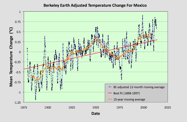
Fig. 93.2: Temperature trends for Mexico based on Berkeley Earth adjusted data. The average is for anomalies from all stations with over 480 months of data. The best fit linear trend line (in red) is for the period 1898-1997 and has a gradient of +0.52 ± 0.03°C/century.


The Berkeley Earth (BE) data presented in Fig. 93.2 was generated using the same averaging process as that used for the data in Fig. 93.1 but using BE adjusted anomaly data. Usually this leads to a large difference in the temperature rise calculated using the unadjusted raw data (Fig. 93.1) from that using the BE adjusted data (Fig. 93.2). I have shown numerous examples in this blog over the last two years for many different countries, states and regions where this is the case, and it is one of my main reasons for doing this blog: to highlight the extent to which much of the original temperature data has been adjusted. 

In this instance, however, the adjustments made by Berkeley Earth (and there are many in most station datasets) appear to make little difference to the final outcome for the overall temperature trend. And this is not because the averaging process I use is different from the Berkeley Earth method. It is. I do not use any homogenization, Kriging or weighted coefficients for the different datasets in the averaging. Yet the temperature trend I derive from the BE adjusted data and present in Fig. 93.2 is virtually identical to the one published by Berkeley Earth and shown in Fig. 93.3 below. So once again the averaging process is not the issue.


Fig. 93.3: The temperature trend for Mexico since 1830 according to Berkeley Earth.


This all seems to suggest that the overall temperature trend for Mexico is as I have calculated in Fig. 93.1, and that this is broadly consistent with the Berkeley Earth version. But if we look at the data more closely we see a complication.


Fig. 93.4: The number of station records included each month in the mean temperature anomaly (MTA) trend for Mexico in Fig. 93.1 (blue curve). These stations can be sorted into two distinct groups. Those with five digit Berkeley Earth ID codes are shown in red, those with six digit IDs are in green.


The data files on the Berkeley Earth website for the stations in Mexico broadly fall into two distinct categories: those with 5-digit IDs and those with 6-digit ones. The different numbers appear to reflect the fact that the original data in each case comes from a different source database, with the 5-digit data files more likely to originate from a single source, usually the Global Historical Climatology Network (GHCN) of NOAA, and the 6-digit data files from multiple databases. The number of each of the two file types used to determine the MTA trend in Fig. 93.1 is shown in Fig. 93.4 above. 

Now ordinarily this difference in file source is not an issue. The same differentiation in ID numbers is seen for stations from many countries. The problem here is that these two sets of data files give wildly different results for the MTA trend of Mexico. This can be seen when we examine the temperature trends for each station individually as the map in Fig. 93.5 below illustrates.


Fig. 93.5: The (approximate) locations of the weather stations in Mexico. Those stations with a high warming trend between 1901 and 2000 are marked in red while those with a cooling or stable trend are marked in blue. Those denoted with squares are stations with a 6-digit Berkeley Earth ID, while diamonds denote stations with a 5-digit ID.


In Fig. 93.5 the geographical location in Mexico of each of the 142 weather stations with the longest temperature records used to determine the mean trend in Fig. 93.1 are plotted. Those in red have significant warming trends while those in blue are generally stable (the total temperature rise is either less than 0.25°C, or the trend is less than twice the error in the trend). In addition, the stations with 5-digit IDs are denoted by a diamond while those with a 6-digit ID are represented by a square. What is noticeable is the different split between warming and stable trends in each case.

In the case of stations with 6-digit IDs 73% (32 out of 44) have a warming trend, whereas for the stations with 5-digit IDs it is only 38% (37 out of 98). This difference is even more apparent if we calculate the mean temperature anomaly (MTA) for each set of stations separately.


Fig. 93.6: The mean temperature change for Mexico relative to the 1961-1990 monthly averages calculated using stations with a 5-digit Berkeley Earth ID. The best fit is applied to the monthly mean data from 1921 to 2010 and has a positive gradient of +0.14 ± 0.07 °C per century.


The MTA data in Fig. 93.6 above shows the mean temperature change for Mexico calculated using only anomaly data from stations with a 5-digit Berkeley Earth ID. The trend in this case is almost completely flat. In contrast, if the same exercise is performed using only anomaly data from stations with a 6-digit Berkeley Earth ID the result is a strong warming trend of over 1°C per century as shown in Fig. 93.7 below.


Fig. 93.7: The mean temperature change for Mexico relative to the 1961-1990 monthly averages calculated using stations with a 6-digit Berkeley Earth ID. The best fit is applied to the monthly mean data from 1898 to 1997 and has a positive gradient of +1.13 ± 0.06 °C per century.


All this means that it is difficult to conclusively assert what the degree of climate change in Mexico has been over the last century. The most reasonable estimate is that the mean temperature has risen by about 0.6°C (see Fig. 93.1 and Fig. 93.2), but it could be anywhere between 1.2°C (see Fig. 93.7) and 0°C (see Fig. 93.6).


Acronyms

BE = Berkeley Earth.

MRT = monthly reference temperature (see Post 47).

MTA = mean temperature anomaly.

List of all stations and links to all the original raw temperature data


Monday, January 31, 2022

92. The Greenhouse Effect for real atmospheres

In my previous post I showed how Schwarzschild's equation for the absorption and emission of radiation by a gas could result in identical results to a model based purely on elastic scattering. The only conditions on the proof I presented were that the gas is only heated at one end, and that energy conservation applies within the gas; namely that the energy each layer of the gas emits by Planck radiation balances the total energy it absorbs from the two fluxes of upwelling and downwelling radiation, Iu(x) and Id(x) respectively. I then showed that this leads to a higher transmission through thick layers of greenhouse gas than would be expected based on the Beer-Lambert law.

In this post I will consider two other situations; one where the gas is heated equally at both ends of a long column, and the second where the gas is heated at the bottom and its concentration decreases exponentially with height. The first is analogous to the situation in Antarctica, while the second is a good approximation of how the Greenhouse Effect works on both Earth and Mars.


1) Heating a column of gas at both ends

In Post 91 I showed in Fig. 91.3 how the intensity of radiation travelling in the forward and reverse directions through a greenhouse gas changes with distance into the gas when the gas is heated at one end. In both cases the radiation flow decreases linearly with distance into the gas, with the difference in the forward and reverse fluxes remaining constant. This difference in fluxes decreases with gas concentration and the thickness of the gas layer as illustrated in Fig. 91.4. But suppose the layer of gas is instead heated equally at both ends? What will happen then?

Well the resulting energy flows can be deduced from Fig. 91.3 using a combination of reflection symmetry and superposition and are shown in Fig. 92.1 below.


Fig. 92.1: The relative intensities of transmitted and reflected radiation in a 500 m long column of air with 420 ppm CO2 that is heated equally from both ends. LT is radiation transmitted from left to right when the heating is at x = 0 m, and LR is the amount reflected. RT is radiation transmitted from right to left when the heating is at x = 500 m, and RR is the amount reflected.


In Fig. 92.1 the curve TL (blue curve) represents the radiation incident from the left at x = 0 m which is then partially reflected by the greenhouse gas to create a reflected flux RL (red curve) that propagates from right to left, building in strength as it propagates. This much is identical to the situation in Fig. 91.3 in the previous post. However, in the case of Fig. 92.1 an identical radiation flux RT also enters the column of gas from the right (green curve). This is also partially reflected by the greenhouse gas to create a reflected flux RR (violet curve) that propagates from left to right. The net result is that there are now two radiation fluxes travelling from left to right (TL and RR), and two travelling in the opposite direction (LR and RT). 

It can then be seen that the total radiation flowing from left to right will be the sum of LT and RR, which will be a constant value of 1.0 at all points along the gas column. The same is true for the total radiation flowing from right to left. In other words, the radiation that is emitted at the right hand exit of the column (x = 500 m) balances exactly the energy that entered initially at x = 0 m. Similarly the radiation that is emitted at the left hand exit of the column (x = 0 m) exactly balances the energy that initially entered at the right (at x = 500 m). This result leads to three important conclusions. 

The first is that in this situation the gas must be isothermal. This follows from the Schwarzschild's equation (see Eq. 91.6 in Post 91). As the total radiation flux in both directions is constant, it follows that the differentials of both Iu(x) and Id(x) must be zero and so the following equality must hold at all points x.

Iu(x) = Id(x) = B(λ,T)

(92.1)

As Iu(x) and Id(x) are both independent of x, then it follows that B(λ,T) must be as well. In which case the temperature T must be independent of x.

The second is that the radiation emitted at each end of the column in not just the radiation that entered at the opposite end. Some of it is radiation that has been reflected by the greenhouse gases via the Greenhouse Effect. This is an important point that is lost on many. It is often falsely claimed that because the gas is isothermal and the radiation flux exiting the gas balances that entering at the opposite end, then this must mean that the Greenhouse Effect is not in operation. Actually it is. It just appears not to be.

The third conclusion is that the Beer-Lambert law cannot be valid in this situation as it cannot explain this result. If the transmitted radiation fluxes LT and RT obeyed the Beer-Lambert law then they would both decay exponentially with distance into the gas, and so too would their reflected fluxes LR and RR. This would mean that the total flux in each direction at the centre of the gas column would be less than at the ends. The laws of thermodynamics cannot allow this to happen as it would lead to a permanent temperature decrease from each end towards the centre. Energy would flow into the centre only to disappear there in violation of the law of conservation of energy. So the Beer-Lambert law is a red herring in this instance.


2) The Greenhouse Effect for Earth's atmosphere

The Earth's atmosphere deviates from the examples I have discussed so far in one major respect: its density, n(x), decreases with height, x. This density change is more or less exponential over most of the lowest 80 km and is of the form 

n(x) = no e-kx

(92.2)

where k = 0.15 km-1. As the relative concentration of carbon dioxide (CO2)in the atmosphere is remarkably constant at about 420 ppm for all altitudes up to at least 80 km, it then follows that the CO2 density will also decay with altitude, x, in accordance with Eq. 92.2 as well with no = 0.018 mol/m3. As the atmosphere is mainly heated from the bottom by the Earth's surface this decrease in density with height will significantly effect the nature of the Greenhouse Effect.

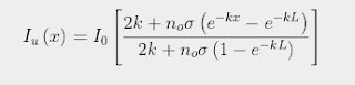
The strength of the Greenhouse Effect can be determined by substituting the expression for n(x) shown in Eq. 92.2 into Eq. 91.5 in Post 91. It is then possible to solve for Iu(x) subject to the constraint that the difference between Iu(x) and Id(x) remains constant for all values of x due to conservation of energy as I explained in Post 88. The result is that Iu(x) varies with x as

(92.3)

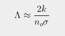
where σ is the absorption/emission cross-section of the CO2 molecules and L is the total height of the atmosphere. It then follows (by setting x = L in Eq. 92.3) that the total amount of radiation emitted at the top of the atmosphere into outer space will be ΛIo where the emitted fraction Λ is given by

 (92.4)

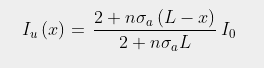
Subtracting ΛIo from Eq. 92.3 then gives the associated expression for the downwelling radiation

(92.5)

As the height of the atmosphere, L,  exceeds 80 km, and k is much smaller than noσ, it can then be seen that Eq. 92.4 will approximate as

(92.6)

This is virtually identical to the result shown in Eq. 91.10 in Post 91, but with L replaced by 1/k. This is not very surprising as the mathematics of integral calculus tells us that 1/k is the effective thickness of an atmosphere that gets exponentially thinner with increasing height. It also indicates that the amount of radiation that escapes at the top of the atmosphere will decrease inversely (i.e. reciprocally) with CO2 concentration and not exponentially as predicted by the Beer-Lambert law. This is shown graphically in Fig. 92.2 below where Iu(x) based on Eq. 92.3 at each altitude x is compared to the expected transmission based on the Beer-Lambert law. The difference is striking.


Fig. 92.2: A comparison of the amount of 15 µm IR radiation transmitted upwards at different heights in the atmosphere (blue curve) compared to that predicted by the Beer-Lambert law (red curve).


What Fig. 92.2 shows is that the amount of 15 µm radiation escaping at the top of the atmosphere is much greater than many people think. According to the Beer-Lambert law it should be so low as to be unmeasurable. In reality it could be as much as 1.5%. The blue curve in Fig. 92.2 does fall exponentially, but not to zero: it tends asymptotically to Λ. The value of Λ also depends on the nature of the atmosphere as Eq. 92.4 shows. However, its dependence on CO2 concentration is reciprocal not exponential. This is why more radiation escapes than many people intuitively think can do.


Summary

The examples outlined in this post show that the Greenhouse Effect is more complex than the simplistic model that is generally presented. Even thick layers of greenhouse gas will emit appreciable amounts of infra-red radiation from within their absorption bands. Relying on the Beer-Lambert law will result in at best an incomplete picture, and at worst a totally misleading one.

Yes, the amount of IR radiation transmitted by the Earth's atmosphere reduces exponentially with height, at least at lower altitudes, but this is not due to its absorbing properties associated with the Beer-Lambert law. It is due primarily to the exponential drop in CO2 concentration with height. Even then this exponential fall never tends to zero as Eq. 92.3 and Eq. 93.4 demonstrate, but instead tend to a finite transmission value Λ that could be as much as 1.5%.


Thursday, January 13, 2022

91. The Schwarzschild equation and scattering

In Post 86 I showed how the Greenhouse Effect can be viewed as resulting from a combined process of absorption of infra-red radiation by molecules of carbon dioxide (CO2), followed by re-emission of the same wavelength of radiation, but in a different random direction. The law that leads to this result is the principle of detailed balance. I also showed how this process resembled a scattering process, but with a much greater strength due to the significantly greater absorption cross-section (σa) of CO2 compared to its cross-section for Rayleigh scattering, σs. Therefore it could be modelled as a scattering process, but one with an appropriately large cross-section.

Then in Post 88 I showed how this combined process of absorption and re-emission resulted in absorption that decreased linearly with distance x into a gas of uniform density, rather than exponentially as predicted by the Beer-Lambert law. The importance of this result is that it demonstrates that the transmission of radiation through an absorbing gas will be greater than that predicted by the Beer-Lambert law, and so changes to the concentration of the absorbing gas will have a larger impact on the overall transmission than the Beer-Lambert law would predict. 

Sadly this result has been questioned by some who have claimed that the scattering (or combined absorption and re-emission) approach is not valid as it does not follow from, or agree with, Schwarzschild's equation. This equation is possibly named after the German physicist Karl Schwarzschild (shown below), although it could actually be named after his son Martin Schwarzschild who worked in the field of stellar evolution. In this post I will show that this claim of non-validity is not true and that Schwarzschild's equation leads to the exact same results as I outlined in Post 88.


 Fig. 91.1: Karl Schwarzschild (1873-1916)


The Model

In order to understand the Greenhouse Effect we need to consider the radiation flows through a thin layer of gas of thickness δx at some altitude x, and then extend this to model to the gas as a whole. In particular, we need to consider radiation flows through the gas from opposing directions. This is because each thin layer of the gas only absorbs a small fraction of radiation passing through it. Most of the rest is then absorbed by subsequent layers above the initial layer. However, after absorption the radiation is re-emitted and the re-emission process occurs equally in both directions (up and down). This means that some of this emitted radiation will travel in a downwards direction and reheat the first layer from the opposite direction. This is why the Beer-Lambert law fails.

In order to model this process we need to consider radiation fluxes in both directions as shown in Fig. 91.2 below. Let's assume that the gas has a concentration or particle density n(x), and each molecule of it has an absorption cross-section σa. If radiation of intensity Iu(x) travels in an upward direction from a hot surface and enters the gas layer from below, as shown in Fig. 91.2 below, a proportion of it will be absorbed by the gas. This in turn will heat the gas and cause it to emit radiation in both an upwards and a downwards direction. The result will be that the intensity of upward radiation leaving the gas layer will change by an amount δIu(x).


Fig. 91.2: A schematic illustration of how scattering, absorption and thermal emission within each thin layer of the atmosphere alters the intensities of the upwelling (Iu) and downwelling (Id) radiation.


The upwelling radiation will then go on to interact with gas above the layer shown in Fig. 91.2 and thus heat this gas as well. This gas will then re-emit radiation, some of it in a downward direction, and this downwelling radiation Id(x) will then also pass through our original layer of gas. It in turn will be partially absorbed, heating the gas and causing it to radiate. The net result is that the intensity of the downwelling radiation leaving the gas layer will also change, in this case by an amount δId(x). So far this model is identical to the one outlined in Post 88. The next step is to consider the changes of intensity, δIu(x) and δId(x), using Schwarzschild's equation and the Planck function, B(λ,T), where λ is the wavelength of the radiation and T is the temperature of the gas in kelvins at this height x. In the following discussion I will consider the absorption and re-emission of radiation at a fixed wavelength λ.


The Proof

As the upwelling radiation Iu(x) at a fixed wavelength λ passes through the thin layer of gas of thickness δx a small amount of it will be absorbed by the gas. This amount will be proportional to the number of molecules encountered per unit area, n(x)δx, their absorption cross-section, σa, and the amount of radiation in the original flux, Iu(x). The result is that the transmitted intensity will decrease by an amount equal to Iu(x)σan(x)δx.

At the same time the thin layer of gas will be emitting radiation in both the upward and downward direction due to its temperature T. This temperature will in turn vary with height x, so both B(λ,T) and Iu(x) will vary with x. The intensity emitted in each direction is given by the Planck function, B(λ,T), multiplied by the number of molecules per unit area in the layer, n(x)δx, and the emission cross-section, σe. The result of this emission process is that the transmitted intensity above the layer will increase by an amount equal to B(λ,T)σen(x)δx.

Combining these two effects of emission and absorption gives the total change in intensity of the upwelling radiation

δIu(x) = [B(λ,T)σe - Iu(x)σa]n(x)δx

(91.1)

This is Schwarzschild's equation. However, it is only half the solution because there is a similar equation that can be derived for the changes to the downwelling radiation Id(x) in the thin layer at the same wavelength λ. Thus the resulting equation will be

δId(x) = [B(λ,T)σe - Id(x)σa]n(x)δx

(91.2)

Finally, there is one other consideration we must take into account: energy conservation at wavelength λ. The total energy flowing into the layer of gas must match the energy flowing out. This means that 

δIu(x) + δId(x) = 0

(91.3)

and so

[ Iu(x) + Id(x) ]σa = 2B(λ,T)σe 

(91.4)

We can now eliminate B(λ,T)σe from Eq. 91.1 and Eq. 91.2 and turn both equations into first order differential equtions. However, because the change in downwelling radiation Id(x) in Fig. 91.2 is defined to be positive for changes of x in a negative direction the δx term must be negative, and therefore the differential term dId/dx = - δId/δx.This means that


 (91.5)

It then turns out that Eq. 91.5 is identical to Eq. 88.5 in Post 88. So if the equations are the same and the boundary conditions are the same, then the solutions must be the same as in Post 88. So even using Schwarzschild's equation as our starting point we end up with the same result. 

Finally, we can write Schwarzschild's equation as two differential equations, one for Iu(x) and one for Id(x). From Eq. 91.1 we get the obvious result

(91.6)

The equivalent equation for Id(x) is similar, but requires some explanation.

(91.7)

In Eq. 91.7 the order of the I(x)σa and B(λ,T)σe terms to the right of the equality sign have been reversed compared to Eq. 91.6. This is because the downwelling radiation, Id(x), is flowing in the negative direction through the thin gas layer. So for Iu(x) the radiation term B(λ,T)σe is directed in the same direction as Iu(x) so it must be positive, while the absorption in the gas layer must leads to a lower value of Iu(x) above the layer than below. In the case of Id(x) the reverse it true in both cases, hence the reversal of sign for both terms.

Finally, it should be noted that conditions of thermal equilibrium generally require the cross-sections σa and σe to be equal. This is particularly true for black body radiation where a black body at constant temperature must emit what it absorbs, otherwise it will gain or lose energy, and thus not be at constant temperature.


Implications

If we now apply the above results to a real system and consider the case of a column of gas of thickness L, and uniform density n that is independent of x, the model outlined above means that the upwelling radiation will vary with x through the gas as (see Post 88)

(91.8)

where Io is the intensity of radiation entering the gas at x = 0, while the downwelling radiation will vary as

(91.9)

The difference between Iu(x) and Id(x) will be constant (ΛIo), as required by energy conservation, and will be equal to the amount transmitted at the end of the column (i.e. at x = L), so 

(91.10)

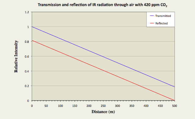
In Fig. 91.3 below I have suggested what Iu(x) and Id(x) might look like through a 500 metre long horizontal column of air with 420 ppm of CO2 when it is irradiated with 15 µm infra-red radiation from one end. It should be noted, though, that this theoretical data is based on an estimated value for the scattering cross-section of the CO2 molecules that could be almost a factor of ten too small. Nevertheless, it still illustrates qualitatively how the transmission of 15µm infra-red radiation changes through the gas, and also how the Greenhouse Effect (as defined by the relative intensity of the reflected radiation at x = 0) is related to this transmission (see the red curve in Fig. 91.3).


Fig. 91.3: The relative intensities of transmitted (Iu) and reflected (Id) radiation along a 500 metre column of air containing 420 ppm of CO2 with an absorption cross-section of 1.6 x 10⁻²⁴ m2.


The graph in Fig. 91.3 suggests that a 500 metre column of air will transmit less than 18% of the incident radiation and reflect back the rest. The question is: is this more or less than that predicted by the Beer-Lambert law? The answer to this can be seen in Fig. 91.4 below.


Fig. 91.4: The relative intensities of radiation transmitted  through a column of air of length L containing 420 ppm of CO2 with an absorption cross-section of 1.6 x 10⁻²⁴ m2 based on two different models: (i) a backscattering model described by Eq. 91.10 (blue curve), and (ii) the Beer-Lambert law (red curve).


The blue curve in Fig. 91.4 demonstrates how the transmission through a column of air would decrease with the length of the column, L, if half of the absorbed radiation is backscattered or re-emitted in the reverse direction and half is re-emitted in the forward direction. The result is a curve that decays with L in accordance with Eq. 91.10. The red curve on the other hand shows how the transmission would change if it followed the (commonly accepted) Beer-Lambert law where the transmitted intensity varies with L as

(91.11)

What is clear is that the Beer-Lambert law underestimates the transmission for large values of L, and in effect predicts that there is no significant transmission beyond 400 metres. The blue curve shows that this is not the case with over 10% transmission for a column of length 1000 metres. In practice this means that the Beer-Lambert law will massively underestimate the impact of future increases in CO2 levels because it will assume that the backscattering is already operating at close to 100% or saturation with 420 ppm of CO2. Yet clearly it is not. In fact even at 10 km (the effective thickness of Earth's atmosphere) there is still more than 1% transmission. While this is small, it is not insignificant, particularly when considering the relatively small changes to the overall size of the Greenhouse Effect that are needed to create a warming of 1.5°C.


Caveats

The only condition I have applied to the proof and discussion described here is that set out in Eq. 91.4, which basically demands that each layer of the gas radiates the same amount of energy at each wavelength as it absorbs from the two fluxes, Iu(x) and Id(x). This will be true provided all the heat of wavelength λ entering the gas originates from the Earth's surface at the bottom of Fig. 91.2, or at the very top of the atmosphere. In which case, the exact functional forms of Iu(x) and Id(x) will depend only on the functional form of n(x) and the boundary conditions. However, at the top of the atmosphere this condition will not be satisfied as some of the incoming ultraviolet radiation from the Sun is absorbed there before it reaches the ground and so gets converted to infra-red radiation within the upper atmosphere. This means that Eq. 91.4 is no longer satisfied for each and every infra-red wavelength of interest within the gas.

In my next blog post I will consider a number of distinct and important examples to demonstrate how dependent the transmission is on the density profile of the gas, n(x), and also on the location of the heat source(s). These examples will also show that even when it sometimes looks like there is no Greenhouse Effect in operation, it is still there.