Friday, July 23, 2021

74. Bangladesh - temperature trends WARMING 0.3°C

Despite being surrounded by India on threes sides, Bangladesh has a slightly different temperature trend to its larger neighbour. This may be because of a reduction in reliable data after 1999 where, in the case of India, the temperature rises abruptly by about 0.6°C; in the case of Bangladesh it does not. Between 1930 and 1990 where Bangladesh has the majority of its temperature data, the agreement with India is actually quite good.


Fig. 74.1: The (approximate) locations of the long and medium temperature records in Bangladesh. Those stations with a high warming trend between 1921 and 2010 are marked in red while those with cooling or stable trends are marked in blue. Those denoted with squares are long stations with over 1200 months of data.


Overall there are 17 temperature records for Bangladesh that have over 480 months of data (for full list see here). Of these three are long stations with over 1200 months of data, while the remainder are medium stations. In fact all the medium stations have at least 600 months of data. The locations of these stations are shown in Fig. 74.1 above. Their geographical spread is fairly even, which suggests that any simple average of their temperature anomalies should yield a fairly accurate approximation to the true mean temperature anomaly for the region. It can also be seen that over half of the stations have stable or cooling trends for the 90 years up to the end of 2010. 

Just as for my previous regional analyses, the monthly temperature anomalies for each station were calculated by subtracting the monthly reference temperature (MRT) for the relevant month from the unadjusted mean temperature for that month. These anomalies from the various long and medium records were then averaged to determine the mean temperature trend for the region. The resulting mean monthly temperature anomaly is shown in Fig. 74.2 below.


Fig. 74.2: The temperature trend for Bangladesh based on an average of anomalies from all long and medium stations. The best fit is applied to the monthly mean data from 1921 to 2010 and has a positive gradient of +0.27 ± 0.08 °C per century. The monthly temperature changes are defined relative to the 1931-1960 monthly averages.


The MRTs are different and specific to each station, but were always calculated using data from the same time period (in this case 1931-1960) for each station using the method described previously in Post 47. This ensures that the baseline reference temperature for each station is consistent so that all temperature changes over time are measured relative to the same point in time. However, no choice of 30-year MRT interval would have enabled all 17 station records to be included in the mean temperature in Fig. 74.2. This is because one station Berhampore (Berkeley Earth ID: 5388) has no data after 1957, while two stations, Dacca Tejgaon (Berkeley Earth ID: 152645) and Sylhet (Berkeley Earth ID: 152652), have virtually no data before 1956. An MRT interval of 1931-1960 allowed Berhampore to be included, thus increasing the number of stations with data before 1930 from three to four (see Fig. 74.3 below).I decided this was more beneficial in terms of overall data quality than having an extra two sets of station data after 1957.


Fig. 74.3: The number of station records included each month in the mean temperature trend for Bangladesh in Fig. 74.2.


The mean temperature trend for Bangladesh shown in Fig. 74.2 exhibits a slight warming of about 0.25°C after 1920. Yet the official Berkeley Earth trend suggests the warming is much greater, being almost 1°C after 1920 and nearly 1.5°C since 1830 (see Fig. 74.4 below). This is despite the fact that there is no real temperature data before 1875. So which data trend is correct?


Fig. 74.4: The temperature trend for Bangladesh since 1800 according to Berkeley Earth.


Well, if we average the Berkeley Earth adjusted data from all 15 stations used in this analysis (the adjusted data is listed on the Berkeley Earth site along with the raw data) we obtain trends that are very similar to those in Fig. 74.4 as the data in Fig. 74.5 below shows. This demonstrates two points. Firstly, it provides strong evidence that the averaging method we use to combine anomalies from the different stations is sufficiently accurate to avoid the need to use gridding and homogenization techniques. If this were not true then the data in Fig. 74.4 and Fig. 74.5 would not agree so well, but the uniform geographical distribution of stations across Bangladesh clearly facilitates this. But secondly, it shows that most of the warming presented in Fig. 74.4 comes from adjustments made to the data, and not from the raw data itself, otherwise the data in Fig. 74.5 would agree with the data in Fig. 74.2.


Fig. 74.5: Temperature trends for Bangladesh based on the average of anomalies for all long and medium stations using Berkeley Earth adjusted data. The best fit linear trend line (in red) is for the period 1921-2010 and has a gradient of +0.74 ± 0.03°C/century.


Finally, comparing the adjusted data in Fig. 74.5 with the unadjusted data in Fig. 74.2 allows us to quantify the contribution made to the trends in Fig. 74.4 by the Berkeley Earth data adjustments. These net adjustments are shown below in Fig. 74.6.


Fig. 74.6: The contribution of Berkeley Earth (BE) adjustments to the anomaly data in Fig. 74.5 after smoothing with a 12-month moving average. The blue curve represents the total BE adjustments including those from homogenization. The linear best fit (red line) to these adjustments for the period 1921-2010 has a positive gradient of +0.431 ± 0.014 °C per century. The orange curve shows the contribution just from breakpoint adjustments.


The data in Fig. 74.6 indicate that the adjustments made to the data by Berkeley Earth add at least 0.4°C of warming to the overall temperature trend after 1930. This explains why Fig. 74.4 and Fig. 74.2 appear so different.


Summary

It is clear from the temperature trend calculated using the raw data (see Fig. 74.2) that there has been no significant climate change in Bangladesh over the last 80 years. The long term temperature rise of 0.24°C is much less than the observed natural variation in the mean temperature.

The small temperature rise of 0.24°C since 1920 could be due to increased greenhouse gas emissions globally. Carbon dioxide levels in the atmosphere have increased from 307 ppm in 1930 to nearly 420 ppm today. But this temperature rise is much less than what mainstream climate science claims should be the case for this magnitude of change in CO2.


Addendum

The regional average in Fig. 74.2 was calculated using 15 of the 17 possible sets of station data because of the choice of MRT interval. The stations at Dacca Tejgaon (Berkeley Earth ID: 152645) and Sylhet (Berkeley Earth ID: 152652) were excluded so that the station with much earlier data at Berhampore (Berkeley Earth ID: 5388) could be included. If the MRT interval is instead chosen to be 1951-1980 the reverse occurs with only Berhampore being excluded. The resulting mean temperature trend is shown below in Fig. 74.7. It has a slightly higher warming trend, but is otherwise very similar to Fig. 74.2.


Fig. 74.7: The temperature trend for Bangladesh based on an average of anomalies from all long and medium stations. The best fit is applied to the monthly mean data from 1921 to 2010 and has a positive gradient of +0.31 ± 0.08 °C per century. The monthly temperature changes are defined relative to the 1951-1980 monthly averages.


Monday, July 12, 2021

73. Sri Lanka - temperature trends STABLE before 1975

The striking thing about the temperature data for Sri Lanka is the lack of medium length weather station records (i.e. those with over 480 months of data). It only has two. Yet the country has ten long weather station records with over 1200 months of data, which considering its area is fifty times less than that of India, means it has over twelve times as many long stations per square kilometre as does India. Even if we combine the number of long and medium stations, Sri Lanka still has six times as many per square kilometre as India. Unfortunately, with only twelve temperature records in total (for a full list see here), any average temperature trend derived from them could potentially be less accurate than that calculated for India in the previous post, despite the higher station density. This is because, as I pointed out in a previous post, in order for regression towards the mean to be able to eradicate random data errors that are present in all temperature series, it appears that there needs to be at least twenty datasets in the average. That said, the temperature trend for Sri Lanka is still informative, not least because of its similarities to those of India and Pakistan.


Fig. 73.1: The (approximate) locations of the long and medium temperature records in Sri Lanka. Those stations with a high warming trend between 1876 and 1975 are marked in red while those with cooling or stable trends are marked in blue. Those denoted with squares are long stations with over 1200 months of data.


The locations of the long and medium stations in Sri Lanka are shown in Fig. 73.1 above. Their geographical spread is fairly even, although most are on the coast. Nevertheless, this suggests any simple average of their temperature anomalies should yield a fairly accurate approximation to the true mean temperature anomaly for the region. It can also be seen that the vast majority of stations have stable or cooling trends for the 100 years up to 1975.

Just as for previous regional analyses, the monthly temperature anomalies for each station were calculated by subtracting the monthly reference temperature (MRT) for the relevant month from the unadjusted mean temperature for that month. The MRTs are different and specific to each station, but were always calculated using data from the same time period (in this case 1951-1980) for each station using the method described previously in Post 47. This ensures that the baseline reference temperature for each station is consistent so that all temperature changes over time are measured relative to the same point in time.


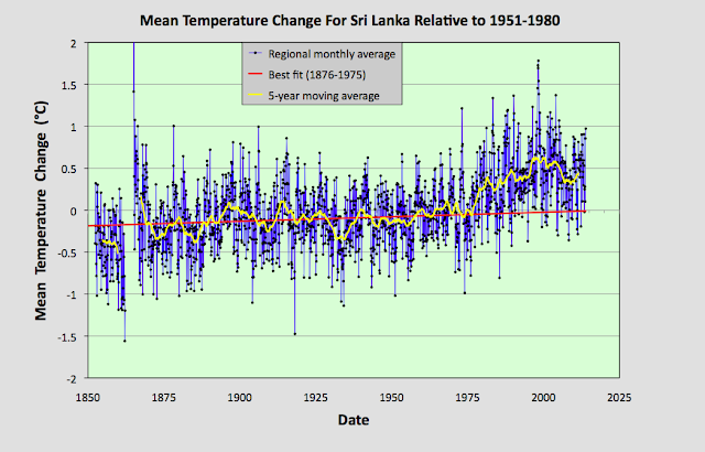
Fig. 73.2: The temperature trend for Sri Lanka based on an average of anomalies from all long and medium stations. The best fit is applied to the monthly mean data from 1876 to 1975 and has a positive gradient of +0.11 ± 0.03 °C per century. The monthly temperature changes are defined relative to the 1951-1980 monthly averages.


If we calculate the monthly temperature anomalies for the twelve stations in Fig. 73.1 and then average them, the resulting times series exhibits a trend that is slightly warming, as shown in Fig. 72.2 above. However, this warming occurs in two distinct phases. Before 1975 the warming is negligible with temperatures rising barely more than 0.1°C in over a century. This is much less than the natural variation in the 5-year average temperature. Then, after 1975, the temperature appears to jump abruptly by about 0.4°C. Similar jumps have been seen in the trends for South Africa, Botswana, Europe, India and Pakistan

I have yet to determine what is causing these jumps. Are they natural or are they man-made? Are they the result of climate changes, economic changes, or changes to data collection methods? In the case of Sri Lanka, one possible cause is the civil war that raged from 1983 to 2009. This may be why there is a large dip between 1980 and 2010 in the station frequency plot in Fig. 73.3 below. And as so many of the station records are consequently discontinuous between 1983 to 2009, this may have led to bad data being generated after 1983 from station moves and equipment changes. That, though, is pure speculation.


Fig. 73.3: The number of station records included each month in the mean temperature trend for Sri Lanka in Fig. 73.2.


Of course the general temperature stability seen in Fig. 73.2 before 1975, and the temperature jump that occurs after 1975, are not what is claimed by climate scientists. Below in Fig. 73.4 is the trend for Sri Lanka according to Berkeley Earth which shows a more or less continuous warming trend since 1830 of about 1.5°C in total. Clearly this is at odds with the trend based on the raw data in Fig. 73.2, and the reasons for the differences are the same as they were for Pakistan. They are mainly due to the adjustments made to the original raw data by Berkeley Earth through the use of breakpoints and homogenization.


Fig. 73.4: The temperature trend for Sri Lanka since 1800 according to Berkeley Earth.


The temperature anomalies used to calculate the trend in Fig. 73.2 were determined using the raw data from each station, using the method that I have used throughout this blog. However, if we average the anomaly data for the same twelve long and medium stations using not the original raw data, but the adjusted data that Berkeley Earth create from the raw data (both adjusted and unadjusted data sets are listed in the data files on their website), the result is the temperature time series shown below in Fig. 73.5. These trends are very similar to the official Berkeley Earth trends shown in Fig. 73.4 above. This once again suggests that gridding and homogenization may be unnecessary steps in creating regional trends. Simple averages of all station times series appear to work just as well in most cases, particularly if the stations are fairly evenly spread.


Fig. 73.5: Temperature trends for Sri Lanka based on the average of anomalies for all long and medium stations using Berkeley Earth adjusted data. The best fit linear trend line (in red) is for the period 1876-1975 and has a gradient of +0.28 ± 0.02°C/century.


The difference between the Berkeley Earth temperature trend in Fig. 73.5 that is based on adjusted data, and the trend derived solely from raw data can be calculated by subtraction. The result is shown is shown in Fig. 73.6 below (blue curve). Also shown are the breakpoint adjustments (orange curve) that are added to the data by Berkeley Earth. It can be seen that most of the difference between the data in Fig. 73.5 and that in Fig. 73.2 is due to the breakpoint adjustments in this case. In fact they add over 0.5°C of warming between 1890 and 2010. This explains why the official Berkeley Earth trends in Fig. 73.4 are so different from the trends that result from the actual raw data in Fig. 73.2.


Fig. 73.6: The contribution of Berkeley Earth (BE) adjustments to the anomaly data in Fig. 73.5 after smoothing with a 12-month moving average. The blue curve represents the total BE adjustments including those from homogenization. The linear best fit (red line) to these adjustments for the period 1876-1975 has a positive gradient of +0.171 ± 0.007 °C per century. The orange curve shows the contribution just from breakpoint adjustments.


Finally, a word of caution. It is also clear that the data in Fig. 73.2 before 1875 is much less reliable as an indicator of the true mean temperature in the region due to insufficicient stations in the average. If we ignore that data, then the trend for Sri Lanka will be as shown in Fig. 73.7 below.


Fig. 73.7: A rescaled plot of the data in Fig. 73.2. The best fit is applied to the monthly mean data from 1876 to 1975 and has a positive gradient of +0.11 ± 0.03 °C per century. The monthly temperature changes are defined relative to the 1951-1980 monthly averages.


Summary

It is clear from the raw data that there was no climate change in Sri Lanka before 1975. Temperatures were actually stable for over 100 years prior to 1975 (see Fig. 73.7), just as in India.

Since 1975 there has been a modest temperature rise of about 0.4°C (see Fig. 73.7), but this is a long way short of the almost 1.5°C claimed by Berkeley Earth (see Fig. 73.4) or the similar value currently being touted by climate science for the mean temperature change for the entire Northern Hemisphere.

The temperature rise of 0.4°C since 1975 could be due to increased greenhouse gas emissions. Carbon dioxide levels in the atmosphere have increased from 330 ppm in 1975 to nearly 420 ppm now. But there could be other reasons, such as the impact of the civil war.


Friday, July 9, 2021

72. Pakistan - temperature trends COOLING before 1997

There are 34 temperature records for Pakistan which have more than 480 months of data (see here for a complete list), of which five are long station records with over 1200 months of data. This means that its overall station density (stations per square kilometre) is about 30% higher than that of India, but it has less than half the density of long stations.


Fig. 72.1: The (approximate) locations of the long and medium temperature records in Pakistan. Those stations with a high warming trend between 1938 and 1997 are marked in red while those with cooling or stable trends are marked in blue. Those denoted with squares are long stations with over 1200 months of data.


The locations of the 34 long and medium stations are shown in Fig. 72.1 above. Their geographical spread is fairly even which suggests any simple average of their temperature anomalies should yield a fairly accurate approximation to the true mean temperature anomaly for the region. It can also be seen that the vast majority of stations (27) have stable or cooling trends for the 60 years up to 1997. 

The monthly temperature anomalies for each station were calculated by subtracting the monthly reference temperature (MRT) for the relevant month from the unadjusted mean temperature for that month. The MRTs are different and specific to each station, but were always calculated using data from the same time period of 1951-1980 for each station using the method described previously in Post 47. This ensures that the baseline reference temperature for each station is consistent so that all temperature changes over time are measured relative to the same point in time.


Fig. 72.2: The temperature trend for Pakistan based on an average of anomalies from all long and medium stations. The best fit is applied to the monthly mean data from 1938 to 1997 and has a negative gradient of -0.12 ± 0.21 °C per century. The monthly temperature changes are defined relative to the 1951-1980 monthly averages.


If we calculate the monthly temperature anomalies for the 34 stations in Fig. 72.1 and average them, the resulting times series exhibits a trend that is slightly warming, as shown in Fig. 72.2 above. However, all this warming occurs either before 1938 or after 1997. Between 1938 and 1997 the climate actually cools, and as Fig. 72.3 below indicates, the data for this time interval is probably more reliable as it is based on good data from a larger number of stations (between 20 and 34). The trend before 1931 is based on at most data from seven stations, most of which are located near major cities. On the other hand, significant data after 1990 comes from stations with large gaps in their temperature records between 1980 and 2000. 

The overall picture from the data in Fig. 72.2 is that, for most of the 20th century, the climate in Pakistan was stable or cooling. Any warming before 1930 was probably restricted to the large cities and was not indicative of the overall climate of the region. The only significant warming to have occurred in Pakistan in the last 150 years has occurred after 1997 and amounts to 0.65°C in total at most. Even then, its reliability is questionable due to the large gaps in much of the data that precede the temperature rise. This is why there is a large dip between 1975 and 2000 in the station frequency plot in Fig. 72.3 below.


Fig. 72.3: The number of station records included each month in the mean temperature trend for Pakistan in Fig. 72.2.


Of course this general temperature stability and moderate temperature rise after 1999 is not what is claimed by climate scientists. Below in Fig. 72.4 is the trend for Pakistan according to Berkeley Earth which shows a warming of at least 1.5°C since 1930. Clearly this is at odds with the trend based on the raw data in Fig. 72.2, and the reasons for the differences are not hard to find, or are unique to Pakistan. Similar differences have been highlighted in many of my previous posts. They are mainly due to the adjustments made to the original raw data by Berkeley Earth through the use of breakpoints and homogenization.


Fig. 72.4: The temperature trend for Pakistan since 1800 according to Berkeley Earth.


The temperature anomalies used to calculate the trend in Fig. 72.2 were determined using the raw data from each station. However, if we average the anomaly data for the 34 long and medium stations using not the original raw data, but the adjusted data that Berkeley Earth create from the raw data (both adjusted and unadjusted data sets are listed in the data files on their website), the result is the temperature time series shown below in Fig. 72.5. These trends are very similar to the official Berkeley Earth trends shown in Fig. 72.4 above.


Fig. 72.5: Temperature trends for Pakistan based on the average of anomalies for all long and medium stations using Berkeley Earth adjusted data. The best fit linear trend line (in red) is for the period 1891-2010 and has a gradient of +0.91 ± 0.03°C/century.


The difference between the Berkeley Earth temperature trend in Fig. 72.5 that is based on adjusted data, and the trend derived solely from raw data shown in Fig. 72.2, is shown in Fig. 72.6 below. As Fig. 72.6 shows, the breakpoint adjustments added to the data by Berkeley Earth add over 0.5°C of warming between 1975 and 2005. This explains why the official Berkeley Earth trends in Fig. 72.4 are so different from the trends that result from the actual raw data in Fig. 72.2.


Fig. 72.6: The contribution of Berkeley Earth (BE) adjustments to the anomaly data in Fig. 72.5 after smoothing with a 12-month moving average. The blue curve represents the total BE adjustments including those from homogenization. The linear best fit (red line) to these adjustments for the period 1881-2010 has a positive gradient of +0.304 ± 0.009 °C per century. The orange curve shows the contribution just from breakpoint adjustments.


Finally, if we compare the data for Pakistan in Fig. 72.2 with the equivalent data for India (see Fig. 71.6 in Post 71) we see that there are both significant differences and similarities between the two temperature trends. The overall temperature changes from 1930 onwards are broadly the same (an increase of about 0.5°C), and many of the peaks in the two different 5-year moving averages coincide (see Fig. 72.7 below). But the overall level of agreement is much less than we have seen for trends for different countries in central Europe (see Post 57) and for different subsets of data for the USA (see Post 67). 

The reason for this is that the stations for India and Pakistan are over 1000 km apart on average. This means that India and Pakistan are much less likely to share a common climate than Austria and Germany are (where the stations are less than about 200 km apart on average). As I showed in Post 11, the spatial separation of weather stations is an important factor in determining the degree of correlation between them in their temperature signals.


Fig. 72.7: A comparison of the 5-year moving average temperature trends for India (blue) and Pakistan (red).


Summary

The mean temperature time series for Pakistan has three distinct epochs, each with a different trend (see Fig. 72.2).

Before 1938 there is some moderate warming of about 0.5°C, but this part of the mean temperature time series is based on only seven temperature records (see Fig. 72.3), most of which are located near major cities.

Between 1938 and 1997 the climate is fairly stable with a slight cooling trend. The data for this epoch is likely to be the most reliable as it is derived using data from between 19 and 34 different station records. This epoch also corresponds to a period when carbon dioxide levels in the atmosphere increased by 18% from 310 ppm to 365 ppm, yet apparently this had no impact on the local climate.

Finally, just after 1997 there appears to be an abrupt increase in temperature of about 0.65°C, which appears inexplicable. This period also coincides with a rapid increase in the number of active stations in the region (see Fig. 72.3), many of which have large gaps in their records in the 1980s and 1990s. So, the reliability of data for this epoch is questionable as well.

The adjusted data created by Berkeley Earth claims the temperature rise since 1900 to be over 1.5°C (see Fig. 72.5), of which over 0.5°C is the result of breakpoint adjustments added after 1995 (see Fig. 72.6).


Conclusions

There was no climate change due to carbon dioxide emissions in Pakistan before 1997.

The sudden temperature rise after 1997 could be the result of global warming, local climate instability, or it could be the result of other factors such as increased energy usage, or maybe even systemic changes to the data collection process. Whatever the cause, what is clear is that the temperature rise is much more modest than climate science would like us to believe.


Tuesday, July 6, 2021

71. India - temperature trends STABLE before 1975

India has some of the longest temperature records in southern Asia. The longest of these is for Chennai (Berkeley Earth ID: 155503) and dates back to 1796, although the data is only continuous from 1875. Overall, there are 40 long stations with over 1200 months of data, and another 59 medium stations with over 480 months of data (see here for a complete list). Unfortunately what complicates the analysis of temperature data for this region is an unusual split in the distribution of the station time series.

Generally when we look at temperature data for a specific region we find that there are more stations after 1970 than before, and that the number of stations decreases the further you go back in time. For India the picture is slightly different. The largest number of long and medium stations were in the 1970s, but decreased slightly up to 2010. But there are also about a dozen long or medium stations with no data after 1957 as well as over thirty with no data before 1970. This means that no single choice for the 30-year period used to define the monthly reference temperatures (MRTs) can enable all the available stations to be incorporated into a single temperature trend for the region. For this reason I have used two different time intervals to determine the MRTs and calculated a separate trend for each. Then I have amalgamated the two trends into a single trend (see Fig. 71.6).


Fig. 71.1: The (approximate) locations of the long and medium temperature records in India. Those stations with a high warming trend are marked in red while those with cooling or stable trends are marked in blue. Those denoted with squares are long stations with over 1200 months of data.


Overall, 98 station temperature records met the twin requirement of having over 480 months of data and also having at least 12 years of data within the two MRT intervals (for an explanation of how the MRTs are calculated see Post 47). The geographical distribution of these stations is shown in Fig. 71.1 above. This clearly shows a very even spread of stations across the country, which effectively negates any need for the use of homogenization or gridding in order to determine the mean temperature trend for the whole country.

It is also apparent from the colours of the station markers in Fig. 71.1 that there is no uniform temperature trend across the country. Indeed there are more stations with stable or cooling trends (for the period 1876-1985) than there are stations with warming trends. A warming trend is defined as being one where the total temperature change over the length of the station time series exceeds 0.25°C and the trend gradient is more than twice the uncertainty in that gradient.


Fig. 71.2: The temperature trend for India based on an average of anomalies from all long and medium stations. The best fit is applied to the monthly mean data from 1876 to 1985 and has a positive gradient of +0.11 ± 0.05 °C per century. The monthly temperature changes are defined relative to the 1921-1950 monthly averages.


In order to maximize the number of stations in the trend before 1950 a 30-year MRT interval of 1921-1950 was selected. The anomalies of all the monthly data in each qualifying temperature record were calculated relative to the monthly averages for this interval, and then the anomaly time series were averaged. The resulting trend is shown in Fig. 71.2 above. This indicates that there was virtually no warming in India before 1985, with a small rise of about 0.6°C happening thereafter. The trend before 1875 is probably unreliable as it is based on insufficient data as indicated in Fig. 71.3 below.


Fig. 71.3: The number of station records included each month in the mean temperature trend for India in Fig. 71.2.


However, the trend after 1970 does not include all the available data, and so is also potentially less accurate for the years after 1970 than it could be. As Fig. 71.3 above shows, less than 40 stations were included in the mean trend after 1975 yet over 70 were available. Including those missing stations changes the trend after 1975, although not by a huge amount, as Fig. 71.4 below shows.


Fig. 71.4: The temperature trend for India based on an average of anomalies from all long and medium stations. The best fit is applied to the monthly mean data from 1876 to 1985 and has a positive gradient of +0.12 ± 0.05 °C per century. The monthly temperature changes are defined relative to the 1981-2010 monthly averages.


In order to incorporate all the stations with data that is mainly after 1970 it is necessary to change the MRT interval to a later period. Choosing 1981-2010 for this period results in a slightly different trend as Fig. 71.4 above illustrates. While the trend before 1985 is very similar to that in Fig. 71.2, afterwards the temperature rise is less pronounced. This change in outcome is a consequence of having more data for this later period (but less for the period before 1960) as Fig. 71.5 below shows.


Fig. 71.5: The number of station records included each month in the mean temperature trend for India in Fig. 71.4.


Ideally we would like to combine the two sets of data shown above into a single trend that utilizes all the available sets of station data. There are several ways to do this, but the simplest is to splice the data before 1957 in Fig. 71.2 to the data after 1957 in Fig. 71.4. The rationale for this is that Fig. 72.2 is more accurate in determining the trend before 1957 because it incorporates more stations into the average than does the trend in Fig. 71.4. For data after 1957 the reverse is true.


Fig. 71.6: The temperature trend for India created by combining the trend in Fig. 71.2 before 1957 and the trend in Fig. 71.4 after 1957. The best fit is applied to the monthly mean data from 1876 to 1975 and has a positive gradient of +0.09 ± 0.06 °C per century. The monthly temperature changes are defined relative to the 1957-1972 monthly averages.


The result of this splicing is the trend shown in Fig. 71.6 above. It clearly exhibits little significant warming from 1876 to 1976. Any slope in the trend is comparable to the uncertainty in its value, and is also much less than the natural fluctuations in the 5-year averaged data. After 1975 the mean temperature rises by about 0.6°C over the next 37 years. Overall it should be noted that the total temperature rise of about 0.5-0.7°C since 1900 is much less than the 1.5°C that is generally claimed by climate science for global warming. 

It should be noted that in order to combine the two trends into one it is necessary to offset one or both in order to avoid a discontinuity at the junction. This is achieved by comparing the mean values for each trend in Fig. 71.2 and Fig. 71.4 over the same time interval. In this case the interval chosen was from 1957 to 1972, with the data from Fig. 71.2 then being adjusted downwards by 0.0276°C and the data from Fig. 71.4 being adjusted upwards by 0.3778°C. 


Fig. 71.7: The temperature trend for India since 1800 according to Berkeley Earth.


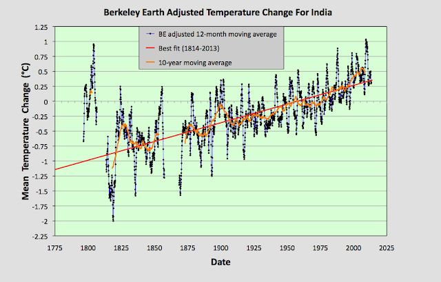
The results shown in Fig. 71.6 clearly differ from the global temperature trend since 1900 as advanced by most mainstream climate science. They also disagree with the trend for India published by Berkeley Earth using adjusted data and shown above in Fig. 71.7. This adjusted data appears to suggest that the climate in India has warmed by 1.5°C since the early 1800s. So which data trend is correct?

Well, if we average the Berkeley Earth adjusted data from all 98 stations used in this analysis (the adjusted data is listed on the Berkeley Earth site along with the raw data) we obtain trends that are very similar to those in Fig. 71.7 as the data in Fig. 71.8 below shows. This demonstrates two points. Firstly, it provides strong evidence that the averaging method we use to combine anomalies from the different stations is sufficiently accurate to avoid the need to use gridding and homogenization techniques. If this were not true then the data in Fig. 71.7 and Fig. 71.8 would not agree so well, but the uniform geographical distribution of stations across India facilitates this. But secondly, it shows that most of the warming presented in Fig. 71.7 comes from adjustments made to the data, and not from the raw data itself, otherwise the data in Fig. 71.7 would agree with the data in Fig. 71.6.


Fig. 71.8: Temperature trends for India based on the average of anomalies for all long and medium stations using Berkeley Earth adjusted data. The best fit linear trend line (in red) is for the period 1814-2013 and has a gradient of +0.63 ± 0.01°C/century.


Finally, comparing the adjusted data in Fig. 71.8 with the unadjusted data in Fig. 71.6 allows us to quantify the contribution made to the trends in Fig. 71.8 by the Berkeley Earth data adjustments. These net adjustments are shown below in Fig. 71.9.


Fig. 71.9: The contribution of Berkeley Earth (BE) adjustments to the anomaly data in Fig. 71.8 after smoothing with a 12-month moving average. The blue curve represents the total BE adjustments including those from homogenization. The linear best fit (red line) to these adjustments for the period 1931-2010 has a positive gradient of +0.244 ± 0.004 °C per century. The orange curve shows the contribution just from breakpoint adjustments.


The data in Fig. 71.9 indicate that the adjustments made to the data by Berkeley Earth add at least 0.5°C of warming to the overall temperature trend between 1870 and 2010, with some additional warming being added via adjustments to the data between 1820 and 1860. This explains why Fig. 71.7 and Fig. 71.6 appear so different. Yet it is Fig. 71.6 that, in my opinion, is the most reliable of the two plots simply because the statistical methods employed to create it are less complicated and the temperature data used is free from adjustments. It is also clear, though, that the data in Fig. 71.6 before 1875 is much less reliable as an indicator of the true mean temperature in the region due to insufficicient stations in the average. If we ignore that data the trend for India will be as shown in Fig. 71.10 below.


Fig. 71.10: A rescaled version of Fig. 71.6. The best fit is applied to the monthly mean data from 1876 to 1975 and has a positive gradient of +0.09 ± 0.06 °C per century. The monthly temperature changes are defined relative to the 1957-1972 monthly averages.


Conclusions

It is clear that there was no climate change in India before 1975. Temperatures were actually stable for over 100 years prior to 1975 (see Fig. 71.10).

Since 1975 there has been a modest temperature rise of about 0.5°C (see Fig. 71.10), but this is a long way short of the 1.5°C claimed by climate science as being the mean temperature change for the entire Northern Hemisphere.

The temperature rise of 0.5°C since 1975 could be due to increased greenhouse gas emissions. Carbon dioxide levels in the atmosphere have increased from 330 ppm in 1975 to nearly 420 ppm now. But there could be other reasons.

Since 1975 the population of India has more than doubled. It has also industrialized, although not as much as China. Both of these factors could have caused an increase in urban heating, and consequently an increase in average temperatures. It therefore remains a matter of conjecture as to how much of the 0.5°C warming in India is directly due to carbon dioxide emissions.